Towards a UX Strategy for GNOME (Part 3)

This post is part of a series on UX strategy. In my previous two posts, I described what I hope are the beginnings of a UX strategy for GNOME. In the first post, I described some background research and analysis. In the second post, I introduced what I think ought to be the high-level goals and principles for the UX strategy.

Now it’s time for the fun bit! For this instalment, I’m going to go over recent work that the GNOME design team has been doing. I’m doing this for two reasons. First: I want to show off some of the great work that the design team has been doing! Second, I want to show this design work fits into the strategic approach that I’ve previously described. A key element of that plan was to prioritise on areas which will have the biggest impact, and I’m going to be using the prioritisation word a lot in what follows.

This post is intended as an overview and, as such, I’m not going to go into the designs in great detail. However, there are detailed designs behind everything I’m presenting, and there’s a list of links at the end of the post, for those who want to learn more.

Core System

In my previous post, I argued that prioritisation ought to be a key part of our UX strategy. This is intended to help us drive up quality, as well as deliver impactful improvements. One way that we can prioritise is by focusing on those parts of GNOME that people use all the time.

The obvious place to start with this is the core elements of the GNOME system: those parts of the software that make up the most basic and common interactions, like login, app launching, window switching, notifications, and so on. I believe that improving the level of polish of these basic features would go a long way to elevating the standing of the entire platform.

Unlock and Login

Login screen mockup

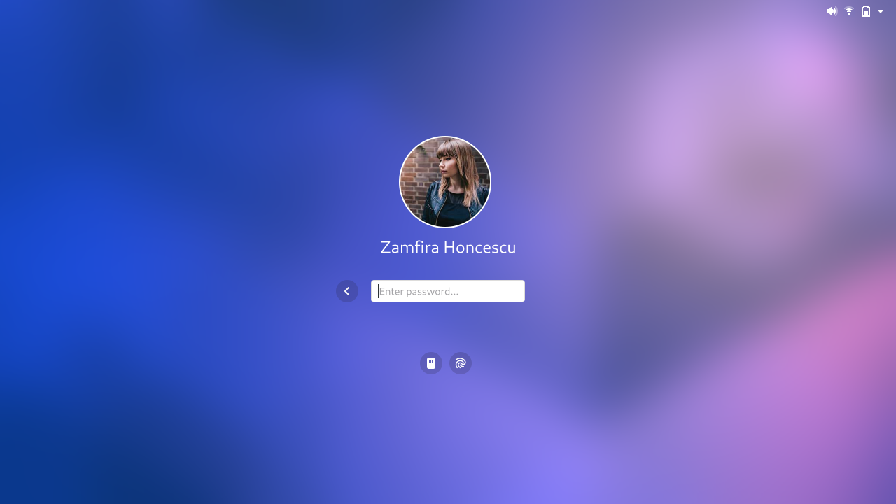
The design team has longstanding ambitions to update GNOME’s unlock and login experience. The designs have continued to evolve since I last blogged about them, and we continue to return to and improve them.

System unlock is a classic example of a touchstone experience. People unlock their computers all the time and, as the entry point to the system, it comes to define the overall experience. It’s the face of the system. It is therefore critical that unlock and login leave a good impression.

The new designs are intended to reduce the amount of friction that people experience when they unlock. They require users to take fewer steps and involve going through fewer transitions, so that people can get to their session faster and more seamlessly. This will in turn make the experience feel more comfortable.

The designs are also intended to be beautiful! As an emblematic part of the GNOME UX, we want unlock and login to look and feel fantastic.

Notifications

Notifications popover mockup

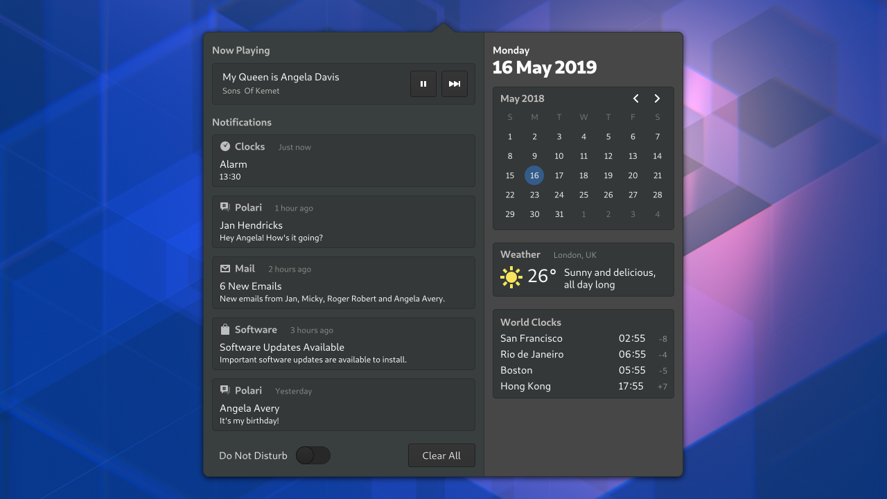
The design team has been systematically reviewing almost all parts of the core GNOME system, with a view to polish and refine them. Some of this work has already landed in GNOME 3.34, where you will see a collection of visual style improvements.

One area where we want to develop this work is the calendar and notifictions list. The improvements here are mostly visual – nicer layout, better typography, and so on – but there are functional improvements too. Our latest designs include a switch for do not disturb mode, for example.

There are other functional improvements that we’d like to see in subsequent iterations to the notification list, such as grouping notifications by application, and allowing notification actions to be accessed from the list.

Notifications are another great example where we can deliver clear value for our users: they’re something that users encounter all the time, and which are almost always relevant, irrespective of the apps that someone uses.

System Polish

System menu and dialog mockup

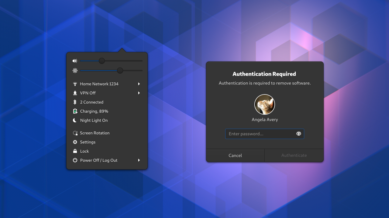
Our core system polish and refinement drive knows no bounds! We have designs for an updated system menu, which are primarily intended to resolve some long-standing discoverability issues. We’ve also systematically gone through all of the system dialogs, in order to ensure that each one is consistent and beautiful (something that is sadly lacking at the moment).

These aren’t the only parts of the core system that the design team is interested in improving. One key area that we are planning on working on in the near future is application launching. We’ve already done some experimental work in this area, and are planning on building on the drag and drop work that Georges Stavracas landed for GNOME 3.34.

Apps

The principle of prioritisation can also be applied to GNOME’s applications. The design team already spends a lot of time on the most essential applications, like Settings, Software and Files. Following the principle of prioritisation, we’ve also been taking a fresh look at some of the really basic apps that people use every day.

Two key examples of this are the document and image viewers. These are essential utilities that everyone uses. Such basic features ought to look and feel great and be firmly part of the GNOME experience. If we can’t get them right, then people won’t get a great impression.

Today our document and image viewers do their jobs reasonably well, but they lack refinement in some areas and they don’t always feel like they belong to the rest of the system. They also lack a few critical features.

Document viewer mockup
Image viewer mockup
Image viewer mockup

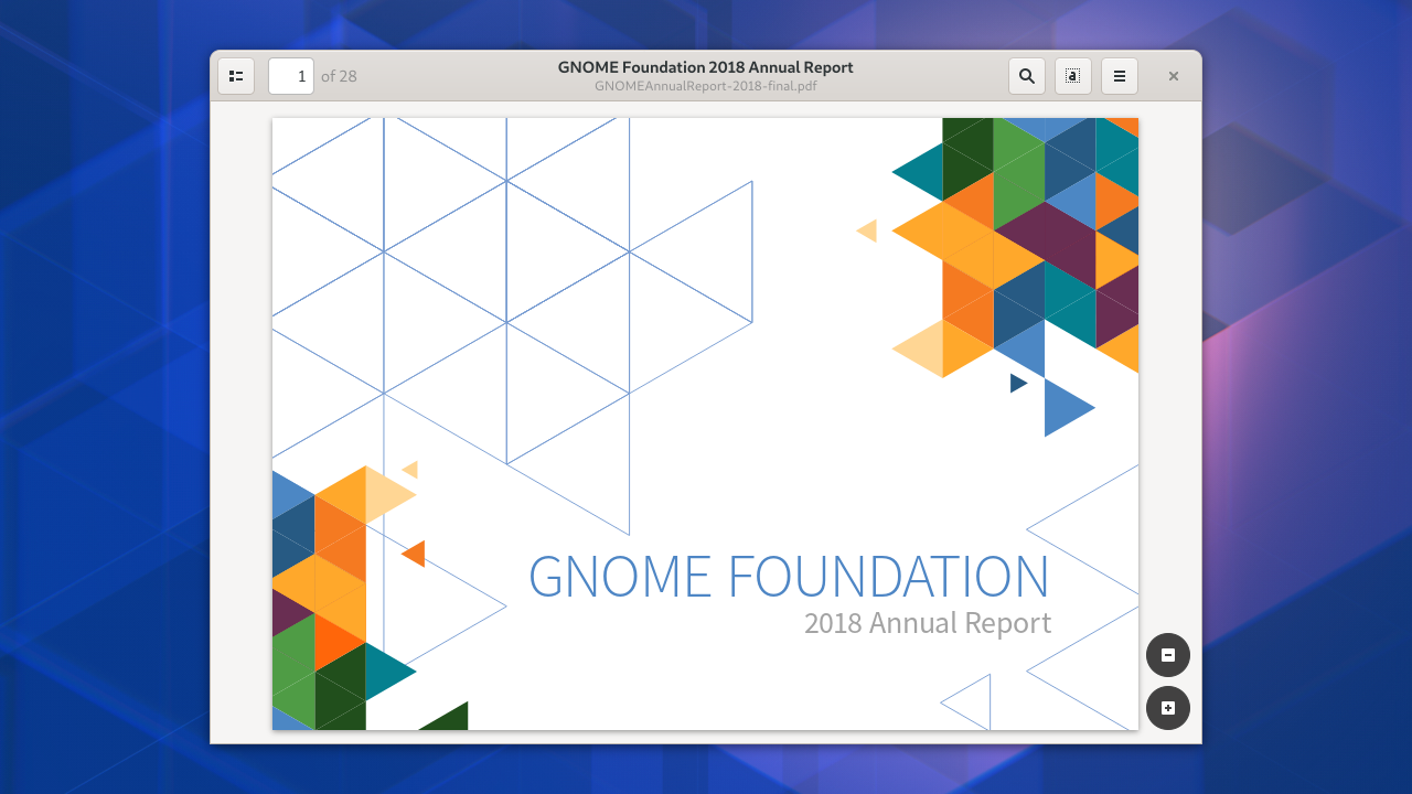
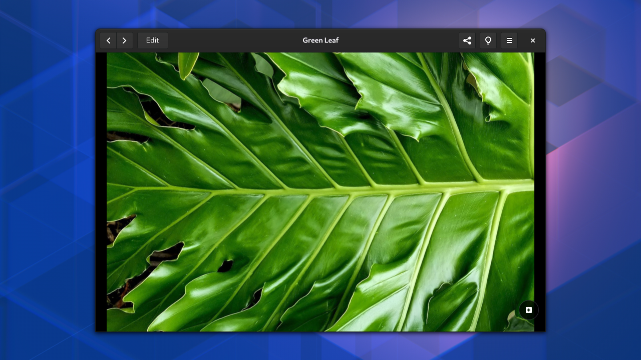
This is why the design team has created updated designs for both the document and image viewers. These use the same design patterns, so they will feel like they belong together (as well as to the rest of the system). They also include some additional important features, like basic image editing (from talking to GNOME users, we know that this is a sorely missed feature).

It would be great to extend this work to look at some of the other basic, frequently-used apps, like the Text Editor and Videos.

There’s a lot of other great application design work that I could share here, but am not going to, because I do think that focusing on these core apps first makes the most strategic sense.

Development Platform

Another way that we can prioritise is by working on the app development platform. Improvements in this area make it easier for developers to create apps. They also have the potential to make every GNOME app look and behave better, and can therefore be an extremely effective way to improve the GNOME UX.

Again, this is an area where the design team has already been doing a lot of work, particularly around our icon system. This is part of the application platform, and a lot of work has recently gone into making it easier than ever to create new icons as well as consume the ones that GNOME provides out of the box. If you’re interested in this topic, I’d recommend Jakub’s GUADEC talk on the subject.

GTK widget mockup
Mockups for menus, dropdown lists, reorderable lists, and in-app notifications

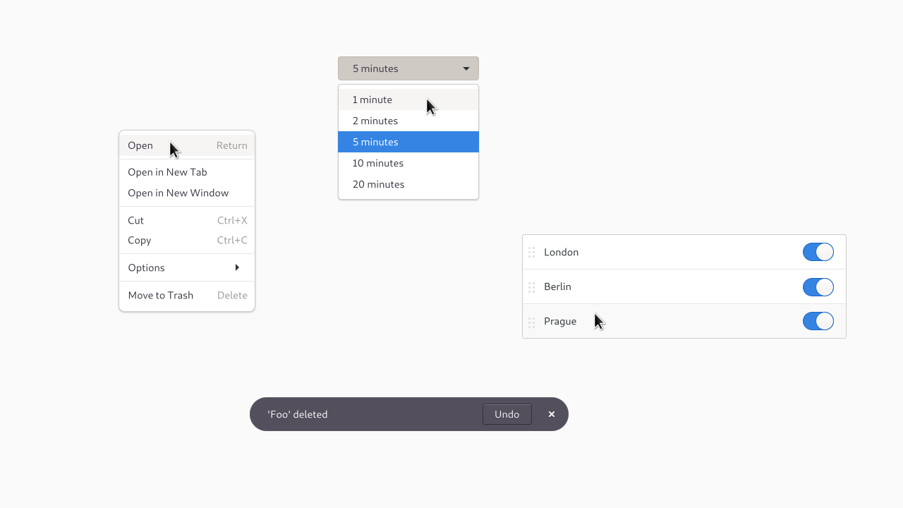
Aside from the icon system, we have also been working to ensure that all the key design patterns are fully supported by the application development platform. The story here is patchy: not all of the design patterns have corresponding widgets in GTK and, in some cases it can be a lot of work to implement standard GNOME application designs. The result can also lack the quality that we’d like to see.

This is why the design team has been reviewing each of our design patterns, with a view to ensuring that each one is both great quality, and is fully supported. We want each pattern to look great, function really well, and be easy for application developers to use. So far, we have new designs for menus, dropdown lists, listboxes and in-app notifications, and there’s more to come. This initiative is ongoing, and we need help from platform and toolkit developers to drive it to completion.

What Next?

UX is more than UI: it is everything that makes up the user’s experience. As such, what I’ve presented here only represents a fraction of what would need to be included in a comprehensive UX strategy. That said, I do think that the work I’ve described above is of critical importance. It represents a programme to drive up the quality of the experience we provide, in a way that I believe would really resonate with users, because it focuses on features that people use every day, and aims to deliver tangible improvements.

As an open, upstream project, GNOME doesn’t have direct control over who works on what. However, it is able to informally influence where resources go, whether it’s by advertising priorities, encouraging contributions in particular areas, or tracking progress towards goals. If we are serious about wanting to compete in the marketplace, then doing this for the kind of UX programme that I’ve described seems like it could be an important step forward.

If there’s one thing I’d like to see come out of this series, it would be a serious conversation about how GNOME can be more strategic in its outlook and organisation.

This post marks the end of the “what” part of the series. In the next and final part, I’ll be moving onto the “how”: rather than talking about what we should be working on and what our priorities should be, I’ll set out how we ought to be working. This “how” part of the equation is critical: you can have the best strategy in the world, but still fail due to poor processes. So, in the final instalment, we’ll be discussing development process and methodology!

Further Reading

More information about the designs mentioned in this post:

Towards a UX Strategy for GNOME (Part 2)

This post is a part of a short series, in which I’m setting out what I think could be the beginnings of a UX strategy for GNOME. In this, the second post, I’m going to describe a potential GNOME UX strategy in high-level terms. These goals are a response to the research and analysis that was described in the previous post and, it is hoped, point the way forward for how GNOME can achieve new success in the desktop market.

Strategic goals

For me, the main goals of a GNOME UX strategy could be:

1. Deliver quality

If GNOME is going to succeed in today’s desktop market, UX quality has to be job #1.

UX quality includes what the software looks like and how it is designed, but it also refers to how the software functions. Performance and bugs (or the lack of them) are both aspects of UX!

More than anything else, people are looking for a desktop that Just Works: they want a solution that allows them to get their work done without getting in their way. This means having a desktop that is reliable, stable, which does what people want, and which is easy to use.

People value solutions that Just Work. They’re also prepared to abandon them when they don’t Just Work.

To its credit, the GNOME project has historically recognised the importance of Just Works, and it has delivered huge improvements in this area. However, there is still a lot of work to be done.

My sense is that driving up quality is one of the key strategic challenges that the GNOME project needs to face up to; I’ll be returning to this topic!

2. Factor in the cloud

In my previous post, I worte about how the cloud has reconfigured the landscape in which GNOME operates. Accordingly, it’s important for our UX strategy to account for the cloud. There are various ways we can do this:

  • Focus on those bits of the desktop that are used by all users, even if they mainly use a web browser. This includes all the parts of the core system, as well as the most essential desktop apps.
  • Enable and encourage native cloud applications (including Electron and Progressive Web Apps)
  • Add value with high-quality native apps.
  • Integrate with existing cloud services, when it is safe to do so.

The last point might seem counter-intuitive, but it makes sense: in a world where the web is dominant, a fantastic set of native apps can be a powerful differentiator.

At the same time, GNOME needs to be careful when it comes to directly competing with sophisticated web apps and services, and it needs to recognise that, nowadays, many apps aren’t worth doing if they don’t have a cloud/cross-device component.

3. Grow the app ecosystem

The primary purpose of a platform like GNOME is to run apps, so it stands to reason that the number and quality of the apps that are available for the platform is of critical importance.

Recently, Flatpak has allowed the GNOME project to make great progress around application distribution, and this is already positively impacting app availability for GNOME. However, there is a lot of work still to be done, particularly around GNOME’s application development platform. This includes work for both designers and developers.

4. Support modern hardware

One of the things that my research revealed is that, for most users, their choice of desktop OS is thoroughly entwined with hardware purchasing choices, with hardware and software typically being seen as part of the same package. Attracting users to GNOME therefore requires that GNOME be available for, work well with, and be associated with high-quality hardware.

A lot of hardware enablement work is done by distros, but a lot also happens in GNOME, including things like high-definition display support, touchscreen support, screen casting, and more. This is important work!

Do less, prioritise

Any UX strategy should address the question of prioritisation: it ought to be able to determine how resources can be directed in order to have maximum impact. This is particularly important for the GNOME project, because its resources are limited: the core community is fairly small, and there’s a lot of code to maintain.

The idea of prioritisation has therefore both influenced the goals I’ve set out above, as well as how I’ve been trying to put them into practice.

When thinking about prioritisation in the context of GNOME UX, there are various principles that we can follow, including:

  • User exposure, both in terms of the proportion of people that use a feature, and also the frequency with which they use it. Improvements to features that everyone uses all the time have a bigger impact than improvements to features that are only used occasionally by a subset of the user base.
  • User needs and desires: features that are viewed as being highly attractive by a lot of people are more impactful than those which are only interesting to a small subset.
  • Common underpinnings: we can prioritise by focusing on common subsystems and technical components. The key example here is something like GTK, where improvements can surface themselves in all the apps that use the toolkit.

When we decide which design and development initiatives we want to focus on (either by working on them ourselves, or advertising them to potential contributors), principles like these, along with the high-level goals that I’ve described above, can be very helpful.

I also believe that, in some cases, the GNOME project needs to have some hard conversations, and think about giving up some of its existing software. If quality is job #1, one obvious answer is to reduce the amount of software we care about, in order to increase the overall quality of everything else. This is particularly relevant for those parts of our software that don’t have great quality today.

Of course, these kinds of conversations need to be handled delicately. Resources aren’t fungible in an upstream project like GNOME, and contributors can and should be free to work on what they want.

What’s next

In my previous post, I described the research and analysis that serves as inputs to the strategy I’m setting out. In this post I’ve translated that background into a high-level plan: four strategic goals, and an overarching principle of prioritisation.

In the next post, I’m going to introduce a raft of design work which I think fits into the strategy that I’ve started to lay out. GNOME is lucky to have a great design team at the moment, which has been pumping out high-quality design work over the past year, so this is a great opportunity to showcase what we’ve been doing, but what I want to do is also show how it fits into context.

Towards a UX Strategy for GNOME (Part 1)

At the recent GUADEC in Thessaloniki, I gave a talk about some strands of work that I’ve been doing around UX strategy and design/development process. I ended up skipping over some points that I’d wanted to make, and I also had some great conversations with people about the talk afterwards, so I wanted to share an updated version of the talk in blog form.

I’ll be splitting the talk into multiple posts. This first post is about creating a UX strategy for GNOME. As you might expect, this is a plan for how to improve GNOME’s user experience! In particular, it tries to answer the question of which areas and features need to be prioritised.

The approach I’ve taken in creating this strategy follows a fairly standard format: analyse the market, research user needs, identify and analyse competitors, then use that data to design a product which will succeed in the current desktop market. The main goal is to offer a product which meets user needs better than the alternatives.

In later posts in the series, I’m going to show off a set of updated designs for GNOME, which I think are a good place to start implementing the strategy that I’m laying out. For many readers, those later posts will probably be more interesting! However, I do think it’s useful to provide the strategy, in order to provide background and put that work in context.

Data sources

Data and research are an essential part of any robust strategy. For my strategy work, I’ve read market reports and general UX literature. I’ve also done a lightweight competitive analysis exercise, as well as some primary research of my own.

My research consisted of three sets of in-depth interviews. These have been with three different groups of users (not just GNOME users), about what influences their choice of desktop. The participants in those interviews have been skewed towards development and technical users in Europe and the United States, but they did include variation and I think that some of themes that emerged are probably widespread.

Market observations

The following are some of the key lessons that I think I’ve learned through the various research and analysis activities I’ve done over the past year. In my mind, these are all significant observations which can influence our UX strategy, and which certainly influence my thinking when I approach desktop design work.

The state of the desktop market

The desktop market hasn’t seen massive growth in recent years, but it is reasonably stable. Within that, we have seen an increasing emphasis on productivity and enterprise use cases, in part because of the relative weakness of the personal computing segment of the market. I think that there’s currently a renewed recognition of the importance of the desktop for productivity tasks, and as a platform for creation and development.

It should be noted that the personal computing market certainly hasn’t disappeared, and that there has been steady growth in convertible laptop sales (laptops which have a touchscreen and some kind of tablet mode).

The cloud

The cloud has changed the competitive landscape for the desktop. One key development is that, nowadays, most of the key desktop apps people use are cloud-based (this includes browser-based apps, apps which act as an interface to a cloud-based service, and apps which are running locally using web technologies). As a result, they are generally cross-platform.

The rise of the cloud presents GNOME with both opportunities and challenges. On the one hand, it makes GNOME and the Linux desktop far more viable, since it means that people running Linux can access most of the apps they need. Applications are no longer constrained to particular platforms in the way that they used to be (though this can still be a significant factor in some cases).

On the other hand, the cloud presents a challenge for GNOME, in that it becomes harder for us to show and deliver value. For some users, the web is already the only application platform that they use.

Expectations and quality

Another observation about the contemporary software landscape: the general standard of software user experience has significantly increased in recent history. (Largely thanks to improved methodologies and processes, including greater prioritisation of design and the increased use of user testing.)

People nowadays are used to software that does its job well, is easy to use, and generally looks good.

This makes GNOME’s job harder. Being OK is no longer good enough. People’s expectations have been raised: they are less inclined to accept poor quality software than they were in the past, and it’s harder to produce something that excites them.

User requirements

The desktop user interviews that I’ve done over the past year have revealed a number of key requirements that people have for their desktop computers. These include:

  • Reliability and stability
  • Ease of use
  • Software availability
  • Affordability
  • Brand trust
  • User control

A bullet list like this is fairly crude way to present research results, and there’s a lot that I could say about each of these topics. However, for now the main thing to say is that people can and do change desktop platforms according to these criteria. I’ve been told stories about the moment someone decided to switch platform, because they were so sick of something not working the way they needed it to. I’ve also been told about the coping strategies that people use when they haven’t been able to find a desktop which meets their needs. The pain is real, and the struggles people have finding a good desktop are real.

Which brings me on to my main point: without naming names, if you look at the desktop market today, there isn’t a product out there which meets all the user needs I’ve identified. Each one is missing part of the winning formula.

From this perspective, the path for GNOME is clear: if it wants to compete, and out-perform its rivals in the desktop space, it needs to deliver on each of the points I’ve listed above.

Up next…

In the posts that follow, I’m going to lay out a UX strategy which builds on these observations. The next post will describe a set of strategic goals which form the framework for the strategy. From there, I’m going to present a raft of design work, which I think represents a implementable UX plan, before finishing with a post about design and development methodology.

Parental Controls and Metered Data Hackfest

This week I participated in the Parental Controls and Metered Data Hackfest, which was held at Red Hat’s London office.

Parental controls and metered data already exist in Endless and/or elementary OS in some shape or form. The goal of the hackfest was to plan how to upstream the features to GNOME. It’s great to see this kind of activity from downstreams so I was very happy to contribute in my capacity as an upstream UX designer.

There have been a fair few blog posts about the event already, so I’m going to try and avoid repeating what’s already been written…

Parental controls

Parental controls sound like a niche feature, but they actually have wider applicability than limiting what the kids can do with your laptop. This is because the same features that are used by parental controls can be useful for other types of functionality, particularly around “digital well-being”. For example, a parent might want to limit how much time their child spends using the computer, but someone might want to self-impose this same limit on themselves, in order to try and lead a healthier lifestyle.

Furthermore, outside of parental controls, the same functionality can be pitched in different ways. A feature like limiting the use of particular apps to certain times of the day could either be presented as a “digital well-being” feature, where the goal is to be happier and healthier, or as a “productivity” feature, where the goal is to help someone get more out of their time in front of the screen.

There are some interesting user experience questions that need to be answered here, such as to what extent we should focus on particular use cases, as well as what those use cases should be.

We discussed these questions a bit during the hackfest, but more thought is going to be necessary. The other next step will be to figure out what the initial MVP should be for these features, since they could potentially be quite extensive.

Metered data

Metered network connections are those that either have usage limits attached to them, or those which have financial costs for usage. In both cases this requires that we limit automatic/background network usage, as well as potentially showing warnings if the user is doing something that could result in high data usage.

My main interest in this area is to ensure that GNOME behaves correctly when people use mobile broadband, either by tethering their phone or when using a dedicated mobile broadband connection. (There’s nothing more frustrating than your laptop silently chewing through your data plan.)

The first target for this work is to make sure that automatic software updates behave well, but there’s some other interesting work that could come out of it, particularly around controls for whether unfocused or backgrounded apps are allowed to use the network.

Philip Withnall has created a survey to find out about peoples’ experiences using metered data. Please fill it out if you haven’t already!

Credits

The hackfest was a great event, and I’d like to thank the following people and organisations for making it possible:

  • Philip Withnall for organising the event
  • The GNOME Foundation for sponsoring me to attend
  • Red Hat for providing the venue

Birds in flight

Flying birds

If you follow Planet GNOME, you’ll know about Jim Hall’s fantastic usability testing work. For years Jim has spearheaded usability testing on GNOME, both by running tests himself and mentoring usability testing internships offered through Outreachy.

This Autumn, Jim will once again be mentoring usability testing internships. However, this time round, we’re planning on running the internships a bit differently.

In previous rounds of usability testing, the tests have typically been performed on released software: that is, apps and features that are already in the hands of users. This is great and has flagged up issues that we’ve gone on to fix, but it has some drawbacks.

Most obviously, it means that users are exposed to the software prior to usability testing takes place. However, it also means that test results can take a long time to be corrected: active development of the software in question might have been paused by the time the tests are conducted, and it can sometimes take a while until a developer is able to correct any usability issues that have been identified.

Therefore, for this round of the Outreachy internships, we are only going to test UX changes that are actively being worked on. Instead of testing finished features, the tests will be on two things:

  1. Mockups or prototypes of changes that we hope to implement soon (this can include static mockups and paper or software prototypes)
  2. Features or UI changes that are being actively worked on, but haven’t been released to users yet

One goal is to increase the number of cycles of data-driven iteration that our UX work goes through. Ideally there should be multiple rounds of testing and design changes prior to coding even taking place! This will reduce the amount of UI changes that have to be made, and in turn reduce the amount of work for our developers.

Organising the tests in this way, we’re drawing on ideas from agile and lean. The plan is to have a predefined schedule of tests. When test day rolls around, we’ll figure out what we want to test. This will force a routine to our practice and ensure that we keep the exercise light and iterative.

There’s lots of work in progress UX work in GNOME right now, all of which would benefit from testing. This includes the new menu arrangements that are replacing app menus, new sound settings, new design patterns for lists, new application permission settings, the new lock screen design, and more.

One thing I’d actually love to see is design initiatives rejected outright because of testing feedback.

The region and language settings are being updated right now. We can test this!

This approach to testing is an experiment and we’ll have to see how well it works in practice. However, if it does go well, I’m hopeful that we can incorporate it into our design and development practice more generally.

Jim and the rest of the design team will be looking for help from the rest of the GNOME community as we approach the test days. If anyone wants to help make prototypes or make sure that development branches can be easily run by our interns, your help would be extremely welcome. Likewise, we’d love to hear from anyone who has development work that they would like to have tested.