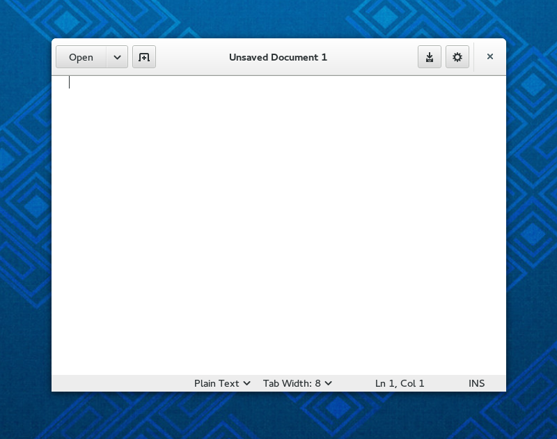
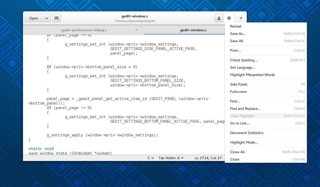
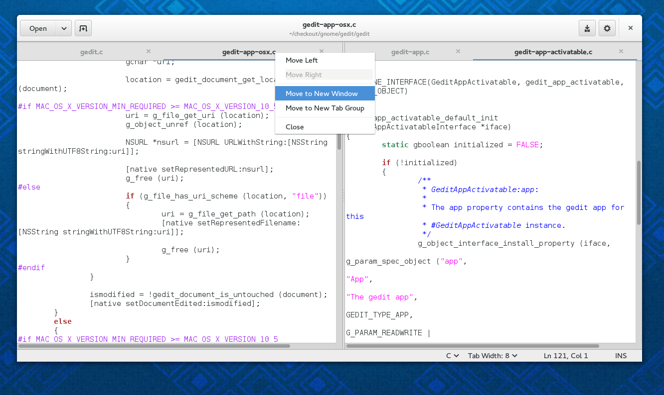
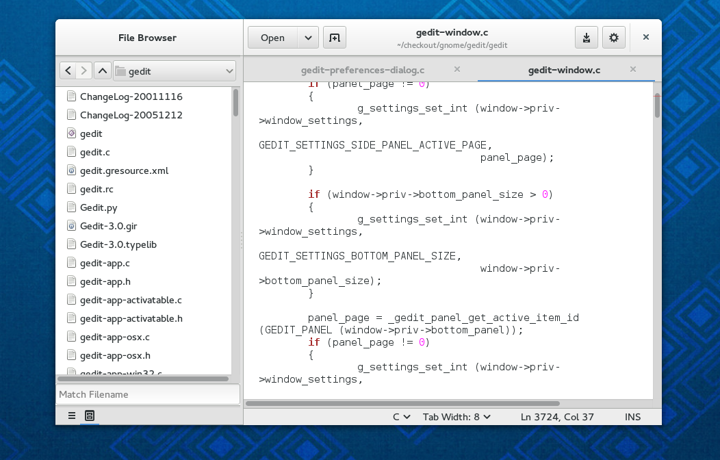
We just landed to git master the changes that implement a refresh of the main user interface.
While small changes and iterations in the UI happened in every cycle, this is the most radical change in the UI in years so it is a very important and significative change.
The goal of this work is to create a modern, slicker interface which wastes less screen estate and lets you focus on the text or code you are writing. No features were harmed in the making of this new UI.
These changes bring gedit in line with the latest GNOME conventions and take advantages of the new design patterns and GTK widgets.
However some of the concepts there have been brewing for a long time and saw many iterations in test branches and mockups.
Some words about what you see in the pictures above
- not everything is set in stone, we would very much welcome feedback
- the tabs look and feel is part of the latest Adwaita gtk theme and not something custom in gedit and could be still subject to changes
- while what you see is the new default look of gedit, the changes to the code base should allow us to have far better integration with the environment we are running on and allow us to easily have different UI on OSX, Windows, Unity, etc. (help from people running gedit out of gnome-shell is very much welcome)
What about plugins
plugins that interacted with the menu will need to be adapted to the new API. We are a bit sorry we had to (partially) break the plugin API again, but this cannot be helped since with the current manpower we can focus on a specific set of changes during each cycle.
We hope you enjoy this new face of gedit and you are very welcome to enter in the #gedit channel of the Gimpnet IRC in case you want to contact with us and discuss any issues about the new design or if you want to help to better support gedit in your favourite desktop environment.


love it!
[WORDPRESS HASHCASH] The poster sent us ‘0 which is not a hashcash value.
Apparently you use the settings button (top-right next to the window close button) instead of the gnome-shell menu button. Evince is also doing this.
It seems the gnome-shell menu button is not really taking off with users, and some applications don’t respect it… I’ve taken it with an open mind but I think it probably should be given up and put that menu in the window, as suggested in the comments of this post:
http://blogs.gnome.org/mclasen/2014/01/13/client-side-decorations-continued/
[WORDPRESS HASHCASH] The poster sent us ‘0 which is not a hashcash value.
We do use the app menu provided by gnome shell, but that’s meant for application specific actions, i.e new window, preferences, about, help, quit…
Whay not add the “new tab” button next to the tabs?
Just some constructive thoughts:
Tabs also look very androd-ish. I think at least the active task should be made more prominent, with and active color that stands out from the background color.
[WORDPRESS HASHCASH] The poster sent us ‘0 which is not a hashcash value.
About the new tab button, it is something we were experimenting with, but in the meantime we came up with this.
This looks exceptionally good.
Two minor issues:
First, are you using a non-default theme, or have you created a custom look for tabs? Please consider using the standard GTK+ tab widget, for consistency in appearance and behavior, as well as themeability. I actually think the look you’re presenting looks good, but it’s a change that needs to occur at the theme level, not in individual applications.
Second, please consider dropping the left/right split mechanism. gnome-shell already has a convenient way to pair up a couple of windows, and I think the UI would become less confusing if it just has windows and tabs, not windows, tabs, and split windows containing tabs.
[WORDPRESS HASHCASH] The poster sent us ‘0 which is not a hashcash value.
Thanks.
For the first: We are using the default theme as pointed out in the post.
For the second: we are not dropping this feature, it is up to the user to use it or not and gedit might be used in something different than gnome-shell as also written in the post.
In the split-window-mode as shown in gedit4.png, do the controls in the statusbar (language selection, tab width, cursor position) only apply to the “active” subwindow (the one the cursor is currently in)? This might be confusing, especially if the left left subwindow is active and the controls are below the right one. Would it be possible to have one set of controls for each subwindow?
[WORDPRESS HASHCASH] The poster sent us ‘0 which is not a hashcash value.
@sven: I guess this would be something to study…
Very consistent guys, great work. Now, can’t say it will please every one =)
[WORDPRESS HASHCASH] The poster sent us ‘0 which is not a hashcash value.
The new tabs look horrible. There is no clear distinction among tabs and the fact that the position of the close button is unpredictable when closing one seems very annoying.
[WORDPRESS HASHCASH] The poster sent us ‘0 which is not a hashcash value.
@john: yeah… we have already complained about it 😉
The general users often use the undo/redo buttons, because they don’t know the keyboard shortcut. But not only the buttons disappeared, they’re not even in the menu, as it seems from the screenshot. It depends on what you want to achieve, but if you try to have a general text editor suitable for general populace, you should really consider re-adding those.
[WORDPRESS HASHCASH] The poster sent us ‘0 which is not a hashcash value.
@kparal in this new approach we use the context menu much more and the buttons are there.
Adwaita’s tabs theming needs improving – there isnt must definition to the tabs so they look weird.
[WORDPRESS HASHCASH] The poster sent us ‘0 which is not a hashcash value.
I do not think lack of undo/redo buttons is a problem, other popular editors like sublime text do not have them and nobody complains.
I have instead to agree that the new tabs look aweful 🙁
[WORDPRESS HASHCASH] The poster sent us ‘0 which is not a hashcash value.
This looks amazing! Great work!
One little question: does the last paragraph imply that the External Tools plugin will stop working in the next release of Gnome Shell?
[WORDPRESS HASHCASH] The poster sent us ‘0 which is not a hashcash value.
No, external tools is already ported to the new api as the rest of the plugins supported by the gedit team.
Very nice! My complaint would be that there’s a duplicate entry for the highlight mode setting. One at the bottom and one at the cog wheel. You would only need one.
[WORDPRESS HASHCASH] The poster sent us ‘0 which is not a hashcash value.
Mc: well you might have the statusbar hidden and still want to change the highlight mode.
I was going to make a cynical remark about gigantic buttons not actually saving any space, but after actually checking it in GIMP, I find the top menu area is actually 3 or so pixels shorter than with the version of gedit I’m using (duplo icons disabled, of course). Since I have text scaling at 0.8, this may actually save me screen space.
I’m rarely eager for change, and especially so after seeing the other GNOME apps, but I’m glad to see that one of the two GNOME apps I still find useful seems to be receiving attention without simplifying it beyond usability.
[WORDPRESS HASHCASH] The poster sent us ‘0 which is not a hashcash value.
Why not add an option to hide the title(or menu) bar & just let tabs visible like in the Firefox?
[WORDPRESS HASHCASH] The poster sent us ‘0 which is not a hashcash value.
Nice post, Nacho. I agree about the tabs, but that will likely get fixed before the 3.12 release. Overall, looks like some good changes for gedit, though.
Guess I should get to work on documentation updates, eh? : )
[WORDPRESS HASHCASH] The poster sent us ‘0 which is not a hashcash value.
nacho: How will you hide the statusbar? I might be blind but I don’t see the option to hide it in the cogwheel. Also shouldn’t tab width also be in the cogwheel then with that logic?
[WORDPRESS HASHCASH] The poster sent us ‘0 which is not a hashcash value.
Mc: from the preferences dialog.
KDE, here I come…
[WORDPRESS HASHCASH] The poster sent us ‘0 which is not a hashcash value.
Frankly, it looks like garbage. More change-for-change’s sake. Throwing away years of UI standards… for what? Because iPads are cool?
[WORDPRESS HASHCASH] The poster sent us ‘0 which is not a hashcash value.
I am bothered by a design that ends up placing (hiding?) a lot of unrelated functionality into a single menu.
The end result looks good, until you have to parse 17 entries every time that you want to do anything other than changing tabs and writing (except if you want to change preferences or view the help, because those are at the top of the screen for some reason).
[WORDPRESS HASHCASH] The poster sent us ‘0 which is not a hashcash value.
When it will released for unity ?
[WORDPRESS HASHCASH] The poster sent us ‘0 which is not a hashcash value.
Is to similar to the IOS notes app…
[WORDPRESS HASHCASH] The poster sent us ‘0 which is not a hashcash value.
Looks nice. Shouldn’t be called “Text” or whatever gnomish name?
[WORDPRESS HASHCASH] The poster sent us ‘0 which is not a hashcash value.
Contrary to what the other person said, the left/right split thing is an extremely useful feature, and one which side-by-side arrangement at the Shell level can’t replace.
Specifically, it allows two documents to be displayed side-by-side, without being affected by Alt-Tab behaviour – i.e I can quickly switch between gedit and a terminal, without having to fiddle around because one gedit window is now behind the terminal and the other on top…
[WORDPRESS HASHCASH] The poster sent us ‘0 which is not a hashcash value.
Nice work!
However, I really think the new tab button and the save button should be swapped. In Web, the new tab button is on the right, and consistency is good. And having save beside open makes more sense to me than having them on opposing ends.
[WORDPRESS HASHCASH] The poster sent us ‘0 which is not a hashcash value.
Also, I do have to echo what others have said about the tabs… they badly, badly need some visual separation between adjacent tabs. Not a gedit-specific problem, as you say, but it looks truly awful.
Not sure what the motivation for that styling change was, but it’s a real regression from current releases.
[WORDPRESS HASHCASH] The poster sent us ‘0 which is not a hashcash value.
I am much more optimistic about this revamp based on this post, thanks for putting this grouchy user at ease 🙂
[WORDPRESS HASHCASH] The poster sent us ‘0 which is not a hashcash value.
Have consider an issue have the close button and setup one too close?
Havr consider that could cause unwanted close instead of a setup action?
[WORDPRESS HASHCASH] The poster sent us ‘0 which is not a hashcash value.
Love it! I can see that the tab close buttons might be confusing at first, but maybe a more pronounced outline on hover would help. Overall, I think the new tab style is a great idea. It removes the visual noise of tabs that try to look realistic, and by omitting outlines, the tab area can be placed directly against the menu/title bar without looking crowded, while maximizing the clickable area. I would remove close buttons from inactive tabs altogether, and only show them on mouse-over.
[WORDPRESS HASHCASH] The poster sent us ‘0 which is not a hashcash value.
Not sure how I managed to miss that; completely withdrawn, and my apologies.
Sorry to hear that, but oh well. The rest still looks good; just trying to make the UI less busy.
[WORDPRESS HASHCASH] The poster sent us ‘0 which is not a hashcash value.
This is horrible. I will change to KDE.
Like Linus says:
“This ‘users are idiots, and are confused by functionality’ mentality of Gnome is a disease. If you think your users are idiots, only idiots will use it. I don’t use Gnome, because in striving to be simple, it has long since reached the point where it simply doesn’t do what I need it to do.
Please, just tell people to use KDE.”
–Linus Torvalds
[WORDPRESS HASHCASH] The poster sent us ‘0 which is not a hashcash value.
Love it, I’m going to swicth from KDE to Gnome, finally some progressive UI evolution 🙂
[WORDPRESS HASHCASH] The poster sent us ‘0 which is not a hashcash value.
This redesign is an example of the issues endemic with Gnome 3’s direction: user interfaces oversimplified to appear “cool” or “modern” with no care given to actual application use. And it’s sloppy.
Gnome 3 saw Apple start to remove features from their apps, so all the Gnome developers decided they were the next Steve Jobs, and just will-nilly started removing menus and settings and hard coding things the way “they were meant to be.” Unfortunately, that strategy only works when you have a good understanding of your users and the work they do. Gnome 3 is like a garish caricature of OS X. They consistently choose the absolute worst of Apple’s decisions to emulate: scrapping dropdown menus in each window (but there’s no Spotlight search or master toolbar to find now-hidden program commands), switching from XML to binary preferences formats (but Gnome has no efficient cloud-synced database driving the migration), giant buttons, menubars, yet tiny scrollbars (even though most GNU/Linux installs are on non-tablet form factors driven with a mouse)
Sure, I still run Linux (Ubuntu 12.04) as my primary work operating system, but I am productive not *becase of* the user experience, but *in spite of it*. I have to reach under the Gnome 3 layer (which I can because of the Linux philosophy) and do serious mucking about before either Ubuntu or Fedora are tolerable.
[WORDPRESS HASHCASH] The poster sent us ‘0 which is not a hashcash value.
@Jake: we know about those issues you spot in your link, and we are working to fix them, see that this is an unstable release so things are still not finished. About the features, as said in the blog post we have not removed any of the features supported by gedit. Also as specified in the post, now things should be easier to support other desktop environment rules. I.e you could have a menubar in unity or in windows. We just need to have a someone to actually do the work of writing a simple xml and a couple of functions. Feeling like doing it?
Awesome work! I will start porting my plugins to this version xd
[WORDPRESS HASHCASH] The poster sent us ‘0 which is not a hashcash value.
Fuuuuuuuuuu I just spent all day on menus for the plugin that I work on and only just got them working yesterday !!
[WORDPRESS HASHCASH] The poster sent us ‘0 which is not a hashcash value.
It would be really good if you could give a link to ported plugins .. or even better a tutorial on porting a simple python based plugin from GEdit3 to GEdit3.next, or whatever this one will be.
[WORDPRESS HASHCASH] The poster sent us ‘0 which is not a hashcash value.
Will you be able to drag the filename to a directory to save a copy of the file there ?
[WORDPRESS HASHCASH] The poster sent us ‘0 which is not a hashcash value.
Sounds good. Perhaps a bit OT but I would like to see gedit start up as quickly and look and feel as light as notepad++ does on Windows. Rightclick and there’s a long wait before u can get to editing yr doc or viewing a log file right now.
[WORDPRESS HASHCASH] The poster sent us ‘0 which is not a hashcash value.
GNOME primary desktop! gedit must be simplest and also with many configuration!
[WORDPRESS HASHCASH] The poster sent us ‘0 which is not a hashcash value.
Beautiful.
Have to say I like the way Gnome is going overall, bold moves guys!
Don’t let the nay sayers distract you, Gnome is on it’s way to become the most modern WM of all.
[WORDPRESS HASHCASH] The poster sent us ‘0 which is not a hashcash value.
The tabs could at least have a subtle alternating light/dark bg – with a lighter one for the current tab.
[WORDPRESS HASHCASH] The poster sent us ‘0 which is not a hashcash value.
Awesome. Maybe someone also fixed the unbearably slow startup time too.
[WORDPRESS HASHCASH] The poster sent us ‘0 which is not a hashcash value.
P.S. what’s the point of adding:
[WORDPRESS HASHCASH] The poster sent us ’0 which is not a hashcash value.
to every comment. Talk about bad UI design.
[WORDPRESS HASHCASH] The poster sent us ‘0 which is not a hashcash value.
I agree with @manoj, the tabs look “aweful”. As in awe-inspiringly good. so good I might even abandon my console editor and start using gedit again.
[WORDPRESS HASHCASH] The poster sent us ‘0 which is not a hashcash value.
Trying to make a decent programmers editor out of gedit is the proverbial lipstick on a pig. It’s not what it is. It’s laughably underpowered for the large codebases and complex APIs in use these day. Still, if you feel its a good use of your undoubted skills fair enough. A shame the people using it will be so many poles apart on what gedit is and should be (note the guy getting so excited he might drop using his…. “console editor”) that it’ll all turn into another editor war without the benefit of actually realising its a good powerful editor in the style of emacs or even vi.
[WORDPRESS HASHCASH] The poster sent us ‘0 which is not a hashcash value.
I love it, my wish list is 1. to have transparency (alpha) 2. minimap like “sublime text editor”.
like in this image:
http://www.carbonatedinc.com/wp-content/uploads/sublime-zoom.jpg
[WORDPRESS HASHCASH] The poster sent us ‘0 which is not a hashcash value.
Nacho, we are ‘tocayo’. ^^
I like Gedit Snippets plugin, but I don’t know how to avoid the conflicts with the defaults snippets being only an user.
Moreover, I don’t know how to activate an automatic popup showing the snippets after one or two character typped.
Despite this two bugs, I finf Gedit awesome.
Thanks for your effort.
[WORDPRESS HASHCASH] The poster sent us ‘0 which is not a hashcash value.
I hope Gedit gets performance improvement to startup. Yes startup speed like Notepad.
[WORDPRESS HASHCASH] The poster sent us ‘0 which is not a hashcash value.
The new interface looks pretty kick-ass to me, keep up the good work!
[WORDPRESS HASHCASH] The poster sent us ‘0 which is not a hashcash value.
I’m here just to congratulate: a core GNOME app is redesigned completely, and the result is “simply better” than the previous version. This doesn’t happen often 😉
I particularly love the freedom to manage multiple tabs _and_ multiple windows, all without touching the mouse.
About the war with console editors… it is pointless. I never tried to convert any professional programmer to gedit, but I know for me learning to master vim is not worth the effort. Moreover, one nice thing of the “mobile” trend is that text editors are no more to ordinary people just “the strange thing you use on computer with no office suite installed”, or “the program to follow online guides on editing .bat files”, but simply programs to write text which does not require formatting.
[WORDPRESS HASHCASH] The poster sent us ‘0 which is not a hashcash value.
Looks to me that you have missed the old metrics. Can I bring the old menu bar back by option? Like firefox allows.
Yes it good to save screen space. But no it not good to increase the number of clicks it requires for me to achieve goal.
[WORDPRESS HASHCASH] The poster sent us ‘0 which is not a hashcash value.