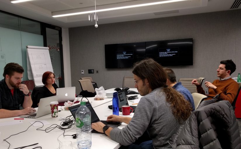
Last week I took part in the GNOME Shell UX Hackfest in London, along with other designers and developers from GNOME and adjacent communities such as Endless, Pop!, and elementary. We talked about big, fundamental things, like app launching and the lock/login screen, as well as some smaller items, like the first-run experience and legacy window decorations.
I won’t recap everything in detail, because Cassidy from System76 has already done a great job at that. Instead, I want to highlight some of the things I found most interesting.
Spatial model
One of my main interests for this hackfest was to push for better animations and making better use of the spatial dimension in GNOME Shell. If you’ve seen my GUADEC Talk, you know about my grand plan to introduce semantic animations across all of GNOME, and the Shell is obviously no exception. I’m happy to report that we made good progress towards a clear, unified spatial model for GNOME Shell last week.
Everything we came up with are very early stage concepts at this point, but I’m especially excited about the possibility of having the login/unlock screen be part of the same space as the rest of the system, and making the transition between these fluid and semantic.
Tiling
Another utopian dream of mine is a tiling-first desktop. I’ve long felt that overlapping windows are not the best way to do multitasking on screens, and tiling is something I’m very interested in exploring as an alternative. Tiling window managers have long done this, but their UX is usually subpar. However, some text editors like Atom have pretty nice graphical implementations of tiling window managers nowadays, and I feel like this approach might be scalable enough to cover most OS-level use cases as well (perhaps with something like a picture-in-picture mode for certain use cases).

We touched on this topic at various points during this hackfest, especially in relation to the resizable half-tiling introduced in 3.26, and the coming quarter-tiling. However, our current tech stack and the design of most apps are not well suited to a tiling-first approach, so this is unlikely ot happen anytime soon. That said, I want to keep exploring alternatives to free-floating, overlapping windows, and will report on my progress here.
Header bars everywhere
A topic we only briefly touched on, but which I care about a lot, was legacy window decorations (aka title bars). Even though header bars have been around for a while, there are still a lot of apps we all rely on with ugly, space-eating bars at the top (Inkscape, I’m looking at you).

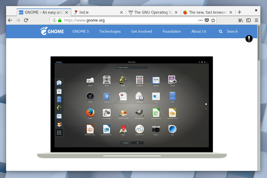
We discussed possible solutions such as conditionally hiding title bars in certain situations, but finally decided that the best course of action is to work with apps upstream to add support for header bars. Firefox and Chromium are currently in the process of implementing this, and we want to encourage other third-party apps to do the same.

This will be a long and difficult process, but it will result in better apps for everyone, instead of hacky partial solutions. The work on this has just begun, and I’ll blog more about it as this initiative develops.
In summary, I think the hackfest set a clear direction for the future of GNOME Shell, and one that I’m excited to work towards. I’d like to thank the GNOME Foundation for sponsoring my attendance, Allan and Mario for organizing the hackfest, and everyone who attended for being there, and being awesome! Until next time!

