Window management is one of those areas I’m fascinated with because even after 50 years, nobody’s fully cracked it yet. Ever since the dawn of time we’ve relied on the window metaphor as the primary way of multitasking on the desktop. In this metaphor, each app can spawn one or more rectangular windows, which are stacked by most recently used, and moved or resized manually.
The traditional windowing system works well as long as you only have a handful of small windows, but issues emerge as soon the number and size of the windows grows. As new windows are opened, existing ones are obscured, sometimes completely hiding them from view. Or, when you open a maximized window, suddenly every other window is hidden.
Over the decades, different OSes have added different tools and workflows to deal with these issues, including workspaces, taskbars, and switchers. However, the basic primitives have not changed since the 70s and, as a result, the issues have never gone away.
While most of us are used to this system and its quirks, that doesn’t mean it’s without problems. This is especially apparent when you do user research with people who are new to computing, including children and older people. Manually placing and sizing windows can be fiddly work, and requires close attention and precise motor control. It’s also what we jokingly refer to as shit work: it is work that the user has to do, which is generated by the system itself, and has no other purpose.
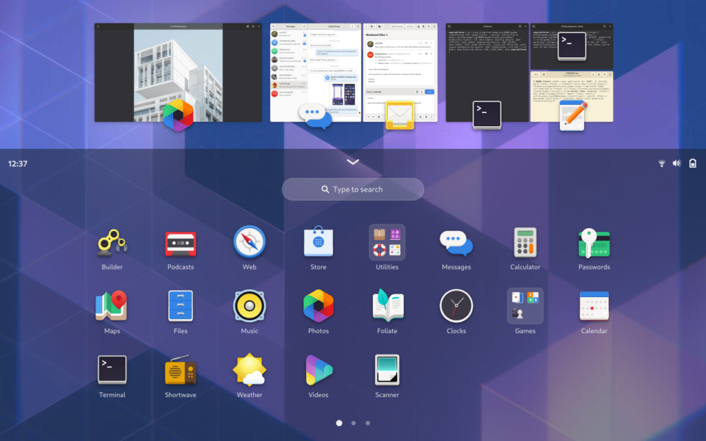
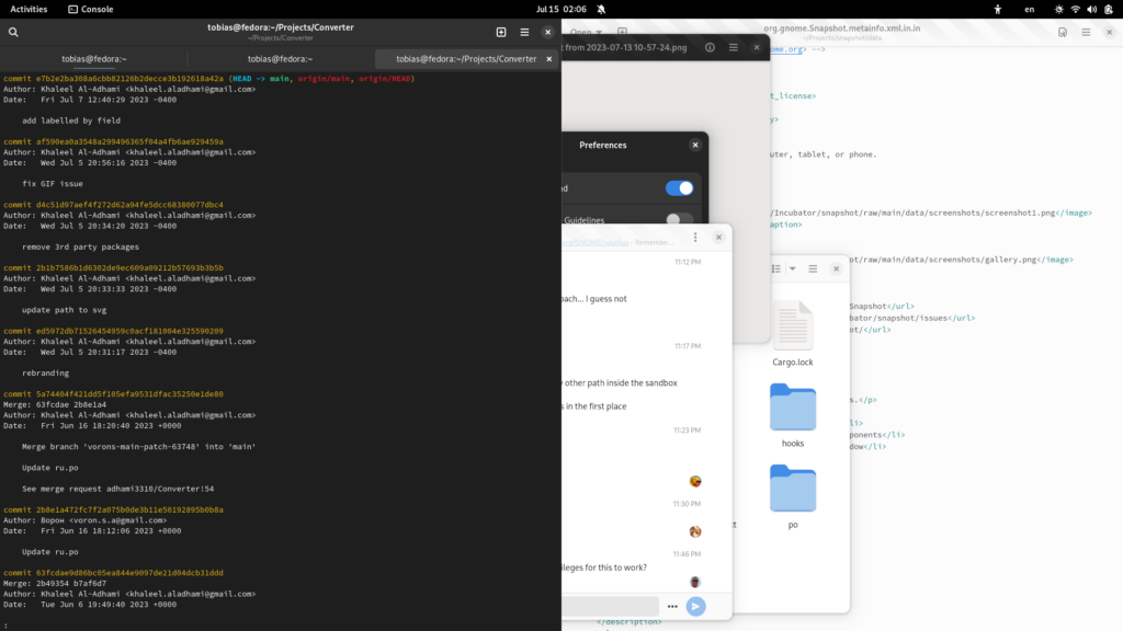
Most of the time you don’t care about exact window sizes and positions and just want to see the windows that you need for your current task. Often that’s just a single, maximized window. Sometimes it’s two or three windows next to each other. It’s incredibly rare that you need a dozen different overlapping windows. Yet this is what you end up with by default today, when you simply use the computer, opening apps as you need them. Messy is the default, and it’s up to you to clean it up.
What about tiling?
Traditional tiling window managers solve the hidden window problem by preventing windows from overlapping. While this works well in some cases, it falls short as a general replacement for stacked, floating windows. The first reason for this is that tiling window managers size windows according to the amount of available screen space, yet most apps are designed to be used at a certain size and aspect ratio. For example, chat apps are inherently narrow and end up having large amounts of empty space at large sizes. Similarly, reading a PDF in a tiny window is not fun.
Another issue with tiling window manager is that they place new windows in seemingly arbitrary positions. This is a consequence of them not having knowledge about the content of a window or the context in which it is being used, and leads to having to manually move or resize windows after the fact, which is exactly the kind of fiddling we want to avoid in the first place.
More constrained tiling window managers such as on iPadOS are interesting in that they’re more purposeful (you always intentionally create the tiling groups). However, this approach only allows tiling two windows side-by-side, and does not scale well to larger screens.
History
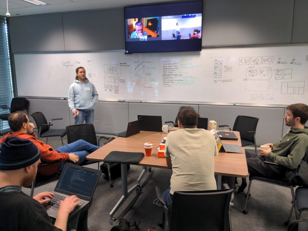
This topic has been of interest to the design team for a very long time. I remember discussing it with Jakub at my first GUADEC in 2017, and there have been countless discussions, ideas, and concepts since. Some particular milestones in our thinking were the concept work leading up to GNOME 40 in 2019 and 2020, and the design sessions at the Berlin Mini GUADEC in 2022 and the Brno hackfest in 2023.
I personally have a bit of a tradition working on this problem for at least a few weeks per year. For example, during the first lockdown in 2020 I spent quite a bit of time trying to envision a tiling-first version of GNOME Shell.
Problems with our current tiling
GNOME has had basic tiling functionality since early in the GNOME 3 series. While this is nice to have, it has obvious limitations:
- It’s completely manual
- Only 2 windows are supported, and the current implementation is not extensible to more complex layouts
- Tiled windows are not grouped in the window stack, so both windows are not raised simultaneously and other windows get in the way
- Workspaces are manual, and not integrated into the workflow
We’ve wanted more powerful tiling for years, but there has not been much progress due to the huge amount of work involved on the technical side and the lack of a clear design direction we were happy with. We now finally feel like the design is at a stage where we can take concrete next steps towards making it happen, which is very exciting!
Get out of my way
The key point we keep coming back to with this work is that, if we do add a new kind of window management to GNOME, it needs to be good enough to be the default. We don’t want to add yet another manual opt-in tool that doesn’t solve the problems the majority of people face.
To do this we landed on a number of high level ideas:
- Automatically do what people probably want, allow adjusting if needed
- Make use of workspaces as a fully integrated part of the workflow
- Richer metadata from apps to allow for better integration
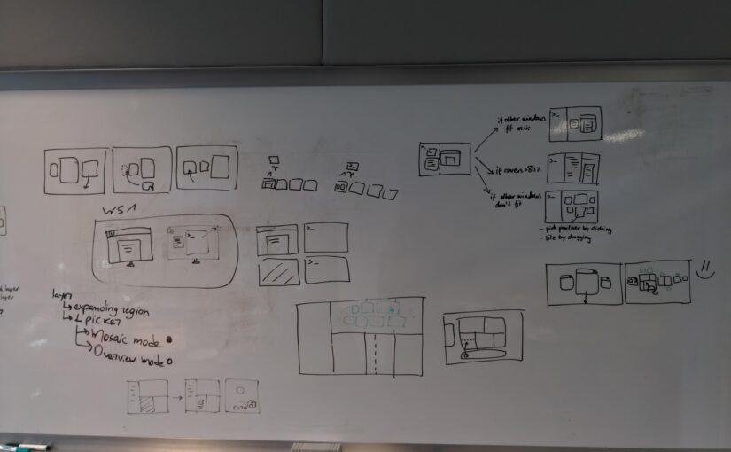
Our current concept imagines windows having three potential layout states:
- Mosaic, a new window management mode which combines the best parts of tiling and floating
- Edge Tiling, i.e. windows splitting the screen edge-to-edge
- Floating, the classic stacked windows model
Mosaic is the default behavior. You open a window, it opens centered on the screen at a size that makes the most sense for the app. For a web browser that might be maximized, for a weather app maybe only 700×500 pixels.
As you open more windows, the existing windows move aside to make room for the new ones. If a new window doesn’t fit (e.g. because it wants to be maximized) it moves to its own workspace. If the window layout comes close to filling the screen, the windows are automatically tiled.
You can also manually tile windows. If there’s enough space, other windows are left in a mosaic layout. However, if there’s not enough space for this mosaic layout, you’re prompted to pick another window to tile alongside.
You’re not limited to tiling just two windows side by side. Any tile (or the remaining space) can be split by dragging another window over it, and freely resized as the window minimum sizes allow.
There are always going to be cases that require placing a window in a specific position on the screen. The new system allows windows to be used with the classic floating behavior, on a layer above the mosaic/tiling windows. However, we think that this floating behaviour is going to be a relatively uncommon, similar to the existing “always on top” behavior that we have today.
There’s of course much more to this, but hopefully this gives an idea of what we have in mind in terms of behavior.
New window metadata
As mentioned above, to avoid the pitfalls of traditional tiling window managers we need more information from windows about their content. Windows can already set a fixed size and they have an implicit minimum size, but to build a great tiling experience we need more.
One important missing piece is having information on the maximum desired size of a window. This is the size beyond which the window content stops looking good. Not having this information is one of the reasons that traditional tiling window managers have issues, especially on larger screens. This maximum size would not be a hard limit and manual resizing would still be possible. Instead, the system would use the maximum size as one factor when it calculates an optimal window layout. For example, when tiling to the side of the screen, a window would only grow as wide as its maximum width rather than filling exactly half of the screen.
In addition, it’d be helpful to know the range of ideal sizes where an app works best. While an app may technically work at mobile sizes that’s probably not the best way to use that app if you have a large display. To stay with our chat example, you probably want to avoid folding the sidebar if it can be avoided, so the range of ideal sizes would be between the point where it becomes single pane and its maximum usable size.
Ideally these properties could be set dynamically depending on the window content. For example, a spreadsheet with a lot of columns but few rows could have a wider ideal size than one with lots of rows.
Depending on apps using new system APIs can be challenging and slow — it’s not easy to move the entire ecosystem! However, we think there’s a good chance of success in this case, due to the simplicity and universal usefulness of the API.
Next steps
At the Brno hackfest in April we had an initial discussion with GNOME Shell developers about many of the technical details. There is tentative agreement that we want to move in the direction outlined in this post, but there’s still a lot of work ahead.
On the design side, the biggest uncertainty is the mosaic behavior — it’s a novel approach to window management without much prior art. That’s exciting, but also makes it a bit risky to jump head-first into implementation. We’d like to do user research to validate some of our assumptions on different aspects of this, but it’s the kind of project that’s very difficult to test outside of an actual prototype that’s usable day to day.
If you’d like to get involved with this initiative, one great way to help out would be to work on an extension that implements (parts of) the mosaic behavior for testing and refining the interactions. If you’re interested in this, please reach out :)
There’s no timeline or roadmap at this stage, but it’s definitely 46+ material and likely to take multiple cycles. There are individual parts of this that could be worked on independently ahead of the more contingent pieces, for example tiling groups or new window metadata. Help in any of these areas would be appreciated.
This post is summarizing collaborative work over the past years by the entire design team (Allan Day, Jakub Steiner, Sam Hewitt, et al). In particular, thanks to Jakub for the awesome animations bringing the behaviors to life!


