Last week was this year’s GUADEC, the first ever in Italy! Here are a few impressions.
Local-First
One of my main focus areas this year was local-first, since that’s what we’re working on right now with the Reflection project (see the previous blog post). Together with Julian and Andreas we did two lightning talks (one on local-first generally, and one on Reflection in particular), and two BoF sessions.
Local-First BoF
At the BoFs we did a bit of Reflection testing, and reached a new record of people simultaneously trying the app:
This also uncovered a padding bug in the users popover :)
Andreas also explained the p2anda stack in detail using a new diagram we made a few weeks back, which visualizes how the various components fit together in a real app.
p2panda stack diagram
We also discussed some longer-term plans, particularly around having a system-level sync service. The motivation for this is twofold: We want to make it as easy as possible for app developers to add sync to their app. It’s never going to be “free”, but if we can at least abstract some of this in a useful way that’s a big win for developer experience. More importantly though, from a security/privacy point of view we really don’t want every app to have unrestricted access to network, Bluetooth, etc. which would be required if every app does its own p2p sync.
One option being discussed is taking the networking part of p2panda (including iroh for p2p networking) and making it a portal API which apps can use to talk to other instances of themselves on other devices.
Another idea was a more high-level portal that works more like a file “share” system that can sync arbitary files by just attaching the sync context to files as xattrs and having a centralized service handle all the syncing. This would have the advantage of not requiring special UI in apps, just a portal and some integration in Files. Real-time collaboration would of course not be possible without actual app integration, but for many use cases that’s not needed anyway, so perhaps we could have both a high- and low-level API to cover different scenarios?
There are still a lot of open questions here, but it’s cool to see how things get a little bit more concrete every time :)
Jakub and I gave the traditional design team talk – a bit underprepared and last-minute (thanks Jakub for doing most of the heavy lifting), but it was cool to see in retrospect how much we got done in the past year despite how much energy unfortunately went into unrelated things. The all-new slate of websites is especially cool after so many years of gnome.org et al looking very stale. You can find the slides here.
Jakub giving the design talk
Inspired by the Summer of GNOME OS challenge many of us are doing, we worked on concepts for a new app to make testing sysexts of merge requests (and nightly Flatpaks) easier. The working title is “Test Ride” (a more sustainable version of Apple’s “Test Flight” :P) and we had fun drawing bicycles for the icon.
Test Ride app mockup
Jakub and I also worked on new designs for Georges’ presentation app Spiel (which is being rebranded to “Podium” to avoid the name clash with the a11y project). The idea is to make the app more resilient and data more future-proof, by going with a file-based approach and simple syntax on top of Markdown for (limited) layout customization.
Georges and Jakub discussing Podium designs
Miscellaneous
There was a lot of energy and excitement around GNOME OS. It feels like we’ve turned a corner, finally leaving the “science experiment” stage and moving towards “daily-drivable beta”.
I was very happy that the community appreciation award went to Alice Mikhaylenko this year. The impact her libadwaita work has had on the growth of the app ecosystem over the past 5 years can not be overstated. Not only did she build dozens of useful and beautiful new adaptive widgets, she also has a great sense for designing APIs in a way that will get people to adopt them, which is no small thing. Kudos, very well deserved!
While some of the Foundation conflicts of the past year remain unresolved, I was happy to see that Steven’s and the board’s plans are going in the right direction.
Brescia
The conference was really well-organized (thanks to Pietro and the local team!), and the venue and city of Brescia had a number of advantages that were not always present at previous GUADECs:
The city center is small and walkable, and everyone was staying relatively close by
The university is 20 min by metro from the city center, so it didn’t feel like a huge ordeal to go back and forth
Multiple vegan lunch options within a few minutes walk from the university
Lots of tables (with electrical outlets!) for hacking at the venue
Lots of nice places for dinner/drinks outdoors in the city center
Many dope ice cream places
Piazza della Loggia at sunset
A few (minor) points that could be improved next time:
The timetable started veeery early every day, which contributed to a general lack of sleep. Realistically people are not going to sleep before 02:00, so starting the program at 09:00 is just too early. My experience from multi-day events in Berlin is that 12:00 is a good time to start if you want everyone to be awake :)
The BoFs could have been spread out a bit more over the two days, there were slots with three parallel ones and times with nothing on the program.
The venue closing at 19:00 is not ideal when people are in the zone hacking. Doesn’t have to be all night, but the option to hack until after dinner (e.g. 22:00) would be nice.
Since that the conference is a week long accommodation can get a bit expensive, which is not ideal since most people are paying for their own travel and accommodation nowadays. It’d have been great if there was a more affordable option for accommodation, e.g. at student dorms, like at previous GUADECs.
A frequent topic was how it’s not ideal to have everyone be traveling and mostly unavailable for reviews a week before feature freeze. It’s also not ideal because any plans you make at GUADEC are not going to make it into the September release, but will have to wait for March. What if the conference was closer to the beginning of the cycle, e.g. in May or June?
A few more random photos:
Matthias showing us fancy new dynamic icon stuffDinner on the first night feat. yours truly, Robert, Jordan, Antonio, Maximiliano, Sam, Javier, Julian, Adrian, Markus, Adrien, and AndreasAdrian and Javier having an ad-hoc Buildstream BoF at the pizzeriaRobert and Maximiliano hacking on Snapshot
It’s been a while, so here’s an update about Aardvark, our initiative to bring local-first collaboration to GNOME apps!
A quick recap of what happened since my last update:
Since December, we had three more Aardvark-focused events in Berlin
We discussed peer-to-peer threat models and put together designs addressing some of the concerns that came out of those discussions
We switched from using Automerge to Loro as a CRDT library in the app, mainly because of better documentation and native support for undo/redo
As part of a p2panda NLnet grant, Julian Sparber has been building the Aardvark prototype out into a more fully-fledged app
We submitted and got approved for a new Prototypefund grant to further build on this work, which started a few weeks ago!
With the initiative becoming more concrete we retired the “Aardvark” codename, and gave the app a real GNOME-style app name: “Reflection”
The Current State
As of this week, the Reflection (formerly Aardvark) app already works for simple Hedgedoc-style use cases. It’s definitely still alpha-quality, but we already use it internally for our team meetings. If you’re feeling adventurous you can clone the repo and run it from Builder, it should mostly work :)
Our current focus is on reliability for basic collaboration use cases, i.e. making sure we’re not losing people’s data, handling various networking edge cases smoothly, and so on. After that there are a few more missing UI features we want to add to make it comfortable to use as a Hedgedoc replacement (e.g. displaying other people’s cursors and undo/redo).
At the same time, the p2panda team (Andreas, Sam, and glyph) are working on new features in p2panda to enable functionality we want to integrate later on, particularly end-to-end encryption and an authentication/permission system.
Prototype Fund Roadmap
We have two primary goals for the Prototype Fund project: We want to build an app that’s polished enough to use as a daily driver for meeting notes in the near-term future, but with an explicit focus on full-stack testing of p2panda in a real-world native desktop app. This is because our second goal is kickstarting a larger ecosystem of local-first GNOME apps. To help with this, the idea is for Reflection to also serve as an example of a GTK app with local-first collaboration that others can copy code and UI patterns from. We’re not sure yet how much these two goals (peer-to-peer example vs. daily driver notes app) will be in conflict, but we hope it won’t be too bad in practice. If in doubt we’ll probably be biased towards the former, because we see this app primarily as a step towards a larger ecosystem of local-first apps.
To that end it’s very important to us to involve the wider community of GNOME app developers. We’re planning to write more regular blog posts about various aspects of our work, and of course we’re always available for questions if anyone wants to start playing with this in their own apps. We’re also planning to create GObject bindings so people can easily use p2panda from C, Python, Javascript, Vala, etc. rather than only from Rust.
Designs for various states of the connection popover
We aim to release a first basic version of the app to Flathub around August, and then we’ll spend the rest of the Prototype Fund period (until end of November) adding more advanced features, such as end-to-end encryption and permission management. Depending on how smoothly this goes, we’d also like to get into some fancier UI features (such as comments and suggested edits), but it’s hard to say at this point.
If we’re approved for Prototype Fund’s Second Stage (will be announced in October), we’ll get to spend a few more months doing mostly non-technical tasks for the project, such as writing more developer documentation, and organizing a GTK+Local-First conference next spring.
Meet us at GUADEC
Most of the Reflection team (Julian Sparber, Andreas Dzialocha, and myself) are going to be at GUADEC in July, and we’ll have a dedicated Local-First BoF (ideally on Monday July 28th, but not confirmed yet). This will be a great opportunity for discussions towards a potential system sync service, to give feedback on APIs if you’ve already tried playing with them, or to tell us what you’d need to make your app collaborative!
So far, GNOME OS has mostly been used for testing in virtual machines, but what if you could just use it as your primary OS on real hardware?
Turns out you can!
While it’s still early days and it’s not recommended for non-technical audiences, GNOME OS is now ready for developers and early adopters who know how to deal with occasional bugs (and importantly, file those bugs when they occur).
The Challenge
To get GNOME OS to the next stage we need a lot more hardware testing. This is why this summer (June, July, and August) we’re launching a GNOME OS daily-driving challenge. This is how it works:
10 points for daily driving GNOME OS on your primary computer for at least 4 weeks
1 point for every (valid, non-duplicate) issue created
You can sign up for the challenge and claim points by adding yourself to the list of participants on the Hedgedoc. As the challenge progresses, add any issues and MRs you opened to the list.
The person with the most points on September 1 will receive a OnePlus 6 (running postmarketOS, unless someone gets GNOME OS to work on it by then). The three people with the most points on September 1 (noon UTC) will receive a limited-edition shirt (stay tuned for designs!).
Using GNOME OS Nightly means you’re running the latest latest main for all of our projects. This means you get all the dope new features as they land, months before they hit Fedora Rawhide et al.
For GNOME contributors that’s especially valuable because it allows for easy testing of things that are annoying/impossible to try in a VM or nested session (e.g. notifications or touch input). For feature branches there’s also the possibility to install a sysext of a development branch for system components, making it easy to try things out before they’ve even landed.
More people daily driving Nightly has huge benefits for the ecosystem, because it allows for catching issues early in the cycle, while they’re still easy to fix.
Is my device supported?
Most laptops from the past 5 years are probably fine, especially Thinkpads. The most important specs you need are UEFI and if you want to test the TPM security features you need a semi-recent TPM (any Windows 11 laptop should have that). If you’re not sure, ask in the GNOME OS channel.
Does $APP work on GNOME OS?
Anything available as a Flatpak works fine. For other things, you’ll have to build a sysext.
Generally we’re interested in collecting use cases that Flatpak doesn’t cover currently. One of the goals for this initiative is finding both short-term workarounds and long-term solutions for those cases.
GNOME OS uses systemd-sysupdate for updating the system, which doesn’t yet support delta updates. This means you have to download a new 2GB image from scratch for every update, which might be an issue if you don’t have regular access to a fast internet connection.
The current installer is temporary, so it’s missing many features we’ll have in the real installer, and the UI isn’t very polished.
Anything else I should know before trying to install GNOME OS?
Update the device’s firmware, including the TPM’s firmware, before nuking the Windows install the computer came with (I’m speaking from experience)!
This is a response to Allan’s response to my most recent blog post. For context, I think it’s important to note that I’m happy that Allan is on the board now, along with some of the other new members coming from the community who joined in the past year. As I think I made clear in my last post, my concerns with the Foundation are with some of its structures, and the leadership predating this year’s board. I have huge respect for the effort Allan has put into the Foundation since he rejoined the board last year, I know it’s thankless work in difficult circumstances. I don’t know why Allan felt the need to issue a personal reply, seeing as this is not about him. However, since he did, I wanted to clarify a few points.
The Ban Itself
From the perspective of many people in the community, especially volunteers not affiliated with any company, Sonny was our representative on the board, trying to fix long-standing problems with the Foundation. Those of us who worked closely with him on the STF team knew how difficult and frustrating this was for him. In that already tense, low-trust situation, Sonny being banned the way he was obviously looks political — how could it not?
If you ban a board member after they try to address the community’s concerns with the Foundation you really need to do a good job communicating why you’re not just getting rid of uncomfortable opposition. What we got instead was silence and appeals to authority. Of course, given that trust in the structures was low to begin with, that was not very convincing to anyone who knew some of the backstory. “Trust me, I’ve seen more evidence” doesn’t work when there are serious concerns about the process as a whole.
My sense is that a big part of the problem is that the board/CoCC never tried to talk things through with Sonny to clear up potential misunderstandings in the CoC complaint, and as a result everyone is operating off of different facts.
Due to CoC confidentiality and the alleged infractions having happened in private settings without other parties present it’s incredibly hard to find any common ground here. I still think a mediation with everyone involved would have been a good path forward, but we’ve seen no interest from the Foundation side in continuing/re-starting something like that. Therefore, it seems we’re at an impasse — those who trust the structures will continue to do so, and those who don’t will continue not to.
The Aftermath
Allan’s post makes the claim that those of us criticizing the way this has been handled are asking for people who make important contributions to the project to be treated differently in the eyes of the CoC — I’m not sure where this is coming from, because nobody has asked for that.
However, in doing something as drastic as an immediate, long-term ban the board and CoC committee should be concerned with avoiding collateral damage. Other community members who are directly or indirectly affected should not be left hanging with no communication and lots of extra work.
Some thought should be put into which modules, programs, or initiatives might be affected by a ban, and measures taken to avoid adverse effects. None of that was done in this case. As an example: I was working with Sonny on a daily basis co-organizing the STF project, and even I didn’t get any official communication of Sonny’s ban when it happened.
In this case, the fallout from messing this up was massive. I don’t think I need to repeat what this meant for the STF project and contractors, but it didn’t stop there. For example, Sonny’s two Google Summer of Code interns also lost all contact to their mentor, with zero communication from anyone. Other volunteers had to scramble and fill in for Sonny, to avoid the interns failing their GSoC evaluations.
Independently of the questions around the validity of the ban itself, the damage caused by the way it has been (mis-)handled has been severe enough that someone should take accountability for it. While it’s true that some directors have apologized to the STF team in private, this does not seem sufficient given the gravity of the failures. There need to be some concrete consequences if the Foundation wants to be credible again in the eyes of the community.
The Independent Review
It’s true that there was an external review of the CoC decision, but unfortunately it did not bring any clarity. This is primarily because the evidence of the case itself was not examined at all, it was only a review of CoC procedures. The report we got was extremely vague and only made high-level process recommendations, it did not answer any of the actual questions around the ban.
This is why I’m confused about the claim that the report said the ban was justified — I’m assuming this was a misunderstanding. In my (and others, see e.g. Andy’s perspective) reading of the report, it only says that such a ban is within the purview of the CoC committee, and does not comment on the merits of this particular case.
There’s obviously a lot more to say, but my goal here was just to clear up a few misconceptions I’ve seen in recent discussions.
I’d like to thank everyone who has reached out and expressed their solidarity after the previous post. It’s clear that even a year later, many people across the community are still feeling hurt, confused, and isolated by the way this has been handled. Between that and the people who seem to think the elephant is just fine where it is and should be actively ignored I think we unfortunately have a lot to work through as a community.
I’d also like to thank Allan for the work he has done and is continuing to do on the Foundation side. I know having to deal with the fallout from this ban on top of everything else is not making things any easier. This situation really sucks for everyone, and I hope we can bring it behind us.
In a few weeks it’ll be one year since a board member of the GNOME Foundation was removed from the project entirely (including Gitlab, Matrix, Discourse, etc.) under very suspicious circumstances. Very little has been said or done about this in public since then. The intentions behind keeping everything internal were good — the hope was to get to a resolution without unnecessary conflict. However, because there’s no non-public way to have discussions across the entire community, and with this dragging on longer and longer, what I’ve seen is partial facts and misunderstandings spreading across different sub-groups, making it harder to talk to each other. I’m now convinced it’s better to break the silence and start having this conversations across the entire project, rather than letting the conflict continue to fester in the background.
That’s not to say nothing has been happening. Over the past year, a number of people from the community (including myself), and some members of the board have tried to resolve this behind the scenes. On a personal level, I’d like to thank all the board members involved for their efforts, even if we didn’t always see eye to eye. Medium-term I’m hopeful that some positive policy changes can be made as a result of this process.
One important thing to note is that nobody involved is against Codes of Conduct. The problem here is the Foundation’s structural dysfunction, bad leadership, and the way the CoC was used in this case as a result. I’m aware of the charged nature of the subject, and the potential for feeding right wing narratives, but I think it’s also important to not let that deter us from discussing these very real issues. But just to be extra clear: Fuck Nazis, GNOME is Antifa.
Sonny has been out since last summer, and as far as I know he’s currently not interested in investing more energy into this. That’s understandable given how he’s been treated, but the rest of us are still here, and we still need to work together. For that we need, if not justice, at least closure, and a way forward.
In this case someone was disappeared entirely from the community with no recourse, no attempts to de-escalate, no process for re-integration, and no communication to the rest of the project (not until months later anyway). Having talked to members of other projects’ CoC structures this is highly unusual, especially completely out of the blue against a well-integrated member of the project.
While the details of this case are unknown to most of the community due to the (understandable) need to keep CoC reports confidential, what is known (semi-) publicly paints a pretty damning picture all by itself:
A first-time CoC complaint was met with an immediate ban
A week later the ban was suspended, and a mediation promised
The 2024 board elections were held a few weeks later without informing the electorate about the ban
2 months later the ban was re-instated unilaterally, against the wishes of the new board
There was an (unsuccessful) vote to remove the chairman of the CoC committee from the board and CoC committee
Given the above, I think it’s fair to say that the people who were on the board and CoC committee when the ban happened, have, at the very least, acted with incredible recklessness. The haphazard and intransparent way in which they handled this case, the incoherence of their subsequent actions, and the lack of communication have have caused great damage to the project. Among other things, in Sonny Piers they have cost us one of our most prolific developers and organizers, and in the STF development team our most successful program in recent history.
What perhaps not everyone’s aware of is that we were working on making this team permanent and tried to apply for followup funding from different sources. None of this materialized due to the ban and the events surrounding it, and the team has since been disbanded. In an alternate world where this had not happened we could be looking at a very different Foundation today, with an arm that strategically funds ongoing development and can employ community members.
More importantly however, we’re now in a situation where large parts of the community do not trust our CoC structure because they feel it can be weaponized as part of internal power struggles.
This ban was only the latest in a long series of failures, missteps, and broken promises by the Foundation. In addition to the recent financial problems and operational failures (e.g. not handling internships, repeatedly messing up invoicing, not responding to time-sensitive communication), all strategic initiatives over the past 5+ years have either stalled or just never happened (e.g. Flathub payments (2019), local-first (2021), development initiative (2024)).
I think there are structural reasons at the root of many of these issues, but it’s also true that much of the Foundation leadership and staff has not changed throughout this period, and that new people joining the board and trying to improve things tend to get frustrated and give up quickly (or in Sonny’s case, get banned). This is a problem we need to confront.
To those on the board and CoC committee who were involved in Sonny’s ban: I’m asking you to step down from your positions, and take some time off from Foundation politics. I know you know you fucked up, and I know you care about this project, like we all do. Whatever your reasons at the time, consider what’s best for the project now. Nobody can undo what happened, but in the medium-term I’m actually hopeful that reconciliation is possible and that both the Foundation and community can come out of this stronger than before. I don’t think that can happen under the current leadership though.
To everyone else: My hope in talking openly about this is that we can get closer to a common understanding of the situation. It seems unlikely that we can resolve this quickly, but I’d at least like to make a start. Eventually I hope we can have some mediated sessions for people from across the community to process the many feelings about this, and see how we can heal these wounds. Perhaps we could organize something at GUADEC this summer — if anyone would be interested in that, let me know.
The 2023/2024 GNOME STF project is mostly wrapped up now, so it’s a good moment to look back at what was done as part of the project, and what’s next for the projects we worked on.
As a brief refresher, STF (Sovereign Tech Fund, recently renamed to Sovereign Tech Agency) is a program by the German Government to support critical public interest software infrastructure. Sonny Piers and I applied with a proposal to improve important, underfunded areas of GNOME and the free desktop and got an investment of 1 Million Euro for 2023/2024.
While we’ve reported individual parts of what we were able to achieve thanks to this investment elsewhere, it felt important to have a somewhat comprehensive post with all of it in one place. Everyone on the team contributed summaries of their work to help put this together, with final editing by Adrian Vovk and myself.
Accessibility is an incredibly important part of the GNOME project, community, and platform, but unfourtunately it has historically been underfunded and undermaintained. This is why we chose to make accessibility one of the primary focus areas for the STF project.
Newton
The Assistive Technology Service Provider Interface (AT-SPI) is the current accessibility API for the Linux desktop. It was designed and developed in the early 2000s, under the leadership of Sun Microsystems. Twenty years later, we are feeling its limitations. It’s slow, requiring an IPC round trip for each query a screen reader may want to make about the contents of an app. It predates our modern desktop security technologies, like Wayland and Flatpak, so it’s unaware of and sometimes incompatible with sandboxing. In short: it’s a product of its time.
The STF project was a good opportunity to start work on a replacement, so we contracted Matt Campbell to make a prototype. The result was Newton, an experimental replacement for the Linux desktop accessibility stack. Newton uses a fundamentally different architecture from AT-SPI, where apps push their accessibility information to the screen reader. This makes Newton significantly more efficient than AT-SPI, and also makes it fully compatible with Wayland and the Flatpak sandbox.
The prototype required work all across the stack, including GTK, Mutter, Orca, and all the plumbing connecting these components. Apps use a new Wayland protocol to send accessibility info to Mutter, which ensures that the accessibility state an app reports is always synchronized with the app’s current visual state. Meanwhile, the prototype has Orca communicate with Mutter via a new D-Bus Protocol.
This D-Bus protocol also includes a solution for one of the major blockers for accessibility on Wayland. Due to Wayland’s anti-keylogging design, Orca is unable to intercept certain keys used to control the screen reader, like Insert or Caps Lock. The protocol gives this intercept functionality to screen readers on Wayland. Recently, RedHat’s Lukáš Tyrychtr has adapted this part of Matt’s work into a standalone patch, which landed in GNOME 48.
As part of this work, Matt added AccessKit support to GTK. This library acts as an abstraction layer over various OS-specific accessibility APIs, and Matt’s experimental fork included support for the Newton Wayland protocol. As a side effect, GTK accessibility now works on Windows and macOS! Matt’s original patch was rebased and merged by Matthias Clasen, and recently it was released in GTK 4.18.
Finally, to test and demonstrate this new accessibility stack, Matt integrated all his changes into a fork of GNOME OS and the GNOME Flatpak Platform.
For more details about Newton’s design and implementation, including a demo video of Newton in action, you can read Matt’s announcement blog post, and his subsequent update.
Orca
The STF project allowed Igalia’s Joanmarie Diggs to rewrite and modernize much of Orca, our screen reader. Between November 2023 and December 2024 there were over 800 commits, with 33711 insertions and 34806 deletions. The changes include significant refactoring to make Orca more reliable and performant as well as easier to maintain and debug. Orca is also used on other desktop environments, like KDE, so this work benefits accessibility on the Linux desktop as a whole.
Orca now no longer depends on the deprecated pyatspi library, and has switched to using AT-SPI directly via GObject Introspection. As part of this replacement, a layer of abstraction was added to centralize any low-level accessibility-API calls. This will make it significantly easier to port Orca to new platform accessibility APIs (like Newton) when the time comes.
Over the years, Orca has added many workarounds for bugs in apps or toolkits, to ensure that users are able to access the apps they need. However, enough of these workarounds accumulated to impact Orca’s performance and reliability. The STF project allowed the majority of these workarounds to be investigated and, where possible, removed. In cases where workarounds were still necessary, bugs were filed against the app or toolkit, and the workaround was documented in Orca’s code for eventual removal.
There is arguably no single “correct” order or number of accessibility events, but both order and number can impact Orca’s presentation and performance. Therefore, Orca’s event scheduling was reworked to ensure that events are recieved in a consistent order regardless of the source. Orca’s event-flood detection was also completely reworked, so that apps can no longer freeze Orca by flooding it with events.
A lot of work went into increasing Orca’s code quality. A couple of tightly-entangled systems were disentangled, making Orca a lot more modular. Some overly complicated systems were refactored to simplify them. Utility code that was unnecessarily grouped together got split up. Linter warnings were addressed and the code style was modernized. Overall, Orca’s sources are now a lot easier to read through and reason about, debug, analyze, and maintain.
Finally, building apps that are compatible with screen readers is occasionally challenging. Screen readers have complicated rules about what they present and when they present it, so sometimes app developers are unsure of what they need to do to make Orca present their app correctly. To improve the developer experience around building accessible apps, there’s now a new guide with tips and techniques to use. This guide is very much a work in progress, and additional content is planned.
WebKitGTK
WebKitGTK is GNOME’s default web rendering engine. GTK4 significantly reworked the accessibility API for GTK widgets, so when WebKitGTK was first ported to GTK4, a major missing feature was the accessibility of web pages. The screen reader was simply unable to see web content visible on screen. As part of the STF project, Igalia’s Georges Basile Stavracas Neto added support for GTK4’s new accessibility APIs to WebKitGTK. This landed in WebKitGTK 2.44, the first stable release with GTK4 support.
Around the same time, Joanmarie removed Orca’s custom WebKitGTK handling in favor of the generic “web” support, which aligns WebKitGTK’s user experience with Firefox and Chromium. This gives Orca users an additional choice when it comes to web browsing. Please note that there are still a couple of accessibility bugs that must be fixed before Orca users can enjoy the full benefits of this change.
The last hurdle to fully functional accessibility in WebKitGTK was Flatpak. Web browsers are generally hard to make work in Flatpak, due to the interaction between Flatpak’s sandbox and the browser’s own sandboxing features, which are usually either turned off, weakened, or replaced downstream. WebKitGTK, however, has strong support for sandboxing in Flatpak, and it actually uses Flatpak’s native subsandboxing support directly. Unfourtunately, the way the sandboxes interacted prevented WebKitGTK from exporting its accessibility information to the system. Georges takes a deep dive into the specifics in his GUADEC 2024 talk.
Since that talk, Georges added features to Flatpak (and a follow-up) that made WebKitGTK work with the screen reader. This makes GNOME Web the first web browser that is both fully accessible and fully Flatpak sandboxed!
Spiel
Text-to-speech (TTS) on Linux is currently handled by a service called SpeechDispatcher. SpeechDispatcher was primarily built for use in screen readers, like Orca. Thus, TTS on Linux has generally been limited to accessibility use cases. SpeechDispatcher is modular, and allows the user to replace the speech synthesizer (which defaults to the robotic-sounding eSpeak) with something that sounds more natural. However, this configuration is done via text files, and can thus be nontrivial to get right, especially if the user wishes to integrate a proprietary synthesizer they might have paid money for.
Eitan Isaacson ran up against these limitations when he was implementing the Web Speech API into Firefox. So, he created Spiel, a new TTS framework for the Linux desktop. Spiel is, at its core, a D-Bus protocol that apps and speech synthesizers can use to communicate. Spiel also has a client library that closely emulates the Web Speech API, which makes it easy for apps to make use of TTS. Finally, Spiel is a distribution system for voices, based on Flatpak. This part of Spiel is still in the early stages. You can learn more about Spiel via Eitan’s GUADEC 2024 Talk.
As part of the STF project, Andy Holmes and Eitan implemented an initial working implementation of Spiel in Orca, demonstrating its viability for screen readers. This helped stabalize Spiel, and encouraged engagement with the project. The Spiel client and server libraries were also hardened with sanitizer and static analysis testing.
Platform
The GNOME Platform consists of the libraries, system and session services, and standards provided by GNOME and Freedesktop. In short, this is the overarching API surface that we expose to app developers so that they can write GNOME apps. Clearly, that’s very important and so we focused much of the STF’s funding there. In no particular order, here’s some of the work that the STF made possible.
Libadwaita
Starting with GTK4, we’ve decoupled GTK from GNOME’s design guidelines. This means that GTK4 no longer includes GNOME’s style sheet, or GNOME-specific widgets. This has many benefits: first and foremost, this makes GTK4 a much more generic UI toolkit, and thus more suitible for use in other desktop environments. Second, it gives GNOME the flexibility to iterate on our design and UI without interfering with other projects, and on a faster timescale. This leads to “platform libraries”, which extend GTK4’s basic widgetry with desktop-specific functionality and styles. Of course GNOME has a platform library, but so do other platforms like elementary OS.
Adwaita is GNOME’s design language, and so GNOME’s platform library is called libadwaita. Libadwaita provides GNOME’s style sheet, as well as widgets that implement many parts of the GNOME Human Interface Guidelines, including the machinery necessary to build adaptive GNOME apps that can work on mobile phones.
The STF project allowed libadwaita’s maintainer, Alice Mikhaylenko, to close a few long-standing gaps as well as finish a number of stalled projects.
Bottom Sheets
Libadwaita now provides a new bottom sheet widget, which provides a sheet that slides up from below and can be swiped back down off screen. Optionally, bottom sheets can have a bottom bar that’s visible when the sheet is collapsed, and which morphs into the sheet whenever the user activates it. This pattern is common with many apps that wish to show some short status on a main page, but a detailed view if the user wants one. For example: music player apps tend to use this kind of pattern for their “now playing” screens.
This shipped in libadwaita 1.6, and apps like Shortwave (shown above) are already using it.
Adaptive Dialogs
Traditionally, in GNOME dialogs were just separate child windows of the app’s main window. This made it difficult, sometimes, to create dialogs and popups that behave correctly on small windows and on mobile devices. Now, libadwaita handles dialogs completely within the app’s main window, which lets them adapt between floating centered pop-ups on desktop, and bottom sheets on mobile. Libadwaita’s new dialogs also correctly manage the appearance of their own close button, so that users have the ability to exit out of dialogs even on mobile devices where windows don’t normally have a close button.
This shipped in libadwaita 1.5 and many apps across GNOME have already been updated to use the new dialogs.
Multi-Layout View
Libadwaita already provides a system of breakpoints, where widget properties are automatically updated depending on the size of the app’s window. However, it was non-trivial to use breakpoints to swap between different layouts, such as a sidebar on desktop and a bottom bar on mobile. The new multi-layout view allows you to define the different layouts an app can use, and control the active layout using breakpoints.
Work on multi-layout views started before the STF project, but it was stalled. The STF project allowed it to be completed, and the feature has shipped in libadwaita 1.6.
Wrap Box
Libadwaita now provides a new wrap box widget, which wraps its children similarly to how lines are wrapped in a text paragraph. This allows us to implement various layouts that we’ve wanted to, like the list of search filters in this mockup, or toolbars that wrap onto multiple lines when there’s not enough room.
Like the multi-layout view, this work was stalled until the STF project. The feature shipped in the recent libadwaita 1.7 release.
Toggle Groups
Libadwata also now provides a new toggle group widget, which is a group of buttons where only one at a time can be selected. This pattern is pretty common in GNOME apps, and usually this was implemented manually which was awkward and didn’t look great. The new widget is a big improvement.
Toggle groups were originally implemented by Maximiliano Sandoval, but the work was stalled. The STF project allowed Alice to bring this work over the finish line. The feature is part of libadwaita 1.7.
GTK CSS
GTK uses a custom version of CSS to style its widgets, with extensions for defining and transforming colors. These extensions were limited in various ways: for instance, the defined colors were global for the entire stylesheet, but it would be very convenient to have them per-widget instead. The color functions only worked in sRGB, which isn’t the optimal colorspace for some kinds of calculations.
Thanks to work by Alice Mikhaylenko and the rest of the GTK team, GTK now has support for the standard CSS variables, color mixing, and relative colors, with a variety of color spaces. The old extensions have been deprecated. This work has already shipped in GTK 4.16, and many apps and libraries (including libadwaita as of 1.6), are making extensive use of it.
This work gets us one step closer to our long-term goal of dropping SCSS in the future, which will simplify the development and distribution process for the GNOME stylesheet.
Notification API
Notifications are a critical component of any modern computing experience; they’re essential for keeping users informed and ensuring that they can react quickly to messages or events.
The original Freedesktop Notification Standard used on the Linux desktop saw almost no significant changes in the past decade, so it was missing many modern features that users have grown to know and expect from other platforms. There were thus various DE-specific extensions and workarounds, which made it difficult for app developers to expect a consistent feature set and behavior. Even within GNOME, there were technically three different supported notification APIs that apps could use, each of which had a different subset of features. Thanks to STF funding, Julian Sparber was able to spend the time necessary to finally untangle some of the difficult issues in this area.
After evaluating different directions, a path forward was identified. The two main criteria were to not break existing apps, and to reuse one of the existing APIs. We decided to extend Flatpak’s notification portal API. The new additions include some of the most essential and highly visible features we’re currently missing, like playing a notification sound, markup styling, and more granular control of notification visibility.
The visibility control is especially impactful because it allows apps to send less intrusive notifications and it improves user privacy. On the other hand, one mostly invisible feature to users was the inclusion of the XDG Activation protocol in the new spec, which allows apps to grab focus after a user interacts with a notification. The updated protocol is already released and documented. You can find the list of changes at the pull request that introduced the v2 notifications portal.
While there is still some technical debt remaining in this area, the STF funding allowed us to get to a more sustainable place and lay the groundwork for future extensions to the standard. There is already a list of planned features for a version 3 of the notification portal.
You can read more about this initiative in Julian’s blog post on the GNOME Shell blog.
Notifications in GNOME Shell
GNOME Shell provides the core user interface for the GNOME desktop, which includes notification banners, the notification list, and the lock screen. As part of the STF project, Julian Sparber worked on refactoring and improving this part of the GNOME Shell code base, in order to make it more feasible to extend it and support new features. Specifically, this allows us to implement the UI for the v2 notifications API:
Notifications are now tracked per-app. We now show which app sent each notification, and this also lays the technical ground work for grouping notifications by app.
Allowing notifications to be expanded to show the full content and buttons
Keeping all notifications until you dismiss them, rather than only keeping the 3 most recent ones
Julian was also able to clean up a bunch of legacy code, like GNOME Shell’s integration with telepathy.
Most of these changes landed in GNOME 46. Grouping landed in GNOME 48. For more detail, see Julian’s blog post.
Global Shorcuts
The global shortcuts portal allows apps to request permission to recieve certain key bindings, regardless of whether the app is currently focused. Without this portal, use cases like push-to-talk in voice chat apps are not possible due to Wayland’s anti-keylogging design.
RedHat’s Allan Day created designs for this portal a while back, which we aimed to implement as part of the STF project.
Dorota Czaplejewicz spearheaded the effort to implement the global shortcuts portal across GNOME. She started the work for this in various components all over the stack, e.g. integration into the Settings UI, the compositor backend API, the GNOME portal, and the various portal client libraries (libportal and ashpd). This work has since been picked up and finalized by Carlos Garnacho and others, and landed in GNOME 48.
XDG Desktop Portals
Portals are cross-desktop system APIs that give sandboxed apps a way to securely access system resources such as files, devices like cameras, and more.
The STF project allowed Georges Stavracas to create a new dedicated documentation website for portals, which will make it easier for apps to understand and adopt these APIs. This documentation also makes it easier for desktop environment developers to implement the backend of these APIs, so that apps have complete functionality on these desktops.
Georges and Hubert Figuiere added a new portal for USB devices, and many parts of the platform are being updated to support it. This portal allows apps to list USB devices, and then request access without opening security holes.
The document portal saw some fixes for various issues, and the file transfer portal now supports directories. The settings portal was extended to advertise a new cross-desktop high contrast setting.
Hubert also worked to improve libportal, the convenience library that wraps the portal API for apps to easily consume. It now supports the settings portal, for apps to conveniently recieve light/dark mode, system accent color, and high contrast mode settings. He also fixed various bugs and memory leaks.
WebKitGTK is GNOME’s default web engine, for rendering web content in apps. It supports modern web standards, and is used in GNOME Web, our default browser. Georges adjusted WebKitGTK to make use of portals for printing and location services. New features were added to all parts of the stack to enable this. This makes WebKitGTK and every app that uses it more secure.
Flatpak and Sandboxing
Flatpak is the standard cross-distribution app packaging format, and it also provides security through sandboxing. It’s split into a few smaller sub-projects: the Flatpak core which implements the majority of Flatpak’s functionality, the xdg-dbus-proxy which filters D-Bus traffic to enforce which services sandboxed apps can talk to, and flatpak-builder which app developers can use to build Flatpak packages conveniently.
As part of the STF project, Hubert worked on improving the maintenance situation for the Flatpak core, and fixed various bugs and memory leaks. Hubert and Georges also implemented the necessary groundwork in Flatpak’s sandboxing for the new USB portal to function.
In flatpak-builder, Hubert implemented the long-awaited feature to rename MIME files and icons, which simplifies packaging of desktop applications. He also performed some general maintenance, including various minor bug fixes.
The XDG D-Bus Proxy previously relied on some very specific implementation details of the various D-Bus client libraries, such as GLib’s gdbus and zbus. This broke when zbus changed its implementation. Thanks to work by Sophie Herold, xdg-dbus-proxy was updated to stop relying on this undefined behavior, which means that all client libraries should now work without problems.
Nautilus File Chooser Portal
The file chooser portal is used by apps to bring up a sandbox-aware file picker provided by the system. It acts as an invisible permission check for Flatpak apps. This portal powers the “Open” or “Save As” actions in apps.
Previously, GNOME’s implementation of xdg-desktop-portals used GTK’s built-in file chooser dialog widget. This, however, caused some problems. Since the dialog’s implementation lived in GTK, and GTK is a dependency of libadwaita, it couldn’t use any of libadwaita’s functionality to avoid circular dependencies. This meant that the dialog couldn’t be made to work on mobile, and didn’t look in line with modern GNOME apps. The behavior of the file chooser was similar to Natuilus, our file manager app, but not identical. This would cause confusion among users. It took lots of work to keep both projects at least somewhat in line, and even then it wasn’t perfect. The file chooser couldn’t benefit from recent performance improvements in Nautilus, and it was missing some of Nautilus’s features. For example, the file chooser couldn’t generate thumbnails and did not support multiple zoom levels.
Nautilus-based file open dialogNautilus-based file save dialog
António Fernandes extended Nautilus with a new implementation for the file chooser portal (with the help of Corey Berla and Khalid Abu Shawarib doing reviews and fixups). Nautilus can now behave like an open or save file picker dialog, handling all the edge cases this entails. This required a surprising amount of work. For example, Mutter needed improvements to handle attaching Nautilus as a modal dialog, Natuilus itself needed several refactors to support different views (saving files, opening files, normal file browser), the initial portal implementation needed to be reworked to avoid breaking dark mode, and there were several iterations on the design to deal with UX edge cases.
All of this work landed in GNOME 47.
GNOME Online Accounts
GNOME Online Accounts (GOA) is GNOME’s single sign-on framework, providing a way for users to setup online accounts to be used across the desktop and preinstalled apps. Since there was no fixed maintainer in recent years, the project fell behind in maintenance, relied on old libraries, used old tooling for tests, and was missing support for open protocols like WebDAV (including CalDAV and CardDAV). Andy Holmes took over maintenance thanks to the STF project, and put it on more stable footing.
GOA used to only have limited WebDAV support as part of its Nextcloud integration. Andy separated the WebDAV support into a standalone integration, which allows users to integrate with more open-source-friendly providers, like Fastmail. This integration was also tested with well-known self-hosted servers.
GOA previously relied on its own webview for Oauth2 login, for providers like Google. Andy replaced this with a secure exchange using the default web browser. This also allowed Andy to upgrade GOA to GTK4 (with reviews by Philp Withnall) and remove the last GTK3 dependency from GNOME Settings. As part of this rework, the backend API was refactored to be fully asynchronous.
Finally, Andy updated GOA’s test infrastructure, to use modern static analyzers and better CI tests.
Language Bindings
GLib is GNOME’s foundational C library, and includes many common-sense utilities that the C standard library lacks. It also provides a layer of platform-agnostic functionality, which means that C programs targeting GLib are easier to port to other operating systems like Windows. For instance, GLib.DateTime is a set of utilities for getting the current time (which is OS-specific), doing complex math with time, and formatting timestamps for human-readable display.
GObject introspection is GNOME’s language binding infrastructure. It allows libraries that are written in C (and, lately, Rust) to be used from other languages, including Rust, Python, JavaScript, Swift, and more! It consists of a set of coding style conventions, annotations (that appear as code comments on functions), an object-oriented type system called GObject, a tool that extracts all of this information into .gir files, a library to parse the these files, and per-language infrastructure to consume this parsed data into the language’s type system. This infrastructure enables language bindings to be relatively easy to make and maintain, which in turn enables GNOME’s large ecosystem of apps written in a diverse set of languages.
GLib and GObject introspection are tightly coupled projects. GLib defines the type system (including GObject, and the lower-level concepts underneath it), and GObject introspection heavily relies on these types. Conversely, GLib itself is accessible from language bindings, which means that GLib depends on GObject introspection. This complicated dependency situation makes it rather difficult to iterate on our language bindings, and was quite messy to maintain.
As part of the STF project, Philip Withnall started work on merging GObject introspection into GLib. Having them in the same repository means that developing them together is easier, because it can avoid dependency cycles. So far, he was able to move libgirepository, which is a large part of GObject introspection. In practice, this has allowed us to generate the .gir files for GLib as part of its build process, rather than generating them externally.
Building on this work, Evan Welsh was able to start making improvements to our language bindings. Evan added support for annotating async functions (based on work by Veena Nager), so that GObject introspection doesn’t need to use heuristics to guess which APIs are async. This allows language bindings to better integrate GNOME’s async APIs with the language’s native async/await syntax.
Evan’s work on async function calls required work across the entire language binding stack, including some more merging of GObject introspection into GLib. Most notably, these new features required new test cases, which meant that GLib’s CI needed to use the bleeding-edge version of GObject introspection, which was rather difficult due to the entangled dependencies between the two projects. Evan made these necessary changes, so now it is more feasible to extend the functionality of our language bindings.
Evan then went on to integrate this work across the rest of the stack. In Meson, there’s a pending pull request to transition from the old GObject introspection tools to the new GLib tools. In GNOME’s JavaScript bindings, Philip started integrating the GLib version of libgirepository, and Evan has since continued this work.
Evan also did some work in GTK to fix an issue that previously skipped some accessibility APIs when generating language bindings. This made it possible for apps written in languages other than C to better communicate their structure to the screen reader, improving the accessibility of those apps.
Finally, Evan worked on advancing GNOME’s TypeScript bindings by merging gi.ts and ts-for-gir into a single toolchain which can fully cover GNOME’s stack and have accurate enough types to work with existing JavaScript codebases. This was possible thanks to help by Pascal Garber, the maintainer of ts-for-gir. This will enable GNOME’s many apps implemented in JavaScript to be ported to TypeScript, allowing for static analysis and increasing code quality. For instance, GNOME Weather was recently ported to TypeScript.
GLib
After merging libgirepository into GLib, Philip was able to port GLib away from gtk-doc and to gi-docgen, GNOME’s modern API documentation generator. This brought a much faster build time for documentation, and makes the docs much more useful for users of language bindings. As part of this transition, someone has to go through API-by-API and port all of the documentation to the new gi-docgen syntax. As part of the STF project, Philip was able to port all section introductions and some API documentation comments, but there’s a huge number of APIs so more work is still required. As documentation is ported, various improvements can be made to documentation quality.
The STF project also allowed Philip to focus on various ongoing maintenance tasks for GLib, with prominent examples including:
Reviewed and landed integration with the CHERI processor, which is an new architecture with increased memory security compared to traditional x86/ARM architectures. Having GLib running on it is an important step to bootstrapping an OS. This is the kind of work which wouldn’t get reviewed without maintenance funding for GLib, yet is important for the wider ecosystem.
Many issues in our development process come from the fact that there’s not enough end-to-end testing with the entire stack. This was the initial motivativation for the GNOME Continuous project, which eventually became GNOME OS as we know it today. GNOME OS powers our automated QA process, and allows some limited direct testing of new GNOME features in virtual machines.
However, GNOME OS has a lot more potential beyond that as a QA and development tool. It’s 90% of the way there to being a usable OS for GNOME developers to daily drive and dogfood the latest GNOME features. This is sometimes the only way to catch bugs, especailly those relating to hardware, input, and similar situations that a VM can’t emulate. Also, since it’s a platform we control, we saw the opportunity to integrate some quality-of-life improvements for GNOME developers deep into the OS.
Transition to Sysupdate
Switching GNOME OS away from ostree and to systemd-sysupdate opened the doors to more complete integration with all of systemd’s existing and future development tools, like systemd-sysext. It also enabled us to build security features into GNOME OS, like disk encryption and UEFI secure boot, which made it suitable for daily-driver use by our developers.
This work started before the STF’s investment. Valentin David and the rest of the GNOME OS team had already created an experimental build of GNOME OS that replaced ostree with systemd-sysupdate. It coexisted with the official recommended ostree edition. At roughly the same time, Adrian Vovk was making a similar transition in his own carbonOS, when he discovered that systemd-sysupdate doesn’t have an easy way to integrate with GNOME. So, he made a patch for systemd that introduces a D-Bus service that GNOME can use to control systemd-sysupdate.
As part of the STF project, these transitions were completed. Codethink’s Tom Coldrick (with help from Jerry Wu and Abderrahim Kitouni) rebased Adrian’s D-Bus service patch, and it got merged into systemd. Jerry Wu and Adrien Plazas also integrated this new service into GNOME Software.
GNOME Software showing sysupdate updates on GNOME OS Nightly
Adrian continued improving sysupdate itself: he added support for “optional features”, which allow parts of the OS to be enabled or disabled by the system administrator. This is most useful for optionally distributing debugging or development tools or extra drivers like the propriertary NVIDIA graphics driver in GNOME OS.
GNOME OS also needed the ability to push updates to different branches simultaneously. For instance, we’d like to have a stable GNOME 48 branch that recieves security updates, while our GNOME Nightly branch contains new unfinished GNOME features. To achieve this, Adrian started implementing “update streams” in systemd-sysupdate, which are currently pending review upstream.
Codethink wrote about the sysupdate transition in a blog post.
Immutable OS Tooling
Thanks to GNOME OS’s deep integration with the systemd stack, we were able to leverage new technologies like systemd-sysext to improve the developer workflow for low-level system components.
As part of his work for Codethink, Martín Abente Lahaye built sysext-utils, a new tool that lets you locally build your own version of various components, and then temporarily apply them over your immutable system for testing. In situations where some change you’re testing substantially compromises system stability, you can quickly return to a known-good state by simply rebooting. This work is generic enough that the basics work on any systemd-powered distribution, but it also has direct integration with GNOME OS’s build tooling, making the workflow faster and easier than on other distributions. Martín went into lots more detail on the Codethink blog.
A natural next step was to leverage sysext-utils on GNOME’s CI infrastructure. Flatpak apps enjoy the benefits of CI-produced bundles which developers, testers, and users alike can download and try on their own system. This makes it very natural and quick to test experimental changes, or confirm that a bug fix works. Martín and Sam Thursfield (with the help of Jordan Petridis and Abderrahim) worked to package up sysext-utils into a CI template that GNOME projects can use. This template creates systemd-sysext bundles that can be downloaded and applied onto GNOME OS for testing, similar to Flatpak’s workflow. To prove this concept, this template was integrated with the CI for mutter and gnome-shell. Martín wrote another blog post about this work.
Security Tracking
To become suitable for daily-driver use, GNOME OS needs to keep track of the potential vulnerabilities in the software it distributes, including various low-level libraries. Since GNOME OS is based on our GNOME Flatpak runtime, improving its vulnerability tracking makes our entire ecosystem more robust against CVEs.
To that end, Codethink’s Neill Whillans (with Abderrahim’s help) upgraded the GNOME Flatpak runtime’s CVE scanning to use modern versions of the freedesktop-sdk tooling. Then, Neill expanded the coverage to scan GNOME OS as well. Now we have reports of CVEs that potentially affect GNOME OS in addition to the GNOME Flatpak runtime. These reports show the packages CVEs come from and a description of each vulnerability.
GNOME OS Installer
To make GNOME OS more appealing to our developer community, we needed to rework the way we install it. At the moment, the existing installer is very old and limited in features: it’s incompatible with dual-boot, and the current setup flow has no support for the advanced security features we now support (like TPM-powered disk encryption).
Adrian started working on a replacement installer for GNOME OS, built around systemd’s low-level tooling. This integration allows the new installer to handle GNOME OS’s new security features, as well as provide a better UX for installing and setting up GNOME OS. Most crucially, the new architecture makes dual-boot possible, which is probably one of the most requested GNOME OS features from our developers at the moment.
Sam Hewitt made comprehensive designs and mockups for the new installer’s functionality, based on which Adrian has mostly implemented the frontend for the new installer. On the backend, we ran into some unexpected difficulties and limitations of systemd’s tools, which Adrian was unable to resolve within the scope of this project. The remaining work is mostly in systemd, but it also requires improvements to various UAPI Group Specifications and better integration with low-level boot components like the UEFI Secure Boot shim. Adrian gave an All Systems Go! talk on the subject, which goes into more details about the current status of this work, and the current blockers.
Buildstream
Buildstream is the tool used to build GNOME OS as well as the GNOME SDK and Runtime for Flathub, building the bases of all GNOME apps distributed there.
Previously, it was not possible to use dependencies originating from git repositories when working with the Rust programming language. That made it impossible to test and integrate unreleased fixes or new features of other projects during the development cycle. Thanks to work by Sophie Herold the use of git dependencies is now possible without any manual work required.
Additionally, Buildstream is also used by the Freedesktop.org project for its SDK and runtime. Most other runtimes, including the GNOME runtime are based on it. With the newly added support for git source, it has now become possible to add new components of the GStreamer multimedia framework. Components written in Rust were previously missing from the runtime. This includes the module that makes it possible to use GStreamer to show videos in GNOME apps. These functions are already used by apps like Camera, Showtime, or Warp.
OpenQA
Quality assurance (QA) testing on GNOME OS is important because it allows us to catch a whole class of issues before they can reach our downstream distributors. We use openQA to automate this process, so that we’re continuously running QA tests on the platform. Twice a day, we generate GNOME OS images containing all the latest git commits for all GNOME components. This image is then uploaded into openQA, which boots it in a VM and runs various test cases. These tests send fake mouse and keyboard input, and then compare screenshots of the resulting states against a set of known-good screenshots.
Codethink’s Neill Whillans created a script that cleans up the repository of known-good screenshots by deleting old and unused ones. He also fixed many of our failing tests. For instance, Neill diagnosed a problem on system startup that caused QA tests to sometimes fail, and triaged it to an issue in GNOME Shell’s layout code.
Building on the sysext-utils work mentioned above, Martín made a prototype QA setup where GNOME’s QA test suite can run as part of an individual project’s CI pipeline. This will make QA testing happen even earlier, before the broken changes are merged into the upstream project. You can see the working prototype for GNOME Shell here, and read more about it in this blog post.
Security
GNOME and its libraries are used in many security-critical contexts. GNOME libraries underpin much of the operating system, and GNOME itself is used by governments, corporations, journalists, activists, and others with high security needs around the world. In recent years, the freedesktop has not seen as much investment into this area as the proprietary platforms, which has led to a gap in some areas (for instance: home directory encryption). This is why it was important for us to focus on security as part of the STF project.
Home Directory Encryption
systemd-homed is a technology that allows for per-user encrypted home directories. Most uniquely, it has a mechanism to delete the user’s encryption keys from memory whenever their device is asleep but powered on. Full Disk Encryption doesn’t protect data while the machine is powered on, because the encryption key is available in RAM and can be extracted via various techniques.
systemd-homed has existed for a couple of years now, but nobody is using it yet because it requires integrations with the desktop environment. The largest change required is that homed needs any “unlock” UI to run from outside of the user session, which is not how desktop environments work today. STF funding enabled Adrian Vovk to work on resolving the remaining blockers, developing the following integrations:
Adding plumbing to systemd-logind that notifies GDM when it’s time to show the out-of-session unlock UI.
Integrating systemd-homed with AccountsService, which currently acts as GNOME’s database of users on the system. Previously, homed users didn’t appear anywhere in GNOME’s UI.
In addition, Adrian triaged and fixed a lot of bugs across the stack, including many blockers in systemd-homed itself.
This work was completed, and a build of GNOME OS with functional homed integration was produced. However, not all of this has been merged upstream yet. Also, due to filesystem limitations in the kernel, we don’t have a good way for multiple homed-backed users to share space on a single system at the moment. This is why we disabled multi-user functionality for now.
The infrastructure to securely store secrets (i.e. passwords and session tokens) for apps on Linux is the FreeDesktop Secret Service API. On GNOME, this API is provided by the GNOME Keyring service. Unfourtunately, GNOME Keyring is outdated, overly complex, and cannot meet the latest security requirements. Historically, it has also provided other security-adjacent services, like authentication agents for SSH and GPG. There have been numerous efforts to gradually reduce the scope of GNOME Keyring and modernize its implementation, the most recent of which was Fedora’s Modular GNOME Keyring proposal. Unfortunately, this work was stalled for years.
As part of the STF project, Dhanuka Warusadura took over the remaining parts of the proposal. He disabled the ssh-agent implementation in GNOME Keyring, which prompted all major distributions to switch to gcr-ssh-agent, the modern replacement. He also ported the existing gnome-keyring PAM module with reworked tests, following the modern PAM module testing best practices. With this work completed, GNOME Keyring has been reduced to just a Secret Service API provider, which makes it possible for us to replace it completely.
As the replacement for this remaining part of GNOME Keyring, Dhanuka extended the oo7 Secret Service client library to also act as a provider for the API. OO7 was chosen because it is implemented in Rust, and memory safety is critical for a service that manages sensitive user secrets. This new oo7-daemon is almost ready as a drop-in replacement for GNOME Keyring, except that it can not yet automatically unlock the default keyring at login.
As part of this project, Dhanuka also took care of general maintenance and improvements to the credential handling components in GNOME. These include gnome-keyring, libsecret, gcr and oo7-client.
Key Rack
Key Rack is an app that allows viewing, creating and editing the secrets stored by apps, such as passwords or tokens. Key Rack is based on oo7-client, and is currently the only app that allows access to the secrets of sandboxed Flatpak apps.
Key Rack was previously limited to displaying the secrets of Flatpak apps, so as part of the STF Project Felix Häcker and Sophie Herold worked on expanding its feature set. It now integrates with the Secret Service, and makes management of secrets across the system easier. With this addition, Key Rack now supports most of the features of the old Seahorse (“Passwords and Keys”) app.
Glycin
Glycin is a component to load and edit images. In contrast to other solutions, it sandboxes the loading operations to provide an extra layer of security. Apps like Camera, Fractal, Identity, Image Viewer, Fotema, and Shortwave rely on glycin for image loading and editing.
Previously, it was only possible to load images in apps and components that were written in the Rust programming language. Thanks to work by Sophie Herold it is now possible to use glycin from all programming languages that support GNOME’s language binding infrastructure. The new feature has also been designed to allow Glycin to be used outside of apps, with the goal of using it throughout the GNOME platform and desktop. Most notably, there are plans to replace GdkPixbuf with Glycin.
Bluetooth
Jonas Dreßler worked on some critical, security-relevant issues in the Linux Bluetooth stack, including work in the kernel, BlueZ, and GNOME’s Bluetooth tooling (1, 2, 3).
Bug Bounty Program
In addition to the primary STF fund, STA offers other kinds of support for public interest software projects. This includes their Bug Resilience Program, which gives projects complementary access to the YesWeHack bug bounty platform. This is a place for security researchers to submit the vulnerabilities they’ve discovered, in exchange for a bounty that depends on the issue’s severity. Once the bug is fixed, the project is also paid a bounty, which makes it sustainable to deal with security reports promptly. YesWeHack also helps triage the reported vulnerabilities (i.e. by confirming that they’re reproducible), which helps further reduce the burden on maintainers.
Sonny and I did the initial setup of this program, and then handed it over to the GNOME security team. We decided to start with only a few of the highest-impact modules, so currently only GLib, glib-networking, and libsoup are participating in the program. Even with this limited scope, at the time of writing we’ve already received about 50 reports, with about 20 bounty payments so far, totaling tens of thousands of Euro.
For up to date information about reporting security vulnerabilities in GNOME, including the current status of the bug bounty program, check the GNOME Security website.
Hardware Support
GNOME runs on a large variety of hardware, including desktops, laptops, and phones. There’s always room for improvement, especially on smaller, less performant, or more power efficient devices. Hardware enablement is difficult and sometimes expensive, due to the large variety of devices in use. For this project we wanted to focus specifically on devices that developers don’t often have, and thus don’t see as much attention as they should.
Mutter and GNOME Shell
Jonas Dreßler worked on improving hardware support in Mutter and GNOME Shell, our compositor and system UI. As part of this to this he improved (and is still improving) input and gesture support in Mutter, introducing new methods for recognizing touchscreen gestures to make touch, touchpad, and mouse interactions smoother and more reliable.
Thanks to Jonas’ work we were also finally able to enable hardware encoding for screencasts in GNOME Shell, significantly reducing resource usage when recording the screen.
GNOME Shell at a common small laptop resolution (1366×768) with the new, better dash sizing
Thanks to work on XWayland fractional scaling in Mutter (1, 2), the support for modern high-resolution (HiDPI) monitors got more mature and works with all kinds of applications now, making GNOME adapt better to modern hardware.
Variable Refresh Rate
Variable Refresh Rate (VRR) is a technology that allows monitors to dynamically change how often the image is updated. This is useful in two different ways. First, in the context of video games, it allows the monitor to match the graphics card’s frame rate to alleviate some microstutters without introducing tearing. Second, on devices which have support for very low minimum refresh rates (such as phones), VRR can save power by only refreshing the screen when necessary.
Dor Askayo had been working on adding VRR support to mutter in their free time for several years, but due to the fast pace of development he was never able to quite get it rebased and landed in time. The STF project allowed them to work on it full-time for a few months, which made it possible to land it in GNOME 46. The feature is currently still marked as experimental due to minor issues in some rare edge cases.
GNOME Shell Performance
GNOME Shell, through its dependency on Mutter, is the compositor and window manager underpinning the GNOME desktop. Mutter does all core input, output, and window processing. When using GNOME, you’re interacting with all applications and UI through GNOME Shell.
Thus, it’s critical that GNOME Shell remains fast and responsive because any sluggishness in Shell affects the entire desktop. As part of the STF project, Ivan Molodetskikh did an in-depth performance investigation of GNOME Shell and Mutter. Thanks to this, 12 actionable performance problems were identified, 7 of which are already fixed (e.g. 1, 2, 3), making GNOME smoother and more pleasing to use. One of the fixes made monitor screencasting eight times faster on some laptops, bringing it from unusable to working fine.
Ivan also conducted a round of hardware input latency testing for GNOME’s VTE library, which underpins GNOME’s terminal emulators. He then worked with RedHat’s Christian Hergert to address the discovered performance bottlenecks, and then retested the library to confirm the vast performance improvement. This work landed in GNOME 46. For more details, see Ivan’s blog post.
Design Support
Close collaboration between developers and designers is an important value of the GNOME project. Even though the bulk of the work we did as part of this project was low-level technical work, many of our initiatives also had a user-facing component. For these, we had veteran GNOME designer Sam Hewitt (and myself to some degree) help developers with design across all the various projects.
This included improving accessibility across the desktop shell and apps, new and updated designs for portals (e.g. global shortcuts, file chooser), designs for security features such as systemd-homed (e.g. recovery key setup) and the new installer (e.g. disk selection), as well as general input on the work of STF contributors to make sure it fits into GNOME’s overall user experience.
Planning, Coordination & Reporting
Sonny Piers and I put together the initial STF application after consulting various groups inside the community, with the goal of addressing as many critical issues in underfunded areas as possible.
Once we got the approval we needed a fiscal host to sign the actual contract, which ended up being the GNOME Foundation. I won’t go into why this was a bad choice here (see my previous blog post for more), except to say that the Foundation was not a reliable partner for us, and we’re still waiting for the people responsible for these failures to take accountability.
However, while we were stretched thin on the administrative side due to Foundation issues, we somehow made it work. Sonny’s organizing talent and experience were a major factor in this. He was instrumental in finding and hiring contractors, reaching out to new partners from outside our usual bubble (e.g. around accessibility), managing cashflow, and negotiating very friendly terms for our contracts with Igalia and Codethink. Most importantly, he helped mediate difficult socio-technical discussions, allowing us to move forward in areas that had previously been stuck for years (e.g. notifications).
On the reporting side we collected updates from contractors and published summaries of what happened to This Week in GNOME and Mastodon. We also managed all of the invoicing for the project, including monthly reports for STA and time sheets organized by project area.
What’s Next
While we got a huge amount of work done over the course of the project, some things are not quite ready yet or need follow-up work. In some cases this is because we explicitly planned the work as a prototype (e.g. the Newton accessibility architecture), in others we realized during the project that the scope was significantly larger than anticipated due to external factors (e.g. systemd’s improved TPM integration changed our plans for how the oo7-daemon service will unlock the keyring), and in others still getting reviews was more challenging or took longer than expected.
The following describes some of the relevant follow-up work from the STF project.
Wayland-Native Accessibility (Newton)
Matt Campbell’s work on Newton, our new Wayland-native accessibility stack, was successful beyond our expectations. We intended it as only a prototype, but we were able to actually already land parts of Matt’s work. For instance, Matt worked to integrate GTK with AccessKit, which will be at the core of the Newton architecture. This work has since been picked up, updated, and merged into GTK.
However, in some ways Newton is still a prototype. It intends to be a cross-desktop standard, but has not yet seen any cross-desktop discussions. Its Wayland protocol also isn’t yet rigorously defined, which is a prerequisite for it to become a new standard. The D-Bus protocol that’s used to communicate with the screen reader is ad-hoc, and currently exists only to communicate between Orca and GNOME Shell. All of these protocols will need to be standardized before apps and desktop environments can start using it.
Even once Newton is ready and standardized, it’ll need to be integrated across the stack. GTK will get support for Newton relatively easily, since Newton is built around AccessKit. However, GNOME Shell uses its own bespoke widget toolkit and this needs to be integrated with Newton. Other toolkits and Wayland compositors will also need to add support for it.
Platform
Julian Sparber’s work on the v2 notification API has landed in part, but other parts of this are still in review (e.g. GLib, portal backend). Additionally, there’s more GUI work to be done, to adjust to some of the features in Notifications v2. GNOME Shell still needs to make better use of the notification visibility settings for the lock screen, to increase user privacy. There’s also the potential to implement special UI for some types of notifications, such as incoming calls or ringing alarms. Finally, we already did some initial work towards additional features that we want to add in a v3 of the specification, such as grouping message notifications by thread or showing progress bars in notifications.
Spiel, the new text-to-speech API, is currently blocked on figuring out how to distrbute speech synthesizers and their voices. At the moment there’s a prototype-quality implementation built around Flatpak, but unfourtunately there are still a couple of limitations in Flatpak that prevent this from working seamlessly. Once we figure out how to distribute voices, Spiel will be ready to be shipped in distros. After that, we can use Spiel in a new portal API, so that apps can easily create features that use text-to-speech.
The work done on language bindings as part of this STF project focused on the low-level introspection in GLib. This is the part that generates language-agnostic metadata for the various languages to consume. However, for this work to be useful each language’s bindings need to start using this new metadata. Some languages, like Python, have done this already. Others, like JavaScript, still need to be ported. Additionally, build systems like Meson still need some minor tweaks to start using the new introspection infrastructure when available.
We’d like to finalize and deploy the prototype that runs openQA test cases directly in the CI for each GNOME component. This infrastructure would allow us to increase the QA test coverage of GNOME as a whole.
Encrypting Home Directories
The work to integrate systemd-homed into GNOME is mostly complete and functional, but parts of it have not landed yet (see this tracking issue and all the merge requests it links to).
Due to filesystem limitations in the kernel, we don’t have a good way for multiple homed-backed users to share space on a single system. For now, we simply disabled that functionality. Follow-up work would include fixing this kernel limitation, and re-enabling multi-user functionality.
Once these things are resolved, distributions can start moving forward with their adoption plans for systemd-homed.
Long-term, we’d like to deprecate the current AccountsService daemon, which provides a centralized database for users that exist on the system. We’d like to replace it with systemd-userdb, which is a more modern and more flexible alternative.
Keyring
Before the oo7-daemon can replace the GNOME Keyring service, it still needs support for unlocking the default keyring at login. An implementation that partially copies GNOME Keyring‘s solution has been merged into libsecret, but it’s still missing integration with oo7-daemon. Once this is solved, oo7-daemon will become drop-in compatible with GNOME Keyring, and distributions will be able to start transitioning.
Longer term we would like to redo the architecture to make use of systemd’s TPM functionality, which will increase the security of the user’s secrets and make it compatible with systemd-homed.
Thanks
The 2023/2024 GNOME STF project was a major success thanks to the many many people who helped to make this possible, in particular:
The Sovereign Tech Agency, for making all of this possible through their generous investment
Tara Tarakiyee and the rest of the STA team, for making the bureaucratic side of this very manageable for us
All of our contractors, for doing such wonderful work
The wider community for their reviews, input, support, and enthusiasm for this project
Igalia and Codethink for generously donating so much of their employee time
RedHat and the systemd project for helping with reviews
Sonny Piers for taking the lead on applying to the STF, and running the project from a technical point of view
Adrian Vovk for splitting the gargantuan task of editing this blog post with me
As I’ve already announced internally, I’m stepping down from putting together an STF application for this year. For inquiries about the 2025 application, please contact Adrian Vovk going forward. This is independent of the 2024 STF project, which we’re still in the process of wrapping up. I’m sticking around for that until the end.
The topic of this blog post is not the only reason I’m stepping down but it is an important one, and I thought some of this is general enough to be worth discussing more widely.
In the context of the Foundation issues we’ve had throughout the STF project I’ve been thinking a lot about what structures are best suited for collectively funding and organizing development, especially in the context of a huge self-organized project like GNOME. There are a lot of aspects to this, e.g. I hadn’t quite realized just how important having a motivated, talented organizer like Sonny is to successfully delivering a complex project. But the specific area I want to talk about here is how power and responsibilities should be split up between different entities across the community.
This is my personal view, based on having worked on GNOME in a variety of structures over the years (volunteer, employee, freelancer, for- and non-profit, worked under grants, organized grants, etc.). I don’t have any easy answers, but I wanted to share how my perspective has shifted as a result of the events of the past year, which I hope will contribute to the wider ongoing discussion around this.
A Short History
Unlike many other user-facing free software projects, GNOME had strong corporate involvement since early on in its history, with many different product companies and consultancies paying people to work on various parts of it. The project grew up during the Dotcom bubble (younger readers may not remember this, but “Linux” was the “AI” of that era), and many of our structures date back to this time.
The Foundation was created in those early days as a neutral organization to hold resources that should not belong to any one of the companies involved (such as the trademark, donation money, or the development infrastructure). A lot of checks and balances were put in place to avoid one group taking over the Foundation or the Foundation itself overshadowing other players. For example, hiring developers via the Foundation was an explicit non-goal, advisory board companies do not get a say in the project’s technical direction, and there is a limit to how many employees of any single company can be on the board. See this episode of Emmanuele Bassi’s History of GNOME Podcast for more details.
The Dotcom bubble burst and some of those early companies died, but there continued to be significant corporate investment, e.g. from enterprise desktop companies like Sun, and then later via companies from the mobile space during the hype cycles around netbooks, phones, and tablets around 2010.
Fast forward to today, this situation has changed drastically. In 2025 the desktop is not a growth area for anyone in the industry, and it hasn’t been in over a decade. Ever since the demise of Nokia and the consolidation of the iOS/Android duopoly, most of the money in the ecosystem has been in server and embedded use cases.
Today, corporate involvement in GNOME is limited to a handful of companies with an enterprise desktop business (e.g. Red Hat), and consultancies who mostly do low-level embedded work (e.g. Igalia with browsers, or Centricular with Gstreamer).
Retaining the Next Generation
While the current level of corporate investment, in combination with volunteer work from the wider community, have been enough to keep the project afloat in recent years, we have a pretty glaring issue with our new contributor pipeline: There are very few job openings in the field.
As a result, many people end up dropping out or reducing their involvement after they finish university. Others find jobs on adjacent technologies where they occasionally get work time for GNOME-related stuff, and put in a lot of volunteer time on top. Others still are freelancing, applying for grants, or trying to make Patreon work.
While I don’t have firm numbers, my sense is that the number of people in precarious situations like these has been going up since I got involved around 2015. The time when you could just get a job at Red Hat was already long gone when I joined, but for a while e.g. Endless and Purism had quite a few people doing interesting stuff.
In a sense this lack of corporate interest is not unusual for user-facing free software — maybe we’re just reverting to the mean. Public infrastructure simply isn’t commercially profitable. Many other projects, particularly ones without corporate use cases (e.g. Tor) have always been in this situation, and thus have always relied on grants and donations to fund their development. Others have newly moved in this direction in recent years with some success (e.g. Thunderbird).
Foundational Issues
I think what many of us in the community have wanted to see for a while is exactly what Tor, Thunderbird, Blender et al. are doing: Start doing development at the Foundation, raise money for it via donations and grants, and grow the organization to pick up the slack from shrinking corporate involvement.
I know why this idea is so seductive to many of us, and has been for years. It’s in fact so popular, I found four board candidacies (1, 2, 3, 4) from the last few election cycles proposing something like it.
On paper, the Foundation seems perfect as the legal structure for this kind of initiative. It already exists, it has the same name as the wider project, and it already has the infrastructure to collect donations. Clearly all we need to do is to raise a bit more money, and then use that money to hire community members. Easy!
However, after having been in the trenches trying to make it work over the past year, I’m now convinced it’s a bad idea, for two reasons: Short/medium term the current structure doesn’t have the necessary capacity, and longer term there are too many risks involved if something goes wrong.
Lack of Capacity
Simply put, what we’ve experienced in the context of the STF project (and a few other initiatives) over the past year is that the Foundation in its current form is not set up to handle projects that require significant coordination or operational capacity. There are many reasons for this — historical, personal, structural — but my takeaway after this year is that there need to be major changes across many of the Foundation’s structures before this kind of thing is feasible.
Perhaps given enough time the Foundation could become an organization that can fund and coordinate significant development, but there is a second, more important reason why I no longer think that’s the right path.
Structural Risk
One advantage of GNOME’s current decentralized structure is its resilience. Having a small Foundation at the center which only handles infrastructure, and several independent companies and consultancies around it doing development means different parts are insulated from each other if something goes wrong.
If there are issues inside e.g. Codethink or Igalia, the maximum damage is limited and the wider project is never at risk. People don’t have to leave the community if they want to quit their current job, ideally they can just move to another company and continue most of their upstream work.
The same is not true of projects with a monolithic entity at the center. If there’s a conflict in that central monolith it can spiral ever wider if it isn’t resolved, affecting more and more structures and people, and doing drastically more damage.
This is a lesson we’ve unfortunately had to learn the hard way when, out of the blue, Sonny was banned last year. I’m not going to talk about the ban here (it’s for Sonny to talk about if/when feels like it), but suffice to say that it would not have happened had we not done the STF project under the Foundation, and many community members including myself do not agree with the ban.
What followed was, for some of us, maybe the most stressful 6 months of our lives. Since last summer we’ve had to try and keep the STF project running without its main architect, while also trying to get the ban situation fixed, as well as dealing with a number of other issues caused by the ban. Thousands of volunteer hours were probably burned on this, and the issue is not even resolved yet. Who knows how many more will be burned before it’s over. I’m profoundly sad thinking about the bugs we could have fixed, the patches we could have reviewed, and the features we could have designed in those hours instead.
This is, to me, the most important takeaway and the reason why I no longer believe the Foundation should be the structure we use to organize community development. Even if all the current operational issues are fixed, the risk of something like this happening is too great, the potential damage too severe.
What are the Alternatives?
If using the Foundation is too risky, what other options are there for organizing development collectively?
I’ve talked to people in our community who feel that NGOs are fundamentally a bad structure for development projects, and that people should start more new consultancies instead. I don’t fully buy that argument, but it’s also not without merit in my experience. Regardless though, I think everyone has also seen at one point or another how dysfunctional corporations can be. My feeling is it probably also heavily depends on the people and culture, rather than just the specific legal structure.
I don’t have a perfect solution here, and I’m not sure there is one. Maybe the future is a bunch of new consulting co-ops doing a mix of grants and client work. Maybe it’s new non-profits focused on development. Maybe we need to get good at Patreon. Or maybe we all just have to get a part time job doing something else.
Time will tell how this all shakes out, but the realization I’ve come to is that the current decentralized structure of the project has a lot of advantages. We should preserve this and make use of it, rather than trying to centralize everything on the Foundation.
Two weeks ago we got together in Berlin for another (Un)boiling The Ocean event (slight name change because Mastodon does not deal well with metaphors). This time it was laser-focused on local-first sync, i.e. software that can move seamlessly between real-time collaboration when there’s a network connection, and working offline when there is no connection.
The New p2panda
This event was the next step in our ongoing collaboration with the p2panda project. p2panda provides building blocks for local-first software and is spearheaded by Andreas Dzialocha and Sam Andreae. Since our initial discussions in late 2023 they made a number of structural changes to p2panda, making it more modular and easier to use for cases like ours, i.e. native GNOME apps.
Sam and Andreas introducing the new p2panda release.
This new version of p2panda shipped a few weeks ago, in the form of a dozen separate Rust crates, along with a new website and new documentation.
On Saturday night we had a little Xmas-themed release party for the new p2panda version, with food, Glühwein, and two talks from Eileen Wagner (on peer-to-peer UX patterns) and Sarah Grant (on radio communication).
The Hackfest
Earlier on Saturday and then all day Sunday we had a very focused and productive hackfest to finally put all the pieces together and build our long-planned prototype codenamed “Aardvark”, a local-first collaborative text editor using the p2panda stack.
Simplified diagram of the overall architecture, with the GTK frontend, Automerge for CRDTs, and p2panda for networking.
Our goal was to put together a simple Rust GTK starter project with a TextView, read/write the TextView’s content in and out of an Automerge CRDT, and sync it with other local peers via p2panda running in a separate thread. Long story short: we pulled it off! By the end of the hackfest we had basic collaborative editing working on the local network (modulo some bugs across the stack). It’s of course still a long road from there to an actual releasable app, but it was a great start.
The reason why we went with a text editor is not because it’s the easiest thing to do — freeform text is actually one of the more difficult types of CRDT. However, we felt that in order to get momentum around this project it needs to be something that we ourselves will actually use every day. Hence, the concrete use case we wanted to target was replacing Hedgedoc for taking notes at meetings (particularly useful when having meetings at offline, where there’s no internet).
The current state of Aardvark: Half of the UI isn’t hooked up to anything yet, and it only sort of works on the local network :)
While the Berlin gang was hacking on the text editor, we also had Ada, a remote participant, looking into what it would take to do collaborative sketching in Rnote. This work is still in the investigation stage, but we’re hopeful that it will get somewhere as a second experiment with this stack.
Thanks to everyone who attended the hackfest, in particular Andreas for doing most of the organizing, and Sam Andreae and Sebastian Wick, who came to Berlin specifically for the event! Thanks also to Weise7 for hosting us, and offline for hosting the release party.
The Long Game
Since it’s early days for all of this stuff, we feel that it’s currently best to experiment with this technology in the context of a specific vertically integrated app. This makes it easy to iterate across the entire stack while learning how best to fit together various pieces.
However, we’re hoping that eventually we’ll settle on a standard architecture that will work for many types of apps, at which point parts of this could be split out into a system service of some kind. We could then perhaps also have standard APIs for signaling servers (sometimes needed for peers to find each other) and “dumb pipe” sync/caching servers that only move around encrypted packets (needed in case none of the other peers are online). With this there could be many different interchangeable sync server providers, making app development fully independent of any specific provider.
Martin Kleppmann’s talk at Local-First Conf 2024 outlines his vision for an ecosystem of local-first apps which all use the same standard sync protocol and can thus share sync services, or sync peer-to-peer.
This is all still pretty far out, but we imagine a world where as an app developer the only thing you need to do to build real-time collaboration is to integrate a CRDT for your data, and use the standard system API for the sync service to find peers and send/receive data.
With this in place it should be (almost) as easy to build apps with seamless local-first collaboration as it is to build apps using only the local file system.
Next Steps
It’s still early days for Aardvark, but so far everyone’s very excited about it and development has been going strong since the hackfest. We’re hoping to keep this momentum going into next year, and build the app into a more full-fledged Hedgedoc replacement as part of p2panda’s NGI project by next summer.
That said, we see the main value of this project not in the app itself, but rather the possibility for our community to experiment with local-first patterns, in order to create capacity to do this in more apps across our ecosystem. As part of that effort we’re also interested in working with other app developers on integration in their apps, making bindings for other languages, and working on shared UI patterns for common local-first user flows such as adding peers, showing network status, etc.
If you’d like to get involved, e.g. by contributing to Aardvark, or trying local-first sync in your own app using this stack feel free to reach out on Matrix (aardvark:gnome.org), or the Aardvark repo on Github.
Last weekend we had another edition of last year’s post-All Systems Go hackfest in Berlin. This year it was even more of a collaborative event with friends from other communities, particularly postmarketOS. Topics included GNOME OS, postmarketOS, systemd, Android app support, hardware enablement, app design, local-first sync, and many other exciting things.
This left us with an awkward branding question, since we didn’t want to name the event after one specific community or project. Initially we had a very long and unpronounceable acronym (LMGOSRP), but I couldn’t bring myself to use that on the announcement post so I went with something a bit more digestible :)
“Boiling The Ocean” refers to the fact that this is what all the hackfest topics share in common: They’re all very difficult long-term efforts that we expect to still be working on for years before they fully bear fruit. A second, mostly incidental, connotation is that the the ocean (and wider biosphere) are currently being boiled thanks to the climate crisis, and that much of our work has a degrowth or resilience angle (e.g. running on older devices or local-first).
I’m not going to try to summarize all the work done at the event since there were many different parallel tracks, many of which I didn’t participate in. Here’s a quick summary of a few of the things I was tangentially involved in, hopefully others will do their own write-ups about what they were up to.
Mobile
Mainline Linux on ex-Android phones was a big topic, since there were many relevant actors from this space present. This includes the postmarketOS crew, Robert with his camera work, and Jonas and Caleb who are still working on Android app support via Alien Dalvik.
To me, one of the most exciting things here is that we’re seeing more well-supported Qualcomm devices (in addition to everyone’s favorite, the Oneplus 6) these days thanks to all the work being done by Caleb and others on that stack. Between this, the progress on cameras, and the Android app support maybe we can finally do the week-long daily driving challenge we’ve wanted to do for a while at GUADEC 2025 :)
Design
On Thursday night we already did a bit of pre-event hacking at a cafe, and I had an impromptu design session with Luca about eSIM support. He has an app for this at the moment, though of course ideally this should just be in Settings longer-term. For now we discussed how to clean up the UI a bit and bring it more in line with the HIG, and I’ll push some updates to the cellular settings mockups based on this soon.
On Friday I looked into a few Papers things with Pablo, in particular highlights/annotations. I pushed the new mockups, including a new way to edit annotations. It’s very exciting to see how energetic the Papers team is, huge kudos to Pablo, Qiu, Markus, et al for revitalizing this app <3
On Saturday I sat down with fellow GNOME design contributor Philipp, and looked at a few design questions in Decibels and Calendar. One of my main takeaways is that we should take a fresh look at the adaptive Calendar layout now that we have Adwaita breakpoints and multi-layout.
47 Release Party
On Saturday night we had the GNOME 47 release party, featuring a GNOME trivia quiz. Thanks to Ondrej for preparing it, and congrats to the winners: Adrian, Marvin, and Stefan :)
Local-First
Adrian and Andreas from p2panda had some productive discussions about a longer-term plan for a local-first sync system, and immediate next steps in that direction.
We have a first collaboration planned in the form of a Hedgedoc-style local-first syncing pad, codenamed “Aardvark” (initial mockups). This will be based on a new, more modular version of p2panda (still WIP, but to be released later this year). Longer-term the idea is to have some kind of shared system level daemon so multiple apps can use the same syncing infrastructure, but for now we want to test this architecture in a self-contained app since it’s much easier to iterate on. There’s no clear timeline for this yet, but we’re aiming to start this work around the end of the year.
GNOME OS
On Sunday we had a GNOME OS planning meeting with Adrian, Abderrahim, and the rest of the GNOME OS team (remote). The notes are here if you’re interested in the details, but the upshot is that the transition to the next-generation stack using systemd sysupdate and homed is progressing nicely (thanks to the work Adrian and Codethink have been doing for our Sovereign Tech Fund project).
If all goes to plan we’ll complete both of these this cycle, making GNOME OS 48 next spring a real game changer in terms of security and reliability.
Community
Despite the very last minute announcement and some logistical back and forth the event worked out beautifully, and we had over 20 people joining across the various days. In addition to the usual suspects I was happy to meet some newcomers, including from outside Berlin and outside the typical desktop crowd. Thanks for joining everyone!
Thanks also to Caleb and Zeeshan for helping with organization, and the venues we had hosting us across the various days:
It’s been over two months but I still haven’t gotten around to writing a blog post about this year’s Berlin Mini GUADEC. I still don’t have time to write a longer post, but instead of putting this off forever I thought I’d at least share a few photos.
Overall I think our idea of running this as a self-organized event worked out great. The community (both Berlin locals and other attendees) really came together to make it a success, despite the difficult circumstances. Thanks in particular to Jonas Dreßler for taking care of recording and streaming the talks, Ondřej Kolín and Andrei Zisu for keeping things on track during the event, and Sonny Piers for helping with various logistical things before the event.
Thanks to everyone who helped to make it happen, and see you next year!
We’ve had a lot of questions from people planning to attend this year’s edition of the Berlin Mini GUADEC from outside Berlin about where it’s going to happen, so they can book accommodation nearby. We have two good news on that front: First, we have secured (pending a few last organizational details) a very cool venue, and second: The venue has a hostel next to it, so there’s the possibility to stay very close by for cheap :)
Come join us at Regenbogenfabrik
The event will happen at Regenbogenfabrik in Kreuzberg (Lausitzerstraße 21a). The venue is a self-organized cultural center with a fascinating history, and consists of, in addition to the event space, a hostel, bike repair and woodworking workshops, and a kindergarten (lucky for us closed during the GUADEC days).
The courtyard at Regenbogenfabrik
Some of the perks of this venue:
Centrally located (a few blocks from Kottbusser Tor)
We can stay as late as we want (no being kicked out at 6pm!)
Plenty of space for hacking
Lots of restaurants, bars, and cafes nearby
Right next to the Landwehrkanal and close to Görlitzer Park
If you’re coming to Berlin from outside and would like to stay close to the venue there’s no better option than staying directly at the venue: We’ve talked to the Regebogenfabrik Hostel, and there’s still somewhere around a dozen spots available during the GUADEC days (in rooms for 2, 3, or 8 people).
Prices range between 20 and 75 Euro per person per night, depending on the size of the room. You can book using the form here (german, but Firefox Translate works well these days :) ).
As the organizing team we don’t have the capacities to get directly involved in booking the accommodations, but we’re in touch with the hostel people and can help with coordination.
Note: If you’re interested in staying at the hostel act fast, because spots are limited. To be sure to get one of the open spots, please book by next Tuesday (March 26th) and mention the codeword “GNOME” so they know to put you in rooms with other GUADEC attendees.
This year’s GUADEC is going to be in the USA, making it difficult to attend both for Visa/border control reasons and because it’s not easy to get to from Europe without flying. Many of us want to avoid the massive emissions in particular (around 3 tons of CO2, which is half the yearly per-capita emissions in most European countries). If that’s you, too, you’re in luck because we’re doing yet another edition of the fabulous Berlin Mini GUADEC!
Berlin has one of the largest GNOME local groups in the world, and is relatively easy to get to from most of Europe by train (should be even easier now thanks to new night train options). At our last Mini GUADEC in 2022 we had people join from all over Europe, including Italy, Belgium, Czech Republic, and the UK.
The local Berlin community has grown steadily over the past few years, with regular events and local hackfests such as the Mobile and Local-first hackfests last year, including collaborations with other communities (such as postmarketOS and p2panda). We hope to make this year’s Mini GUADEC another opportunity for friends from outside the project to join and work on cool stuff with us.
We’re still in the process of figuring out the venue, but we can already announce that the 2024 Mini GUADEC will cover both the conference and BoF days (July 19-24), so you can already mark it on your calendars and start booking trains :)
This week we had a local-first workshop at offline in Berlin, co-organized with the p2panda project. As I’ve written about before, some of us have been exploring local-first approaches as a way to sync data between devices, while also working great offline.
We had a hackfest on the topic in September, where we mapped out the problem space and discussed different potential architectures and approaches. We also realized that while there are mature solutions for the actual data syncing part with CRDT libraries like Automerge, the network and discovery part is more difficult than we thought.
Network Woes
The issues we need to address at the network level are the classic problems any distributed system has, including:
Discovering other peers
Connecting to the other peers behind a NAT
Encryption and authentication
Replication (which clients need what data?)
We had sketched out a theoretical architecture for first experiments at the last hackfest, using WebRTC data channel to send data, and hardcoding a public STUN server for rendezvous.
A few weeks after that I met Andreas from p2panda at an event in Berlin. He mentioned that in p2panda they have robust networking already, including mDNS discovery on the local network, remote peer discovery using rendezvous servers, p2p connections via UDP holepunching or relays, data replication, etc. Since we’re very interested in getting a low-fi prototype working sooner rather than later it seemed like a promising direction to explore.
p2panda
The p2panda project aims to provide a batteries-included SDK for easy local-first app development, including all the hard networking stuff mentioned above. It’s been around since about 2020, and is currently primarily developed by Andreas Dzialocha and Sam Andreae.
The architecture consist of nodes and clients. Nodes include networking, materialization, and an SQL database. Clients sign and create data, and interact with the node using a GraphQL API.
As of the latest release there’s TLS transport encryption between nodes, but end-to-end data-encryption using MLS is still being worked on, as well as a capabilities system and privacy-respecting deletion. Currently there’s a single key/value CRDT being used for all data, with no high-level way for apps to customize this.
The Workshop
The idea for the workshop was to bring together people from the GNOME and local-first communities, discuss the problem space, and do some initial prototyping.
For the latter Andreas prepared a little bookmark manager demo project (git repository) that people can open in Workbench and hack on easily. This demo runs a node in the background and accesses the database via GraphQL from a simple GTK frontend, written in Rust. The demo app automatically finds other peers on the local network and syncs the data between them.
We had about 10 workshop participants with diverse backgrounds, including an SSB developer, a Mutter developer, and some people completely new to both local-first and GTK development. We didn’t get a ton of hacking done due to time constraints (we had enough program for an all-day workshop realistcally :D), but a few people did start projects they plan to pursue after the workshop, including C/GObject bindings for p2panda-rs and an app/demo to sync a list of map locations. We also had some really good discussions on local-first architecture, and the GNOME perspective on this.
Thoughts on Local-First Architectures
The way p2panda splits responsibilities between components is optimized for simple client development, and being able to use it in the browser using the GraphQL API. All of the heavy lifting is done in the node, including networking, data storage, and CRDTs. It currently only supports one CRDT, which is optimized for database-style apps with lots of discrete fields.
One of the main takeaways from our previous hackfest was that data storage and CRDTs should ideally be in the client. Different apps need different CRDTs, because these encode the semantics of the data. For example, a text editor would need a custom text CRDT rather than the current p2panda one.
Longer-term we’ll probably want an architecture where clients have more control over their data to allow for more complex apps and diverse use cases. p2panda can provide these building blocks (generic reducer logic, storage providers, networking stack, etc.) but these APIs still need to be exposed for more flexibility. How exactly this could be done and if/how parts of the stack could be shared needs more exploration :)
Theoretical future architectures aside, p2panda is a great option for local-first prototypes that work today. We’re very excited to start playing with some real apps using it, and actually shipping them in a way that people can try.
What’s Next?
There’s a clear path towards first prototype GNOME apps using p2panda for sync. However, there are two constraints to keep in mind when considering ideas for this:
Data is not encrypted end-to-end for now (so personal data is tricky)
The default p2panda CRDT is optimized for key / value maps (more complex ones would need to be added manually)
This means that unfortunately you can’t just plug this into a GtkSourceView and have a Hedgedoc replacement. That said, there’s still lots of cool stuff you can do within these constraints, especially if you get creative in the client around how you use/access data. If you’re familiar with Rust, the Workbench demo Andreas made is a great starting point for app experiments.
Some examples of use cases that could be well-suited, because the data is structured, but not very sensitive:
Thanks to Andreas Dzialocha for co-organizing the event and providing the venue, Sebastian Wick for co-writing this blog post, Sonny Piers for his help with Workbench, and everyone who joined the event. See you next time!
In celebration of the 45 release we had a hackfest and release party in Berlin last week. It was initially supposed to be a small event, but it turns out the German community is growing more rapidly than we thought! In the end we were around 25 people, about half of them locals from Berlin :)
GNOME OS
Since many of the GNOME OS developers were in town for All Systems Go, this was one of the main topics. In addition to Valentin, Javier, and Jordan (remote), we also had Lennart from systemd and Adrian from carbonOS and discussed many of the key issues for image-based operating systems.
I was only present for part of these discussions so I’ll leave it to others to report the results in detail. It’s very exciting how things are maturing in this area though, as everyone is standardizing on systemd’s tools for image-based OSes.
Discussing the developer story on image-based OSes with Jonas and Sebastian from GNOME Shell/mutter. Left side: Adrian, Javier, Valentin, Sebastian. Right side: Jonas, Kai, Lennart
Local-First
On Saturday the primary topic was local-first. This is the idea that software should always work offline, and optionally use the network when available for device sync and collaboration. This allows for people to own their data, but still have access to modern features like multiplayer editing.
People in the GNOME community have long been interested in local-first and we’ve had various discussions and experiments in this direction over the past few years. However, so far we have not really investigated how we’d implement it at a larger scale, and what concrete steps in that direction would look like.
For context, any sync system (local-first or not) needs the following things:
Network: Device discovery, channel to send the actual data, way to handle offline nodes, encryption, device authentication, account management
Sync: Merging data from different peers, handling conflicts
UI: User interface for viewing and manipulating the data, showing sync status, managing devices, permissions, etc.
Local-first usually refers to systems that do the “sync” part on the client, though that doesn’t mean the other areas are easy :)
Muse
Adam Wiggins stopped by on Saturday morning to tell us about his work on Muse, a local-first whiteboard app for Apple platforms. While it’s a totally different tech stack and background, it was super interesting because Muse is one of very few consumer apps using local-first sync in production today.
Some of my takeaways from the session with Adam:
Local-first means all the logic lives in the client. In the Muse architecture, the server is extremely simple, basically just a dumb pipe routing data between clients. While data is not encrypted end-to-end in their case, it’s possible to use this same architecture with E2E.
CRDTs (conflict-free replicated data types) are a magical new advancement in computer science over the past few years, which makes the actual merging of content relatively easy.
Merge conflicts are not as big a deal as one might think, and not the hardest problem to solve in this space.
Local-first is a huge opportunity for desktop projects like GNOME. We were not really able to be competitive with proprietary software in the past decade on features like sync and multiplayer because we can’t realistically run huge cloud services for every single app/use case. Local-first could change this, since the logic is shifting back to the client. Servers become generic dumb pipes, which all kinds of apps can use without needing their own custom sync server.
To learn more about Muse, I recommend watching Adam’s Local-First Meetup talk from earlier this year, which touches on many of the topics we discussed in our hackfest session as well.
Other Relevant Art
The two projects we discussed as relevant art from our community are Christian Hergert’s Bonsai, and Carlos Garnacho’s work on RDF sync in tracker (codename “Emergence”).
Bonsai is not quite local-first architecturally, since it assumes an always-on home server. This server hosts your data and runs services, which apps on your other devices can use to access data, sync, etc. This is quite different from the dumb pipe server model discussed above, and of course comes with the usual caveats with any kind of public-facing service on local networks (NAT, weird network configurations, etc.).
Codename “Emergence” is a way to sync graph databases (such as tracker’s SPARQL database). It only touches on the “sync” layer, and is only intended for app data, e.g. bookmarks, contacts, and the like. There was a lot of discussion at the hackfest about whether the conflict resolution algorithm is/could be a CRDT, but regardless, using this system for syncing some types of content wouldn’t affect the overall architecture. We could use it for syncing e.g. bookmarks, and share the rest of the stack (e.g. network layer) with other apps not using tracker.
By the end of the hackfest, we had a rough consensus that long-term we probably want something like this:
Muse-style architecture with dumb pipe sync servers that only route encrypted traffic between clients
Some kind of system daemon that apps can use to send packets to sync servers, so they don’t all have to run in the background
The ability to fall back to other kinds of transport with full compatibility, e.g. local network or USB keys
A client library that makes it easy to integrate sync into apps, using well-established CRDTs
However, there was also a general feeling that we want to go slowly and explore the space before coming up with over-engineered solutions. To this end, we think the best next step is to try CRDTs in small, self-contained apps. We brainstormed a number of potentially interesting use cases, including:
Alarms: Make extra sure you hear your alarms by having it synced on all devices
Scratchpad: Super simple notepad that’s always in sync across devices
Emoji history: The same recently used emoji on all devices
Podcasts: Sync subscription list, episode playback state, per-episode progress, currently played episode, etc.
Birthday reminders: Simple list of birthdays with reminder notifications that syncs across all devices
For a first minimum viable prototype we discussed ways to cut as many corners as possible, and came up with the following plan:
Use an off-the shelf plain text CRDT to build a syncing scratchpad as a first experiment
To avoid having to deal with servers, do peer-to-peer transfer only and send data via WebRTC data channel
For peer discovery, just hardcode a public WebRTC STUN server in the client
Simple Rust GTK app mostly consisting of a text area, using gstreamer for WebRTC and automerge for CRDTs
Sync only between two devices
We’ll see how this develops, but it’s great to have mapped out the territory, and put together a concrete plan for next steps in this direction. I’m also conscious that we’re a huge community and only a handful of people were present at the hackfest. It’s very likely that these plans will evolve as more people get involved and we get more experience working with the technology.
If you’d like to experiment with this in your own app and have any questions, don’t hesitate to reach out :)
Our beautiful GNOME 45 cake :)
Transparent Panel
Jonas has had an open merge request for a transparent panel for a number of years, and while we’ve tried to get it over the line a few times we never quite managed. Recently Adrian Vovk was interested in giving it another try, so at the hackfest him and Jonas sat down and did some archaeology on Jonas’ old commits, rebased it, got it to work agian, and opened a new merge request.
Adrian and Jonas hard at work rebasing ancient commits
While there are still a few open questions and edge cases, it’s early in the cycle so there’s a real chance that we might finally get this in for 46 :)
And More!
A few other things I was involved with during the hackfest:
Julian looked into one of my pet bugs: The default generated avatars when you create a new account not looking like AdwAvatar, but using an older, uglier implementation. This is surprisingly tricky because GDM/GNOME Shell can’t show GTK widgets, and the exported PNG avatars from libadwaita can only be exported at the size they’re being displayed at (which is smaller than in GDM/GNOME Shell).
We worked a bit on Annotations in Evince with Pablo, and also interviewed Keywan about how they use annotations in the editorial process for their magazine.
DieBahn was officially renamed to Railway, and we discussed next steps for the app and train APIs in general. Railway works for so many providers by accident, because so many of them use the same backend (HAFAS), but it’d be great to have actual open APIs for querying trains from all providers. Perhaps we need a lobbying group to get some EU legislation for this? :)
We discussed a “demo mode”, i.e. an easy way to set up a device with a bunch of nice-looking apps, pre-loaded with nice-looking content. One potential approach we discussed was a script that installs a set of apps, and sets them up with data by pre-filling their .var/app/ directories. The exact process for creating and updating this data would need looking into, but I’m very interested in getting something set up for this, because not having it really our software hard to demo.
Marvin showed me how he uses CLion for C/Vala development, and we discussed what features Builder would need to gain for him to switch from his custom Vala setup in CLion to Builder.
Julian working on fixing the default avatars
Thanks to Sonny for co-organizing, Cultivation Space for hosting us, and the GNOME Foundation for financial sponsorship! See you next time :)
Window management is one of those areas I’m fascinated with because even after 50 years, nobody’s fully cracked it yet. Ever since the dawn of time we’ve relied on the window metaphor as the primary way of multitasking on the desktop. In this metaphor, each app can spawn one or more rectangular windows, which are stacked by most recently used, and moved or resized manually.
Overlapping windows can get messy quickly
The traditional windowing system works well as long as you only have a handful of small windows, but issues emerge as soon the number and size of the windows grows. As new windows are opened, existing ones are obscured, sometimes completely hiding them from view. Or, when you open a maximized window, suddenly every other window is hidden.
Over the decades, different OSes have added different tools and workflows to deal with these issues, including workspaces, taskbars, and switchers. However, the basic primitives have not changed since the 70s and, as a result, the issues have never gone away.
While most of us are used to this system and its quirks, that doesn’t mean it’s without problems. This is especially apparent when you do user research with people who are new to computing, including children and older people. Manually placing and sizing windows can be fiddly work, and requires close attention and precise motor control. It’s also what we jokingly refer to as shit work: it is work that the user has to do, which is generated by the system itself, and has no other purpose.
Most of the time you don’t care about exact window sizes and positions and just want to see the windows that you need for your current task. Often that’s just a single, maximized window. Sometimes it’s two or three windows next to each other. It’s incredibly rare that you need a dozen different overlapping windows. Yet this is what you end up with by default today, when you simply use the computer, opening apps as you need them. Messy is the default, and it’s up to you to clean it up.
What about tiling?
Traditional tiling window managers solve the hidden window problem by preventing windows from overlapping. While this works well in some cases, it falls short as a general replacement for stacked, floating windows. The first reason for this is that tiling window managers size windows according to the amount of available screen space, yet most apps are designed to be used at a certain size and aspect ratio. For example, chat apps are inherently narrow and end up having large amounts of empty space at large sizes. Similarly, reading a PDF in a tiny window is not fun.
GNOME 44 with the “Forge” tiling extension. Just because windows can be tall and narrow doesn’t mean they should be :)
Another issue with tiling window manager is that they place new windows in seemingly arbitrary positions. This is a consequence of them not having knowledge about the content of a window or the context in which it is being used, and leads to having to manually move or resize windows after the fact, which is exactly the kind of fiddling we want to avoid in the first place.
More constrained tiling window managers such as on iPadOS are interesting in that they’re more purposeful (you always intentionally create the tiling groups). However, this approach only allows tiling two windows side-by-side, and does not scale well to larger screens.
History
This topic has been of interest to the design team for a very long time. I remember discussing it with Jakub at my first GUADEC in 2017, and there have been countless discussions, ideas, and concepts since. Some particular milestones in our thinking were the concept work leading up to GNOME 40 in 2019 and 2020, and the design sessions at the Berlin Mini GUADEC in 2022 and the Brno hackfest in 2023.
Tiling BoF in Brno during the HDR hackfest. Left to right: Robert Mader, Marco Trevisan, Georges Stavracase, Jakub Steiner and Allan Day (remote), Florian Müllner, Jonas Dreßler
I personally have a bit of a tradition working on this problem for at least a few weeks per year. For example, during the first lockdown in 2020 I spent quite a bit of time trying to envision a tiling-first version of GNOME Shell.
GNOME has had basic tiling functionality since early in the GNOME 3 series. While this is nice to have, it has obvious limitations:
It’s completely manual
Only 2 windows are supported, and the current implementation is not extensible to more complex layouts
Tiled windows are not grouped in the window stack, so both windows are not raised simultaneously and other windows get in the way
Workspaces are manual, and not integrated into the workflow
Because tiled windows are currently mixed with overlapping floating windows they’re not really helping make things less messy in practice.
We’ve wanted more powerful tilingfor years, but there has not been much progress due to the huge amount of work involved on the technical side and the lack of a clear design direction we were happy with. We now finally feel like the design is at a stage where we can take concrete next steps towards making it happen, which is very exciting!
Get out of my way
The key point we keep coming back to with this work is that, if we do add a new kind of window management to GNOME, it needs to be good enough to be the default. We don’t want to add yet another manual opt-in tool that doesn’t solve the problems the majority of people face.
To do this we landed on a number of high level ideas:
Automatically do what people probably want, allow adjusting if needed
Make use of workspaces as a fully integrated part of the workflow
Richer metadata from apps to allow for better integration
Our current concept imagines windows having three potential layout states:
Mosaic, a new window management mode which combines the best parts of tiling and floating
Edge Tiling, i.e. windows splitting the screen edge-to-edge
Floating, the classic stacked windows model
Mosaic is the default behavior. You open a window, it opens centered on the screen at a size that makes the most sense for the app. For a web browser that might be maximized, for a weather app maybe only 700×500 pixels.
As you open more windows, the existing windows move aside to make room for the new ones. If a new window doesn’t fit (e.g. because it wants to be maximized) it moves to its own workspace. If the window layout comes close to filling the screen, the windows are automatically tiled.
You can also manually tile windows. If there’s enough space, other windows are left in a mosaic layout. However, if there’s not enough space for this mosaic layout, you’re prompted to pick another window to tile alongside.
You’re not limited to tiling just two windows side by side. Any tile (or the remaining space) can be split by dragging another window over it, and freely resized as the window minimum sizes allow.
There are always going to be cases that require placing a window in a specific position on the screen. The new system allows windows to be used with the classic floating behavior, on a layer above the mosaic/tiling windows. However, we think that this floating behaviour is going to be a relatively uncommon, similar to the existing “always on top” behavior that we have today.
There’s of course much more to this, but hopefully this gives an idea of what we have in mind in terms of behavior.
New window metadata
As mentioned above, to avoid the pitfalls of traditional tiling window managers we need more information from windows about their content. Windows can already set a fixed size and they have an implicit minimum size, but to build a great tiling experience we need more.
Some apps should probably never be maximized/tiled on a 4K monitor…
One important missing piece is having information on the maximum desired size of a window. This is the size beyond which the window content stops looking good. Not having this information is one of the reasons that traditional tiling window managers have issues, especially on larger screens. This maximum size would not be a hard limit and manual resizing would still be possible. Instead, the system would use the maximum size as one factor when it calculates an optimal window layout. For example, when tiling to the side of the screen, a window would only grow as wide as its maximum width rather than filling exactly half of the screen.
In addition, it’d be helpful to know the range of ideal sizes where an app works best. While an app may technically work at mobile sizes that’s probably not the best way to use that app if you have a large display. To stay with our chat example, you probably want to avoid folding the sidebar if it can be avoided, so the range of ideal sizes would be between the point where it becomes single pane and its maximum usable size.
Ideally these properties could be set dynamically depending on the window content. For example, a spreadsheet with a lot of columns but few rows could have a wider ideal size than one with lots of rows.
Depending on apps using new system APIs can be challenging and slow — it’s not easy to move the entire ecosystem! However, we think there’s a good chance of success in this case, due to the simplicity and universal usefulness of the API.
Next steps
At the Brno hackfest in April we had an initial discussion with GNOME Shell developers about many of the technical details. There is tentative agreement that we want to move in the direction outlined in this post, but there’s still a lot of work ahead.
On the design side, the biggest uncertainty is the mosaic behavior — it’s a novel approach to window management without much prior art. That’s exciting, but also makes it a bit risky to jump head-first into implementation. We’d like to do user research to validate some of our assumptions on different aspects of this, but it’s the kind of project that’s very difficult to test outside of an actual prototype that’s usable day to day.
If you’d like to get involved with this initiative, one great way to help out would be to work on an extension that implements (parts of) the mosaic behavior for testing and refining the interactions. If you’re interested in this, please reach out :)
There’s no timeline or roadmap at this stage, but it’s definitely 46+ material and likely to take multiple cycles. There are individual parts of this that could be worked on independently ahead of the more contingent pieces, for example tiling groups or new window metadata. Help in any of these areas would be appreciated.
This post is summarizing collaborative work over the past years by the entire design team (Allan Day, Jakub Steiner, Sam Hewitt, et al). In particular, thanks to Jakub for the awesome animations bringing the behaviors to life!
Last week we had a small hackfest in Berlin, with a focus on making GNOME work better on mobile across the stack. We had about 15 people from various projects and backgrounds attending, including app developers, downstreams, hardware enablement, UX design, and more. In addition to hacking and planning sessions we also had some social events, and it was an opportunity to meet nice people from different corners of the wider community :)
The Event(s)
The postmarketOS gang had their own hackfest over the weekend before ours, and on Monday we had the Cultivation Space venue for some chill random hacking. I wasn’t there for most of this, so I’ll let others report on it.
The main hackfest days were Tuesday and Wednesday, where we had an actual unconference agenda and schedule. We met at 11:30 in the morning at Cultivation Space and then managed to get through a surprisingly large list of topics very efficiently on both days. Kudos to Sonny for coming up with the format and moderating the schedule.
Late night podcast recording on Wednesday (note the microphone in the bottle in the center)
systemd and Image-Based OSes
On Tuesday Lennart from systemd stopped by for a bit, so we had a session with him and the postmarketOS people discussing integration issues, and a larger session about various approaches for how to do image-based OSes. It’s clear that this direction is the future — literally everyone is either doing it (Endless, Silverblue, GNOME OS, SUSE, Carbon OS, Vanilla OS) or wants to do it (PureOS, postmarketOS, elementaryOS). There are lots of different approaches being tried and nobody has the perfect formula for it yet, so it’s an exciting space to watch.
Edit: Clarification from postmarketOS: “We are looking into doing a version of postmarketOS that is image-based/has an immutable file system. But it will still be possible to use postmarketOS without it.”
I personally only half followed some of this while working on other stuff, but it was definitely interesting to hear people discuss the tradeoffs of the various approaches. For example, OSTree doesn’t support offline security which is why Lennart wants A/B/C partitions instead.
OS Stack Bake-Off
After this we had a big OS stack show and tell with people from Debian, GNOME OS, and postmarketOS. From a development/app platform point of view what we need is an OS with:
very recent kernel/hardware enablement (because most phones are still in the process of getting mainlined)
large, active community around the OS, including a security team
image-based, with Flatpak apps
up to date middleware (systemd, flatpak, portals, etc.)
release cycle in sync with GNOME’s
nightly images for testing/dogfooding
aligned with GNOME in terms of design philosophy (upstream first, design first, suitably scared of preferences, etc.)
Currently there isn’t an obvious best option, unfortunately. Debian/Mobian has a large community and recent kernels, but its stable version doesn’t have most of the other things we need since its release cycle is way too slow and out of sync with GNOME’s (and using testing/unstable has other problems). postmarketOS is doing lots of great work on hardware enablement and has a lot of what we want, but the lack of systemd makes it impractical (especially once we implement things like homed encryption). GNOME OS nominally has most of what we want, but the community around it is still too small and not enough people are using it full-time.
We’ll see what the future holds in this regard, but I’m hopeful that one or more options will tick all the boxes in the future!
Shell History and Discussion
Another point on the agenda was longer-term planning for the shell. The Phosh/GNOME Shell question has been unaddressed for years, and we keep investing tons of time and energy into maintaining two shells that implement the exact same design.
Unfortunately we didn’t have enough people from the Phosh side at the hackfest to do any actual planning, but we did discuss the history and current state of both projects. People also discussed next steps on the GNOME Shell mobile side, primarily making it clearer that the branch is maintained even though it’s not fully upstream yet, giving it a proper README, having an issue tracker, and so on.
MPRIS Controls
Oliver was interested in MPRIS buttons, so we had a design session about it. The problem here is that different apps need different buttons in their MPRIS widget depending on the use case (e.g. podcast apps need jump buttons, pause doesn’t make much sense for a live stream, etc.). Currently we have no way for apps to tell the system what buttons it needs, so we discussed how this could be done. The results of our session are written up in this issue, and a vague consensus that this could be done as an extension of the existing MPRIS protocol.
To address the short-term issue of not having jump buttons for podcasts, Jonas statically added them to the mobile shell branch for now.
File Opening
Pablo had encountered some oddities with the file opening pattern in his work on Evince, so we took a look at the question more broadly. Turns out we have a lot of different patterns for this, and almost every app behaves slightly differently! We didn’t get as far as defining if/how this could be standardized, but at least we wrote up the status quo and current use cases in apps in an issue.
Flathub
Bart and Kolja from Flathub also joined on Monday and Tuesday, so we worked on the Flathub website a bit (primarily the app tile layout), and discussed a new initiative to make it possible to show the best apps on the home page. The current idea for this is to start off with a new toolbar on Flathub app pages when you’re logged in as a moderator, that allows a mods to set additional metadata on apps. We’d pair this with an outreach campaign to raise the bar on app metadata, and perhaps automated linting for some of the easier to check things.
Bart and Kolja also worked on finally getting the libappstream port done, so that we can have device support metadata, image captions, etc. from Flathub. They made a lot of good progress but this is still not quite done, because there’s lots of edge cases where the new system doesn’t work with some existing app metadata.
Kolja and Bart hacking on Flathub
Mobile Platform Roadmap
A few of us sat down and worked on a priority list of things we’d need in GNOME mobile to be able to realistically daily drive it, including platform, shell, and app features. We documented the results in this issue.
Various other things that happened but that I didn’t follow closely:
Pablo and Sonny sat down together and looked over the postmarketOS GNOME session, doing a bit of QA and finding areas where it could be closer to the upstream GNOME vision. Lots of nice improvements since we last looked at it a few months back, and lots more to come :)
There was a session about device wakeup APIs. I didn’t attend it, but it sounded like they made progress towards a portal for this so that e.g. alarms can wake up the device when it’s suspended or powered off.
Robert, Dorota, Caleb, and others had several in-depth sessions on camera hardware enablement, libcamera and the like
Julian got GNOME OS running on the Librem 5 with a recent kernel
GNOME OS running on the Librem 5 for the first time
Overall I found the event very productive and a lot of fun, so thanks everyone for making it a success. In particular, thanks to the GNOME Foundation for sponsoring, Elio Qoshi and Cultivation Space for hosting us, and Sonny for co-organizing. See you next time!
Part 1 of this series looks at the state of the climate emergency we’re in, and how we can still get our governments to do something about it. Part 2 looks at collapse scenarios we’re likely to face if we fail in those efforts, and part 3 is about concrete things we could work towards to make our software more resilient in those scenarios. In this final part we’re looking at obstacles and contradictions on the path to resilience.
Part 3 of this series was, in large parts, a pretty random list of ideas for how to make software resilient against various effects of collapse. Some of those ideas are potentially contradictory, so in this part I want to explore these contradictions, and hopefully start a discussion towards a realistic path forward in these areas.
Efficient vs. Repairable
The goals of wanting software to be frugal with resources but also easy to repair are often hard to square. Efficiency is generally achieved by using lower-level technology and having developers do more work to optimize resource use. However, for repairability you want something high-level with short feedback loops and introspection, i.e. the opposite.
An app written and distributed as a single Python file with no external dependencies is probably as good as it gets in terms of repairability, but there are serious limitations to what you can do with such an app and the stack is not known for being resource-efficient. The same applies to other types of accessible programming environments, such as scripts or spreadsheets. When it comes to data, plain text is very flexible and easy to work with (i.e. good for repairability), but it’s less efficient than binary data formats, can’t be queried as easily as a database, etc.
My feeling is that in many cases it’s a matter of choosing the right tradeoffs for a given situation, and knowing which side of the spectrum is more important. However, there are definitely examples where this is not a tradeoff: Electron is both inefficient and not very repairable due to its complexity.
What I’m more interested in is how we could bring both sides of the spectrum closer together: Can we make the repair experience for a Rust app feel more like a single-file Python script? Can we store data as plain text files, but still have the flexibility to arbitrarily query them like a database?
As with all degrowth discussions, there’s also the question whether reducing the scope of what we’re trying to achieve could make it much easier to square both goals. Similar to how we can’t keep using energy at the current rate and just swap fossil fuels out for renewables, we might have to cut some features in the interest of making things both performant and repairable. This is of course easier said than done, especially for well-established software where you can’t easily remove things, but I think it’s important to keep this perspective in mind.
File System vs. Collaboration
If you want to store data in files while also doing local-first sync and collaboration, you have a choice to make: You can either have a global sync system (per-app or system wide), or a per-file one.
Global sync: Files can use standard formats because history, permissions for collaboration, etc. are managed globally for all files. This has the advantage that files can be opened with any editor, but the downside is that copying them elsewhere means losing this metadata, so you can no longer collaborate on the file. This is basically what file sync services à la Nextcloud do (though I’m not sure to what degree these support real-time collaboration).
Per-file sync: The alternative is having a custom file format that includes all the metadata for history, sync, and collaboration in addition to the content of the file. The advantage of this model is that it’s more flexible for moving files around, backing them up, etc. because they are self-contained. The downside is that you lose access to the existing ecosystem of editors for the file type. In some cases that may be fine because it’s a novel type of content anyway, but it’s still not great because you want to ensure there are lots of apps that can read your content, across all platforms. The Fullscreen whiteboard app is an example of this model.
Of course ideally what you’d want is a combination of both: Metadata embedded in each file, but done in such a way that at least the latest version of the content can still be opened with any generic editor. No idea how feasible that’d be in general, but for text-based formats I could imagine this being a possibility, perhaps using some kind of front-matter with a bunch of binary data?
More generally, there’s a real question where this kind of real-time collaboration is needed in the first place. For which use cases is the the ability to collaborate in real time worth the added complexity (and hence reduced repairability)? Perhaps in many cases simple file sync is enough? Maybe the cases where collaboration is needed are rare enough that it doesn’t make sense to invest in the tech to begin with?
Bandwidth vs. Storage
In thinking about building software for a world with limited connectivity, it’s generally good to cache as much as possible on disk and hit the network as little as possible. But of course that also means using more disk space, which can itself become a resource problem, especially in the case of older computers or mobile devices. This would be accelerated if you had local-first versions of all kinds of data-heavy apps that currently only work with a network connection (e.g. having your entire photo and music libraries stored locally on disk).
One potential approach could be to also design for situations with limited storage. For example, could we prioritize different kinds of offline content in case something has to be deleted/offloaded? Could we offload large, but rarely used content or apps to external drives?
For example, I could imagine moving extra Flatpak SDKs you only need for development to a separate drive, which you only plug in when coding. Gaming could be another example: Your games would be grayed-out in the app grid unless you plug in the hard drive they’re on.
Having properly designed and supported workflows and failure states for low-storage cases like these could go a long way here.
Why GNOME?
Perhaps you’re wondering why I’m writing about this topic in the context of free software, and GNOME in particular. Beyond the personal need to contextualize my own work in the reality of the climate crisis, I think there are two important reasons: First, free software may have an important role to play in keeping computers useful in coming crisis scenarios, so we should make sure it’s good at filling that role. GNOME’s position in the GNU/Linux space and our close relationships and personnel overlap with projects up and down the stack make it a good forum to discuss these questions and experiment with solutions.
But secondly, and perhaps more importantly, I think this community has the right kinds of people for the problems at hand. There aren’t very many places where low-level engineering and principled UX design are done together at this scale, in the commons.
Some resilience-focused projects are built on the very un-resilient web stack because that’s what the authors know. Others have a tiny community of volunteer developers, making it difficult to build something that has impact beyond isolated experiments. Conversely, GNOME has a large community of people with expertise all across the stack, making it an interesting place to potentially put some of these ideas into practice.
People to Learn From?
While it’s still quite rare in tech circles overall, there are some other people thinking about computing from a climate collapse point of view, and/or working on adjacent problems. While most of this work is not directly relevant to GNOME in terms of technology, I find some of the ideas and perspectives very valuable, and maybe you do as well. I definitely recommend following some of these people and projects on Mastodon :)
Permacomputing is a philosophy trying to apply permaculture-like principles to computing. The term was coined by Ville-Matias “Viznut” Heikkilä in a 2020 essay. Permaculture aims to establish natural systems that can work sustainably in the long term, and the goal with permacomputing is to do something similar for computing, by rethinking its relationship to resource and energy use, and the kinds of things we use it for. As further reading, I recommend this interview with Heikkilä and Marloes de Valk.
100 Rabbits is a two-person art collective living on a sailboat and experimenting with ideas around resilience, wherein their boat studio setup is a kind of test case for the kinds of resource constraints collapse might bring. One of their projects is uxn, a tiny, portable emulator, which serves as a super-constrained platform to build apps and games for in a custom Assembly language. I think their projects are especially interesting because they show that you don’t need fancy hardware to build fun, attractive things – what’s far more important is the creativity of the people doing it.
Collapse OS is an operating system written in Forth by Virgil Dupras for a further-away future, where industrial society has not only collapsed, but when people stop having access to any working modern computers. For that kind of scenario it aims to provide a simple OS that can run on micro-controllers that are easy to find in all kinds of electronics, in order to build or repair custom electronics and simple computers.
Low Tech is an approach to technology that tries to keep things simple and resilient, often by re-discovering older technologies and recombining them in new ways. An interesting example of this philosophy in both form and content is Low Tech Magazine (founded in 2007 by Kris De Decker). Their website uses a dithered aesthetic for images that allows them to be just a few Kilobytes each, and their server is solar-powered, so it can go down when there’s not enough sunlight.
Screenshot of the Low Tech Magazine website with its battery meter background
p2panda is a protocol for building local-first apps. It aims to make it easy enough to build p2p applications that developers can spend their time thinking about interesting user experiences rather than focus on the basics of making p2p work. It comes with reference implementations in Rust and Typescript.
Earthstar is a local-first sync system developed by Sam Gwilym with the specific goal to be “like a bicycle“, i.e. simple, reliable, and easy enough to understand top-to-bottom to be repairable.
Funding Sources
Unfortunately, as with all the most important work, it’s hard to get funding for projects in this area. It’ll take tons of work by very skilled people to make serious progress on things like power profiling, local-first sync, or mainlining Android phones. And of course, the direction is one where we’re not only not enabling new opportunities for commerce, but rather eliminating them. The goal is to replace subscription cloud services with (free) local-first ones, and make software so efficient that there’s no need to buy new hardware. Not an easy sell to investors :)
However, while it’s difficult to find funding for this work it’s not impossible either. There are a number of public grant programs that fund projects like these regularly, and where resilience projects around GNOME would fit in well.
If you’re based in the the European Union, there are a number of EU funds under the umbrella of the Next Generation Internet initiative. Many of them are managed by dutch nonprofit NLNet, and have funded a number of different projects with a focus on peer-to-peer technology, and other relevant topics. NLNet has also funded other GNOME-adjacent projects in the past, most recently Julian’s work on the Fractal Matrix client.
If you’re based in Germany, the German Ministry of Education’s Prototype Fund is another great option. They provide 6 month grants to individuals or small teams working on free software in a variety of areas including privacy, social impact, peer-to-peer, and others. They’ve also funded GNOME projects before, most recently the GNOME Shell mobile port.
The Sovereign Tech Fund is a new grant program by the German Ministry of Economic Affairs, which will fund work on software infrasctucture starting in 2023. The focus on lower-level infrastructure means that user-facing projects would probably not be a good fit, but I could imagine, for example, low-level work for local-first technology being relevant.
These are some grant programs I’m personally familiar with, but there are definitely others (don’t hesitate to reach out if you know some, I’d be happy to add them here). If you need help with grant applications for projects making GNOME more resilient don’t hesitate to reach out, I’d be happy to help :)
What’s Next?
One of my hopes with this series was to open a space for a community-wide discussion on topics like degrowth and resilience, as applied to our development practice. While this has happened to some degree, especially at in-person gatherings, it hasn’t been reflected in our online discourse and actual day-to-day work as much as I’d hoped. Finding better ways to do that is definitely something I want to explore in 2023.
On the more practical side, we’ve had sporadic discussions about various resilience-related initiatives, but nothing too concrete yet. As a next step I’ve opened a Gitlab issue for discussion around practical ideas and initiatives. To accelerate and focus this work I’d like to do a hackfest with this specific focus sometime soon, so stay tuned! If you’d be interested in attending, let me know :)
Closing Thoughts
It feels surreal to be writing this. There’s something profoundly weird about discussing climate collapse… on my GNOME development blog. Believe me, I’d much rather be writing about fancy animations and porting apps to phones. But such are the times. The climate crisis affects, or will affect, every aspect of our lives. It’d be more surreal not to think about how it will affect my work, to ignore or compartmentalize it as a separate thing.
But no matter how bad things get, there’s always hope in action. Whether you glue yourself to the road to force the government to enact emergency measures, directly stop emissions by blocking the expansion of coal mines, seize the discourse with symbolic actions in public places, or disincentivize luxury emissions by deflating SUV tires, there’s a wing of this movement for everyone. It’s not too late to avoid the worst outcomes – If you, too, come and join the fight.
Part 1 of this series looks at the state of the climate crisis, and how we can still get our governments to do something about it. Part 2 considers the collapse scenarios we’re likely to face if we fail in those efforts. In this part we’re looking at concrete things we could work towards to make our software more resilient in those scenarios.
The takeaway from part 2 was that if we fail to mitigate the climate crisis, we’re headed for a world where it’s expensive or impossible to get new hardware, where electrical power is scarce, internet access is not the norm, and cloud services don’t exist anymore or are largely inaccessible due to lack of internet.
What could we do to prepare our software for these risks? In this part of the series I’ll look at some ideas and relevant art for resilient technlogy, and how we could apply this to GNOME.
Local-First
Producing power locally is comparatively doable given the right equipment, but internet access is contingent on lots of infrastructure both locally and across the globe. This is why reducing dependence on connectivity is probably the most important challenge for resilience.
Unfortunately we’ve spent the past few decades making software ever more reliant on having fast internet access, all the time. Manyof theapps people spend all day in are unusable without an internet connection. So what would be the opposite of that? Is anyone working in the direction of minimizing reliance on the network?
As it turns out, yes! It’s called “local-first”. The idea is that instead of the primary copy of your data being on a server and local apps acting as clients to it, the client is the primary source of truth. The network is only used optionally for syncing and collaboration, with potential conflicts automatically resolved using CRDTs. This allows for superior UX because you’re not waiting on the network, better privacy because you can end-to-end encrypt everything, and better handling of low-connectivity cases. All of this is of course technically very challenging, and there aren’t many implementations of it in production today, but the field is growing and maturing quickly.
Among the most prominent proponents of the local-first idea are the community around the Ink & Switch research lab and Muse, a sketching/knowledge work app for Apple platforms. However, there’s also prior work in this direction from the GNOME community: There’s Christian Hergert’s Bonsai, the Endless content apps, and it’s actually one of the GNOME Foundation’s newly announced goals to enable more people to build local-first apps.
automerge, a library for building local-first software
Fullscreen, a web-based whiteboard app which allows saving to a custom file format that includes history and editing permissions
Magic Wormhole, a system to send files directly between computers without any servers
Earthstar, a local-first sync system with USB support
USB Fallback
Local-first often assumes it’s possible to sometimes use the network for syncing or transferring data between devices, but what if you never have an internet connection?
It’s possible to use the local network in some instances, but they’re not very reliable in practice. Local networks are often weirdly configured, and things can fail in many ways that are hard to debug (Source: Endless tried it and decided it was not worth the hassle). In contrast USB storage is reliable, flexible, and well-understood by most people, making it a much better fallback.
As a practical example, a photo management app built in this paradigm would
Store all photos locally so there’s never any spinners after first setup
Allow optionally syncing with other devices and collaborative album management with other people via local network or the internet
Automatically reconcile conflicts if something changed on other devices while they were disconnected
Allow falling back to USB, i.e. copying some of the albums to a USB drive and then importing them on another device (including all metadata, collaboration permissons, etc.)
Mockup for USB drive support in GNOME Software (2020)
Some concrete things we could work on in the local-first area:
Investigate existing local-first libraries, if/how they could be integrated into our stack, or if we’d need to roll our own
Prototype local-first sync in some real-world apps
Implement USB app installation and updates in GNOME Software (mockups)
Resource Efficiency
While power can be produced locally, it’s likely that in the future it will be far less abundant than today. For example, you may only have power a few hours a day (already a reality in parts of the global south), or only when there’s enough sun or wind at the moment. This makes power efficiency in software incredibly important.
Power Measurement is Hard
Improving power efficiency is not straightforward, since it’s not possible to measure it directly. Measuring the computer’s power consumption as a whole is trivial, but knowing which program caused how much of it is very difficult to pin down (for more on this check out Aditya Manglik’s GUADEC talk (Recording on Youtube) about power profiling tooling). Making progress in this area is important to allow developers to make their software more power-efficient.
However, while better measurements would be great to have, in practice there’s a lot developers can do even without it. Power is in large part a function of CPU, GPU, and memory use, so reducing each of these definitely helps, and we do have mature profiling tools for these.
Choose a Low-Power Stack
Different tech stacks and dependencies are not created equal when it comes to power consumption, so this is a factor to take into account when starting new projects. One area where there are actual comparative studies on this is programming languages: For example, according to this paper Python uses way more power than other languages commonly used for GNOME app development.
Relative energy use of different programming languages (Source: Pereira et al.)
Another important choice is user interface toolkit. Nowadays many applications just ship their own copy of Chrome (in the form of Electron) to render a web app, resulting in huge downloads, slow startup times, large CPU and memory footprints, and laggy interfaces. Using native toolkits instead of web technologies is a key aspect of making resilient software, and GTK4/Adwaita is actually in a really good position here given its performance, wide language support, modern feature set and widgets, and community-driven development model.
Schedule Power Use
It’s also important to actively consider the temporal aspect of power use. For example, if your power supply is a solar panel, the best time to charge batteries or do computing-intensive tasks is during the day, when there’s the most sunlight.
If we had a way for the system to tell apps that right now is a good/bad time to use a lot of power, they could adjust their behavior accordingly. We already do something similar for metered connections, e.g. Software doesn’t auto-download updates if your connection is metered. I could also imagine new user-facing features in this direction, e.g. a way to manually schedule certain tasks for when there will be more power so you can tell Builder to start compiling the long list of dependencies for a newly cloned Rust project tomorrow morning when the sun is back out.
Some concrete things we could work on in the area of resource efficiency:
Improve power efficiency across the stack
Explore a system API to tell apps whether now is a good time to use lots of power or not
Improve the developer story for GTK on Windows and macOS, to allow more people to choose it over Electron
Data Resilience
In hedging against loss of connectivity, it’s not enough to have software that works offline. In many cases what’s more important is the data we read/write using that software, and what we can do with it in resource-constrained scenarios.
The File System is Good, Actually
The 2010s saw lots of experimentation with moving away from the file system as the primary way to think about data storage, both within GNOME and across the wider industry. It makes a lot of sense in theory: Organizing everything manually in folders is shit work people don’t want to do, so they end up with messy folder hierarchies and it’s hard to find things. Bespoke content apps for specific kinds of data, with rich search and layouts custom-tailored to the data are definitely a nicer, more human-friendly way to deal with content–in theory.
In practice we’ve seen a number of problems with the content app approach though, including
Flexibility: Files can be copied/pasted/deleted, stored on a secondary internal drive, sent as email attachments, shared via a USB key, opened/changed using other apps, and more. With content apps you usually don’t have all of these options.
Interoperability: The file system is a lowest common denominator across all OSes and apps.
Development Effort: Building custom viewers/editors for every type of content is a ton of work, in part because you have to reimplement all the common operations you get for free in a file manager.
Familiarity: While it’s messy and not that easy to learn, most people have a vague understanding of the file system by now, and the universality of this paradigm means it only has to be learned once.
Unmaintained Apps: Data living in a specific app’s database is useless if the app goes unmaintained. This is especially problematic in free software, where volunteer maintainers abandoning projects is not uncommon.
Due to the above reasons, we’ve seen in practice that the file system is not in fact dying. It’s actually making its way into places where it previously wasn’t present, including iPhones (which now come with a Files app) and the web (via Nextcloud, Google Drive, and company).
From a resilience point of view some of the shortcomings of content apps listed above are particularly important, such as the flexibility to be moved via USB when there’s no internet, and cross-platform interoperability. This is why I think user-accessible files should be the primary source of truth for user data in apps going forward.
Simple, Standardized Formats
With limited connectivity, a potential risk is that you don’t have the ability to download new software to open a file you’re encountering. This is why sticking to well-known standard formats that any computer is likely to have a viewer/editor for is generally preferable (plain text, standard image formats, PDF, and so on).
When starting a new app, ask yourself, is a whole new format needed or could it use/extend something pre-existing? Perhaps there’s a format you could use that already has an ecosystem of apps that support it, especially on other platforms?
For example, if you were to start a new notes app that can do inline media you could go with a custom binary format and a database, but you could also go with Markdown files in a user-accessible folder. In order to get inline media you could use Textbundle, an extension to Markdown implemented by a number of other Markdown apps on other platforms, which basically packs the contained media into an archive together with the Markdown file.
Side note: I really want a nice GTK app that supports Textbundle (more specifically, its compressed variant Textpack), if you want to make one I’d be deligthed to help on the design side :)
Export as Fallback
Ideally data should be stored in standardized formats with wide support, and human-readable in a text editor as a fallback (if applicable). However, this isn’t possible in every case, for example if an app produces a novel kind of content there are no standardized formats for yet (e.g. a collaborative whiteboard app). In these cases it’s important to make sure the non-standard format is well-documented for people implementing alternative clients, and has support for exporting to more common formats, e.g. exporting the current state of a collaborative whiteboard as PDF or SVG.
Some concrete things we could work on towards better data resilience:
Explore new ways to do content apps with the file system as a backend
Look at where we’re using custom formats in our apps, and consider switching to standard ones
Consider how this fits in with local-first syncing
Keep Old Hardware Running
There are many reasons why old hardware stops being usable, including software built for newer, faster devices becoming too slow on older ones, vendors no longer providing updates for a device, some components (especially batteries) degrading with use over time, and of course planned obsolescence. Some of these factors are purely hardware-related, but some also only depend on software, so we can influence them.
Use old Hardware for Development
I already touched on this in the dedicated section above, but obviously using less CPU, RAM, etc. helps not only with power use, but also allows the software to run on older hardware for longer. Unfortunately most developers use top of the line hardware, so they are least impacted by inefficiencies in their personal use.
One simple way to ensure you keep an eye on performance and resource use: Don’t use the latest, most powerful hardware. Maybe keep your old laptop for a few years longer, and get it repaired instead of buying a new one when something breaks. Or if you’re really hardcore, buy an older device on purpose to use as your main machine. As we all know, the best way to get developers to care about something is to actually dogfood it :)
Hardware Enablement for Common Devices
In a world where it’s difficult to get new hardware, it’ll become increasingly important to reuse existing devices we have lying around. Unfortunately, a lot of this hardware is stuck on very old versions of proprietary software that are both slow and insecure.
With Windows devices there’s an easy solution: Just install an up-to-date free software OS. But while desktop hardware is fairly well-supported by mainline Linux, mobile is a huge mess in this regard. The Android world almost exclusively uses old kernels with lots of non-upstreamable custom patches. It takes years to mainline a device, and it has to be done for every device.
Projects like PostmarketOS are working towards making more Android devices usable, but as you can see from their device support Wiki, success is limited so far. One especially problematic aspect from a resilience point of view is that the devices that tend to be worked on are the ones that developers happen to have, which are generally not the models that sell the most units. Ideally we’d work strategically to mainline some of the most common devices, and make sure they actually fully work. Most likely that’d be mid-range Samsung phones and iPhones. For the latter there’s curiously little work in this direction, despite being a gigantic, relatively homogeneous pool of devices (for example, there are 224 million iPhone 6 out there which don’t get updates anymore).
Hack Bootloaders
Unfortunately, hardware enablement alone is not enough to make old mobile devices more long-lived by installing more up-to date free software. Most mobile devices come with locked bootloaders, which require contacting the manufacturer to get an unlock code to install alternative software – if they allow it at all. This means if the vendor company’s server goes away or you don’t have internet access there’s no way to repurpose a device.
What we’d probably need is a collection of exploits that allow unlocking bootloaders on common devices in a fully offline way, and a user-friendly automated unlocking tool using these exploits. I could imagine this being part of the system’s disk utility app or a separate third-party app, which allows unlocking the bootloader and installing a new OS onto a mobile device you plug in via USB.
Some concrete things we could work on to keep old hardware running:
Actively try to ensure older hardware keeps working with new versions of our software (and ideally getting faster with time rather than slower thanks to ongoing performance work)
Explore initiatives to do strategic hardware eneblament for some of the most common mobile devices (including iPhones, potentially?)
Forge alliances with the infosec/Android modding community and build convenient offline bootloader unlocking tools
Build for Repair
In a less connected future it’s possible that substantial development of complex systems software will stop being a thing, because the necessary expertise will not be available in any single place. In such a scenario being able to locally repair and repurpose hardware and software for new uses and local needs is likely to become important.
Repair is a relatively clearly defined problem space for hardware, but for software it’s kind of a foreign concept. The idea of a centralized development team “releasing” software out into the world at scale is built into our tools, technologies, and culture at every level. You generally don’t repair software, because in most cases you don’t even have the source code, and even if you do (and the software doesn’t depend on some server component) there’s always going to be a steep learning curve to being able to make meaningful changes to an unfamiliar code base, even for seasoned programmers.
In a connected world it will therefore always be most efficient to have a centralized development team that maintains a project and makes releases for the general public to use. But with that possibly no longer an option in the future, someone else will end up having to make sure things work as best they can at the local level. I don’t think this will mean most people will start making changes to their own software, but I could see software repair becoming a role for specialized technicians, similar to electricians or car mechanics.
How could we build our software in a way that makes it most useful to people in such a future?
Use Well-Understood, Accessible Tech
One of the most important things we can do today to make life easier for potential future software repair technicians is using well-established technology, which they’re likely to already have experience with. Writing apps in Haskell may be a fun exercise, but if you want other people to be able to repair/repurpose them in the future, GJS is probably a better option, simply because so many more people are familiar with the language.
Another important factor determining a technology stack’s repairability is how accessible it is to get started with. How easy is it for someone to get a development environment up and running from scratch? Is there good (offline) documentation? Do you need to understand complex math or memory management concepts?
Local-First Development
Most modern development workflows assume a fast internet connection on a number of levels, including downloading and updating dependencies (e.g. npm modules or flatpak SDKs), documentation, tutorials, Stackoverflow, and so on.
In order to allow repair at the local level, we also need to rethink development workflows in a local-first fashion, meaning things like:
Ship all the source code and development tools needed to rebuild/modify the OS and apps with the system
Have a first-class flow for replacing parts of the system or apps with locally modified/repaired versions, allowing easy management of different versions, rollbacks, etc.
Have great offline documentation and tutorials, and maybe even something like a locally cached subset of Stackoverflow for a few technologies (e.g. the 1000 most popular questions with the “gtk” tag)
Getting the tooling and UX right for a fully integrated local-first software repair flow will be a lot of work, but there’s some interesting relevant art from Endless OS from a few years back. The basic idea was that you transform any app you’re running into an IDE editing the app’s source code (thanks to Will Thompson for the screencast below). The devil is of course in the details for making this a viable solution to local software repair, but I think this would be a very interesting direction to explore further.
Some concrete things we could work on to make our software more repairable:
Avoid using obscure languages and technologies for new projects
Avoid overly complex and brittle dependency trees
Investigate UX for a local-first software repair flow
Revive or replace the Devhelp offline documentation app
Look into ways to make useful online resources (tutorials, technical blog posts, Stackoverflow threads, etc.) usable offline
This was part three of a four-part series. In the fourth and final installment we’ll wrap up the series by looking at some of the hurdles in moving towards resilience and how we could overcome them.
This is a lightly edited version of my GUADEC 2022 talk, given at c-base in Berlin on July 21, 2022. Part 1 briefly summarizes the horrors we’re likely to face as a result of the climate crisis, and why civil resistance is our best bet to still avoid some of the worst-case scenarios. Trigger Warning: Very depressing facts about climate and societal collapse.
While I think it’s critical to use the next few years to try and avert the worst effects of this crisis, I believe we also need to think ahead and consider potential failure scenarios.
What would it mean if we fail to force our governments to enact the necessary drastic climate action, both for society at large but also very concretely for us as free software developers? In other words: What does collapse mean for GNOME?
In researching the subject I discovered that there’s actually a discipline studying questions like this, called “Collapsology”.
Collapsology studies the ways in which our current global industrial civilization is fragile and how it could collapse. It looks at these systemic risks in a transdisciplinary way, including ecology, economics, politics, sociology, etc. because all of these aspects of our society are interconnected in complex ways. I’m far from an expert on this topic, so I’m leaning heavily on the literature here, primarily Pablo Servigne and Raphaël Stevens’ book “How Everything Can Collapse” (translated from the french original).
So what does climate collapse actually look like? What resources, infrastructure, and organizations are most likely to become inaccessible, degrade, or collapse? In a nutshell: Complex, centralized, interdependent systems.
There are systems like that in every part of our lives of course, from agriculture, to pharma, to energy production, and of course electronics. Because this talk’s focus is specifically the impact on free software, I’ll dig deeper on a few areas that affect computing most directly: Supply chains, the power grid, the internet, and Big Tech.
Supply Chains
As we’ve seen repeatedly over the past few years, the supply chains that produce and transport goods across the globe are incredibly fragile. During the first COVID lockdowns it was toilet paper, then we got the chip shortage affecting everything from Play Stations to cars, and more recently a baby formula shortage in the US, among others. To make matters worse, many industries have moved to just-in-time manufacturing over the past decades, making them even less resilient.
Now add to that more and more extreme natural disasters disrupting production and transport, wars and sanctions disrupting trade, and financial crises triggered or exacerbated by some of the above. It’s not hard to imagine goods that are highly dependent on global supply chains becoming prohibitively expensive or just impossible to get in parts of the world.
Computers are one of the most complex things manufactured today, and therefore especially vulnerable to supply chain disruption. Without a global system of resource extraction, manufacturing, and trade there’s no way we can produce chips anywhere near the current level of sophistication. On top of that chip supply chains are incredibly centralized, with most of global chip production being controlled by a single Taiwanese company, and the machines used for that production controlled by a single Dutch company.
Power Grid
Access to an unlimited amount of power, at any time, for very little money, is something we take for granted, but probably shouldn’t. In addition to disruptions by extreme weather events one important factor here is that in an ever-hotter world, air conditioning starts to put an increasing amount of strain on the power grid. In parts of the global south this is one of the reasons why power outages are a daily occurrence, and having power all the time is far from guaranteed.
In order to do computing we of course need power, not only to run/charge our own devices, but also for the data centers and networking infrastructure running a lot of the things we’re connecting to while using those devices.
Which brings us to our next point…
Internet
Having a reliable internet connection requires a huge amount of interconnected infrastructure, from undersea cables, to data centers, to the local cable infrastructure that goes to your neighborhood, and ultimately your router or a nearby cellular tower.
All of this infrastructure is at risk of being disrupted by sea level rise and extreme weather, taken over by political actors wanting to control the flow of information, abandoned by companies when it becomes unprofitable to operate in a certain area due to frequent extreme weather, and so on.
Big Tech
Finally, at the top of the stack there’s the actual applications and services we use. These, too, have become ever more centralized and fragile at all levels over the past decades.
At the most basic level there’s OS updates and app stores. There are billions of iOS devices out there that are literally unable to get security updates or install new software if they lose access to Apple’s servers. Apple collapsing seems unlikely in the short term, but, for example, what if they stop doing business in your country because ofsanctions?
We used to warn about lock-in to proprietary software and formats, but at least Photoshop CS2 continues to run on your computer regardless of what happens to the company. With Figma et al you can not only not access your existing files anymore if the server isn’t accessible, you can’t even create new ones.
In order to get a few nice sharing and collaboration features people are increasingly just running all software in the cloud on someone else’s computer, whether it’s Google Slides for presentations, SketchUp for 3D modeling, Notion for note taking, Figma for design, and even games via game streaming services like Stadia.
From a free software perspective another particularly risky point of corporate centralization is Github, given that a huge number of important projects are hosted there. Even if you’re not actively using it yourself for development, you’re almost certainly depending on other projects hosted on Github. If something were to happen to it… yikes.
Failure Scenarios
So to summarize, this is a rough outline of a potential failure scenario, as applied to computing:
No new hardware: It’s difficult and expensive to get new devices because there’s little to no new ones being made, or they’re not being sold where you live.
Limited power: There’s power some of the time, but only a few hours a day or when there’s enough sun for your solar panels. It’s likely that you’ll want to use it for more important things than powering computers though…
Limited connectivity: There’s still a kind of global internet, but not all countries have access to it due to both degraded infrastructure and geopolitical reasons. You’re able to access a slow connection a few times a month, when you’re in another town nearby.
No cloud: Apple and Google still exist, but because you don’t have internet access often enough or at sufficient speeds, you can’t install new apps on your iOS/Android devices. The apps you do have on them are largely useless since they assume you always have internet.
This may sound like an unrealistically dystopian scenario, until you realize: Parts of the global south are experiencing this today. Of course a collapse of these systems at the global level would have a lot of other terrible consequences, but I think seeing the global south as a kind of preview of where everyone else is headed is a helpful reference point.
A Smaller World
The future is of course impossible to predict, but in all likelihood we’re headed for a world where everything is a lot more local, one way or the other. Whether by choice (to reduce emissions and be more resilient), or through a full-on collapse, our way of life is going to change drastically over the next decades.
The future we’re looking at is likely to be a lot more disconnected in terms of the movement of goods, people, as well as information. This will necessitate producing things locally, with whatever resources are available locally. Given the complexity of most supply chains, this means many things we build today probably won’t be produced at all anymore, so there will need to be a lot more repair, and a lot less consumption.
Above all though, this will necessitate much stronger communities at the local level, working together to keep things running and make life liveable in the face of the catastrophes to come.
To be Clear: Fuck Nazis
When discussing apocalyptic scenarios like these I think a lot of people’s first point of reference is the Hollywood version of collapse – People out for themselves, fighting for survival as rugged individuals. There are certain types of people attracted by that who hold other reprehensible views, so when discussing topics like preparing for collapse it’s important to distance oneself from them.
That said, individual prepping is also not an effective strategy, because real life is not a Hollywood movie. In crisis scenarios mutual aid is just as natural a response for people as selfishness, and it’s a much better approach to actually survive longer-term. Resilient communities of people helping each other is our best bet to withstand whatever worst case scenarios might be headed our way.
We’ll Still Need Computers…
If this future comes to pass, how to do computing will be far from our biggest concern. Having enough food, drinkable water, and other necessities of life are likely to be higher on our priority list. However, there will definitely be important things that we will need computers for.
The thing to keep in mind here is that we’re not talking about the far future here: The buildings, roads, factories, fields, etc. we’ll be working with in this future are basically what we have today. The factories where we’re currently building BMWs are not going away overnight, even if no BMWs are being built. Neither are the billions of Intel laptops and mid-range Android phones currently in use, even if they’ll be slow and won’t get updates anymore.
So what might we need computers for in this hyper-local, resource-constrained future?
Information Management
At the most basic level, a lot of our information is stored primarily on computers today, and using computers is likely to remain the most efficient way to access it. This includes everything from teaching materials for schools, to tutorials for DIY repairs, books, scientific papers, and datasheets for electronics and other machines.
The same goes for any kind of calculation or data processing. Computers are of course good at the calculations needed for construction/engineering (that’s kind of what they were invented for), but even things like spreadsheets, basic scripting, or accounting software are orders of magnitude more efficient than doing the same things without a computer.
Local Networking
We’re used to networking always meaning “access to the entire internet”, but that’s not the only way to do networks – Our existing computers are perfectly capable of talking to each other on a local network at the level of a building or town, with no connection to a global internet.
There are lots of examples of potential use cases for local-only networking and communication, e.g. city-level mesh networks, or low-connectivity chat apps like Briar.
Reuse, Repair, Repurpose
Finally, there’s a ton of existing infrastructure and machinery that needs computers in order to be able to run, be repaired, or repurposed, including farm equipment, medical devices, public transit, and industrial tools.
I’m assuming – but this is conjecture on my part, it’s really not my area of expertise – the machines we’re currently using to build cars and planes could be repurposed to make something more useful, which can actually still be constructed with locally available resources in this future.
…Running Free Software?
As we’ve already touched on earlier, the centralized nature of proprietary software means it’s inherently less resilient than free software. If the company building it goes away or doesn’t sell you the software anymore, there’s not much you can do.
Given all the risks discussed earlier, it’s possible that free software will therefore have a larger role in a more localized future, because it can be adapted and repaired at the local level in ways that are impossible with proprietary software.
Assumptions to Reconsider?
However, while free software has structural advantages that make it more resilient than proprietary software, there are problematic aspects of current mainstream technology culture that affect us, too. Examples of assumptions that are pretty deeply ingrained in how most modern software (including free software) is built include:
Fast internet is always available, offline/low-connectivity is a rare edge case, mostly relevant for travel
New, better hardware is always around the corner and will replace the current hardware within a few years
Using all the resources available (CPU, storage, power, bandwidth) is fine
Assumptions like these manifest in many subtle ways in how we work and what we build.
Dependencies and Package Managers
Over the past decade language-specific package managers such as npm and crates.io have taken off in an unprecedented way, leading to software with larger and more complex dependency graphs than ever before. This is the dominant paradigm for building software today, newer languages all come with their own built-in package manager.
However, just like physical supply chains, more complex dependency graphs are also less resilient. More dependencies, especially with pinned versions and lack of caching between projects means huge downloads and long build times when building software locally, resulting in lots of bandwidth, power, and disk space being used. Fully offline development is basically impossible, because every project you build needs to download its own specific version of every dependency.
It’s possible to imagine some kind of cross-project shared local dependency cache for this, but to my knowledge no language ecosystem is doing this by default at the moment.
Web-Based Tooling
Core parts of the software development workflow are increasingly moving to web-based tools, especially around code forges like Github or Gitlab. Issue management, merge requests, CI, releases, etc. all happen on these platforms, which are primarily or exclusively used via very, very, slow websites. It’s hard to overstate this: Code forges are among the slowest, shittiest websites out there, basically unusable unless you have a fast connection.
This is, of course, not resilient at all and a huge problem given that we rely on these tools for many of our key workflows.
Cloud Storage & Streaming
As already discussed relying on data centers is problematic on a number of levels, but in practice most people (even in the free software community), have embraced cloud services in some areas, at least at a personal level.
Instead of local photo, music, and movie collections many of us just use Google Photos, Spotify, and Netflix nowadays, which of course affects which kinds of apps are being built. For example, there are no modern, actively developed apps to manage your photo collection locally anymore, but we do have a nice, modern Spotify client…
Global Community Without the Internet?
Scariest of all, I think, is imagining free software development without the internet. This movement came into existence and grew alongside the global internet in the 80s and 90s, and it’s almost impossible to imagine what it could look like without it.
Maybe the movement as a whole, as well as individual projects would splinter into smaller, local versions in the regions that are still connected? But would there be a sufficient amount of expertise in each of those regions? Would development at any real scale just stop, and instead people would only do small repairs to what they have at the local level?
I don’t have any smart answers here, but I believe it’s something we really ought to think about.
This was part two of a four-part series. In part 3 we’ll look at concrete ideas and examples of things we can work towards to make our software more resilient.
This is a lightly edited version of my GUADEC 2022 talk, given at c-base in Berlin on July 21, 2022. Trigger Warning: Very depressing facts about climate and societal collapse.
In this community I’m primarily known for my work as a designer, but if you know me a bit better you’re aware that I also do a different kind of activism, which sometimes looks like this:
Yours truly (bottom left), chained to a 1.5 degree symbol blocking a bridge near the German parliament.
This was an Extinction Rebellion action in Berlin earlier this year, the week the new IPCC report was released. Among other things, the report says that keeping global warming to within 1.5 degrees, the goal all our governments agreed to, is basically impossible at this point.
The idea with this action in particular was to force the state to symbolically destroy the 1.5 degree goal in order to clear our street blockade. Here’s the police doing that:
Police literally the dismantling the 1.5 degree target :P
It’s Happening Now
The climate crisis is no longer a thing future generations will one day have to deal with, like we were told as kids. It’s here, affecting all of us today, including in the global north. Some of the people travelling to this year’s Berlin Mini GUADEC were delayed by the massive heatwave, because train tracks on the way could not handle the heat.
There are already a number of unavoidable horrible consequences on the horizon. These include areas around the equator where the combination of temperature and humidity is deadly for humans for parts of the year, crop failures causing ever larger famines, conflicts around resources such as water, and general infrastructure breakdown caused by a combination of ever more extreme weather events and decreasing capacity to deal with them.
Second-order consequences will include billions of people having to flee to less affected areas, which in turn will have almost unimaginable political consequences – If 5 million refugees from the Syrian civil war caused a Europe-wide resurgence in proto-fascist parties, what will 100 million or more do?
And that’s not the worst of it.
Tipping Over
The climate system is not linear. There are a number of tipping elements which can, once destabilized, not be brought back to their previous state and go from being carbon sinks to actually releasing carbon into the atmosphere.
We don’t know which tipping points are reached at what temperature exactly, but past 2 degrees it’s very likely that we’ll cross enough of them to cause 4, 5, or more degrees of warming.
We Have 3 Years
While many terrible things can’t be avoided anymore, scientists tell us that we still have a “brief and rapidly closing window of opportunity” to avoid some of the worst consequences – If we manage to turn things around and start actually reducing emissions in the next few years, and then continue doing so over the following decades.
That doesn’t mean each of us individually deciding to buy organic food and bamboo toothbrushes – The individual carbon footprint was literally invented by BP to deflect responsibility from corporations onto people. It’s obviously important to reduce our emissions as much as possible individually (especially luxury emissions such as meat and air travel), but that should not be where we stop or invest most of our energy.
Unfortunately, on that front we’ve seen zero actual progress over the 40+ years that we’ve known about the impending catastrophe. Emissions have continuously increased in the past decades, rather than decreased. We’ve emitted more since the release of the first IPCC report in 1992 than in the entire history of humanity before that point. Even now, our governments are still subsidizing new fossil infrastructure with public money, while failing to meet the (already insufficient) goals they set for themselves.
Climate policy so far has completely failed to achieve even a reduction in new emissions, let alone removing carbon from the atmosphere to get back to a safe level below 350 ppm.
It’s not too Late – Yet
This political and economic system is clearly not capable of the kind of action needed to avert this crisis. However, we’re also not going to be able to build an entirely new system in the next few years, there’s just not enough time. We can either try to use the existing state regulatory apparatus to reduce emissions now, or accept collapse as inevitable.
That sounds incredibly bleak, and it is – but there really is still a path to turn this around, and there are people and movements with a plan. Depending on where you live they have different names, logos, and tactics, but the strategy is roughly the same:
Mass Mobilization: Organize a small part of the population (something like a single digit percentage) into a mass civil resistance movement, and generate awareness of the emergency in the broader population.
Civil Resistance: Use civil disobedience tactics to disrupt business, politics, and infrastructure and do enough economic damage that the government can’t ignore it.
Citizens’ Assemblies: Demand that the government give the power to decide how to respond to the climate crisis to Citizens’ Assemblies. Members of these assemblies are chosen at random, in a way that is representative of the population, and advised by scientific experts. The assemblies can then decide how to reduce emissions and mitigate the effects of the crisis in a way that is both effective and socially equitable, because they are not beholden to capital interests.
Successful multi-day blockade at “Großer Stern” in Berlin, 2019
So in the face of this, should we all just drop everything and start doing blockades for the next few years?
Well, yes. If you’re not currently doing civil disobedience wherever you live, I’d recommend looking into what groups exist locally and joining them. Even if you’re not ready to glue yourself to the road, there’s plenty of stuff you can do to help. They need your support to succeed, and we all really need them to succeed.
If you’re based in or near Germany, there’s actually a great opportunity coming up for getting involved: There’s a big rebellion wave September 17-20, so now’s an ideal time to get in touch with a local group nearby, do an action training, and book the trip to Berlin! See you there ;)
This is the first part of a four-part series. In part 2 we’ll explore what happens if we don’t manage to force our governments to enact radical change in the next few years, and what that would mean concretely for free software.
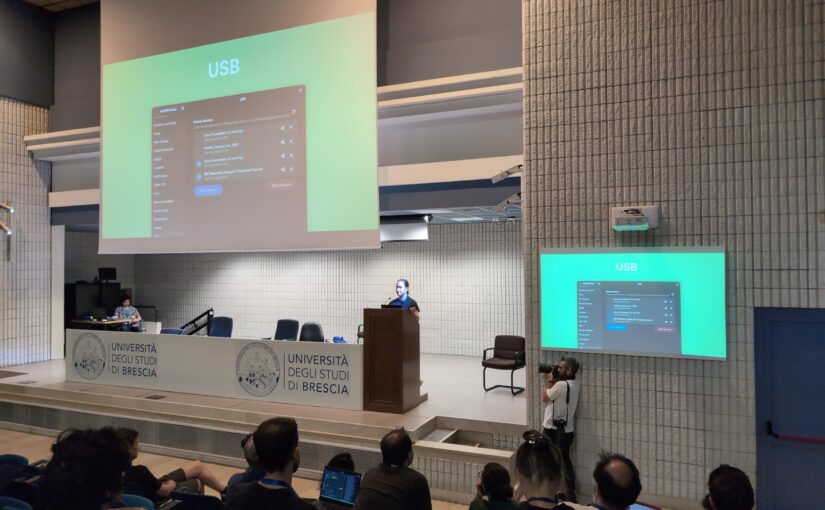
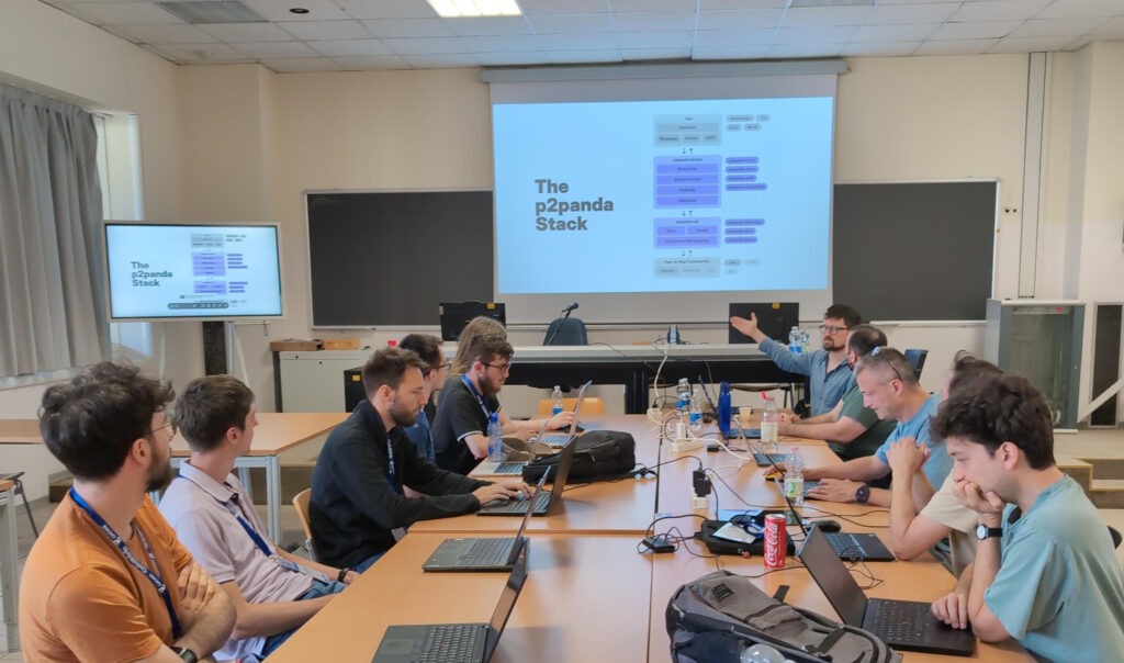
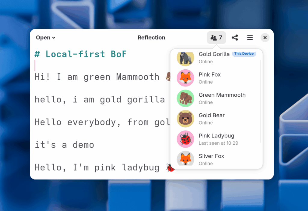
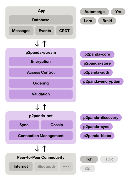
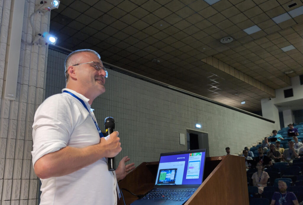
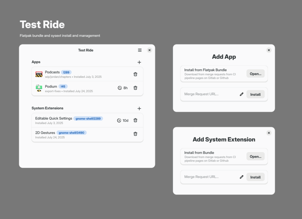
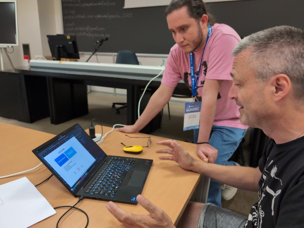
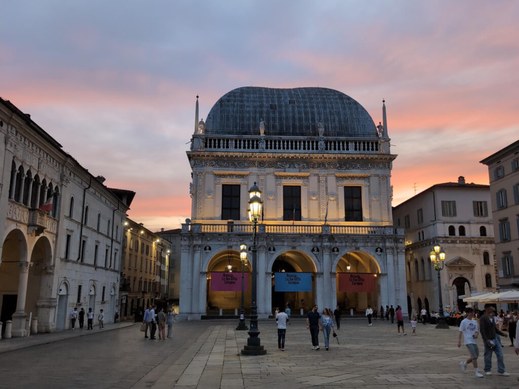
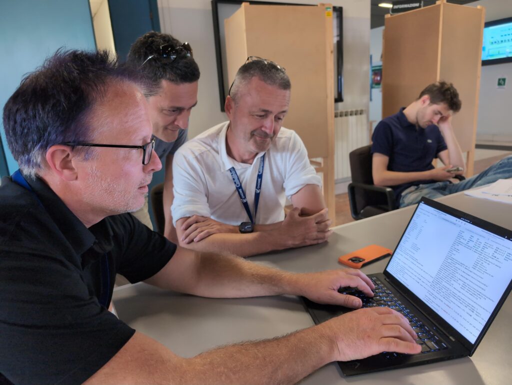
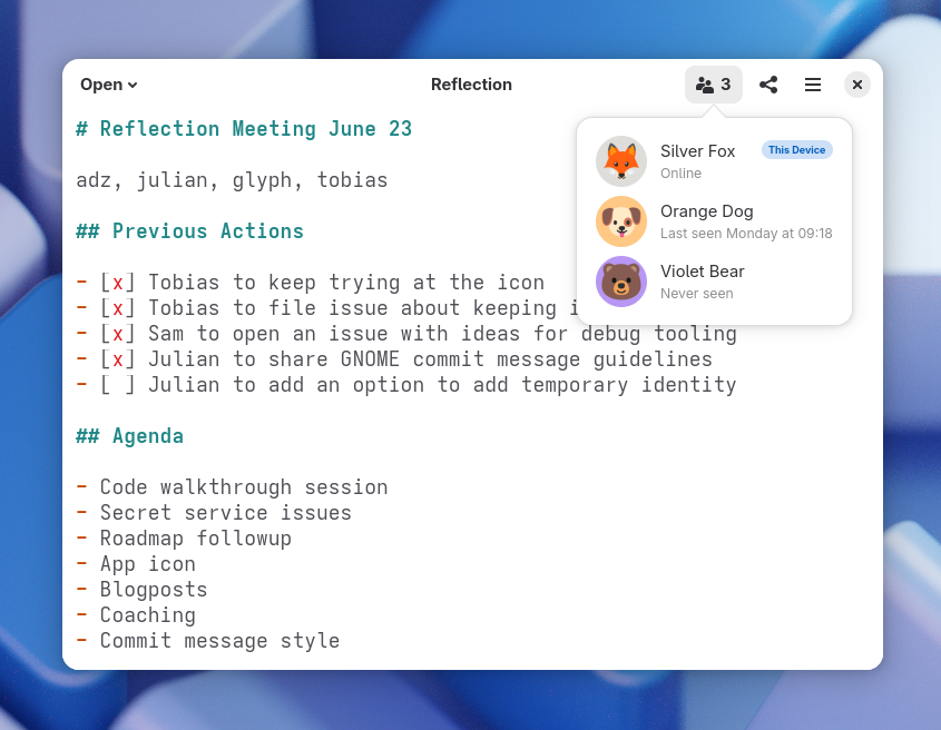
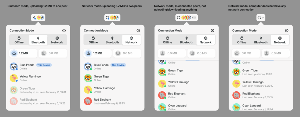

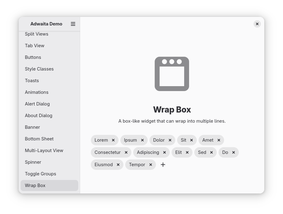
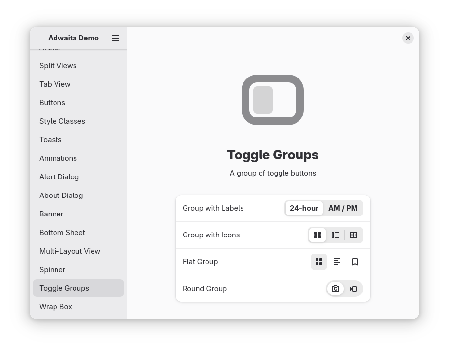
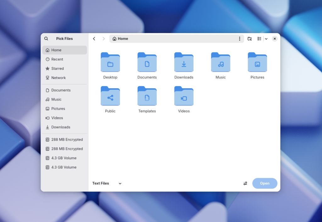

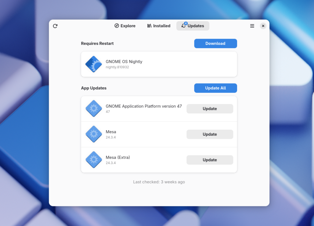
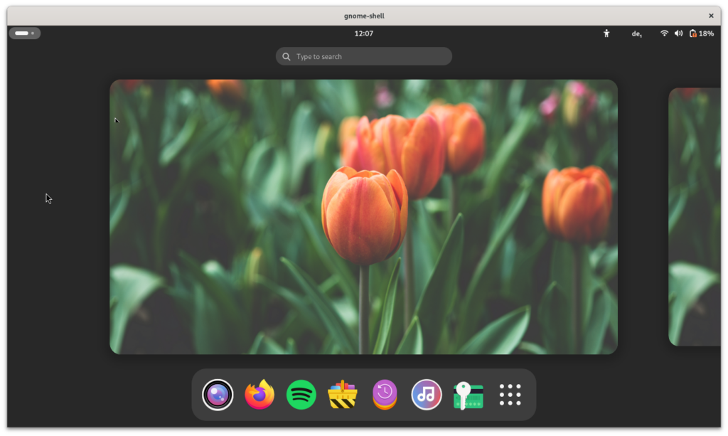
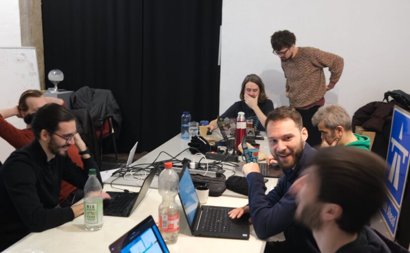


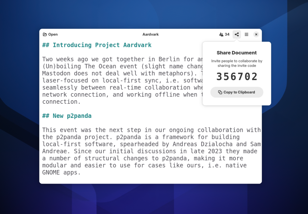
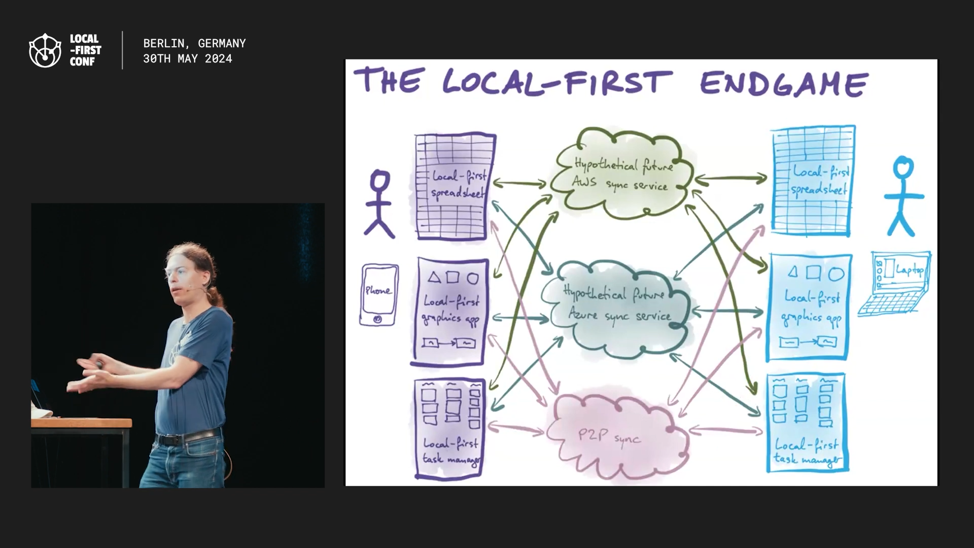
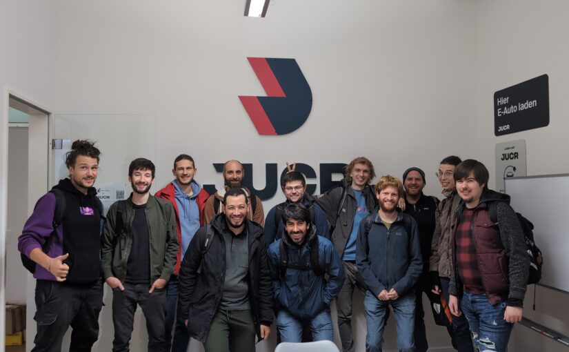
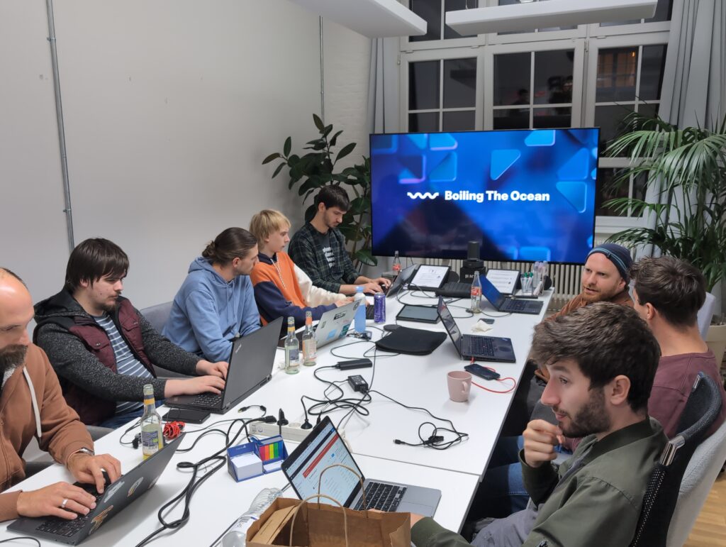
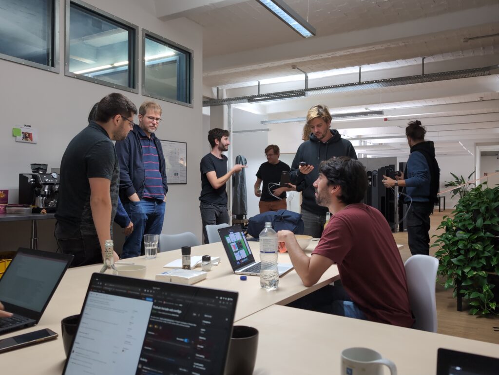
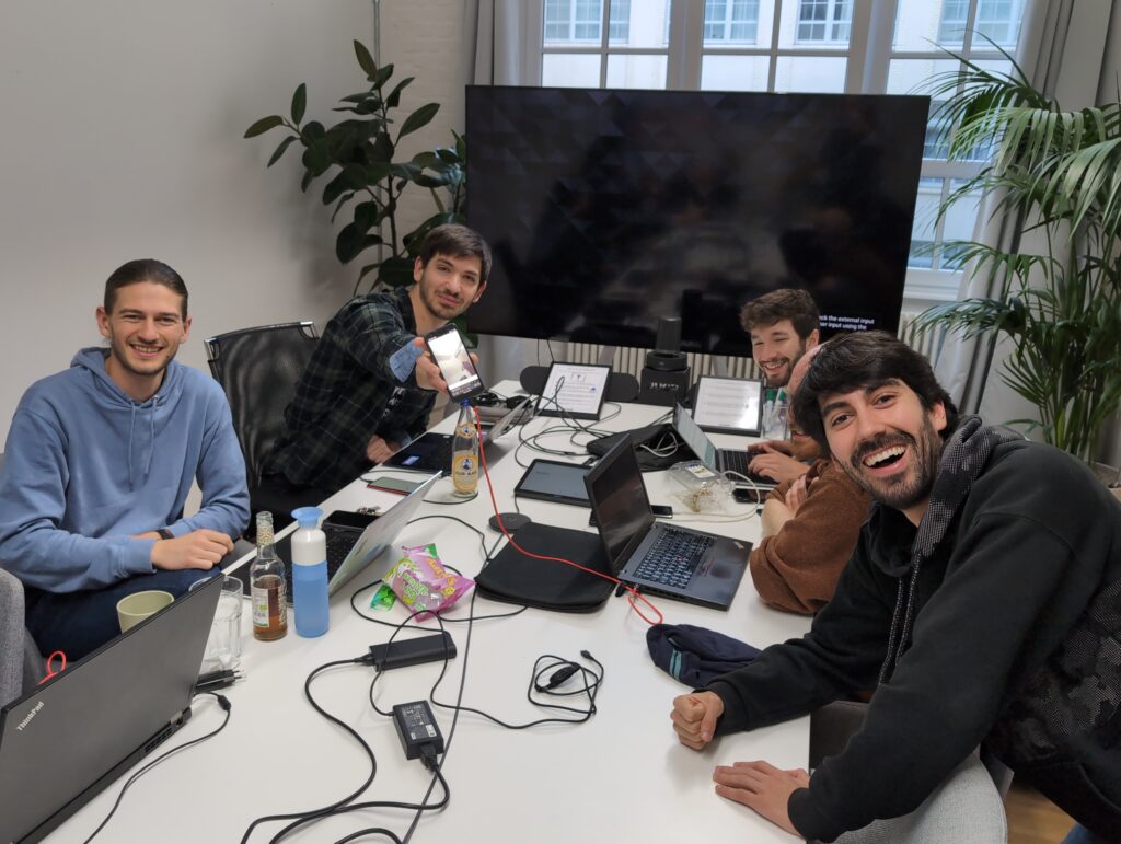
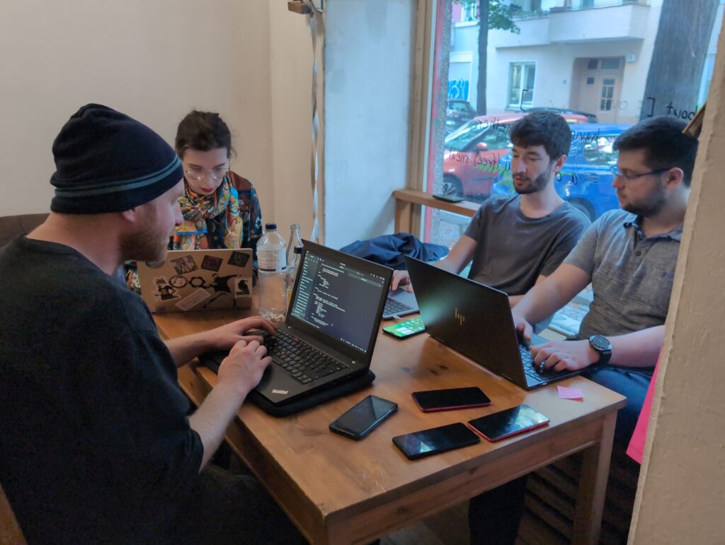
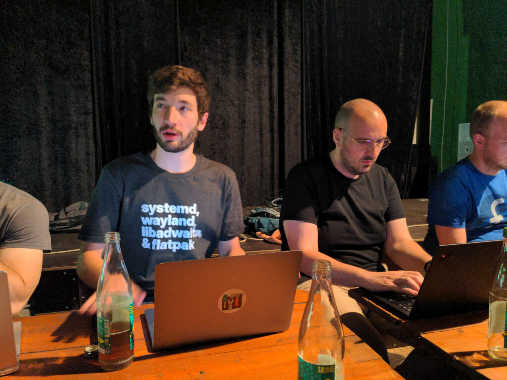
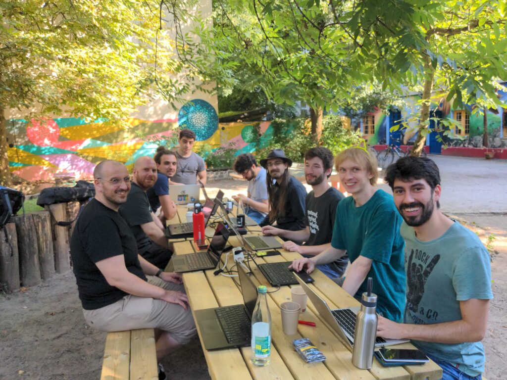
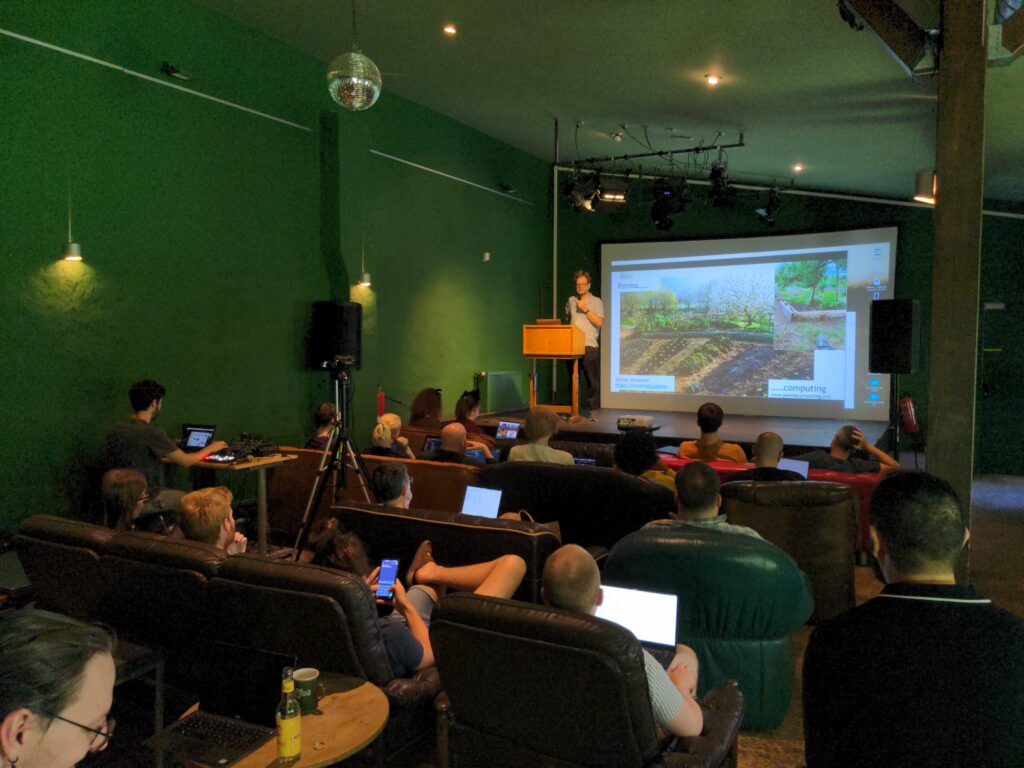
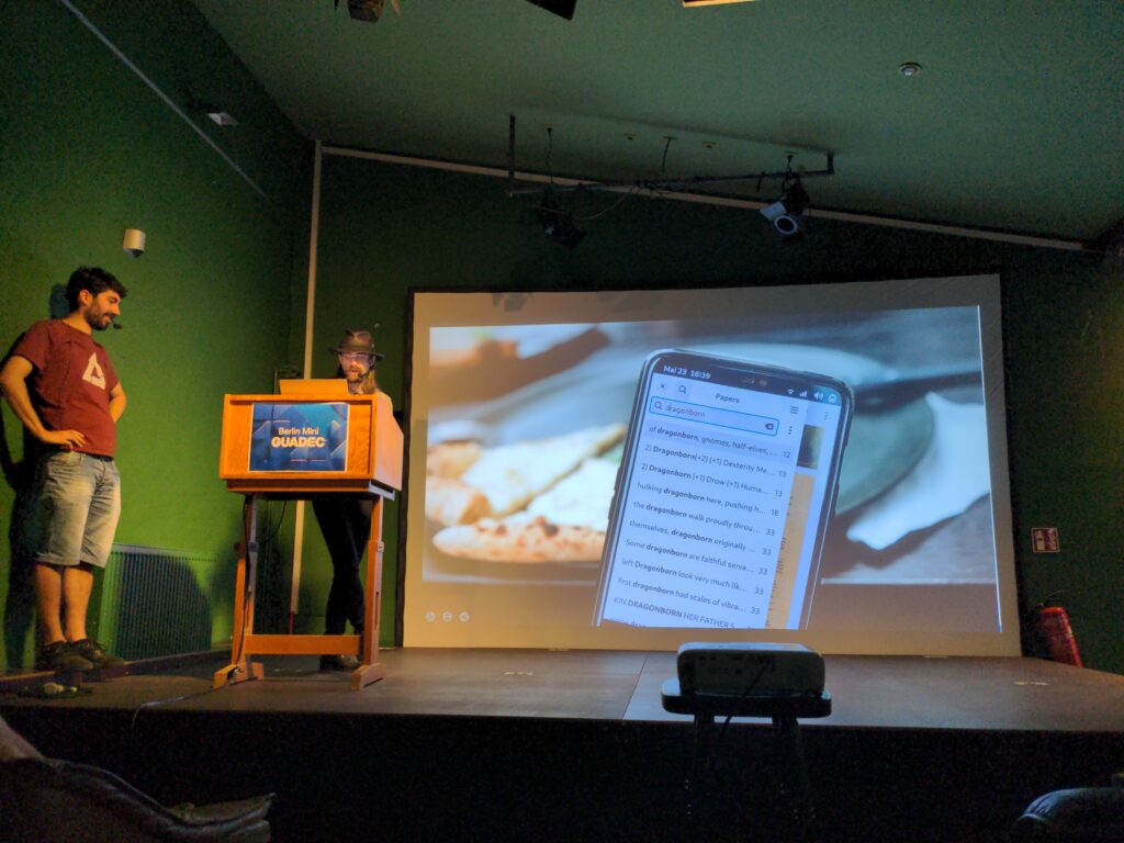
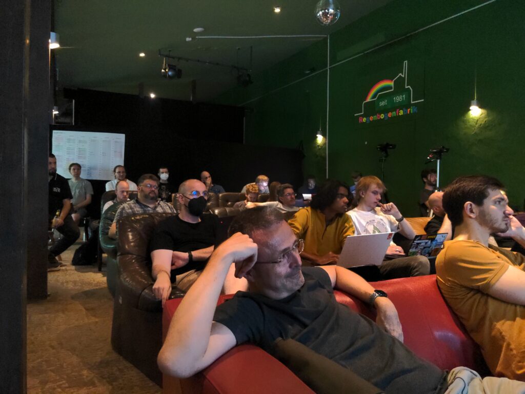
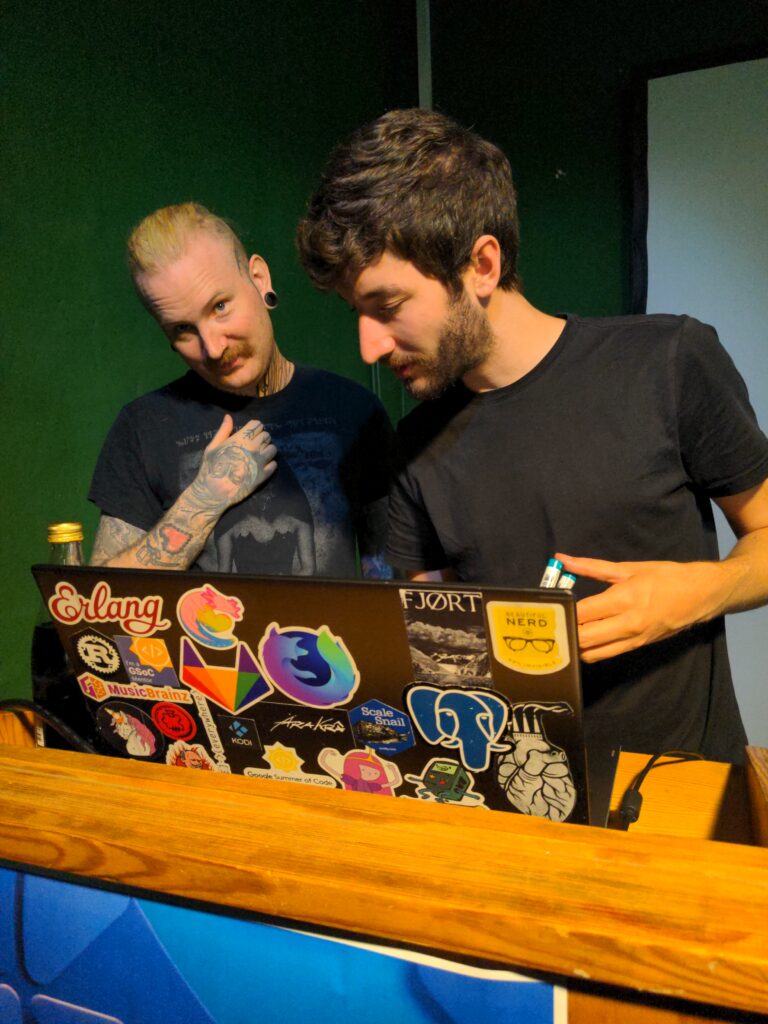
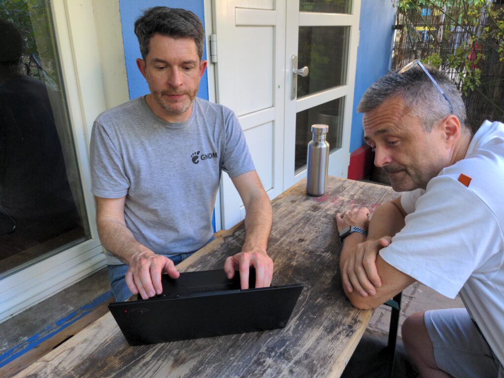
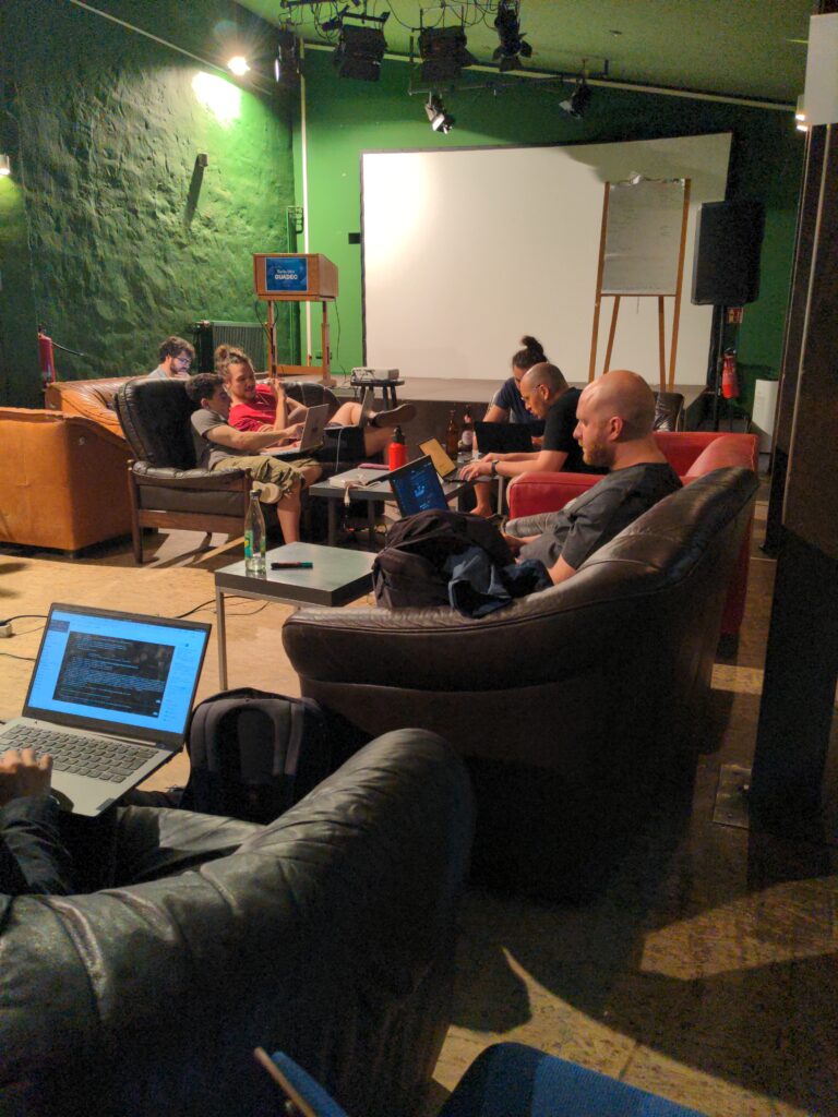
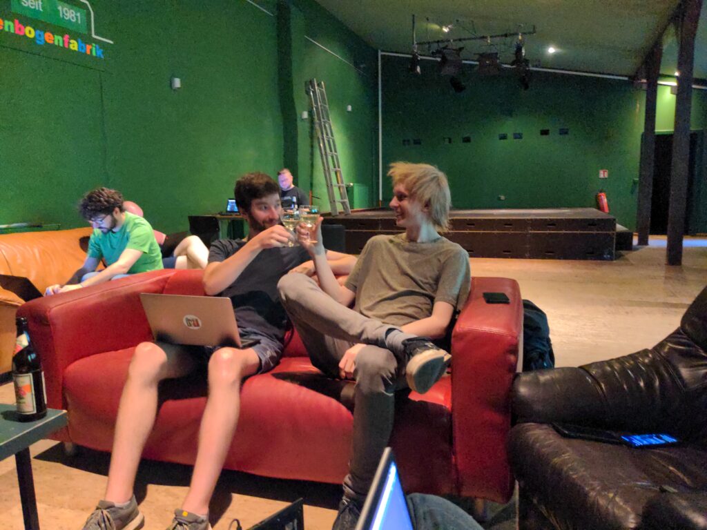
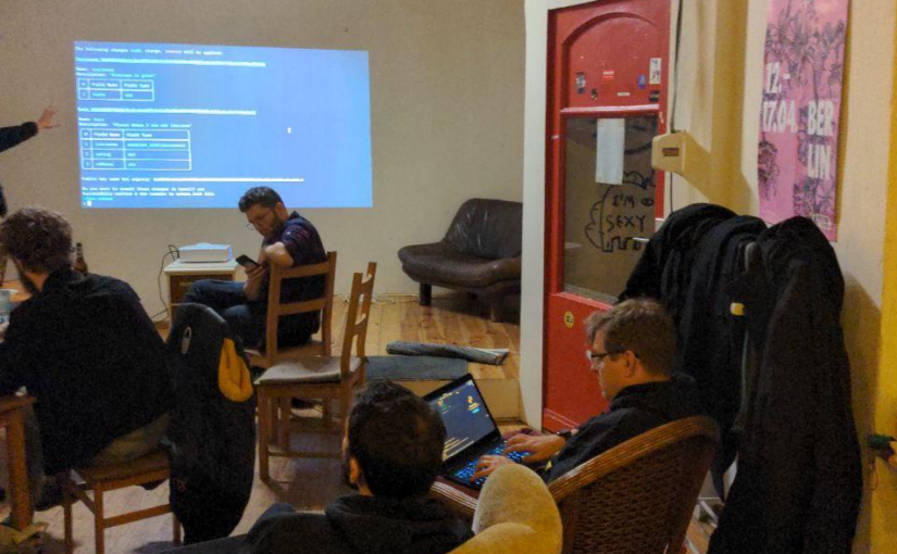
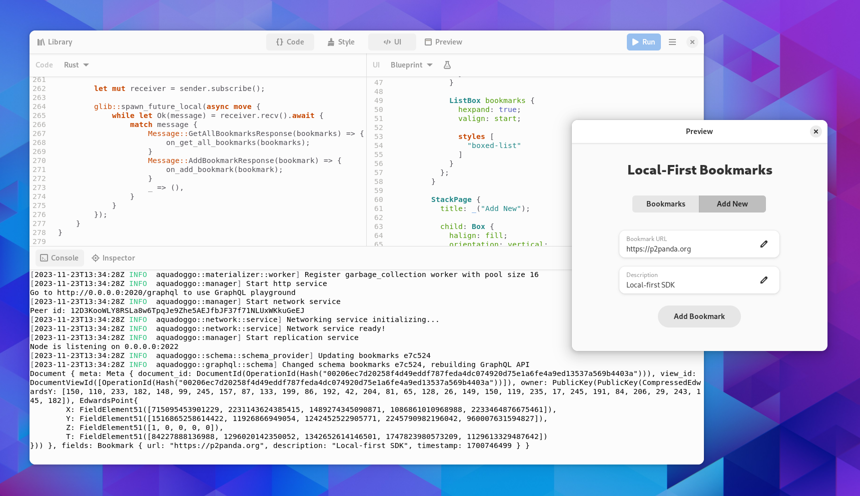
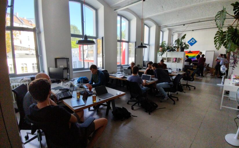
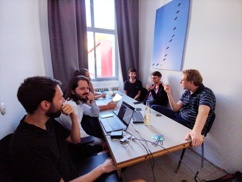
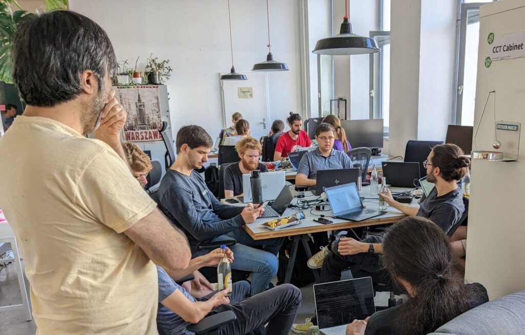
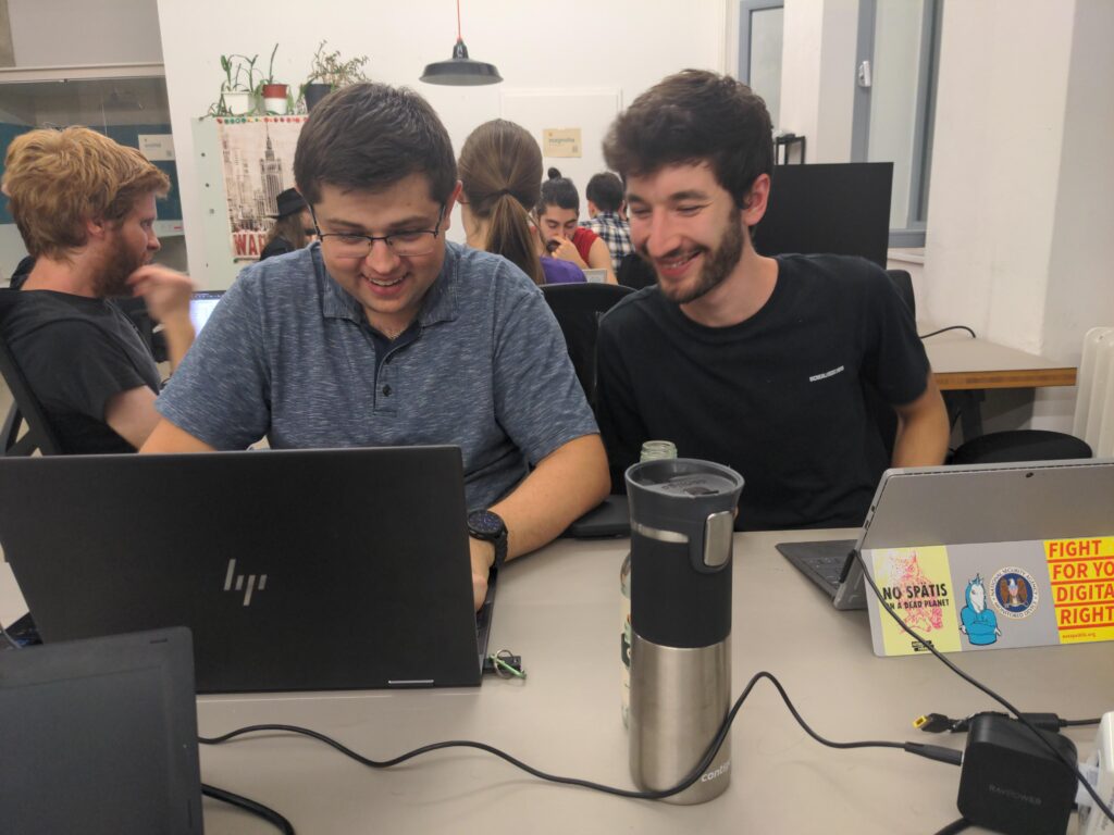

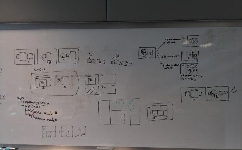
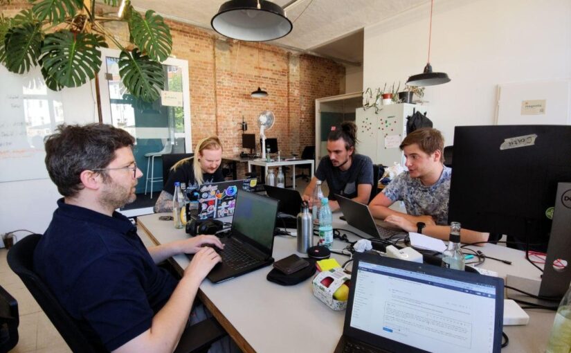
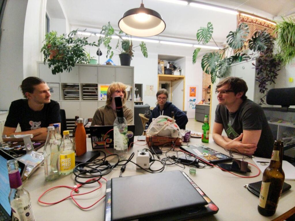
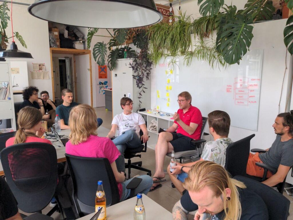
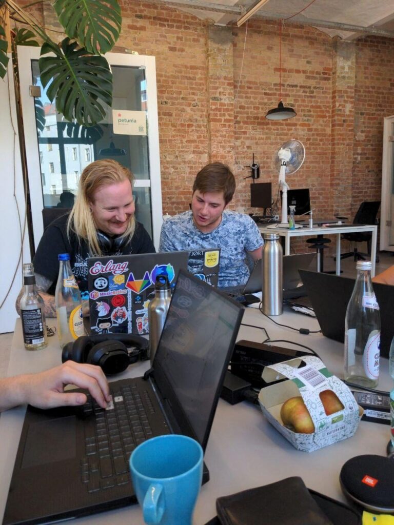

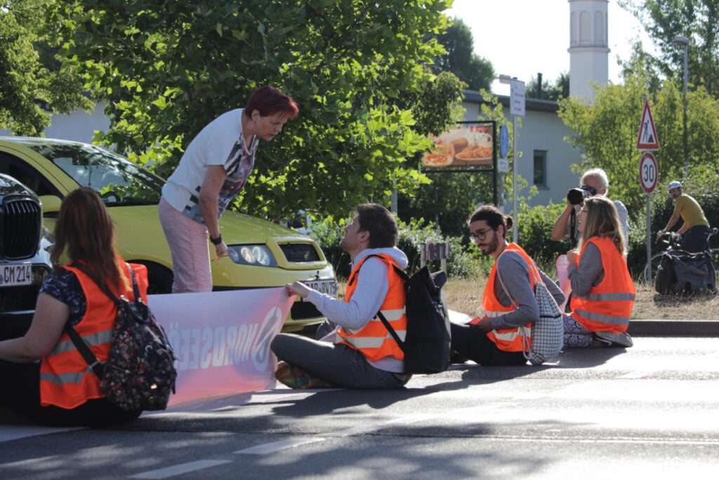
