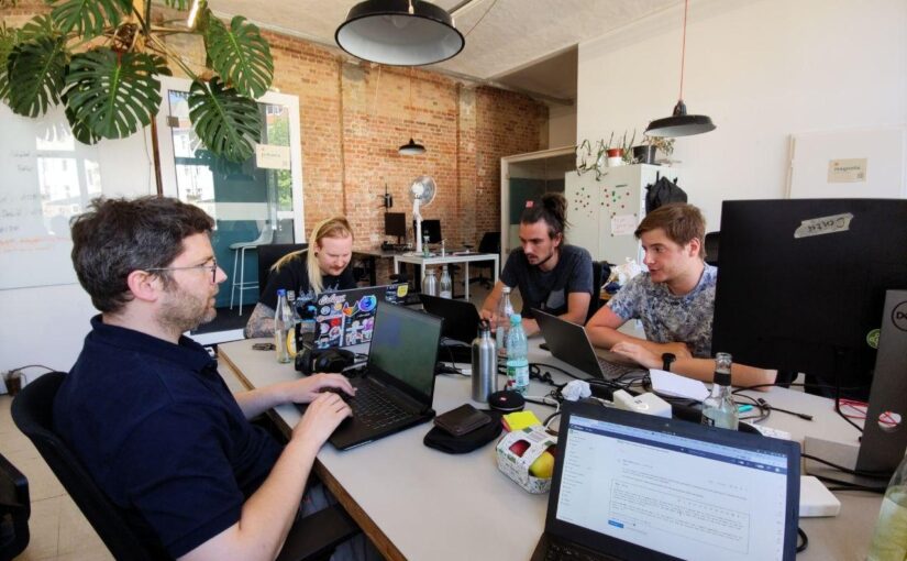
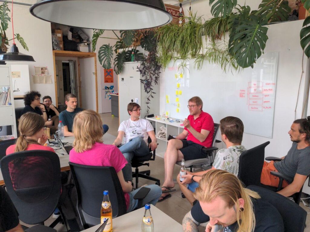
Last week we had a small hackfest in Berlin, with a focus on making GNOME work better on mobile across the stack. We had about 15 people from various projects and backgrounds attending, including app developers, downstreams, hardware enablement, UX design, and more. In addition to hacking and planning sessions we also had some social events, and it was an opportunity to meet nice people from different corners of the wider community :)
The Event(s)
The postmarketOS gang had their own hackfest over the weekend before ours, and on Monday we had the Cultivation Space venue for some chill random hacking. I wasn’t there for most of this, so I’ll let others report on it.
The main hackfest days were Tuesday and Wednesday, where we had an actual unconference agenda and schedule. We met at 11:30 in the morning at Cultivation Space and then managed to get through a surprisingly large list of topics very efficiently on both days. Kudos to Sonny for coming up with the format and moderating the schedule.
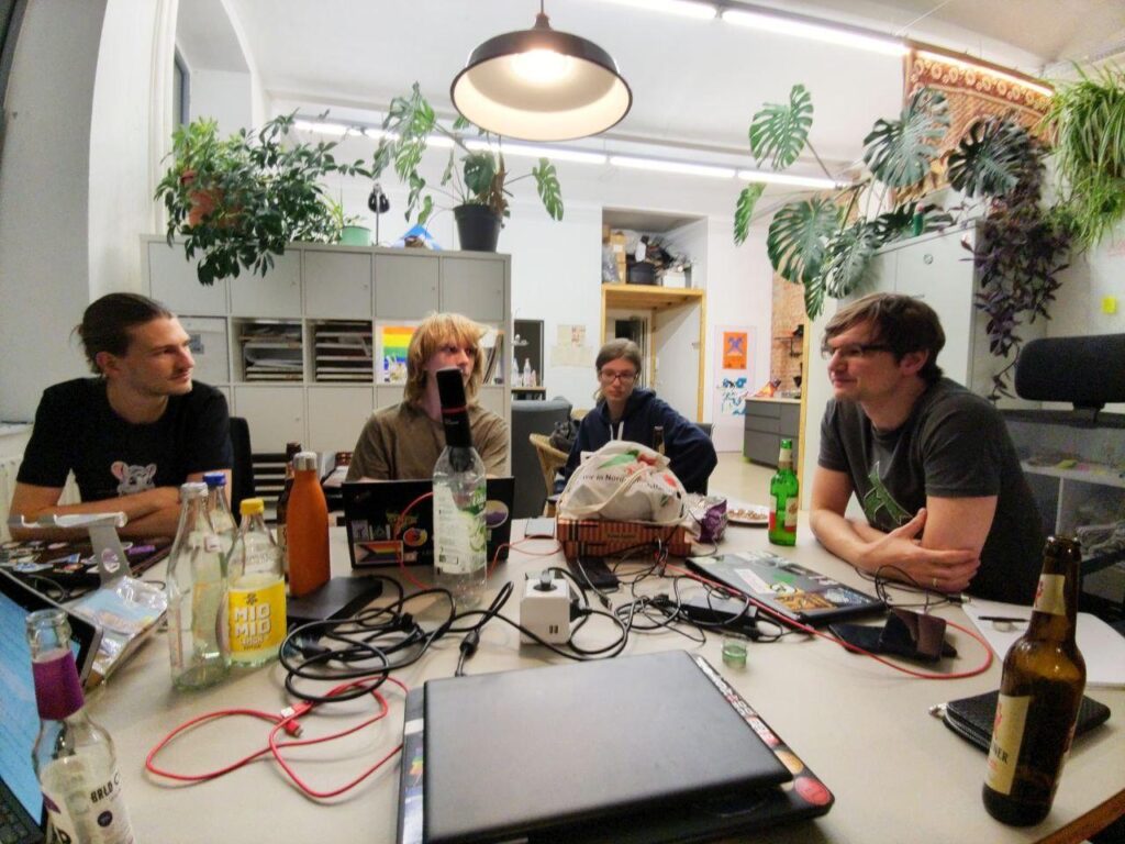
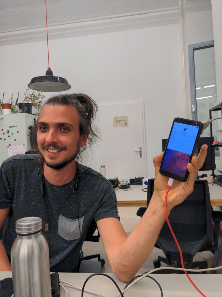
Late night podcast recording on Wednesday (note the microphone in the bottle in the center)
systemd and Image-Based OSes
On Tuesday Lennart from systemd stopped by for a bit, so we had a session with him and the postmarketOS people discussing integration issues, and a larger session about various approaches for how to do image-based OSes. It’s clear that this direction is the future — literally everyone is either doing it (Endless, Silverblue, GNOME OS, SUSE, Carbon OS, Vanilla OS) or wants to do it (PureOS, postmarketOS, elementaryOS). There are lots of different approaches being tried and nobody has the perfect formula for it yet, so it’s an exciting space to watch.
Edit: Clarification from postmarketOS: “We are looking into doing a version of postmarketOS that is image-based/has an immutable file system. But it will still be possible to use postmarketOS without it.”
I personally only half followed some of this while working on other stuff, but it was definitely interesting to hear people discuss the tradeoffs of the various approaches. For example, OSTree doesn’t support offline security which is why Lennart wants A/B/C partitions instead.
OS Stack Bake-Off
After this we had a big OS stack show and tell with people from Debian, GNOME OS, and postmarketOS. From a development/app platform point of view what we need is an OS with:
very recent kernel/hardware enablement (because most phones are still in the process of getting mainlined)
large, active community around the OS, including a security team
image-based, with Flatpak apps
up to date middleware (systemd, flatpak, portals, etc.)
release cycle in sync with GNOME’s
nightly images for testing/dogfooding
aligned with GNOME in terms of design philosophy (upstream first, design first, suitably scared of preferences, etc.)
Currently there isn’t an obvious best option, unfortunately. Debian/Mobian has a large community and recent kernels, but its stable version doesn’t have most of the other things we need since its release cycle is way too slow and out of sync with GNOME’s (and using testing/unstable has other problems). postmarketOS is doing lots of great work on hardware enablement and has a lot of what we want, but the lack of systemd makes it impractical (especially once we implement things like homed encryption). GNOME OS nominally has most of what we want, but the community around it is still too small and not enough people are using it full-time.
We’ll see what the future holds in this regard, but I’m hopeful that one or more options will tick all the boxes in the future!
Shell History and Discussion
Another point on the agenda was longer-term planning for the shell. The Phosh/GNOME Shell question has been unaddressed for years, and we keep investing tons of time and energy into maintaining two shells that implement the exact same design.
Unfortunately we didn’t have enough people from the Phosh side at the hackfest to do any actual planning, but we did discuss the history and current state of both projects. People also discussed next steps on the GNOME Shell mobile side, primarily making it clearer that the branch is maintained even though it’s not fully upstream yet, giving it a proper README, having an issue tracker, and so on.
MPRIS Controls
Oliver was interested in MPRIS buttons, so we had a design session about it. The problem here is that different apps need different buttons in their MPRIS widget depending on the use case (e.g. podcast apps need jump buttons, pause doesn’t make much sense for a live stream, etc.). Currently we have no way for apps to tell the system what buttons it needs, so we discussed how this could be done. The results of our session are written up in this issue, and a vague consensus that this could be done as an extension of the existing MPRIS protocol.
To address the short-term issue of not having jump buttons for podcasts, Jonas statically added them to the mobile shell branch for now.
File Opening
Pablo had encountered some oddities with the file opening pattern in his work on Evince, so we took a look at the question more broadly. Turns out we have a lot of different patterns for this, and almost every app behaves slightly differently! We didn’t get as far as defining if/how this could be standardized, but at least we wrote up the status quo and current use cases in apps in an issue.
Flathub
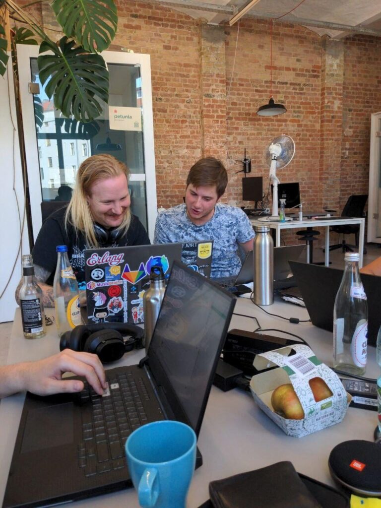
Bart and Kolja from Flathub also joined on Monday and Tuesday, so we worked on the Flathub website a bit (primarily the app tile layout), and discussed a new initiative to make it possible to show the best apps on the home page. The current idea for this is to start off with a new toolbar on Flathub app pages when you’re logged in as a moderator, that allows a mods to set additional metadata on apps. We’d pair this with an outreach campaign to raise the bar on app metadata, and perhaps automated linting for some of the easier to check things.
Bart and Kolja also worked on finally getting the libappstream port done, so that we can have device support metadata, image captions, etc. from Flathub. They made a lot of good progress but this is still not quite done, because there’s lots of edge cases where the new system doesn’t work with some existing app metadata.
Kolja and Bart hacking on Flathub
Mobile Platform Roadmap
A few of us sat down and worked on a priority list of things we’d need in GNOME mobile to be able to realistically daily drive it, including platform, shell, and app features. We documented the results in this issue.
Various other things that happened but that I didn’t follow closely:
Pablo and Sonny sat down together and looked over the postmarketOS GNOME session, doing a bit of QA and finding areas where it could be closer to the upstream GNOME vision. Lots of nice improvements since we last looked at it a few months back, and lots more to come :)
There was a session about device wakeup APIs. I didn’t attend it, but it sounded like they made progress towards a portal for this so that e.g. alarms can wake up the device when it’s suspended or powered off.
Robert, Dorota, Caleb, and others had several in-depth sessions on camera hardware enablement, libcamera and the like
Julian got GNOME OS running on the Librem 5 with a recent kernel
GNOME OS running on the Librem 5 for the first time
Overall I found the event very productive and a lot of fun, so thanks everyone for making it a success. In particular, thanks to the GNOME Foundation for sponsoring, Elio Qoshi and Cultivation Space for hosting us, and Sonny for co-organizing. See you next time!
I’ve written about designing GNOME apps at a high level before, but not about the actual process of drawing UI mockups the way we do on the GNOME design team. In this tutorial we’ll pick up the Read It Later example from previoustutorials again, and draw some mockups in Inkscape from scratch.
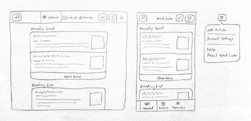
Before we start, let’s look at the sketches we’re going to base this on. I’ve re-drawn some of the sketches from my last app design blog post with just the parts we’ll need for this tutorial.
I recommend having a look at that other blog post before jumping into this one, as it will give you some background on the basic design patterns and show step by step how we got to this layout.
What’s in a Mockup?
After you’ve designed the basic structure of your app (e.g. as a sketch on paper) but before starting implementation, it’s good to check what your layout will look like with real UI elements.
Left: The initial mockup drawn in Inkscape, right: Screenshot of the real app
This doesn’t mean mockups need to recreate every gradient and highlight from the GTK stylesheet. Doing that would make mockups very hard to edit and keep in sync as the stylesheet evolves. However, things like spacing, border radii, button styling, etc. can be made to look very close to how they’ll look in the implemented version with relatively little effort. This is why on the GNOME design team we use a simplified style somewhere between a wireframe and a mockup, where sizes and metrics are mostly pixel-perfect, but UI visuals are not.
This level of fidelity is great for trying variations on layouts, placement of individual controls, different icon metaphors, etc. which are the most important things to validate before starting development. Once the implementation is in progress there’s usually additional rounds of iteration on different aspects of the design, but those don’t always require mockups as you can just iterate directly in code at that point.
Pre-Requisites
In order to be able to follow along with this tutorial, you’ll need to install a few apps:
Inkscape: The vector drawing app we’ll be using to draw our mockup
Icon Library: A handy app for finding symbolic icons to use in mockups
Next, you need the GNOME mockup template. This is an SVG file with many of our most common UI patterns, which enables you to make mockups by copying and adapting these existing components, rather than having to draw every element yourself. You can download the template from GNOME Gitlab.
Finally, you need a recent version of Cantarell, GNOME’s interface font. It’s possible that while you may have a font with that name installed, it’s not the right version, because some distributions and Google Fonts are still on an old version (which has only 2 weights, rather than 5). You can download the new version here.
Inkscape Basics
If you’ve never used Inkscape before it might be good to do some more general beginner tutorials as a first step. I’ll assume familiarity with navigation and object manipulation primitives such as selection, moving/scaling/rotating, duplicating, manipulating z-index, grouping/ungrouping, and navigating through group hierarchies.
Nevertheless, here’s a quick overview of the features we’ll be using primarily.
Controls
Inkscape has a lot of features, but we only need a small subset for what we’re doing. Most interfaces are just nested rectangles, after all ;)
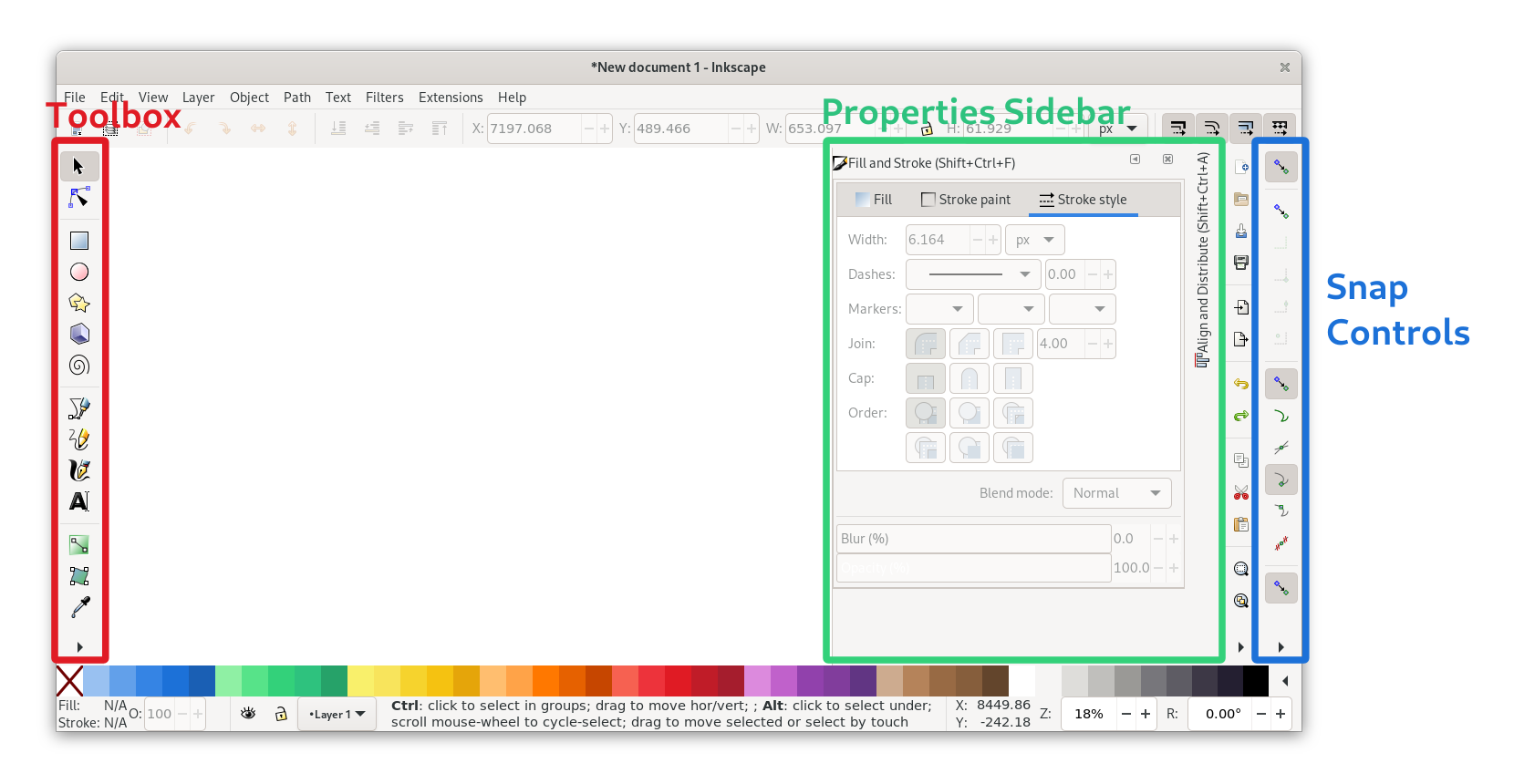
Toolbox (the toolbar on the left edge):
Selection/movement/scaling tool (S)
Rectangle tool (R)
Ellipse tool (E)
Text tool (T)
Color picker (D)
Properties Sidebar (configuration dialogs docked to the right side):
Fill & Stroke (Ctrl + Shift + F)
Align & Distribute (Ctrl + Shift + A)
Export (Ctrl + Shift + E)
Document Properties (Ctrl + Shift + D)
Snap Controls (the toolbar on the right edge): Inkscape has very fine-grained snapping controls to configure what should be snapped to when you move items on the canvas (e.g. path nodes, object center, path intersections). It’s a bit fiddly, but very useful for making sure things are aligned to the grid. The icon tooltips are your friends :)
When aligning things or working with the pixel grid it’s very helpful to have the page grid visible. It can be toggled with the # shortcut or in the View menu.
Advanced: Partial Rounded Corners
One sort of advanced thing I started doing recently is using path effects to get rounded corners only on specific corners of a rectangle. This is handy compared to having the rounding baked into the geometry, because it keeps the rounding flexible, so the object can be scaled without affecting the rounded corners.
The feature is quite hidden and looks very complex, but once you know where it is it’s not that scary. You can find it in Path > Path Effects... > + > Corners (Fillet/Chamfer).
You’ll find that the mockup templates use this path effect technique for e.g. rounded bottom corners on windows.
Color Palette
It’s not as important for mockups as it is for app icons, but still nice to have: The GNOME color palette. Inkscape 1.0+ includes it by default, so you can just choose it from the arrow menu on the right.
Otherwise you can also get it via the dedicated color palette app, or download the .gpl from Gitlab and put it in ~/.var/app/org.inkscape.Inkscape/config/inkscape/palettes for Flatpak Inkscape or ~/.config/inkscape/palettes if it’s on the host.
Page Setup
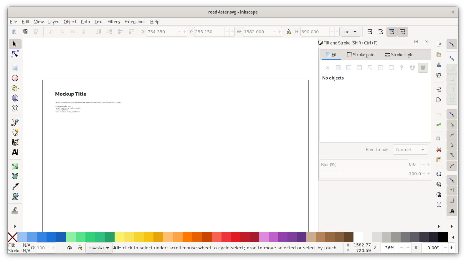
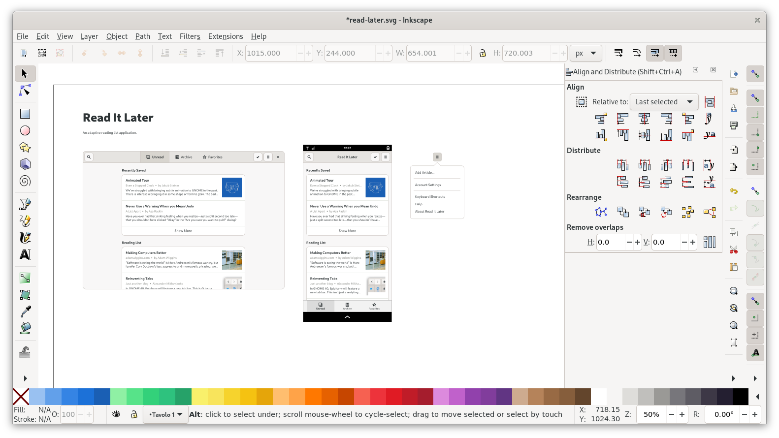
With that out of the way, let’s get started making our mockup! First, we need a basic page to start from. We can start from the empty-page.svg file, by opening that file and saving it under the name we’ll ultimately want for our mockup, e.g. read-later.svg.
GNOME mockups usually consist of one or more views laid out on a “page” of whatever size is needed to make the content fit. There’s usually a title and description at the top, plus additional captions to explain things about the individual screens where it’s needed (example).
The page dimensions can be adjusted in Document Properties (Ctrl + Shift + D). One useful shortcut here is Ctrl+Shift+R, which resizes to the bounding box of the current selection (Note: Only use this shortcut if the thing you’re resizing to is e.g. a rectangle you set up for that purpose. Resizing the page to things off the pixel grid will break it, because it moves the document origin).
Let’s do that, and tweak the title and description for our case:
Desktop View
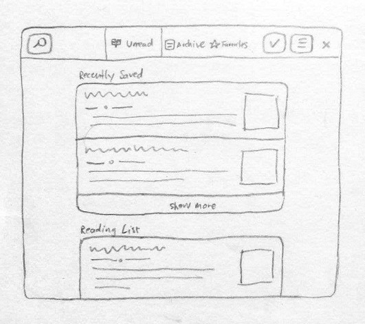
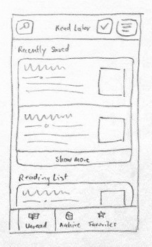
Now that the page is set up we can add our first screen. This is the sketch we’re going to be drawing first:
As a first step, let’s bring in the window template with view switcher from pattern-templates.svg. Open that file in Inkscape, select the top leftmost screen, copy it, and paste it into your mockup file.
After roughly positioning the window, check the exact position using the numeric position entries in the bar at the top, and make sure both X and Y positions are full integers (if they’re not integers it means your mockup is off the pixel grid and will look blurry).
It’s worth pointing out that while in this case we’re just starting from the plain default templates, it’s often faster to start from an existing mockup for another app. The app-mockups repository on GNOME Gitlab is full of existing mockups to borrow elements from or use as a starting point for a new mockup. That said, depending on their age those mockups might be using outdated patterns, so it’s good to check when a particular mockup was last updated :)
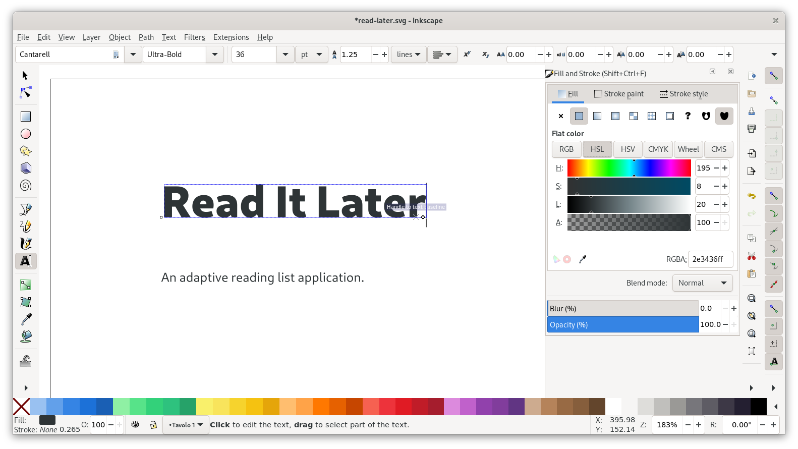
Headerbar
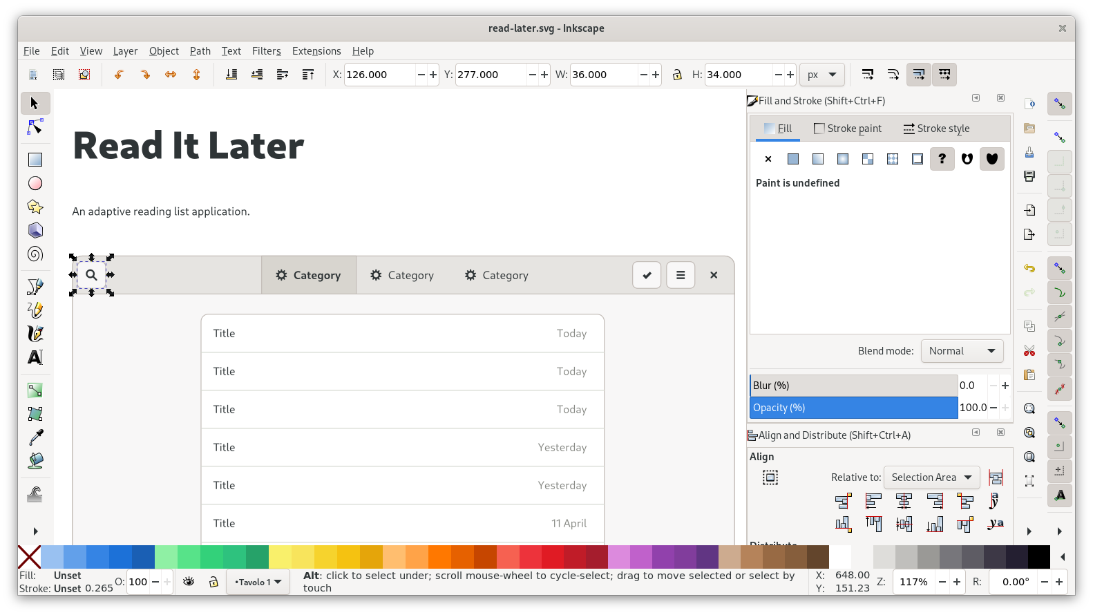
Let’s start by adjusting the headerbar to what we have in our sketch. Conveniently, several of the buttons don’t need to change at all from the template. All we need to do here is move the search button to the left, delete the add button, and adjust the switcher.
As a general rule, spacing between elements is a multiple of 6 pixels (so 6, 12, 18, 24…). For example, there are 6px of padding around buttons inside a headerbar, and 6px between the individual buttons.
When moving/placing elements, always make sure that snapping to bounding box is active (topmost group of snapping controls). As with the placement of the window earlier, it’s good to verify that sizes and positions are even integers in the toolbar up top.
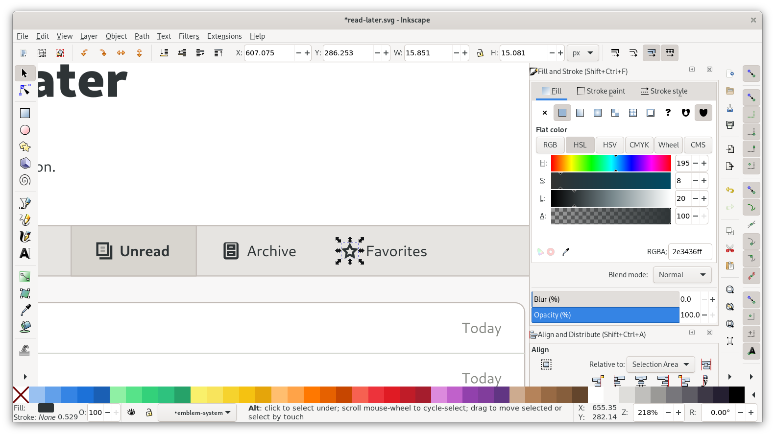
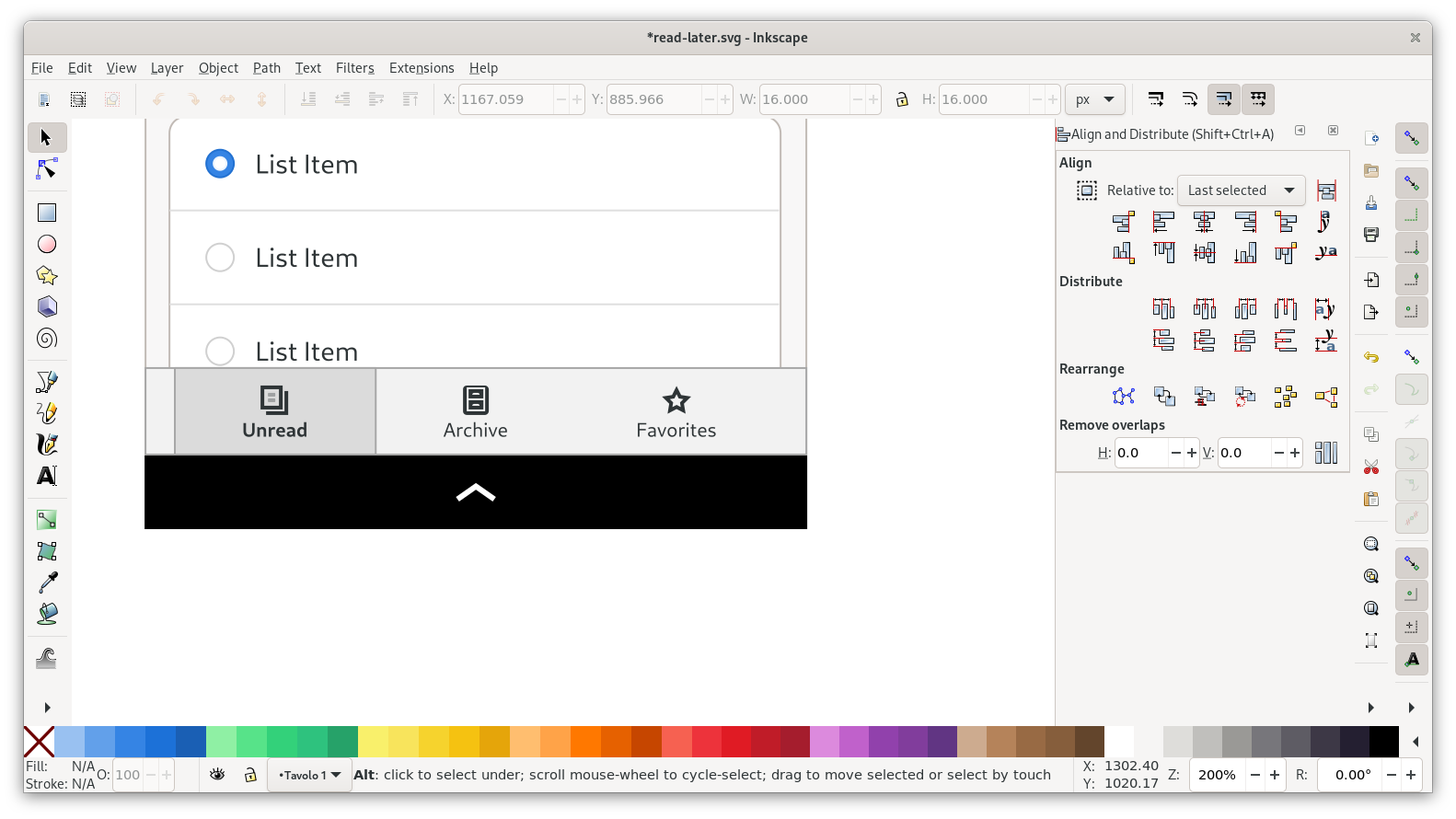
Next up: The view switcher. You can start by changing the three labels, and then re-centering the icon + label groups on their respective containers. The inactive items have invisible containers, so they’re a bit fiddly to select.
For the icons, you can fire up Icon Library and search for the following icons:
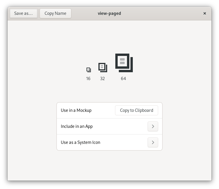
Unread: view-paged
Archive: drawer *
Favorites: star-outline-thick
* This icon isn’t included yet, but will be in a future version
You can paste icons directly into Inkscape using the “Copy to Clipboard” feature. Before pasting, navigate into the relevant icon group (each of the icons is grouped with an invisible 16px rectangle, because that’s the icon canvas size). When placing an icon, make sure to center it on the invisible canvas rectangle, and place them on the pixel grid. You may want to turn on outline mode (Ctrl+5 cycles through display modes) to deal with the invisible rectangles more easily.
Once the icons are replaced, change the label strings with the text tool, and move the icon+label blocks horizontally so they look centered within their containers. I personally just do this manually by eye rather than using the alignment tool, so I don’t lose the icon’s alignment to the pixel grid, but you can also align and then manually move it to the closest position on the pixel grid.
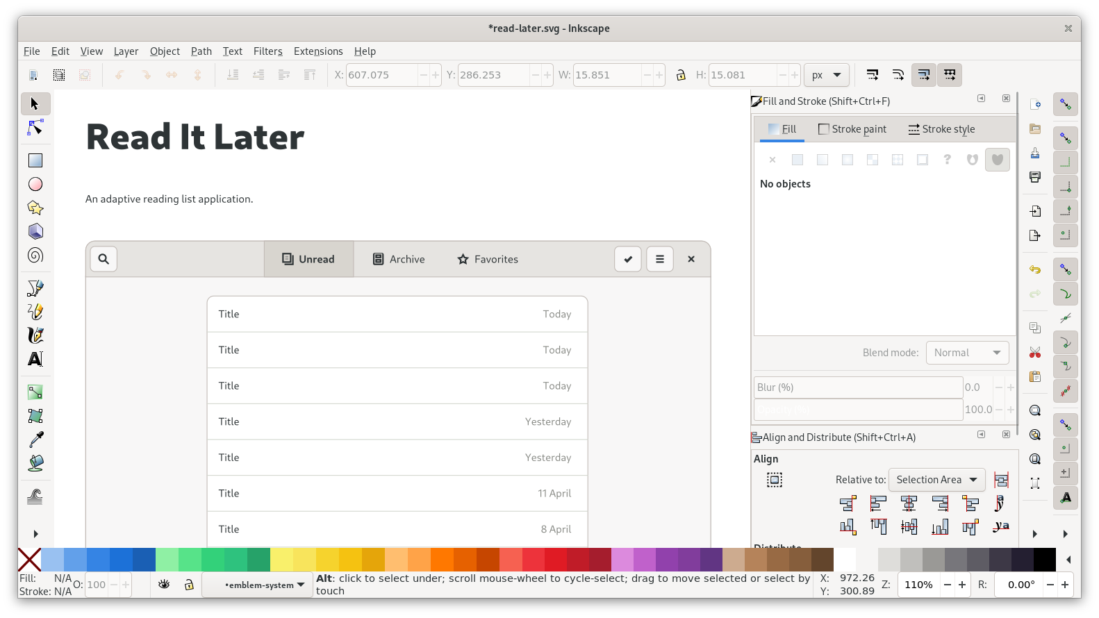
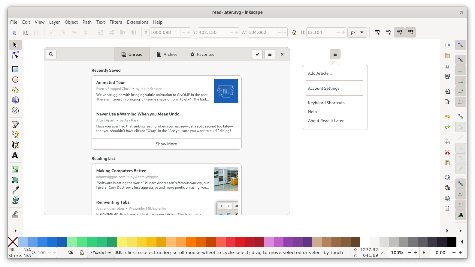
With this, the headerbar is complete now:
Content
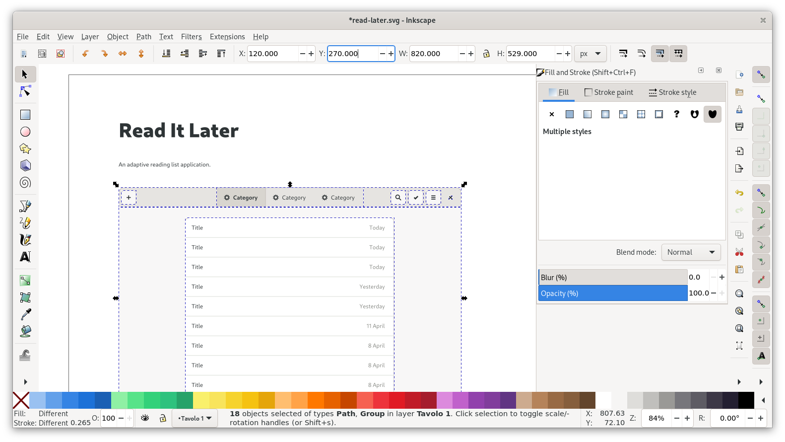
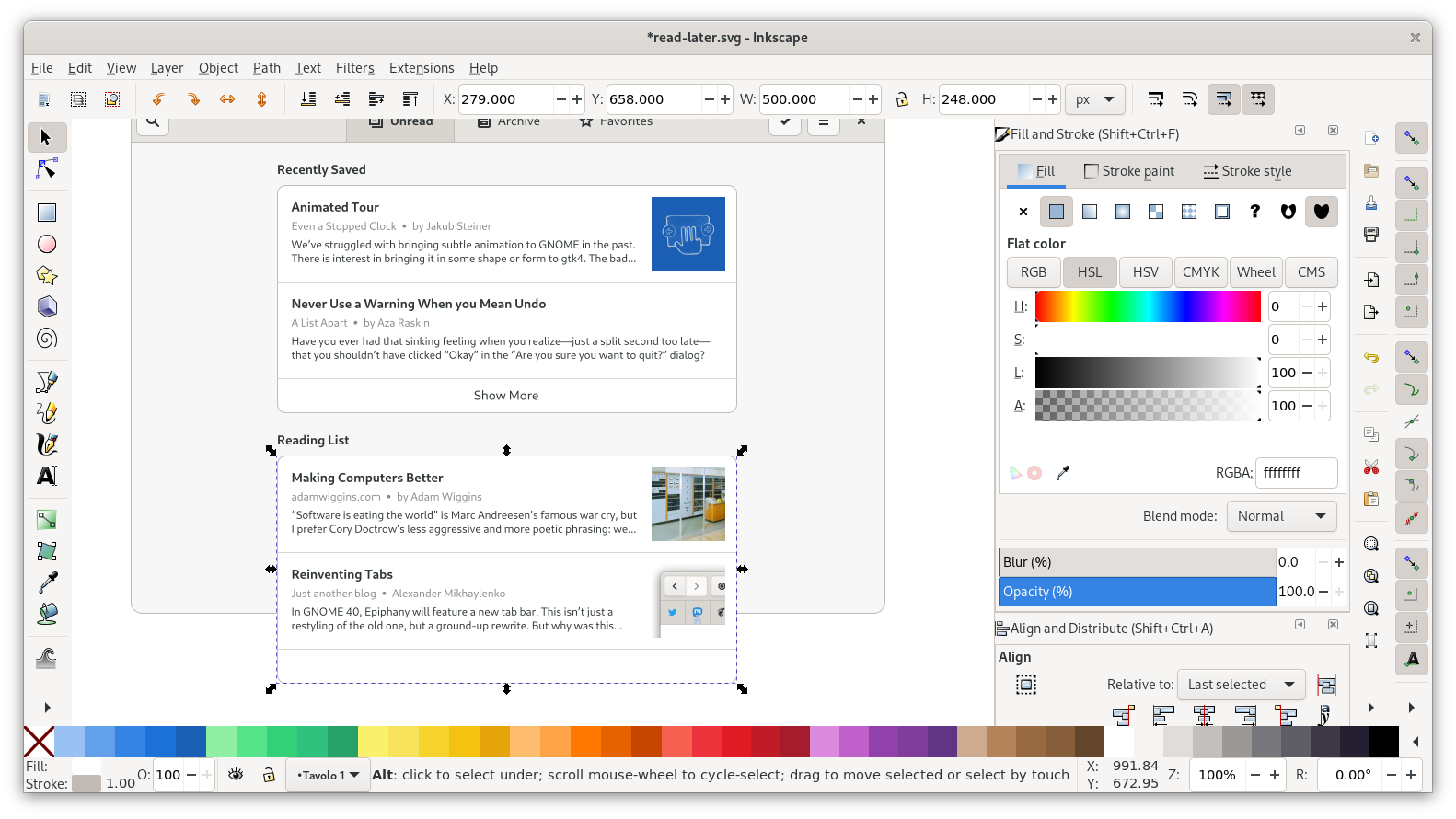
Let’s look at the content inside the window next. We can keep the basic structure of the listbox from the template, but obviously we want to change what’s in the list.
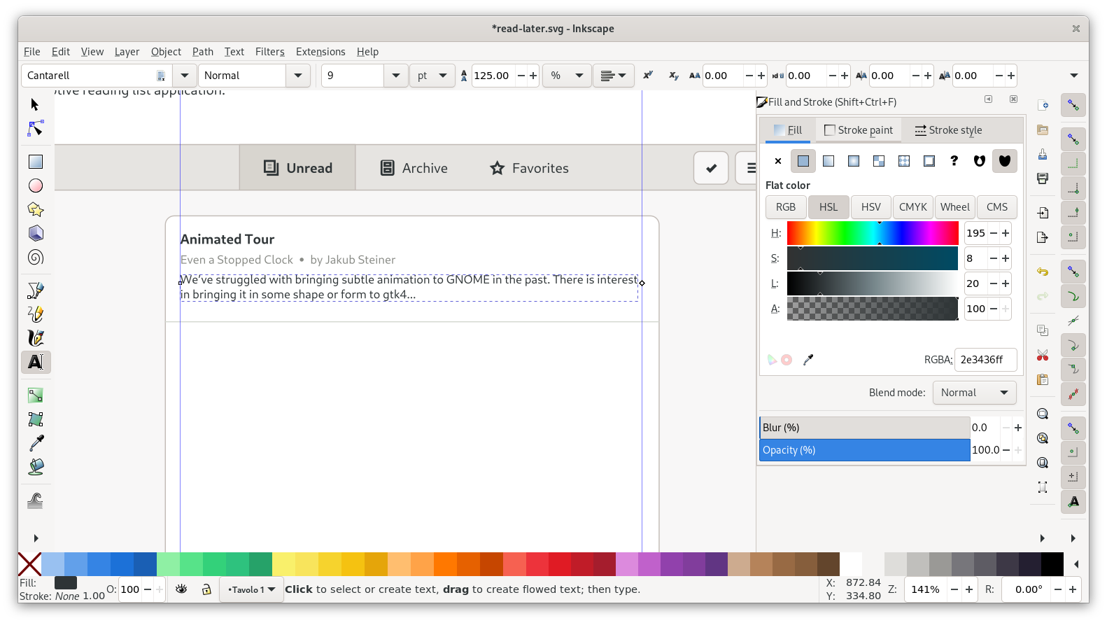
I’ve prepared some example content we can just copy and paste that into our mockup. Each article consists of three labels, one using the regular font size (10.5pt), and two using the small one (9pt). The metadata label also uses a lighter gray, to distinguish it from the body copy (you can get the color from the labels on the right side of the list in the template using the color picker tool).
The list from the template is grouped and has a clipping mask to cut off scrolling content at the bottom. Since our layout is different anyway we can remove the clipping by simply ungrouping (Ctrl + Shift + G). Next, we can delete all content except the first row, and change that to our first article.
In order to accommodate multiple pieces of content inline as part of the same label, a common pattern is to use middle dots (“·”) as dividers. Pro tip: The Typography app makes it easy to copy and paste typographic symbols like this one into your mockups.
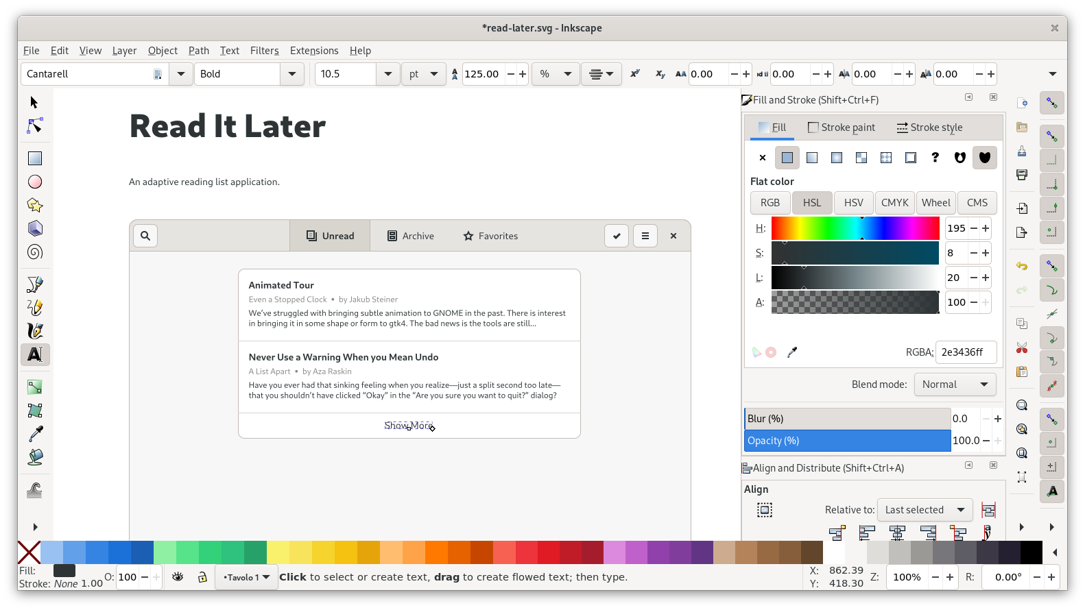
After adding the articles in the first listbox, we need the “Show more” button at the bottom. For that we can just resize the list so it extends past the last article, and add a centered label on that area.
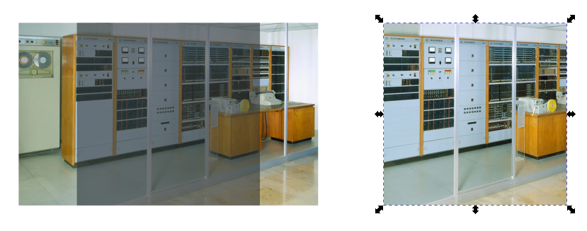
Some of the articles also have images associated with them (there are download URLs for the images in the example content file). Images that aren’t already square need to be clipped to a square shape for our layout. To do that in Inkscape
Pull in the image via drag and drop from the file manager (or paste it directly from a website via “Copy Image”)
Place a rectangle with the right size/proportions where we want the image to go in the layout. In this case, images should be 80px squares, with 12px spacing all around.
Move and scale the image to cover the rectangle on all sides
Select both the image and the rectangle, and do Object > Clip > Set. Note that the clipping object (the rectangle) needs to be above the target (the image).
With the first list done, we can move it down a bit and add a title above it. You can re-use one of the titles from the list for that, and just horizontally align it with the list container. Spacing between title baseline and list should also be 12px, and above the title 18px to the edge of the view.
After that, our first list is complete:
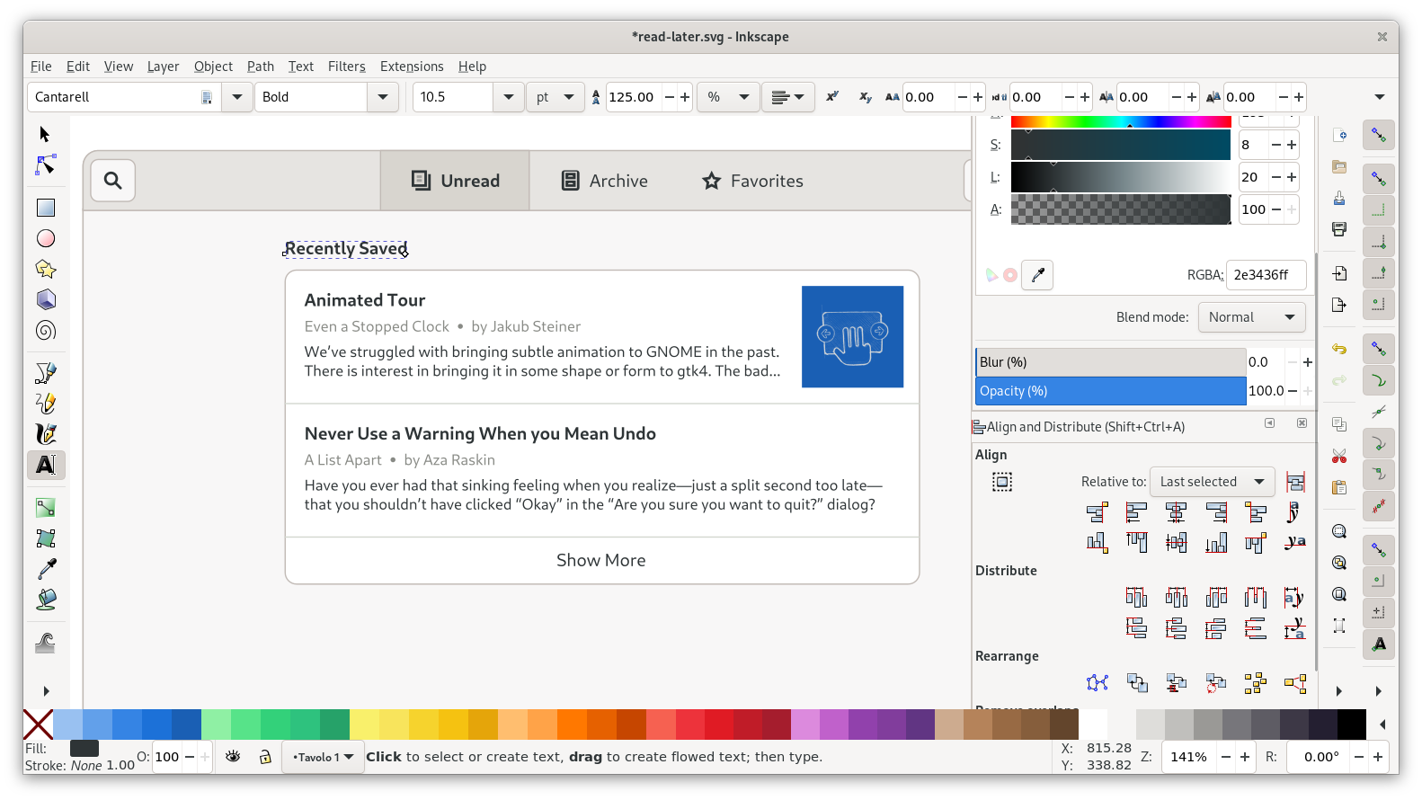
For the second list we can duplicate our first list, move it down below, and just change the content:
In order to have it cut off nicely at the bottom we can bring back a clipping mask. Group the list, duplicate the window background rectangle, and use that as a clipping mask for the list. To make the last article a little more visible I’m also resizing the window background to be a little bit taller first.
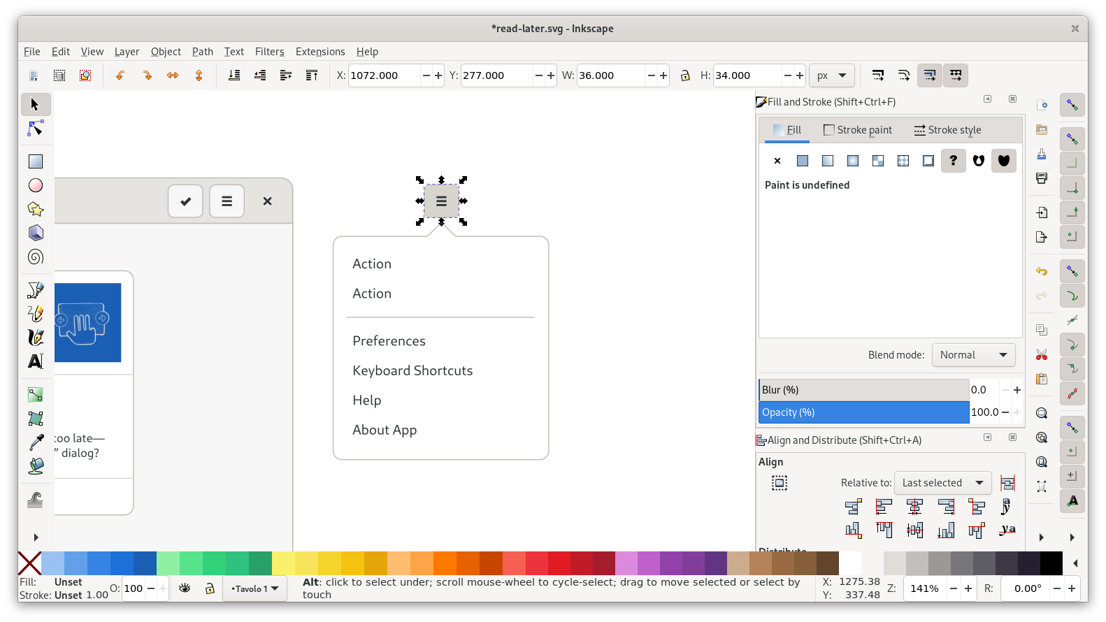
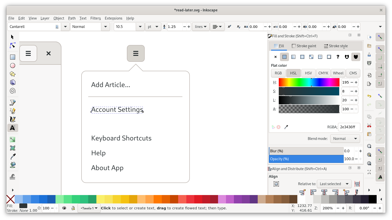
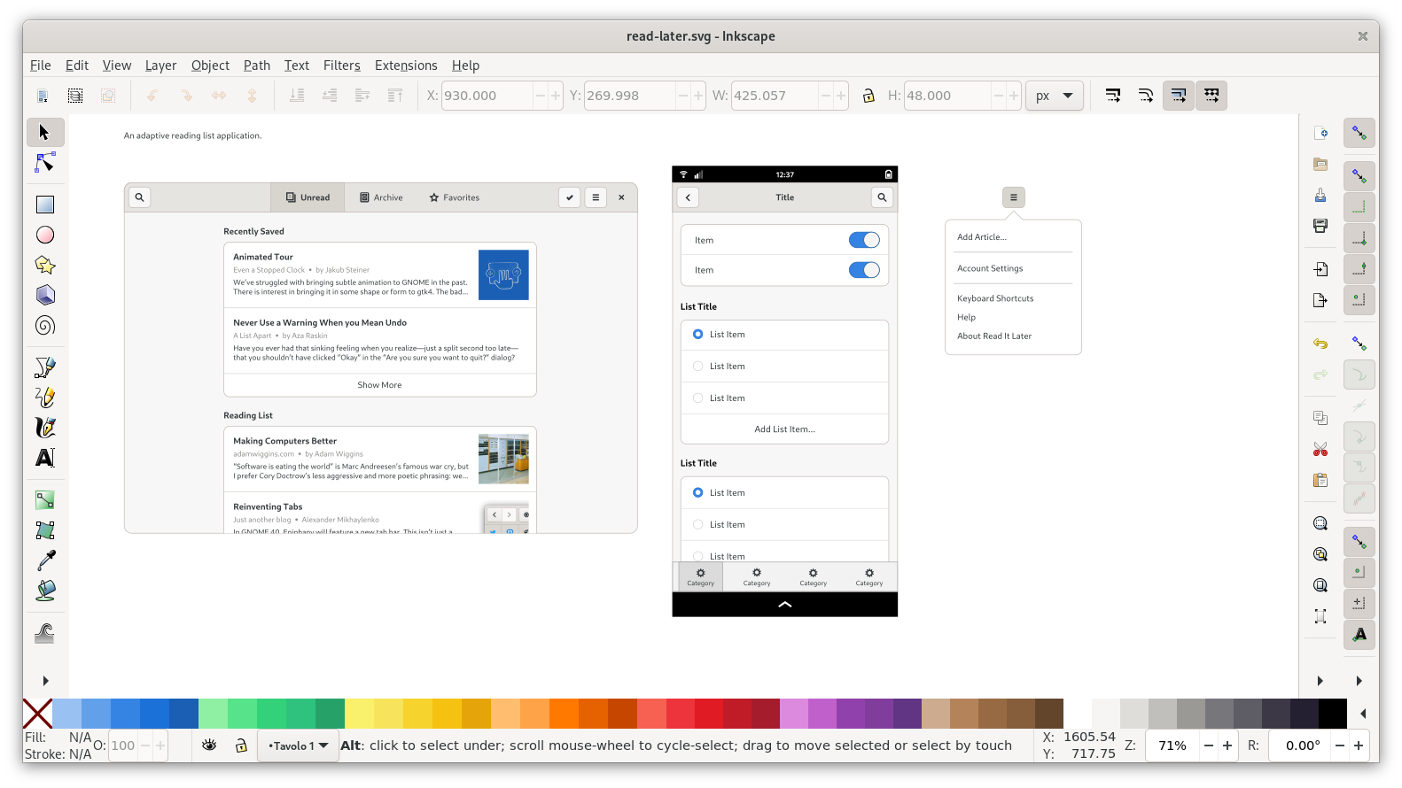
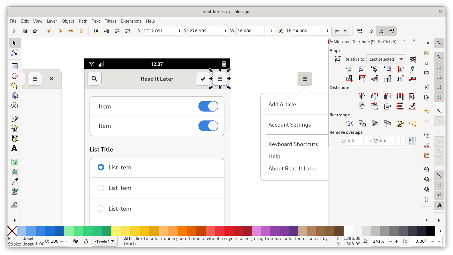
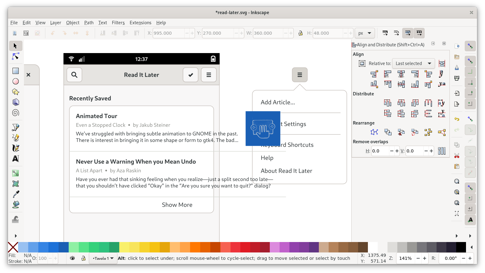
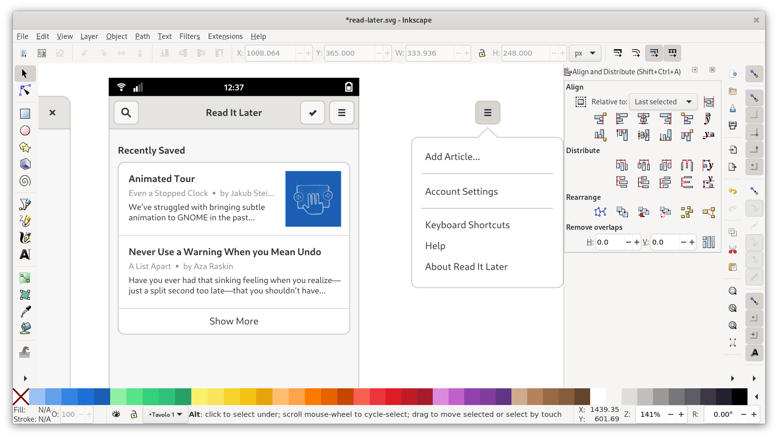
Menu
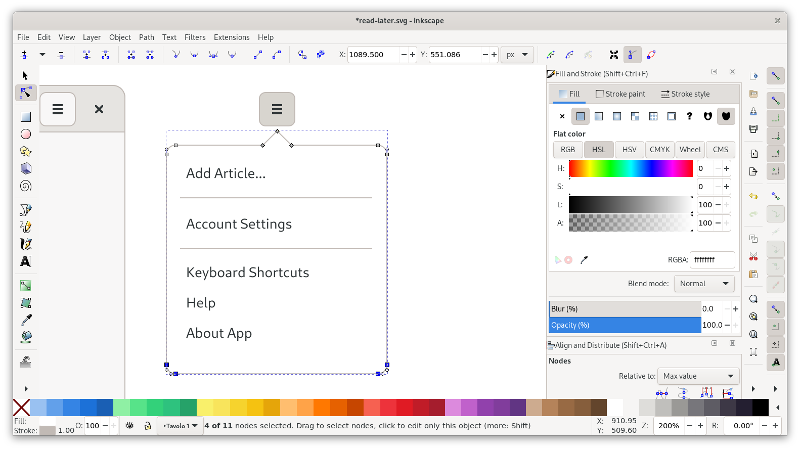
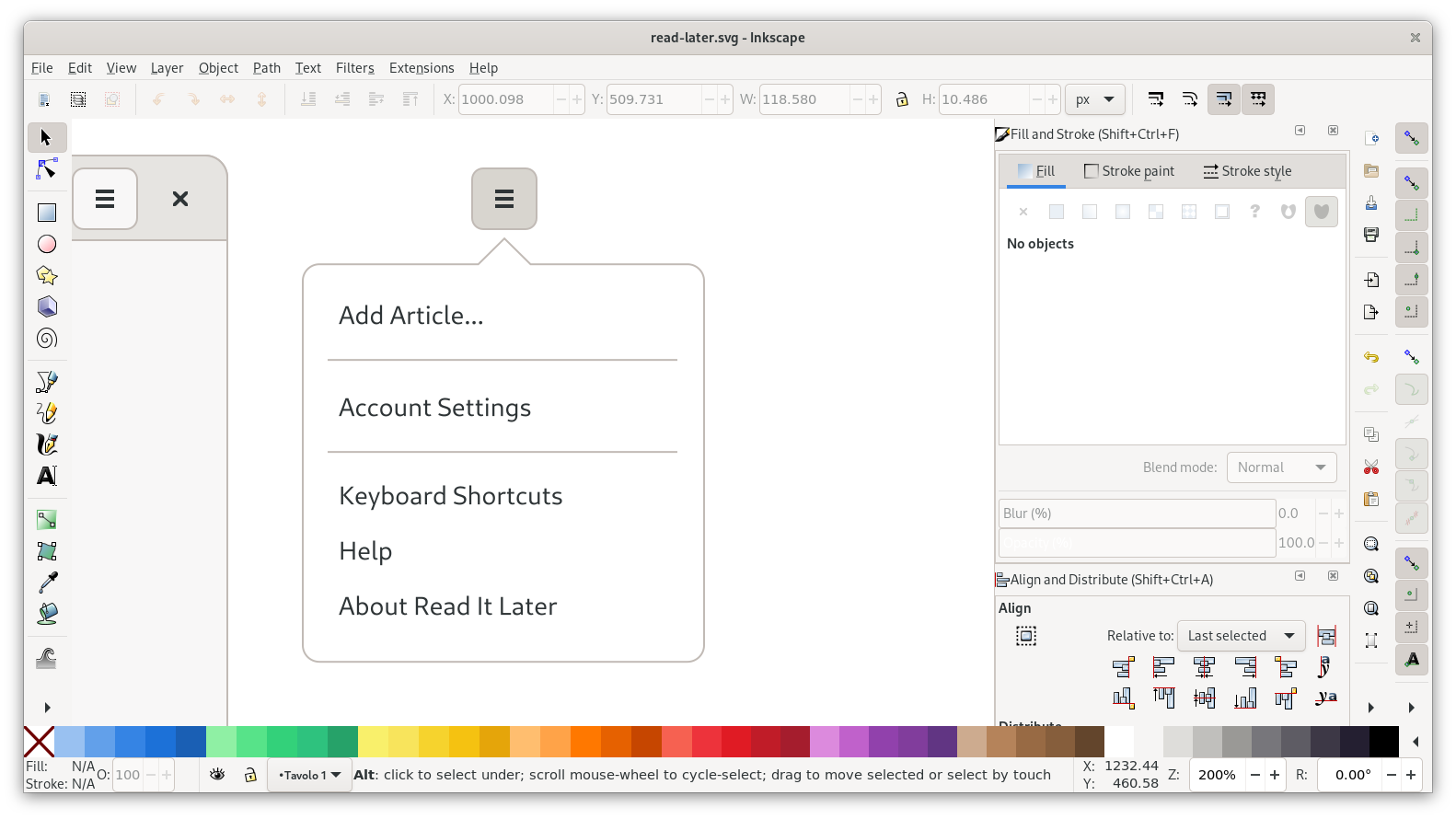
For the primary menu we can pretty much just re-use the menu from the template (top left, outside the canvas). Copy over the template popover and button, and vertically align it so the button is at the same height as the one in the window.
Since we don’t need many actions other than the default ones, all we need to do here is change a few labels, add another divider, and put in the name of the app.
That leaves us with a bunch of whitespace in the popover though, so let’s move up the actions and then resize the popover by selecting the bottom nodes and moving them up using the arrow keys:
And with that, our menu looks pretty good:
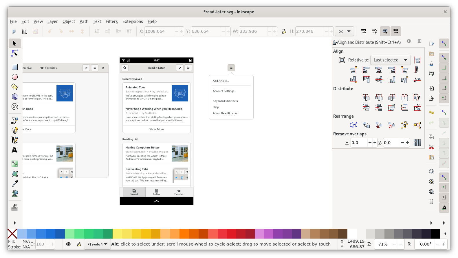
That completes our desktop view, and we can move on to mobile.
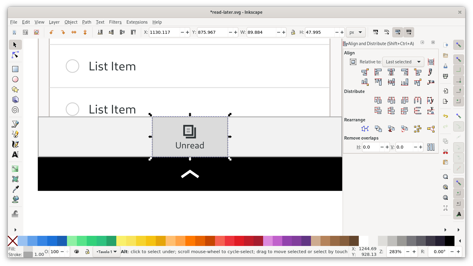
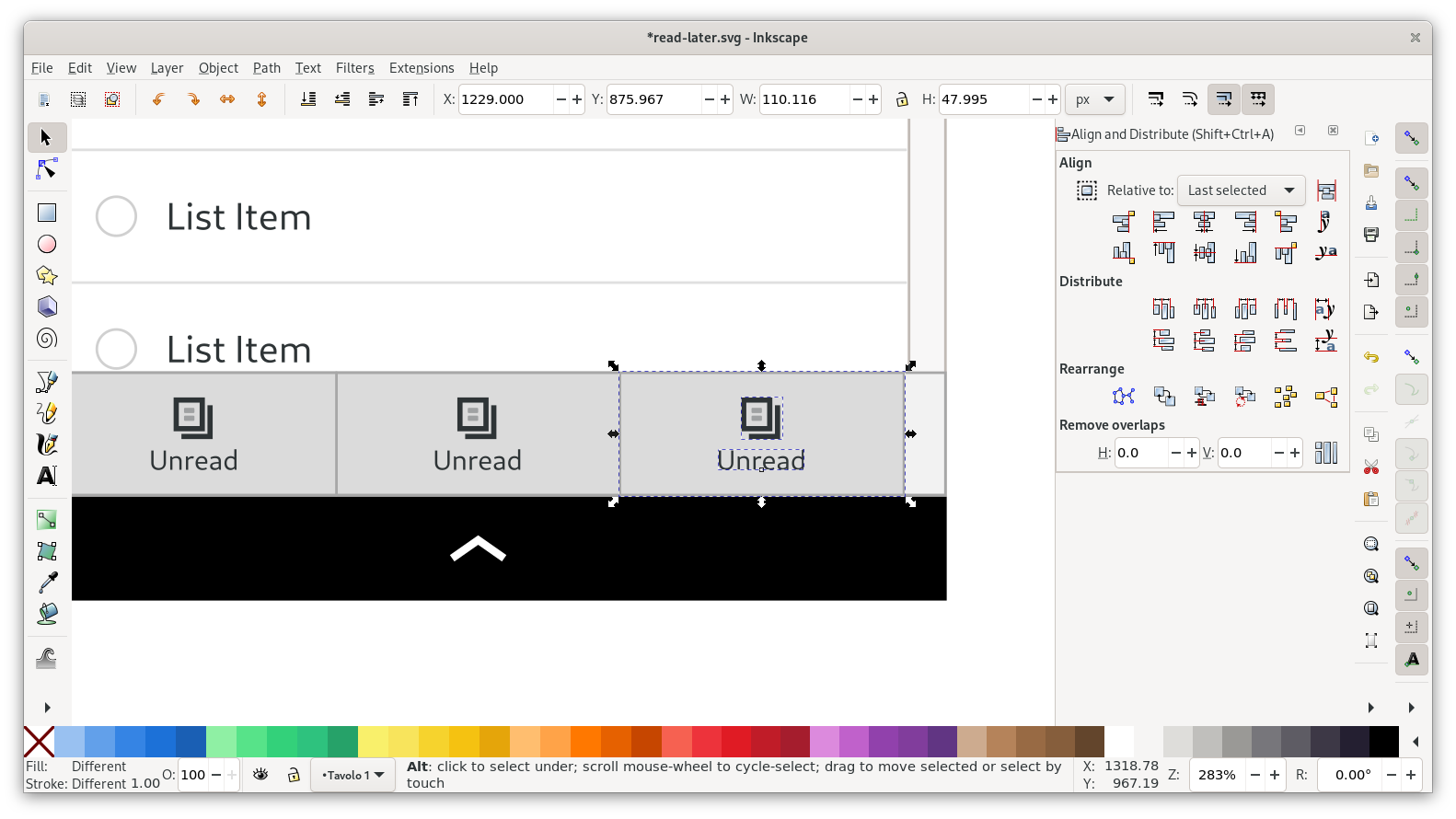
Mobile View
Now that we have a desktop view, let’s do a mobile version of it. Let’s have another look at our sketch:
We can re-use all the elements from the desktop view here, but we need to resize and move around a few things.
As a starting point for the layout, let’s bring in the mobile template. I like to align the mobile headerbar with the desktop one vertically, so all the headerbar buttons have the same vertical position.
Headerbar & Navigation
On mobile sizes there’s not enough horizontal space to keep the view switcher in the headerbar, so instead there’s just a title. The view switcher is in a separate bar at the bottom.
For the headerbar we can duplicate the buttons from the desktop mockup and use them to replace the placeholder buttons on the mobile template.
For the switcher, start by deleting all items except one. Then center the remaining one, and resize the background rectangle to a bit less than a third of the width of the view.
After that you can duplicate the item twice, and move the two additional switcher items to the sides:
Now you can change the icons and strings, and delete the backgrounds on two of the items, and we have a complete mobile switcher:
Content
Adapting the content is easy in this case. Duplicate the lists from the desktop mockup, left-align it with the lists from the template and delete the original lists.
Then we just need to resize the text boxes by moving the handle on the right of the baseline, truncate the text to two lines, move the images to 12px from the right edge, and center the “Show More” label.
Repeat the same thing for the second list, and we have a complete mobile layout!
Page Size & Export
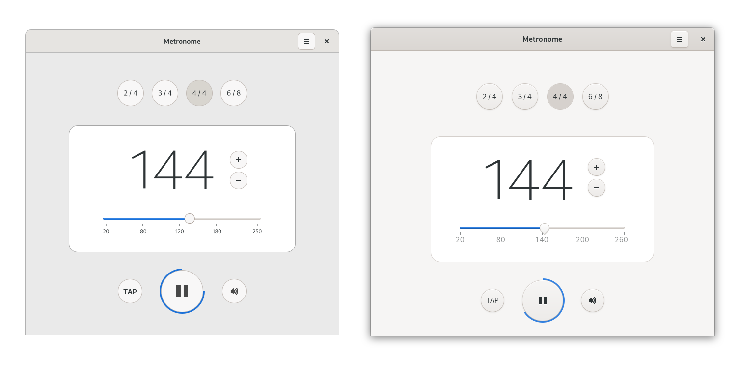
If we zoom out and look at the whole thing together, we can see that this looks pretty much done now:
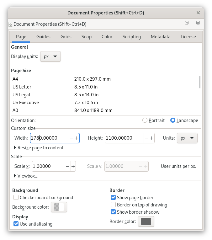
However, the canvas size is too big for the content we have. Open Document Properties (Ctrl + Shift + D) and change the size to about 1780×1100px.
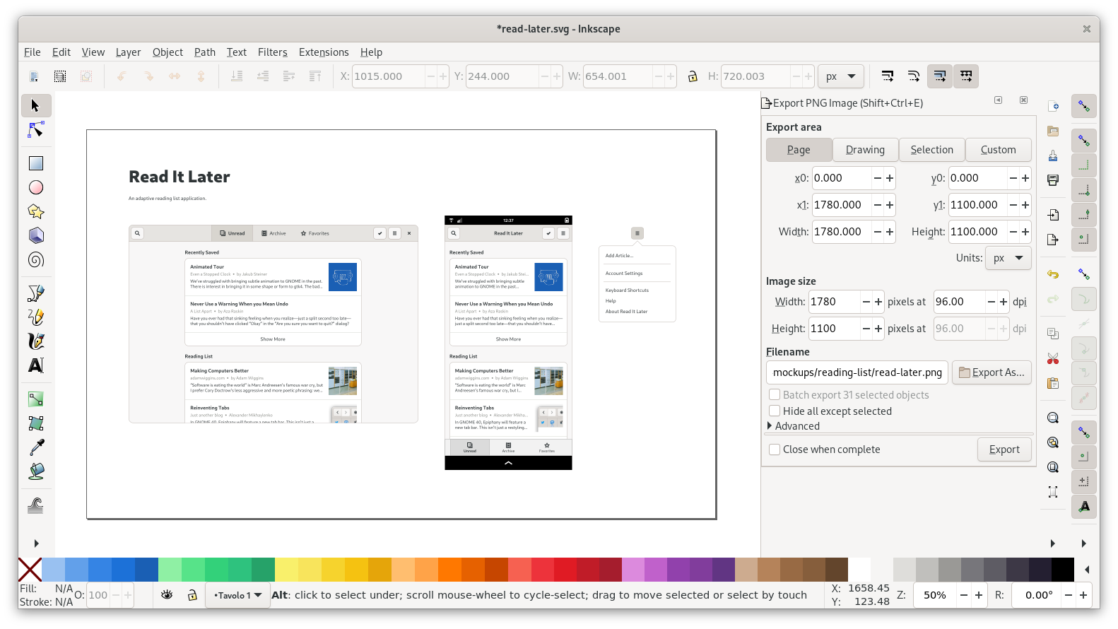
This is what it looks like with the new page size:
Now that the mockup is ready, let’s export a PNG for easy sharing. Open the Export dialog (Ctrl+Shift+E), choose “Page” at the very top, make sure the DPI is 96, and set the file path. Then press Export, and try opening the PNG in an image viewer to check if there are any issues you missed.
On the design team we usually then push the finished mockup to a git repository, but that’s out of scope for this tutorial.
Conclusion
Congratulation, you made it all the way to the end! I hope this was useful, and you’ll go on to make many great mockups using what you learned :)
You can download the SVG for the mockup I created for this tutorial from GNOME Gitlab. It might come in handy if you have problems with a specific part of the tutorial and want to see how I did it. By the way: The inkscape-tutorial-resources repository contains snapshots of all templates and resources used in this tutorial, in case the original ones change in the future.
Obviously for a real mockup we’d do additional screens (e.g. the article page, various other menus, settings screens, and the like), but I think we’ve covered most of the basics with just this one screen. If you have questions feel free to comment or get in touch!
After the name, the app icon is the most important part of an app’s brand. The icon can help explain at a glance what the app does, and serves as an entry point to the rest of the experience. A high quality icon can make people want to use an app more, because it’s a stand-in for the quality of the entire app.
Think of the app icon like an album cover for your app. Yes, technically the music is the same even if you have a terrible cover, but a great cover can capture the spirit of the album and elevate the quality of the thing as a whole.
Metaphors
The first thing you need is a metaphor, i.e. some kind of physical object, symbol, or other visual artifact that symbolizes your application.
Finding a good metaphor is a fuzzy and sometimes difficult process, as it’s often hard to find a physical object many people will recognize as related to the domain of your app. There are no hard and fast rules for this, but ideally your icon metaphor should fall into one of these categories:
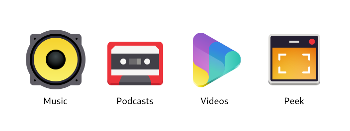
Physical objects directly related to what the app does (e.g. a speaker for Music)
Physical objects vaguely related to the app’s domain or an older analog version of it (e.g. a cassette tape for Podcasts)
Symbols related to the domain (e.g. the “play” triangle for Videos)
A simplified/stylized version of the app’s user interface (e.g. Peek)
There are also anti-patterns for metaphors which should be avoided, if possible:
My process for brainstorming metaphors is quite similar to the one I use to brainstorm names: I come up with a few ideas for physical objects, put them in a thesaurus to find more related ones, and repeat that until I have a list with at least a few viable candidates.
Let’s start with related physical objects:
Reading List
List
Book
Bookshelf
Article
Newspaper
Bookmark
How about related non-objects? Maybe we can find some more interesting objects that way:
Reading, the activity: Couch, reading light, tea/coffee, glasses
Later (as in, “read later”): Clock, timer
Collecting things: Folder, clipboard
Now that we have a few options, let’s see which ones are viable. Ideally, the metaphor you choose should have these attributes:
Somewhat specific to the app’s domain (e.g. a book is probably too generic in our case)
Recognizable at small sizes
Can be drawn in a simple, geometric style (this can save you a lot of work later on)
In this case, the most viable options are probably
Stack of books
Bookshelf
Bookmark
One of the above + a clock
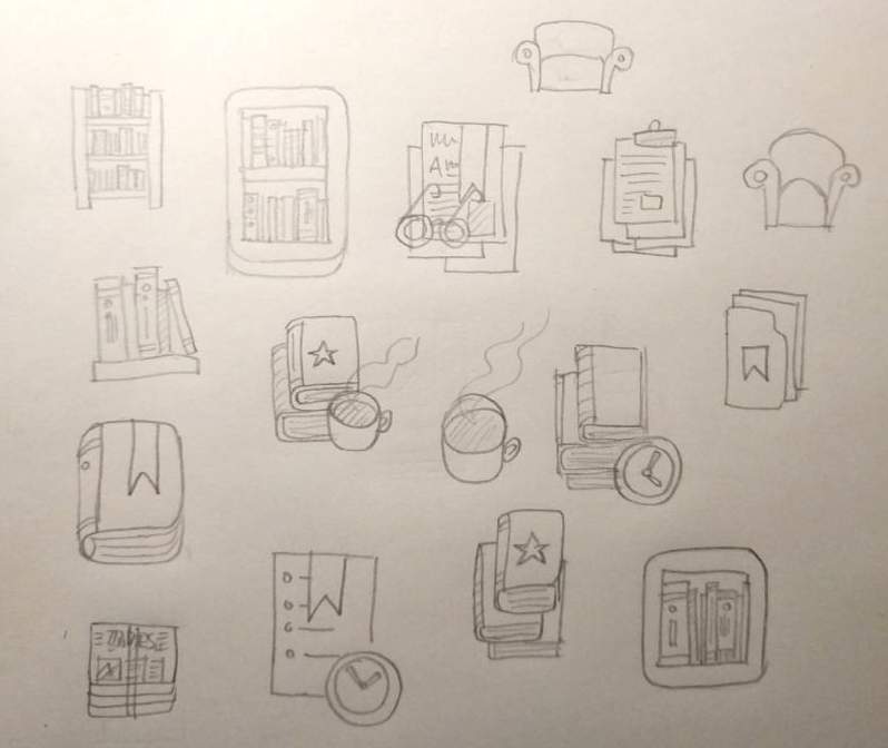
Sketches
Now that we have some metaphors, let’s try to sketch them to see if they make for good icons. I usually use pencil and paper for this, but you can also use a whiteboard, digital drawing tablet, or whatever else works for you to quickly visualize some concepts.
While sketching it’s good to think about the overall shape your icon will have. If it makes sense for your metaphor, try to make the icon not just a simple square or circle, but something more unique and interesting. If it doesn’t make sense in your case don’t force it though, there are other ways to make the icon visually unique and interesting, such as color and structure.
In this case, it looks like there are a number of viable concepts among our sketches, though nothing jumps out as the obvious best option. I kind of like the bookshelf, so let’s try going forward with that one.
Start from a Template
We now have a concept we like, so we can move to vector. This is where we can start using the shiny new icon design tools!
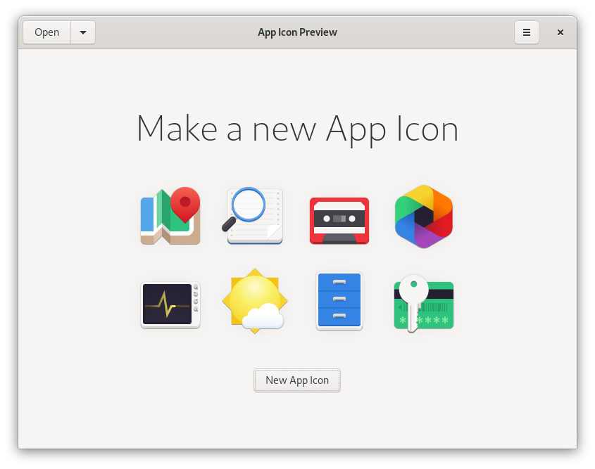
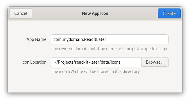
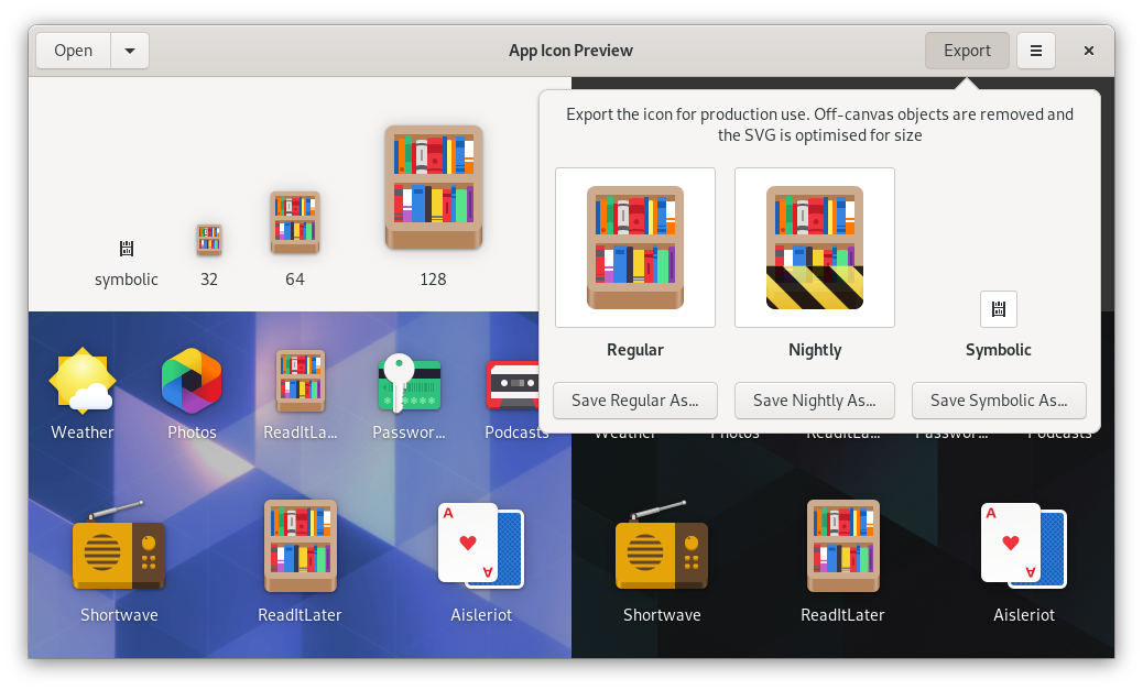
Open App Icon Preview, and hit the “New App Icon” button on the welcome screen. We’re asked for the Reverse Domain Name Notation name of the app (e.g. org.mozilla.Firefox), and where to store the icon project file.
In most cases you’ll want to keep this file in your app’s git repository. Think of it as your icon’s source file, which the final icon assets are later exported from.
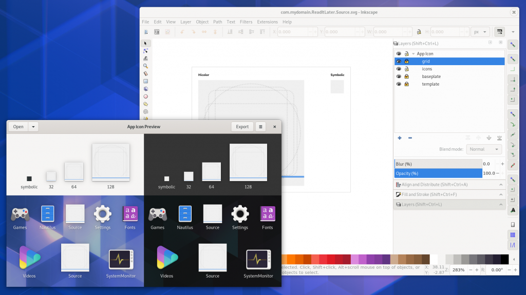
After that, the icon will open in preview mode in App Icon Preview. Now we open the same file in a vector drawing app, and edit it from there. Every time we save the source file, the preview will automatically update.
Now we have our icon source file open in both App Icon Preview and Inkscape. Icon Preview shows just the icon grid:
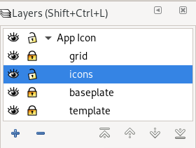
In Inkscape, open the Layers panel (Ctrl + Shift + L) and check out the layer structure. The icons layer is where the actual icon goes. The grid and baseplate layers contain the icon grid and the canvas respectively.
Behind everything else is the template layer, which doesn’t contain anything visible and is only needed so App Icon Preview can get the canvas size for preview and export. Don’t change, hide, rename, or delete this layer, because the icon might not show up in App Icon Preview anymore.
When previewing the icon in App Icon Preview you’ll want to hide the grid and baseplate layers (using the little eye icon next to the layers).
Make sure you have the GNOME HIG Colors palette in Inkscape. Inkscape 1.0 Beta has it by default, otherwise you can download it from the HIG App Icons repository and put it in ~/.var/app/org.inkscape.Inkscape/config/inkscape/palettes for Flatpak Inkscape or ~/.config/inkscape/palettes if it’s on the host. There’s also a color palette app, which you can get on Flathub.
Inkscape Tips
Once you’re familiar with the template, you can start drawing your icon idea as vector. If you’re using Inkscape and aren’t very familiar with the app yet, here’s a quick overview of the things you’ll likely need.
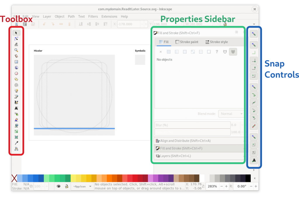
Toolbox (the toolbar on the left edge)
Selection/movement/scaling tool (S)
Rectangle tool (R)
Ellipse tool (E)
And if you’re doing something a little more advanced:
Bezier path drawing tool (B)
Path & node editor (N)
Gradient editor
Dialogs Sidebar (configuration dialogs docked to the right side)
Fill & Stroke (Ctrl + Shift + F)
Align & Distribute (Ctrl + Shift + A)
Layers (Ctrl + Shift + L)
Snap Controls (the toolbar on the right edge) Inkscape has very fine-grained snapping controls, where you can configure what should be snapped to when you move items on the canvas (e.g. path nodes, object center, path intersections). It’s a bit fiddly, but very useful for making sure things are aligned to the grid. The icon tooltips are your friends :)
Of course, teaching Inkscape is a bit out of scope for this guide. If you’re just getting started with it, I recommend doing a few beginner tutorials first to familiarize yourself with the basic workflows (especially around the tools listed here).
The GNOME Icon Style
Traditionally, GNOME app icons were very complex, with lots of photorealistic detail and many different sizes which had to be drawn separately. This changed when we revamped the style in 2018, with the explicit goal of making it easier to produce, and more approachable for third party icon designers.
The new style is very geometric, so in many cases you can draw an entire icon with just basic shapes.
These icons consist of rectangles (some with rounded corners) and circles exclusively
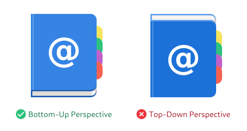
Perspective
One important attribute of the style is the abstract perspective. Even though the style is simple and geometric, it’s not “flat”: It makes use of material, depth, and perspective, but in a way that is optimized for easy production as vector.
The perspective works by “folding” horizontal and vertical layers into one dimension, so you can see the object orthogonally from both the top and the front.
This results in a kind of “chin” an the bottom of the object, which is shaded darker than the top surface, since light comes evenly from the top/back.
The perspective is achieved by folding the top and front views together
In practice, this usually doesn’t have a huge impact, since it’s also suggested to make objects not too tall, when possible. A lot of icons are just a simple 2D shape with a small chin at the bottom.
That said, it can look very weird when you get the perspective wrong, e.g. by folding the layers from the top/back instead of the front, so it’s important to keep this in mind.
Material & Lighting
Icons can make use of skeuomorphic materials (e.g. wood, metal, or glass) if it’s needed for the physical metaphor, but outside of those special cases it’s recommended to keep things simple.
Examples of icons with realistic materials
Straight surfaces have flat colors (instead of e.g. slight vertical gradients), but curved surfaces can/should have gradients. The corners on the chin on rounded base shapes should have a highlight gradient.
The highlight on the corners of the chin is done with a horizontal gradient.
Shadows inside the icon should be avoided if possible, but can be used if necessary (e.g. for contrast reasons). Do not use drop shadows that affect the app outline though, because GTK renders such a shadow automatically.
Icon Grid & Standard Shapes
In order to make sure icons are somewhat similar in size, alignment, etc. we have a grid system.
The canvas is 128x128px (for legacy reasons), but you’re designing for 64×64, while also taking 32×32 into account where possible. In general, it’s good to make sure you’re putting as many lines as possible on grid lines, so they’re sharp even at 32. Testing in App Icon Preview helps a lot with this.
Each of the grid squares is 8×8 pixels. In order to be pixel-perfect at 64 and 32, orthogonal lines/edges should be on these grid lines (or fractions of them).
The icon grid also has some standard shapes for wide, tall, square, and circular icons, which can be used as a basis for the structure of the icon if it makes sense for the metaphor (e.g. if the object is more or less square, use the square standard shape).
Protip: Great Artists Steal Reuse
There are lots of apps with icons in the GNOME style out there, and they’re all free software. If there’s something you like about another app’s icon you can get the source from GNOME Gitlab or Github, look at how a certain object is drawn, or just take (parts of) other icons and adapt them to your needs.
This is especially useful for common objects needed in many icons, e.g. pencils, books, or screens. The icon template in App Icon Preview comes with a few of these common objects on the canvas, which can be a good starting point for new icons.
Draw, Preview, Repeat!
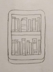
Armed with this knowledge about the style and tooling, we can finally jump in and start drawing! In this case I re-did the sketch at a slightly larger size to get a better feel for it:
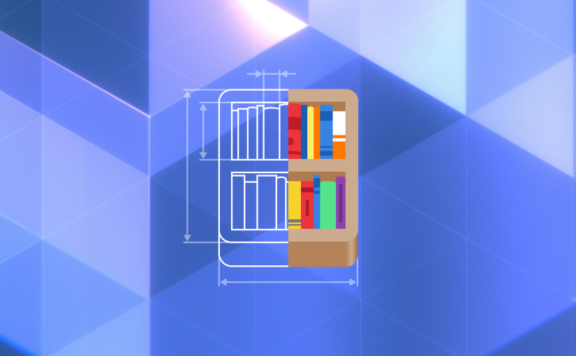
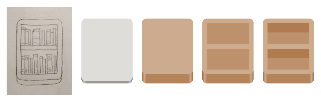
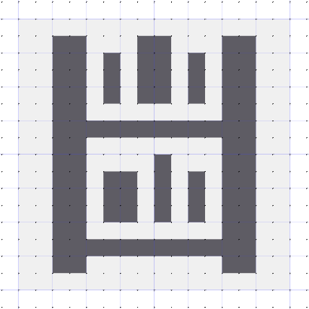
Now let’s try vectorizing it. Since the overall shape is a tall rectangle, we can start with the tall rectangle standard shape. If we change the color to brown, and make the chin at the bottom thicker (by resizing the top layer vertically), we have the basic frame for the shelf.
After that we can add the actual shelves, by simply adding two slightly darker brown rectangles (the back of the shelf), and two wide rectangles at the top of these (the bottom of the horizontal shelf).
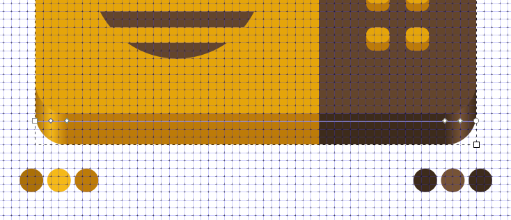
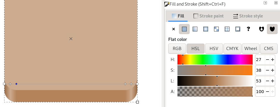
Changing the color of the chin is a bit tricky, because it has a horizontal gradient. It requires selecting the bottom rectangle with the gradient tool, clicking each gradient stop manually and changing it to brown by clicking one of the colors in the color palette at the bottom edge of the window.
If you use e.g. Brown 3 from the palette for the top surface, you can use the Brown 4 or 5 for the chin, and Brown 2 or 3 for the highlights in the corners.
Let’s see what this looks like in Icon Preview now:
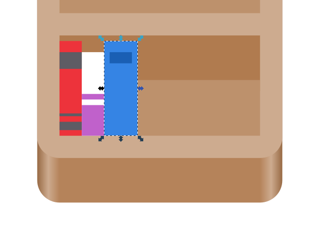
Getting there, right? Now let’s add some books. Lucky for us, book spines can also be drawn as rectangles, so this shouldn’t be too hard. We don’t want too much detail, because we’re designing for 64px first and foremost. Something like 10 books per row should work.
100% rectangles :)
If we want to get fancy we can also round the top of the spine on some of the books by adding an ellipse of the same color, but it’s not really needed at this size.
Finished full-color icon in App Icon Preview
Looking good! I think we’re done with the full-color icon.
If at this point in the process you feel like the concept or metaphor isn’t working out (for example because it doesn’t look interesting enough, or because it’s too complicated to work at small sizes) you can always go back a few steps and try vectorizing a different one of your sketches. The nice thing about the simplicity of this style is that you can do this without losing weeks of work, making iteration on concepts much more feasible.
Symbolic
Now that the full-color icon is done, we can start thinking about the symbolic icon for our app. Ideally this is a simplified, one-color version of the app icon, designed for a 16×16 px canvas. It’s used in notifications and some other places in the Shell where a colorful icon would not be appropriate.
I won’t go into too much detail on this here since drawing good symbolics is a big topic, and this post is too long already. I might expand on this in a future post, but for now here are a few quick tips:
Alignment to the pixel grid is very important here if you don’t want the icon to end up a blurry mess
Stick to the original metaphor if at all possible, go for something else if not
Test in App Icon Preview to make sure the icon is actually recognizable at 16px
If possible leave the outermost 1px empty on all sides
Most strokes should be 2px, but they can be 1px in some cases
Don’t overthink it for the first version. This icon is a secondary thing, and it’s relatively little effort to fix/redo it later :)
Our bookshelf example looks tricky at first glance, because we have all these tiny books, and only 16 pixels to work with. However, if we simplify it enough it’s not too hard to get something decent. We can just use a two tall and two wide rectangles to draw the shelf, and three smaller rectangles as books on each shelf:
This one is literally just rectangles :)
And that’s it! We have a real app icon now, with everything that entails. If you want to have a look at the source for the icon we made in this tutorial, you can download the SVG here. It includes the final icon and some of the intermediate steps.
Export
Now that we’re happy with the icon, we can press the “Export” button in App Icon Preview and save the final icon assets. The app will automatically optimize the SVGs for size, and if you have nightly builds of your app, you also get an automatically generated nightly icon without any extra work!
Congratulations for making it all the way to the end! I hope you found this tutorial useful, and will go on to make great icons for your apps. If there’s anything you found unclear while following along, please let me know in the comments.
So you’ve decided to make a new app for GNOME, and designed a great interface for it. Now you want to start building it, so you open Gitlab to create a new repository. But then, oh no — it wants a name for the repository. Existential dread sets in.
Naming things is hard, and naming user-facing things is even more so. App names are read, pronounced, heard, and remembered by lots of people. The name is, along with the icon, the most important identifier for your project. With this tutorial I hope to make finding a great name for your app a bit easier.
“An application’s name is vital. It is what users will be first exposed to, and will help them decide whether they want to use an application or not. It is a major part of your application’s public face.”
Finding a good name is not always easy, but putting in a bit of effort up-front is worth it, because renaming the app once it’s established is much harder and messier.
A good name should:
Consist of one or two simple nouns
Be related to the app’s domain (e.g. Celluloid for a video app)
Be short (less than 15 characters)
Be easy to pronounce
Make it easy to come up with a good icon (e.g. by referencing a physical object that could be used as the icon)
Use title case (e.g. Icon Preview instead of iconPreview)
A good name should avoid:
Using trademarks or names of other projects (e.g. GNOME MPV)
Having a “G” prefix (e.g. GParted)
Overly complicated names and acronyms (e.g. GIMP)
Puns and inside jokes (e.g. D-Feet)
Non-standard punctuation or whitespace (e.g. UberWriter)
Made-up words or word combinations (e.g. Inkscape)
The Process
Over the years I’ve been involved with naming a lot of projects, and at this point I have a process which consistently produces pretty good results. It more or less goes like this:
Write down all the words related to the app’s domain you can think of
Do a thesaurus search for some of those words to find even more related words
When you have about 15, start picking out some of the best-sounding ones, and look at their other qualities. Are they too long? Easy enough to pronounce? Do they have any unintended negative connotations?
Once you have picked a handful of favorites, do a quick check to see if the names are already taken
Among the ones not taken, pick your favorite one
Of course, when naming an app which is part of GNOME itself, the rules are a little different because these apps have completely generic names describing their function or the type content they show (e.g. Files, Image Viewer, Fonts, Music). That’s a much more rare (and usually easier) case though, so in this tutorial I’ll focus on independent third-party apps.
Let’s look at a real-world example of this process. A few months ago I was involved in renaming an internet radio app. At the time it was called Gradio, which was a bad name for many of the reasons mentioned above, and we wanted a nicer name for the new, completely rewritten version of the app.
1. Brainstorm
So, internet radio. What words immediately come to mind?
Radio
Transmission
Stations
These are pretty generic, so let’s branch out a bit. As with most digital technologies it’s hard to find nice metaphors, but we can make use of the analog predecessor to it (i.e. analog radio). Are there physical objects related to that which we could use?
Receiver
Headphones
Antenna
Maybe something related to analog radio technology?
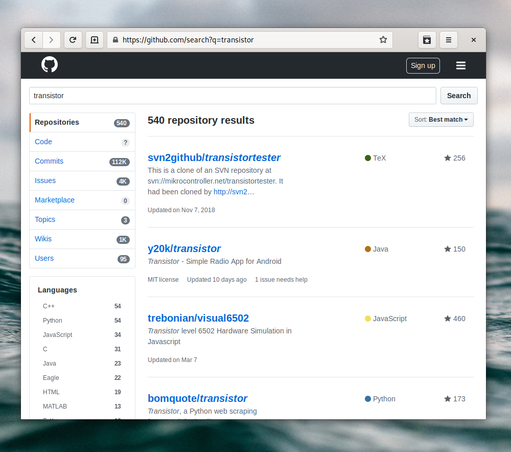
Transistor
Frequencies
What about names of people who worked on the technology?
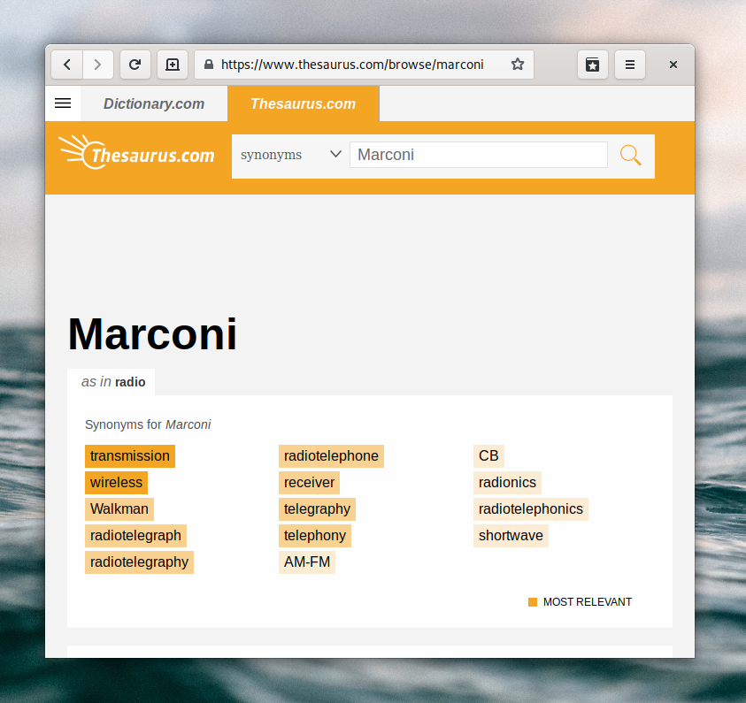
Marconi
Hertz
2. Thesaurus
Now that we have a few words to start with, let’s plug them into a thesaurus and see if there are any good related words. This is usually pretty hit or miss, as most related words you’ll find will not be relevant to the domain or make sense as names. However, after a few searches I always find a few good options that I didn’t think of before.
Update: I recently found another good website to find related words, appropriately named relatedwords.org.
Here are a few additional words from thesaurus searches:
Transmission
Shortwave
Wireless
Decibel
In this particular case we also had a brainstorming session on Matrix with a group of people from the community, which produced a few more options:
Longwave
Shortrange
Hzzzzz
Spectrum
Waves
3. Pick the best ones
Now we have about 20 words, which is a good place to stop brainstorming and start looking at which ones would make good names.
This process is not very scientific, just look at each word and imagine it as the name of the app. In particular, pay attention to the length of the name, ease of pronunciation, and whether it sounds nice.
In this case, some of my favorites are:
Transistor
Hertz
Spectrum
Shortwave
They’re all relatively short, easy to pronounce, and sound good as app names. The main question at this point is whether we can use them or if they’re already taken.
4. Check if they’re taken
I usually start off by searching directly on Github, to see if there are other FOSS projects already using the name. If I don’t find anything there, I search for the name on on Duckduckgo, adding “app” or “open source”.
In many cases you’ll find something somewhere using the name already. That doesn’t necessarily have to be a problem if it’s an app/project/company in a different domain, but it’s good to avoid large projects and companies.
In this case, it turns out “Transistor” is already a radio app for Android. Since it’s an app doing something very similar, people might think our radio app is affiliated with this project, which we want to avoid.
“Hertz” is the name of a car rental service. It’s a pretty big company, so best to stay away from that as well.
“Spectrum” is already the name of a forum software (which looks really cool btw). The potential for confusion is low, but the project looks well-established with 6000+ stars on Github, so not a great option.
“Shortwave” is used by a bookmarking app, and there are some search results related to actual analog radio software, but nothing that looks big or problematic. This seems like a viable option.
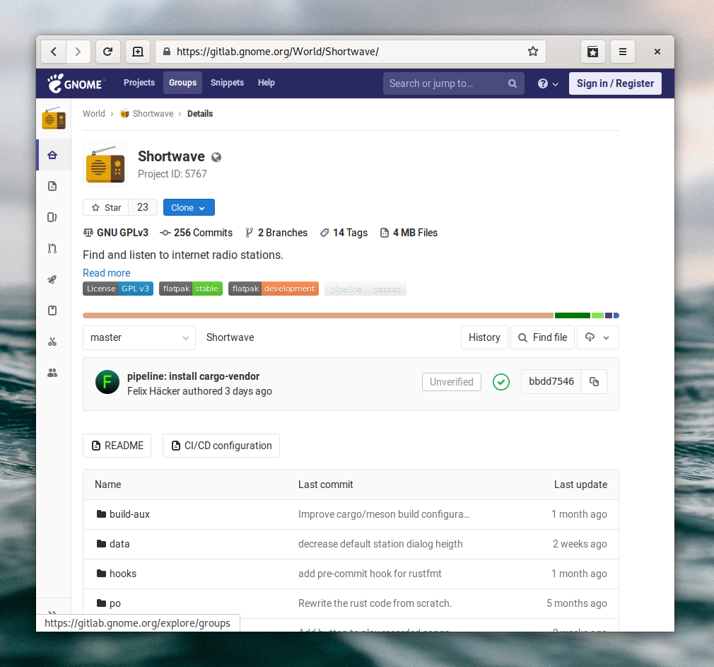
5. Pick a winner
At this point you probably already know which of the viable options you like best, so just go ahead and make it official. In our example,”Shortwave” won because it was short but distinct-sounding, related to the domain, a pronounceable English word, and not taken by any major projects or companies.
The Shortwave Gitlab repo with the new name
If you find that all your favorites are taken, go back to the first steps and do some more brainstorming. The perfect name for your app is out there, and you’ll find it!
Bonus: Good Examples
For inspiration, here are some examples of well-named third party apps in the GNOME ecosystem, and what makes their names great:
Fragments — A torrent app. The name is great because it’s unique among torrent app names (which usually reference water, e.g. Deluge), yet still clearly connected to the domain (BitTorrent splits up files into lots of tiny parts and sends them in random order).
Peek — A GIF screen recorder. The name is very appropriate since the app is for making short recordings of small parts of the screen. The app feels small, quick, and frictionless, which the name perfectly encapsulates.
Teleport — Sends files across the local network. The idea behind Teleport is to make sending a file across the local network effortless compared to other methods, such as using web services or USB drives. Using a sci-fi metaphor in the name lends itself well to that.
So you’re excited about the Librem 5 and GNOME going mobile, and want to start building an app for it. Of course, the first step is to design your app. This can seem quite challenging if you’re just starting out with a new platform, but fear not! In this blog post I’ll walk you through some of the most important UI patterns, and the process of going from idea to mockups step by step. Throughout this I’ll be using a read-it-later app as an example.
The GNOME design philosophy
Before starting to design for a platform, it’s good to familiarize yourself with the design philosophy of the platform. The GNOME Human Interface Guidelines have a “design principles” page which I encourage you to read in its entirety, but will paraphrase a few highlights from here:
Simplicity and Focus — Make sure you have clear goals for your app from the outset, and focus on those. Often it’s better to make a separate application to cover an additional use case rather than cramming too many things into one app (e.g. video podcasts are different enough from audio podcasts to be better off as their own app).
Search and Undo — If there are large amounts of content in your app, provide full-text search to make it easy to find things. Be forgiving about people making mistakes by making it hard to lose data, and never use a warning when you mean undo.
Avoid Preferences — “Just adding an option” often seems like a quick fix, but in most cases you’re just treating symptoms rather than the root cause. It’s better to figure out what that root cause is and fix the problem for everyone, rather than papering over the cracks with a preference. I highly recommend this article by Havoc Pennington on the topic.
Design Process
Now that we’re full of high-minded ideals, let’s jump into the actual design process. Let’s design a great read-it-later app.
We will follow the GNOME design process, which primarily consists of three steps (plus iterations):
Define goals and non-goals for your app
Collect relevant art, i.e. examples of similar apps to borrow ideas from
Make sketches/mockups of the main views and user flows
1. Define Goals
The app we’re designing is going to be a native client for read-it-later web services (such as Pocket). These services allow you to store articles and other web pages that you are interested in, but don’t have time to read right now. That way you can catch up on all the stuff you saved later on, when you have more time. As such, our primary goals are:
Listing your saved articles
Providing a great, focused experience for reading articles in the app
Helping you actually catch up with your reading list
Storing articles offline, so they can be read without a network connection
Some non-goals, i.e. things that are out of scope for this application:
Social features
Content discovery
2. Relevant Art
The next step is to find some examples of existing apps that do similar things. It’s good to look at how other people have solved the same problems, what they do well, and what could be improved before jumping into designing a new app.
So let’s check out the competition:
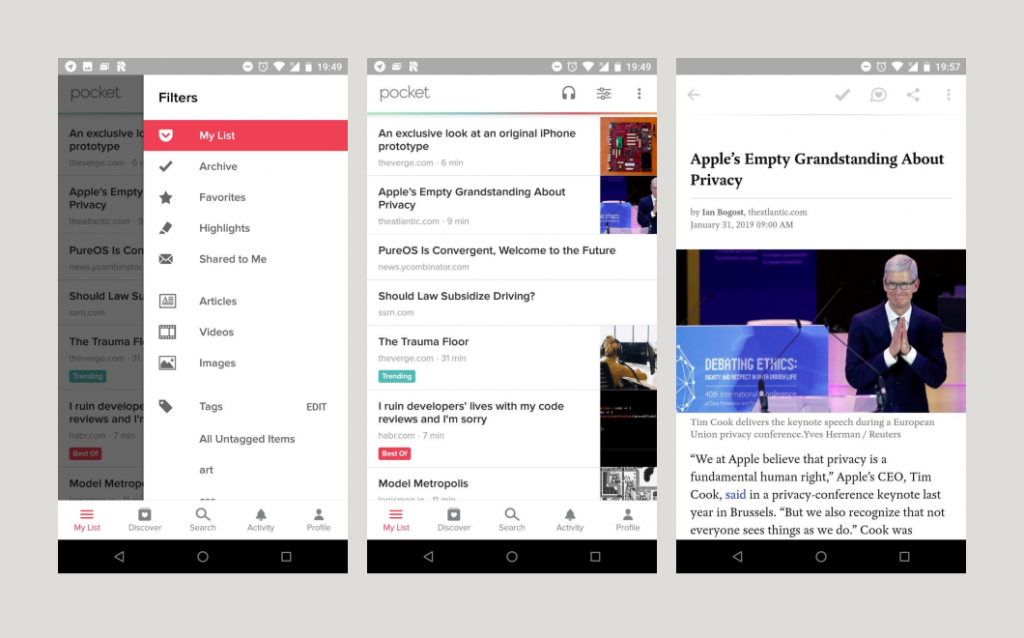
Pocket on Android (screenshots by me)
Pocket on Android has a lot of features, and a pretty complicated interface. It has lots of categories, social features, a discover section, text-to-speech, and much more. I’ve personally never used most of these features, and they make the app feel quite cluttered. In my experience Pocket is also not very good at helping me get through the list of things I’ve already saved. It feels like it mostly wants me to discover new things to save (and then not read).
Clearly there are some lessons to be learned here for our app.
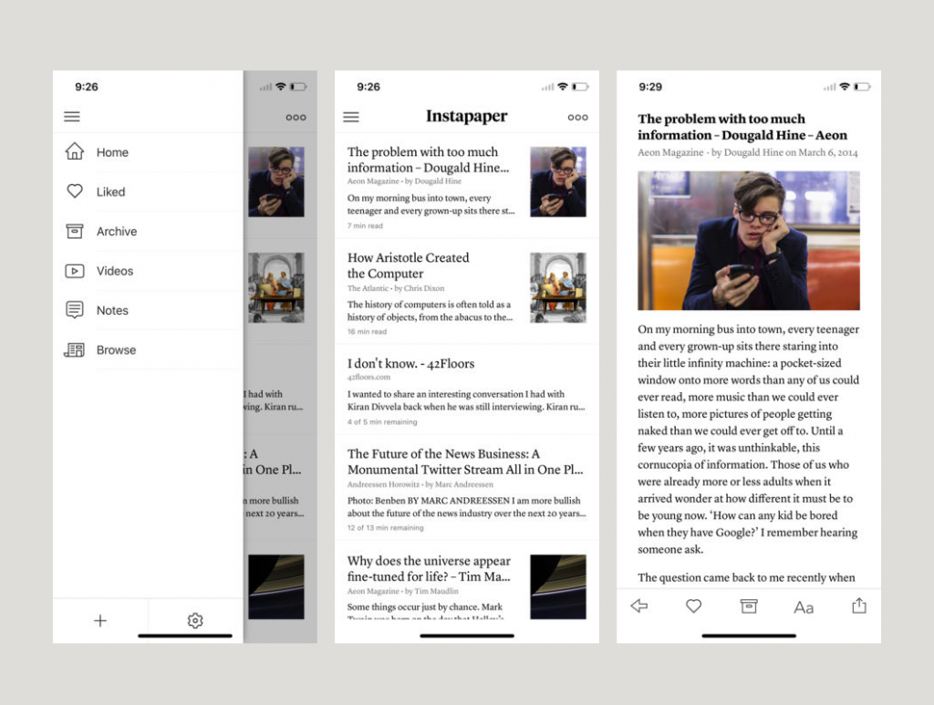
I’ve never used the app myself, but judging from screenshots, Instapaper’s UI feels a lot saner and more focused than Pocket. I also really like the rich article previews in the list view and the nice typography.
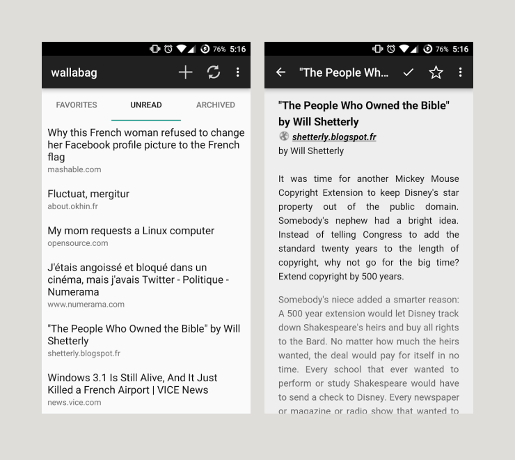
Wallabag is a self-hosted alternative to Pocket and Instapaper. This Android client for it (also called Wallabag) is not very sophisticated UI-wise, but it’s a good example of a very simple native client for this kind of service.
Structurally, these apps are all quite similar: a main view with a list of articles, and an article view that just displays the article in a clean, readable format.
Depending on the service, there are multiple lists for different types of articles such as Archive, Highlights, Favorites, Notes, etc. To keep things simple, and because we’re targeting Wallabag first and foremost (since it’s the only self-hosted service), we’re going with only three categories: Unread, Archive, and Favorites.
This means that our application is going to have four main screens we need to design: the three article categories mentioned above plus a reader view, which displays the article content.
3. Sketches/Mockups
Now that we have a basic idea of the structure of the app, we can finally dive into designing the UI. Personally, I like starting off with sketches on paper and then move to Inkscape for more detailed mockups, but you can use any tool you’re familiar with. You don’t need to be good at drawing or a particular application for this, just find a way to visualize your ideas which works for you :)
If you’re using Inkscape for mockups, you might want to check out the GNOME mockup template which contains some common layouts and patterns to use in your designs. If you are looking for GNOME-style symbolic icons for your mockups, you can find them here, here, and here.
Navigation
When it comes to the layout of an interface, one of the first things to consider is what navigation structure makes the most sense for the type of content you have.
The most common navigation patterns in GNOME apps are the Stack, the View Switcher, and the Sidebar List.
Example of Stack navigation in GNOME Photos
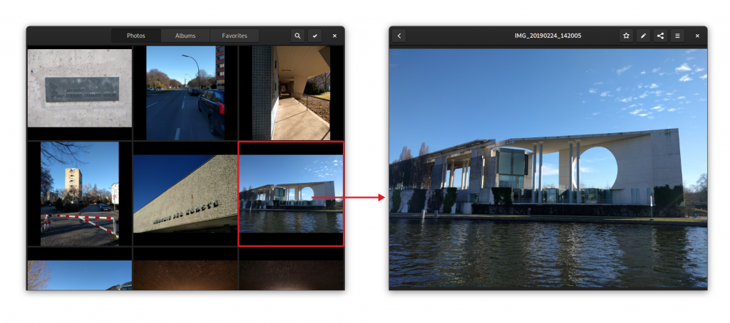
The Stack pattern is when you have completely separate views with no shared UI, and a back button to go back to the overview. This is what Photos does for navigating between the stream of photos and the detailed view of an individual photo, for example. There is a bit more friction to switch between views than with other patterns, but it’s also more focused. This pattern is great for situations where you don’t switch between views a lot.
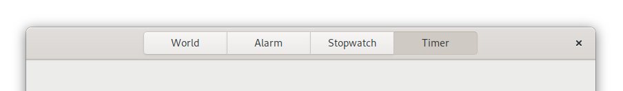
View switcher in GNOME Clocks
The View Switcher is for cases where there are a small number of views that are equally important or need to always be easily accessible. It’s used in GNOME apps such as Clocks, Music, and Software as the primary navigation. On the desktop, this switcher is always in the headerbar, but there’s work on a new adaptive version of it, which moves to the bottom of the screen for mobile. This is not quite ready yet, but will hit a version of Libhandy near you soon™.
Sidebar List in Fractal
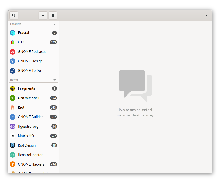
The Sidebar List is for cases where there are a lot of views that you need to switch between often. For example, it’s used in Fractal for the room list, because it gives an overview of all rooms and allows for quick context switching. Of course, on mobile there’s not enough space for a content pane and a sidebar, so there is a Libhandy widget called Leaflet, which transforms from a Sidebar List on desktop to a Stack on mobile.
Experimental branch of GNOME Settings using HdyLeaflet to switch between Sidebar List and Stack navigation
For our read-it-later app, we need navigation to switch between the different lists (Unread, Archive, Favorites), and to switch between list and article views.
The former is a small set of views that we want to be easily accessible, so a view switcher is a good fit. Since we can’t use the shiny new adaptive view switcher widget yet, we can use a plain old view switcher in the header bar for now (though we can already design the UI with the new switcher in mind).
For the latter we could either use a stack or a sidebar list (using the Leaflet widget so it works on mobile). Since we want this app to be a focused reading experience and switching back and forth quickly between articles is not a very common use case, a Stack is probably the best solution here.
This means that our main screens will look something like this:
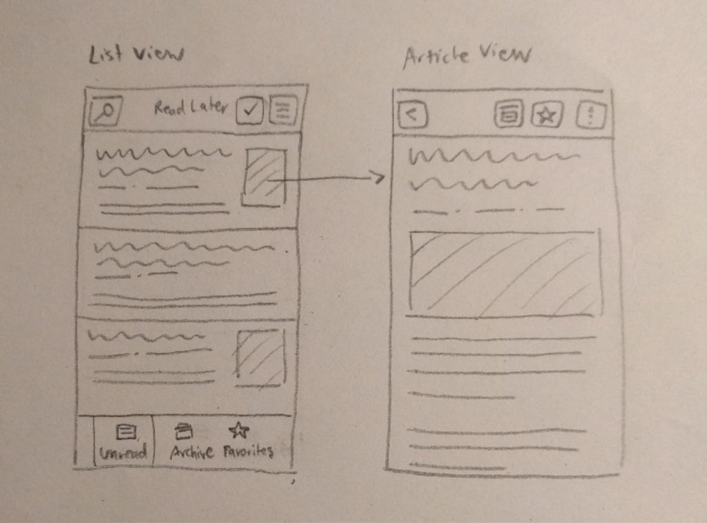
Quick pencil sketch of the layout for the list and article screens
Article List Screens
Now that we have a basic navigation structure we can design the individual screens in more detail. The three article list screens are basically the same lists with different content.
The main purpose of these screens is to provide a nice, legible list of the saved articles that entices people to catch up with their reading list. In order to do this we’re going with a comfortable layout including article title, preview, and some information about the article.
To help people catch up with their saved articles, we should also try to make the content as interesting as possible. A simple reverse-chronological list of saved items is quite boring, and I’ve noticed in my own use that I often scroll down the list randomly to discover older articles. A potential way to build this into the core experience would be to show the reading list in randomized order, and show the most recently saved articles at the top in a separate category. I’ve tried that in the mockups below.
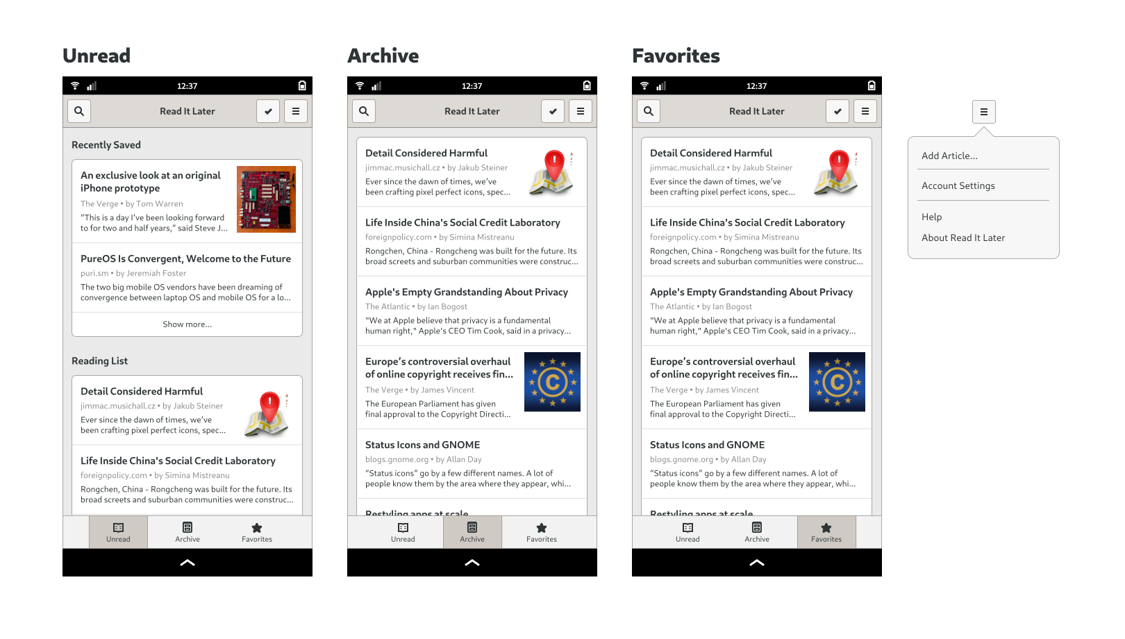
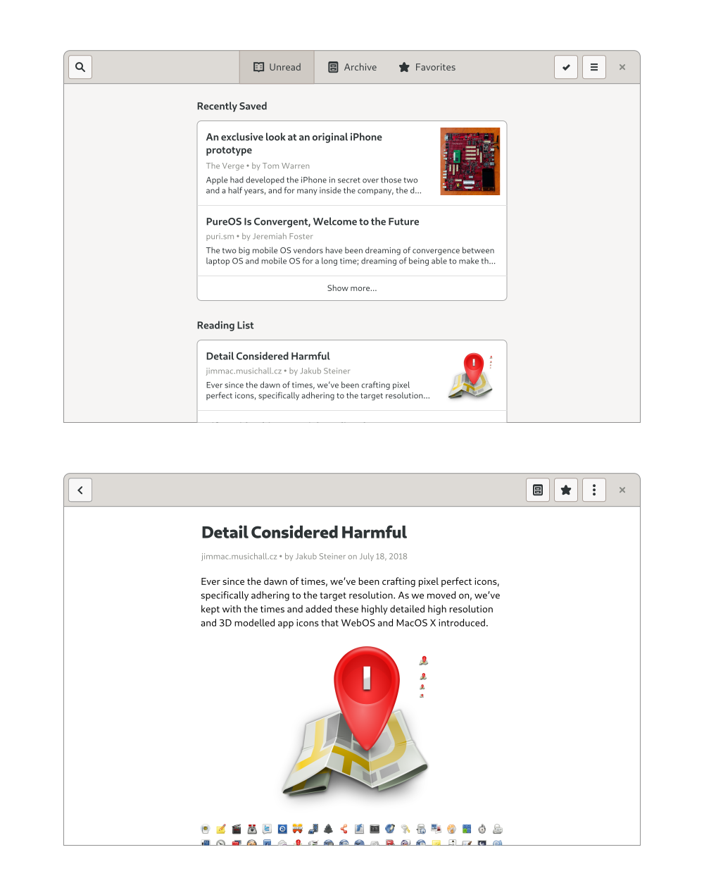
Mockups of the Unread, Archive and Favorites screens (the latter two are structurally identical, though of course in the real app they’d have different content)
In terms of actions, we need to expose search and selection mode (for operations on multiple elements), as well as the application’s primary menu. The primary menu contains global app-level things such as Help, Preferences, and About.
In selection mode we need the ability to move articles to Favorites and Archive, and delete them from our reading list. Since this is not essential functionality though, we won’t be doing designs for it yet. If you want to learn more, have a look at the selection mode page in the GNOME HIG. The same goes for search (relevant HIG page).
Article Screen
The article screen’s job is pretty straightforward: provide a great reading experience for the saved articles. Since many websites kind of suck in this regard, a reader mode (like Epiphany and Firefox have) should be the default view whenever possible. However, since there’s no guarantee that a given article will be rendered perfectly, we need some way to show to the website with its native styling when necessary.
We also need a way to move an article to Favorites and Archive, delete it, and share it. The most important actions are usually exposed directly in the header bar, but for less important actions (or if there’s not enough space), we can use a secondary menu.
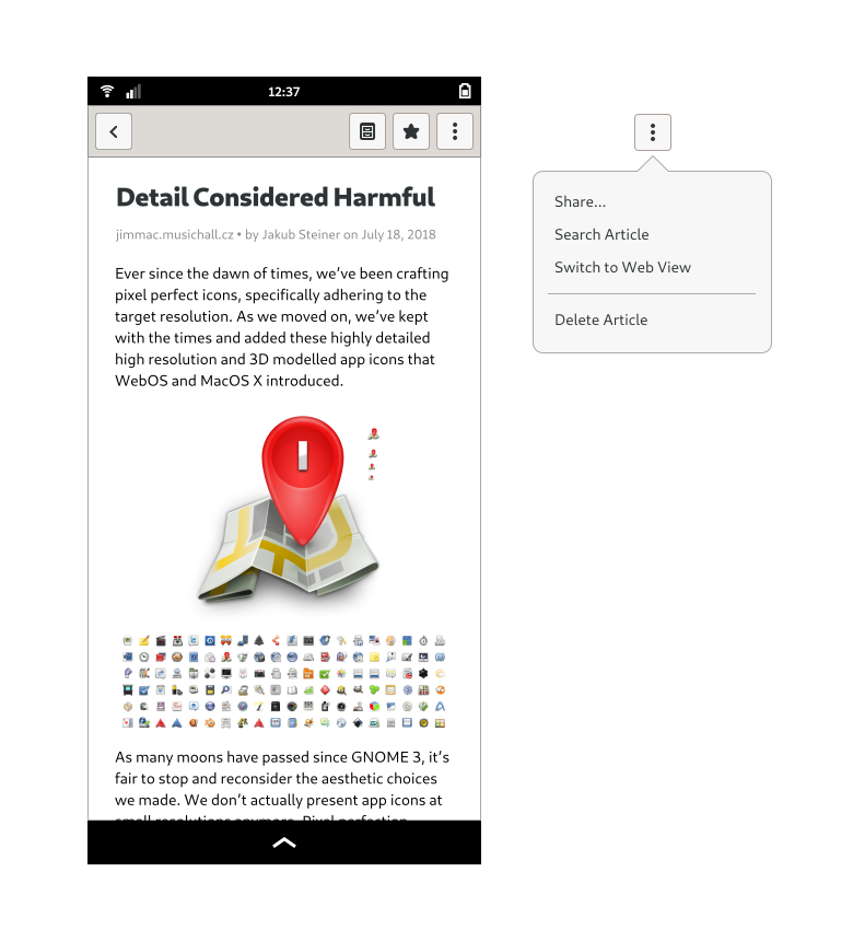
Mockup of the article screen
Desktop
We now know more or less what the app looks like on mobile, but what about the desktop? As with responsive web design, if you design your app for mobile first, it’s usually pretty easy to make it work well on larger screens too.
In this case, since we don’t have any sidebars or other complicated layout elements, the main change happening at larger sizes is that the content column width grows with the window, until it reaches a maximum width comfortable for reading. This can be implemented by wrapping the content area in an HdyColumn. The view switcher also moves up to the header bar, and there is a close button on the right side.
Desktop mockups of some screens
There’s more…
What we now have is the basic structure and most important screens of the application, but that’s of course far from everything. We don’t yet have designs for login and account settings, empty states, first run experience, errors, search, and a number of other things. I wanted to stick to the basics for this post, but perhaps I could expand on these things in future blog posts if there’s interest.
It’s also worth noting that mockups are never final, and interfaces almost always change during implementation, as you learn more about use cases, the underlying technology, and other constraints. Ideally you’d also do some informal user testing on real people, and get feedback on the design that way.
I hope this has been useful as an introduction to designing apps for the Librem 5 (and GNOME more generally). If you have any questions feel free to drop by on #gnome-design on IRC/Matrix or the Librem 5 apps Matrix room (#community-librem-apps:talk.puri.sm).
If you want to play with the mockups I made for this tutorial, here’s the source SVG.
I’m very happy to announce that I’ve joined Purism. It’s awesome to be working for a company that not only cares about software freedom, but also has Ethical Design as a core principle. My role there is UI/UX designer on the Librem 5, a phone built from the ground up to run free software and GNU/Linux.
As a past user of first Firefox OS and then Ubuntu Touch, I couldn’t be more excited about this. Unlike these previous failed efforts, the Librem 5 is focused on freedom and privacy, because it’s made by people who share that philosophy. It’s using PureOS (a full GNU/Linux distro based on Debian), instead of a completely different technology stack with Android drivers (like Firefox OS and Ubuntu Touch did). To make things even sweeter, the UI will be GTK-based, and we’re using upstream GNOME apps (which we’re adapting with a responsive layout). We’ll also be working on new applications for the phone, such as Calls and Messages, which will work on the desktop as well. We want as much of this work as possible to go upstream, so it can benefit all GNOME users.
It’s still early days, but some of the work around apps should become more concrete in the coming weeks, so expect phone-related discussions in #gnome-design. Let’s make a killer GNOME phone!


