So you’re excited about the Librem 5 and GNOME going mobile, and want to start building an app for it. Of course, the first step is to design your app. This can seem quite challenging if you’re just starting out with a new platform, but fear not! In this blog post I’ll walk you through some of the most important UI patterns, and the process of going from idea to mockups step by step. Throughout this I’ll be using a read-it-later app as an example.
The GNOME design philosophy
Before starting to design for a platform, it’s good to familiarize yourself with the design philosophy of the platform. The GNOME Human Interface Guidelines have a “design principles” page which I encourage you to read in its entirety, but will paraphrase a few highlights from here:
Simplicity and Focus — Make sure you have clear goals for your app from the outset, and focus on those. Often it’s better to make a separate application to cover an additional use case rather than cramming too many things into one app (e.g. video podcasts are different enough from audio podcasts to be better off as their own app).
Search and Undo — If there are large amounts of content in your app, provide full-text search to make it easy to find things. Be forgiving about people making mistakes by making it hard to lose data, and never use a warning when you mean undo.
Avoid Preferences — “Just adding an option” often seems like a quick fix, but in most cases you’re just treating symptoms rather than the root cause. It’s better to figure out what that root cause is and fix the problem for everyone, rather than papering over the cracks with a preference. I highly recommend this article by Havoc Pennington on the topic.
Design Process
Now that we’re full of high-minded ideals, let’s jump into the actual design process. Let’s design a great read-it-later app.
We will follow the GNOME design process, which primarily consists of three steps (plus iterations):
- Define goals and non-goals for your app
- Collect relevant art, i.e. examples of similar apps to borrow ideas from
- Make sketches/mockups of the main views and user flows
1. Define Goals
The app we’re designing is going to be a native client for read-it-later web services (such as Pocket). These services allow you to store articles and other web pages that you are interested in, but don’t have time to read right now. That way you can catch up on all the stuff you saved later on, when you have more time. As such, our primary goals are:
- Listing your saved articles
- Providing a great, focused experience for reading articles in the app
- Helping you actually catch up with your reading list
- Storing articles offline, so they can be read without a network connection
Some non-goals, i.e. things that are out of scope for this application:
- Social features
- Content discovery
2. Relevant Art
The next step is to find some examples of existing apps that do similar things. It’s good to look at how other people have solved the same problems, what they do well, and what could be improved before jumping into designing a new app.
So let’s check out the competition:
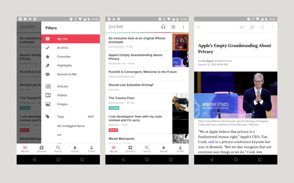
Pocket on Android has a lot of features, and a pretty complicated interface. It has lots of categories, social features, a discover section, text-to-speech, and much more. I’ve personally never used most of these features, and they make the app feel quite cluttered. In my experience Pocket is also not very good at helping me get through the list of things I’ve already saved. It feels like it mostly wants me to discover new things to save (and then not read).
Clearly there are some lessons to be learned here for our app.
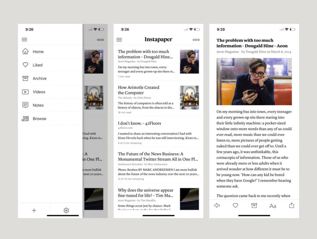
I’ve never used the app myself, but judging from screenshots, Instapaper’s UI feels a lot saner and more focused than Pocket. I also really like the rich article previews in the list view and the nice typography.
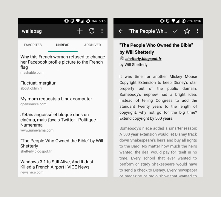
Wallabag is a self-hosted alternative to Pocket and Instapaper. This Android client for it (also called Wallabag) is not very sophisticated UI-wise, but it’s a good example of a very simple native client for this kind of service.
Structurally, these apps are all quite similar: a main view with a list of articles, and an article view that just displays the article in a clean, readable format.
Depending on the service, there are multiple lists for different types of articles such as Archive, Highlights, Favorites, Notes, etc. To keep things simple, and because we’re targeting Wallabag first and foremost (since it’s the only self-hosted service), we’re going with only three categories: Unread, Archive, and Favorites.
This means that our application is going to have four main screens we need to design: the three article categories mentioned above plus a reader view, which displays the article content.
3. Sketches/Mockups
Now that we have a basic idea of the structure of the app, we can finally dive into designing the UI. Personally, I like starting off with sketches on paper and then move to Inkscape for more detailed mockups, but you can use any tool you’re familiar with. You don’t need to be good at drawing or a particular application for this, just find a way to visualize your ideas which works for you :)
If you’re using Inkscape for mockups, you might want to check out the GNOME mockup template which contains some common layouts and patterns to use in your designs. If you are looking for GNOME-style symbolic icons for your mockups, you can find them here, here, and here.
Navigation
When it comes to the layout of an interface, one of the first things to consider is what navigation structure makes the most sense for the type of content you have.
The most common navigation patterns in GNOME apps are the Stack, the View Switcher, and the Sidebar List.
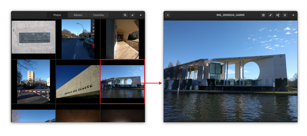
The Stack pattern is when you have completely separate views with no shared UI, and a back button to go back to the overview. This is what Photos does for navigating between the stream of photos and the detailed view of an individual photo, for example. There is a bit more friction to switch between views than with other patterns, but it’s also more focused. This pattern is great for situations where you don’t switch between views a lot.
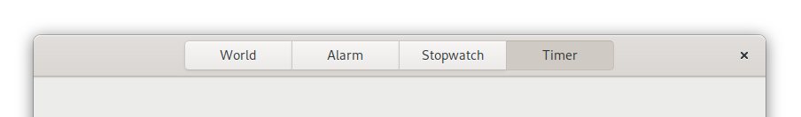
The View Switcher is for cases where there are a small number of views that are equally important or need to always be easily accessible. It’s used in GNOME apps such as Clocks, Music, and Software as the primary navigation. On the desktop, this switcher is always in the headerbar, but there’s work on a new adaptive version of it, which moves to the bottom of the screen for mobile. This is not quite ready yet, but will hit a version of Libhandy near you soon™.
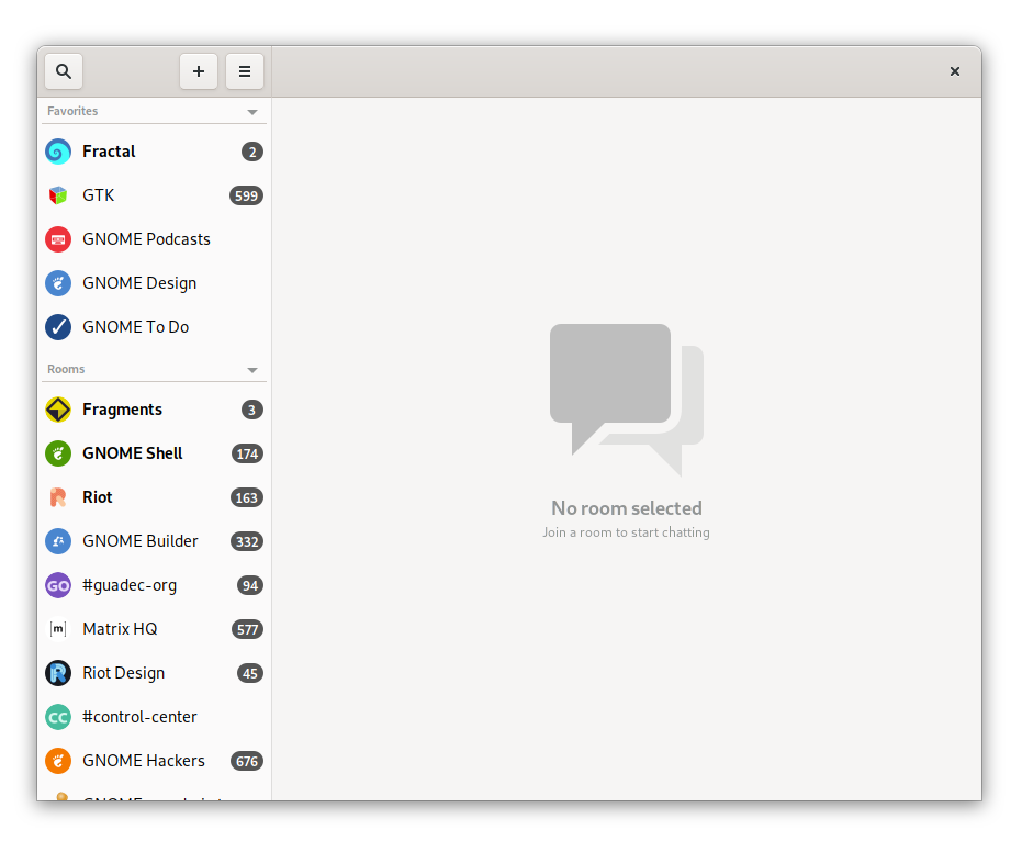
The Sidebar List is for cases where there are a lot of views that you need to switch between often. For example, it’s used in Fractal for the room list, because it gives an overview of all rooms and allows for quick context switching. Of course, on mobile there’s not enough space for a content pane and a sidebar, so there is a Libhandy widget called Leaflet, which transforms from a Sidebar List on desktop to a Stack on mobile.
For our read-it-later app, we need navigation to switch between the different lists (Unread, Archive, Favorites), and to switch between list and article views.
The former is a small set of views that we want to be easily accessible, so a view switcher is a good fit. Since we can’t use the shiny new adaptive view switcher widget yet, we can use a plain old view switcher in the header bar for now (though we can already design the UI with the new switcher in mind).
For the latter we could either use a stack or a sidebar list (using the Leaflet widget so it works on mobile). Since we want this app to be a focused reading experience and switching back and forth quickly between articles is not a very common use case, a Stack is probably the best solution here.
This means that our main screens will look something like this:
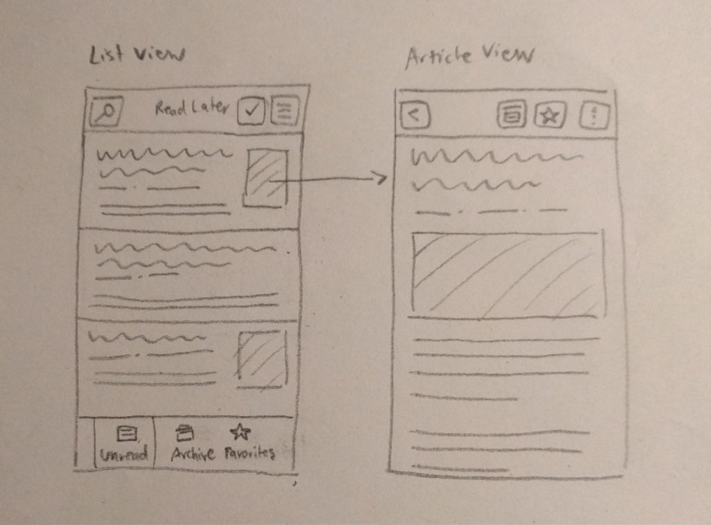
Article List Screens
Now that we have a basic navigation structure we can design the individual screens in more detail. The three article list screens are basically the same lists with different content.
The main purpose of these screens is to provide a nice, legible list of the saved articles that entices people to catch up with their reading list. In order to do this we’re going with a comfortable layout including article title, preview, and some information about the article.
To help people catch up with their saved articles, we should also try to make the content as interesting as possible. A simple reverse-chronological list of saved items is quite boring, and I’ve noticed in my own use that I often scroll down the list randomly to discover older articles. A potential way to build this into the core experience would be to show the reading list in randomized order, and show the most recently saved articles at the top in a separate category. I’ve tried that in the mockups below.
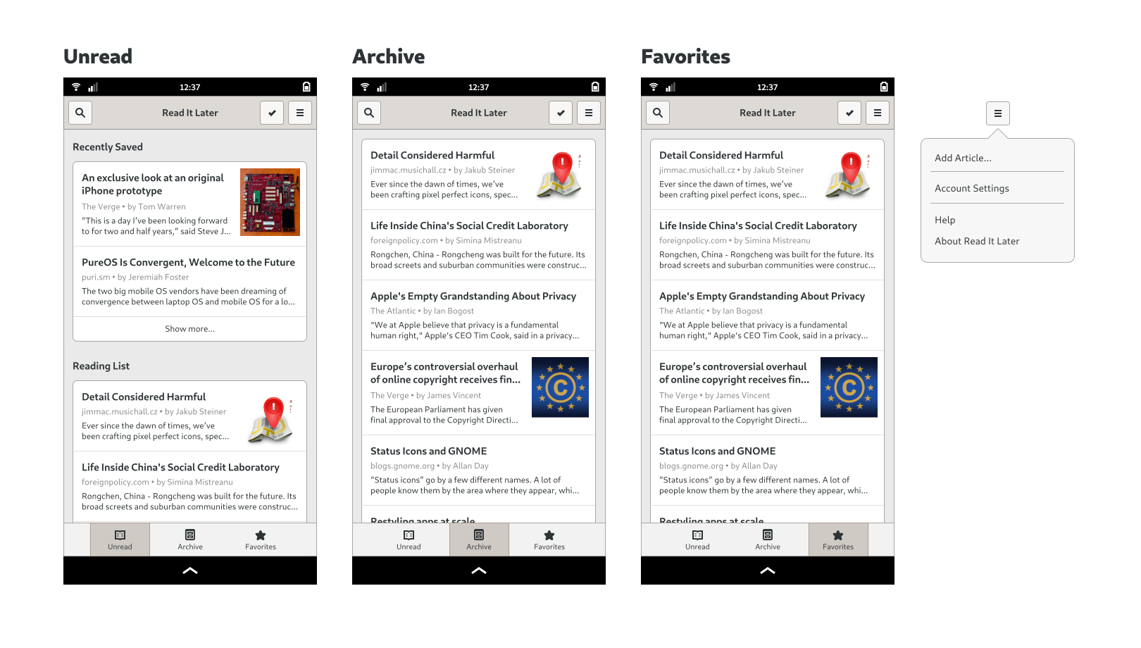
In terms of actions, we need to expose search and selection mode (for operations on multiple elements), as well as the application’s primary menu. The primary menu contains global app-level things such as Help, Preferences, and About.
In selection mode we need the ability to move articles to Favorites and Archive, and delete them from our reading list. Since this is not essential functionality though, we won’t be doing designs for it yet. If you want to learn more, have a look at the selection mode page in the GNOME HIG. The same goes for search (relevant HIG page).
Article Screen
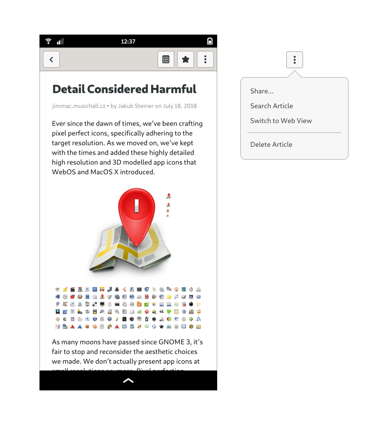
The article screen’s job is pretty straightforward: provide a great reading experience for the saved articles. Since many websites kind of suck in this regard, a reader mode (like Epiphany and Firefox have) should be the default view whenever possible. However, since there’s no guarantee that a given article will be rendered perfectly, we need some way to show to the website with its native styling when necessary.
We also need a way to move an article to Favorites and Archive, delete it, and share it. The most important actions are usually exposed directly in the header bar, but for less important actions (or if there’s not enough space), we can use a secondary menu.
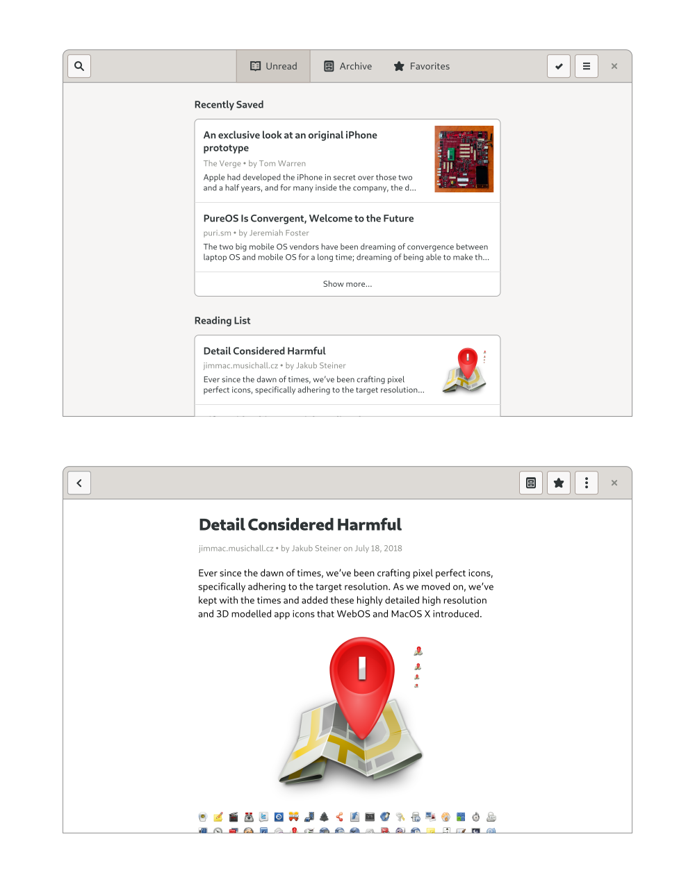
Desktop
We now know more or less what the app looks like on mobile, but what about the desktop? As with responsive web design, if you design your app for mobile first, it’s usually pretty easy to make it work well on larger screens too.
In this case, since we don’t have any sidebars or other complicated layout elements, the main change happening at larger sizes is that the content column width grows with the window, until it reaches a maximum width comfortable for reading. This can be implemented by wrapping the content area in an HdyColumn. The view switcher also moves up to the header bar, and there is a close button on the right side.
There’s more…
What we now have is the basic structure and most important screens of the application, but that’s of course far from everything. We don’t yet have designs for login and account settings, empty states, first run experience, errors, search, and a number of other things. I wanted to stick to the basics for this post, but perhaps I could expand on these things in future blog posts if there’s interest.
It’s also worth noting that mockups are never final, and interfaces almost always change during implementation, as you learn more about use cases, the underlying technology, and other constraints. Ideally you’d also do some informal user testing on real people, and get feedback on the design that way.
I hope this has been useful as an introduction to designing apps for the Librem 5 (and GNOME more generally). If you have any questions feel free to drop by on #gnome-design on IRC/Matrix or the Librem 5 apps Matrix room (#community-librem-apps:talk.puri.sm).
If you want to play with the mockups I made for this tutorial, here’s the source SVG.
