Given the location of this year’s GUADEC many of us couldn’t make it to the real event (or didn’t want to because of the huge emissions), but since there’s a relatively large local community in Berlin and nearby central Europe, we decided to have a new edition of our satellite event, to watch the talks together remotely.
This year we were quite a few more people than last year (a bit more than 20 overall), so it almost had a real conference character, though the organization was a lot more barebones than a real event of course.
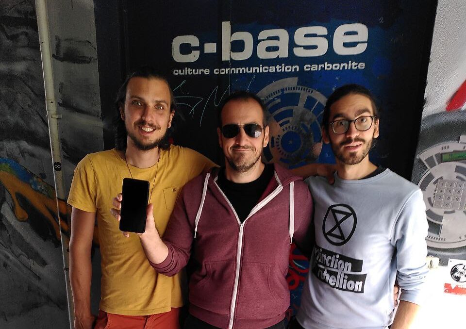
Thanks to Sonny Piers we had c-base as our venue this year, which was very cool. In addition to the space ship interior we also had a nice outside area near the river we could use for COVID-friendly hacking.
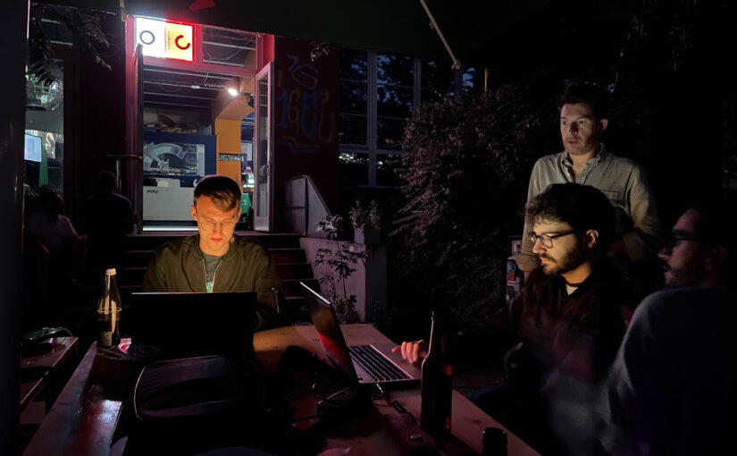
The main hacking area inside at c-base
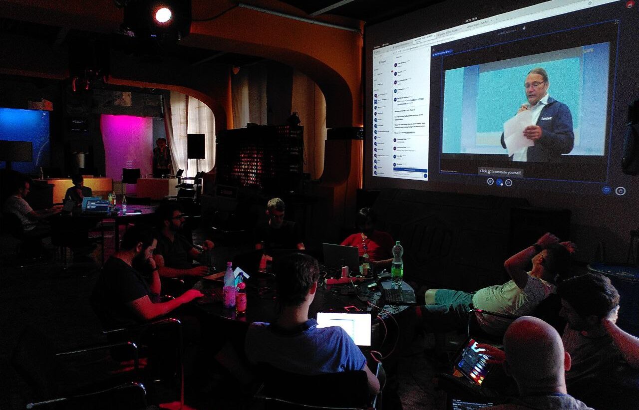
We also had a number of local live talks streamed from Berlin. Thanks to the people from c-base for their professional help with the streaming setup!
On Thursday I gave my talk about post-collapse computing, i.e. why we need radical climate action now to prevent a total catastrophe, and failing that, what we could do to make our software more resilient in the face of an ever-worsening crisis.
Unfortunately I ran out of time towards the end so there wasn’t any room for questions/discussion, which is what I’d been looking forward to the most. I’ll write it up in blog post form soon though, so hopefully that can still happen asynchronously.
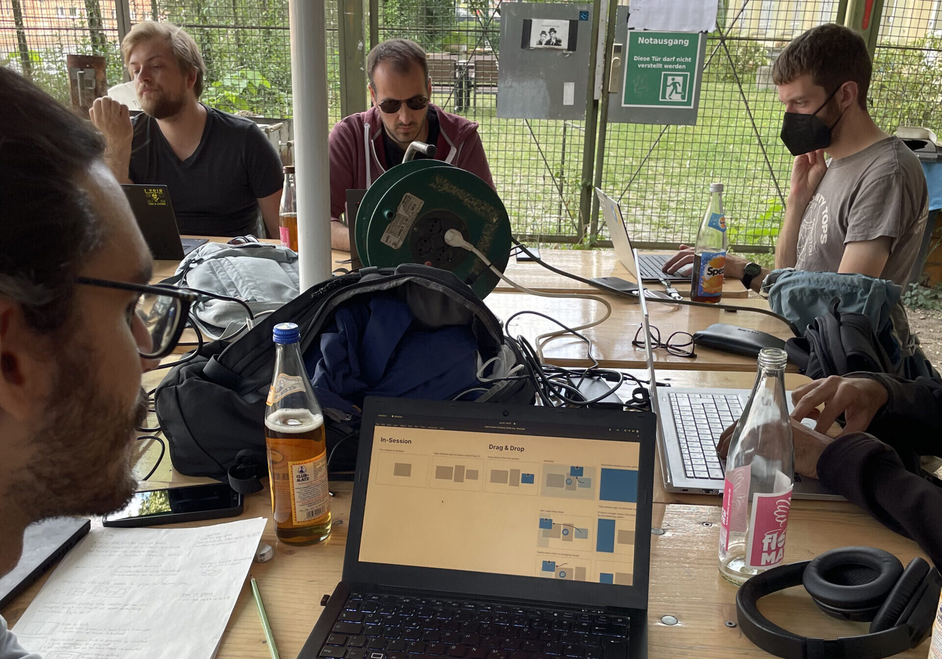
Hacking outside c-base on the river side
Since Allan, Jakub, and I were there we wanted to use the opportunity to work on some difficult design questions in person, particularly around tiling and window management. We made good progress in some of these areas, and I’m personally very excited about the shape this work is taking.
Because we had a number of app maintainers attending we ended up doing a lot of hallway design reviews and discussions, including about Files, Contacts, Software, Fractal, and Health. Of course, inevitably there were also a lot of the kinds of cross-discipline conversations that can only happen in these in-person settings, and which are often what sets the direction for big things to come.
One area I’m particularly interested in is local-first and better offline support across the stack, both from a resilience and UX point of view. We never quite found our footing in the cloud era (i.e. the past decade) because we’re not really set up to manage server infrastructure, but looking ahead at a local-first future, we’re actually in a much better position.
The Purism gang posing with the Librem 5: Julian, Adrien, and myself
This is Part 2 of a series on what’s wrong with the free desktop app ecosystem and how we can fix it, based on the talk Jordan Petridis and I gave at LAS 2019 in Barcelona.
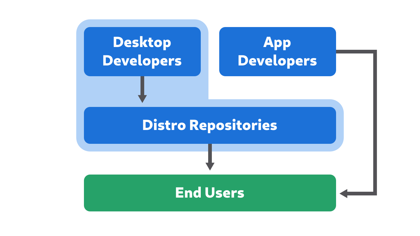
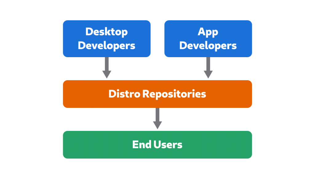
In Part 1 we looked at all the different elements making up a platform, and found that there is only one “complete” platform in the free software desktop world at the moment. This is because desktops control the developer platforms, while packaging and system integration is managed by separate communities, the distributions, for historical reasons. This additional layer of middlemen is a key reason why we don’t have real platforms.
Power to the Makers
The problems outlined in Part 1 are of coursenot new, and people havebeen workingon solutions to them for a long time. Some of these solutions have really started to come together over the last few years, empowering the people making the software to distribute it directly to the people using it.
Thanks to the work of many amazing people in our community you can now develop an app in GNOME Builder, submit it to Flathub, get it reviewed, and have it available for people to install right away. Once it’s on there you can also update it on a schedule you control. No more waiting 6 months for the next distribution release!
Thanks to GNOME Builder’s Flatpak integration, “works on my machine” is largely a thing of the past now!
But though this is all very awesome, Flatpak is unfortunately not a complete solution to the platform conundrum discussed earlier in this series.
Flatpak is Not Enough
Flatpak does solve a number of the issues around app distribution very elegantly, because app developers do their own packaging, and control their release schedule. It’s also a unified package format that works across different host systems, and the Flatpak runtimes are clearly defined development targets to do QA against.
But that doesn’t magically fix all our problems. The two elephants in the room are
The Host still matters: Flatpak only solves part of the issues with distro packaged apps
Downstream drama: Flatpak does not address the conflicts between desktops and distributions
1. The Host Still Matters
Even with Flatpak there are still some unpredictable variables on the host system which affect app developers. On the technical side a number of things can go wrong, from an outdated Flatpak version (which can mean some Portals apps rely on may be missing), to missing/incompatible system APIs such as password storage, calendar, or address book.
These things can lead to applications not working properly, or at all. For example, this is why new versions of GNOME Contacts cannot access any contacts on Debian 10, why recent GNOME Calendar cannot access any calendars on Ubuntu 18.04, or why Fractal doesn’t remember your password across restarts on some non-GNOME environments.
There are also user-facing integration points where applications interface with the system. These include things like notifications, the application menu, search providers, the old systray, and the design patterns used in individual apps.
For example, when the system UI or design guidelines change, applications follow the platform and change their UI accordingly. This means if you install newer apps on an older system, there are going to be weird edge cases. For example, if you install new apps on Debian 10 you get a confusing mix of the old and new application menu paradigms because the design guidelines were changed with GNOME 3.32 (early 2019).
Before GNOME 3.32 applications had global menu items in the application menu in the Shell top bar, but now they are in the primary menu, inside the app window.
Flatpak also applies the host GTK stylesheet and icon set to apps. This means that if the host distribution overrides the system stylesheet, Flatpak will happily apply random, never-tested CSS to every app. Obviously this leads to lots of issues, ranging from ugly but relatively harmless glitches to real usability issues, such as illegible text on buttons. For more background on this particular issue, see this blog post.
Some of these issues could be fixed with more standardization, changes to Flatpak, or new portals. However, fundamentally, in order to be a real platform you need a clearly defined environment to develop and test for. Flatpak alone is not enough to achieve that.
Just like “write once, run everywhere” is always an illusion, it’s never going to be possible to completely split apps from the OS. You always need app developers to do some extra work to support different environments, and currently every distribution represents yet another extra environment to support.
2. Downstream Drama
Flatpak does not completely solve the issues app developers face in shipping their software, because these can not be isolated from the ones desktop developers face. In order to fix the app developer story we need real platforms. In order to get those we need to resolve the desktop/distribution dilemma.
The issues here roughly match the ones with traditional distribution packaging mentioned in Part 1, and can be grouped into three broad categories:
Structural issues inherent to having distributions and desktops be separate projects.
Fragmentation issues because we have multiple of everything so there’s duplication and/or bad abstraction layers.
Configuration issues, primarily around settings and other defaults, which have to be set at the distribution level but affect the user experience.
Structural Issues
One of the biggest structural issues is distribution release schedules not being aligned with the upstream one (or between different distributions). GNOME releases every 6 months, but distributions can take anywhere from a few weeks to several years to ship these releases.
This category also includes distributions overriding upstream decisions around system UX, as well as theming/branding issues, due to problematic downstream incentives. This means there is no clear platform visual identity developers can target.
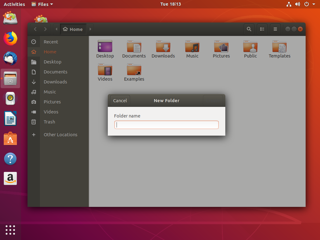
For example, Ubuntu 18.04 (the current LTS) ships with GNOME 3.28 (from March 2018), includes significant changes to system UX and APIs (e.g. Unity-style dock, desktop icons, systray extension), and ships a branded stylesheet that breaks even in core applications.
Ubuntu 18.04 overrides the GTK system stylesheet, which results in the “Create” button on the new folder dialog in Files being invisible (among many many other issues, especially in third party apps).
Fragmentation Issues
Having multiple implementations of everything means we either need do tons of duplicate work, or try to abstract over the different implementations.
On one end of the spectrum there are OS installers: There is no GNOME installer, so every distribution builds their own. Unfortunately, most of these installers are not very good, and don’t integrate well with the rest of the desktop experience (e.g. they use different design patterns than the OS itself). This can be either due to a lack of resources (e.g. not every downstream has their own GNOME designers), or because different distributions have specific downstream goals and motivations (e.g. Fedora and RHEL share an installer, which introduces lots of complexity).
The famously awkward Fedora installer is a good example of why such core parts of the experience should be designed and developed upstream. Unfortunately this isn’t really feasible due to distribution fragmentation.
In other areas we have the opposite problem, because we’re trying to abstract over the fragmentation with a single component. For example, PackageKit is meant to abstract over different package formats, but in practice it only works for a handful of them, and even for those it’s often buggy. The PackageKit maintainers have officially given up on this approach.
Configuration Issues
This includes the default apps, the fonts shipped with the system by default, the terminal shell and prompt, and the UX around things like Plymouth. All of these things are usually configured at the distribution level and are therefore often not great, because these choices need to be made in concert with the rest of the platform UX.
Forging Platforms
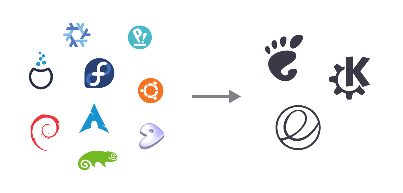
Given the constraint of there being multiple different desktops projects and technology stacks (and the host still mattering), we’ll never have a single “Linux” or “FreeDesktop” platform. We could have one platform per desktop though.
From an app developer point of view, testing for GNOME, KDE, and elementary isn’t as nice as testing only for a single platform, but it’s not impossible. However, testing for Debian, Fedora, multiple Ubuntu releases, OpenSUSE, Arch, Endless, and dozens more is not and never will be feasible, even with Flatpak. Multiple different distributions, even ones that ship the same desktop environment, don’t add up to a platform. But exactly that is what we need, one way or another.
The question is, how do we get there?
The Nuclear Option
When we look at it from a Flatpak context, the solution seems obvious. Flatpak is solving the middleman problem for app developers by circumventing the distributions and providing a direct channel between developers and end users. What if we could do the same thing for the OS itself?
Of course the situation isn’t exactly the same, so what would that mean in practice?
With Flatpak runtimes there is no extra “distribution” abstraction layer. There are no Debian or Fedora runtimes, just GNOME and KDE, because those are the technology stacks app developers target.
These runtimes are already more or less full-fledged distributions which are controlled by the desktops, we’re just not using them as such. The Freedesktop SDK (which most runtimes are based on) is not based in any distro, but built directly from upstream sources using Buildstream as the build tool, and it already has most of the things you need to make a basic operating system.
There is an early-stage effort to make bootable nightly GNOME OS images for development/testing, built on top of the Freedesktop SDK. From there it wouldn’t be a huge leap to actually make an independent, consumer-facing platform OS for GNOME (and KDE, and other platforms).
However, though this is likely to become a very attractive solution in the future, there are a number of hurdles to be overcome:
An OS needs an installer, OS updates, a Plymouth theme, etc. All of these are being worked on for the nightly GNOME OS images, but are not quite there yet.
A “real” OS needs a dedicated group of people doing things like release management, security tracking, and QA. These are being done to some degree for the Flatpak runtimes, but a consumer OS would need more manpower.
It’s an OSTree-based immutable system, which means there is no traditional package management. Apps are installed via Flatpak, and server/developer workflows need to happen in containers. Though projects like Silverblue’s toolbox have come a long way over the past few years, there’s still work to be done before immutable OSes can painlessly replace systems with old-school package managers for all use cases.
It takes time to start a new operating system from scratch, especially when it’s using cutting-edge technology. So while things like GNOME OS could be amazing in the longer-term future, it’s likely going to take a few more years before this becomes a viable alternative.
Squaring the Circle
What could we do within the constraints of the technology, ecosystem, and communities we have today, then? If we can’t go around distributions with a platform OS, the only alternative is to meld the distributions into a meta platform OS.
Technically there’s nothing stopping a group of separate distributions from acting more or less like a unified platform OS together. It would require extraordinary discipline and compromise on all sides (admittedly not things our communities are usually known for), but given how important it is that we fix this problem, it’s at least worth thinking about.
To get an idea what this could look like in practice, let’s think through some of the specific issues mentioned earlier:
Release Schedule: This is probably among the thorniest issues since release cycles vary wildly in length and structure, and changing them is very difficult. It’s not unimaginable that at least some progress could be made here though. For example, GNOME could have long term support releases every 2-3 years for “stable” distributions like RHEL and Ubuntu LTS. Distributions could then agree to either be on the regular 6 month schedule, or the 2 year “LTS” schedule. Alternatively, all distributions could find a single compromise schedule that can work for everyone (e.g. maybe one release per year, like mobile operating systems do).
Theming/Branding: Some distributions want ways to customize the OS experience such that their system looks recognizably different from others. This is not necessarily a problem, as long as this is done using APIs that are supported and intended to be used in this way (which unfortunately is currently not happening in many cases).
Creating more branding opportunities which do not break APIs which apps rely upon (especially third party apps shipped via Flatpak), is certainly possible and there have been discussions in this direction (e.g. GTK accent colors). Whether distributions would limit themselves to these APIs once they exist is of course an open question, but at least there is a ongoing dialog about this.
System UX/API Changes: Some distributions make significant changes to the core system, which fragments the visual identity of the platform at best, and severely damages the app ecosystem at worst. This includes things like adding a permanent dock, icons on the desktop, re-enabling the systray, or a “dark mode” setting which just changes the system stylesheet from under apps.
The solution here is simple in theory: If you think a change to the system UX is needed to fix a specific problem, don’t just patch it downstream, but instead help to address the actual underlying issue (We already touched on this in Part 1). For example, if you find that new users are confused by the empty desktop at startup, don’t just ship an extension that completely breaks the structure of the shell. Bring the problem to the upstream designers and developers, figure out a solution together, and help implement it upstream.
In practice it’s not always that easy, but a lot can be done by simply adopting an upstream-first UX mindset. It can take a while to get used to, especially for companies with more, uh, “traditional” internal processes, but it’s definitely possible seeing as it’s working well for Red Hat and Purism, for example.
OS Installer: It may not be doable to have a single code base, but we could definitely share at least the design (and possibly some UI code) for the installers used across distributions. A cross-distribution initiative for nice, native GNOME installers across the major distributions would probably not be easy logistically, but is not unimaginable.
Software Installation & Updates: GNOME Software and PackageKit’s “abstract across distros” strategy has clearly failed, and we need a new approach here. For applications there is a relatively easy solution: Distributions stop packaging apps, and work together on a common repository of developer-submitted Flatpaks (e.g. something like Flathub). We’d need to work out how this common solution can accommodate various distribution policies around e.g. proprietary software, but this seems very doable and most of it already exists in Flathub.
The resources currently going into repackaging every app for every distribution could be pooled to review the apps submitted by developers to the common Flatpak repository.
Seeing as most distributions are not (yet) image-based like e.g. Silverblue or Endless, we would still also need a way to update the packages that make up the core system. For this there’s probably no way around backend duplication.
System Default Configuration: Making progress in this area is likely not too difficult comparatively. The main thing we’d need is better coordination between the various parties needed to synchronize these things better (which is of course easier said than done). Having some kind of common forum where the upstream design and release team, as well as people in charge of major distributions can discuss and standardize defaults across the entire ecosystem might work for that.
The Bottom Line
If we want a future with real platforms we can either go around the distributions or have them all work together (or potentially both), but one way or another we need to vertically integrate.
Neither path is straightforward or easy, and there’s a huge amount of work ahead either way. However, the first and most important step is acknowledging that this problem exists, and that we need to radically change our approach if we’re serious about building attractive app ecosystems.
The good news is that many people across different projects are already working towards enabling this future. We hope that you’ll join us.
There was a point in my life when I ran Arch, had an elaborate personalized terminal prompt, and my own custom icon theme. I stopped doing all these things at various points for different reasons, but underlying them all is a general feeling that it’s taken me some time to figure out how to articulate: I no longer want to invest time in things that don’t scale.
What I mean by that in particular is things that
Only fix a problem for myself (and maybe a small group of others)
Have to be maintained in perpetuity (by me)
Not only is it highly wasteful for me to come up with a custom solution to every problem, but in most cases those solutions would be worse than ones developed in collaboration with others. It also means nobody will help maintain these solutions in the long run, so I’ll be stuck with extra work, forever.
Conversely, things that scale
Fix the problem in way that will just work™ for most people, most of the time
Are developed, used, and maintained by a wider community
A few examples:
I used to have an Arch GNU/Linux setup with tons of tweaks and customizations. These days I just run vanilla Fedora. It’s not perfect, but for actually getting things done it’s way better than what I had before. I’m also much happier knowing that if something goes seriously wrong I can reinstall and get to a usable system in half an hour, as opposed to several hours of tedious work for setting up Arch. Plus, this is a setup I can install for friends and relatives, because it does a decent job at getting people to update when I’m not around.
Until relatively recently I always set a custom monospace font in my editor and terminal when setting up a new machine. At some point I realized that I wouldn’t have to do that if the default was nicer, so I just opened an issue. A discussion ensued, a better default was agreed upon, and voilà — my problem was solved. One less thing to do after every install. And of course, everyone else now gets a nicer default font too!
I also used to use ZSH with a configuration framework and various plugins to get autocompletion, git status, a fancy prompt etc. A few years ago I switched to fish. It gives me most of what I used to get from my custom ZSH thing, but it does so out of the box, no configuration needed. Of course ideally we’d have all of these things in the default shell so everyone gets these features for free, but that’s hard to do unfortunately (if you’re interested in making it happen I’d love to talk!).
Years ago I used to maintain my own extension set to the Faenza icon theme, because Faenza didn’t cover every app I was using. Eventually I realized that trying to draw a consistent icon for every single third party app was impossible. The more icons I added, the more those few apps that didn’t have custom icons stuck out. Nowadays when I see an app with a poor icon I file an issue askingifthedeveloperwouldlikehelp with a nicer one. This has worked out great in most cases, and now I probably have more consistent app icons on my system than back when I used a custom theme. And of course, everyone gets to enjoy the nicer icons, not only me.
Some other things that don’t scale (in no particular order):
Separate home partition
Dotfiles
Non-trivial downstream patches
Manual tracker/cookie/Javascript blocking (I use uMatrix, which is already a lot nicer than NoScript, but still a pretty terrible experience)
Multiple Firefox profiles
User styles on websites
Running your blog on a static site generator
Manual backups
Encrypted email
Hosting your own email (and self-hosting more generally)
Google-free Android (I use Lineage on a Pixel 1, it’s a miserable existence)
Buying a Windows computer and installing GNU/Linux
Auto-starting apps
Custom keyboard shortcuts, e.g. for launching apps (I still have a few of these, mostly because of muscle memory)
The free software community tends to celebrate custom, hacky solutions to problems as something positive (“It’s so flexible!”), even when these hacks are only necessary because things are broken by default. It’s nice that people with a lot of time and technical skills can fix their own problems, but the benefits from that don’t automatically trickle down to everybody else.
If we want ethical technology to become accessible to more people, we need to invest our (very limited) time and energy in solutions that scale. This means good defaults instead of endless customization, apps instead of scripts, “it just works” instead of “read the fucking manual”. The extra effort to make proper solutions that work for everyone, rather than hacks just for ourselves can seem daunting, but is always worth it in the long run. Just as with accessibility and commenting your code, the person most likely to benefit from it is you, in the future.
After the name, the app icon is the most important part of an app’s brand. The icon can help explain at a glance what the app does, and serves as an entry point to the rest of the experience. A high quality icon can make people want to use an app more, because it’s a stand-in for the quality of the entire app.
Think of the app icon like an album cover for your app. Yes, technically the music is the same even if you have a terrible cover, but a great cover can capture the spirit of the album and elevate the quality of the thing as a whole.
Metaphors
The first thing you need is a metaphor, i.e. some kind of physical object, symbol, or other visual artifact that symbolizes your application.
Finding a good metaphor is a fuzzy and sometimes difficult process, as it’s often hard to find a physical object many people will recognize as related to the domain of your app. There are no hard and fast rules for this, but ideally your icon metaphor should fall into one of these categories:
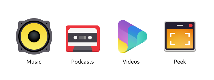
Physical objects directly related to what the app does (e.g. a speaker for Music)
Physical objects vaguely related to the app’s domain or an older analog version of it (e.g. a cassette tape for Podcasts)
Symbols related to the domain (e.g. the “play” triangle for Videos)
A simplified/stylized version of the app’s user interface (e.g. Peek)
There are also anti-patterns for metaphors which should be avoided, if possible:
My process for brainstorming metaphors is quite similar to the one I use to brainstorm names: I come up with a few ideas for physical objects, put them in a thesaurus to find more related ones, and repeat that until I have a list with at least a few viable candidates.
Let’s start with related physical objects:
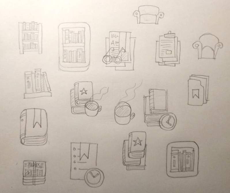
Reading List
List
Book
Bookshelf
Article
Newspaper
Bookmark
How about related non-objects? Maybe we can find some more interesting objects that way:
Reading, the activity: Couch, reading light, tea/coffee, glasses
Later (as in, “read later”): Clock, timer
Collecting things: Folder, clipboard
Now that we have a few options, let’s see which ones are viable. Ideally, the metaphor you choose should have these attributes:
Somewhat specific to the app’s domain (e.g. a book is probably too generic in our case)
Recognizable at small sizes
Can be drawn in a simple, geometric style (this can save you a lot of work later on)
In this case, the most viable options are probably
Stack of books
Bookshelf
Bookmark
One of the above + a clock
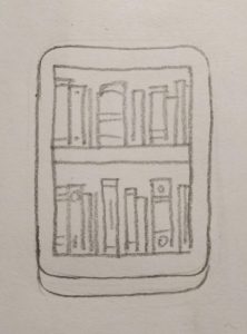
Sketches
Now that we have some metaphors, let’s try to sketch them to see if they make for good icons. I usually use pencil and paper for this, but you can also use a whiteboard, digital drawing tablet, or whatever else works for you to quickly visualize some concepts.
While sketching it’s good to think about the overall shape your icon will have. If it makes sense for your metaphor, try to make the icon not just a simple square or circle, but something more unique and interesting. If it doesn’t make sense in your case don’t force it though, there are other ways to make the icon visually unique and interesting, such as color and structure.
In this case, it looks like there are a number of viable concepts among our sketches, though nothing jumps out as the obvious best option. I kind of like the bookshelf, so let’s try going forward with that one.
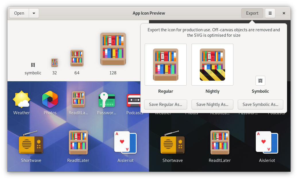
Start from a Template
We now have a concept we like, so we can move to vector. This is where we can start using the shiny new icon design tools!
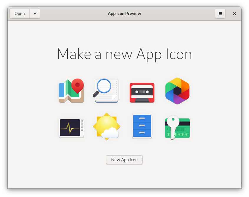
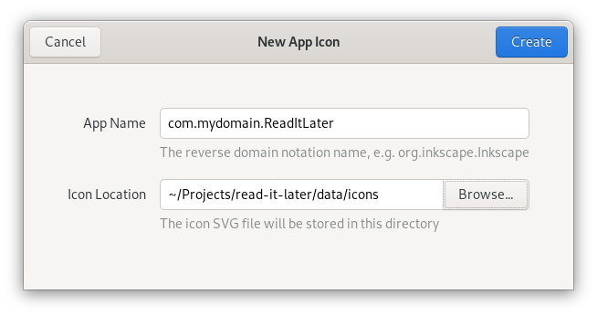
Open App Icon Preview, and hit the “New App Icon” button on the welcome screen. We’re asked for the Reverse Domain Name Notation name of the app (e.g. org.mozilla.Firefox), and where to store the icon project file.
In most cases you’ll want to keep this file in your app’s git repository. Think of it as your icon’s source file, which the final icon assets are later exported from.
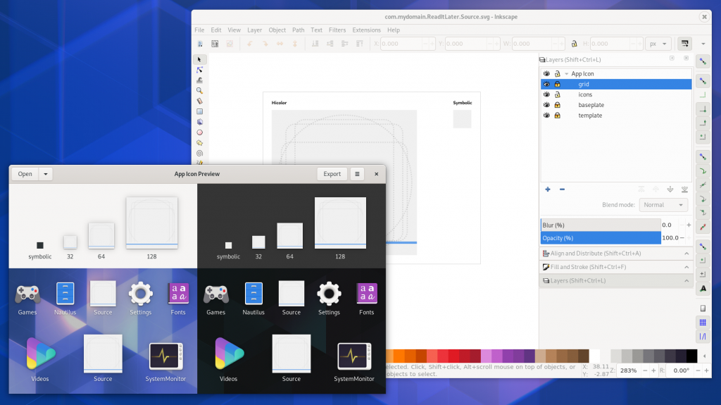
After that, the icon will open in preview mode in App Icon Preview. Now we open the same file in a vector drawing app, and edit it from there. Every time we save the source file, the preview will automatically update.
Now we have our icon source file open in both App Icon Preview and Inkscape. Icon Preview shows just the icon grid:
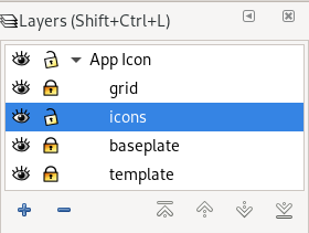
In Inkscape, open the Layers panel (Ctrl + Shift + L) and check out the layer structure. The icons layer is where the actual icon goes. The grid and baseplate layers contain the icon grid and the canvas respectively.
Behind everything else is the template layer, which doesn’t contain anything visible and is only needed so App Icon Preview can get the canvas size for preview and export. Don’t change, hide, rename, or delete this layer, because the icon might not show up in App Icon Preview anymore.
When previewing the icon in App Icon Preview you’ll want to hide the grid and baseplate layers (using the little eye icon next to the layers).
Make sure you have the GNOME HIG Colors palette in Inkscape. Inkscape 1.0 Beta has it by default, otherwise you can download it from the HIG App Icons repository and put it in ~/.var/app/org.inkscape.Inkscape/config/inkscape/palettes for Flatpak Inkscape or ~/.config/inkscape/palettes if it’s on the host. There’s also a color palette app, which you can get on Flathub.
Inkscape Tips
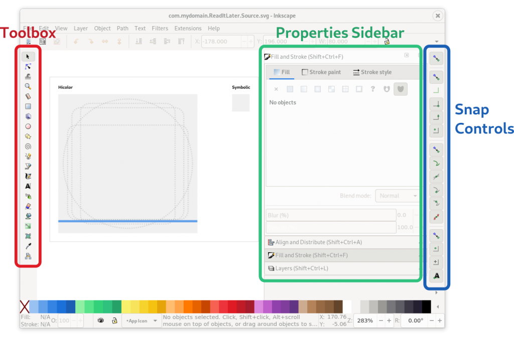
Once you’re familiar with the template, you can start drawing your icon idea as vector. If you’re using Inkscape and aren’t very familiar with the app yet, here’s a quick overview of the things you’ll likely need.
Toolbox (the toolbar on the left edge)
Selection/movement/scaling tool (S)
Rectangle tool (R)
Ellipse tool (E)
And if you’re doing something a little more advanced:
Bezier path drawing tool (B)
Path & node editor (N)
Gradient editor
Dialogs Sidebar (configuration dialogs docked to the right side)
Fill & Stroke (Ctrl + Shift + F)
Align & Distribute (Ctrl + Shift + A)
Layers (Ctrl + Shift + L)
Snap Controls (the toolbar on the right edge) Inkscape has very fine-grained snapping controls, where you can configure what should be snapped to when you move items on the canvas (e.g. path nodes, object center, path intersections). It’s a bit fiddly, but very useful for making sure things are aligned to the grid. The icon tooltips are your friends :)
Of course, teaching Inkscape is a bit out of scope for this guide. If you’re just getting started with it, I recommend doing a few beginner tutorials first to familiarize yourself with the basic workflows (especially around the tools listed here).
The GNOME Icon Style
Traditionally, GNOME app icons were very complex, with lots of photorealistic detail and many different sizes which had to be drawn separately. This changed when we revamped the style in 2018, with the explicit goal of making it easier to produce, and more approachable for third party icon designers.
The new style is very geometric, so in many cases you can draw an entire icon with just basic shapes.
These icons consist of rectangles (some with rounded corners) and circles exclusively
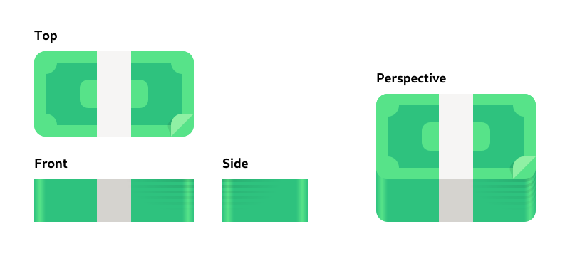
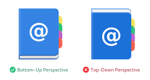
Perspective
One important attribute of the style is the abstract perspective. Even though the style is simple and geometric, it’s not “flat”: It makes use of material, depth, and perspective, but in a way that is optimized for easy production as vector.
The perspective works by “folding” horizontal and vertical layers into one dimension, so you can see the object orthogonally from both the top and the front.
This results in a kind of “chin” an the bottom of the object, which is shaded darker than the top surface, since light comes evenly from the top/back.
The perspective is achieved by folding the top and front views together
In practice, this usually doesn’t have a huge impact, since it’s also suggested to make objects not too tall, when possible. A lot of icons are just a simple 2D shape with a small chin at the bottom.
That said, it can look very weird when you get the perspective wrong, e.g. by folding the layers from the top/back instead of the front, so it’s important to keep this in mind.
Material & Lighting
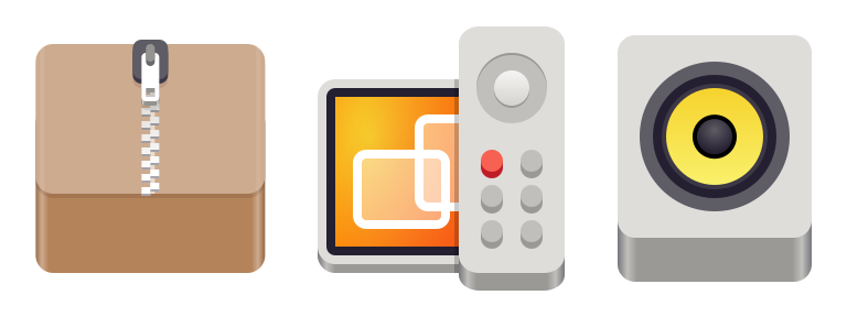
Icons can make use of skeuomorphic materials (e.g. wood, metal, or glass) if it’s needed for the physical metaphor, but outside of those special cases it’s recommended to keep things simple.
Examples of icons with realistic materials
Straight surfaces have flat colors (instead of e.g. slight vertical gradients), but curved surfaces can/should have gradients. The corners on the chin on rounded base shapes should have a highlight gradient.
The highlight on the corners of the chin is done with a horizontal gradient.
Shadows inside the icon should be avoided if possible, but can be used if necessary (e.g. for contrast reasons). Do not use drop shadows that affect the app outline though, because GTK renders such a shadow automatically.
Icon Grid & Standard Shapes
In order to make sure icons are somewhat similar in size, alignment, etc. we have a grid system.
The canvas is 128x128px (for legacy reasons), but you’re designing for 64×64, while also taking 32×32 into account where possible. In general, it’s good to make sure you’re putting as many lines as possible on grid lines, so they’re sharp even at 32. Testing in App Icon Preview helps a lot with this.
Each of the grid squares is 8×8 pixels. In order to be pixel-perfect at 64 and 32, orthogonal lines/edges should be on these grid lines (or fractions of them).
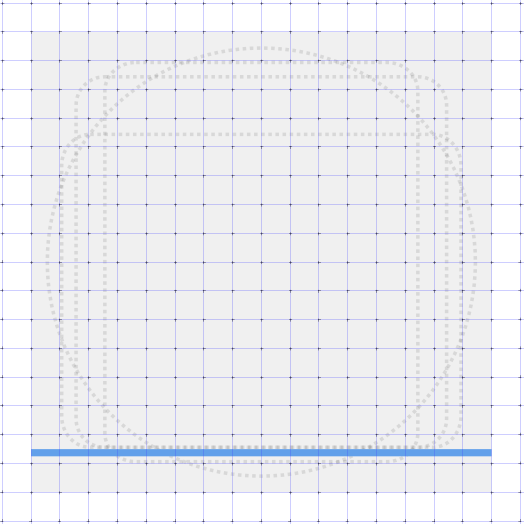
The icon grid also has some standard shapes for wide, tall, square, and circular icons, which can be used as a basis for the structure of the icon if it makes sense for the metaphor (e.g. if the object is more or less square, use the square standard shape).
Protip: Great Artists Steal Reuse
There are lots of apps with icons in the GNOME style out there, and they’re all free software. If there’s something you like about another app’s icon you can get the source from GNOME Gitlab or Github, look at how a certain object is drawn, or just take (parts of) other icons and adapt them to your needs.
This is especially useful for common objects needed in many icons, e.g. pencils, books, or screens. The icon template in App Icon Preview comes with a few of these common objects on the canvas, which can be a good starting point for new icons.
Draw, Preview, Repeat!
Armed with this knowledge about the style and tooling, we can finally jump in and start drawing! In this case I re-did the sketch at a slightly larger size to get a better feel for it:
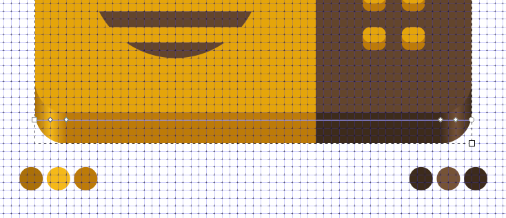
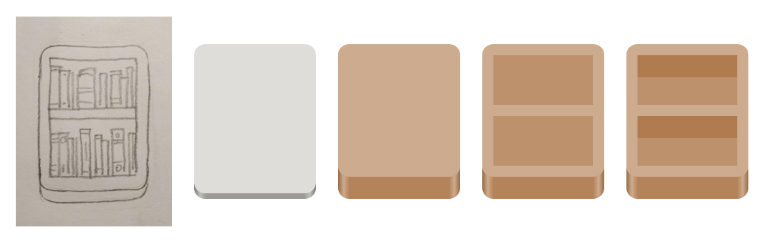
Now let’s try vectorizing it. Since the overall shape is a tall rectangle, we can start with the tall rectangle standard shape. If we change the color to brown, and make the chin at the bottom thicker (by resizing the top layer vertically), we have the basic frame for the shelf.
After that we can add the actual shelves, by simply adding two slightly darker brown rectangles (the back of the shelf), and two wide rectangles at the top of these (the bottom of the horizontal shelf).
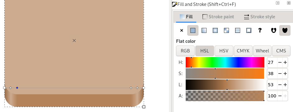
Changing the color of the chin is a bit tricky, because it has a horizontal gradient. It requires selecting the bottom rectangle with the gradient tool, clicking each gradient stop manually and changing it to brown by clicking one of the colors in the color palette at the bottom edge of the window.
If you use e.g. Brown 3 from the palette for the top surface, you can use the Brown 4 or 5 for the chin, and Brown 2 or 3 for the highlights in the corners.
Let’s see what this looks like in Icon Preview now:
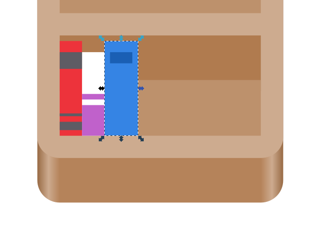
Getting there, right? Now let’s add some books. Lucky for us, book spines can also be drawn as rectangles, so this shouldn’t be too hard. We don’t want too much detail, because we’re designing for 64px first and foremost. Something like 10 books per row should work.
100% rectangles :)
If we want to get fancy we can also round the top of the spine on some of the books by adding an ellipse of the same color, but it’s not really needed at this size.
Finished full-color icon in App Icon Preview
Looking good! I think we’re done with the full-color icon.
If at this point in the process you feel like the concept or metaphor isn’t working out (for example because it doesn’t look interesting enough, or because it’s too complicated to work at small sizes) you can always go back a few steps and try vectorizing a different one of your sketches. The nice thing about the simplicity of this style is that you can do this without losing weeks of work, making iteration on concepts much more feasible.
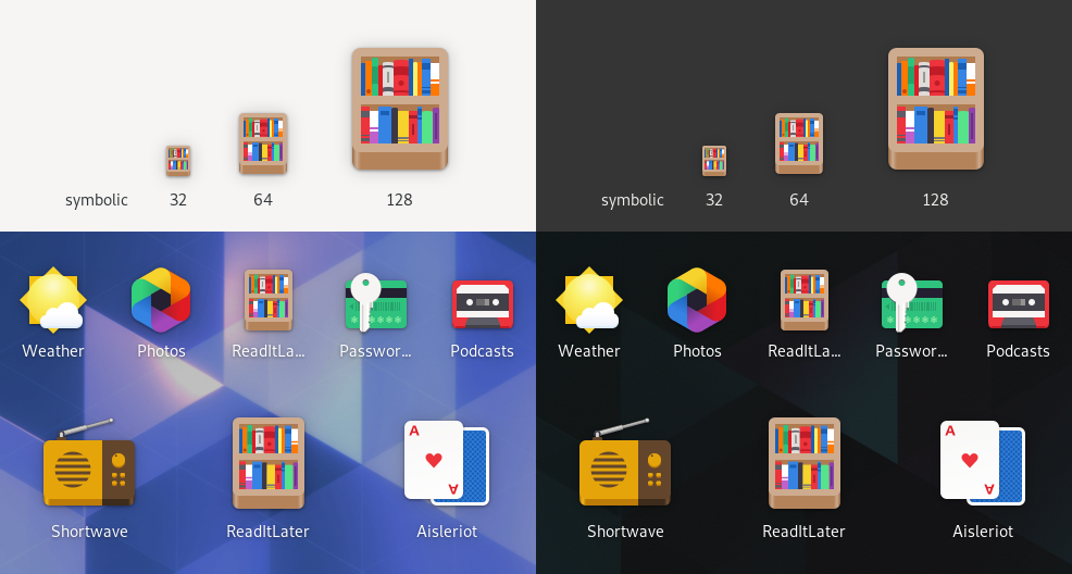
Symbolic
Now that the full-color icon is done, we can start thinking about the symbolic icon for our app. Ideally this is a simplified, one-color version of the app icon, designed for a 16×16 px canvas. It’s used in notifications and some other places in the Shell where a colorful icon would not be appropriate.
I won’t go into too much detail on this here since drawing good symbolics is a big topic, and this post is too long already. I might expand on this in a future post, but for now here are a few quick tips:
Alignment to the pixel grid is very important here if you don’t want the icon to end up a blurry mess
Stick to the original metaphor if at all possible, go for something else if not
Test in App Icon Preview to make sure the icon is actually recognizable at 16px
If possible leave the outermost 1px empty on all sides
Most strokes should be 2px, but they can be 1px in some cases
Don’t overthink it for the first version. This icon is a secondary thing, and it’s relatively little effort to fix/redo it later :)
Our bookshelf example looks tricky at first glance, because we have all these tiny books, and only 16 pixels to work with. However, if we simplify it enough it’s not too hard to get something decent. We can just use a two tall and two wide rectangles to draw the shelf, and three smaller rectangles as books on each shelf:
This one is literally just rectangles :)
And that’s it! We have a real app icon now, with everything that entails. If you want to have a look at the source for the icon we made in this tutorial, you can download the SVG here. It includes the final icon and some of the intermediate steps.
Export
Now that we’re happy with the icon, we can press the “Export” button in App Icon Preview and save the final icon assets. The app will automatically optimize the SVGs for size, and if you have nightly builds of your app, you also get an automatically generated nightly icon without any extra work!
Congratulations for making it all the way to the end! I hope you found this tutorial useful, and will go on to make great icons for your apps. If there’s anything you found unclear while following along, please let me know in the comments.
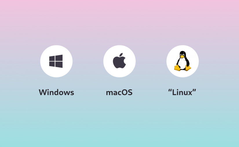
In our community there is this idea that “Linux” is the third platform next to Windows and macOS. It’s closely connected to things like the “year of the Linux desktop”, and can be seen in the language around things like Flatpak, which bills itself as “The Future of Apps on Linux” and the Linux App Summit, which is “designed to accelerate the growth of the Linux application ecosystem”.
But what does that actually mean? What does a healthy app ecosystem look like? And why don’t we have one?
I think the core of the problem is actually the layer below that: Before we can have healthy ecosystems, we need healthy platforms to build them on.
What is a Platform?
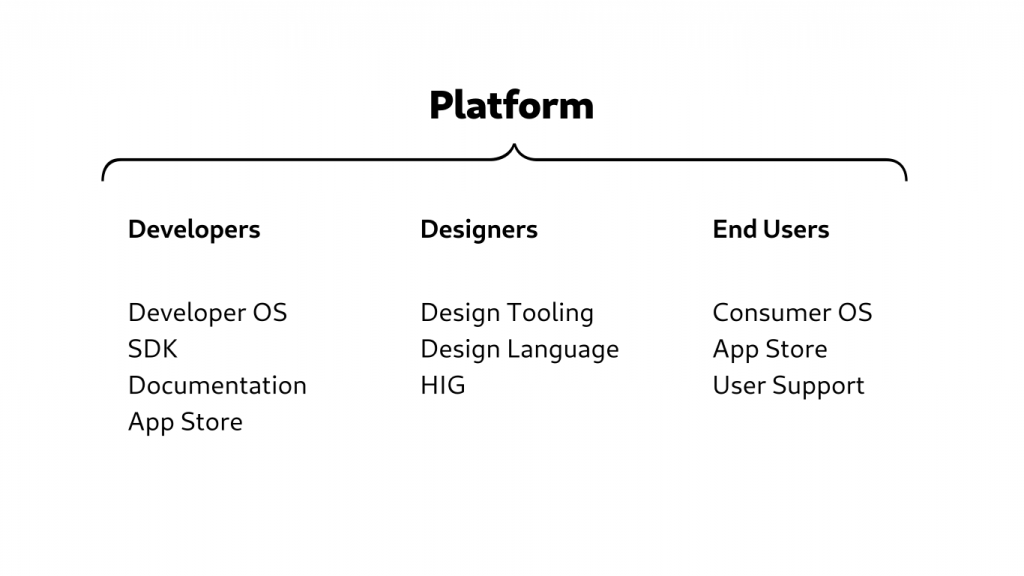
The word “platform” is often used without a clear definition of what exactly that entails. If we look at other successful platforms there are a ton of different things enabling their success, which are easy to miss when you just look at the surface.
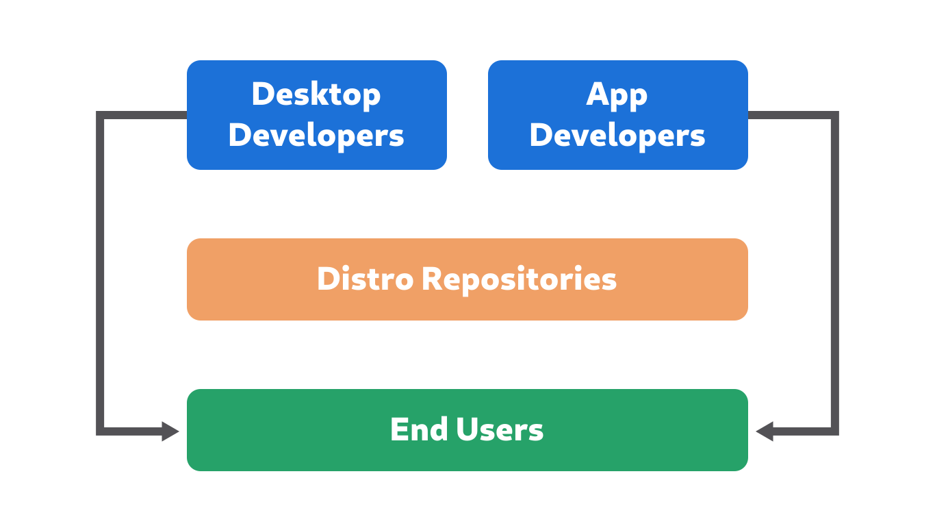
On the developer side you need an operating system developers can use to make apps. You also need a developer SDK and tooling which are integrated with the operating system. You need developer documentation, tutorials, etc. so people can learn how to develop for the platform. And of course once the apps are built there needs to be an app store to submit them to.
Developers can’t make great apps all by themselves, for that you also need designers. Designers need tools to mock up and prototype apps, platform UI patterns for things like layout and navigation, so every app doesn’t have to reinvent the wheel, and a visual design language so designers can make their app fit in with the rest of the system visually. You also need Human Interface Guidelines documenting all of the above, as well as tutorials and other educational resources to help people learn to design for the platform.
On the end user side you need a consumer OS with an integrated app store, where people can get the great apps developers make. The consumer OS can be the same as the developer OS, but doesn’t have to be (e.g. it isn’t for Android or iOS). You also need a way for people to get help/support when they have problems with their system (whether that’s physical stores, a help website, or just easily google-able Stackoverflow questions).
That’s a lot of different things, but we can group them into four major pieces which are needed in order for something to be a real platform:
Operating System
Developer Platform
Design Language
App Store
So if we look at the free software world, where are the platforms?
Linux?
Linux is a kernel, which can be used to build OSes, which can be used to build platforms. Some people (e.g. Google with Android) have done so, but a kernel by itself doesn’t have any of the four things outlined above, and therefore is not a platform.
FreeDesktop.org?
What about “Desktop Linux”, which is what people usually mean when they say “Linux”? The problem is that this term doesn’t have a clear definition. You could take it to mean “FreeDesktop.org”, but that also doesn’t come close to being a platform. FreeDesktop is a set of standards that can be used to build platforms (and/or ensure some level of compatibility between different platforms). Endorsement of a single platform or set of technologies goes directly against FreeDesktop’s aims, and as such it should only be thought of as the common building blocks platforms might share.
Ubuntu?
What about distributions? Ubuntu is one of the most popular ones, and unlike others it has its own app store. It still isn’t a platform though, because it doesn’t have the most critical pieces: a developer SDK/technology stack, and a design language.
Other distributions are in a similar but worse position because they don’t have an app store.
GNOME?
GNOME is the most popular desktop stack, and it does have an SDK and design language. However, it only sort of has an app store (because GNOME people work on Flathub), and it doesn’t have an OS. Many distributions ship GNOME, but they are all different in various ways (more on this later), so they don’t provide a unified development target.
Elementary?
Despite being a relatively small project, elementary is attracting third party developers making apps specifically for their platform
Interestingly, the only project which currently has all the pieces is elementary. It has an OS, an SDK, a HIG, and an app store to submit apps to. The OS is largely Ubuntu and the technology stack largely GNOME, but it develops its own desktop and apps on top of that, and does the integration work to make it into a complete consumer product.
This begs the question, why is elementary the only one?
The Means of Distribution
The reasons for this are largely historical. In the early days, free software desktops were a bunch of independently developed components. They were not necessarily designed for each other, or well integrated. This meant in order to have a usable system, someone needed to curate these components and assemble them into an operating system: The first distributions were born.
Over the last decades this landscape has changed drastically, however. While GNOME 1 was a set of loosely coupled components, GNOME 2 was already much more cohesive and GNOME 3 is now essentially an integrated product. The shell, core apps, and underlying technologies are all designed with each other in mind, and provide a complete OS experience.
Desktops like GNOME have expanded their scope to cover most of the responsibilities of platforms, and are in effect platforms now, minus the OS part. They have a very clear vision of how the system should work, and app developers target them directly.
The elementary project has taken this development to its logical end point, and made its own vertically integrated OS and app store. This is why it’s the only “real” platform in the free software space at the moment.
GNOME has a relatively vibrant ecosystem of nice third party apps now, despite not being a complete platform (yet). This gives us a glimpse of the potential of this ecosystem.
Distributions, on the other hand, have not really changed since the 90s. They still do integration work on desktop components, package system and applications, set defaults, and make UX decisions. They still operate as if they’re making a product from independent components, even though the actual product work is happening at the desktop layer now.
This disconnect has led to tensions in many areas, which affect both the quality of the system user experience, and the health of the app ecosystem.
What’s interesting about this situation is that desktop developers are now in the same situation app developers have always been in. Unlike desktops, apps have always been complete products. Because of this they have always suffered from the fragmentation and disconnect between developers and users introduced by distribution packaging.
Grievances with the distribution model, which affect both app and desktop developers, include:
Release schedule: Developers don’t have control over the pace at which people get updates to their software. For apps this can mean people still get old versions of software with issues that were fixed upstream years ago. For desktops it’s even worse, because it means app developers don’t know what version of the platform to target, especially since this can vary wildly (some distributions release every 6 months, others every 2+ years).
Packaging errors: Distribution packaging is prone to errors because individual packagers are overloaded (often maintaining dozens or hundreds of packages), and don’t know the software as well as the developers.
Overriding upstream decisions: When distributions disagree with upstream decisions, they sometimes keep old version of software, or apply downstream patches that override the author’s intentions. This is very frustrating if you’re an app developer, because users never experience your app as you intended it to be. However, similar to the release schedule issue, it’s even worse when it happens to the core system, because it fragments the platform for app developers.
Distro Theming: App developers test with the platform stylesheet and icons, so when distributions change these it can break applications in highly visible ways (invisible widgets, unreadable text, wrong icon metaphors). This is especially bad for third party apps, which get little or no testing from the downstream stylesheet developers. This blog post explains the issue in more detail.
The Wrong Incentives
The reason for a lot of these issues is the incentives on the distribution side. Distributions are shipping software directly to end users, so it’s very tempting to solve any issues they find downstream and just ship them directly. But because the distributions don’t actually develop the software this leads to a number of other problems:
Perpetual rebasing: Any change that isn’t upstreamed needs to be rebased on every future version of the upstream software.
Incoherent user experience: Downstream solutions to UX problems are often simplistic and don’t fix the entire issue, because they don’t have the development resources for a proper fix. This leads to awkward half-redesigns, which aren’t as polished or thought-through as the original design.
Ecosystem fragmentation: Every downstream change adds yet another variable app developers need to test for. The more distributions do it, the worse it gets.
The Endless OS shell is a great example of this. They started out with vanilla GNOME Shell, but then added ever more downstream patches in order to address issues found in in-house usability tests. This means that they end up having to do huge rebasesevery release, which is a lot of work. At the same time, the issues that prompted the changes do not get fixed upstream (Endless have recently changed their strategy and are working upstream much more now, so hopefully this will get better in the future).
This situation is clearly bad for everyone involved: Distributions spend a ton of resources rebasing their patches forever, app developers don’t have a clear target, and end users get a sub-par experience.
So, what could we do to improve this? We’ll discuss that in part 2 of this series :)


