Application menus – or app menus, as they are often called – are the menu that you see in the GNOME 3 top bar, with the name and icon for the current app. These menus have been with us since the beginning of the GNOME 3.0 series, but we’re planning on retiring them for the next GNOME release (version 3.32). This post is intended to provide some background on this change, as well as information on how the transition will happen.
Background
When app menus were first introduced, they were intended to play two main roles. First, they were supposed to contain application-level menu items, like Preferences, About and Quit. Secondly, they were supposed to indicate which app was focused.
Unfortunately, we’ve seen app menus not performing well over the years, despite efforts to improve them. People don’t always engage with them. Often, they haven’t realised that the menus are interactive, or they haven’t remembered that they’re there.
My feeling is that this hasn’t been helped by the fact that we’ve had a split between app menus and the menus in application windows. With two different locations for menu items, it becomes easy to look in the wrong place, particularly when one menu is more frequently visited than the other.
One of the other issues we’ve had with application menus is that adoption by third-party applications has been limited. This has meant that they’re often empty, other than the default quit item, and people have learned to ignore them.
As a result of these issues, there’s a consensus that they should be removed.
The plan
We are planning on removing application menus from GNOME in time for the next release, version 3.32. The application menu will no longer be shown in the top bar (neither the menu or the application name and icon will be shown). Each GNOME application will move the items from its app menu to a menu inside the application window (more detailed design guidelines are on the GNOME Gitlab instance).
If an application fails to remove its app menu by 3.32, it will be shown in the app’s header bar, using the fallback UI that is already provided by GTK. This means that there’s no danger of menu items not being accessible, if an app fails to migrate in time.
We are aiming to complete the entire migration away from app menus in time for GNOME 3.32, and to avoid being in an awkward in-between state for the next release. The new menu arrangement should feel natural to existing GNOME users, and they hopefully shouldn’t experience any difficulties.
The technical changes involved in removing app menus are quite simple, but there are a lot of apps to convert (so far we’ve
fixed 11 out of 63!) Therefore, help with this initiative would be most welcome, and it’s a great opportunity for new contributors to get involved.
App menus, it was nice knowing you…
So no more indication of which application is currently focused?
That’s the plan. It seems fine in testing, and you can easily try it yourself (Tweaks > Top Bar > Application Menu).
How about adding a Global menu OS X style? Unity did it so it shouldn’t be too difficult
It gives focus indication and it saves screen real estate etc.
GNOME applications do not have menu bars to have a global menu.
People run more apps than just GNOME applications. And they sure do have a menu.
If GNOME had trouble making people adopt the App Menu, how difficult do you think it will be to get them to move away from “File, Edit …”.
They do, actually. It’s just hidden.
What’s the point of that when there are no menubars?
Because what about all the applications that really should have menus, for example, gimp to access functionality.
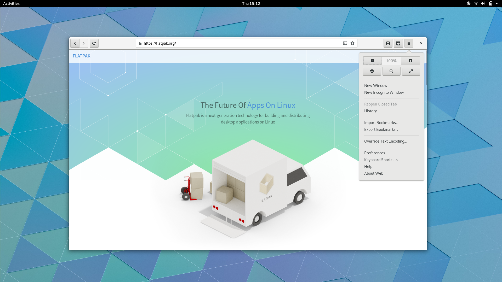
Even the web browser screenshot, looks daft, now we are going to have 1 menu with tons of additional stuff shoved in there – what was wrong with regular menus.
As others have mentioned, non-GNOME applications often have traditional menubars. Personally, rather than ask for a global menu to randomly be thrown in, I’d love to see a way to make these applications fit in better as if they’re native apps.
I don’t know exactly how GNOME handles these applications, but since they often don’t have their own CSDs, I assume GNOME must draw an SSD titlebar? Would it be possible to draw a headerbar instead, pulling the application’s traditional menubar and putting it into a hamburger menu in the headerbar instead?
KDE Plasma has a feature where instead of having a global menu, you can move an application’s menubar into a little menu button that appears in the titlebar: https://www.kde.org/announcements/plasma-5.12/global-menus-window-bar.png
This is basically what I’m thinking, but more GNOME-ified. If it’s possible, it could help make foreign apps look and behave more like native apps.
Unity did it by:
– applying downstream patches to applications
– changing the toolkit to rip out parts of windows behind the application’s back, and inspecting those parts to build a (hopefully complete) remote representation of them
The first thing is something GNOME cannot do, and the second is a terrible and unacceptable hack that GNOME won’t do.
So if we wanted to adapt a global menu, it would require applications to port their menubars to GMenu – that is, the same API used by the app menu. It is unlikely that applications that haven’t added an application menu in years will suddenly port its menubars to GMenu. That is, a global menu that isn’t based on hacks would very much be limited to applications that used to have an app menu (mostly GNOME apps) and still have a menubar (hardly any GNOME apps).
How about merging the titlebars of not-CSD apps into the top panel then? Similar to how some gnome extensions do it.
If it is a modern gnome app, than the current design fits perfectly.
But if it is not a modern gnome app or a not-gtk app without CSD, then there is really a lot of vertical screenspace wasted.
This would be awesome, so “we” or I don’t have to install the equivalent extension anymore.
This seems to confirm my worst fears. I’m okay with moving the application menu out of the top bar, but why does the name of the focused application have to be removed along with it? You said right there in your blog post that it served a purpose by indicating the focused application, and then nothing more was said on that point. Applications might not be using it much as a menu, but it still serves that purpose of indicating focus. That’s very important!
I agree that the name or icon of the focused application should be indicated somewhere, either in the top bar or in a dock.
Well, as Allan said it worked well in testing thus far. Perhaps you could all try it as he has indicated and see if it causes issues. File a bug and provide feedback on why it or didn’t work for you would be very much appreciated. If it doesn’t work out we can always change it. It’s just software. :-)
I agree on this too, in multi monitor setup when I switch workspace with hotkeys, I often get the wrong application focused; top bar entry helps me in this situation.
Fully agreed. The app name and icon in menu is far from ideal to distinguish focused window, but at least it’s something. Without it, the experience will be once again worse. This is a very common pain in multi-monitor setups. Of course it would be nice to complement this change with some improved way to distinguish focused window, like highlighted border, shadow or perhaps a side dock. But until that is available, I don’t understand why the app name needs to get removed from the top panel, instead of just the menus.
Actually app menus were introduced in 3.4. Thanks god they are gone, it always seemed like a stupid idea, and they didn’t work well outside GNOME.
Out of interest, why were the application menu items not merged with the dash context menus? Things like opening a new window and changing app settings seem to be in the same category from a user perspective, i.e. about the app but not about a window, yet were in different places.
The Dash is another dark area of the shell. For example, there is no distinction between an application or a window.
Personally I would prefer that the Dash will be removed and that the lists could be customized in the application view. Ultimately a classic Dock like in macOS.
Yeah, on Windows 10 it is quite convenient to right-click on the app icon in the task bar to bring up a menu where you can open recent files and such.
Yay. I’ve been a Gnome Shell fan since 3.0. But this was one part of the design I didn’t like. I’m glad to see it go.
Removal of the menu itself is probably for the best, but I agree with others who commented here that it would be nice if the focused application indicator didn’t disappear with it.
With most GNOME (and more, e.g. Firefox and Chrome) applications having no window decorations these days, the top bar is often the only place you can see the application name. Please don’t take that away.
But isn’t the active / focused application indicator merely a workaround of a different issue? I mean, if you really need such an indicator, then there’s probably something seriously wrong with your window manager – it does not serve one of its main purposes.
There is the dash or dock “don’t know the official name”. I think they should improve on the dock to have some menus like open, close, preferences, about, … application menu was a pain in the a.. I never know where to find what I want. So I glad it is gone and gnome gets even cleaner.
Hmm,
as someone who seems to have a rather obscure workflow ( Multimonitor setup, and no problem noticing the application that is focused) I am really happy that this confusing, mouse milage generating, split up of functionality will be gone.
Thanks
So what’s the point of a top bar that extends for miles along the screen and is always visible?
I agree that app menu is terrible in this current form, but that’s because it’s super limited compared to what it should be (macos/unity).
Anyway, you have a big chance of fixing the TopIcon extension missing from mainline now that you are making room :-)
I think that it is a good idea, I liked. But, I have one question: in KDE you can group menu in a widget and make a global menu or group then in a icon that appears in the window top bar, this way you can hide the horizontal menu bar from applications that contains it and you get a clean and less ugly design. With that this will be possible in Gnome? Maybe a extension to have a global menu or a icon in the window top bar on the place of the ugly horizontal menu may now be possible?
So will the top bar get removed entirely? To put it differently, does there really need to be a bar at the top, when you’ve already got a bigger bar/dock on the left?
There is no bigger bar/dock on the left. You are probably thinking of Ubuntu, not upstream GNOME.
GNOME doesn’t have dock on the left. The one you’re probably talking about is an Ubuntu modification.
GNOME doesn’t have a dock on the left in the normal view. Only in the activities view. You’re probably confusing with the Ubuntu UI which is different from GNOME.
Great idea, this has confused me many times over the years.
Awesome! App menus in the bar always annoyed me! It’s great to see them go away.
This would be a lot clearer for non-Gnome users if a) you showed a screenshot of an old-style application with its top bar menu and b) you took the screenshots at a smaller screen size. A Google image search for “Gnome top bar application menus” gives lots of results for Gnome shell extensions which e.g. add a global menu or application title to the top bar, so it’s quite unclear what Gnome’s default top bar app menu was.
(Although I use KDE Plasma and Windows 10, I’m always interested in other desktop UX, if only to counter all the histrionic “Gnome is literally 1000x worse than useless!!” comments by embarrassing fanbois :-) .)
I am not convinced of either the old or the new approach. And the “Hamburg menu” is a bad choice, espacially on a Desktop.
Why don’t you allow normal menu bars? A global menu would be nice.
Why and How to Avoid Hamburger Menus
https://lmjabreu.com/post/why-and-how-to-avoid-hamburger-menus/
Alternatives of hamburger menu — UX Planet
https://uxplanet.org/alternatives-of-hamburger-menu-a8b0459bf994
Kill The Hamburger Button — TechCrunch
https://techcrunch.com/2014/05/24/before-the-hamburger-button-kills-you/?guccounter=1
Hamburger Menus and Hidden Navigation Hurt UX Metrics — NN Group
https://www.nngroup.com/articles/hamburger-menus/
Apple: http://devstreaming.apple.com/videos/wwdc/2014/211xxmyz80g30i9/211/211_hd_designing_intuitive_user_experiences.mov?dl=1
What testing did you exactly do? Did you only test on your giant monitor?
These screenshots
https://gitlab.gnome.org/GNOME/gnome-shell/issues/624#note_344561
clearly show that without an indicator of the currently focused app in the top panel, your maximized applications will always need title bars (on non header bar apps) to be distinguishable.
[WORDPRESS HASHCASH] The poster sent us ‘0 which is not a hashcash value.
The global app menu was a personal pet peeve of mine. I could never understand how the decision to add it was made. I’ve always found it confusing, never really grasping how applications decided what should go in there or not. Bottom line, I’m glad the UI/UX team decided to retire it. Better late than never. Cheers