Last November we had a small hackfest in London, focused on GNOME Shell design. We explored various themes during the hackfest and came up with a bunch of initial designs, which we’ve subsequently been developing. The main area of recent work has been the login and unlock experience. The rest of this post gives an overview of the design that we’ve come up with.
Background
Unlocking and logging into a device is something that people do a lot. Since people do it a lot, it’s important that the experience is smooth and doesn’t get in the way. However, it’s also important for it to look and feel really good. Login/unlock is the gateway to the rest of the experience. It is the public face of the product. It therefore needs to make a good impression and reinforce a positive relationship with the user.
This is one of the reasons why we’ve spent a fair bit of time on the design for login and unlock, as well as why we’ve involved a larger design team than usual. The hackfest that we had last year allowed us to bring extra designers in – people like Robin Tafel (Endless) and Cassidy James (System76/elementary OS) – as well as to work more closely with new regular participants, like Tobias Bernard.
When we originally discussed login/unlock at the hackfest, we came up with a long list goals and objectives for the new design. Chief amongst these was the idea of making the lock screen frictionless, so that people can get to their session easily. We also wanted to add a little joy and delight to an experience that can sometimes feel a bit flat, and we wanted to improve the navigational aspects of the design, with a clear spatial model.
Finally, we wanted to improve how the login/unlock UI performs in different scenarios. the current design works reasonably well for a small number of users, but doesn’t perform great on single user machines, or on those with many users. We wanted to make sure that it scales.
The lock screen
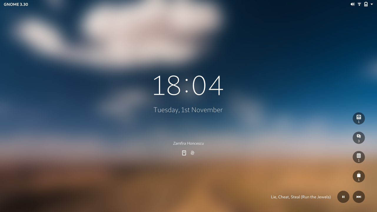
Without further ado, mockups! Here’s what we currently have for the lock screen:
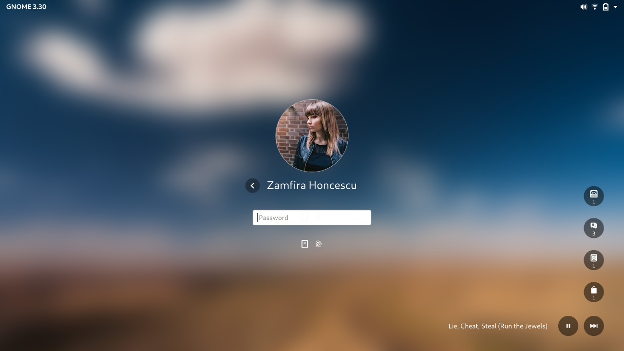
Key press or mouse click then reveals the password entry:
This motion mockup shows what the transitions would look like, going from the session, to a locked screen, and back to the session again:
As you can see, the existing “shield” concept has been retained – when you lock the device, a layer appears to slide down over the content. This slides up when the system is unlocked. We’ve tried to hold on to some of the character of the existing design, particularly with the centered time and date, so it is identifiably the same product as before.
So what’s changed? Here are some of the main things:
- The grey background is gone – the password field appears with the same background as the rest of the lock screen. This reduces the amount of friction the user experiences when logging in, and makes the process a lot smoother.
- Notifications are more minimal, have been moved to the side of the screen, and continue to be shown while the user authenticates (they’re currently hidden once the password field is visible) – giving users more time to register what’s been happening while the device has been locked.
- We’re going straight to user login from boot. This is an obvious win for single-user systems, since it’s less work to start using the machine. However, it’s also usually the right thing to do for multi-user systems too, since there is often one person who uses the machine more than others.
- We’re using a blurred version of the regular desktop background for the lock screen wallpaper, rather than a separate user-defined lock screen wallpaper. This is suggestive of a semi-transparent film or sheet that’s been placed over the session, but it also ties in with the user selection screen (described below).
There are a number of other smaller changes too, which I won’t go into here, although I’m obviously happy to answer questions, and there’s also more information on the design page.
User selection
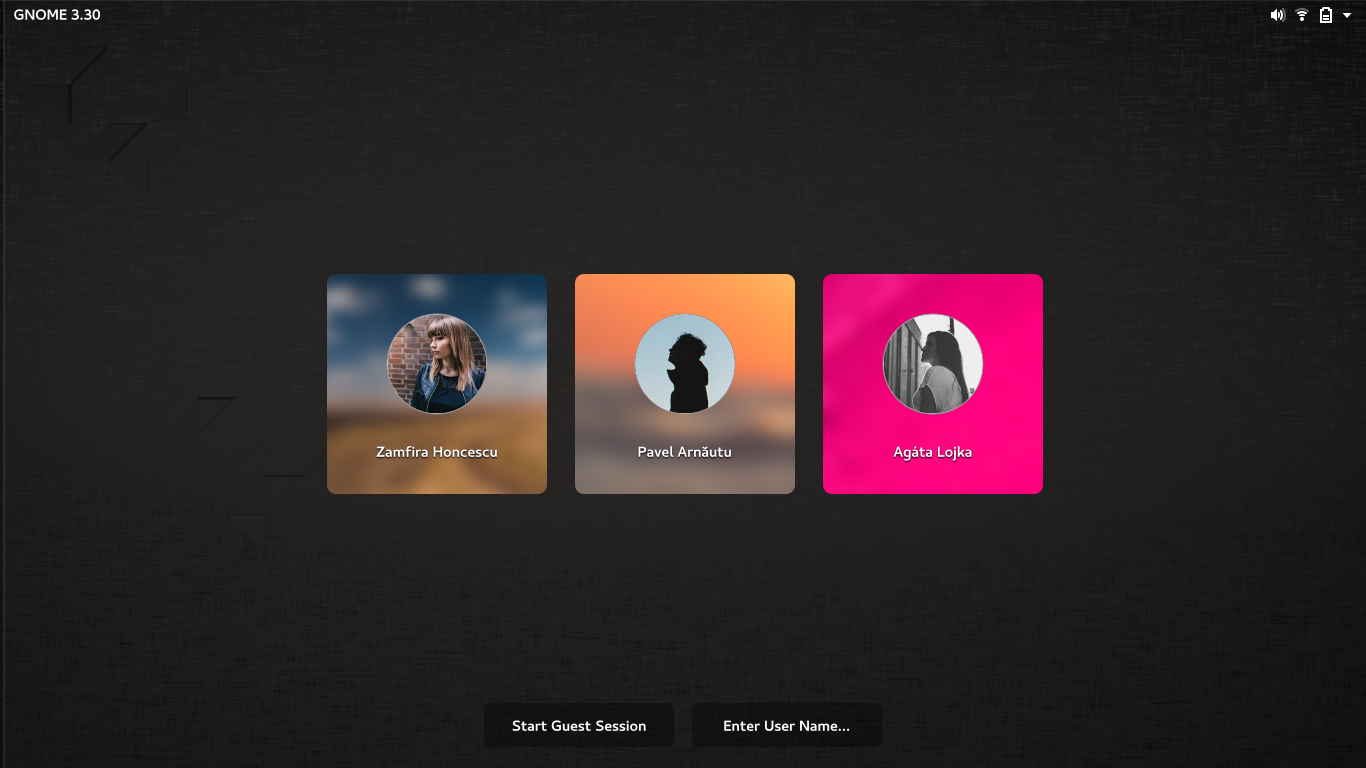
The other major part of the design is the user selection screen. This can be accessed from the lock screen as well as the session, and is used when switching user. The existing implementation uses a fairly simple list of users. We’ve given this a fairly thorough overhaul as part of the new design:
There’s also a motion mockup, which shows the transition from boot to login to user selection:
As you can see, the new design uses a grid of tiles, each of which features a blurred version of the user’s wallpaper. These are a key part of the spatial model for login. This allows users to orient themselves and contextualises navigation.
The user grid is designed to scale, so that it works well with large numbers of users. There’s also a simple username entry screen that can be used on deployments where a grid of user accounts might not be appropriate.
Next steps
We’re hoping that work on implementing the designs will start soon, and it would be great if anyone wants to help make them a reality. That said, the designs aren’t set in stone, and we expect them to continue to evolve as we get feedback and as implementation takes place. Hopefully we’ll get chance to do some user testing on them too, before they land in a stable version.
Questions and comments are welcome.
Wow, I have to say, this looks absolutely amazing. Kudos to everyone who worked towards this!!
One thing I’d like to see integrated in the login/lock system, is cryptoroot (or other) unlocking.
The issue I see is that at least full-disk encryption is pretty much essential with laptops and mobile devices, and it’s annoying to have to type passwords in multiple times before being able to log in.
macOS has a pretty nice system where in the “initrd” stage they have a simplified login UI, where you select the user and fill in the password already. The username+password combination unlocks the full disk encryption, and you’ll bypass the standard, full-featured (?) macOS login screen and be logged in directly.
I imagine for it to work you’d need to add each username+password as a LUKS key, and include some user metadata (name, profile picture) to the initrd. Running gdm entirely from the initrd is probably not feasible though…?
I totally second this. Additionally it would make it for inexperienced people easier to understand and one does not have to remember two different passwords.
You can already sort of get that if you use the same passphrase for LUKS disk encryption and your user session: just enable autologin.
At boot you enter your passphrase to unlock the disks, and systemd stores it in the kernel keyring. GDM then gets the passphrase out of the kernel keyring and uses it to unlock your session. (including the login keyring which stores all your passwords for online accounts, WiFi networks, and web sites)
Of course, this only works on single-user machines.
You also want to do that with GDM >= 3.28, because earlier versions had a bug which could lead you to losing access to your session keyring.
For single-user laptops, it’s really pretty great. :)
Actually if you enable autologin the password gets forwarded from the luks screen to the login session for the autologin user.
I think the feature broke recently with a systemd change, but most of the bits are in place for it work.
I don’t like this idea, i like to have two diffrent passwords, my encryption password is way longer than my root password, and i want to keep it that way, the encryption password can be long because i rarely need to type it in, but my root password i have to type in quiet often.
Looks excellent! I have two cents:
1) I agree that going straight to user login from boot is excellent, I would love that! But I am wondering if a left-pointing “back” arrow then is appropriate to use as a symbolic for switching account. Am I aware where I am going back to? Do we show that “zoom” animation on boot too?
2) I love the idea of using the user’s wallpaper to help the user identify his/her login option. But I imagine this is not so helpful if multiple users have the exact same default wallpaper, though. Maybe we can drop having a single default wallpaper and randomly choose among multiple fallback wallpapers?
About 1, I know what you mean, but then I do think that left arrow is recognised as meaning “back out”. I tried experimenting with other options, like a close button to the top right of the profile picture, but it didn’t seem to work as well.
hmm, another option could be a flat “switch account” button.
Please don’t show the shield when the screen isn’t locked! Or at least give us an option…
Can you clarify? I’m not sure what you mean.
Gnome puts up the screen shield when the display goes to sleep, regardless if it’s locked or not. There’s an extension but in my experience it’s been quite buggy and hard to get to work… https://extensions.gnome.org/extension/672/disable-screen-shield/
There’s been a lot of people complaining about this for a long time if you google for it.
And a bunch of bugzillas that have been rejected AFAIK,
https://bugzilla.gnome.org/show_bug.cgi?id=792094
https://bugzilla.gnome.org/show_bug.cgi?id=734638
Thanks for the clarification. I think we could explore removing the shield when the screen is woken up and the session isn’t locked – I’ll add it to the design page.
There are security problems related to the current behavior. It happened to me twice that I started to type my password on the shield as if logging in only to find that the screen was unlocked and I was typing into my last open window.
If my last open window was an IRC chat, things could end pretty badly.
That Looks just like Plasma’s KDE, I wonder where you guys got the idea…
I haven’t even seen KDE’s login screen. But really, who cares?
True story.
Those mockups are simply gorgeous.
-j
I know it may have been too much to cover in this single post, but I’d be curious to see the implementation for enterprise settings where the login screen is configured to not display a user name (i.e., the user name is not “saved” from prior sessions, and the user has to type their user name before they first log-in to a session).
Also, is there consideration for a company logo to be included in the new implementation of the GDM screen (I think that this functionality exists currently – only curious as to how it may be implemented in the new setup).
Thanks for your work thus far! It looks great!
Depending on PAM configuration in the enterprise, they may not even have to type their username… could be a smart card or fingerprint scan that’s required.
Hey Jim! There’s some material on the design page about enterprise setups. The main mockup is this one:
https://gitlab.gnome.org/Community/Design/london-ux2017-experiments/raw/master/lock-login/final/username-entry.png
We’ve talked about logos and we recognise that we’re going to have to support that feature, although I don’t think there’s a way to do it very nicely, unfortunately.
The whole design feels different than Gnome Shell design. It looks good, but it’s different. I believe it’s mostly the font weights.
Few questions about notifications:
Is it possible to see notifications content?
It may be also usefull for user to see notification content at all times to know if it’s worth to unlock the device. For example if email is just newsletter it can wait, but seeing message from friend you may want to respond to it as soon as possible.
Are you sure that it is a good decision to place them in bottom right corner? It may not work best on the phone/tablet screen in portait mode. Also the animation makes it look like they come from system dropdown (the one in top right corner) while actually they’re in date dropdown.
The current behavior is good, where typing input goes to the password field immediately (except for the spacebar, which simply reveals the password screen).
The way Windows 10 does it — where you have to hit a key to reveal the unlock screen, and *then* begin typing your password — is cumbersome and pointless.
Please keep the current behavior!
The Windows 10 thing is touted as a security feature, but you can turn it off: https://superuser.com/questions/979239/is-there-a-work-around-for-the-extra-key-press-and-delay-at-login-screen
The GNOME way is equally annoying if the first character in your password is a space, of course ;)
Thanks you for the link, i realy hate that behavior of windows. Didn’t know you could change it.
second that, i hate to press a button first in windows, i used to just type in gnome and always gets confused when logging in to my windows pc.
Love this! I just can’t believe how much more refined GNOME is getting over the releases.
I like that moving notifications to the side will differentiate the lock screen from Android’s and it makes me curious on a couple of points –
– How can a user expand the notification icons and view the accompanying text? I’m sure the users focusing on usability will be interested in seeing a mockup of that.
– How are a large number of notifications handled in this UI?
and btw, thanks Allan and everyone who contributed to this!
I really like the mockups. Something that is a bit unclear to me from the article/video: “Key press or mouse click then reveals the password entry” – I hope you keep the concept that the first pressed letter is also counted as first char of the password.
This bugs me every time I am forced to log in at a Windows 10 system compared to Gnome ;)
I like the style, as I’ve occasionally wondered why the unlock screen isn’t themed when the lock screen is.
My only thought is whether it needs so much… bounce. The movement (and combining blob effect) on the notification icons when the shield moves in gives them a bizarre amount of physicality and weight, and the pulsing of the user’s avatar to something larger than its final size seems excessive.
One question: Is there a separate design for single user desktops? While the inclusion of the desktop is potentially useful for multi-user systems, it can seem a bit much for single user systems (which is all of my systems). I’m intrigued as to how it would work with encrypted home directories as well.
Not sure if inspired but it reminds me a lot of the OSX login screen :(
http://cdn.osxdaily.com/wp-content/uploads/2015/11/login-screen-screenshot-mac-os-x-el-capitan-610×381.jpg
Just an opinion, I see too much `rubber effect` and rounded corners. To me GNOME is a bit more sober.
Thanks for your work!
Please make option to do not turn off screen after locking screen! There are situations when you need to lock screen for short period of time, you still want to see clock and notifications. This is important as many displays turn on quite slowly.
There are two romanians names in mokeups. Are there romanians involved in this project?
Bogdan, from Romania
Hello, this is really great concept, but i’m afraid of something.
You said you want a frictionless login screen, and that’s nice a very welcomed, but the biggest issue here for me is the default framerate on the login screen.
I have a 144hz monitor, so my desktop is configured at 144hz for that sweet sweet fps boost on videogames and also in the DE. But the login screen is always at 60hz, i couldn’t change that since ever. Is this rework of the login screen taking this into account. I just want the login screen to run at 144fps just like the desktop so the screen doesn’t go black for a few seconds when changing the framerate.
Thank you Allan for your great work :)
The round user icon should also address https://bugzilla.gnome.org/show_bug.cgi?id=772285
Looks very nice. With this login I think gnome-shell should also be a bit revamped
Wow!!! I would love it if that design came to the whole system!
Finally bigger profil photos i realy like that.
The other issue i had with the old locksreen was that on many wallpaper with the main content in the middle the clock was not realy readable, i always had to choose a wallpaper where the middle part was quiet clear so you could see the clock. I thought putting it in an edge like windows does would be a better solution, because in most of the pictures i use you could read it there better. Bluring the background is an other was to achieve better readability. Though i would slightly prefere the clock to be in an edge of the screen. But all in all pretty good improvements to the current lock screen.
Will there be a way to reboot or shutdown the PC from the lock screen?
Looking very good!
Just wanted to add my 2 cents: I really like my gnome setup and would like to keep it as stock as possible. One thing that can distract me out is the wallpaper animation on the lock screen. (I see it a lot every day.) Would be nice to have some settings available for the lock screen. In example, I would not mind going straight to the password input on my desktop and avoid any features designed for mobile/tablet experience.