Given the location of this year’s GUADEC many of us couldn’t make it to the real event (or didn’t want to because of the huge emissions), but since there’s a relatively large local community in Berlin and nearby central Europe, we decided to have a new edition of our satellite event, to watch the talks together remotely.
This year we were quite a few more people than last year (a bit more than 20 overall), so it almost had a real conference character, though the organization was a lot more barebones than a real event of course.
Thanks to Sonny Piers we had c-base as our venue this year, which was very cool. In addition to the space ship interior we also had a nice outside area near the river we could use for COVID-friendly hacking.
The main hacking area inside at c-base
We also had a number of local live talks streamed from Berlin. Thanks to the people from c-base for their professional help with the streaming setup!
On Thursday I gave my talk about post-collapse computing, i.e. why we need radical climate action now to prevent a total catastrophe, and failing that, what we could do to make our software more resilient in the face of an ever-worsening crisis.
Unfortunately I ran out of time towards the end so there wasn’t any room for questions/discussion, which is what I’d been looking forward to the most. I’ll write it up in blog post form soon though, so hopefully that can still happen asynchronously.
Hacking outside c-base on the river side
Since Allan, Jakub, and I were there we wanted to use the opportunity to work on some difficult design questions in person, particularly around tiling and window management. We made good progress in some of these areas, and I’m personally very excited about the shape this work is taking.
Because we had a number of app maintainers attending we ended up doing a lot of hallway design reviews and discussions, including about Files, Contacts, Software, Fractal, and Health. Of course, inevitably there were also a lot of the kinds of cross-discipline conversations that can only happen in these in-person settings, and which are often what sets the direction for big things to come.
One area I’m particularly interested in is local-first and better offline support across the stack, both from a resilience and UX point of view. We never quite found our footing in the cloud era (i.e. the past decade) because we’re not really set up to manage server infrastructure, but looking ahead at a local-first future, we’re actually in a much better position.
The Purism gang posing with the Librem 5: Julian, Adrien, and myself
Since GUADEC is hard to get to from Europe and some of us don’t do air travel, we’re going to do another edition of Berlin Mini GUADEC this year!
We have a pretty solid local community in Berlin these days, and there are a lot of other contributors living reasonably close by in and around central Europe. Last year’s edition was very fun and productive with minimal organizational effort, and this year will be even better!
Location and other details are TBA, but it’s going to be in Berlin during the conference and BoF days (July 20th to 25th).
Update: The location is C-Base (Rungestraße 20 in Kreuzberg, near U Jannowitzbrücke), and there’s now a Wiki page. Please add yourself to the attendee list so we get an idea how many people will be joining :)
GNOME 41 is going to be released in a few weeks, and as you may have heard it will come with a major refresh to Software’s interface.
Our goals for this initiative included making it a more appealing place to discover and install new apps, exposing app information more clearly, and making it more reliable overall. We’ve made big strides in all these areas, and I think you’ll be impressed how much nicer the app feels in 41.
There’s a lot of UI polish all across the app, including a cleaner layout for app cards, more consistent list views, a new simplified set of categories, a better layout for category pages, and much more.
Most of the groundwork for adaptiveness is also in place now. There are still a few views in need of additional tweaks, but for the most part the app is adaptive in 41.
However, the most visible change in this release is probably the near-complete overhaul of the app details pages. This includes a prettier header section, a more prominent screenshot carousel, and an all-new way of displaying app metadata.
Introducing Context Tiles
For the app details page we wanted to tackle a number of long-standing tricky questions about how to best communicate information about apps. These include:
Communicating app download size in a more nuanced way, especially for Flatpak apps where downloading additional shared runtimes may be required as part of installing an app
Showing the benefits of software freedom in a tangible way rather than just displaying the license
Making it clearer which files, devices, and capabilities apps have access to on the system
Incentivizing app developers to use portals rather than poking holes in the sandbox
Warning people about potential security problems
Providing information on whether the app will work on the current hardware (especially relevant for mobile)
Exposing age ratings more prominently and with more context
The solution we came up with is what we call context tiles. The idea is that each of these tiles provides the most important information about a given area at a glance, and clicking it opens a dialog with the full details.
Context tiles on the app details page
Storage
The storage tile has two different states: When the app is not installed, it shows the download size of the app, as well as any additional required downloads (e.g. runtimes). When the app is installed it changes to show the size the app is taking up on disk.
Safety
The Safety tile combines information from a number of sources to give people an overall idea of how safe an app is to install and use.
At the most basic level this is about how technically secure an app is. Two important questions here are whether an app is sandboxed (i.e. whether it’s flatpaked or running on the host), and whether it uses Wayland.
However, even if an app is sandboxed it can still have unlimited access to e.g. your home folder or the webcam, if these are defined as static permissions in the Flatpak manifest.
While for some apps there is no alternative to this (e.g. IDEs are probably always going to need access to the file system), in many cases there are more secure portal APIs through which people can allow limited one-time access to various resources.
For example, if you switch an app from using the old GtkFileChooser to the portal-based GtkFileChooserNative you can avoid requiring a sandbox hole for the file system.
All of the above is of course a lot worse if the app also has internet access, since that can make security issues remotely exploitable and allows malicious apps to potentially exfiltrate user data.
While very important, sandboxing is not the entire story here though. Public auditability of the code is also very important for ensuring the security of an app, especially for apps which have a lot of permissions. This is also taken into consideration to assess the overall safety of an app, as a practical advantage of software freedom.
Folding all of these factors into a single rating at scale isn’t easy. I expect we’ll continue to iterate on this over the next few cycles, but I think what we have in 41 is a great step in the right direction.
Hardware Support
With GNOME Mobile progressing nicely and large parts of our app ecosystem going adaptive it’s becoming more important to be able to check whether an app is adaptive before installing it. However, while adaptiveness is the most prominent use case for the hardware support tile at the moment, it’s not the only one.
The hardware support tile is a generic way to display which input and output devices an app supports or requires, and whether they match the currently available hardware. For example, this can also be used to communicate whether an app is fully keyboard-accessible or requires a gamepad.
Age Rating
Age ratings (via OARS) have been in Software for years, but we’ve wanted to present this information in a better way for some time.
The context tile we’re introducing in 41 shows the reasons for the rating at a glance, rather than just a rating.
The dialog shows more information on the exact types of content the app includes, though the current implementation is not quite the design we’d like here eventually. Due to technical constraints we currently list every single type of content and whether or not the app contains it, but ideally it would only show broad categories for things the app doesn’t contain. This will hopefully be improved next cycle to make the list easier to scan.
Metadata Matters
No matter how good an app store itself is, its appeal for people ultimately comes from the apps within it. Luckily GNOME has a sizable ecosystem of cool third party apps these days, exactly the kinds of apps people are looking to discover when they open Software.
However, not all of these apps look as good as they could in Software currently due to incomplete, outdated, or low quality metadata.
If the version of Adwaita on your screenshots is so old that people get nostalgic it’s probably time to take new ones ;)
Additionally, Software 41 comes with some changes to how app metadata is presented (e.g. context tiles, larger screenshots), which make it more prominently visible than before.
This means now is the perfect moment to review and update your app metadata and make a new release ahead of the GNOME 41 release in a few weeks.
Lucky for you I already wrote a blog post walking you through the different kinds of metadata your app needs to really shine in Software 41. Please check it out and update your apps!
Conclusion
Software 41 was a real team effort, and I’d like to thank everyone who helped make it happen, especially Philip Withnall, Phaedrus Leeds, Adrien Plazas, and Milan Crha for doing most of the implementation work, but also Allan Day and Jakub Steiner for helping with various aspects of the design.
This is also a cool success story for cross-company upstream collaboration with people from Endless, Purism, and Red Hat all working together on an upstream-first product initiative. High fives all around!
Software 41 will be released with the rest of GNOME 41 in a few weeks, and it brings a number of changes to how app metadata is presented, including the newly added hardware support information, larger screenshots, more visible age ratings, and more.
If you haven’t updated your app’s metadata in a while this is the perfect moment to review what you have, update what’s missing, and release a new version ahead of the GNOME 41 release!
In this blog post I’ll walk you through the different kinds of metadata your app needs to really shine in Software 41, and best practices for adding it.
App Summary
The app summary is a very short description that gives people an idea of what the app does. It’s often used in combination with the app name, e.g. on banners and app tiles.
If your summary is ellipsized on the app tile, you know what to do :)
In Software 41 we’re using the summary much more prominently than before, so it’s quite important for making your app look good. In particular, make sure to keep it short (we recommend below 35 characters, but the shorter the better), or it will look weird or be ellipsized.
Writing a good summary
The summary should answer the question “What superpower does this app give me?”. It doesn’t need to comprehensively describe everything the app does, as long as it highlights one important aspect and makes it clear why it’s valuable.
Some general guidance:
Keep it short (less than 35 characters)
Be engaging and make people curious
Use imperative if possible (e.g. “Browse the web” instead of “A web browser”)
Use sentence case
Things to avoid:
Technical details (e.g. the toolkit or programming language)
Structures like “GUI for X” or “Client for Y”
Mentioning the target environment (e.g. “X for GNOME”)
Repeating the app’s name
Overly generic adjectives like “simple”, “easy”, “powerful”, etc.
Articles (e.g. “A …” or “An …”)
Punctuation (e.g. a period at the end)
Title case (e.g. “Chat With Your Team”)
Good examples:
Maps: “Find places around the world”
Shortwave: “Listen to internet radio”
Byte: “Rediscover your music”
Code Example
The app summary is set in your appdata XML file, and looks like this:
Hardware support metadata describes what kinds of input and output devices an app supports, or requires to be useful. This is a relatively recent addition to appstream, and will be displayed in Software 41 for the first time.
The primary use case for this at the moment is devices with small displays needing to query whether an app will fit on the screen, but there are all sorts of other uses for this, e.g. to indicate that an app is not fully keyboard-accessible or that a game needs a gamepad.
Code Examples
Appstream has a way for apps to declare what hardware they absolutely need (<require>), and things that are known to work (<recommends>). You can use these two tags in your appdata XML to specify what hardware is supported.
For screen size, test the minimum size your app can scale to and put that in as a requirement. The “ge” stands for “greater or equal”, so this is what you’d do if your app can scale to phone sizes (360px or larger):
Note: The appstream spec also specifies some named sizes (xsmall, small, large, etc.), which are broken and should not be used. It’s likely that they’ll be removed in the future, but for now just don’t use them.
If you want your app to make a good impression good screenshots are a must-have. This is especially true in 41, because screenshots are much larger and more prominent now.
The new, larger screenshot carousel
Some general guidance for taking good app screenshots:
Provide multiple screenshots showing off the main areas of the app
Use window screenshots with a baked-in shadow (you can easily take them with Alt+PrintScr).
For apps that show content (e.g. media apps, chat apps, creative tools, file viewers, etc.) the quality of the example content makes the screenshot. Setting up a great screenshot with content takes a ton of time, but it’s absolutely worth it.
If you’re only doing screenshots in a single language/locale, use en-US.
Don’t force a large size if your app is generally used at small sizes. If the app is e.g. a small utility app a tiny window size is fine.
Before taking your screenshots make sure your system is using GNOME default settings. If your distribution changes these, an easy way to make sure they are all correct is to take them in a VM with Fedora, Arch, or something else that keeps to defaults. In particular, make sure you have the following settings:
System font: Cantarell
GTK stylesheet: Adwaita
System icons: Adwaita Icon Theme
Window controls: Close button only, on the right side
Things to avoid:
Fullscreen screenshots with no borders or shadow.
Awkward aspect ratios. Use what feels natural for the app, ignore the 16:9 recommendation in the appstream spec.
Huge window sizes. They make it very hard to see things in the carousel. Something like 800×600 is a good starting point for most apps.
Code Example
Screenshots are defined in the appdata XML file and consist of an image and a caption which describes the image.
The things I’ve covered in detail here are the most prominent pieces of metadata, but there are also a number of others which are less visible and less work to add, but nevertheless important.
These include links to various websites for the project, all of which are also defined in the appstream XML.
App website (or code repository if it has no dedicated website)
Issue tracker
Donations
Translations
Online help or user documentation
When making releases it’s also important to add release notes for the new version to your appdata file, otherwise the version history box on your details page looks pretty sad:
Conclusion
I hope this has been useful, and inspired you to update your metadata today!
Most of these things can be updated in a few minutes, and it’s really worth it. It doesn’t just make your app look good, but the ecosystem as a whole.
Like everyone else, I’m sad that we can’t have in-person conferences at the moment, especially GUADEC. However, thanks to the lucky/privileged combination of low COVID case numbers in central Europe over the summer, vaccines being available to younger people now, and a relatively large local community in and around Berlin we were able to put together a tiny in-person GUADEC satellite event.
Despite the somewhat different context we did a surprising number of classic GUADEC activities such as struggling to make it to the venue by lunchtime, missing talks we wanted to watch, and walking around forever to find food.
As usual we also did quite a bit of hacking (on Adwaita, Fractal, and Shell among other things), and had many interesting cross-domain discussions that rarely happen outside of physical meetups.
Thanks to Elio Qoshi and Onion Space for hosting, the GNOME Foundation for sponsoring, and everyone for attending. See you all at a real GUADEC next year, hopefully!
In the previous parts of this series (part 1, part 2, part 3, part 4) we looked at how power works within GNOME, and what this means for people wanting to have an impact in the project. An important takeaway was that the most effective way to do that is to get acquainted with the project’s ethos and values, and then working towards things that align with these.
However, you have to start somewhere. In practical terms, how do you do that?
Start Small
Perhaps you have lots of big ideas and futuristic plans for the project, and your first impulse is to start working on those. However, if you’re a new contributor keep the following in mind:
There’s often important context and history around a subject that you may not be aware of yet. Having this context inform your ideas generally makes them better and easier for others to get on board with.
It’s important to build trust with the community. People are likely to be skeptical of super ambitious proposals from people they don’t know yet, and who may not stick around long term.
Learning to effectively advertise your ideas and get buy-in from various people takes time. This goes especially for bigger changes, e.g. ones which impact many different modules.
Ideally the size of the things you propose should be proportionate to how well-integrated into the community you are. Trying to do a complete rewrite of GNOME Shell as your first contribution is likely not going to result in much. Something simple and self-contained, such as an individual view in an app is usually a good place to get started.
This doesn’t mean newcomers shouldn’t dream big (I certainly did). However, realistically you’ll be more successful starting with small tasks and working your way up to larger ones as you gain a better understanding of the project’s history, the underlying technologies, and the interests of various stakeholders.
Jumping In
What exactly to do first depends on the area you’re planning on contributing to. I’ll keep this focused on the areas I’m personally most involved with and which have the most immediate impact on the product, but of course there are lots of other great ways to get involved, such as documentation, engagement, and localization.
For programming there is a newcomer guide that guides you towards your first merge request. Check out the developer portal for documentation and other resources. Beyond the newcomer projects you can of course also just look at open newcomer (and non-newcomer) issues in specific projects written in your language of choice on GNOME Gitlab.
For design it’s easiest to just reach out to the design team and ask them to help you find a good first task. Ideally you’d start working with developers on something real as soon as possible, and the design team usually know what urgently needs design at the moment.
Of course, if you’re a developer there’s also the option of starting out by writing your own third-party apps, rather than contributing to existing ones. A great third-party app is a very valuable contribution to the project, and with GNOME Circle there is a direct path to GNOME Foundation membership.
Community
Becoming a part of the community is not just about doing work. It’s also about generally being active in community spaces, whether that’s hanging out in chat rooms, interacting with fellow contributors on social media, or going to physical meetups, hackfests, and conferences.
Some starting points for that:
Join the Matrix channels for the projects you’re interested in. Depending on the channel it’s possible that not much is going on at the moment, but this tends to be seasonal. Especially app-specific channels can fluctuate wildly in activity depending on how many people are working on the app right now.
Join some of the larger “general” GNOME Matrix channels for project-wide discussions and community stuff.
Reach out to people who work on things you want to get into and ask them about ways to get involved more closely. Of course it’s important to be respectful of people’s time, but most people I know are happy to answer a few quick questions once in a while.
Come to GUADEC, LAS, or other real-world meetups. Meeting other contributors face to face is one of the best ways to truly become part of the community, and it’s a lot of fun! Once it’s possible again COVID-wise, I highly recommend attending an in-person event.
Doing the Work
If you follow the above steps and contribute on a regular basis for a few months you’ll find that you’ve organically become a part of the project.
People will start to ask your opinion about what they’re currently doing, or for you to review their work. You’ll probably specialize in one or a few areas, and maybe become the go-to person for those things. Before you know it someone will ask you if you’re coming to the next hackfest, if you’ve already got your Foundation membership, or if you’d like to become co-maintainer of a module.
If you’ve joined the project with big ideas, this is the point where you can really start moving towards making those ideas a reality. Of course, making big changes isn’t easy even as a long-time contributor. Depending on the scope of an initiative it can take months or years to get something done (for example, our adaptive apps initiative started in 2018 and is still ongoing).
However, as an experienced contributor you have the technical, social, and ideological context to push for your ideas in a way that aligns with other people’s goals and motivations. This not only makes it less likely that your plans will face opposition, but if you’re doing it right it people will join you and help make it happen.
Conclusion
This concludes my 5-part series on how power works in the GNOME community, and how to get your pet feature implemented. Sorry to disappoint if you thought it was going to be quick and easy :)
On the plus side though, it’s a chance to be part of this amazing community. The friends you make along the way are truly worth it!
While this is the end of the series as I originally planned it, there are definitely areas it doesn’t cover and that I might write about in the future. If there are specific topics you’d be interested in, feel free to leave a comment.
In the first three parts of this series (part 1, part 2, part 3) we looked at how power works within GNOME and what that means for getting things done. We got to the point that to make things happen you (or someone you’ve hired) need to become a trusted member of the community, which requires understanding the project’s ethos.
In this post we’ll go over that ethos, both in terms of high level values, and what those translate to in more practical terms.
Values and Principles
GNOME is a very principled project, and there’s a fair amount of writing on this topic already.
To give you an overview though, here’s my personal bullet point summary. It follows the same structure as the development process laid out in part 2 based on what areas specific values and ideas apply to. It’s not meant to be comprehensive, but rather give you an idea of the way people inside the project think.
The Why
Base motivations that inform everything we do.
We believe in software freedom as an inclusive, accountable model for producing technology in the commons.
Our software is built to be usable by everyone. We care deeply about user experience, accessibility, internationalization, and support for a diverse range of hardware.
Software should be structurally and aesthetically elegant, both in terms of underlying technology and user interface.
The What
What kinds of things we think are worth pursuing, and (just as important) what kinds of things should be avoided.
Third-party apps are the best abstraction to extend the core system with additional functionality. This is why we put a huge amount of work into empowering third party app developers to build more and better apps.
Every preference has a cost, and this cost rises exponentially as you add more of them. This is why we avoid preferences as much as possible, and focus on fixing the underlying problems instead.
Similarly, there is a direct relationship between how vertically integrated a product is and how cohesive you can make it. Every unnecessary variable you eliminate across the stack frees up time and energy, and creates opportunities for features you couldn’t otherwise build.
People’s attention is precious. We pride ourselves in being distraction free.
The How
Useful rules of thumb around how we go about making things.
We don’t do hacks. Rather than working around a problem at the wrong layer of abstraction, we believe in going to the root of the problem and fixing it for everyone, even if that means digging into lower layers (and ends up being far more difficult as a result).
We see design holistically, rather than as an isolated thing the design team does. It’s not just about functionality and aesthetics, but also underlying technology, and what to build in the first place. Even if you’re not contributing on the design team, developing an affinity for design will make you a more effective contributor.
Looking at relevant art is important, but simply copying the competition doesn’t usually produce great results. We have a proud history of inventing new paradigms that are better than the status quo.
As a general rule, start from the user experience you want and then go about building the technology necessary to create it, not the other way around. However: This is not an excuse for bad engineering or pursuing ideas that are conceptually impossible (e.g. multi-protocol chat clients).
Defer to the Expert. Everyone has different areas of expertise, such as user experience, security, accessibility, performance, or localization. Listen to the people most experienced in a given domain.
Design is all about trade-offs. Be wary of hard and fast rules that only look at one part of a problem (e.g. “vertical space is at a premium, therefore…”), and instead try to balance various concerns in a way that works well overall.
In Practice
Some of the above principles are quite abstract, so what do they translate to when actually building software day to day? Here are some examples of how they apply to real-world questions.
App developers should do their own packaging. It’s the only way to do it sustainably at scale.
The “traditional desktop” is dead, and it’s not coming back (Note: I’m talking about Windows 95 era UI patterns here, not desktop vs. mobile). Instead of trying to bring back old concepts like menu bars or status icons, invent something better from first principles.
System-wide theming is a broken idea. If you don’t like the way apps look, contribute to them directly (or to the platform style).
Shell extensions are always going to be a niche thing. If you want to have real impact your time is better invested working on apps or GNOME Shell itself.
“Filling the available space” is rarely a good goal by itself, and an easy way to design yourself into a corner.
All of the above is of course my personal perception, and you’ll find variations on these ideas depending on who you talk to. However, in my experience most of them are shared fairly consistently by people across the community, especially given our informal structure.
Now that we’ve covered how things get done, by whom, and why, you’re in a great position to start making your mark. In the next part of this series we’ll look at practical first steps for contributing.
In parts 1 and 2 of the series we looked at how different groups inside the GNOME community work together to get things done. In this post we’ll look at what that means for people wanting to push for their personal agenda, e.g. getting a specific feature implemented or bug fixed.
Implicit in the theoretical question how power works in GNOME is often a more practical one: How can I get access to it? How can I exercise power to get something I want?
At a high level that’s very easy to answer: You either do the work yourself, or you convince someone else to do it.
Do It Yourself
If you’re the person working on something you have a ton of power over that thing. Designing and building software is in essence an endless stream of decisions. The more work you do, the more of those decisions you end up making.
Of course, in practice it’s not quite that simple. User-visible features need design reviews, and unless you’re the sole maintainer of a project you also need to go through code reviews to get your changes merged. As a designer, most things you design need to be implemented by someone else, so you have to convince them to do that.
However, it’s definitely possible to have a huge impact simply by doing a lot of work, and not only because of all the decisions you end up making directly as you implement things. If you contribute regularly to a module you’ll eventually end up reviewing other people’s work, and generally being asked for your opinion on topics you’re knowledgeable about.
Making Your Case
If you can’t, don’t want to, or don’t have time to do the work yourself, you’ll need to find someone else to do it for you. This is obviously a difficult task, because you’re essentially trying to convince people to work for you for free.
Some general tips for this:
Get an idea of what kinds of things the people you’re trying to convince are interested in, e.g. technologies they like and types of problems they care about.
Make the case that your idea fits into something they are already working on, or will help them reach goals they are already pursuing.
Generally speaking, you’ll have a much better chance with new-ish contributors. They tend to be less overworked since they don’t maintain as many mission-critical modules.
Realistically, unless your idea is very small in scope, or exactly what someone was already looking for, this strategy is not very likely to succeed. Most contributors, volunteer or paid, already have a huge backlog of their own to work through. There are only so many hours in the day, and GtkTimeMachine is not yet a thing :)
However, the chances are not zero either, and it’s always possible that even if your idea isn’t picked up right away it will spark something later on, or influence future discussions.
Paying Someone Else
You can of course also convince people to work on something you want by hiring them (radical, I know!).
There are plenty of very talented people in the GNOME community who do contract development, from individuals to fairly large consultancies. You can also hire someone from outside the project, but then they will have to build trust with the community first, which is non-trivial overhead. In most cases, hiring existing contributors is orders of magnitude more effective than people who aren’t already a part of the project.
How to hire people to implement things for you is out of scope for this series, but if you’d like advice on it feel free to contact me or leave a comment. If there’s enough interest I might write about it in the future.
All of that said, if the thing you want doesn’t align with the ethos of the project it’s going to be difficult regardless of which strategy you go with. This is why familiarizing yourself with that ethos is important if you want to make your mark on the project. To help with that we’ll go over GNOME’s principles and values in the next part of this series.
In part 1 of this series we looked at some common misconceptions about how power works inside the GNOME project and went over the roles and responsibilites of various sub-groups.
With that in place, let’s look at how of a feature (or app, redesign, or other product initiative) goes from idea to reality.
The Why
At the base of everything are the motivations for why we embark on new product initiatives. These are our shared values, beliefs, and goals, rooted in GNOME’s history and culture. They include goals like making the system more approachable or empowering third party developers, as well as non-goals, such as distracting people or introducing unnecessary complexity.
Since people across the project generally already agree on these it’s not something we talk about much day-to-day, but it informs everything we do.
This topic is important for understanding our development process, but big enough to warrant its own separate post in this series. I’ll go into a lot more detail there.
The What
At any given moment there are potentially hundreds of equally important things people working on GNOME could do to further the project’s goals. How do we choose what to work on when nobody is in charge?
This often depends on relatively hard to predict internal and external factors, such as
A volunteer taking a personal interest in solving a problem and getting others excited about it (e.g. Alexander Mikhaylenko’s multi-year quest for better 1-1 touchpad gestures)
A company giving their developers work time to focus on getting a specific feature done upstream (e.g. Endless with the customizable app grid)
The design team coming up with something and convincing developers to make it happen (e.g. the Shell dialog redesign in 3.36)
A technological shift presenting a rare opportunity to get a long-desired feature in (e.g. the Libadwaita stylesheet refresh enabling recoloring)
For larger efforts, momentum is key: If people see exciting developments in an area they’ll want to get involved and help make it even better, resulting in a virtuous cycle. A recent example of this was GNOME 40, where lots of contributors who don’t usually do much GNOME Shell UI work pitched in during the last few weeks of the cycle to get it over the line.
If something touches more than a handful of modules (e.g. the app menu migration), the typical approach is to start a formal “Initiative”: This is basically a Gitlab issue with a checklist of all affected modules and information on how people can help. Any contributor can start an initiative, but it’s of course not guaranteed that others will be interested in helping with it and there are plenty of stalled or slow-moving ones alongside the success stories.
The How
If a new app or feature is user-facing, the first step towards making it happen is to figure out the user experience we’re aiming for. This means that at some point before starting implementation the designers need to work through the problem, formulate goals, look at relevant art, and propose a way forward (often in the form of mockups). This usually involves a bunch of iterations, conversations with various stakeholders, and depending on the scale of the initiative, user research.
If the feature is not user-facing but has non-trivial technical implications (e.g. new dependencies) it’s good to check with some experienced developers or the release team whether it fits into the GNOME stack from a technical point of view.
Once there is a more or less agreed-upon design direction, the implementation can start. Depending on the size and scope of the feature there are likely additional design or implementation questions that require input from different people throughout the process.
When the feature starts getting to the point where it can be tested by others it gets more thorough design reviews (if it’s user facing), before finally being submitted for code review by the module’s maintainers. Once the maintainers are happy with the code, they merge it into the project’s main branch.
In the next installment we’ll look at what this power structure and development process mean for individual contributors wanting to work towards a specific goal, such as getting their pet bug fixed or feature implemented.
People new to the GNOME community often have a hard time understanding how we set goals, make decisions, assume responsibility, prioritize tasks, and so on. In short: They wonder where the power is.
When you don’t know how something works it’s natural to come up with a plausible story based on the available information. For example, some people intuitively assume that since our product is similar in function and appearance to those made by the Apples and Microsofts of the world, we must also be organized in a similar way.
This leads them to think that GNOME is developed by a centralized company with a hierarchical structure, where developers are assigned tasks by their manager, based on a roadmap set by higher management, with a marketing department coordinating public-facing messaging, and so on. Basically, they think we’re a tech company.
This in turn leads to things like
People making customer service style complaints, like they would to a company whose product they bought
General confusion around how resources are allocated (“Why are they working on X when they don’t even have Y?”)
Blaming/praising the GNOME Foundation for specific things to do with the product
If you’ve been around the community for a while you know that this view of the project bears no resemblance to how things actually work. However, given how complex the reality is it’s not surprising that some people have these misconceptions.
To understand how things are really done we need to examine the various groups involved in making GNOME, and how they interact.
GNOME Foundation
The GNOME Foundation is a US-based non-profit that owns the GNOME trademark, hosts our Gitlab and other infrastructure, organizes conferences, and employs one full-time GTK developer. This means that beyond setting priorities for said GTK developer, it has little to no influence on development.
Update: As of June 14, the GNOME Foundation no longer employs any GTK developers.
Individual Developers
The people actually making the product are either volunteers (and thus answer to nobody), or work for one of about a dozen companies employing people to work on various parts of GNOME. All of these companies have different interests and areas of focus depending on how they use GNOME, and tend to contribute accordingly.
In practice the line between “employed” contributor and volunteer can be quite blurry, as many contributors are paid to work on some specific things but also additionally contribute to other parts of GNOME in their free time.
Maintainers
Each module (e.g. app, library, or system component) has one or more maintainers. They are responsible for reviewing proposed changes, making releases, and generally managing the project.
In theory the individual maintainers of each module have more or less absolute power over those modules. They can merge any changes to the code, add and remove features, change the user interface, etc.
However, in practice maintainers rarely make non-trivial changes without consulting/communicating with other stakeholders across the project, for example the design team on things related to the user experience, the maintainers of other modules affected by a change, or the release team if dependencies change.
Release Team
The release team is responsible for coordinating the release of the entire suite of GNOME software as a single coherent product.
In addition to getting out two major releases every year (plus various point releases) they also curate what is and isn’t part of the core set of GNOME software, take care of the GNOME Flatpak runtimes, manage dependencies, fix build failures, and other related tasks.
The Release Team has a lot of power in the sense that they literally decide what is and isn’t part of GNOME. They can add and remove apps from the core set, and set system-wide default settings. However, they do not actually develop or maintain most of the modules, so the degree to which they can concretely impact the product is limited.
Design Team
Perhaps somewhat unusually for a free software project GNOME has a very active and well-respected design team (If I do say so myself :P). Anything related to the user experience is their purview, and in theory they have final say.
This includes most major product initiatives, such as introducing new apps or features, redesigning existing ones, the visual design of apps and system, design patterns and guidelines, and more.
However: There is nothing forcing developers to follow design team guidance. The design team’s power lies primarily in people trusting them to make the right decisions, and working with them to implement their designs.
How do things get done then?
No one person or group ultimately has much power over the direction of the project by themselves. Any major initiative requires people from multiple groups to work together.
This collaboration requires, above all, mutual trust on a number of levels:
Trust in the abilities of people from other teams, especially when it’s not your area of expertise
Trust that other people also embody the project’s values
Trust that people care about GNOME first and foremost (as opposed to, say, their employer’s interests)
Trust that people are in it for the long run (rather than just trying to quickly land something and then disappear)
This atmosphere of trust across the project allows for surprisingly smooth and efficient collaboration across dozens of modules and hundreds of contributors, despite there being little direct communication between most participants.
This concludes the first part of the series. In part 2 we’ll look at the various stages of how a feature is developed from conception to shipping.
Windows XP was still everywhere. Smartphones were tiny, and not everyone had one yet. Newoperatingsystems were coming out left and right. Android phones had physical buttons, and webOS seemed to have a bright future. There was general agreement that the internet would bring about a better world, if only we could give everyone unrestricted access to it.
This was the world into which GNOME 3.0 was released.
I can’t speak to what it was like inside the project back then, this is all way before my time. I was still in high school, and though I wasn’t personally contributing to any free software projects yet, I remember it being a very exciting moment.
3.0 was a turning point. It was a clear sign that we’d not only caught up to, but confidently overtaken the proprietary desktops. It was the promise that everything old and crufty about computing could be overcome and replaced with something better.
As an aspiring designer and free software activist it was incredibly inspiring to me personally, and I know I’m not alone in that. There’s an entire generation of us who are here because of GNOME 3, and are proud to continue working in that tradition.
I’ve written about designing GNOME apps at a high level before, but not about the actual process of drawing UI mockups the way we do on the GNOME design team. In this tutorial we’ll pick up the Read It Later example from previoustutorials again, and draw some mockups in Inkscape from scratch.
Before we start, let’s look at the sketches we’re going to base this on. I’ve re-drawn some of the sketches from my last app design blog post with just the parts we’ll need for this tutorial.
I recommend having a look at that other blog post before jumping into this one, as it will give you some background on the basic design patterns and show step by step how we got to this layout.
What’s in a Mockup?
After you’ve designed the basic structure of your app (e.g. as a sketch on paper) but before starting implementation, it’s good to check what your layout will look like with real UI elements.
Left: The initial mockup drawn in Inkscape, right: Screenshot of the real app
This doesn’t mean mockups need to recreate every gradient and highlight from the GTK stylesheet. Doing that would make mockups very hard to edit and keep in sync as the stylesheet evolves. However, things like spacing, border radii, button styling, etc. can be made to look very close to how they’ll look in the implemented version with relatively little effort. This is why on the GNOME design team we use a simplified style somewhere between a wireframe and a mockup, where sizes and metrics are mostly pixel-perfect, but UI visuals are not.
This level of fidelity is great for trying variations on layouts, placement of individual controls, different icon metaphors, etc. which are the most important things to validate before starting development. Once the implementation is in progress there’s usually additional rounds of iteration on different aspects of the design, but those don’t always require mockups as you can just iterate directly in code at that point.
Pre-Requisites
In order to be able to follow along with this tutorial, you’ll need to install a few apps:
Inkscape: The vector drawing app we’ll be using to draw our mockup
Icon Library: A handy app for finding symbolic icons to use in mockups
Next, you need the GNOME mockup template. This is an SVG file with many of our most common UI patterns, which enables you to make mockups by copying and adapting these existing components, rather than having to draw every element yourself. You can download the template from GNOME Gitlab.
Finally, you need a recent version of Cantarell, GNOME’s interface font. It’s possible that while you may have a font with that name installed, it’s not the right version, because some distributions and Google Fonts are still on an old version (which has only 2 weights, rather than 5). You can download the new version here.
Inkscape Basics
If you’ve never used Inkscape before it might be good to do some more general beginner tutorials as a first step. I’ll assume familiarity with navigation and object manipulation primitives such as selection, moving/scaling/rotating, duplicating, manipulating z-index, grouping/ungrouping, and navigating through group hierarchies.
Nevertheless, here’s a quick overview of the features we’ll be using primarily.
Controls
Inkscape has a lot of features, but we only need a small subset for what we’re doing. Most interfaces are just nested rectangles, after all ;)
Toolbox (the toolbar on the left edge):
Selection/movement/scaling tool (S)
Rectangle tool (R)
Ellipse tool (E)
Text tool (T)
Color picker (D)
Properties Sidebar (configuration dialogs docked to the right side):
Fill & Stroke (Ctrl + Shift + F)
Align & Distribute (Ctrl + Shift + A)
Export (Ctrl + Shift + E)
Document Properties (Ctrl + Shift + D)
Snap Controls (the toolbar on the right edge): Inkscape has very fine-grained snapping controls to configure what should be snapped to when you move items on the canvas (e.g. path nodes, object center, path intersections). It’s a bit fiddly, but very useful for making sure things are aligned to the grid. The icon tooltips are your friends :)
When aligning things or working with the pixel grid it’s very helpful to have the page grid visible. It can be toggled with the # shortcut or in the View menu.
Advanced: Partial Rounded Corners
One sort of advanced thing I started doing recently is using path effects to get rounded corners only on specific corners of a rectangle. This is handy compared to having the rounding baked into the geometry, because it keeps the rounding flexible, so the object can be scaled without affecting the rounded corners.
The feature is quite hidden and looks very complex, but once you know where it is it’s not that scary. You can find it in Path > Path Effects... > + > Corners (Fillet/Chamfer).
You’ll find that the mockup templates use this path effect technique for e.g. rounded bottom corners on windows.
Color Palette
It’s not as important for mockups as it is for app icons, but still nice to have: The GNOME color palette. Inkscape 1.0+ includes it by default, so you can just choose it from the arrow menu on the right.
Otherwise you can also get it via the dedicated color palette app, or download the .gpl from Gitlab and put it in ~/.var/app/org.inkscape.Inkscape/config/inkscape/palettes for Flatpak Inkscape or ~/.config/inkscape/palettes if it’s on the host.
Page Setup
With that out of the way, let’s get started making our mockup! First, we need a basic page to start from. We can start from the empty-page.svg file, by opening that file and saving it under the name we’ll ultimately want for our mockup, e.g. read-later.svg.
GNOME mockups usually consist of one or more views laid out on a “page” of whatever size is needed to make the content fit. There’s usually a title and description at the top, plus additional captions to explain things about the individual screens where it’s needed (example).
The page dimensions can be adjusted in Document Properties (Ctrl + Shift + D). One useful shortcut here is Ctrl+Shift+R, which resizes to the bounding box of the current selection (Note: Only use this shortcut if the thing you’re resizing to is e.g. a rectangle you set up for that purpose. Resizing the page to things off the pixel grid will break it, because it moves the document origin).
Let’s do that, and tweak the title and description for our case:
Desktop View
Now that the page is set up we can add our first screen. This is the sketch we’re going to be drawing first:
As a first step, let’s bring in the window template with view switcher from pattern-templates.svg. Open that file in Inkscape, select the top leftmost screen, copy it, and paste it into your mockup file.
After roughly positioning the window, check the exact position using the numeric position entries in the bar at the top, and make sure both X and Y positions are full integers (if they’re not integers it means your mockup is off the pixel grid and will look blurry).
It’s worth pointing out that while in this case we’re just starting from the plain default templates, it’s often faster to start from an existing mockup for another app. The app-mockups repository on GNOME Gitlab is full of existing mockups to borrow elements from or use as a starting point for a new mockup. That said, depending on their age those mockups might be using outdated patterns, so it’s good to check when a particular mockup was last updated :)
Headerbar
Let’s start by adjusting the headerbar to what we have in our sketch. Conveniently, several of the buttons don’t need to change at all from the template. All we need to do here is move the search button to the left, delete the add button, and adjust the switcher.
As a general rule, spacing between elements is a multiple of 6 pixels (so 6, 12, 18, 24…). For example, there are 6px of padding around buttons inside a headerbar, and 6px between the individual buttons.
When moving/placing elements, always make sure that snapping to bounding box is active (topmost group of snapping controls). As with the placement of the window earlier, it’s good to verify that sizes and positions are even integers in the toolbar up top.
Next up: The view switcher. You can start by changing the three labels, and then re-centering the icon + label groups on their respective containers. The inactive items have invisible containers, so they’re a bit fiddly to select.
For the icons, you can fire up Icon Library and search for the following icons:
Unread: view-paged
Archive: drawer *
Favorites: star-outline-thick
* This icon isn’t included yet, but will be in a future version
You can paste icons directly into Inkscape using the “Copy to Clipboard” feature. Before pasting, navigate into the relevant icon group (each of the icons is grouped with an invisible 16px rectangle, because that’s the icon canvas size). When placing an icon, make sure to center it on the invisible canvas rectangle, and place them on the pixel grid. You may want to turn on outline mode (Ctrl+5 cycles through display modes) to deal with the invisible rectangles more easily.
Once the icons are replaced, change the label strings with the text tool, and move the icon+label blocks horizontally so they look centered within their containers. I personally just do this manually by eye rather than using the alignment tool, so I don’t lose the icon’s alignment to the pixel grid, but you can also align and then manually move it to the closest position on the pixel grid.
With this, the headerbar is complete now:
Content
Let’s look at the content inside the window next. We can keep the basic structure of the listbox from the template, but obviously we want to change what’s in the list.
I’ve prepared some example content we can just copy and paste that into our mockup. Each article consists of three labels, one using the regular font size (10.5pt), and two using the small one (9pt). The metadata label also uses a lighter gray, to distinguish it from the body copy (you can get the color from the labels on the right side of the list in the template using the color picker tool).
The list from the template is grouped and has a clipping mask to cut off scrolling content at the bottom. Since our layout is different anyway we can remove the clipping by simply ungrouping (Ctrl + Shift + G). Next, we can delete all content except the first row, and change that to our first article.
In order to accommodate multiple pieces of content inline as part of the same label, a common pattern is to use middle dots (“·”) as dividers. Pro tip: The Typography app makes it easy to copy and paste typographic symbols like this one into your mockups.
After adding the articles in the first listbox, we need the “Show more” button at the bottom. For that we can just resize the list so it extends past the last article, and add a centered label on that area.
Some of the articles also have images associated with them (there are download URLs for the images in the example content file). Images that aren’t already square need to be clipped to a square shape for our layout. To do that in Inkscape
Pull in the image via drag and drop from the file manager (or paste it directly from a website via “Copy Image”)
Place a rectangle with the right size/proportions where we want the image to go in the layout. In this case, images should be 80px squares, with 12px spacing all around.
Move and scale the image to cover the rectangle on all sides
Select both the image and the rectangle, and do Object > Clip > Set. Note that the clipping object (the rectangle) needs to be above the target (the image).
With the first list done, we can move it down a bit and add a title above it. You can re-use one of the titles from the list for that, and just horizontally align it with the list container. Spacing between title baseline and list should also be 12px, and above the title 18px to the edge of the view.
After that, our first list is complete:
For the second list we can duplicate our first list, move it down below, and just change the content:
In order to have it cut off nicely at the bottom we can bring back a clipping mask. Group the list, duplicate the window background rectangle, and use that as a clipping mask for the list. To make the last article a little more visible I’m also resizing the window background to be a little bit taller first.
Menu
For the primary menu we can pretty much just re-use the menu from the template (top left, outside the canvas). Copy over the template popover and button, and vertically align it so the button is at the same height as the one in the window.
Since we don’t need many actions other than the default ones, all we need to do here is change a few labels, add another divider, and put in the name of the app.
That leaves us with a bunch of whitespace in the popover though, so let’s move up the actions and then resize the popover by selecting the bottom nodes and moving them up using the arrow keys:
And with that, our menu looks pretty good:
That completes our desktop view, and we can move on to mobile.
Mobile View
Now that we have a desktop view, let’s do a mobile version of it. Let’s have another look at our sketch:
We can re-use all the elements from the desktop view here, but we need to resize and move around a few things.
As a starting point for the layout, let’s bring in the mobile template. I like to align the mobile headerbar with the desktop one vertically, so all the headerbar buttons have the same vertical position.
Headerbar & Navigation
On mobile sizes there’s not enough horizontal space to keep the view switcher in the headerbar, so instead there’s just a title. The view switcher is in a separate bar at the bottom.
For the headerbar we can duplicate the buttons from the desktop mockup and use them to replace the placeholder buttons on the mobile template.
For the switcher, start by deleting all items except one. Then center the remaining one, and resize the background rectangle to a bit less than a third of the width of the view.
After that you can duplicate the item twice, and move the two additional switcher items to the sides:
Now you can change the icons and strings, and delete the backgrounds on two of the items, and we have a complete mobile switcher:
Content
Adapting the content is easy in this case. Duplicate the lists from the desktop mockup, left-align it with the lists from the template and delete the original lists.
Then we just need to resize the text boxes by moving the handle on the right of the baseline, truncate the text to two lines, move the images to 12px from the right edge, and center the “Show More” label.
Repeat the same thing for the second list, and we have a complete mobile layout!
Page Size & Export
If we zoom out and look at the whole thing together, we can see that this looks pretty much done now:
However, the canvas size is too big for the content we have. Open Document Properties (Ctrl + Shift + D) and change the size to about 1780×1100px.
This is what it looks like with the new page size:
Now that the mockup is ready, let’s export a PNG for easy sharing. Open the Export dialog (Ctrl+Shift+E), choose “Page” at the very top, make sure the DPI is 96, and set the file path. Then press Export, and try opening the PNG in an image viewer to check if there are any issues you missed.
On the design team we usually then push the finished mockup to a git repository, but that’s out of scope for this tutorial.
Conclusion
Congratulation, you made it all the way to the end! I hope this was useful, and you’ll go on to make many great mockups using what you learned :)
You can download the SVG for the mockup I created for this tutorial from GNOME Gitlab. It might come in handy if you have problems with a specific part of the tutorial and want to see how I did it. By the way: The inkscape-tutorial-resources repository contains snapshots of all templates and resources used in this tutorial, in case the original ones change in the future.
Obviously for a real mockup we’d do additional screens (e.g. the article page, various other menus, settings screens, and the like), but I think we’ve covered most of the basics with just this one screen. If you have questions feel free to comment or get in touch!
This is Part 2 of a series on what’s wrong with the free desktop app ecosystem and how we can fix it, based on the talk Jordan Petridis and I gave at LAS 2019 in Barcelona.
In Part 1 we looked at all the different elements making up a platform, and found that there is only one “complete” platform in the free software desktop world at the moment. This is because desktops control the developer platforms, while packaging and system integration is managed by separate communities, the distributions, for historical reasons. This additional layer of middlemen is a key reason why we don’t have real platforms.
Power to the Makers
The problems outlined in Part 1 are of coursenot new, and people havebeen workingon solutions to them for a long time. Some of these solutions have really started to come together over the last few years, empowering the people making the software to distribute it directly to the people using it.
Thanks to the work of many amazing people in our community you can now develop an app in GNOME Builder, submit it to Flathub, get it reviewed, and have it available for people to install right away. Once it’s on there you can also update it on a schedule you control. No more waiting 6 months for the next distribution release!
Thanks to GNOME Builder’s Flatpak integration, “works on my machine” is largely a thing of the past now!
But though this is all very awesome, Flatpak is unfortunately not a complete solution to the platform conundrum discussed earlier in this series.
Flatpak is Not Enough
Flatpak does solve a number of the issues around app distribution very elegantly, because app developers do their own packaging, and control their release schedule. It’s also a unified package format that works across different host systems, and the Flatpak runtimes are clearly defined development targets to do QA against.
But that doesn’t magically fix all our problems. The two elephants in the room are
The Host still matters: Flatpak only solves part of the issues with distro packaged apps
Downstream drama: Flatpak does not address the conflicts between desktops and distributions
1. The Host Still Matters
Even with Flatpak there are still some unpredictable variables on the host system which affect app developers. On the technical side a number of things can go wrong, from an outdated Flatpak version (which can mean some Portals apps rely on may be missing), to missing/incompatible system APIs such as password storage, calendar, or address book.
These things can lead to applications not working properly, or at all. For example, this is why new versions of GNOME Contacts cannot access any contacts on Debian 10, why recent GNOME Calendar cannot access any calendars on Ubuntu 18.04, or why Fractal doesn’t remember your password across restarts on some non-GNOME environments.
There are also user-facing integration points where applications interface with the system. These include things like notifications, the application menu, search providers, the old systray, and the design patterns used in individual apps.
For example, when the system UI or design guidelines change, applications follow the platform and change their UI accordingly. This means if you install newer apps on an older system, there are going to be weird edge cases. For example, if you install new apps on Debian 10 you get a confusing mix of the old and new application menu paradigms because the design guidelines were changed with GNOME 3.32 (early 2019).
Before GNOME 3.32 applications had global menu items in the application menu in the Shell top bar, but now they are in the primary menu, inside the app window.
Flatpak also applies the host GTK stylesheet and icon set to apps. This means that if the host distribution overrides the system stylesheet, Flatpak will happily apply random, never-tested CSS to every app. Obviously this leads to lots of issues, ranging from ugly but relatively harmless glitches to real usability issues, such as illegible text on buttons. For more background on this particular issue, see this blog post.
Some of these issues could be fixed with more standardization, changes to Flatpak, or new portals. However, fundamentally, in order to be a real platform you need a clearly defined environment to develop and test for. Flatpak alone is not enough to achieve that.
Just like “write once, run everywhere” is always an illusion, it’s never going to be possible to completely split apps from the OS. You always need app developers to do some extra work to support different environments, and currently every distribution represents yet another extra environment to support.
2. Downstream Drama
Flatpak does not completely solve the issues app developers face in shipping their software, because these can not be isolated from the ones desktop developers face. In order to fix the app developer story we need real platforms. In order to get those we need to resolve the desktop/distribution dilemma.
The issues here roughly match the ones with traditional distribution packaging mentioned in Part 1, and can be grouped into three broad categories:
Structural issues inherent to having distributions and desktops be separate projects.
Fragmentation issues because we have multiple of everything so there’s duplication and/or bad abstraction layers.
Configuration issues, primarily around settings and other defaults, which have to be set at the distribution level but affect the user experience.
Structural Issues
One of the biggest structural issues is distribution release schedules not being aligned with the upstream one (or between different distributions). GNOME releases every 6 months, but distributions can take anywhere from a few weeks to several years to ship these releases.
This category also includes distributions overriding upstream decisions around system UX, as well as theming/branding issues, due to problematic downstream incentives. This means there is no clear platform visual identity developers can target.
For example, Ubuntu 18.04 (the current LTS) ships with GNOME 3.28 (from March 2018), includes significant changes to system UX and APIs (e.g. Unity-style dock, desktop icons, systray extension), and ships a branded stylesheet that breaks even in core applications.
Ubuntu 18.04 overrides the GTK system stylesheet, which results in the “Create” button on the new folder dialog in Files being invisible (among many many other issues, especially in third party apps).
Fragmentation Issues
Having multiple implementations of everything means we either need do tons of duplicate work, or try to abstract over the different implementations.
On one end of the spectrum there are OS installers: There is no GNOME installer, so every distribution builds their own. Unfortunately, most of these installers are not very good, and don’t integrate well with the rest of the desktop experience (e.g. they use different design patterns than the OS itself). This can be either due to a lack of resources (e.g. not every downstream has their own GNOME designers), or because different distributions have specific downstream goals and motivations (e.g. Fedora and RHEL share an installer, which introduces lots of complexity).
The famously awkward Fedora installer is a good example of why such core parts of the experience should be designed and developed upstream. Unfortunately this isn’t really feasible due to distribution fragmentation.
In other areas we have the opposite problem, because we’re trying to abstract over the fragmentation with a single component. For example, PackageKit is meant to abstract over different package formats, but in practice it only works for a handful of them, and even for those it’s often buggy. The PackageKit maintainers have officially given up on this approach.
Configuration Issues
This includes the default apps, the fonts shipped with the system by default, the terminal shell and prompt, and the UX around things like Plymouth. All of these things are usually configured at the distribution level and are therefore often not great, because these choices need to be made in concert with the rest of the platform UX.
Forging Platforms
Given the constraint of there being multiple different desktops projects and technology stacks (and the host still mattering), we’ll never have a single “Linux” or “FreeDesktop” platform. We could have one platform per desktop though.
From an app developer point of view, testing for GNOME, KDE, and elementary isn’t as nice as testing only for a single platform, but it’s not impossible. However, testing for Debian, Fedora, multiple Ubuntu releases, OpenSUSE, Arch, Endless, and dozens more is not and never will be feasible, even with Flatpak. Multiple different distributions, even ones that ship the same desktop environment, don’t add up to a platform. But exactly that is what we need, one way or another.
The question is, how do we get there?
The Nuclear Option
When we look at it from a Flatpak context, the solution seems obvious. Flatpak is solving the middleman problem for app developers by circumventing the distributions and providing a direct channel between developers and end users. What if we could do the same thing for the OS itself?
Of course the situation isn’t exactly the same, so what would that mean in practice?
With Flatpak runtimes there is no extra “distribution” abstraction layer. There are no Debian or Fedora runtimes, just GNOME and KDE, because those are the technology stacks app developers target.
These runtimes are already more or less full-fledged distributions which are controlled by the desktops, we’re just not using them as such. The Freedesktop SDK (which most runtimes are based on) is not based in any distro, but built directly from upstream sources using Buildstream as the build tool, and it already has most of the things you need to make a basic operating system.
There is an early-stage effort to make bootable nightly GNOME OS images for development/testing, built on top of the Freedesktop SDK. From there it wouldn’t be a huge leap to actually make an independent, consumer-facing platform OS for GNOME (and KDE, and other platforms).
However, though this is likely to become a very attractive solution in the future, there are a number of hurdles to be overcome:
An OS needs an installer, OS updates, a Plymouth theme, etc. All of these are being worked on for the nightly GNOME OS images, but are not quite there yet.
A “real” OS needs a dedicated group of people doing things like release management, security tracking, and QA. These are being done to some degree for the Flatpak runtimes, but a consumer OS would need more manpower.
It’s an OSTree-based immutable system, which means there is no traditional package management. Apps are installed via Flatpak, and server/developer workflows need to happen in containers. Though projects like Silverblue’s toolbox have come a long way over the past few years, there’s still work to be done before immutable OSes can painlessly replace systems with old-school package managers for all use cases.
It takes time to start a new operating system from scratch, especially when it’s using cutting-edge technology. So while things like GNOME OS could be amazing in the longer-term future, it’s likely going to take a few more years before this becomes a viable alternative.
Squaring the Circle
What could we do within the constraints of the technology, ecosystem, and communities we have today, then? If we can’t go around distributions with a platform OS, the only alternative is to meld the distributions into a meta platform OS.
Technically there’s nothing stopping a group of separate distributions from acting more or less like a unified platform OS together. It would require extraordinary discipline and compromise on all sides (admittedly not things our communities are usually known for), but given how important it is that we fix this problem, it’s at least worth thinking about.
To get an idea what this could look like in practice, let’s think through some of the specific issues mentioned earlier:
Release Schedule: This is probably among the thorniest issues since release cycles vary wildly in length and structure, and changing them is very difficult. It’s not unimaginable that at least some progress could be made here though. For example, GNOME could have long term support releases every 2-3 years for “stable” distributions like RHEL and Ubuntu LTS. Distributions could then agree to either be on the regular 6 month schedule, or the 2 year “LTS” schedule. Alternatively, all distributions could find a single compromise schedule that can work for everyone (e.g. maybe one release per year, like mobile operating systems do).
Theming/Branding: Some distributions want ways to customize the OS experience such that their system looks recognizably different from others. This is not necessarily a problem, as long as this is done using APIs that are supported and intended to be used in this way (which unfortunately is currently not happening in many cases).
Creating more branding opportunities which do not break APIs which apps rely upon (especially third party apps shipped via Flatpak), is certainly possible and there have been discussions in this direction (e.g. GTK accent colors). Whether distributions would limit themselves to these APIs once they exist is of course an open question, but at least there is a ongoing dialog about this.
System UX/API Changes: Some distributions make significant changes to the core system, which fragments the visual identity of the platform at best, and severely damages the app ecosystem at worst. This includes things like adding a permanent dock, icons on the desktop, re-enabling the systray, or a “dark mode” setting which just changes the system stylesheet from under apps.
The solution here is simple in theory: If you think a change to the system UX is needed to fix a specific problem, don’t just patch it downstream, but instead help to address the actual underlying issue (We already touched on this in Part 1). For example, if you find that new users are confused by the empty desktop at startup, don’t just ship an extension that completely breaks the structure of the shell. Bring the problem to the upstream designers and developers, figure out a solution together, and help implement it upstream.
In practice it’s not always that easy, but a lot can be done by simply adopting an upstream-first UX mindset. It can take a while to get used to, especially for companies with more, uh, “traditional” internal processes, but it’s definitely possible seeing as it’s working well for Red Hat and Purism, for example.
OS Installer: It may not be doable to have a single code base, but we could definitely share at least the design (and possibly some UI code) for the installers used across distributions. A cross-distribution initiative for nice, native GNOME installers across the major distributions would probably not be easy logistically, but is not unimaginable.
Software Installation & Updates: GNOME Software and PackageKit’s “abstract across distros” strategy has clearly failed, and we need a new approach here. For applications there is a relatively easy solution: Distributions stop packaging apps, and work together on a common repository of developer-submitted Flatpaks (e.g. something like Flathub). We’d need to work out how this common solution can accommodate various distribution policies around e.g. proprietary software, but this seems very doable and most of it already exists in Flathub.
The resources currently going into repackaging every app for every distribution could be pooled to review the apps submitted by developers to the common Flatpak repository.
Seeing as most distributions are not (yet) image-based like e.g. Silverblue or Endless, we would still also need a way to update the packages that make up the core system. For this there’s probably no way around backend duplication.
System Default Configuration: Making progress in this area is likely not too difficult comparatively. The main thing we’d need is better coordination between the various parties needed to synchronize these things better (which is of course easier said than done). Having some kind of common forum where the upstream design and release team, as well as people in charge of major distributions can discuss and standardize defaults across the entire ecosystem might work for that.
The Bottom Line
If we want a future with real platforms we can either go around the distributions or have them all work together (or potentially both), but one way or another we need to vertically integrate.
Neither path is straightforward or easy, and there’s a huge amount of work ahead either way. However, the first and most important step is acknowledging that this problem exists, and that we need to radically change our approach if we’re serious about building attractive app ecosystems.
The good news is that many people across different projects are already working towards enabling this future. We hope that you’ll join us.
There was a point in my life when I ran Arch, had an elaborate personalized terminal prompt, and my own custom icon theme. I stopped doing all these things at various points for different reasons, but underlying them all is a general feeling that it’s taken me some time to figure out how to articulate: I no longer want to invest time in things that don’t scale.
What I mean by that in particular is things that
Only fix a problem for myself (and maybe a small group of others)
Have to be maintained in perpetuity (by me)
Not only is it highly wasteful for me to come up with a custom solution to every problem, but in most cases those solutions would be worse than ones developed in collaboration with others. It also means nobody will help maintain these solutions in the long run, so I’ll be stuck with extra work, forever.
Conversely, things that scale
Fix the problem in way that will just work™ for most people, most of the time
Are developed, used, and maintained by a wider community
A few examples:
I used to have an Arch GNU/Linux setup with tons of tweaks and customizations. These days I just run vanilla Fedora. It’s not perfect, but for actually getting things done it’s way better than what I had before. I’m also much happier knowing that if something goes seriously wrong I can reinstall and get to a usable system in half an hour, as opposed to several hours of tedious work for setting up Arch. Plus, this is a setup I can install for friends and relatives, because it does a decent job at getting people to update when I’m not around.
Until relatively recently I always set a custom monospace font in my editor and terminal when setting up a new machine. At some point I realized that I wouldn’t have to do that if the default was nicer, so I just opened an issue. A discussion ensued, a better default was agreed upon, and voilà — my problem was solved. One less thing to do after every install. And of course, everyone else now gets a nicer default font too!
I also used to use ZSH with a configuration framework and various plugins to get autocompletion, git status, a fancy prompt etc. A few years ago I switched to fish. It gives me most of what I used to get from my custom ZSH thing, but it does so out of the box, no configuration needed. Of course ideally we’d have all of these things in the default shell so everyone gets these features for free, but that’s hard to do unfortunately (if you’re interested in making it happen I’d love to talk!).
Years ago I used to maintain my own extension set to the Faenza icon theme, because Faenza didn’t cover every app I was using. Eventually I realized that trying to draw a consistent icon for every single third party app was impossible. The more icons I added, the more those few apps that didn’t have custom icons stuck out. Nowadays when I see an app with a poor icon I file an issue askingifthedeveloperwouldlikehelp with a nicer one. This has worked out great in most cases, and now I probably have more consistent app icons on my system than back when I used a custom theme. And of course, everyone gets to enjoy the nicer icons, not only me.
Some other things that don’t scale (in no particular order):
Separate home partition
Dotfiles
Non-trivial downstream patches
Manual tracker/cookie/Javascript blocking (I use uMatrix, which is already a lot nicer than NoScript, but still a pretty terrible experience)
Multiple Firefox profiles
User styles on websites
Running your blog on a static site generator
Manual backups
Encrypted email
Hosting your own email (and self-hosting more generally)
Google-free Android (I use Lineage on a Pixel 1, it’s a miserable existence)
Buying a Windows computer and installing GNU/Linux
Auto-starting apps
Custom keyboard shortcuts, e.g. for launching apps (I still have a few of these, mostly because of muscle memory)
The free software community tends to celebrate custom, hacky solutions to problems as something positive (“It’s so flexible!”), even when these hacks are only necessary because things are broken by default. It’s nice that people with a lot of time and technical skills can fix their own problems, but the benefits from that don’t automatically trickle down to everybody else.
If we want ethical technology to become accessible to more people, we need to invest our (very limited) time and energy in solutions that scale. This means good defaults instead of endless customization, apps instead of scripts, “it just works” instead of “read the fucking manual”. The extra effort to make proper solutions that work for everyone, rather than hacks just for ourselves can seem daunting, but is always worth it in the long run. Just as with accessibility and commenting your code, the person most likely to benefit from it is you, in the future.
After the name, the app icon is the most important part of an app’s brand. The icon can help explain at a glance what the app does, and serves as an entry point to the rest of the experience. A high quality icon can make people want to use an app more, because it’s a stand-in for the quality of the entire app.
Think of the app icon like an album cover for your app. Yes, technically the music is the same even if you have a terrible cover, but a great cover can capture the spirit of the album and elevate the quality of the thing as a whole.
Metaphors
The first thing you need is a metaphor, i.e. some kind of physical object, symbol, or other visual artifact that symbolizes your application.
Finding a good metaphor is a fuzzy and sometimes difficult process, as it’s often hard to find a physical object many people will recognize as related to the domain of your app. There are no hard and fast rules for this, but ideally your icon metaphor should fall into one of these categories:
Physical objects directly related to what the app does (e.g. a speaker for Music)
Physical objects vaguely related to the app’s domain or an older analog version of it (e.g. a cassette tape for Podcasts)
Symbols related to the domain (e.g. the “play” triangle for Videos)
A simplified/stylized version of the app’s user interface (e.g. Peek)
There are also anti-patterns for metaphors which should be avoided, if possible:
My process for brainstorming metaphors is quite similar to the one I use to brainstorm names: I come up with a few ideas for physical objects, put them in a thesaurus to find more related ones, and repeat that until I have a list with at least a few viable candidates.
Let’s start with related physical objects:
Reading List
List
Book
Bookshelf
Article
Newspaper
Bookmark
How about related non-objects? Maybe we can find some more interesting objects that way:
Reading, the activity: Couch, reading light, tea/coffee, glasses
Later (as in, “read later”): Clock, timer
Collecting things: Folder, clipboard
Now that we have a few options, let’s see which ones are viable. Ideally, the metaphor you choose should have these attributes:
Somewhat specific to the app’s domain (e.g. a book is probably too generic in our case)
Recognizable at small sizes
Can be drawn in a simple, geometric style (this can save you a lot of work later on)
In this case, the most viable options are probably
Stack of books
Bookshelf
Bookmark
One of the above + a clock
Sketches
Now that we have some metaphors, let’s try to sketch them to see if they make for good icons. I usually use pencil and paper for this, but you can also use a whiteboard, digital drawing tablet, or whatever else works for you to quickly visualize some concepts.
While sketching it’s good to think about the overall shape your icon will have. If it makes sense for your metaphor, try to make the icon not just a simple square or circle, but something more unique and interesting. If it doesn’t make sense in your case don’t force it though, there are other ways to make the icon visually unique and interesting, such as color and structure.
In this case, it looks like there are a number of viable concepts among our sketches, though nothing jumps out as the obvious best option. I kind of like the bookshelf, so let’s try going forward with that one.
Start from a Template
We now have a concept we like, so we can move to vector. This is where we can start using the shiny new icon design tools!
Open App Icon Preview, and hit the “New App Icon” button on the welcome screen. We’re asked for the Reverse Domain Name Notation name of the app (e.g. org.mozilla.Firefox), and where to store the icon project file.
In most cases you’ll want to keep this file in your app’s git repository. Think of it as your icon’s source file, which the final icon assets are later exported from.
After that, the icon will open in preview mode in App Icon Preview. Now we open the same file in a vector drawing app, and edit it from there. Every time we save the source file, the preview will automatically update.
Now we have our icon source file open in both App Icon Preview and Inkscape. Icon Preview shows just the icon grid:
In Inkscape, open the Layers panel (Ctrl + Shift + L) and check out the layer structure. The icons layer is where the actual icon goes. The grid and baseplate layers contain the icon grid and the canvas respectively.
Behind everything else is the template layer, which doesn’t contain anything visible and is only needed so App Icon Preview can get the canvas size for preview and export. Don’t change, hide, rename, or delete this layer, because the icon might not show up in App Icon Preview anymore.
When previewing the icon in App Icon Preview you’ll want to hide the grid and baseplate layers (using the little eye icon next to the layers).
Make sure you have the GNOME HIG Colors palette in Inkscape. Inkscape 1.0 Beta has it by default, otherwise you can download it from the HIG App Icons repository and put it in ~/.var/app/org.inkscape.Inkscape/config/inkscape/palettes for Flatpak Inkscape or ~/.config/inkscape/palettes if it’s on the host. There’s also a color palette app, which you can get on Flathub.
Inkscape Tips
Once you’re familiar with the template, you can start drawing your icon idea as vector. If you’re using Inkscape and aren’t very familiar with the app yet, here’s a quick overview of the things you’ll likely need.
Toolbox (the toolbar on the left edge)
Selection/movement/scaling tool (S)
Rectangle tool (R)
Ellipse tool (E)
And if you’re doing something a little more advanced:
Bezier path drawing tool (B)
Path & node editor (N)
Gradient editor
Dialogs Sidebar (configuration dialogs docked to the right side)
Fill & Stroke (Ctrl + Shift + F)
Align & Distribute (Ctrl + Shift + A)
Layers (Ctrl + Shift + L)
Snap Controls (the toolbar on the right edge) Inkscape has very fine-grained snapping controls, where you can configure what should be snapped to when you move items on the canvas (e.g. path nodes, object center, path intersections). It’s a bit fiddly, but very useful for making sure things are aligned to the grid. The icon tooltips are your friends :)
Of course, teaching Inkscape is a bit out of scope for this guide. If you’re just getting started with it, I recommend doing a few beginner tutorials first to familiarize yourself with the basic workflows (especially around the tools listed here).
The GNOME Icon Style
Traditionally, GNOME app icons were very complex, with lots of photorealistic detail and many different sizes which had to be drawn separately. This changed when we revamped the style in 2018, with the explicit goal of making it easier to produce, and more approachable for third party icon designers.
The new style is very geometric, so in many cases you can draw an entire icon with just basic shapes.
These icons consist of rectangles (some with rounded corners) and circles exclusively
Perspective
One important attribute of the style is the abstract perspective. Even though the style is simple and geometric, it’s not “flat”: It makes use of material, depth, and perspective, but in a way that is optimized for easy production as vector.
The perspective works by “folding” horizontal and vertical layers into one dimension, so you can see the object orthogonally from both the top and the front.
This results in a kind of “chin” an the bottom of the object, which is shaded darker than the top surface, since light comes evenly from the top/back.
The perspective is achieved by folding the top and front views together
In practice, this usually doesn’t have a huge impact, since it’s also suggested to make objects not too tall, when possible. A lot of icons are just a simple 2D shape with a small chin at the bottom.
That said, it can look very weird when you get the perspective wrong, e.g. by folding the layers from the top/back instead of the front, so it’s important to keep this in mind.
Material & Lighting
Icons can make use of skeuomorphic materials (e.g. wood, metal, or glass) if it’s needed for the physical metaphor, but outside of those special cases it’s recommended to keep things simple.
Examples of icons with realistic materials
Straight surfaces have flat colors (instead of e.g. slight vertical gradients), but curved surfaces can/should have gradients. The corners on the chin on rounded base shapes should have a highlight gradient.
The highlight on the corners of the chin is done with a horizontal gradient.
Shadows inside the icon should be avoided if possible, but can be used if necessary (e.g. for contrast reasons). Do not use drop shadows that affect the app outline though, because GTK renders such a shadow automatically.
Icon Grid & Standard Shapes
In order to make sure icons are somewhat similar in size, alignment, etc. we have a grid system.
The canvas is 128x128px (for legacy reasons), but you’re designing for 64×64, while also taking 32×32 into account where possible. In general, it’s good to make sure you’re putting as many lines as possible on grid lines, so they’re sharp even at 32. Testing in App Icon Preview helps a lot with this.
Each of the grid squares is 8×8 pixels. In order to be pixel-perfect at 64 and 32, orthogonal lines/edges should be on these grid lines (or fractions of them).
The icon grid also has some standard shapes for wide, tall, square, and circular icons, which can be used as a basis for the structure of the icon if it makes sense for the metaphor (e.g. if the object is more or less square, use the square standard shape).
Protip: Great Artists Steal Reuse
There are lots of apps with icons in the GNOME style out there, and they’re all free software. If there’s something you like about another app’s icon you can get the source from GNOME Gitlab or Github, look at how a certain object is drawn, or just take (parts of) other icons and adapt them to your needs.
This is especially useful for common objects needed in many icons, e.g. pencils, books, or screens. The icon template in App Icon Preview comes with a few of these common objects on the canvas, which can be a good starting point for new icons.
Draw, Preview, Repeat!
Armed with this knowledge about the style and tooling, we can finally jump in and start drawing! In this case I re-did the sketch at a slightly larger size to get a better feel for it:
Now let’s try vectorizing it. Since the overall shape is a tall rectangle, we can start with the tall rectangle standard shape. If we change the color to brown, and make the chin at the bottom thicker (by resizing the top layer vertically), we have the basic frame for the shelf.
After that we can add the actual shelves, by simply adding two slightly darker brown rectangles (the back of the shelf), and two wide rectangles at the top of these (the bottom of the horizontal shelf).
Changing the color of the chin is a bit tricky, because it has a horizontal gradient. It requires selecting the bottom rectangle with the gradient tool, clicking each gradient stop manually and changing it to brown by clicking one of the colors in the color palette at the bottom edge of the window.
If you use e.g. Brown 3 from the palette for the top surface, you can use the Brown 4 or 5 for the chin, and Brown 2 or 3 for the highlights in the corners.
Let’s see what this looks like in Icon Preview now:
Getting there, right? Now let’s add some books. Lucky for us, book spines can also be drawn as rectangles, so this shouldn’t be too hard. We don’t want too much detail, because we’re designing for 64px first and foremost. Something like 10 books per row should work.
100% rectangles :)
If we want to get fancy we can also round the top of the spine on some of the books by adding an ellipse of the same color, but it’s not really needed at this size.
Finished full-color icon in App Icon Preview
Looking good! I think we’re done with the full-color icon.
If at this point in the process you feel like the concept or metaphor isn’t working out (for example because it doesn’t look interesting enough, or because it’s too complicated to work at small sizes) you can always go back a few steps and try vectorizing a different one of your sketches. The nice thing about the simplicity of this style is that you can do this without losing weeks of work, making iteration on concepts much more feasible.
Symbolic
Now that the full-color icon is done, we can start thinking about the symbolic icon for our app. Ideally this is a simplified, one-color version of the app icon, designed for a 16×16 px canvas. It’s used in notifications and some other places in the Shell where a colorful icon would not be appropriate.
I won’t go into too much detail on this here since drawing good symbolics is a big topic, and this post is too long already. I might expand on this in a future post, but for now here are a few quick tips:
Alignment to the pixel grid is very important here if you don’t want the icon to end up a blurry mess
Stick to the original metaphor if at all possible, go for something else if not
Test in App Icon Preview to make sure the icon is actually recognizable at 16px
If possible leave the outermost 1px empty on all sides
Most strokes should be 2px, but they can be 1px in some cases
Don’t overthink it for the first version. This icon is a secondary thing, and it’s relatively little effort to fix/redo it later :)
Our bookshelf example looks tricky at first glance, because we have all these tiny books, and only 16 pixels to work with. However, if we simplify it enough it’s not too hard to get something decent. We can just use a two tall and two wide rectangles to draw the shelf, and three smaller rectangles as books on each shelf:
This one is literally just rectangles :)
And that’s it! We have a real app icon now, with everything that entails. If you want to have a look at the source for the icon we made in this tutorial, you can download the SVG here. It includes the final icon and some of the intermediate steps.
Export
Now that we’re happy with the icon, we can press the “Export” button in App Icon Preview and save the final icon assets. The app will automatically optimize the SVGs for size, and if you have nightly builds of your app, you also get an automatically generated nightly icon without any extra work!
Congratulations for making it all the way to the end! I hope you found this tutorial useful, and will go on to make great icons for your apps. If there’s anything you found unclear while following along, please let me know in the comments.
In our community there is this idea that “Linux” is the third platform next to Windows and macOS. It’s closely connected to things like the “year of the Linux desktop”, and can be seen in the language around things like Flatpak, which bills itself as “The Future of Apps on Linux” and the Linux App Summit, which is “designed to accelerate the growth of the Linux application ecosystem”.
But what does that actually mean? What does a healthy app ecosystem look like? And why don’t we have one?
I think the core of the problem is actually the layer below that: Before we can have healthy ecosystems, we need healthy platforms to build them on.
What is a Platform?
The word “platform” is often used without a clear definition of what exactly that entails. If we look at other successful platforms there are a ton of different things enabling their success, which are easy to miss when you just look at the surface.
On the developer side you need an operating system developers can use to make apps. You also need a developer SDK and tooling which are integrated with the operating system. You need developer documentation, tutorials, etc. so people can learn how to develop for the platform. And of course once the apps are built there needs to be an app store to submit them to.
Developers can’t make great apps all by themselves, for that you also need designers. Designers need tools to mock up and prototype apps, platform UI patterns for things like layout and navigation, so every app doesn’t have to reinvent the wheel, and a visual design language so designers can make their app fit in with the rest of the system visually. You also need Human Interface Guidelines documenting all of the above, as well as tutorials and other educational resources to help people learn to design for the platform.
On the end user side you need a consumer OS with an integrated app store, where people can get the great apps developers make. The consumer OS can be the same as the developer OS, but doesn’t have to be (e.g. it isn’t for Android or iOS). You also need a way for people to get help/support when they have problems with their system (whether that’s physical stores, a help website, or just easily google-able Stackoverflow questions).
That’s a lot of different things, but we can group them into four major pieces which are needed in order for something to be a real platform:
Operating System
Developer Platform
Design Language
App Store
So if we look at the free software world, where are the platforms?
Linux?
Linux is a kernel, which can be used to build OSes, which can be used to build platforms. Some people (e.g. Google with Android) have done so, but a kernel by itself doesn’t have any of the four things outlined above, and therefore is not a platform.
FreeDesktop.org?
What about “Desktop Linux”, which is what people usually mean when they say “Linux”? The problem is that this term doesn’t have a clear definition. You could take it to mean “FreeDesktop.org”, but that also doesn’t come close to being a platform. FreeDesktop is a set of standards that can be used to build platforms (and/or ensure some level of compatibility between different platforms). Endorsement of a single platform or set of technologies goes directly against FreeDesktop’s aims, and as such it should only be thought of as the common building blocks platforms might share.
Ubuntu?
What about distributions? Ubuntu is one of the most popular ones, and unlike others it has its own app store. It still isn’t a platform though, because it doesn’t have the most critical pieces: a developer SDK/technology stack, and a design language.
Other distributions are in a similar but worse position because they don’t have an app store.
GNOME?
GNOME is the most popular desktop stack, and it does have an SDK and design language. However, it only sort of has an app store (because GNOME people work on Flathub), and it doesn’t have an OS. Many distributions ship GNOME, but they are all different in various ways (more on this later), so they don’t provide a unified development target.
Elementary?
Despite being a relatively small project, elementary is attracting third party developers making apps specifically for their platform
Interestingly, the only project which currently has all the pieces is elementary. It has an OS, an SDK, a HIG, and an app store to submit apps to. The OS is largely Ubuntu and the technology stack largely GNOME, but it develops its own desktop and apps on top of that, and does the integration work to make it into a complete consumer product.
This begs the question, why is elementary the only one?
The Means of Distribution
The reasons for this are largely historical. In the early days, free software desktops were a bunch of independently developed components. They were not necessarily designed for each other, or well integrated. This meant in order to have a usable system, someone needed to curate these components and assemble them into an operating system: The first distributions were born.
Over the last decades this landscape has changed drastically, however. While GNOME 1 was a set of loosely coupled components, GNOME 2 was already much more cohesive and GNOME 3 is now essentially an integrated product. The shell, core apps, and underlying technologies are all designed with each other in mind, and provide a complete OS experience.
Desktops like GNOME have expanded their scope to cover most of the responsibilities of platforms, and are in effect platforms now, minus the OS part. They have a very clear vision of how the system should work, and app developers target them directly.
The elementary project has taken this development to its logical end point, and made its own vertically integrated OS and app store. This is why it’s the only “real” platform in the free software space at the moment.
GNOME has a relatively vibrant ecosystem of nice third party apps now, despite not being a complete platform (yet). This gives us a glimpse of the potential of this ecosystem.
Distributions, on the other hand, have not really changed since the 90s. They still do integration work on desktop components, package system and applications, set defaults, and make UX decisions. They still operate as if they’re making a product from independent components, even though the actual product work is happening at the desktop layer now.
This disconnect has led to tensions in many areas, which affect both the quality of the system user experience, and the health of the app ecosystem.
What’s interesting about this situation is that desktop developers are now in the same situation app developers have always been in. Unlike desktops, apps have always been complete products. Because of this they have always suffered from the fragmentation and disconnect between developers and users introduced by distribution packaging.
Grievances with the distribution model, which affect both app and desktop developers, include:
Release schedule: Developers don’t have control over the pace at which people get updates to their software. For apps this can mean people still get old versions of software with issues that were fixed upstream years ago. For desktops it’s even worse, because it means app developers don’t know what version of the platform to target, especially since this can vary wildly (some distributions release every 6 months, others every 2+ years).
Packaging errors: Distribution packaging is prone to errors because individual packagers are overloaded (often maintaining dozens or hundreds of packages), and don’t know the software as well as the developers.
Overriding upstream decisions: When distributions disagree with upstream decisions, they sometimes keep old version of software, or apply downstream patches that override the author’s intentions. This is very frustrating if you’re an app developer, because users never experience your app as you intended it to be. However, similar to the release schedule issue, it’s even worse when it happens to the core system, because it fragments the platform for app developers.
Distro Theming: App developers test with the platform stylesheet and icons, so when distributions change these it can break applications in highly visible ways (invisible widgets, unreadable text, wrong icon metaphors). This is especially bad for third party apps, which get little or no testing from the downstream stylesheet developers. This blog post explains the issue in more detail.
The Wrong Incentives
The reason for a lot of these issues is the incentives on the distribution side. Distributions are shipping software directly to end users, so it’s very tempting to solve any issues they find downstream and just ship them directly. But because the distributions don’t actually develop the software this leads to a number of other problems:
Perpetual rebasing: Any change that isn’t upstreamed needs to be rebased on every future version of the upstream software.
Incoherent user experience: Downstream solutions to UX problems are often simplistic and don’t fix the entire issue, because they don’t have the development resources for a proper fix. This leads to awkward half-redesigns, which aren’t as polished or thought-through as the original design.
Ecosystem fragmentation: Every downstream change adds yet another variable app developers need to test for. The more distributions do it, the worse it gets.
The Endless OS shell is a great example of this. They started out with vanilla GNOME Shell, but then added ever more downstream patches in order to address issues found in in-house usability tests. This means that they end up having to do huge rebasesevery release, which is a lot of work. At the same time, the issues that prompted the changes do not get fixed upstream (Endless have recently changed their strategy and are working upstream much more now, so hopefully this will get better in the future).
This situation is clearly bad for everyone involved: Distributions spend a ton of resources rebasing their patches forever, app developers don’t have a clear target, and end users get a sub-par experience.
So, what could we do to improve this? We’ll discuss that in part 2 of this series :)
This October I attended the GNOME Shell Hackfest 2019 in the Netherlands. It was originally just planned as a small hackfest for core Shell developers, but then us designers decided to crash the party and it became a pretty big thing. In the end we were about 15 people from lots of different companies, including Red Hat, Endless, Purism, and Canonical. The venue was the Revspace hackerspace in Leidschendam, which is somewhere between the Hague and Leiden.
The venue was very cool, with plenty of hackerspace-y gadgets and a room with couches and a whiteboard, which was perfect for the design team’s planning sessions.
Excitement on the first day
Allan, Jakub, and I were primarily there to make progress on some long-standing issues with GNOME Shell, such as new user onboarding, the app grid, and the spatial model of the Shell. We’ve wanted to address many of these things for a long time (in fact, some of them were already discussed at the London hackfest 2 years ago). In the weeks leading up to the hackfest we had already been working on this (together with Sam Hewitt who couldn’t make it to the hackfest unfortunately), preparing a number of concepts to be worked out in more detail.
Jakub and Allan hard at work
At the hackfest we made these concepts more concrete, worked on mockups and prototypes, and discussed them with Shell developers. It’s still early days for all of this, but we’re very excited about sharing it more widely soon.
Jakub presenting some exciting prototypes to the Shell developers
We also worked on a number of other things, such as the new lock screen design, which Georges has started to implement, prettier Shell dialogs, and some changes to the system status menu.
Dinner on the final day
Thanks to Carlos Garnacho and Hans de Goede for organizing, Revspace for hosting us, and the GNOME Foundation for sponsoring my travel and accommodation!
A few weeks ago I attended the Linux App Summit in Barcelona. I arrived very late on Monday night by bus, after almost not making it to Spain that day (my train from Paris stopped in Montpellier due to the rails being destroyed by a storm and the highway was blocked by a protest). Adrien, Julian and I had a shared accommodation, which conveniently was just down the street from the venue.
On Tuesday and Wednesday I attended some talks, but was mostly focused on preparing the talk Jordan and I had on Wednesday afternoon. Talks with multiple presenters are always tough, especially if there’s not much time for practicing, but I think it went okay given the circumstances. There’s a recording on Youtube in the day 2 live stream video.
Over the course of the conference I had lots of good conversations about the state of free software with people from GNOME and other projects. In some areas it’s exciting how far we’ve come (e.g. Flatpak), but in others it’s frustrating how little has changed over the past decades (e.g. fragmentation).
Adrien talking about Libhandy
Adrien gave a talk about how GNOME Mobile slowly materialized over the past two years, especially on the application and toolkit side. I was also happy to see not one but two talks (by Florian and Daniel) about how very very dead the Systray is, without anyone really disagreeing. It’s nice to see most people maybe finally on the same page on this. Now we just need Ubuntu to stop shipping a certain extension… ;)
Later in the week I also managed to do a bit of hacking. Now that the GNOME OS images can get updates the main missing piece is an installer, so we discussed that with Javier and Valentin from Codethink. I was also very happy to meet Manuel (the maintainer of UberWriter) in person, and talk about some cool future stuff for that app.
Guessing game at the social event. They made me guess “gnome-look.org” 🙈
Overall the conference was great! Because there were so many GNOME friends it almost felt like a second GUADEC, but I also met many cool new people. Thanks to the organizers for putting together a great event, to Purism for paying for our accommodation, and the GNOME Foundation for covering my travel.
Last week I was in Thessaloniki (Greece) for this year’s GUADEC. This time I took vacations before the conference, visiting Athens and Delphi among other places, before coming to Thessaloniki.
On Sunday I gave a talk about adaptive patterns and making GNOME apps that work well across form factors, from phones all the way to desktops. There is a video of my talk, and the slides are here.
Julian, myself, Bastian, Adrien, and Heather waiting for the Foundation AGM to start (and Sigu photobombing)
Monday: GTK
I spent most of Monday in the GTK BoF, where we discussed (among other things) menus, dark styles, upstreaming Libhandy widgets, and a new pattern library for GNOME. Since there were so many app maintainers in the room, we inevitably also talked about random things in various apps, such as the Mouse/Touchpad settings, the Display settings, and Evince.
Pattern Library
One of the things we’ve talked a lot about recently on the GNOME design team is making it easier to implement our UI patterns.
Many of the platform widgets are in GTK directly, which makes them easy to use, but hard to iterate on since we don’t want to break API there. Other things are in third party libraries, such as Libzazzle or Libhandy, but those are not “official”, and app developers have to know about them. Other widgets are just copy-pasted between apps, or completely custom everywhere. This makes it needlessly complex to follow our design guidelines, and has resulted in inconsistency in how different apps implement patterns. One idea to fix this was to have a separate official pattern library, and a new widget factory that showcases these patterns. This library could move significantly faster than GTK, and its release cycle could be better aligned with GNOME.
On a parallel track we’ve also been discussing for some time (both within Purism and GNOME) how best to upstream the widgets in Libhandy. Some of the things in there are fairly generic and should go into GTK (e.g. HdyColumn), but since GTK3 is stable we can’t upstream them directly before GTK4. Other widgets are more GNOME-specific (e.g. HdyPreferencesWindow), and would ideally be able to move at a faster speed, so a separate library would be a better fit.
We discussed this at length over the course of GUADEC, and this seems like the most likely way forward: For GTK4 we’ll have a separate GNOME pattern library outside GTK, which contains “official” widgets implementing patterns from the GNOME HIG. Some of these widgets would come from currently separate libraries such as Libhandy, while others might be moved out of GTK (e.g. GtkShortcutsWindow). The new library would have a clearly defined inclusion/review process for new widgets, and would be kept in sync with the HIG.
For GTK3 it seems like the path of least resistance is to just adopt Libhandy upstream, after removing a few things that are too specific or no longer needed (e.g. HdyDialer and HdyArrows), and instituting the same review process for new widgets as for the GTK4 library.
It’s still early days for all of this, but this is the current consensus as I understood it from various conversations at GUADEC.
Adrien and Bastian in front of the Arch of Galerius
Tuesday: Vendor Themes
On Tuesday we had a BoF with various interested parties (including design team, distros, and app developers) to discuss a possible future Vendor Styles API.
GNOME does not currently support making changes to the platform stylesheet/icons, and app developers build their apps with this in mind. Changing these means ripping out API from under developers, which often results in apps looking broken. Some downstreams are doing it however, which is a problem for our overall platform developer story.
The good news is that some of these downstreams realize this is an issue, and are willing to work upstream to improve the situation. During the BoF we discussed the motivations for changing the platform style, and the kinds of changes they’re interested in. We broadly categorized these changes in 3 groups:
“Accent Colors”: Making it possible to change some UI colors (at both the system and app level) without breaking things
“Upstreamable”: Stylistic changes which upstream might be interested in (such as rounded menus, flatter checkboxes, etc.)
“Here Be Dragons”: Anything that touches widget sizing, margins, and the like (because changes to these break apps the hardest)
We spent most of the BoF discussing the “Accent Colors” category, because that’s where most of the low-hanging fruit is. The main things we need to figure out for this are
Which and how many variables do we want (and can realistically be supported)?
How would app developers test for different color combinations? What kind of tooling do we need to make that easier?
How do we ensure good contrast?
Can colors be set arbitrarily or are there constraints?
How are the colors set? What should that API look like?
Could we do this for GTK3 given that it’s stable? Would it be GTK4 only?
How would we handle Appstream screenshots looking different from the app once installed?
We discussed most of these questions in some detail, but all of this needs a lot more work before we can definitively say if and how we’ll go forward with it. At the BoF we outlined some first steps in this direction, namely documenting the current set of color variables within Adwaita, and looking at what other variables we might need. For more on this read the Discourse topic.
Once all of that is figured out though, there are some pretty exciting things on the horizon. For example, some third party app developers would like to use color in more interesting ways in their apps, but the way Adwaita is set up, this is currently not easy. If done right, making Adwaita more flexible would not only allow for vendor styles, but also empower app developers to do more cool stuff.
Epiphany uses a blue header bar in incognito mode. This kind of thing would be much easier to implement with an accent color API.
Another potential benefit is that a lot of the work around ensuring contrast on different background colors, better documentation around color variables, etc. would be needed anyway if we get a global “prefer dark” preference. If and when that happens, it will be a much easier transition if we’ve already worked out some of these things.
Lunch with some Purism people and other GNOME friends
Software Freedom/Ethics Ratings
I also sat down with François on Tuesday to discuss the software ethics rating system we’ve been thinking about for a while. The goal of this initiative is to make the value of software freedom more tangible to people when they’re looking for applications in an app store (e.g. “this app won’t leak your data” instead of “this app is licensed GPLv3+”). On the developer side, the goal is to encourage ethical practices (e.g. encryption) and discourage unethical ones (e.g. tracking). So far we’ve mostly discussed this idea internally at Purism, but as with everything else we’d ideally want it to be a ecosystem-wide thing others can benefit from rather than something we do downstream.
There’s plenty of relevant art for nudging people towards more ethical choices. In other industries there are many examples for both info badges/warnings (e.g. food labels with nutritional information) and indirect incentives (e.g. higher taxes on unhealthy foods). In the software realm, interesting examples include FDroid’s anti-feature warnings, and Terms of Service; Didn’t Read, which has curated summaries and letter grades.
Screenshot of the ToS;DR rating for Twitter
In our case we have limited options in the short term, because we have to deal with multiple different software sources (someone might have apps from a distribution repo, multiple Flatpak remotes, and who knows what else). In addition to that, giving a simple answer to the question “Is this app safe to use?” is often complicated and somewhat subjective. For example, it’s impossible to build an email client that doesn’t send unencrypted messages, or an RSS app that doesn’t connect to servers which could track you. Does that mean we should mark these apps as insecure/unethical?
There currently isn’t a trusted entity which could make the complex value judgements that are involved with deciding whether applications are ethical at scale, for many different software sources.
My feeling is that instead of coming up with a complicated process that may or may not work the way we expect it to, it would be good to first experiment with some leaner solutions and test the general approach. A potential first step we discussed could be something similar to the anti-features on FDroid, perhaps tied in with the existing Appstream metadata we have. In combination with Flatpak sandboxing/permissions there are a number of cases where you can actually say with relative certainty that an app is safe/ethical without complicated judgement calls (e.g. fully sandboxed apps without network access). If we can find a few such categories of apps this could be a good starting point, to see if this helps us reach our goals.
Obviously this needs a lot more work, but I’m hoping to do at least some mockups/prototypes soon. Also, I haven’t talked to a ton of people about this so far, but I imagine other projects with a focus in software freedom/ethics might be interested in this problem as well. If you work on such a project and have ideas/comments/concerns, let’s chat!
Wednesday: Beach BoF!
After 5 intense days of GUADEC and BoFs we had a more chill day at the beach on Wednesday. We still had lots of productive discussions about GNOME stuff there of course, maybe even better in some ways because we didn’t have our laptops distracting us :)
Thanks
I’d like to thank the organizers for putting together an awesome GUADEC, all of my GNOME friends old and new for being there, and the GNOME Foundation for sponsoring my attendance!
So you’ve decided to make a new app for GNOME, and designed a great interface for it. Now you want to start building it, so you open Gitlab to create a new repository. But then, oh no — it wants a name for the repository. Existential dread sets in.
Naming things is hard, and naming user-facing things is even more so. App names are read, pronounced, heard, and remembered by lots of people. The name is, along with the icon, the most important identifier for your project. With this tutorial I hope to make finding a great name for your app a bit easier.
“An application’s name is vital. It is what users will be first exposed to, and will help them decide whether they want to use an application or not. It is a major part of your application’s public face.”
Finding a good name is not always easy, but putting in a bit of effort up-front is worth it, because renaming the app once it’s established is much harder and messier.
A good name should:
Consist of one or two simple nouns
Be related to the app’s domain (e.g. Celluloid for a video app)
Be short (less than 15 characters)
Be easy to pronounce
Make it easy to come up with a good icon (e.g. by referencing a physical object that could be used as the icon)
Use title case (e.g. Icon Preview instead of iconPreview)
A good name should avoid:
Using trademarks or names of other projects (e.g. GNOME MPV)
Having a “G” prefix (e.g. GParted)
Overly complicated names and acronyms (e.g. GIMP)
Puns and inside jokes (e.g. D-Feet)
Non-standard punctuation or whitespace (e.g. UberWriter)
Made-up words or word combinations (e.g. Inkscape)
The Process
Over the years I’ve been involved with naming a lot of projects, and at this point I have a process which consistently produces pretty good results. It more or less goes like this:
Write down all the words related to the app’s domain you can think of
Do a thesaurus search for some of those words to find even more related words
When you have about 15, start picking out some of the best-sounding ones, and look at their other qualities. Are they too long? Easy enough to pronounce? Do they have any unintended negative connotations?
Once you have picked a handful of favorites, do a quick check to see if the names are already taken
Among the ones not taken, pick your favorite one
Of course, when naming an app which is part of GNOME itself, the rules are a little different because these apps have completely generic names describing their function or the type content they show (e.g. Files, Image Viewer, Fonts, Music). That’s a much more rare (and usually easier) case though, so in this tutorial I’ll focus on independent third-party apps.
Let’s look at a real-world example of this process. A few months ago I was involved in renaming an internet radio app. At the time it was called Gradio, which was a bad name for many of the reasons mentioned above, and we wanted a nicer name for the new, completely rewritten version of the app.
1. Brainstorm
So, internet radio. What words immediately come to mind?
Radio
Transmission
Stations
These are pretty generic, so let’s branch out a bit. As with most digital technologies it’s hard to find nice metaphors, but we can make use of the analog predecessor to it (i.e. analog radio). Are there physical objects related to that which we could use?
Receiver
Headphones
Antenna
Maybe something related to analog radio technology?
Transistor
Frequencies
What about names of people who worked on the technology?
Marconi
Hertz
2. Thesaurus
Now that we have a few words to start with, let’s plug them into a thesaurus and see if there are any good related words. This is usually pretty hit or miss, as most related words you’ll find will not be relevant to the domain or make sense as names. However, after a few searches I always find a few good options that I didn’t think of before.
Update: I recently found another good website to find related words, appropriately named relatedwords.org.
Here are a few additional words from thesaurus searches:
Transmission
Shortwave
Wireless
Decibel
In this particular case we also had a brainstorming session on Matrix with a group of people from the community, which produced a few more options:
Longwave
Shortrange
Hzzzzz
Spectrum
Waves
3. Pick the best ones
Now we have about 20 words, which is a good place to stop brainstorming and start looking at which ones would make good names.
This process is not very scientific, just look at each word and imagine it as the name of the app. In particular, pay attention to the length of the name, ease of pronunciation, and whether it sounds nice.
In this case, some of my favorites are:
Transistor
Hertz
Spectrum
Shortwave
They’re all relatively short, easy to pronounce, and sound good as app names. The main question at this point is whether we can use them or if they’re already taken.
4. Check if they’re taken
I usually start off by searching directly on Github, to see if there are other FOSS projects already using the name. If I don’t find anything there, I search for the name on on Duckduckgo, adding “app” or “open source”.
In many cases you’ll find something somewhere using the name already. That doesn’t necessarily have to be a problem if it’s an app/project/company in a different domain, but it’s good to avoid large projects and companies.
In this case, it turns out “Transistor” is already a radio app for Android. Since it’s an app doing something very similar, people might think our radio app is affiliated with this project, which we want to avoid.
“Hertz” is the name of a car rental service. It’s a pretty big company, so best to stay away from that as well.
“Spectrum” is already the name of a forum software (which looks really cool btw). The potential for confusion is low, but the project looks well-established with 6000+ stars on Github, so not a great option.
“Shortwave” is used by a bookmarking app, and there are some search results related to actual analog radio software, but nothing that looks big or problematic. This seems like a viable option.
5. Pick a winner
At this point you probably already know which of the viable options you like best, so just go ahead and make it official. In our example,”Shortwave” won because it was short but distinct-sounding, related to the domain, a pronounceable English word, and not taken by any major projects or companies.
The Shortwave Gitlab repo with the new name
If you find that all your favorites are taken, go back to the first steps and do some more brainstorming. The perfect name for your app is out there, and you’ll find it!
Bonus: Good Examples
For inspiration, here are some examples of well-named third party apps in the GNOME ecosystem, and what makes their names great:
Fragments — A torrent app. The name is great because it’s unique among torrent app names (which usually reference water, e.g. Deluge), yet still clearly connected to the domain (BitTorrent splits up files into lots of tiny parts and sends them in random order).
Peek — A GIF screen recorder. The name is very appropriate since the app is for making short recordings of small parts of the screen. The app feels small, quick, and frictionless, which the name perfectly encapsulates.
Teleport — Sends files across the local network. The idea behind Teleport is to make sending a file across the local network effortless compared to other methods, such as using web services or USB drives. Using a sci-fi metaphor in the name lends itself well to that.
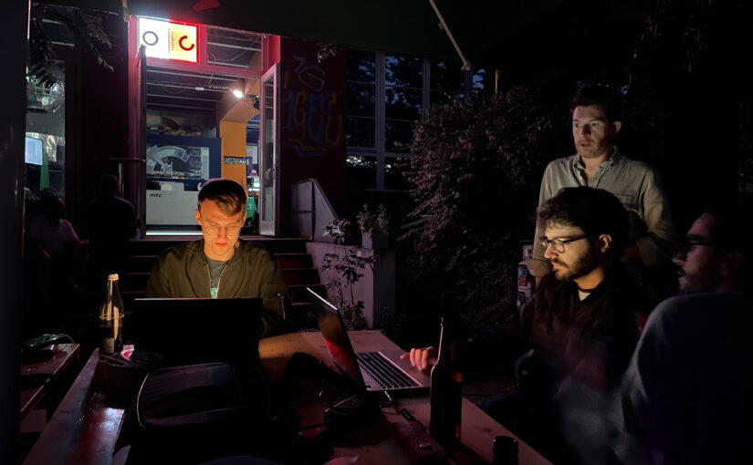
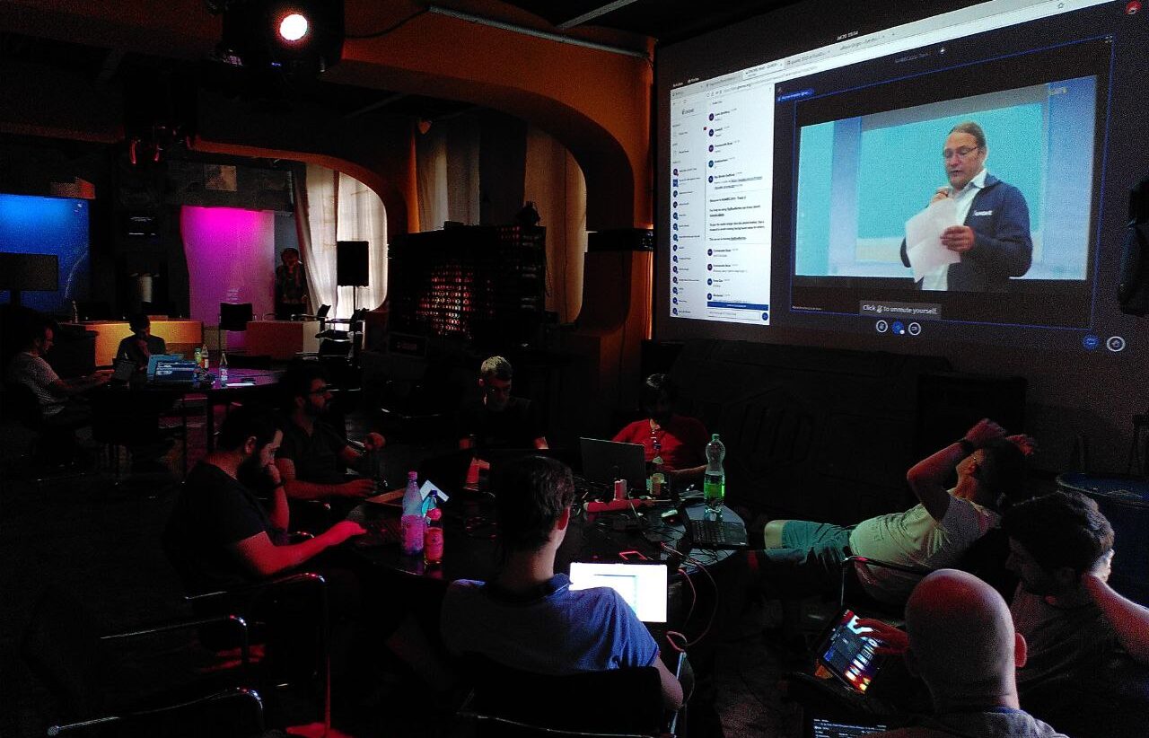
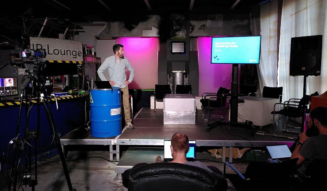
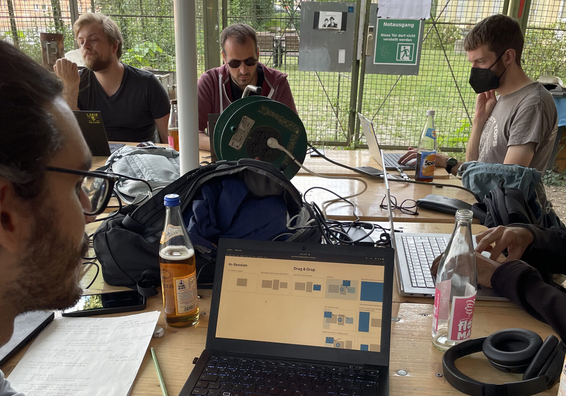
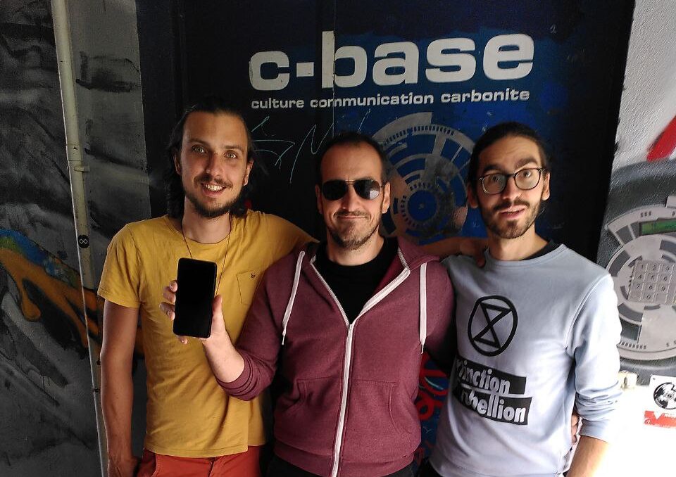

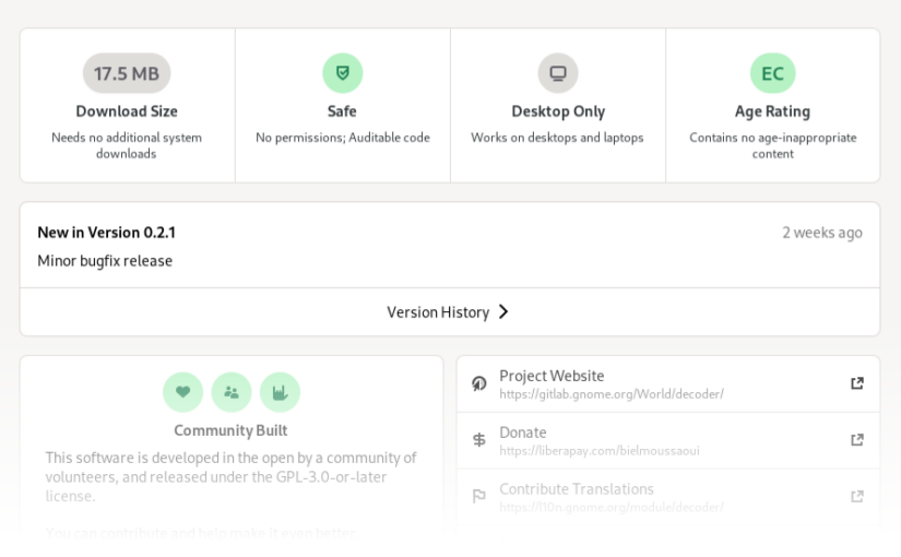
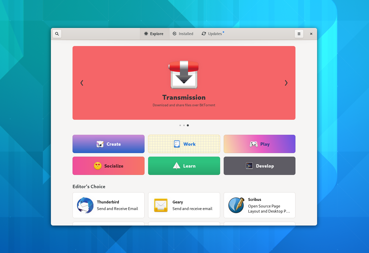
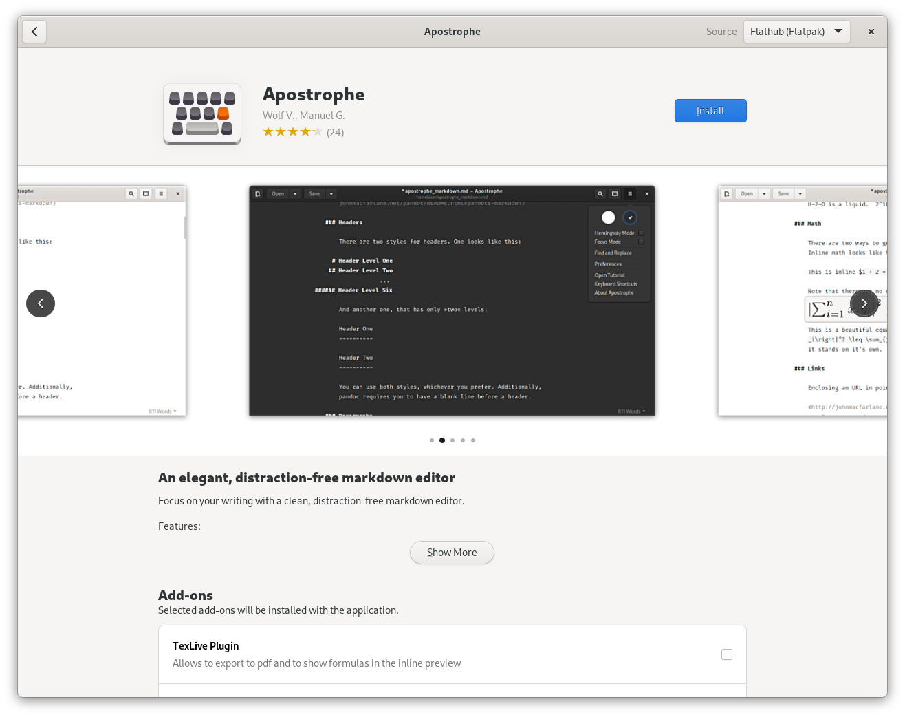
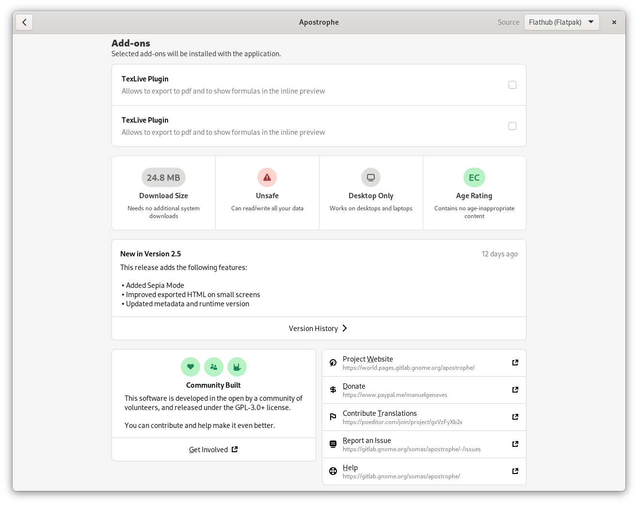
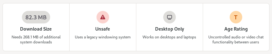
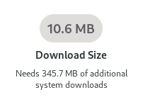
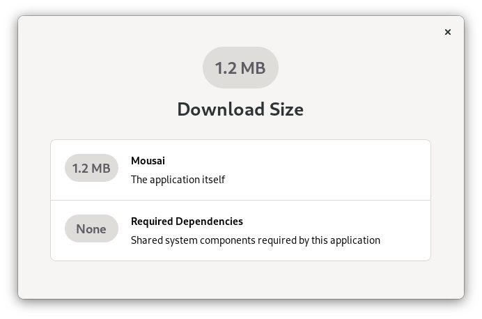
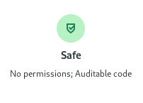
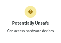
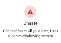
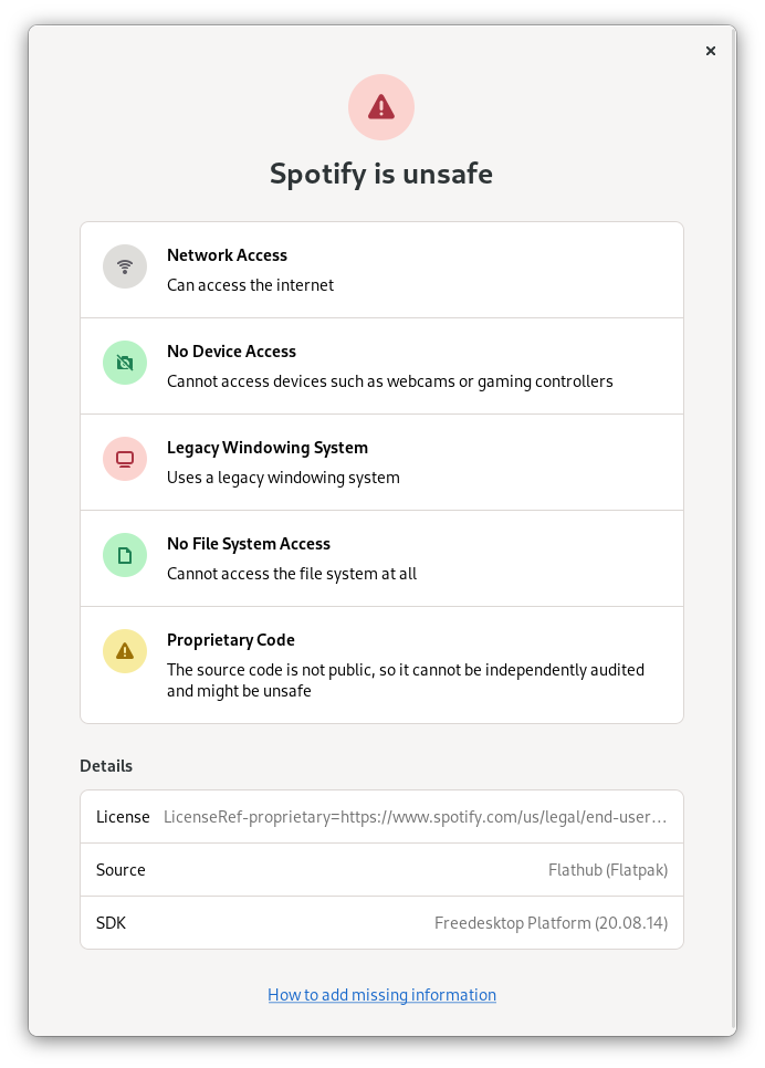
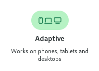
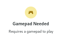
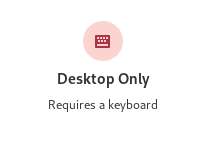
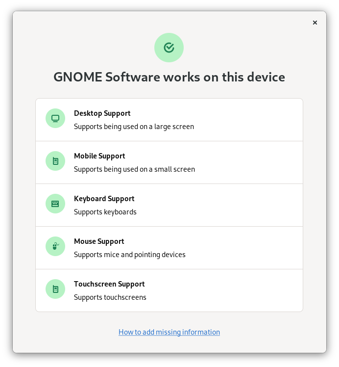
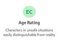
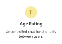
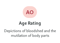
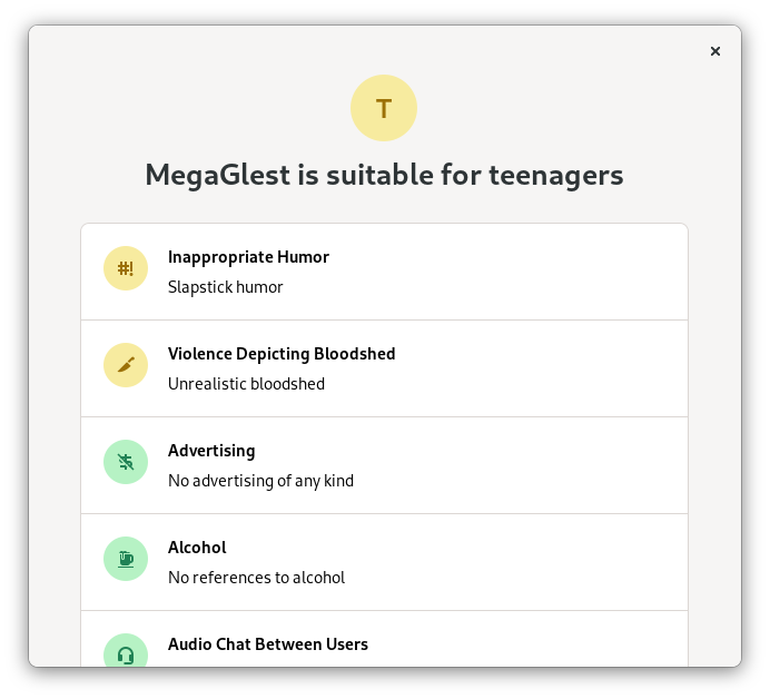
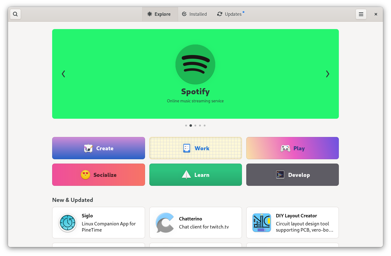
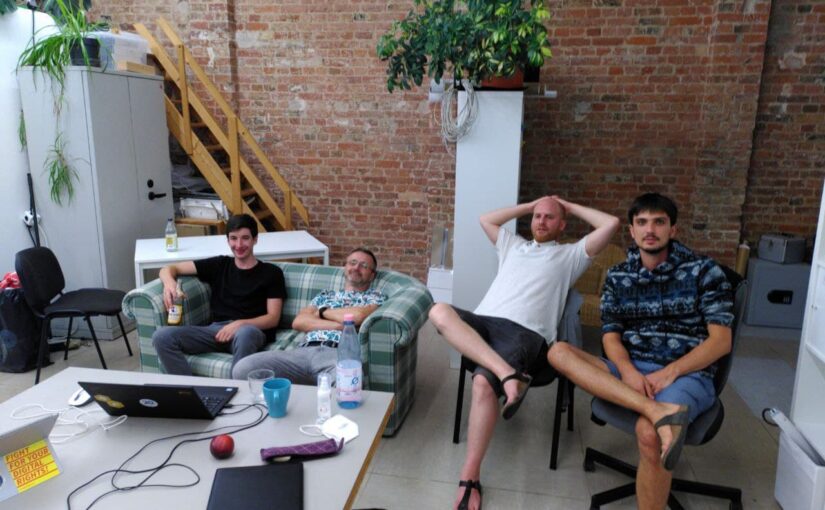
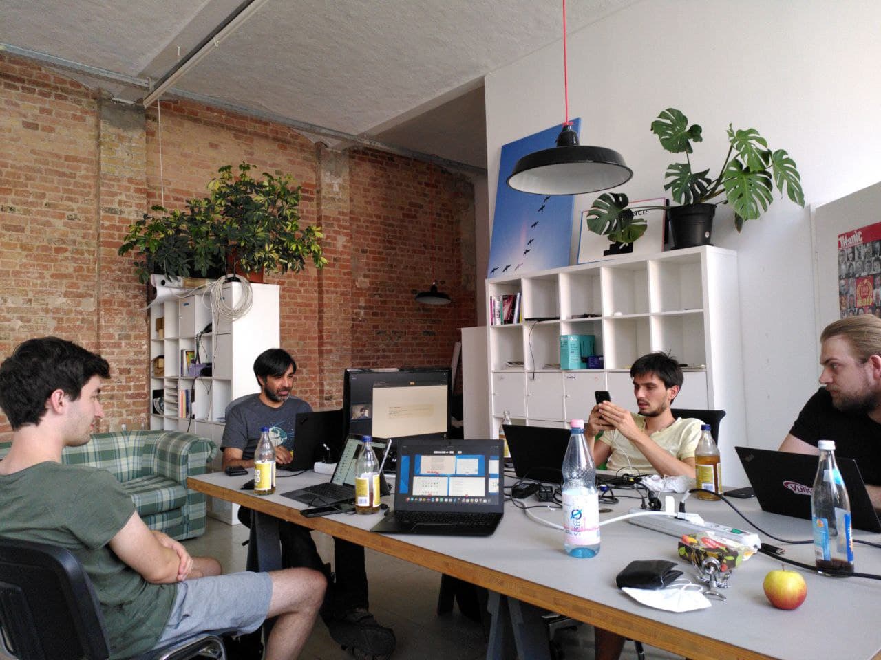
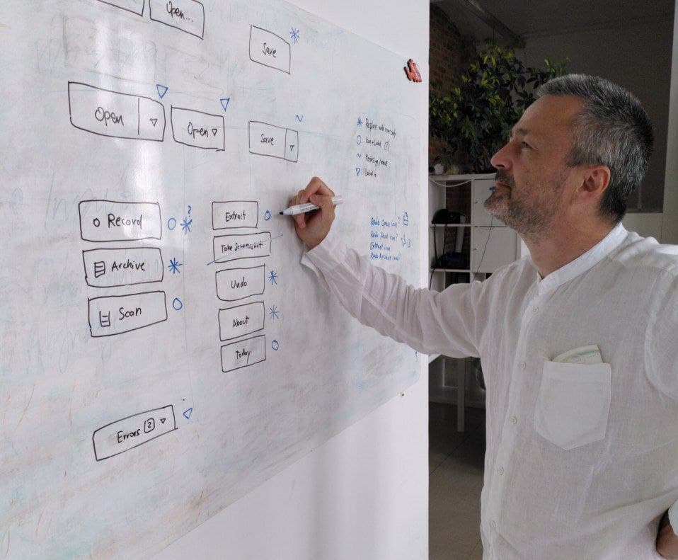
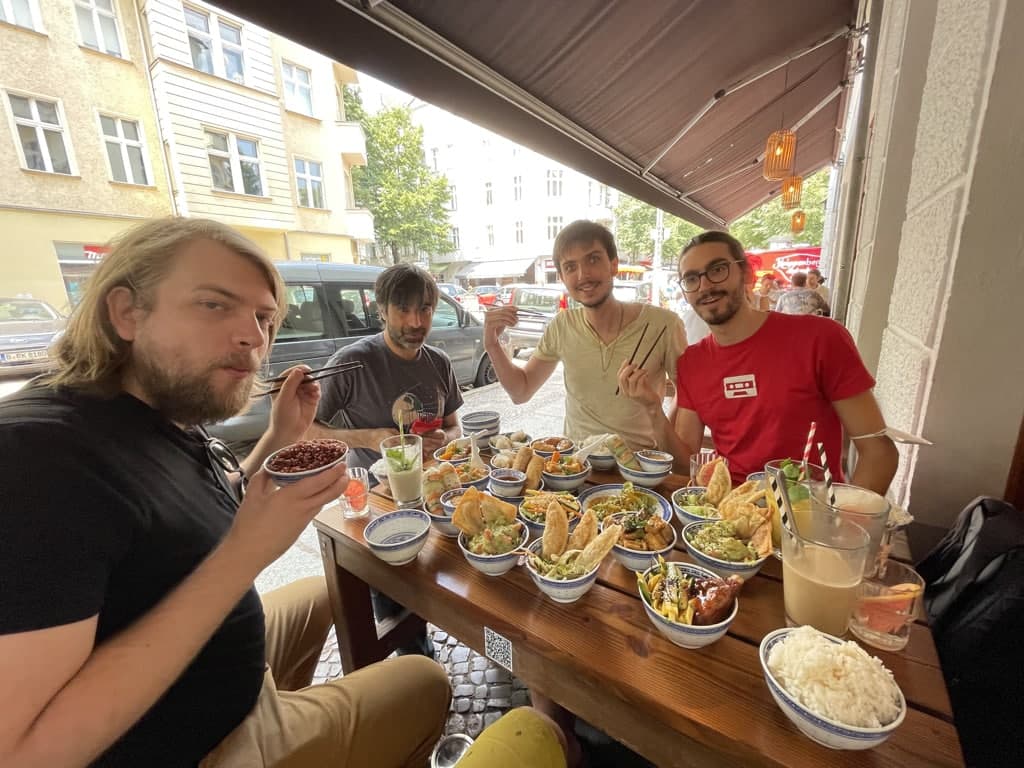
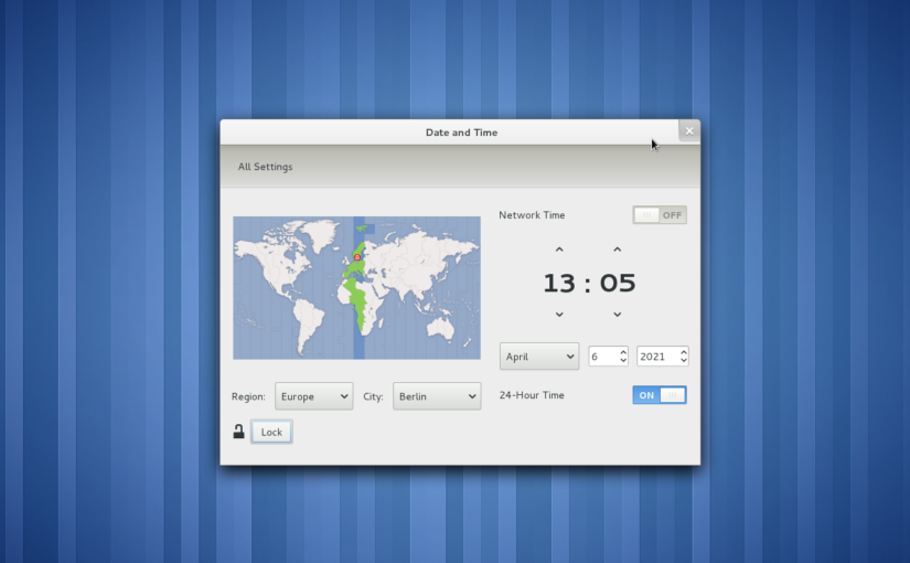


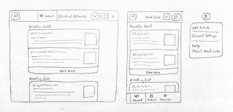
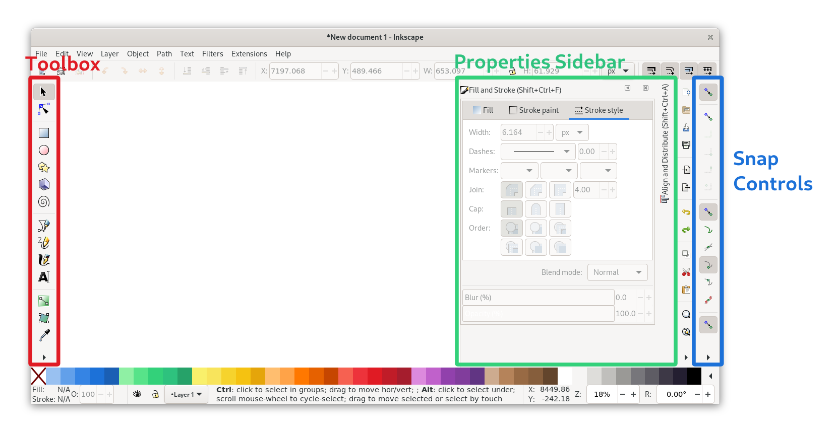
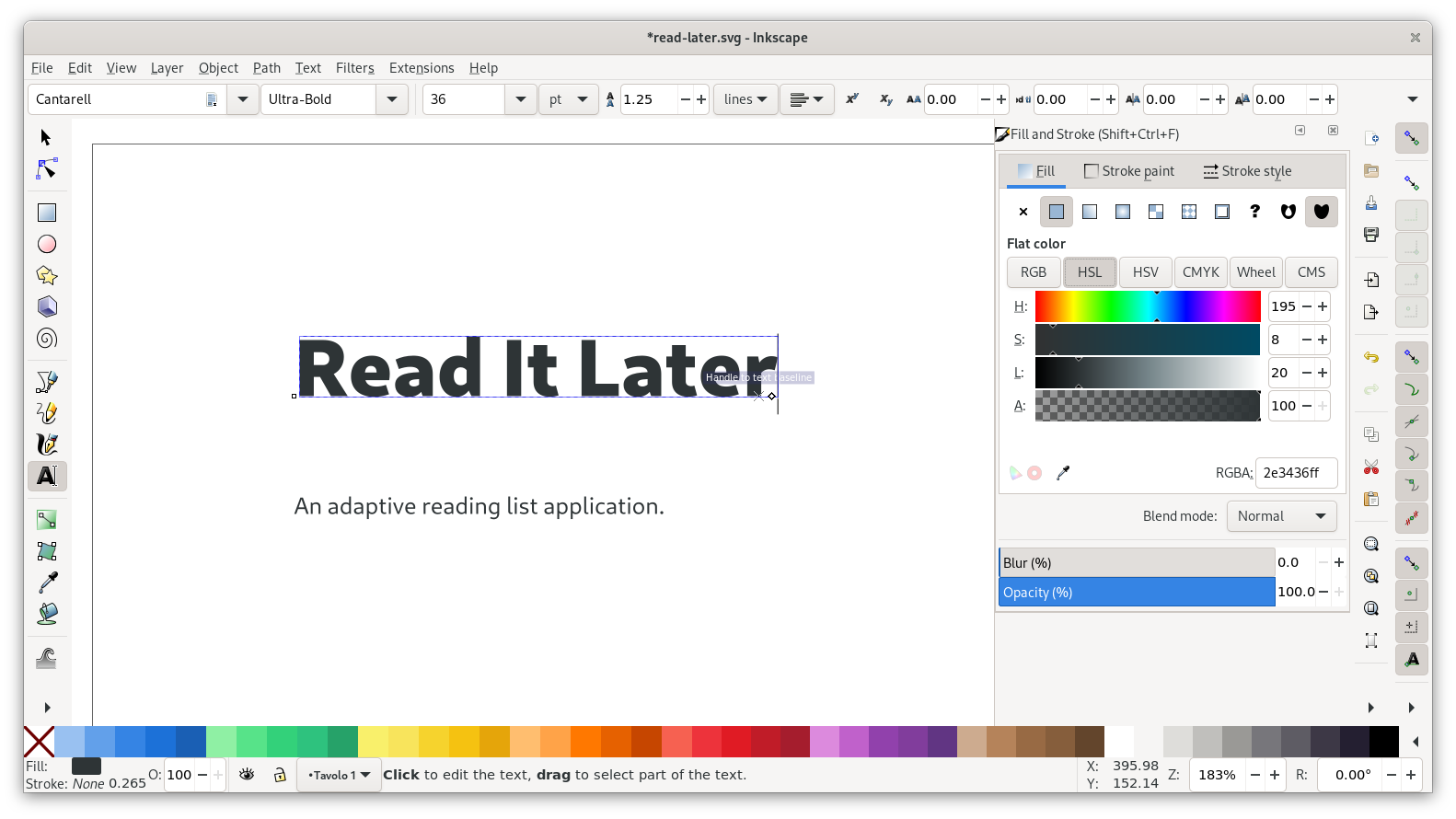
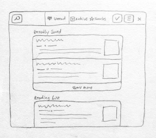
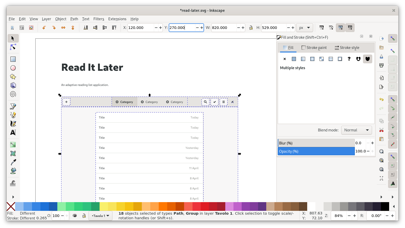
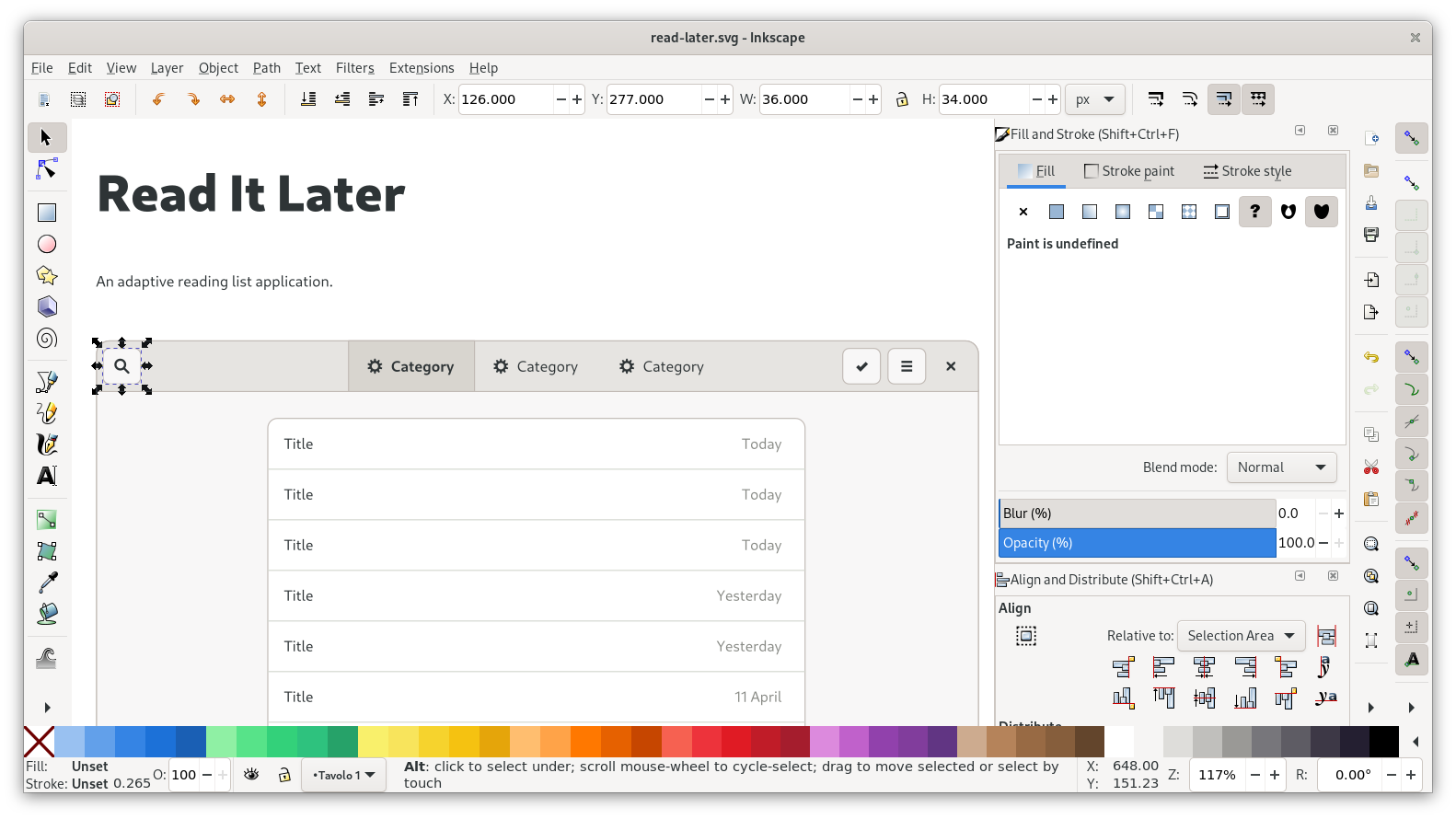
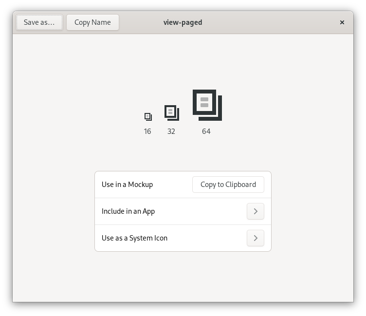
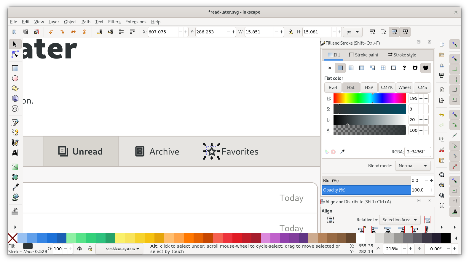
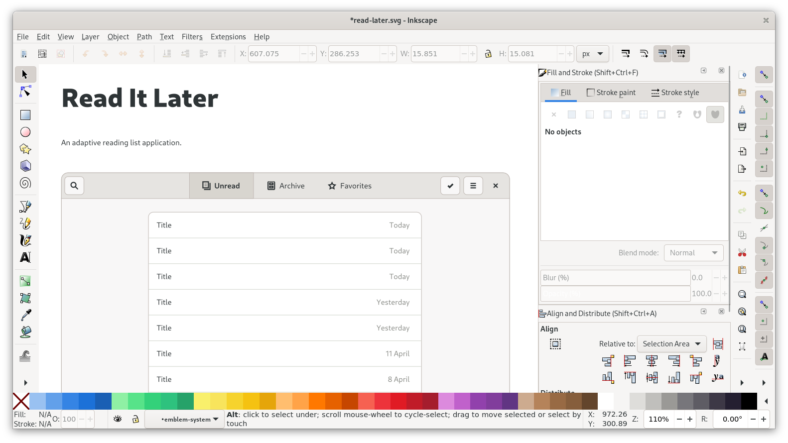
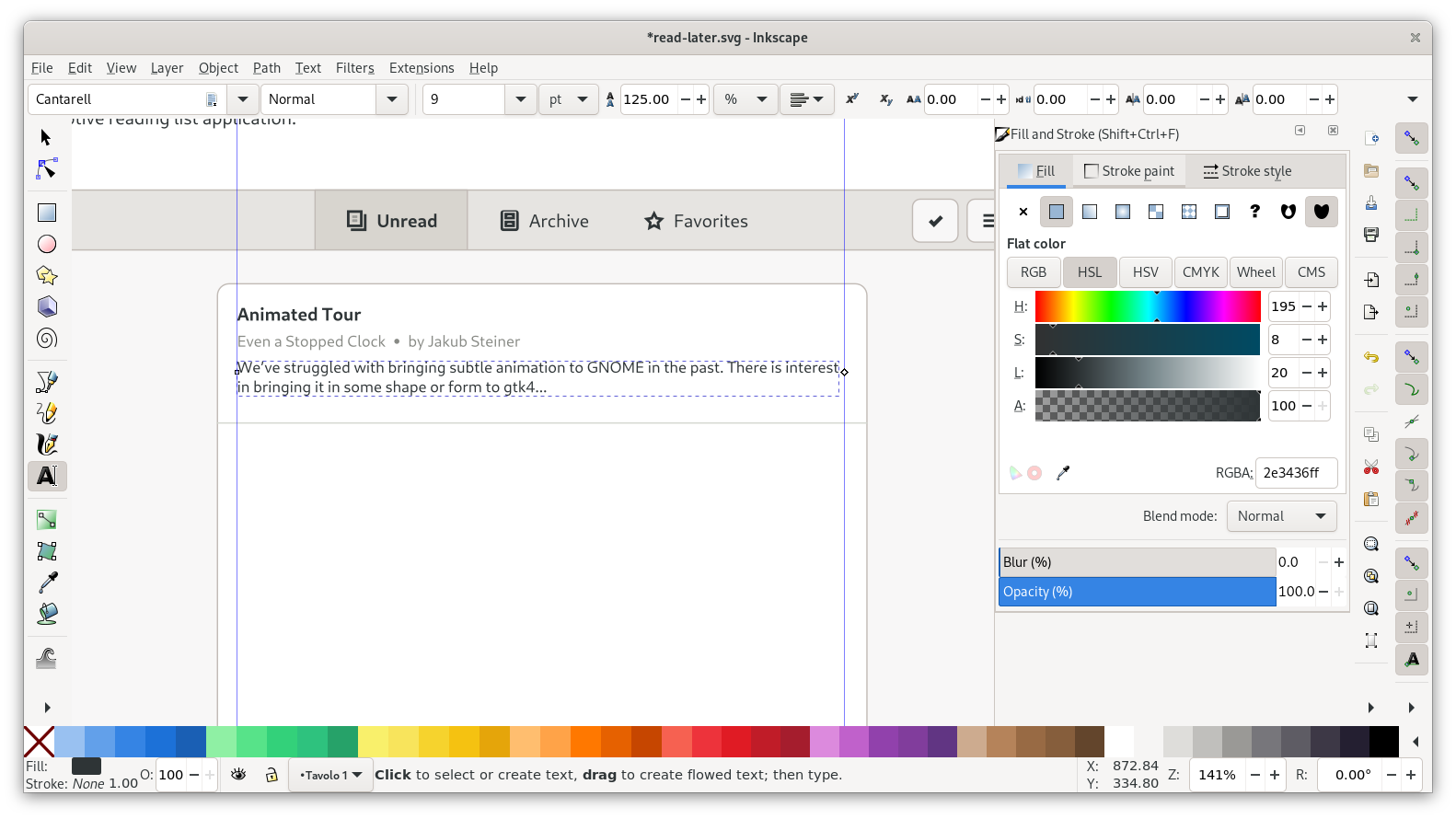
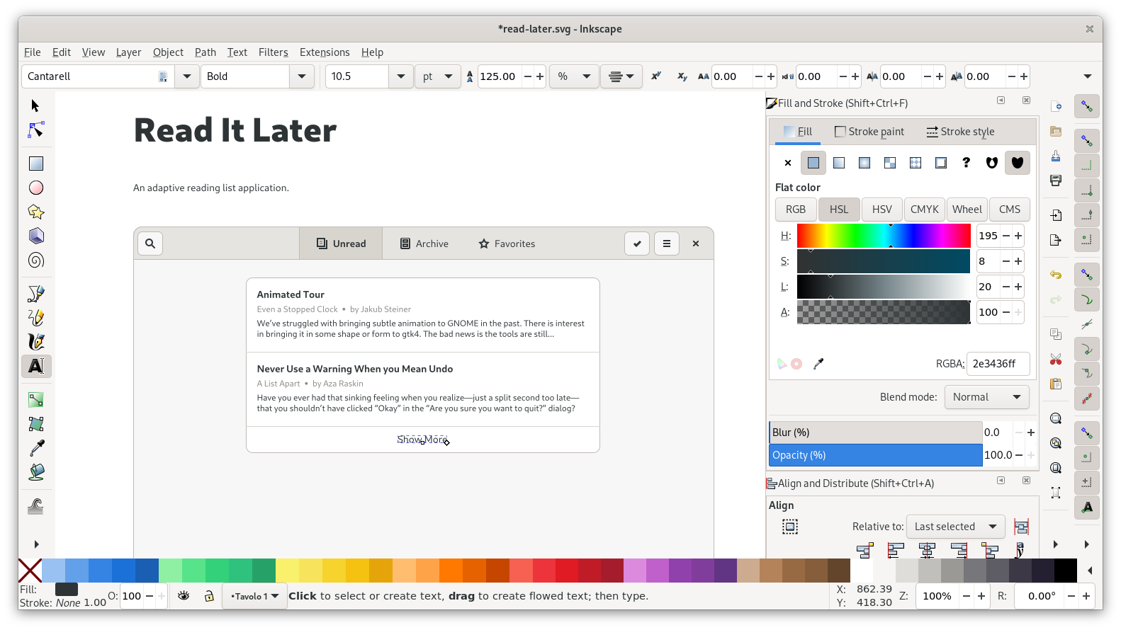
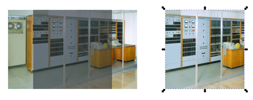
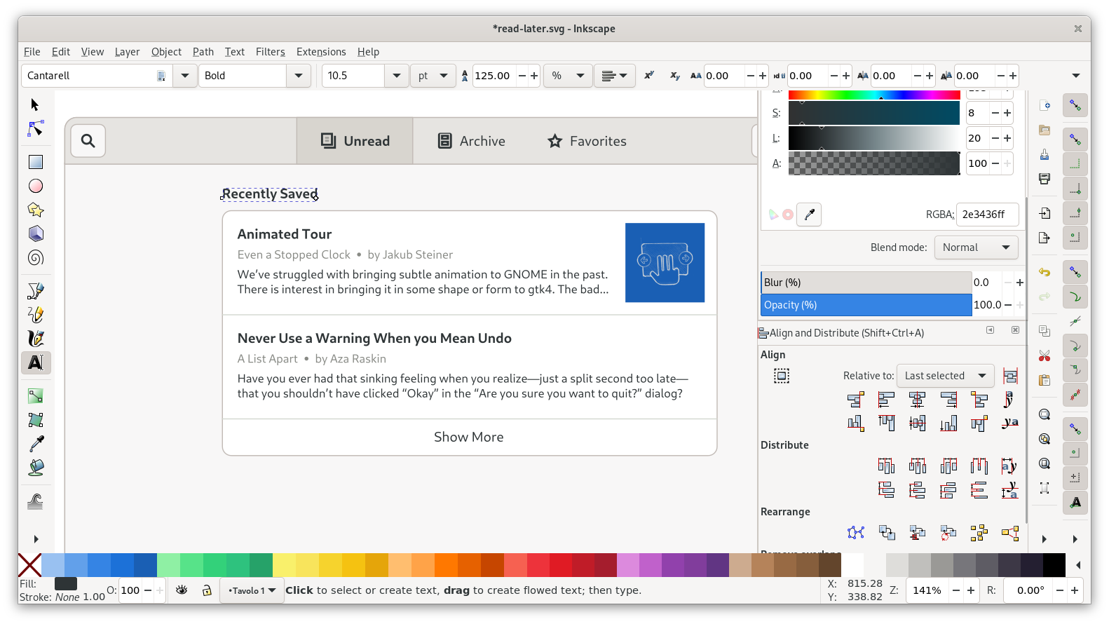
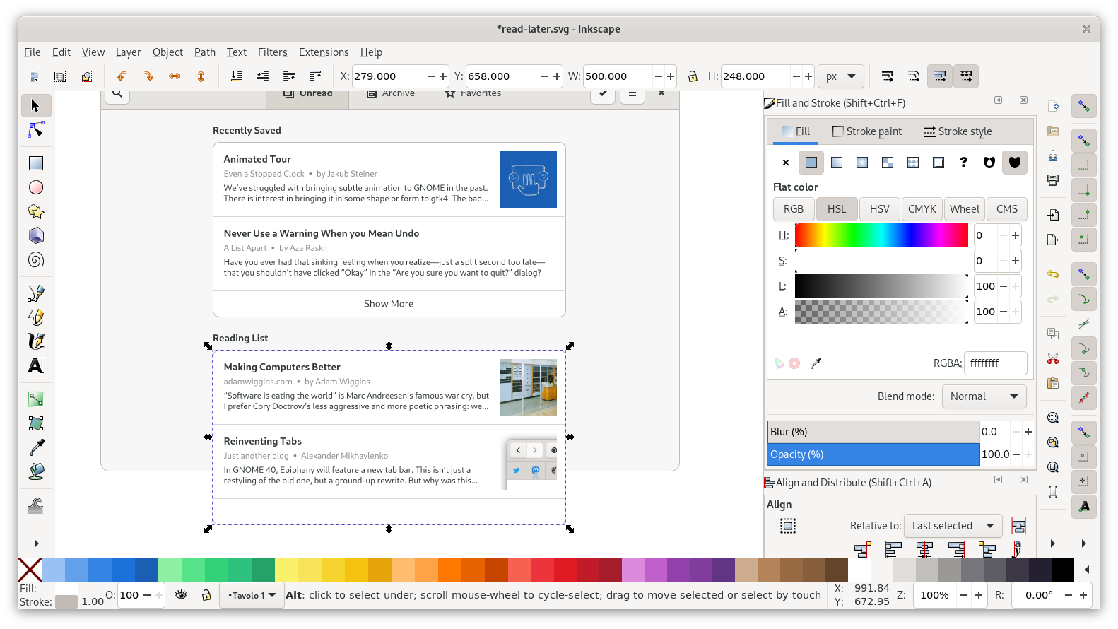
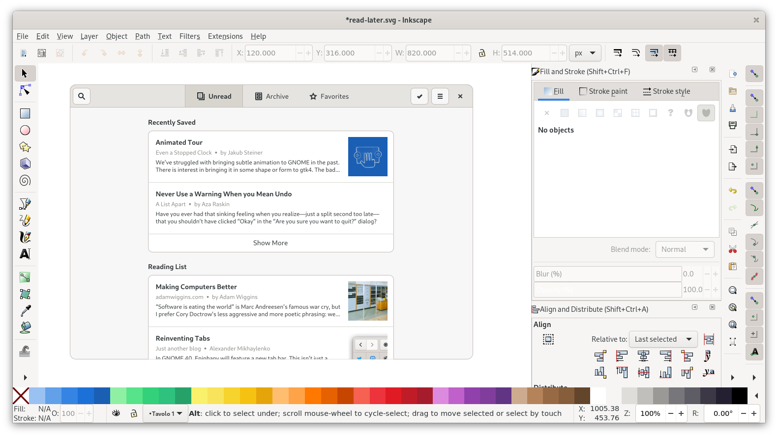
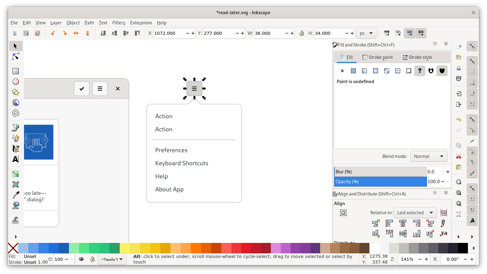
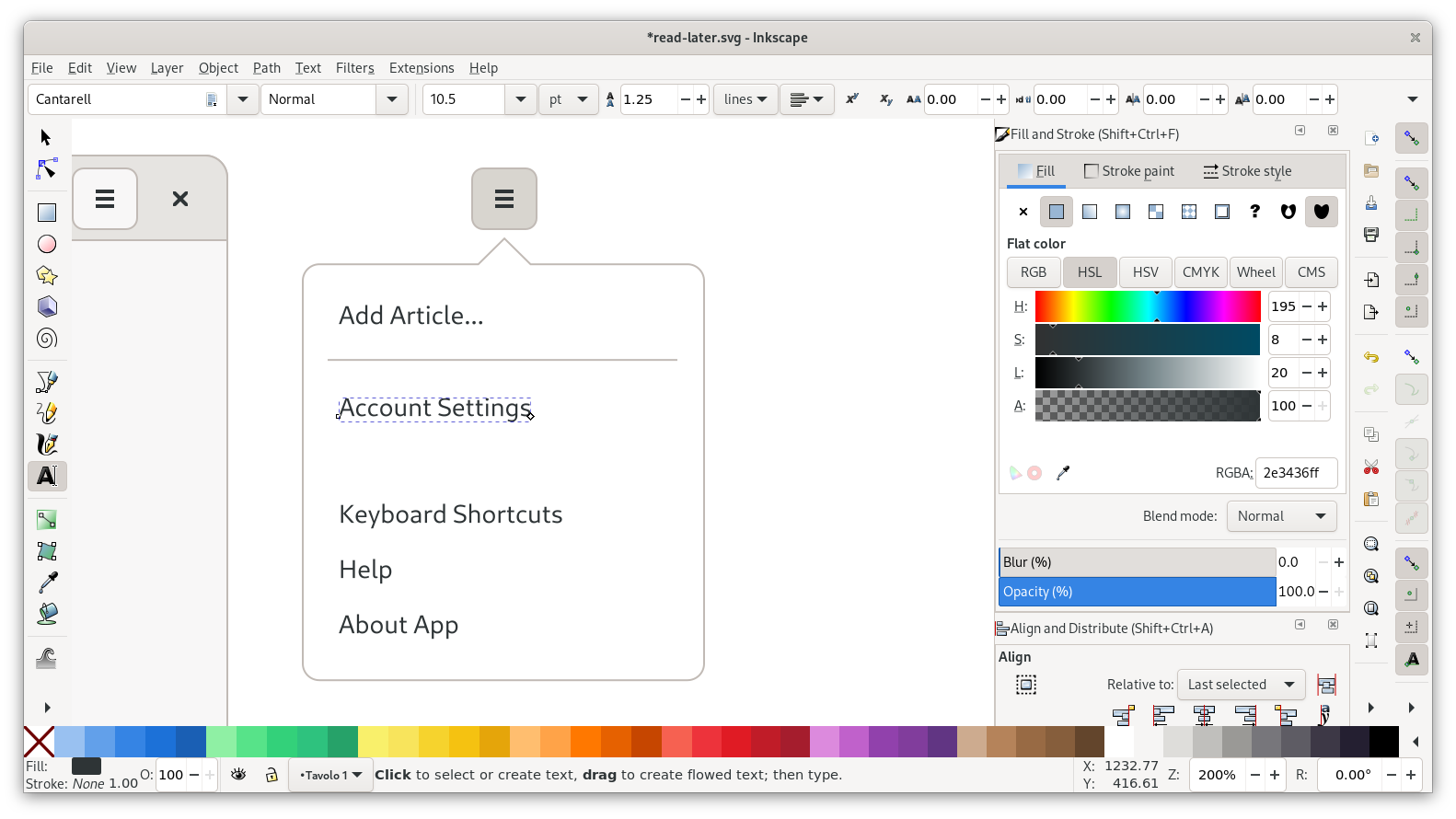
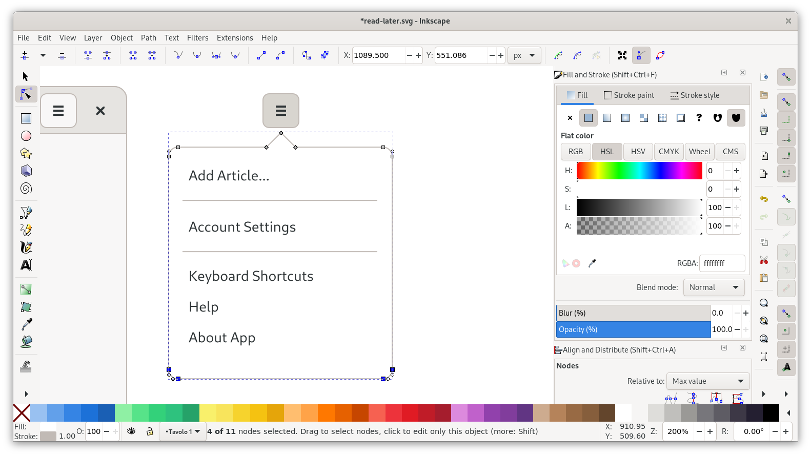
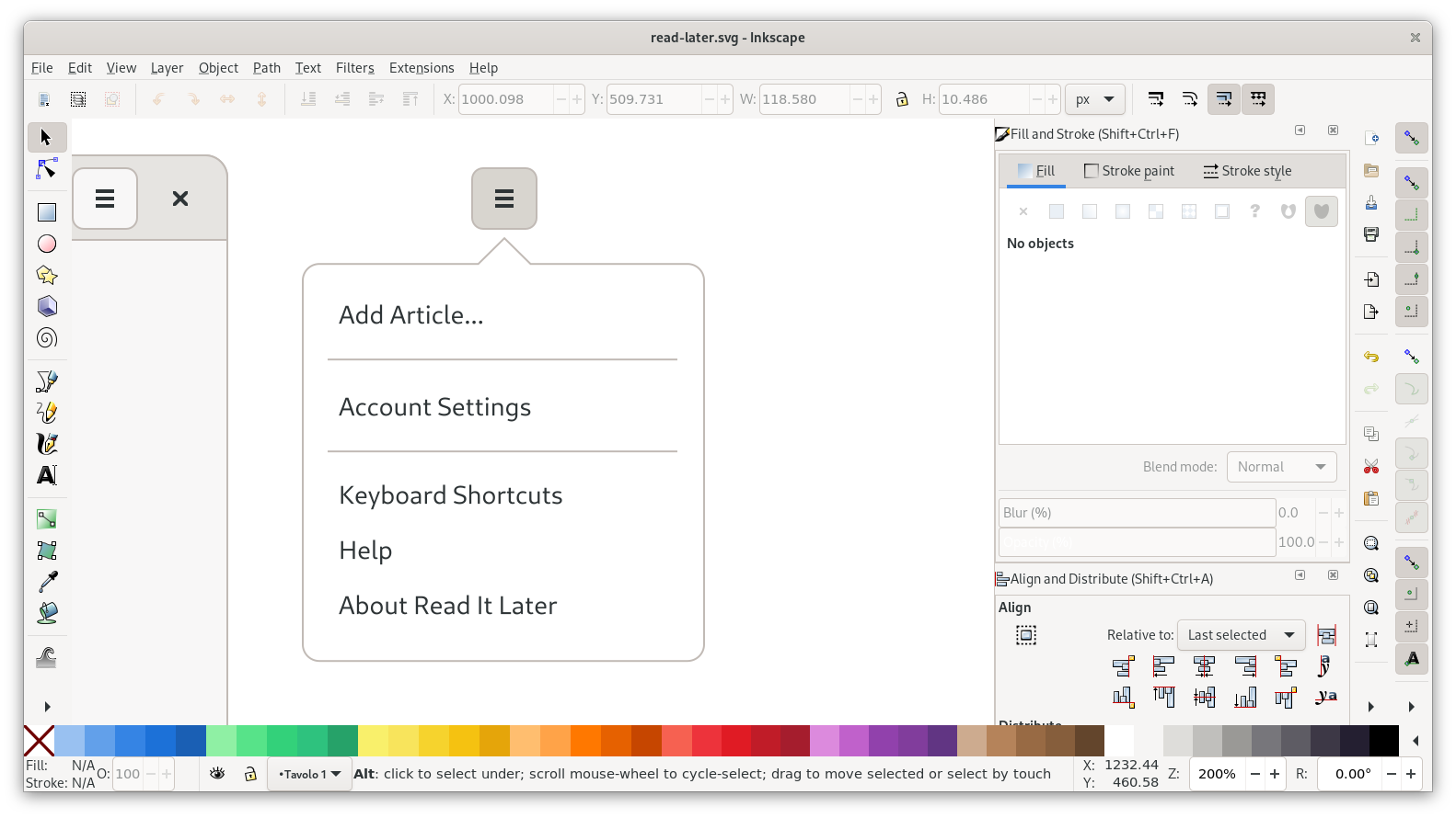
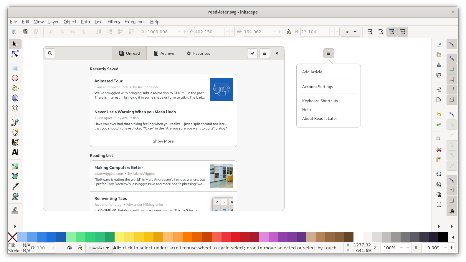
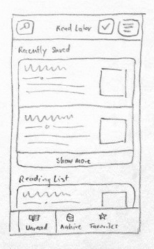
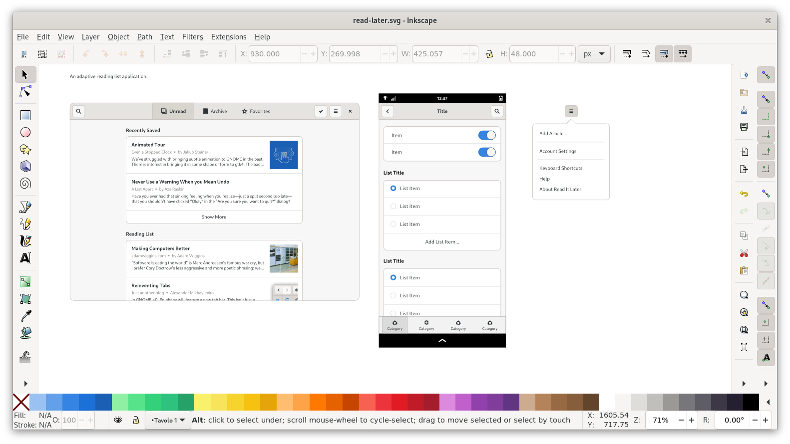
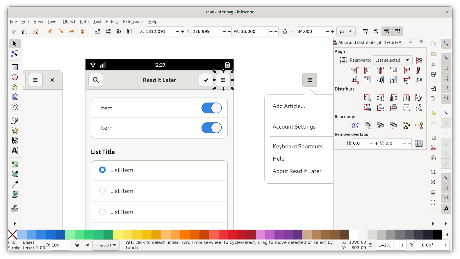
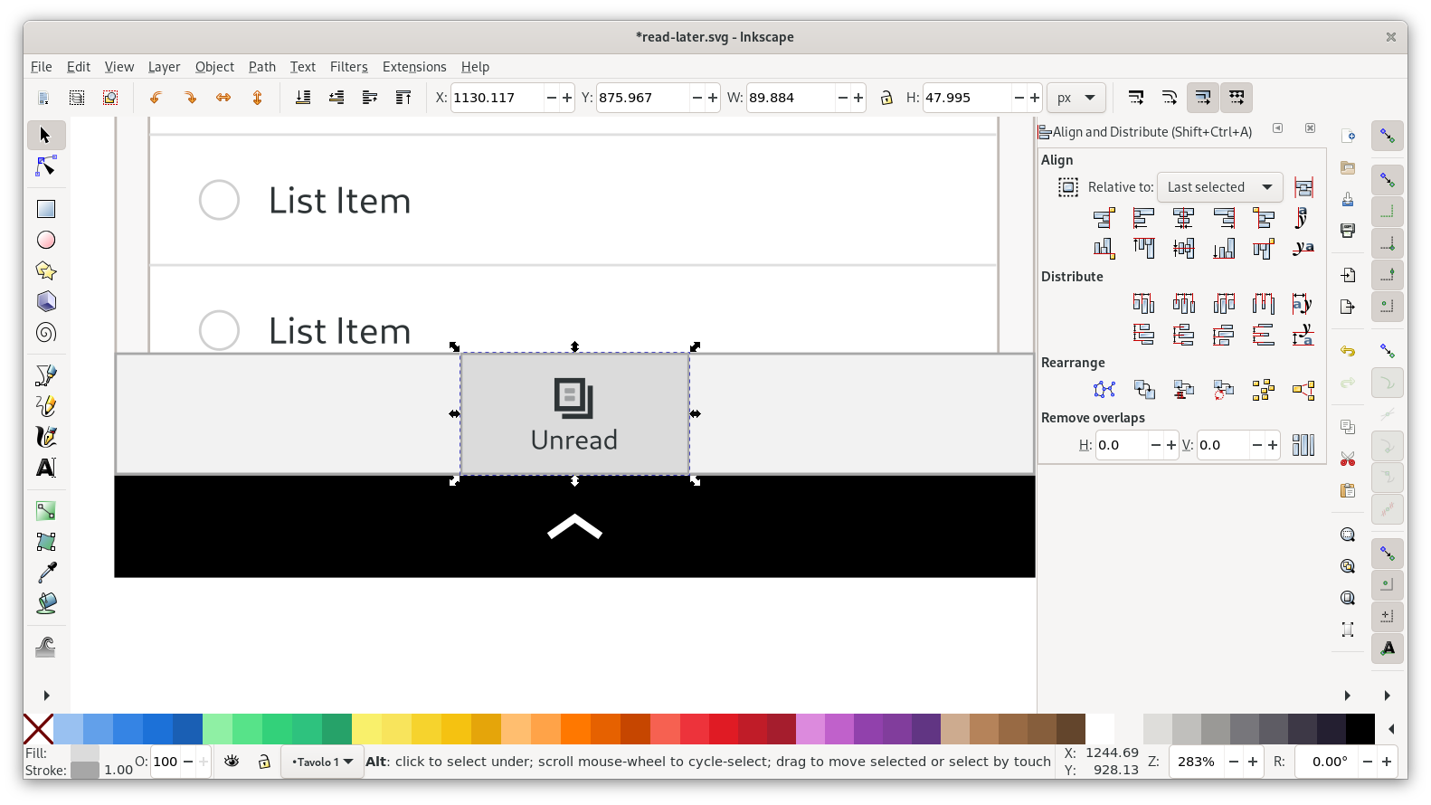
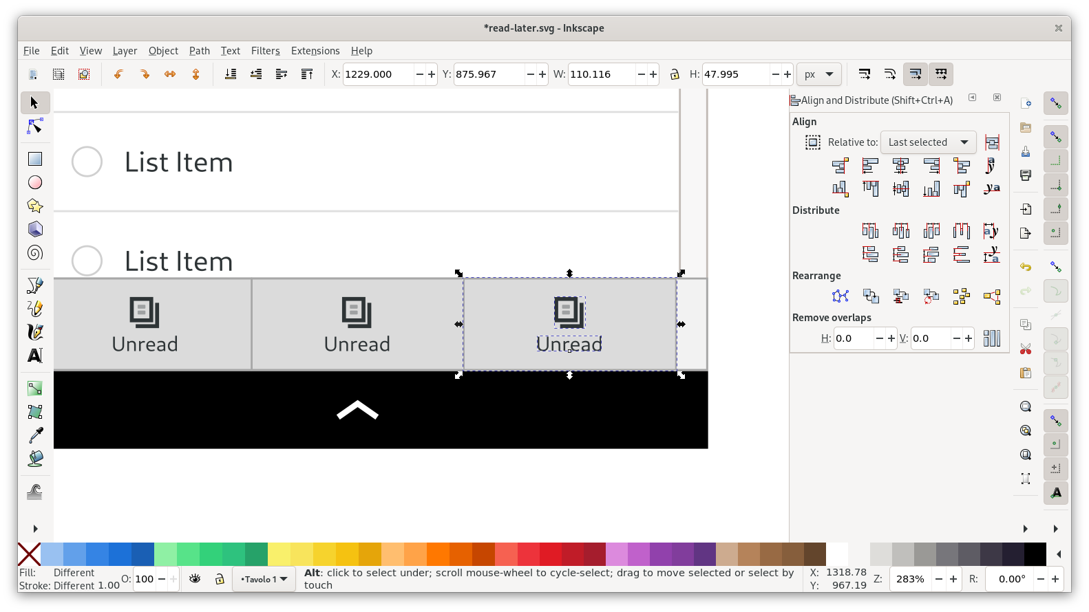
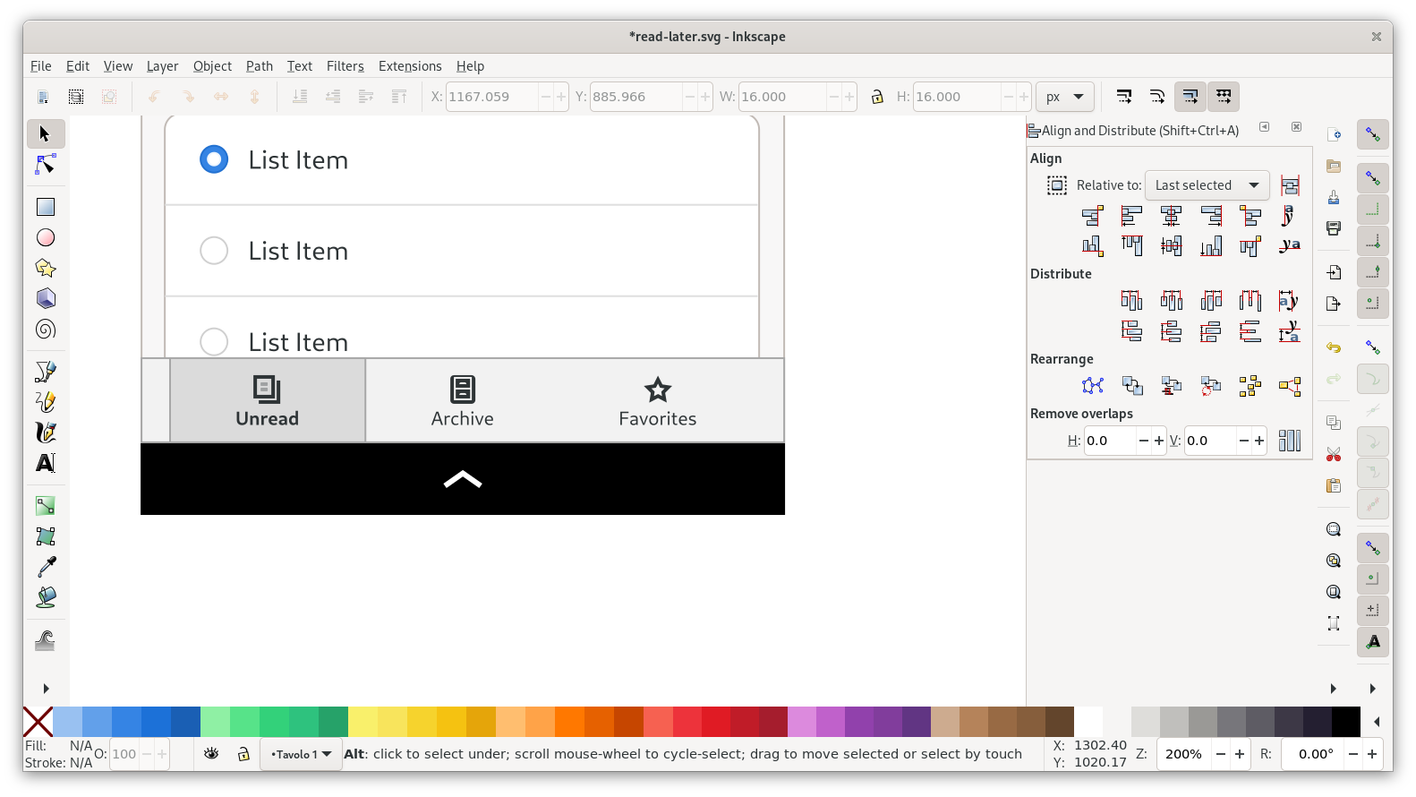
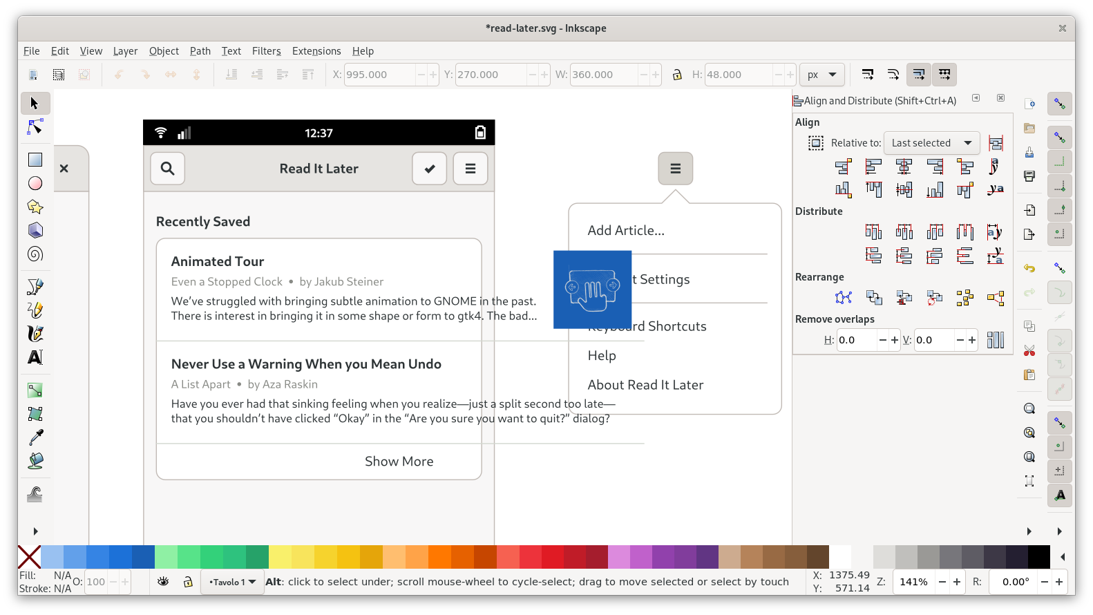
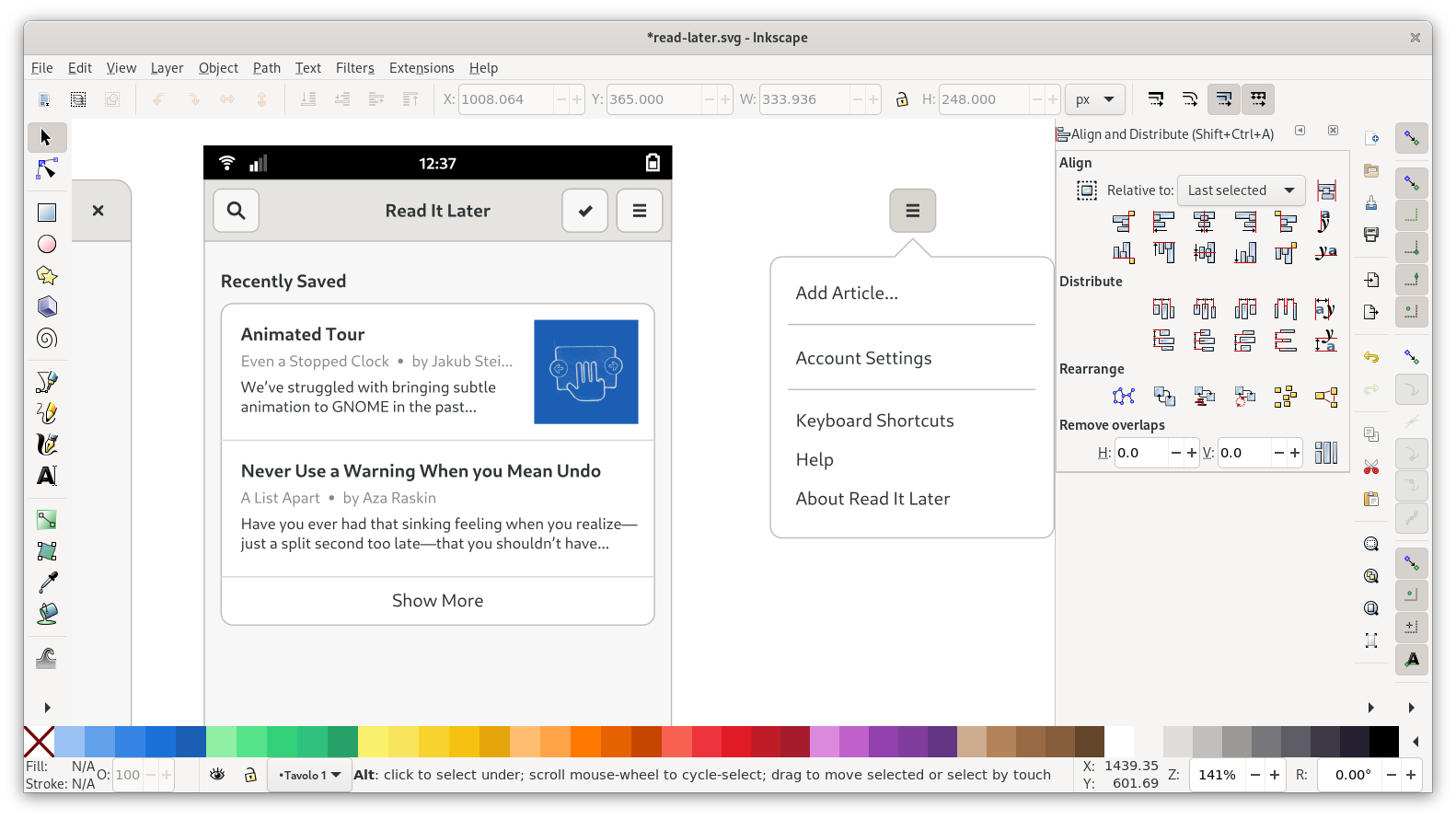
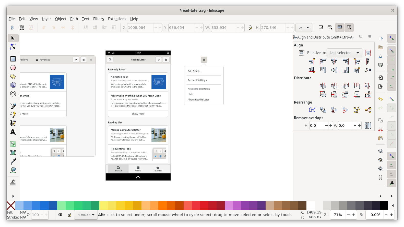
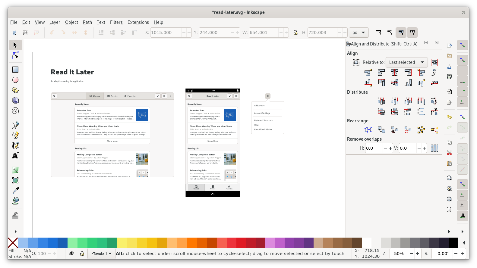
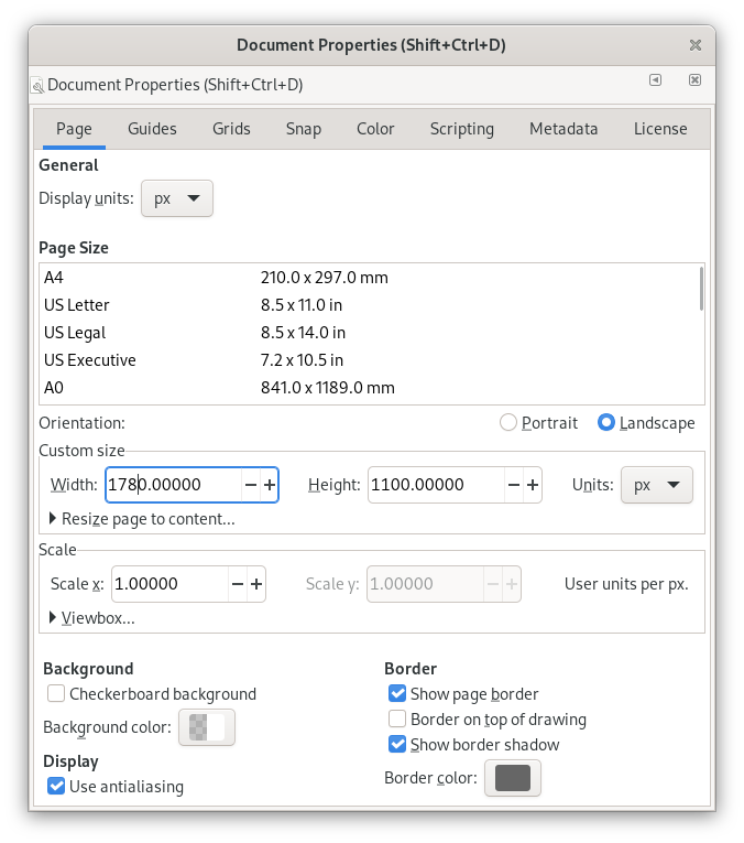
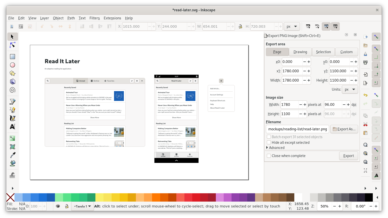
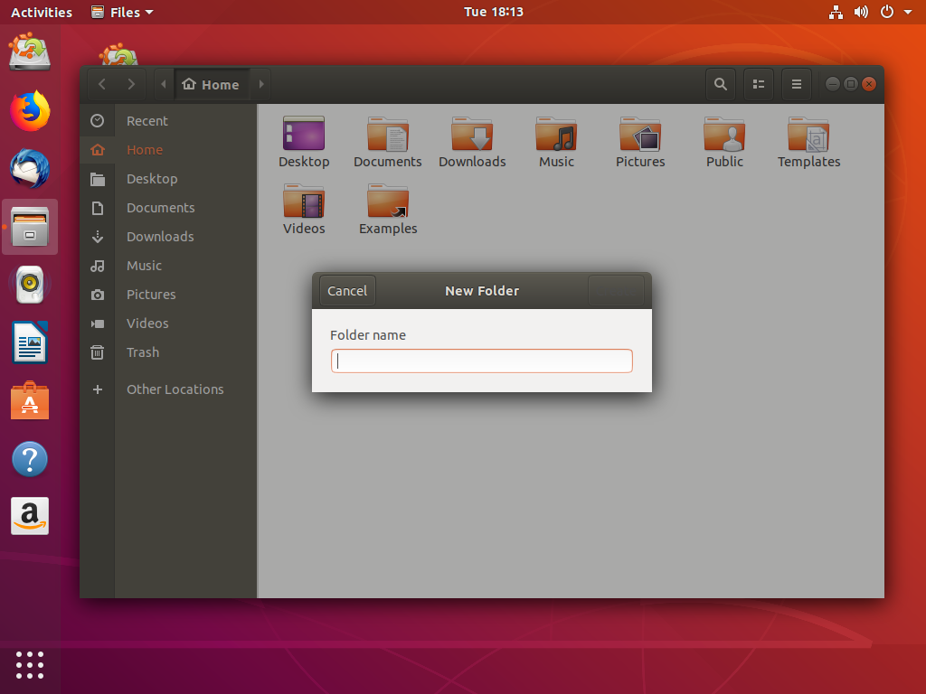
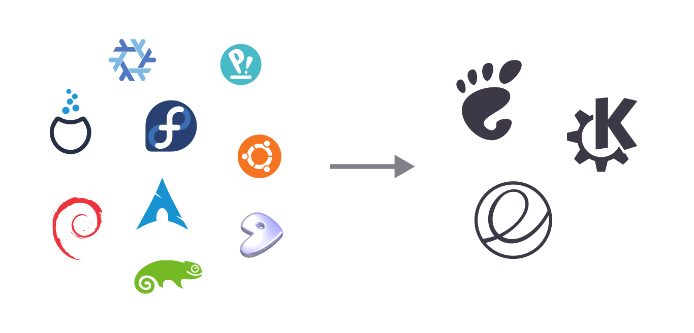
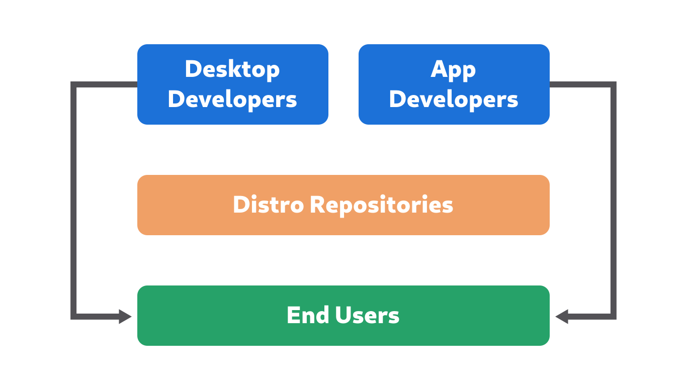
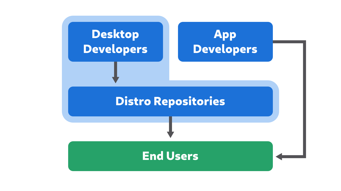
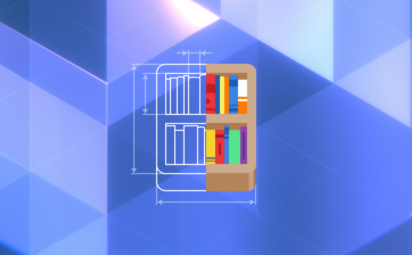
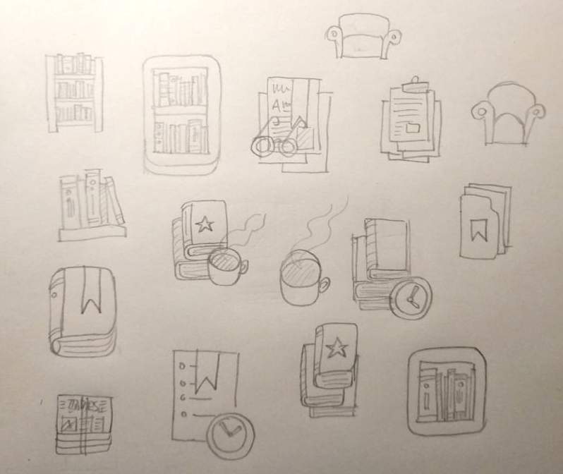
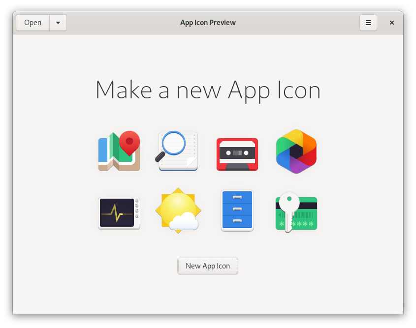
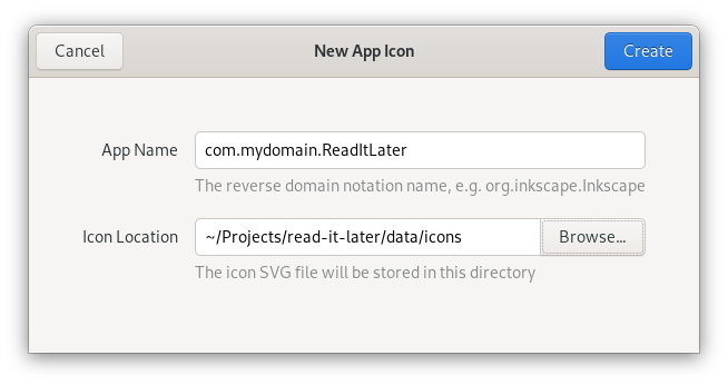
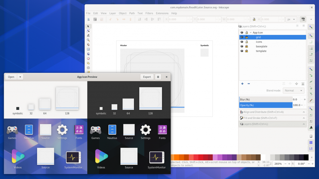
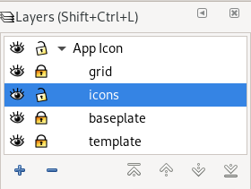
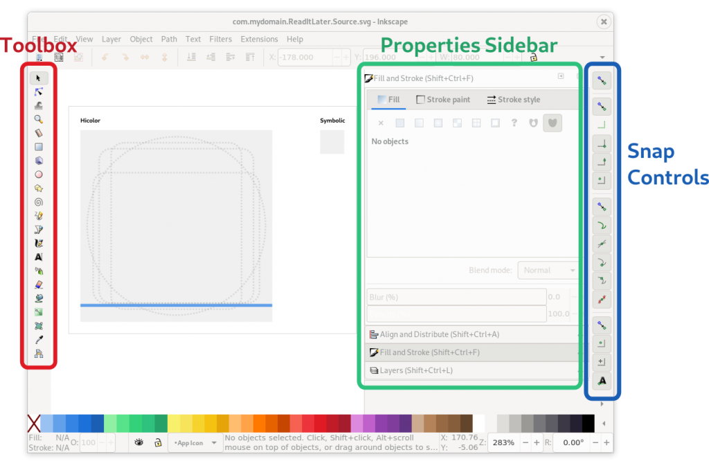
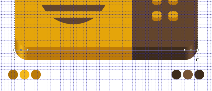
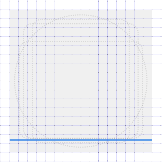
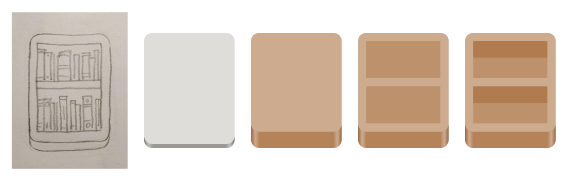
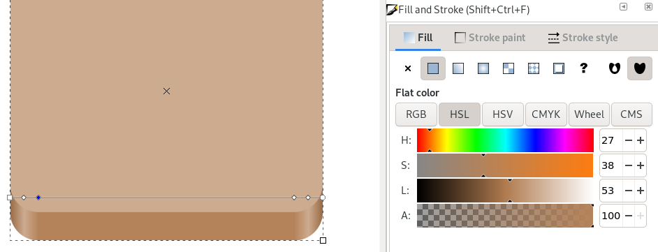

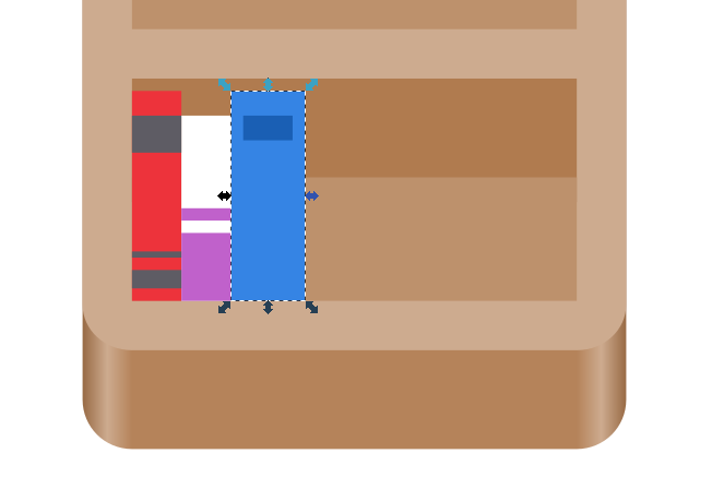
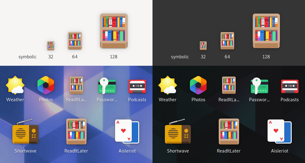

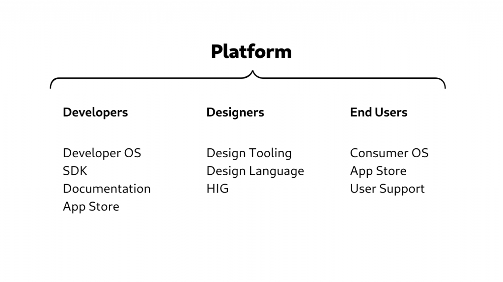
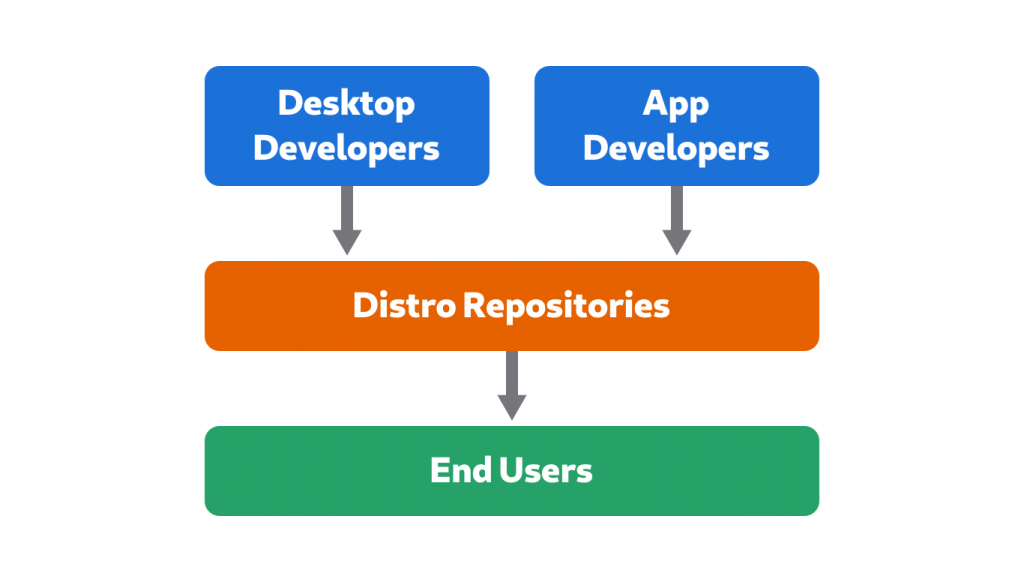
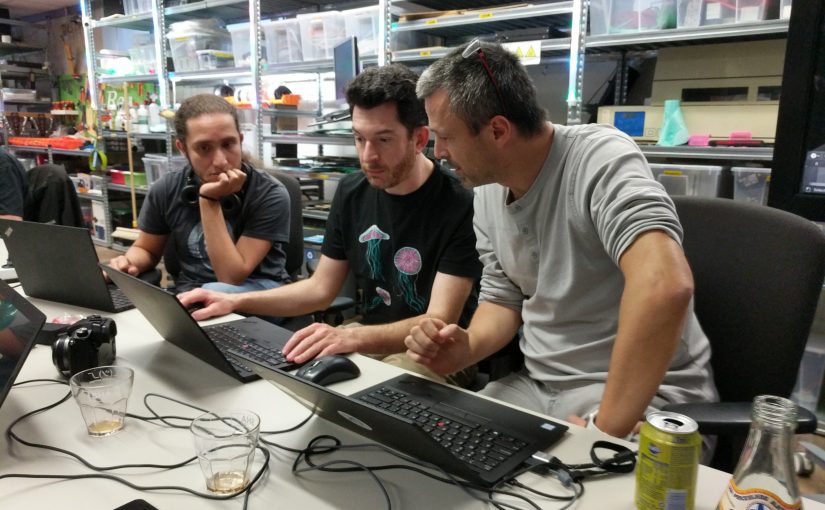
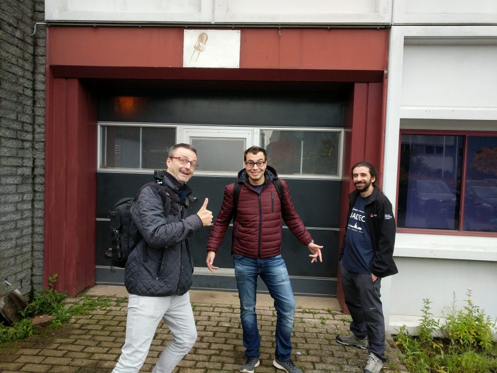
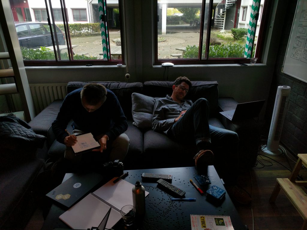
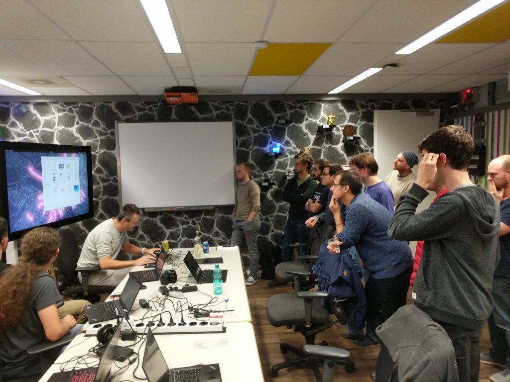
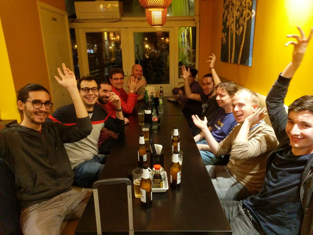
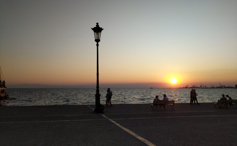
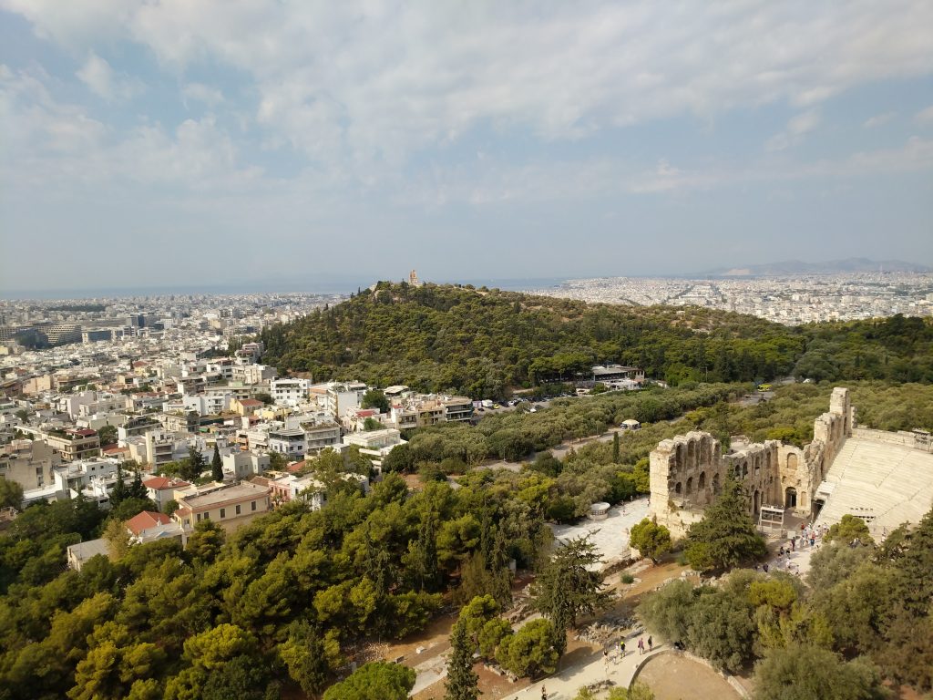
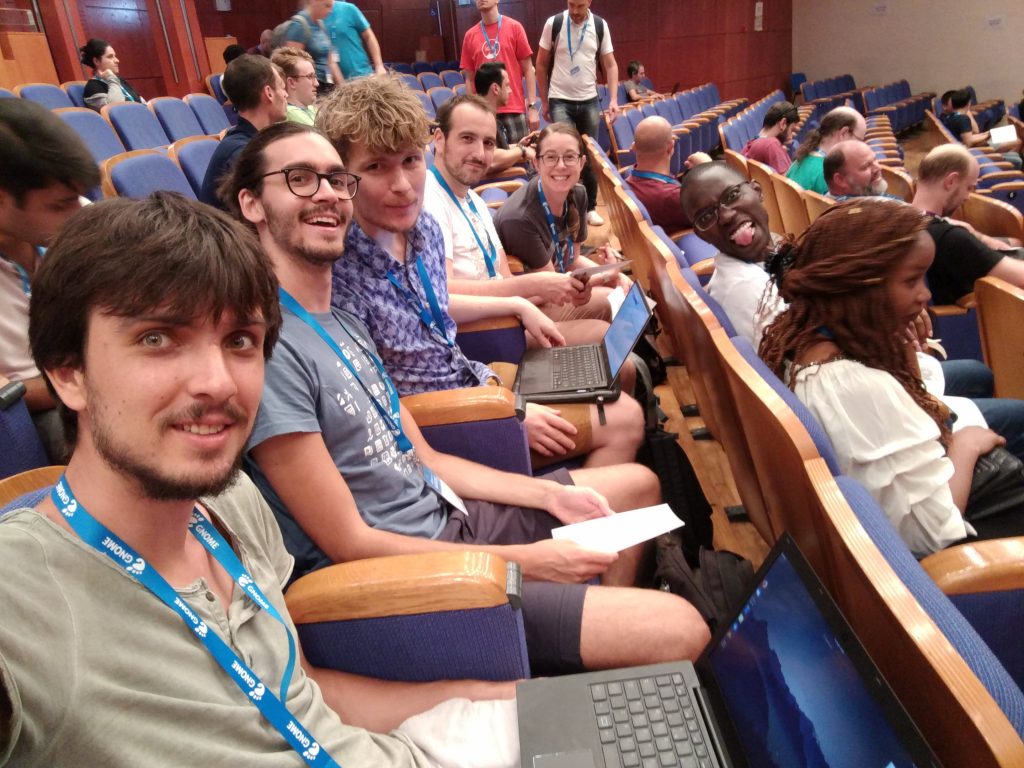
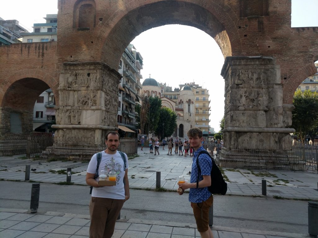
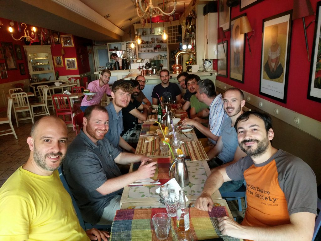