Software 41: Context Tiles

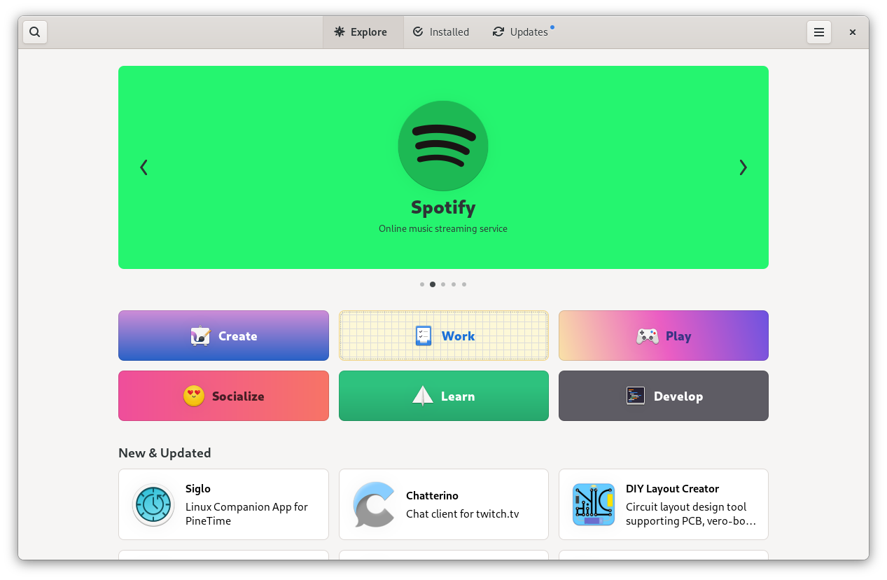
GNOME 41 is going to be released in a few weeks, and as you may have heard it will come with a major refresh to Software’s interface.

Our goals for this initiative included making it a more appealing place to discover and install new apps, exposing app information more clearly, and making it more reliable overall. We’ve made big strides in all these areas, and I think you’ll be impressed how much nicer the app feels in 41.
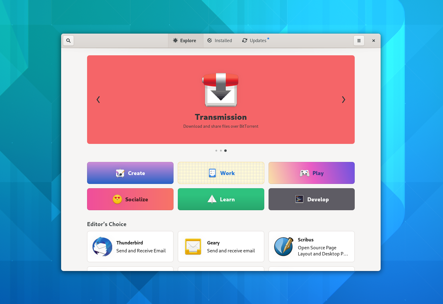
There’s a lot of UI polish all across the app, including a cleaner layout for app cards, more consistent list views, a new simplified set of categories, a better layout for category pages, and much more.

Most of the groundwork for adaptiveness is also in place now. There are still a few views in need of additional tweaks, but for the most part the app is adaptive in 41.

However, the most visible change in this release is probably the near-complete overhaul of the app details pages. This includes a prettier header section, a more prominent screenshot carousel, and an all-new way of displaying app metadata.
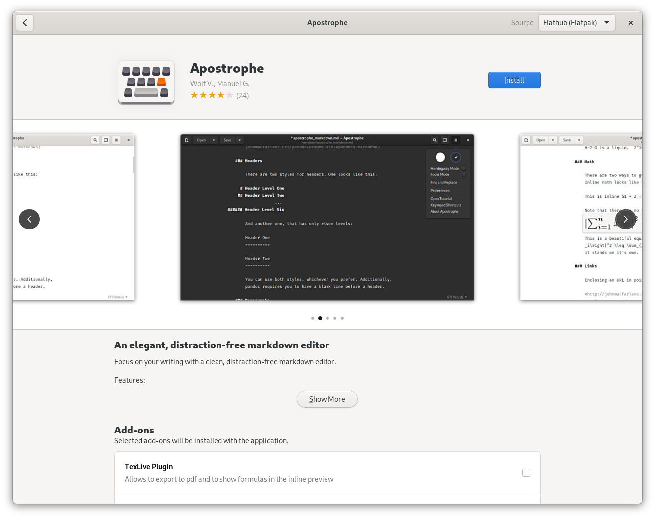
Introducing Context Tiles

For the app details page we wanted to tackle a number of long-standing tricky questions about how to best communicate information about apps. These include:

  • Communicating app download size in a more nuanced way, especially for Flatpak apps where downloading additional shared runtimes may be required as part of installing an app
  • Showing the benefits of software freedom in a tangible way rather than just displaying the license
  • Making it clearer which files, devices, and capabilities apps have access to on the system
  • Incentivizing app developers to use portals rather than poking holes in the sandbox
  • Warning people about potential security problems
  • Providing information on whether the app will work on the current hardware (especially relevant for mobile)
  • Exposing age ratings more prominently and with more context

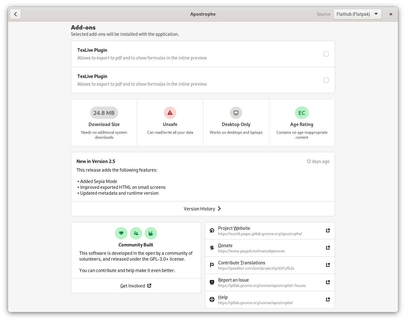
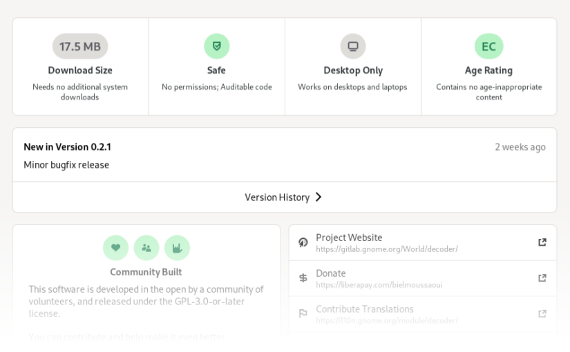
The solution we came up with is what we call context tiles. The idea is that each of these tiles provides the most important information about a given area at a glance, and clicking it opens a dialog with the full details.

Context tiles on the app details page

Storage

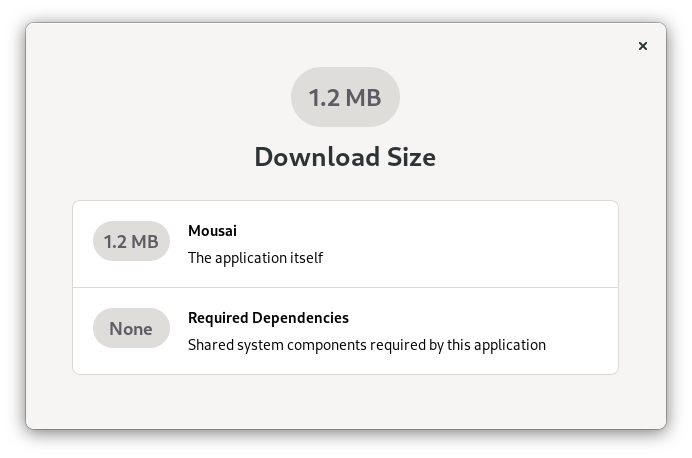
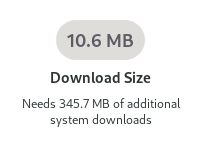
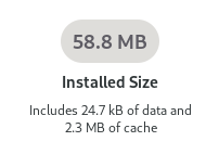
The storage tile has two different states: When the app is not installed, it shows the download size of the app, as well as any additional required downloads (e.g. runtimes). When the app is installed it changes to show the size the app is taking up on disk.
Safety

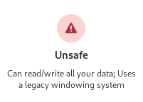
The Safety tile combines information from a number of sources to give people an overall idea of how safe an app is to install and use.
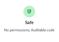
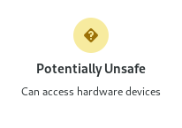
At the most basic level this is about how technically secure an app is. Two important questions here are whether an app is sandboxed (i.e. whether it’s flatpaked or running on the host), and whether it uses Wayland.

However, even if an app is sandboxed it can still have unlimited access to e.g. your home folder or the webcam, if these are defined as static permissions in the Flatpak manifest.

While for some apps there is no alternative to this (e.g. IDEs are probably always going to need access to the file system), in many cases there are more secure portal APIs through which people can allow limited one-time access to various resources.

For example, if you switch an app from using the old GtkFileChooser to the portal-based GtkFileChooserNative you can avoid requiring a sandbox hole for the file system.

All of the above is of course a lot worse if the app also has internet access, since that can make security issues remotely exploitable and allows malicious apps to potentially exfiltrate user data.

While very important, sandboxing is not the entire story here though. Public auditability of the code is also very important for ensuring the security of an app, especially for apps which have a lot of permissions. This is also taken into consideration to assess the overall safety of an app, as a practical advantage of software freedom.
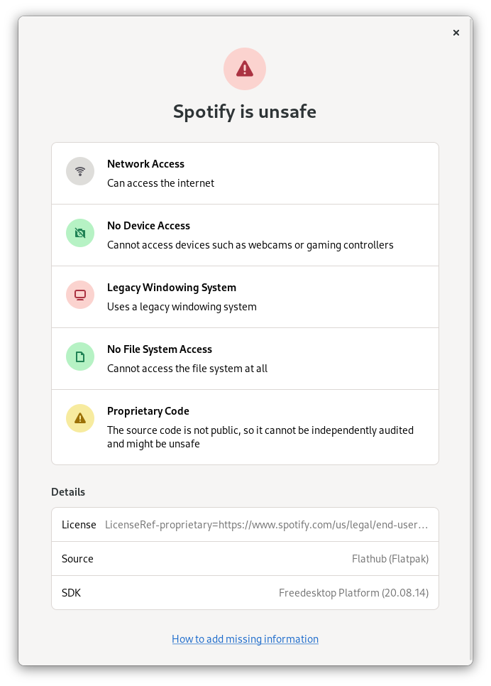
Folding all of these factors into a single rating at scale isn’t easy. I expect we’ll continue to iterate on this over the next few cycles, but I think what we have in 41 is a great step in the right direction.

Hardware Support

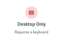
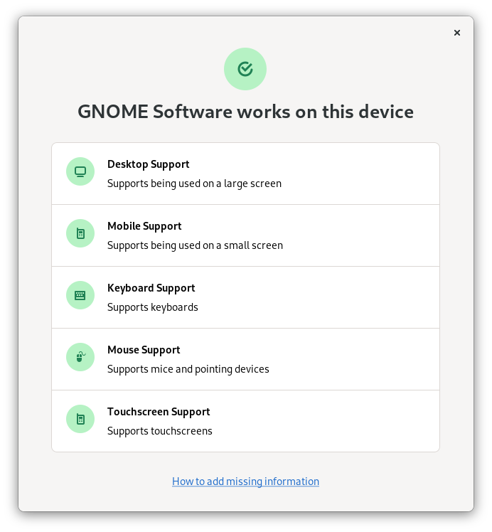
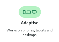
With GNOME Mobile progressing nicely and large parts of our app ecosystem going adaptive it’s becoming more important to be able to check whether an app is adaptive before installing it. However, while adaptiveness is the most prominent use case for the hardware support tile at the moment, it’s not the only one.

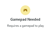
The hardware support tile is a generic way to display which input and output devices an app supports or requires, and whether they match the currently available hardware. For example, this can also be used to communicate whether an app is fully keyboard-accessible or requires a gamepad.
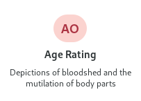
Age Rating

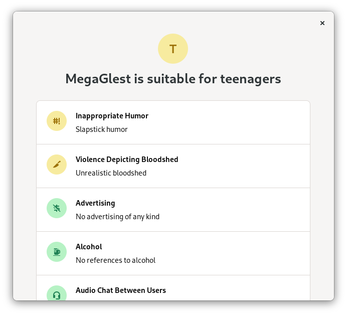
Age ratings (via OARS) have been in Software for years, but we’ve wanted to present this information in a better way for some time.
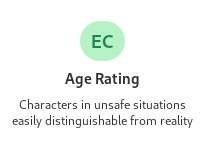
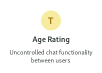
The context tile we’re introducing in 41 shows the reasons for the rating at a glance, rather than just a rating.

The dialog shows more information on the exact types of content the app includes, though the current implementation is not quite the design we’d like here eventually. Due to technical constraints we currently list every single type of content and whether or not the app contains it, but ideally it would only show broad categories for things the app doesn’t contain. This will hopefully be improved next cycle to make the list easier to scan.
Metadata Matters

No matter how good an app store itself is, its appeal for people ultimately comes from the apps within it. Luckily GNOME has a sizable ecosystem of cool third party apps these days, exactly the kinds of apps people are looking to discover when they open Software.

However, not all of these apps look as good as they could in Software currently due to incomplete, outdated, or low quality metadata.
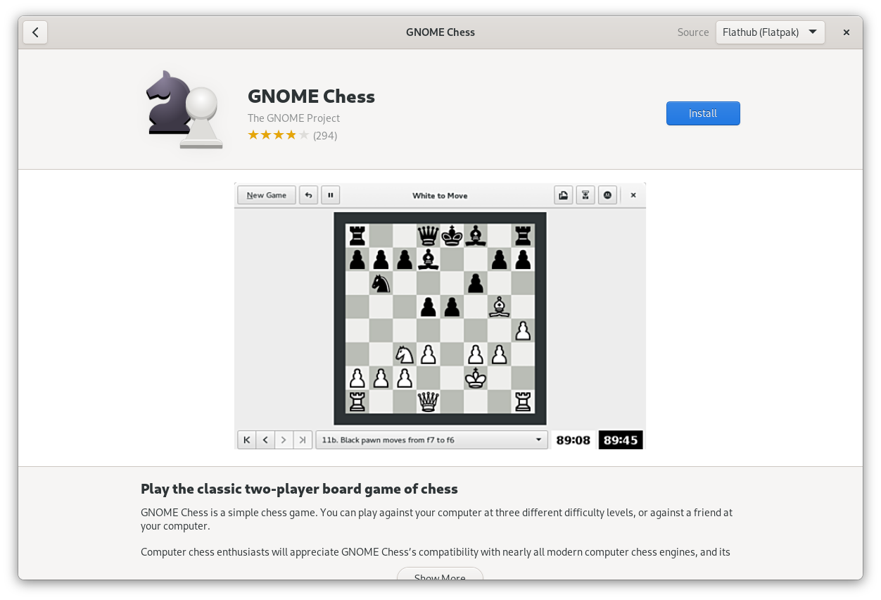
If the version of Adwaita on your screenshots is so old that people get nostalgic it’s probably time to take new ones ;)

Additionally, Software 41 comes with some changes to how app metadata is presented (e.g. context tiles, larger screenshots), which make it more prominently visible than before.

This means now is the perfect moment to review and update your app metadata and make a new release ahead of the GNOME 41 release in a few weeks.

Lucky for you I already wrote a blog post walking you through the different kinds of metadata your app needs to really shine in Software 41. Please check it out and update your apps!

Conclusion

Software 41 was a real team effort, and I’d like to thank everyone who helped make it happen, especially Philip Withnall, Phaedrus Leeds, Adrien Plazas, and Milan Crha for doing most of the implementation work, but also Allan Day and Jakub Steiner for helping with various aspects of the design.

This is also a cool success story for cross-company upstream collaboration with people from Endless, Purism, and Red Hat all working together on an upstream-first product initiative. High fives all around!
Get your apps ready for Software 41

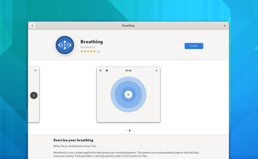
Software 41 will be released with the rest of GNOME 41 in a few weeks, and it brings a number of changes to how app metadata is presented, including the newly added hardware support information, larger screenshots, more visible age ratings, and more.

If you haven’t updated your app’s metadata in a while this is the perfect moment to review what you have, update what’s missing, and release a new version ahead of the GNOME 41 release!

In this blog post I’ll walk you through the different kinds of metadata your app needs to really shine in Software 41, and best practices for adding it.

App Summary

The app summary is a very short description that gives people an idea of what the app does. It’s often used in combination with the app name, e.g. on banners and app tiles.

If your summary is ellipsized on the app tile, you know what to do :)

In Software 41 we’re using the summary much more prominently than before, so it’s quite important for making your app look good. In particular, make sure to keep it short (we recommend below 35 characters, but the shorter the better), or it will look weird or be ellipsized.

Writing a good summary

The summary should answer the question “What superpower does this app give me?”. It doesn’t need to comprehensively describe everything the app does, as long as it highlights one important aspect and makes it clear why it’s valuable.

Some general guidance:

  • Keep it short (less than 35 characters)
  • Be engaging and make people curious
  • Use imperative if possible (e.g. “Browse the web” instead of “A web browser”)
  • Use sentence case

Things to avoid:

  • Technical details (e.g. the toolkit or programming language)
  • Structures like “GUI for X” or “Client for Y”
  • Mentioning the target environment (e.g. “X for GNOME”)
  • Repeating the app’s name
  • Overly generic adjectives like “simple”, “easy”, “powerful”, etc.
  • Articles (e.g. “A …” or “An …”)
  • Punctuation (e.g. a period at the end)
  • Title case (e.g. “Chat With Your Team”)

Good examples:

  • Maps: “Find places around the world”
  • Shortwave: “Listen to internet radio”
  • Byte: “Rediscover your music”

Code Example

The app summary is set in your appdata XML file, and looks like this:

<summary>Listen to internet radio</summary>

Appstream documentation

Device Support

Hardware support metadata describes what kinds of input and output devices an app supports, or requires to be useful. This is a relatively recent addition to appstream, and will be displayed in Software 41 for the first time.

The primary use case for this at the moment is devices with small displays needing to query whether an app will fit on the screen, but there are all sorts of other uses for this, e.g. to indicate that an app is not fully keyboard-accessible or that a game needs a gamepad.

Code Examples

Appstream has a way for apps to declare what hardware they absolutely need (<require>), and things that are known to work (<recommends>). You can use these two tags in your appdata XML to specify what hardware is supported.

For screen size, test the minimum size your app can scale to and put that in as a requirement. The “ge” stands for “greater or equal”, so this is what you’d do if your app can scale to phone sizes (360px or larger):

<requires>
  <display_length compare="ge">360</display_length>
</requires>

Note: The appstream spec also specifies some named sizes (xsmall, small, large, etc.), which are broken and should not be used. It’s likely that they’ll be removed in the future, but for now just don’t use them.

Input devices can be specified like so:

<recommends>
  <control>keyboard</control>
  <control>pointing</control>
  <control>touch</control>
</recommends>

Appstream documentation

Screenshots

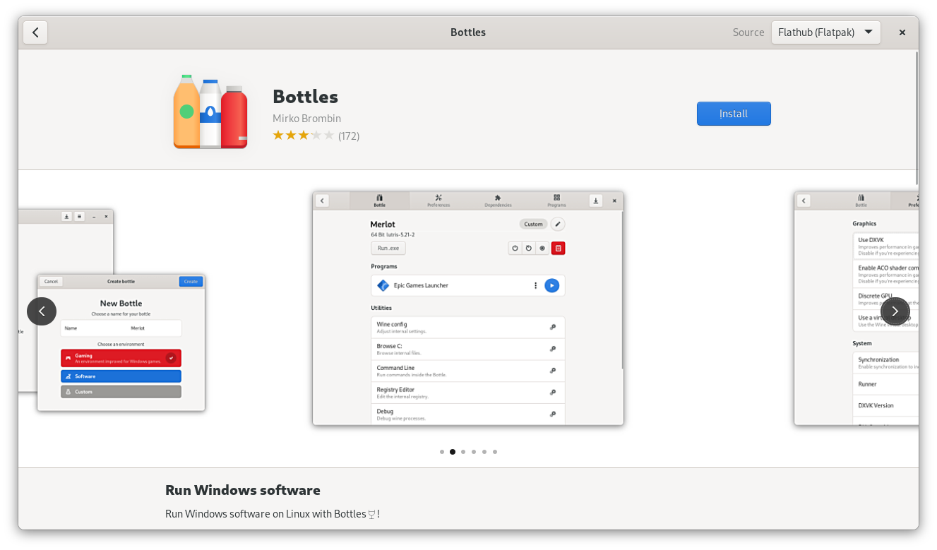
If you want your app to make a good impression good screenshots are a must-have. This is especially true in 41, because screenshots are much larger and more prominent now.

The new, larger screenshot carousel

Some general guidance for taking good app screenshots:

  • Provide multiple screenshots showing off the main areas of the app
  • Use window screenshots with a baked-in shadow (you can easily take them with Alt+PrintScr).
  • For apps that show content (e.g. media apps, chat apps, creative tools, file viewers, etc.) the quality of the example content makes the screenshot. Setting up a great screenshot with content takes a ton of time, but it’s absolutely worth it.
  • If you’re only doing screenshots in a single language/locale, use en-US.
  • Don’t force a large size if your app is generally used at small sizes. If the app is e.g. a small utility app a tiny window size is fine.

Before taking your screenshots make sure your system is using GNOME default settings. If your distribution changes these, an easy way to make sure they are all correct is to take them in a VM with Fedora, Arch, or something else that keeps to defaults. In particular, make sure you have the following settings:

  • System font: Cantarell
  • GTK stylesheet: Adwaita
  • System icons: Adwaita Icon Theme
  • Window controls: Close button only, on the right side

Things to avoid:

  • Fullscreen screenshots with no borders or shadow.
  • Awkward aspect ratios. Use what feels natural for the app, ignore the 16:9 recommendation in the appstream spec.
  • Huge window sizes. They make it very hard to see things in the carousel. Something like 800×600 is a good starting point for most apps.

Code Example

Screenshots are defined in the appdata XML file and consist of an image and a caption which describes the image.

  <screenshots>
    <screenshot type="default">
      <image>https://domain.tld/screenshot.png</image>
      <caption>Screenshot caption</caption>
    </screenshot>
  </screenshots>

Appstream documentation

Other Metadata

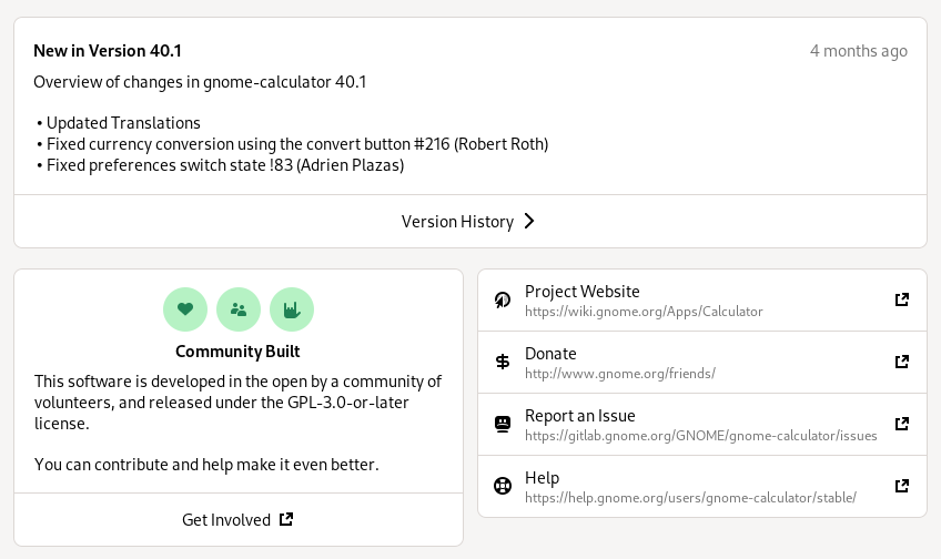
The things I’ve covered in detail here are the most prominent pieces of metadata, but there are also a number of others which are less visible and less work to add, but nevertheless important.

These include links to various websites for the project, all of which are also defined in the appstream XML.

  • App website (or code repository if it has no dedicated website)
  • Issue tracker
  • Donations
  • Translations
  • Online help or user documentation

When making releases it’s also important to add release notes for the new version to your appdata file, otherwise the version history box on your details page looks pretty sad:

Conclusion

I hope this has been useful, and inspired you to update your metadata today!

Most of these things can be updated in a few minutes, and it’s really worth it. It doesn’t just make your app look good, but the ecosystem as a whole.

Thanks in advance :)