Over the past several GNOME releases, we have been aiming to stabilise GNOME Shell as much as possible. We have been largely successful in this: the last major UI change was in 3.10, when we introduced the combined system status area, and the main improvements in the recent 3.12 release were for performance and bug fixing. This is a good thing. At the same time, there is one area where a number of us still feel that bigger changes are needed. This is notifications, particularly the Message Tray.
In this post, I’m going to present a new set of designs for notifications and the Message Tray, which we’re hoping to implement for the next GNOME release. As ever, these aren’t set in stone and are in a state of evolution. The aim of publicising the designs is to get feedback so we can improve them.
A bit of history
The original notifications design for GNOME 3 was introduced with 3.0. One of the main features of that design was being able to take actions directly from notifications. There was also an emphasis on integrated chat – you could reply to messages directly from a notification, and you could (and still can) see your conversations in the Message Tray and post to them from there. This feature influenced the basic design of the tray, which was structured as a set of “message sources” that you can interact with from the bottom of the screen.
The first iteration of the Message Tray implementation had some UI bugs with it, which we sought to address with a design update in 3.8. Despite these changes, we have continued to encounter a number of issues with the design of the Message Tray, and I think it’s fair to say that the tray hasn’t been performing as well as we’d hoped. Reasons for this include:
- The layout of the tray as a strip of icons means that it doesn’t communicate a lot of information when it is first opened. It also makes it hard work to use, since each notification source has to be individually opened to get more information.
- The tray is too difficult to open with a pointer, as it requires a lot of downward pressure against the bottom screen-edge.
- There isn’t a way to quickly see how many notifications are in the tray, and there’s no reminder provided about waiting notifications.
Addressing these issues requires that we rethink the overall design of the Message Tray. This is also an opportunity to address a range of smaller interaction issues with the existing design.
This said, the original vision for notifications in GNOME 3 has some very positive aspects, which we want to preserve. Being able to directly act on notifications is a powerful feature, for example. The combination of a minimal message banner (the initial notification popup) which can be expanded is also good, as is the concept of having a tray where outstanding notifications can be viewed and interacted with.
Design goals
Before I get into the details of the design itself, it’s worth talking a little bit about the goals and principles behind it. As the new design has evolved, a number of themes and objectives have emerged, and reviewing these helps to clarify what the design aims to achieve. These goals include:
- Be immediately useful. We want the tray to instantly provide useful information, and we want it to be possible to act on notifications straight away.
- Make use of physical affordances. In particular, we want to make greater use of the screen edge when using the pointer. This should make interacting with notifications and the tray easier.
- Sequential ordering. Notifications occur in time. Reflecting this in the layout of the Message Tray means that it will provide a more accurate representation of your notifications.
- Advertise interactivity. Some interactive parts of the existing design often haven’t been noticed. We’ll be making these much more obvious with the new design.
- Consistency and simplification. The existing design has been a bit burdened by its complexity, particularly because notifications are organised into different message sources. With the new design, we are pushing to simplify the design as much as possible. This should help to reduce the number of bugs, as well as improve usability, since we are aiming to ensure that notifications have a consistent appearance and layout.
The final goal is one that was at the core of the original design, and which is central to the design of GNOME 3 as a whole: that is, to be noticable and useful without being distracting. Wherever possible with GNOME 3, we have tried to produce a distraction-free experience which helps you concentrate on the task in hand. This requires a fine balancing act, which can be tricky to get right. With the new designs, we want to change that balance slightly, by making notifications a bit more noticable and by providing more effective reminders, but we still want to retain the emphasis on avoiding distraction.
A new design
The new design that we’re hoping to implement for GNOME 3.14 has been evolving for a while. There’s been a lot of experimentation in the design space, and quite a few concepts have been evaluated and thrown out. The design that is described below is the current state of that process. Since notifications can be quite complex, there are a lot of details involved. If you’re interested, there is plenty of information on the wiki.
The Message Tray
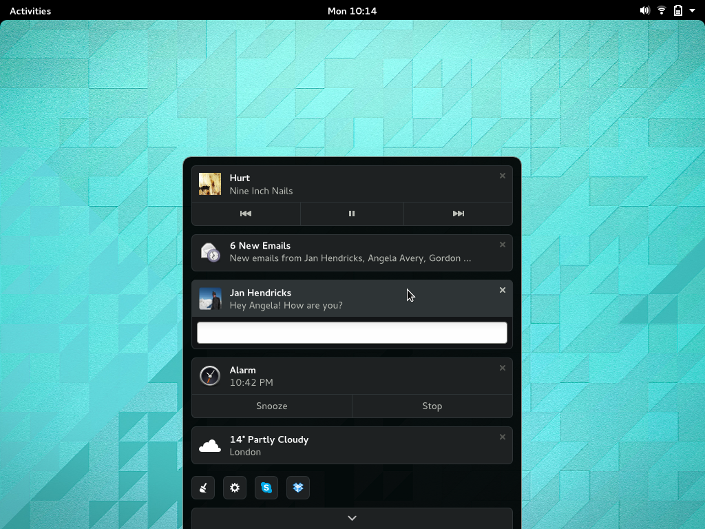
The most striking change with the new design is the introduction of a completely new Message Tray. The previous Message Tray design presented message sources as a set of icons in a strip along the bottom of the screen. With the new design, the tray contains a list of notifications, and slides up from the same bottom screen edge. This allows simplification, since the notifications are no longer reorganised into a set of message sources. The list is time-ordered, reflecting their sequential nature. It is also immediately useful, since you can see information about each notification straight away.
https://www.youtube.com/watch?v=C4TzqY0Ct90
The new design also changes the way that the tray is opened. Hovering or pushing on the screen edge will cause the tray to peek up, along with an indication of the number of notifications in the tray. Clicking the visible portion of the tray will cause it to open and a second click will cause it to hide again. The peeking tray, along with the notification count, will always be visible in the Activities Overview, in order to provide a reminding function.
This aspect of the design is intended to provide a quick way to check if you have missed any notifications, as well as to quickly inspect the contents of the tray itself. We also want to make the action of opening the tray much easier than it is now.
Lock Screen
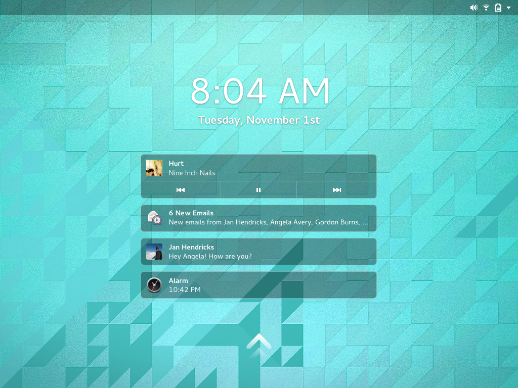
One of the primary goals of the lock screen was to show missed notifications when you return to the computer. Designs for expanding the role of lock screen notifications have existed for some time, particularly with regards to being able to activate notifications from the lock screen. I’m not sure whether we’ll get chance to implement this aspect of the design for 3.14, but it should be said that the new design makes an effort to make the Lock Screen and Message Tray notifications as consistent as possible.
Notification banners
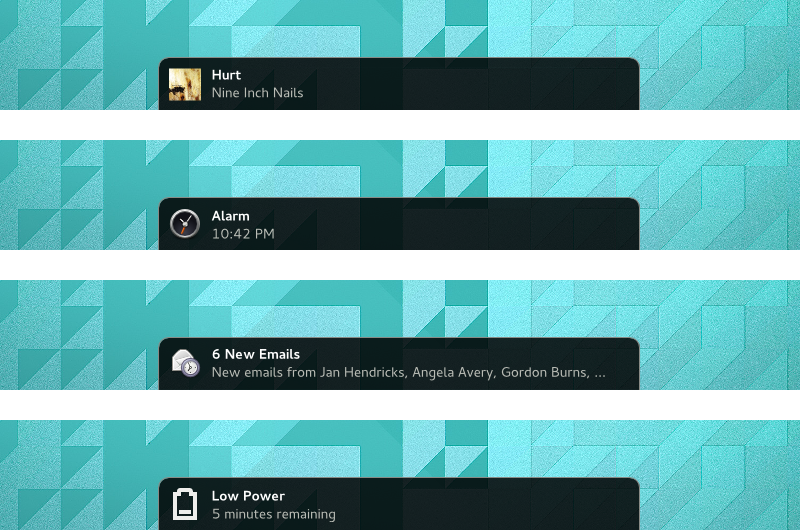
The existing formula for notification banners remains the same with the new design. Some aspects of the layout have changed, however: this enables them to have a consistent layout, irrespective of whether they are presented as a popup, are in the Message Tray, or are on the Lock Screen. The banners are bigger, which makes them more noticable.
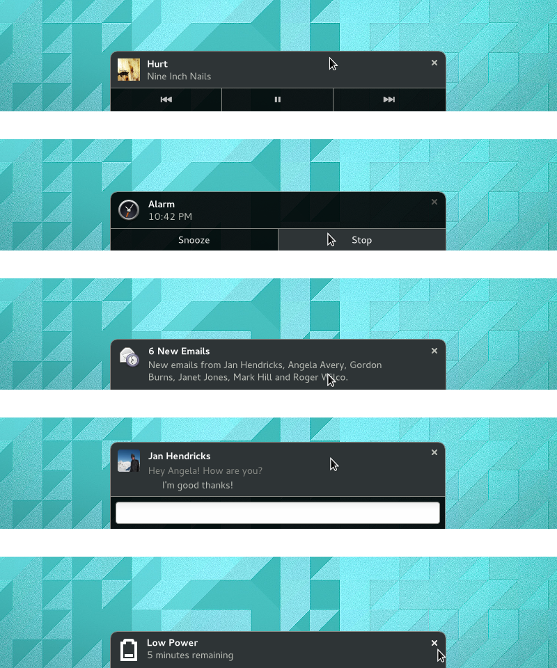
Expanded banners also remain fundamentally the same, albeit with a modified layout. Buttons are now flush against the screen edge, making them easier to target with a pointer. We also plan to use hover states more readily, in order to communicate interactivity.
Next steps
Everything I have presented here is currently being treated as experimental. Jasper has an initial implementation in the works, which we are already testing, and are going to continue evaluating as it is developed. As usual, the design might change as we try things out, and we’ll only merge this into 3.14 if and when we feel that it is worthwhile.
You can help us to develop the designs with your questions, comments and feedback.
Looks great! Allan, what are your thoughts on the touch interaction in this case? Has there been mockups with regards to this form of input yet?
-Bastian
Yes, we’ve thought about touch. Currently thinking about using an upward swipe from the screen edge to open the tray. There are a few notes about this on the wiki, although I think they’ll need to be expanded.
Hello.
Still an excellent job. ;)
Can I use theses mockups for writing a french article on my blog?
Of course! They’re freely licensed, so there’s no need to ask.
Hello,
I’m happy to see that there is attention give to the notification area:
I’m mainly a AwesomeWM user, but last week I started Gnome, and used it the whole week: one of the pain points of it was the notification area: the rest of G3 interface, it grew on me, I adapted to it, or call it however you want, with the exception of the notifications;
Coming from AwesomeWM, I want to make a few sugestions:
Can the main bar (the in upper side of the screen) be made less evident? Like making it dissapear, or making it smaller? Is there a easy way to do it?
Also, have you considered moving the notification bar above? like in more traditional desktops? I know that you can get attached to what are you creating, but have you considered this? Maybe it can sit in the dropdown where the profile, sound control are?
Also, how about making the title bar of windows smaller? I noticed in new application it has a functional feature, with those small buttons (like in gedit), which is nice, if you ask me, but there are applications where it’s not used at all: just wasted screen space;
Getting back on the topic, I think the new notifications look great; The notification bar still bothers me.
One thing though, with the screen lock notifications: take care of privacy and evil behavior of other people: Most of us lock the screens to protect some sort of sensitive information, we don’t want those to reach in the wrong hands, even if those hands are our spouse hands, for example (think of a “secret” medical procedure, or planning a birthday party, and one of the notification spoils one of those); second, if I’m at work, I don’t want some colleague to make fun of me, by sending “funny” messages to my boss, for example.
Hey Dumitru, check out the notification settings – these allow you to control how much information is displayed on the lock screen.
@Allan, please consider the idea that @Dumitru suggested about the location of the notification area. The current and the mockups you’ve showed up hide the notification completely (they require me to make a move to notice if I have any notifications) but! if you had a notification applet in the top right area which would have maybe include a number (the number of notifications) and only appear if you have any and by clicking it you’d reveal the widget that you display in the latest mockups but in reversed order (cause it now goes from top to bottom instead of the opposite).
Something like this would be awesome: http://i.imgur.com/KHXLAUy.png
I’m really sorry Allan for this triple-post, I tried to edit my comment but it seems like the wordpress system doesn’t allow comment edits. Here is a more detailed explanation of what I was thinking:
I posted this in Allan’s blog post and I will post it here as well:
The new designs are awesome but they still are so non-distractive that they don’t distract you at all (they are not notifying you at all!). What i think would be ideal is the following:
You will have a notification icon in the top right (the topbar’s right area).
when a new notification appears, the notification itself will appears like it does in the mockup and then it will hide (with maybe a nice slideOff effect) inside the notification icon which will now have increased it’s number by 1 and when you click that icon it will reveal something like this:
http://i.imgur.com/KHXLAUy.png
You can hide the top bar with this extension: https://extensions.gnome.org/extension/545/hide-top-bar/
GNOME Shell use a lot of CSS, you can easily change. For exemple, https://unix.stackexchange.com/questions/40415/how-do-i-resize-gnome-shell-top-bar
Unfortunately, for each update, there may need to redo
Unless you create your own theme based on GNOME Shell default one that provides such modifications
On the topic of hiding the top bar: there are various extensions that should do what you want… e.g. https://extensions.gnome.org/extension/545/hide-top-bar/
Thanks for working on this. My pet peeve with current design – there is no history of notifications. Some notifications are “transient” (or how to say it) – they don’t create any new icon in the message tray, they just appear and disappear, leaving no trace behind them. Very often it happens to me that I’m focused on some part of the screen and I realize some notification popped up in my peripheral view. But if I can’t move my eyes at that very moment, the notification disappears after a few seconds. When I can finally pay attention to it, I open the tray… and there’s nothing. No notification, it just disappeared.
This is very frustrating, because you know you missed something, but you don’t know why. And you feel like punished for not having been able to look at it at the given 5-second interval.
I wish there was a history of all notifications in the current session and I could read what I missed.
Hey Kamil, I’d be interested to know which notifications these are (hard question to answer, I know). I’m not actually sure which notifications are transient, currently.
I’ve had the same experience.
I used to get a lot of notifications telling me that Ubuntu One uploaded/downloaded something. If I accidentally missed one, there would be no way to see what it said. I’m not sure right now, but I’m thinking SparkleShare and ownCloud do the same, except there you at least have a way to review recent changes. Still, none of the icons for these indicate that you missed a notification.
In general, basically any application that tends to have a permanent place in the notification tray and that also presents notifications when something happens (e.g. Music telling you that it’s playing another song) tends to have this problem.
Then of course you have the low battery notification, and that’s transient deliberately.
The Hamster time tracker “current activity reminder” notification appears to be in this “transient” state.
I’m not completely sure which notifications behave like this, because when I missed them, I don’t know what they were about :-) But I think tin man described it nicely, it’s probably mostly third-party applications I guess, like Dropbox. The dropbox notification just slides up and down, and when it disappears, there’s no indication that in the message tray that it originated from dropbox.
The problem is, when you see it just with your peripheral vision, you don’t know if it was important or not. Then you try to look through the message tray and you wonder – was it just a harmless notification e.g. from dropbox, or have I missed something really important and can’t find it right now? It’s disconcerting.
Even for deliberately transient notifications from GNOME, like battery or network reconnect notifications, I believe they should be in the “notification history” somewhere. Because once again, if I see it only peripherally, you don’t know if it was important or not. So then, it would be very helpful if I could see the notification history and realize “oh, it was just a wifi reconnection message, no problem”. And I would no longer be in tension.
One further problem I remembered now is for external disk disconnect (thumb drive for example). After copying some large files you usually see something like “Don’t disconnect yet, still writing data to the device”. So you begin working on something else. It’s quite easy to miss the message “You can now remove the device” when you’re focused on something else. And after some time you wonder – can I finally disconnect the device, or not yet? Will I lose some data, or is it safe? Have I missed the notification, or is it still going to appear? And there’s no way to tell. The notification history would make this much clearer.
Thanks.
In reply to tin man:
With music players, e.g., you probably don’t want to keep all notifications, you probably only want the last song. It is similar with file sharing services: you probably don’t want twenty notifications for twenty synced files, you want one notification that gives the latest status: “example.txt and 19 other files synced” (example.txt being the last file to be uploaded). (Although there should be a way to look at all synced files, but that should be part of the syncing application, not part of the notification.)
So, maybe it would help to not allow applications to delete notification. Instead, only allow applications to replace notifications (i.e. “Now playing Song 1” could be replaced by “Now playing Song 2”; “Synced example.c and 18 other files” could become “Synced example.d and 19 other files”; “Installing Example App — 95 %” could become “Example App Installed”).
The only one that could delete notifications would then be the user.
I’ve seen similar issues with Hexchat’s notifications. I know it’s not a native GNOME application, so how it presents and expires them is not really under control (I have high hopes for Polari!), but my biggest annoyance there with these transient popups is when I reconnect to my Irssi proxy on login and get a bunch of notifications. Due to the way the irssi proxy notifies any client connection, there are a a batch of popups that often disappear before I’ve had a real chance to see them (side note: as I have a proxy to both freenode and gimpnet, I get each notification twice, once via each proxy connection, which is a pain but not any fault of the notification system!). Finding the notifications inside hexchat is a pain as it’s not always clear which of the many channels I’ve joined actually contains the generated notification messages.
Anyway, I appreciate this isn’t really the fault of notification system, but just wanted to give you an example. hexchat does not keep a permanent icon FWIW, I’ll often open the message tray and have several separate icons for it under 3.12
Hope this is useful.
Definitely would like it not to show the content of chat messages on the lock screen by default, even unlocked I’ve had a friend send me some borderline nsfw/embarrasing messages that have popped up in the notification area in the office.
Also – I hope the new notifications take into account the gnome3 design goal of a non-distracting desktop.
I like this new design. Currently there is a disjoint between the way notifications look when they pop up initially (in the center of the screen), and when you click on them later in the message tray (they appear to above the icon in the notification tray — so mainly to the right ). These mockups help to fix that :)
However, The issue i reularly run into is that there is no visible indication on the desktop that there are unread notifications. If i miss the pop-up bubble while i am looking at a different part of the screen, i routinely miss important notifications (specifically chat notifications). Most times the only time i know i missed a notification is when i lock my screen, as they show up there.
On my phone, there are indicators in the top left of the topbar showing i have unread notifications, which i find rectifies this issue (for my phone use-case at least)
I feel your pain. I often don’t notice chat notifications until hours later and worse when the person is now offline.
I like the comparison to the LED notification indicators on a phone. We need *something* to say look-here-when-you-have-a-moment.
Ryan isn’t talking about the LED, he is talking about the status bar (Android).
Further on this topic: Have you thought about a OS X-like notification center that can be brought in from the right side of the top bar, too?
I can see the argument for putting music controls in the notification tray, but could we avoid giving a new notification every time a new song comes on? I can hear with my ears when this happens. :) Android works like this.
Also, this is more an implementation detail, but has there been any thought of integrating with web-based notifications as produced by Firefox and Chrome?
Not showing notifications for new tracks is something we’re considering, yes. :)
I like to know what I’m listening to :(
I like the changes on the message tray, it makes it faster to see all notifications.
As we have status icons on the upper right, wouldn’t it make sense to display the number of unread notifications there ? If we only have that information at the bottom, either it is displayed inconditionally and it forces more the user to take action as it is on his way, or it is only displayed on hover and some may not notice it.
I have a concern about the lock screen. Notifications in the lock screen could leak personal information while you are away from the computer. Not a feature I’d want to have enabled on a workstation in a government office for example.
I think we default to not showing details in the lock screen notifications. Right now it just shows the app and the number of notifications, for example.
You can manage that in settings and decide exactly what you want to have shown on the lock screen and what not.
I’m not sure this solves the biggest problem I see with the current system: that notifications like Pidgin’s are not immediately useful (in fact, they’re mostly unusable).
For background, there’s a category of notification icon where the state is interesting and should be visible at a glance, but state changes aren’t worthy of my immediate attention. NetworkManager is in this category, and I find that my productivity is much higher if instant messages just change an icon somewhere instead of flashing at me. (And I specifically do not want to see the text of the IM immediately.)
The problem is that NetworkManager is somehow blessed and is always on the screen, but I have to click something to see Pidgin’s icon. That makes Pidgin’s icon basically useless. (I can’t even use the number of notifications as a useful proxy: Pidgin, just like wlan, is always present; it just doesn’t always have anything to say.)
One solution would be to make the set of app icons that are on-screen configurable. (Note that Windows has been able to do exactly that for quite some time.) I’m sure that other solutions are possible.
This is by far the biggest annoyance. Not only Pidgin has this problem but also Dropbox. The Dropbox icon simply does not belong in the hidden message tray. When I click save on a document (which resides in my DB folder) I want to see the icon changing to see if it sync and when it has finished syncing.
Hiding icons is just a bad idea in general. Quite often I try out some new application and close it only to find out an hour later that it lives on in the message tray. On any other desktop this would not be a problem, since you’d instantly notice the new icon in the tray.
yeah, never understood this decision either. Try this, works great:
https://extensions.gnome.org/extension/495/topicons/
I comment here instead of IRC so other people can see it =)
Before, we have a source for each conversation and a max height for each conversation, allowing to have some context of the conversation but also not allowing to grow the notification too much.
However, now that all conversation will be positioned on the drawer I see two problems:
1- In this design we don’t have enough context of the conversation (I’m happy with that though, go to chat app for more).
2- What happens if we answer while in the drawer? does the notification remain in the drawer? does the drawer grow? how much? what happens if you are talking with i.e.10 people? It’s something the user can’t avoid to happen.
I guess this is more a general problem of the user having multiple notifications, but I think this specific case can be common and annoying.
Then as a subjective opinion, the row of the icons feels like mixing actions with applications. And also a little unbalanced visually.
Looks pretty nice overall! =) thanks!
One of the worst aspects of Gnome is the Message Tray. Mostly because no one cared about, open or closed source. That created a weird situation for desktop users.
The biggest pet peeves is the system tray icons like Hangouts, Skype, or Dropbox.
1. You push the bottom of the screen.
2. It brings up the message tray with Skype’s or Dropbox’s classic-system-tray-icons.
3. You click the icon
4. Message tray collapses.
5. You have a right-clicked menu hanging nowhere.
Does that makes sense?
I see Skype and Dropbox in the demo. Let’s say I have opened the new notification. What happens after I right click Skype which opens Skype-right-click-menu a) the notification center remains open with Skype-right-click-menu or b) the notification center collapses and we have a hanging Skype or Dropbox right-click-menu which brings us back to same problem.
Great design, but there is still one problem, I think! Apps like Steam, Skype and so on are useful with their tray buttons, because U just click on the button and there is the menu. This is already a problem in actual tray, because the tray swaps back and the menu is flying in the nowhere. Also making already to clicks or a lot of swiping to only access the icons of this apps isn’t very handsome. I guess at the moment, the top-icons-extension serves this. Maybe it would be good to split the message tray in notifications and tray-icons of mentioned apps, because they should be in sight more faster to get a quicker look at them (for chat status in skype, for example) and uncomplicated access to their menus. But to be honest, I don’t know any solution for this.
Guys – make this persistent as an option and default ON – I mean this little “peak” with numbers of unread notifications. Not everybody sits in front of PC 24/7 and wants to remeber about checking bottom of screen if anyone sent mail/IRCmessage/pidgin one. Message tray is useful thanks to that – it’s permanent info about “waiting to be dealt with” things like chats.
Is there any differentiation between “ongoing” notifications (those representing apps in the background, e.g. music, running sync services, chat, Redshift, weather, etc.) and event-triggered notifications (e.g. alarm, new message, etc.)? It’d be nice if the notification counter only applied to event-triggered notifications, for example, as counting in ongoing notifications makes it less obvious how many notifications actually deserve attention.
Additionally, is there any standard mechanism for getting back a ongoing notification? Currently, closing the Music notification keeps it closed until another song plays, but that kind of mechanism is unobvious, undesirable if one doesn’t want the notification, and doesn’t at all work for apps like Weather. On Android, ongoing notifications are not closable and disappear when they stop being relevant [1].
On an unrelated note, aside from notifications, one basic thing that I find still doesn’t work quite well in Gnome is mouse-based window switching. I find that it still takes me quite a while to decipher window thumbnails, especially as they’re almost always predominantly white rectangles with black text. It’d be great if you could reconsider bug 634599 and add application icons — they’ve been there since the days of the taskbar and they work very well in elementary OS [2].
[1] https://developer.android.com/design/patterns/notifications.html
[2] http://img.netupd8.com/elementary-os-luna-beta2-expose.png
I’m not sure if I understood the interactive design completely but I think overall it is a change in the right direction.
However I see two fundamentally different types of “notifications”:
A) new emails, printer job done/failed, next song etc – these items (usually) don’t require immediate action.
B) things which I want to be aware of immediately – no matter how many other notifications are present. E.g. new incoming call (I might not have speakers enabled so sound doesn’t work for me), new IM message, alarms.
For items in category B IMHO Gnome should ensure that I can not overlook that particular notification (because otherwise other people thing I’m impolite and ignoring them purposely when I don’t react to their IM messages). For example in MacOS I think a program icon would start bouncing in the doc if something important happens. Basically I need a persistent visual clue that something really important is happening – until I take some action.
Can the new concept implement something like that? If not, do you thing the use case mentioned above is sensible/should be supported by “vanilla” Gnome?
This seems good in general. Will there also be a keyboard shortcut or live edge (as is the case in 3.10) to open the notification area fully? The fact that it can (currently) be opened without having to click the mouse is a major advantage.
Hi Allan,
I’m glad to see some work on the notifications area. Thanks! One pain point with the notifications area for me has been around how it handles email (through Thunderbird or Evolution). It would show a pop-up for each message that I received, so if I had just opened my email client, I would end up with maybe 30 notifications. This made them pretty useless, and I would just turn off the notifications.
I can’t really recommend a workflow on this, and it does look like you may have something sorted out on handling multiple email notices, but I just wanted to present “how to handle receipt & display of a large volume of emails” as an issue to consider.
Also, just wanted to say thanks very much for putting together such a professional description of where you want to go with this aspect of GNOME shell, and thanks for kindly addressing so many user questions / comments on your blog here. It’s obvious that you’ve taken great care in both areas.
Cheers.
Great stuff, looking forward to it!
My greatest bugbears with the current message tray are: the way the rest of the desktop gets ‘grayed out’ and shifted up when you get to the tray, which requires extra effort (an extra click at least) and some window movement to switch back to an application (the movement matters when you want to get back to an application and click on something in particular like a message or folder in evolution, then you first have to click on the shifted-up view, then wait for the normal view to come back and the desktop to shift back down, then re-position the mouse pointer down to where you wanted to click and then click again); secondly, there are things that pop up that I just want to dismiss, but even if I click the ‘x’ icon in the corner of the bubble it lingers on the message tray and I have to remove it manually by right-clicking and selecting ‘remove’, such as e.g. package-updates-are-available notifications, although those might not be gnome code actually).
Well, at least it only took 6 years to back to (just shy of) feature parity of where we (Christian Hammond and to a much lesser extent I) had desktop notifications before Canonical and GNOME decided to go and “change things”. Hard to deny it’s “prettier” in this form, but then again had someone asked for this exact layout, we could have done it then.
This is quite nice!
One question: why not put this on the top, rather than the bottom? In particular, how about integrating it with the calendar?
I use gnome 3 everyday. Currently in 3.4 debian stable.
The notifications in gnome 3 are amoung the best features g3 has introduced mainly for comunication.
Keep in mind that the notification should noy mess with what the user is doing. It should apear and disappear without user input but should be easy to reach.
Looks nice!
(And that means something, seeing as I neither like nor use Gnome Shell).
Please add notification panel to right side like new osx yosemite – http://www.youtube.com/watch?v=tAMDYFEUYYY
this looks great! :mewants:
Hey Allan, I’m very glad this is being addressed and looking good!
I get how the bottom of the screen is the obvious place for the notifications because the remaining sides of the desktop already serve a function, however, it is a bit frustrating how the notifications’ popups cover what you might be doing when you’re e.g. chatting on IM, using a terminal, etc. where you’re usually typing at the bottom of the screen.
I would personally prefer to have the spaces at the bottom (and horizontal) and notifications on the right but I understand that this wouldn’t be as innovative and distinctive as the current design, and now it’d be a bit too disruptive to change it at this point so I am looking forward to trying out this new design ;)
I also agree with the people that ask for an always-visible hint for the presence of notifications but there’s already an extension for this if just a few people miss it.
Keep up the good work!
Please-please add the top bar icon saying there are something in the notficication area that requires user’s attention. I’m missing incoming empathy message all the time and people wonder why do I ignore them.
I think my biggest feedback points would likely mirror what others have already said, but I’ll summarise here.
1. Interacting with tray icons, especially those with a menu, is really not nice when the tray snaps back.
2. I agree that if I’ve been away from my computer (and say it doesn’t lock), I do probably want a little reminder that there are pending notifications. Perhaps the “number bell” (whatever you will call the little handle thingy!), should somehow make its presenece known either periodically (e.g. once a minute for a few seconds) until you actively interact with it – (perhaps just hovering is enough to dismiss it until the next notification, but personally, I would prefer to have something on screen at all times indicating the presense of something waiting. It doesn’t have to be blinking or distracting but some form of indication would be nice. Sadly the only area where this is do-able is in the status bar, but that’s physically far away from the message tray. I’m not sure how these two elements could interact without reassessing where the message tray actually lives… perhaps it’s better to encourage peopel to interact more with the top bar and not have different “zones of activity” in different areas of the screen?
3. Try as I do, I really cannot shake the desire to have a task list along the bottom of my screen. It’s still, for me, the easiest and quickest way to have a mental reminder of what’s active and switching between things. As this takes up the bottom area of the screen, I hope care is taken to ensure the message tray interacts nicely with this layout. I’d actually rather see the message tray move over to the task bar should one be used, so I’d request that you try and make sure the designs allow a good amount of flexibility with regards to repositioning via extensions.
Keep up the good work!
On number 2: notification banners (already) stay on the screen until you move the mouse.
Don’t make notifications/system tray icons hidden! I cannot fathom how the GNOME design team thought that that would be a _good_ idea? For example, (He)xChat can run in the background, but in order to access it one would need to open that silly little message tray. Empathy/Pidgin is another example of where the message tray fails. If you don’t like the clutter of too many system tray icons, do what Windows (shock horror!) does: show only a limited number of icons, then have an arrow which then creates a popup which shows all of the other icons.
tl;dr: Hidden notifications/system tray icons/message tray = bad idea.
IMHO, the basic problem is having notifications disconnected from the rest of the Shell UI. The detailed view is clearly inspired on what other systems are doing, but having it slide up from the bottom of the screen forces you to make some questionable design decisions.
Why not use the same approach for notifications that is already used for system state? Icons along the top bar with a summary of current state, that reveal more information and actions when clicked.
I haven’t given thought to how interaction would be handled without a touchscreen, but I sorely miss WebOS-style stacked notifications:
https://www.youtube.com/watch?v=ZIe_CjG-xkk
I like the design though I face the same issue as many others have mentioned before. I find it hard to see if I have unread notifications. Maybe you can color the bottom of the screen like when you find yourself in overview mode and you place your mouse over “1 message”. Maybe you could even change the color depending on which type of notificaion pops up. Still I love gnome-shell and I am pretty sad that currently almost no bigger distro is offering gnome 3.12 except arch…
Anyway keep up the great work!
Assuming meta+M will still bring up the notification area, another (probably lesser priority) thing to get right here is being able to easily navigate, delete and act on notifications with just the keyboard. The current tray allows you to navigate and show, but can’t remove notifications.
One more thing — there are a lot of comments concerning the position of the notifications. It’d be great if you could tell us the various positions that were considered and the reasons for dismissing them.
I’m especially curious about whether the top center area was considered. Given that this area could provide an always-visible notification count (next to the clock), is capable of providing a large target area without conflicting with the application area, doesn’t depend on a screen edge (screen edge reliance can be problematic in virtual machines), is quite prominent, and is the standard area for notifications on the commonly-used mobile operating systems, it seems like the perfect area for notifications.
I realize that the clock currently presents a “Today” pop-over, and that, being a clock, there is an association there. However, notifications are closely related to time as well (the notification-centered Android Wear watches come to mind). A bottom placement for a “Today” tray, much like the access point for Google Now in Android, seems just as fitting, though perhaps the pop-over could be done away with entirely. Based on the proposed design, many of its current elements seem appropriate for the notification tray. Given that Weather resides in the tray, there should be room for Clocks and Calendar as well.
I really, REALLY love this design for notifications. However it seems to be a step back for “tray icons”. I only have one of these right now (ownCloud client) but that one I use a lot and it doesn’t feel right in the current notification tray. The new design feels like a step in the wrong direction in this regard.
What about Dock-Users? Docks mostly stay at the bottom, right where the notifications are…
I always got a bit frustrated with the notifications. Here’s why:
Nearly every Gnome app uses a large amount of screen real estate. They’re intended to be used in full screen mode, so I get that, even if I hate it. But if I mount a new drive, I get a notification pop up. I used to leave that window open, but then I’d be scrolling through Nautilus trying to interact with files, and a significant portion of the screen would be useless until I dismissed that notification. I’d have to scroll the nautilus window just right and click on the top of the files and folder to interact with things. There are plenty of other applications that have important interactive elements at the bottom of the window which are made useless. All of this because I didn’t immediately deal with a notification that Gnome thought was more important than whatever I’m doing. And the hot zone for the notification popup was absurdly huge.
Combining that with all the DPI problems I had in Gnome (to be fair, partly blamed on my screen)) making controls unusably large, and I had to switch away. To clarify about my DPI issues, I was working with a 1080P 46″ TV for a planned media center, but xrandr and Gnome thought it was 7″. Navigating was unbearably difficult. KDE and every other WM, on the other hand, let me control the resolution and scaling separately. Automatic settings are nice, but sometimes you need to override that. And yes, you can alter the DPI settings, but a fallback to editing conf files in xorg.d is hardly a step forward. A manual override for the display scaling would be far better.
Please recognize that only a portion of the notification plague at the bottom of the screen is interactive. And yet it claims interaction priority over that entire section of the screen. If you’re going to use transparency to show that there’s something important in the foreground in that window section, either let me click through it or bring it up regardless of where I click. Having large translucent-and-yet-unclickable-and-unresponsive portions of the screen is extremely frustrating.
Hi Allan,
I hope it’s not too late to post feedbacks about this recent work.
I also vote to move the notification area on the top bar because:
– this top bar is the “control center” of Gnome
– our natural eyes movement is more from top to bottom than the opposite I think
Personaly, I won’t use the screen bottom edge, but that’s just a personal feeling.
Regarding the lock screen, I think these mockups are great in a personal use of Gnome. If we think of a professional use, this can raise some confidentiality issue. It would be very nice to propose an option to display only the number of waiting notifications on the lock screen.
My 2 cents.