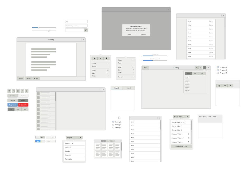
I’ve recently been hard at work on a new and updated version of the GNOME Human Interface Guidelines, and am pleased to announce that this will be ready for the upcoming 3.14 release.
Over recent years, application design has evolved a huge amount. The web and native applications have become increasingly similar, and new design patterns have become the norm. During that period, those of us in the GNOME Design Team have worked with developers to expand the range of GTK+’s capabilities, and the result is a much more modern toolkit.
It has been a long road, in which we have done a lot of testing and prototyping before incorporating new features into GTK+. As a result of that work, GTK+ provides a contemporary lexicon to draw on when designing and implementing applications, including header bars, popovers, switches, view switchers, linked and specially styled buttons, and much more.
There is a downside to all the experimentation that has been happening in software design in recent years, of course – it can often be a bewildering space to navigate. This is where the HIG comes in. Its goal is to help developers and designers take advantage of the new abilities at their disposal, without losing their way in the process. This is reflected in the structure of the new HIG: the guidelines don’t enforce a single template on which applications have to be based, but presents a series of patterns and elements which can be drawn upon. Each of these is accompanied by advice on when each pattern is appropriate, as well as alternatives that can be considered.
The HIG is also designed so that it can grow and evolve over time. The initial version that I have been working on covers the essentials, and there is a lot more ground to be covered. We want to assist people in finding the design that best fits their needs, and we want to make a whole range of creative solutions available.
In writing the HIG, I’ve made an effort to produce a document that is as useful to as many people as possible. While there is an emphasis on integration with GNOME 3, there should be useful material for anyone using GTK+ to create applications. It includes guidelines on creating more traditional desktop applications as well as newfangled ones, and includes advice for those who are responsible for GNOME 2 style apps. Likewise, the new HIG includes guidance on how to design effective cross-platform applications.
The new HIG wouldn’t have been possible without the help and hard work of many individuals. It incorporates updated material from the previous version, which was written by Seth Nickell, Calum Benson, Bryan Clark, Adam Elman, and Colin Robertson, many of whom recently helped us to relicense the original HIG.
Credit also has to go to those people who designed and developed all the new capabilities that are documented in the new HIG, including Jon McCann and Jakub Steiner on the design side, as well as the developer/designers who helped to test new patterns and add new capabilities to GTK+ – Cosimo Cecchi, Matthias Clasen, Carlos Garnacho, Alexander Larsson, Benjamin Otte, and many others.
I’d also like to thank the GNOME Documentation Team for their advice and assistance with proofreading.
This being the initial release, I’d love to hear feedback, and I’m sure that there’s plenty to be improved. If you’re interested, you can clone gnome-devel-docs and read the development version using Yelp.

I had a great read, thanks for bringing this on the table for 3.14!
One question: In tab-based applications, would you say “Ctrl+T” is a standard shortcut key for creating new tabs?
To clarify, if you want to view the HIG in yelp, you’d clone the repo and then do:
cd gnome-devel-docs/hig3/C && yelp . (so that’s yelp – space – period).
Congrats on getting the HIG3 out the door.
Now that we have human interface guidelines that say “Never capitalize every letter in a word”, can we please rename GNOME to “Gnome”?
“Shouting at your users isn’t nice.”
sorry, can’t do. GNOME is still an acronym, and it’s still our trademark.
Based on the display above I would think the 1st thing to learn is ‘contrast’.
I cannot read any words in the graphic and I believe it’s mostly due to the fact of lack of contrast.
As much as we dislike Microsoft, when they 1st came out with VB the manual had specific instructions on interface layouts and what to show and when not to show certain elements.
Brilliant as usual Allan… The HIG is maturing really nicely and it is a great source of inspiration in UI design and patterns not just in the gnome world but else where as well. For example, we use the principles and some of the patterns of HIG while designing UI for web application.
I’m not completely through the document yet. However, could we add code examples in an appendix? I’d be willing to translate them to vala and to maintain them. I’m sure others are willing to pick up js and python.
Hey Flo! It would be fantastic to have coding tutorials that match the HIG. Adding them to the HowDoI pages might be a good way to start – https://wiki.gnome.org/HowDoI/
“If you’re interested, you can clone gnome-devel-docs and read the development version using Yelp.”
This isn’t very usable. How about a website zip and a PDF?
Tobi translated the pages into HTML: https://people.gnome.org/~tobiasmue/hig3/
This was a one shot deal, and is already a little out of date, but it’s something.
Link to the guide lines in html: https://people.gnome.org/~tobiasmue/hig3/
While clonging a repository isn’t rocket science, following a link is easier, if all you want to do is read it.