GTK+ has been getting some really nice new features in recent times. Over the past few releases the list new of widgets has come to include things like ListBoxes and FlowBoxes, stacks and stack switchers, revealers and header bars. Now, in the upcoming 3.12 release, there will be another new widget: popovers. This is something that those of us who work on GNOME design have wanted for a while, and it’s exciting to finally have them.
Of course, once you have a new interface widget, you need to know what to do with it, so I thought I’d write a bit about how to design with popovers. If you’re an application developer or designer and you’re not sure what popovers are for or how to use them, then this post is for you.
What is a popover, anyway?

Popovers are containers that appear over a parent window. They have some significant characteristics:
- They are generic containers, meaning that they can contain a variety of widget types (just like a dialog).
- They have arrow points which are always directed at a specific interface element. Often, this is a button, icon or thumbnail, and the popover appears when this is pressed. (This isn’t always the case though, as one of the later examples indicates.)
- They cannot be moved and have a fixed position.
Popovers are used to show additional controls or information. As such, they are an example of a widget that allows you to practice “progressive disclosure” in your application. This essentially means hiding non-essential or infrequently used interface elements slightly out of the way. Progress disclosure helps to keep your UI focused by giving more attention to the most important elements. As my favourite part of the HIG states:
“Every extra piece of information or interface control competes with the truly relevant bits of information and distracts the user from important information. Hence, don’t clutter your interface, and don’t overload the user with buttons, menu options, icons, or irrelevant information. Instead, use progressive disclosure and other techniques to limit what the user sees at any given moment.”
The next time you are adding extra controls or information to a UI, you might want to think: “maybe I should put this in a popover”.
When to use popovers
Popovers are one of a number of ways to achieve progressive disclosure, and there are a number of other widgets that can be used in a similar way. In particular, they are similar to dialog windows, so you might find yourself being uncertain about whether to use a dialog or a popover. There are a few things to consider here.
- What is the size and complexity of the content you want to display? A popover should generally be small and simple, so if you have a lot of information or controls to disclose, a dialog window is often better: they are nicer than popovers at larger sizes, and you can use tabs to break them up into sections.
- Is there a specific element that can act as the source of the popover? If the answer is no, you should use a dialog, since they don’t have to point to something.
- Do any of the established conventions for dialogs apply in this case? There are certain interaction patterns where dialogs are the established convention, such as presenting confirmation checks or application preferences. It is best not to abandon the conventions that people are familiar with for dialogs, as this will help your users understand what is happening.
If you can answer these questions and a popover still seems like a good idea, you may well want to use one. In fact, popovers have a number of advantages over dialogs when used correctly. They aren’t as disruptive, since dialogs require a bigger focus shift and give the users more new UI to interpret. In contrast, popovers don’t change the frame in which the user is working, and are generally a more subtle visual presence. This involves less severe context switches and a smoother user experience.
Examples
We’ve been utilising popovers in our application designs for some time, so I thought that it might be instructive to end this post with some examples from our mockups. Hopefully this will give you a better idea about some of the possibilities they present.
A filter menu
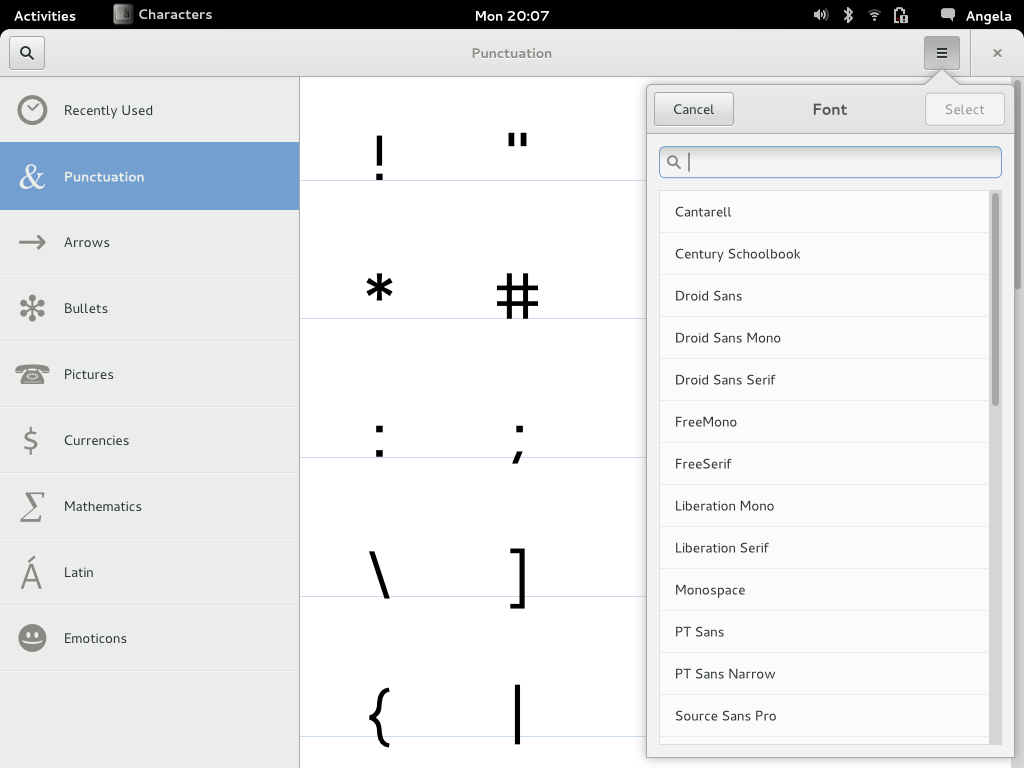
This is taken from our mockups for a new character map application. Here a popover is used to allow a filter to be selected for the view (in this case, selecting a font). In the past we would have had to have used a combobox or a dialog for this. A popover is better than either option: it is easier to scroll and search than a combobox, and less disruptive than a dialog.

Note that the popover header shown in this mockup currently isn’t possible, although you could implement something quite similar without it.
Gear menus
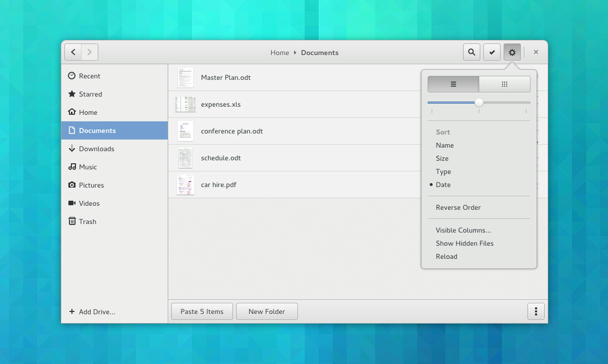
Gear menus are a common pattern in GNOME applications. Previously we have used a menu that is activated by a button for this. Popovers are a much nicer way to present a button menu though. Not only can popovers be used as a simple replacement for button menus, but you can also supplement the menu with other controls. In this example, taken from our latest Nautilus mockups, the menu has been prefaced with a pair of buttons and a slider. This makes the menu more compact and interesting, and the slider is a more appropriate control for setting the zoom level than menu items.

A word of caution when using popovers in this way: be careful not to make the popover too complex by loading them with lots of different types of widget. As a rule of thumb, use no more than three different widget types.
Editing Selections
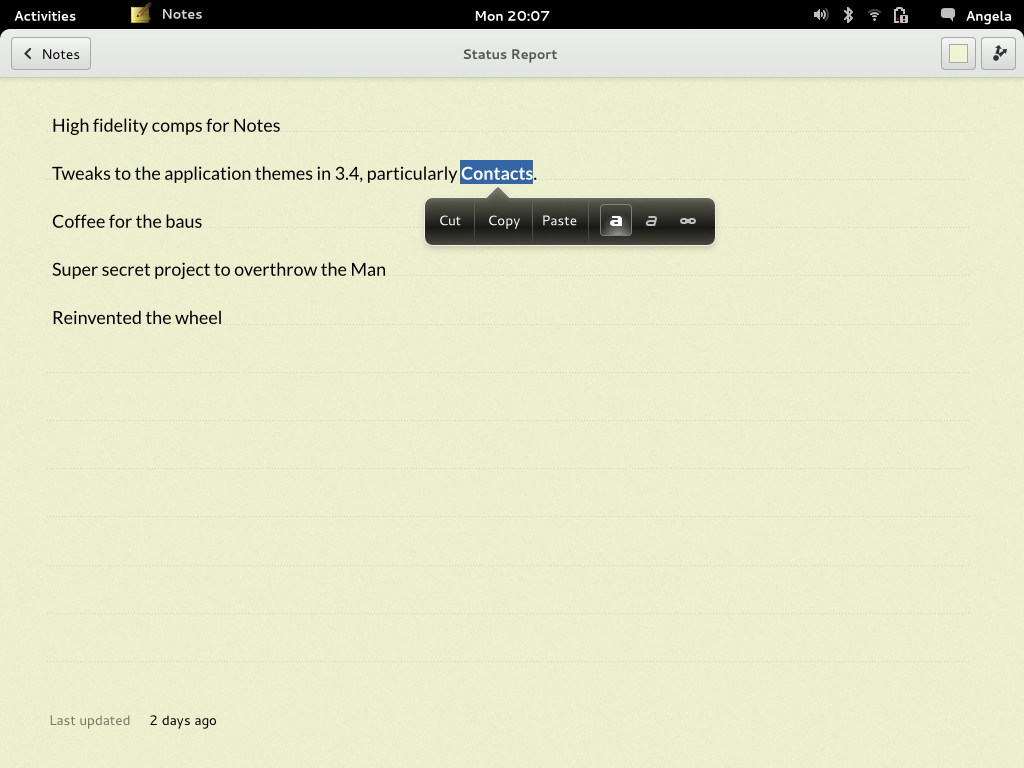
One really nice way to use popovers is for editing controls. Here, the popover can appear in relation to the selection. The great thing about this is that it avoids showing controls until they are needed, so you don’t have toolbars full of insensitive buttons. It also emphasises the context specific nature of the controls that are being presented.
You can already see how this can work in the Notes app, which has had its own popovers implementation for a while. Here’s one of our early mockups for that:

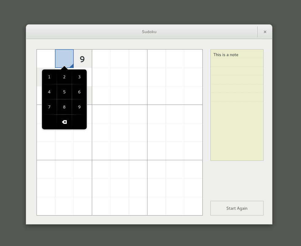
And here is a similar pattern for Sudoku controls:

Have Fun!
Popovers are an extremely flexible widget, which means that they lend themselves to creative design. They are a really nice way to inject interest and originality into applications, I’m really looking forward to seeing how people end up using them. If anyone has any questions about how to design with popovers, I’d be happy to offer advice.
