For a small team, GNOME design generates a huge amount of work. While we try to publicise as much of it as possible, not everything gets blogged about. In this post, I’m going to present design material from our archives that hasn’t featured in a blog post previously, and which you might not have encountered before. A lot of it is for less critical applications which, while interesting and important, aren’t the core focus of our activities.
The mockups that I’m including here are the raw wireframes that we’ve had sitting around in our design repository – they haven’t been finessed or polished for public consumption, so don’t be surprised if there’s the odd mistake or unfinished pieces here and there. The aim is to give an insight into the work, warts and all.
Usage
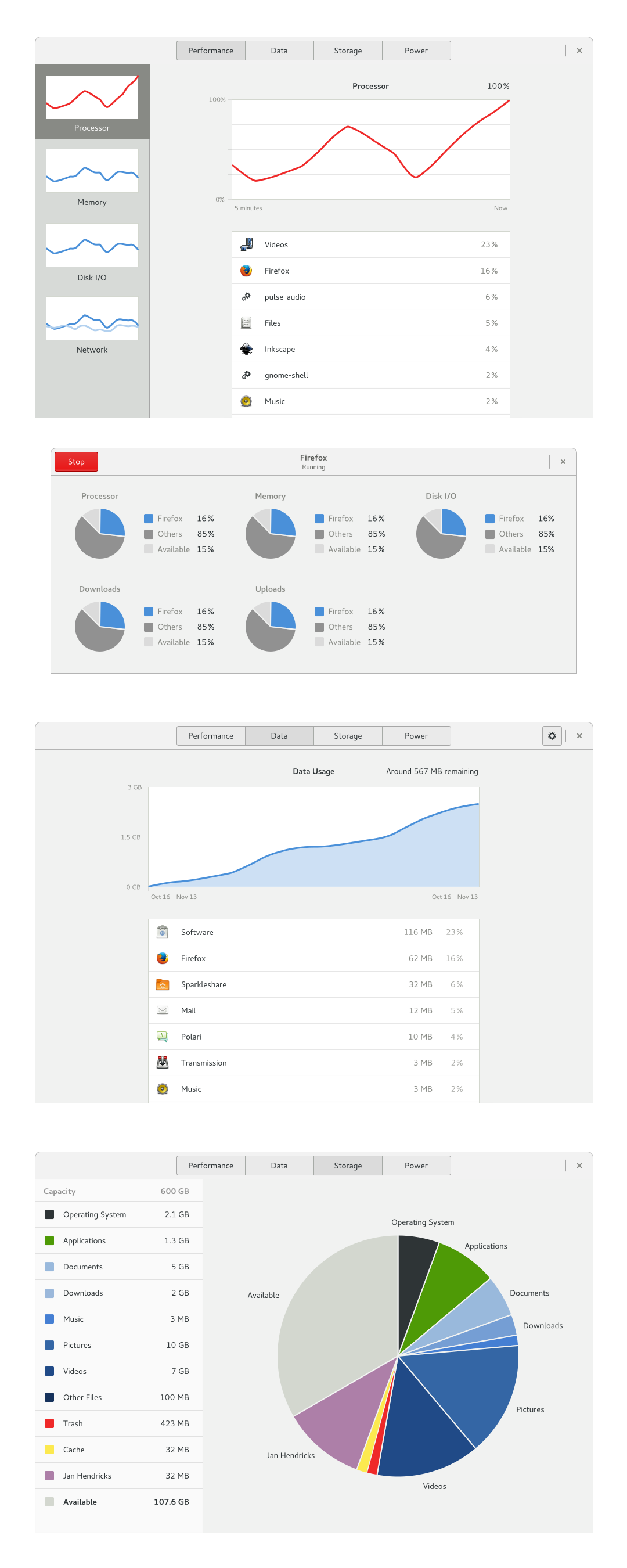
Usage is the name us designers have for a revamped System Monitor application. The name reflects the fact that we don’t want the app to be just about what your computer is doing right now – we also want it to be a place where you can get historical information about usage of resources like battery power or network.
We’ve had some designs sitting around for the Usage application for a while. Not so long ago I decided to update them a bit. In doing so, I added a section for disk usage, which is probably the worst part of the existing System Monitor app, and is loosely based on our Disk Usage Analyzer (aka Baobab).
Tweak Tool
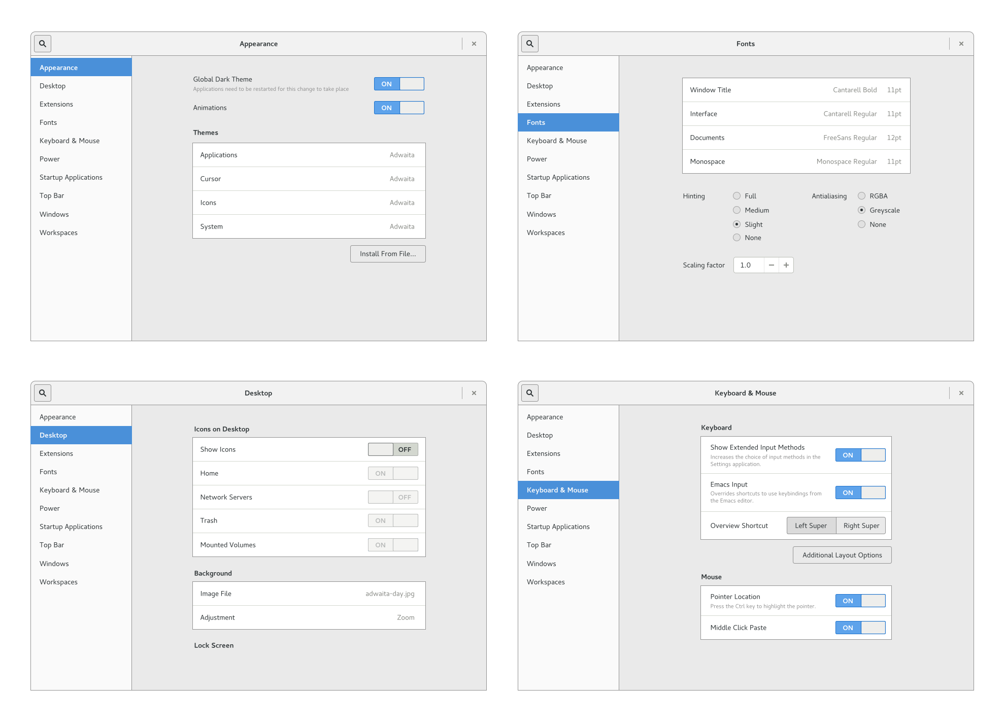
Ah the trusty Tweak Tool! Some people seem to think that us designers don’t like it, which is quite the opposite of the truth: we’re the ones that conceived it in the first place! Anyway, the Tweak Tool could use a bit of love in some areas, so some time ago I produced a complete set of updated wireframes for it.
The new designs are primarily intended as a polish exercise: a lot of the UI has been refined to be nicer looking and easier to use.
Passwords & Keys
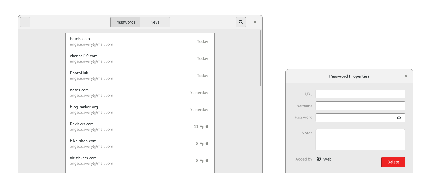
Yes, GNOME’s trusty passwords app has had a redesign! This one is further advanced than some of the others: Daiki Ueno has been working on the new version. The aim is to update the app to use modern design patterns, so it is consistent with the rest of GNOME 3. The current application exposes a lot of technical details about how passwords are stored, which isn’t helpful in a lot of cases, so we’re trying to only show those unless they are needed.
Chat
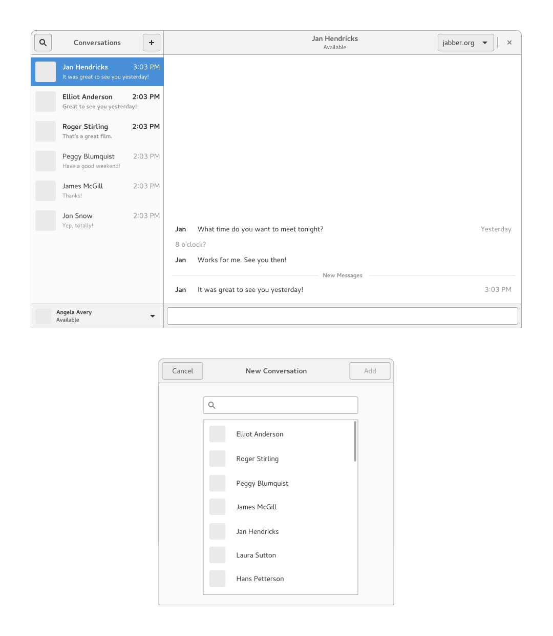
The world seems to have moved on from open chat protocols, unfortunately, and demand for chat clients that support them isn’t what it used to be. Nevertheless, there are still cases where they get used. With that in mind, we have some basic initial wireframes for a GNOME 3 chat application. These primarily exist in case anyone fancies having a go at writing a replacement for Empathy. They are intentionally incomplete, and are supposed to be just enough to get a developer started.
gitg
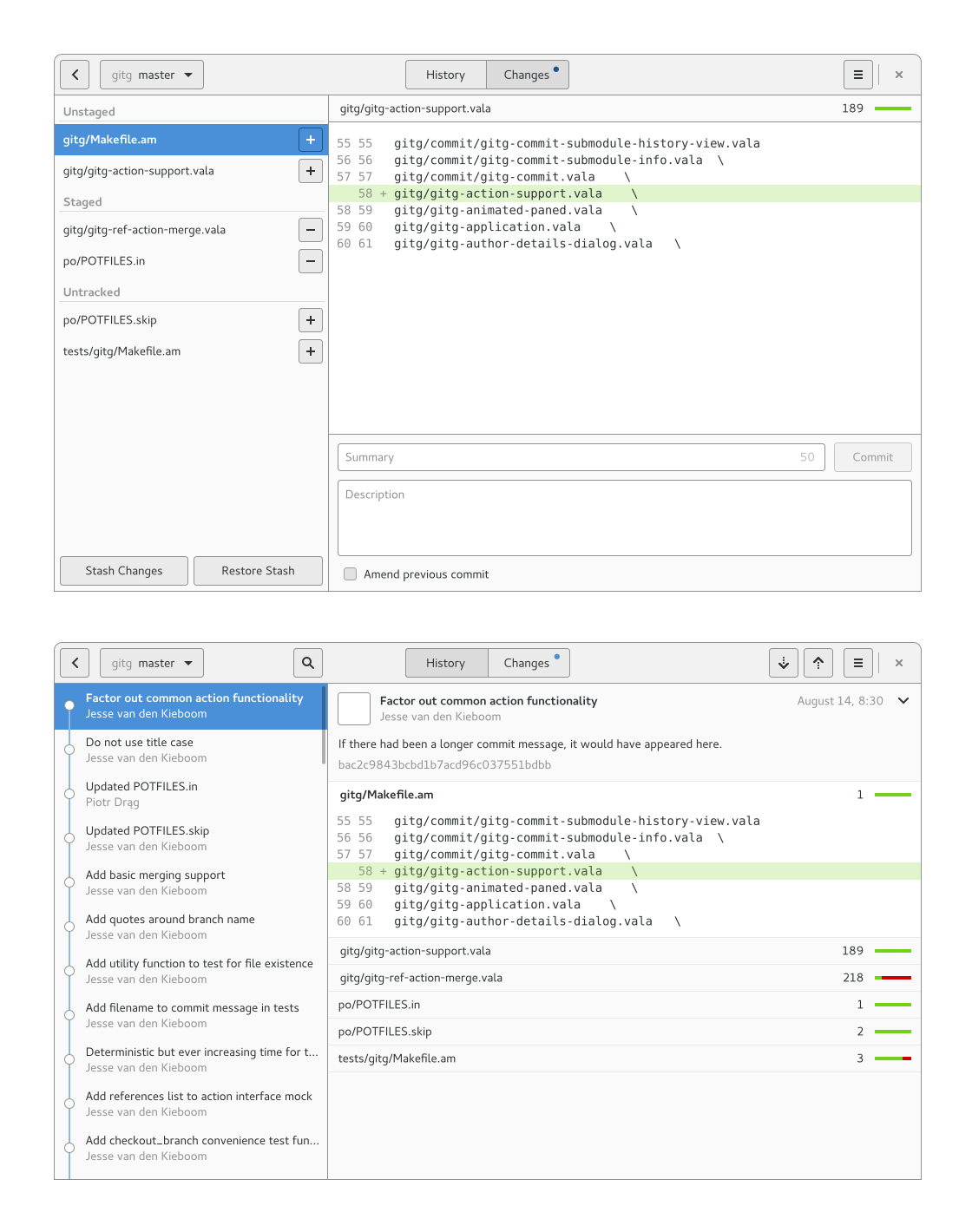
gitg, the GNOME Git client, had a few nice improvements last release. One or two of them were a result of a batch of mockups I did early in the last development cycle; there’s a lot more to these which it would be great to have implemented in the future, though.
The mockups make the toggle for switching between the history and staging/commit views much more prominent, which is appropriate considering how fundamental they are to the design, and subsequently makes key functions easier to discover. They also aim to make it really quick to stage, commit and stash changes, since these are some of the most frequent operations that people do with Git: it’s one click to stage a file and another to commit it (well, once you’ve written a commit message).
These designs are currently being discussing these with the gitg maintainers, and may well evolve in the near future.
That’s not all
This is just a summary of some of the things that we haven’t got around to publicising in the past, and they aren’t the main priorities that us designers are focusing on. In fact, we are already busy with the 3.20 cycle, working on Software, Nautilus, Polari, Settings, Web, Photos, Music and more, and there is plenty that needs doing in those areas. Nevertheless, if any of these designs do resonate with you, then you should definitely get in touch to help out.
I like it. What is the history going to look like in gitg if it is not linear? The history in neovim (https://github.com/neovim/neovim/) looks like a good example. See here: http://fpaste.org/355081/65776146/
This looks a lot like the output of `git log –graph –decorate –oneline –abbrev-commit –all`.
I have an alias on it, and it’s my primary way of viewing the history of the projects I work on in Git.
Being able to view a graph of merges/splits is fundamental, showing the history linearly is hiding too much important information.
The history mockups show a simple example out of expediency rather than as a statement of intent – the design exercise wasn’t intended to cover every possible case. If we go down the road of implementing this I’m sure it will get discussed though.
Are there any plans to redesign the icons of GNOME?
None that I know of. Although you should be aware that there are different types of icons in GNOME: app icons, symbolics and the other full colour icons (of which we only use a subset nowadays).
I think he refers to application icons, which is the only part of GNOME that is quite ugly by default nowadays.
I like most mockups, especially the seahorse ones. The UI is the main reason I prefer KeepassX over seahorse.
One thing I’m not happy with: The gitg navigation on the left side (last mockup) has two major downsides:
a) It only works for very short commit messages
b) It presents to less information due to the vertical spacing
It’s pretty standard convention in git for the first line of the commit message to be at most 52 characters; truncating there seems reasonable. But I agree regarding vertical spacing; we should try to save more space there.
Love the designs Allan! My initial thoughts on those chat markups is that they look a whole lot like OSX’s iMessage app that allows a user to send text messages through their phone from their computer.
Some sort of open chat implementation for android/iOS using those mockups would be awesome. Being able to send SMS messages from my desktop through my phone would be brilliant.
> writing a replacement for Empathy
Empathy is no longer maintained. Instead of writing a replacement, it’s better if someone takes over the maintenance of Empathy and change the design.
I don’t have a particularly strong opinion on that, and I don’t consider it my call to make. However, a redesign would probably involve Empathy losing features (certainly in the short term) and that could be painful for existing users.
I’d like to see how historical data is shown in the Power/Battery tab and, like in Android, we can see which applications or daemons are sucking our battery time.
So nice! Everything thing looks nice especially Password and Chat!
For me, Password should be a top priority!