Nowadays, digital content is all about the cloud. Indeed, in GNOME we’ve been pushing to integrate with cloud-based content through our new content apps, like Documents, Photos, Music and Videos. This is important work and needs to continue.
However, local files are still central to the way that many people work, and are an essential part of lots of workflows. This means that, while cloudy things are important, it is also important that we pay attention to the experience of working with local files in GNOME. It is for this reason that a group of us has been working on a plan to improve the state of Nautilus, our venerable file browser.
The new designs are fairly extensive and cover a lot of ground. In the rest of this post I’ll try to describe as much as I can. As always, they are not set in stone and will evolve. Questions, comments and feedback are most welcome, and will help us to develop them further.
Lists & Grids

The most important thing in the Files app is, well, your files. If Nautilus is going to provide the kind of experience that we want it to, it needs to do a better job at making your files easy to recognise, look good, and take centre stage. This requires lists and grids that have even spacing, helpful zoom levels, and big, clear thumbnails.
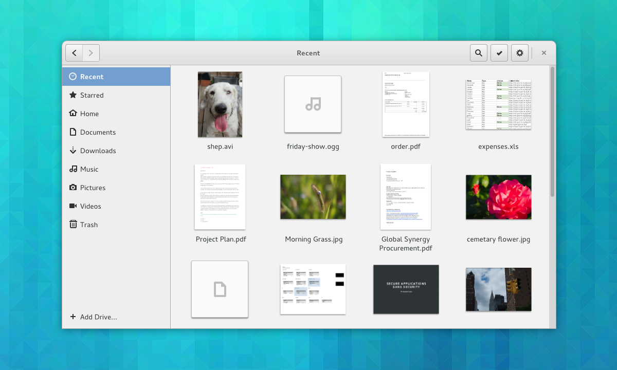
The designs feature new lists and grids, which should hopefully be possible with GTK’s new grid and list widgets. The grids we have in mind will be responsive, so that the content will scale to fit the size and shape of the window (without large spaces between cells or gutters on one side). Lists will feature thumbnails and have separators between rows to aid readability.
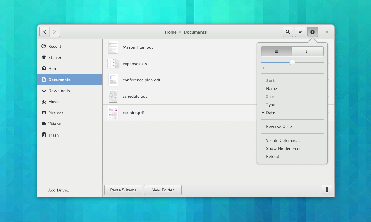
The designs also include mockups for an updated view “menu”. This contains all the existing options, except with nicer controls.
Previews
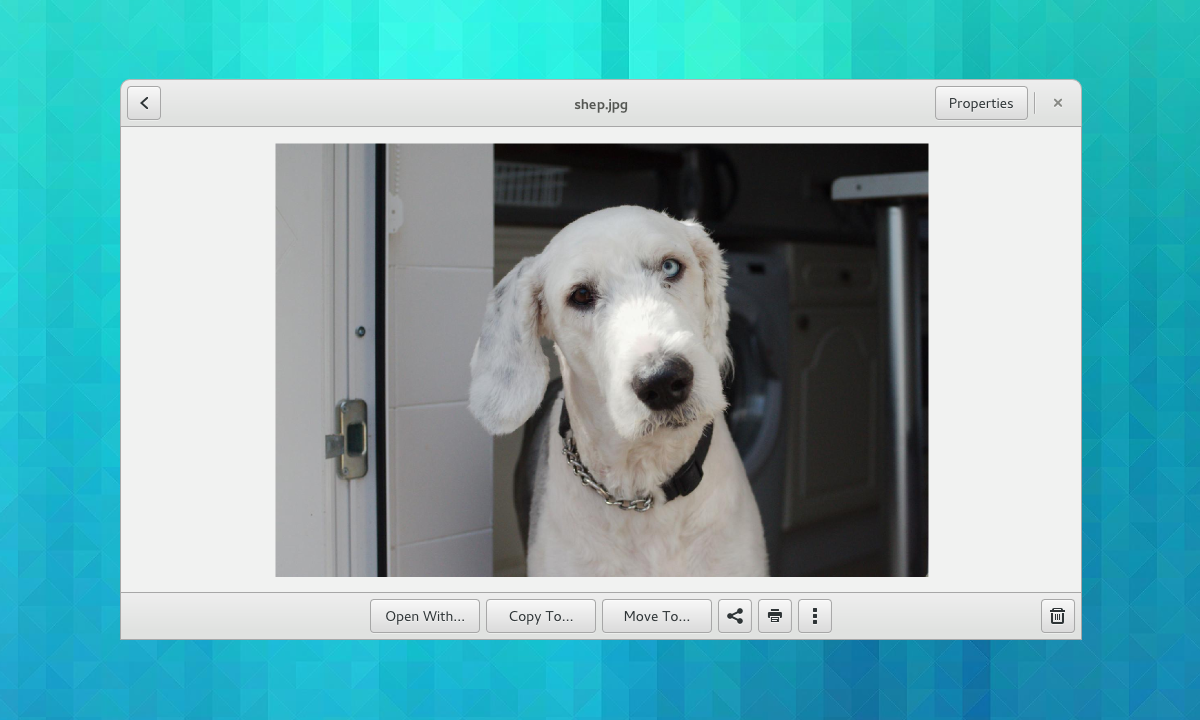
Being able to inspect the content of a file is often essential to identifying it, such as when you have lots of similar photos, or PDFs with unhelpful file names. Nautilus already has a previewing feature, but it functions as an optional extra and can easily be missed. The new designs make previewing much more central to the browsing experience. They also include actions alongside previews, so that you can quickly act on the file that’s in front of you.
One thing that you can’t see in this mockup – we also want to make it possible to browse between files from the preview – so you can flip back and forth between images or documents in order to compare them.
Generating previews like this may well require new infrastructure. Specifically, it is likely that we will need a new library for generating previews.
Places
Many of the ideas for the new sidebar design came from the awesome António Fernandes.
The main objective for the places sidebar is to make it more focused on the things you care about. Right now, the sidebar automatically includes every available volume and drive. This can lead to a cluttered sidebar which contains lots of items that you never use. These often get in the way and distract from the items that you use all the time.
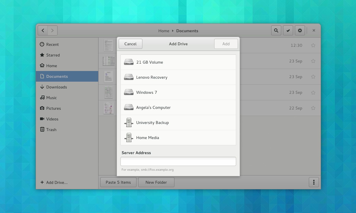
We want to rebalance the sidebar: more things you care about, less things you don’t. To achieve this, we want to make adding drives to the sidebar a manual action. In this way you will be able to customise the sidebar to your needs.
Clarification: manual addition won’t be necessary for removable drives – they will be automatically added to the sidebar as they are now. Also, once an internal volume or remote drive is added, it will persistent even when it’s not mounted.
A new add drive dialog is a key part of the new sidebar design. This will allow you to quickly add both local and remote locations to the sidebar all from the same dialog. It is also an attempt to clean up the various network browsing features that are currently available in Nautilus, and consolidate these features into one place.
The reimagined sidebar also contains a new feature which will be really handy: starred files. Being able to mark items that you want to keep track of is such as obvious feature, and I’m sure it will be useful to many people. In UI terms it’s a fairly simple thing to do.
Selections
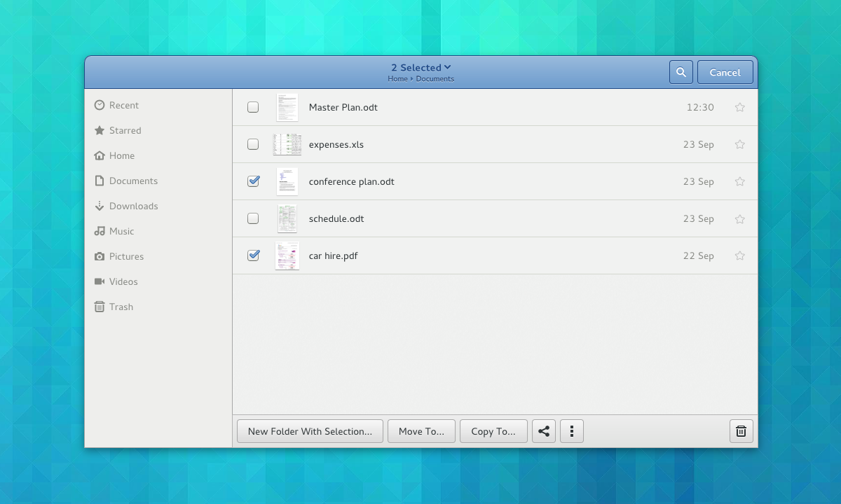
Selection mode is a design pattern that we’re using extensively in the other GNOME 3 applications. It’s nice because it makes contextual actions much more discoverable. It also allows us to use single click (rather than the undiscoverable and inconsistent double-click) throughout.
The best way to think of the use of selection mode here is as a discoverable context menu. Existing methods of selecting multiple items, like holding ctrl and shift in combination with the mouse button, will continue to work.
Added Discoverability
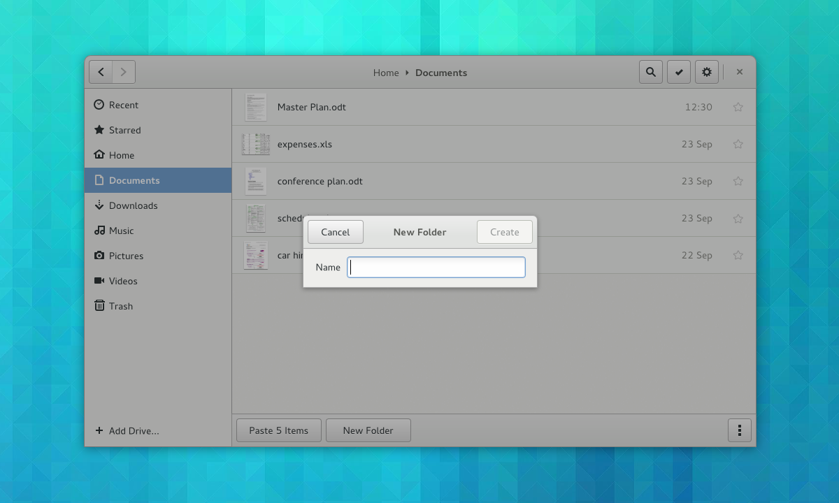
It’s amazing how many undiscoverable conventions that we acclimatise ourselves to, and an old app like Nautilus has a lot of them. At some point in the past, we all learned to double-click to open, to press return to finish naming a new folder, or that Ctrl+V pastes content into the current location. All of this is totally unobvious to new users, of course, and there can be embarrassing moments when you watch someone use an app like Nautilus for the first time.
The new Nautilus designs bring a lot of hidden functionality to the surface, and they make an effort not to assume prior knowledge. Much of the functionality that is currently hidden in the background has been brought to the surface: there are visible buttons for common tasks like pasting items or creating folders, for example. Simple things – like using a dialog for creating new folders – are designed to eliminate basic usability bugs.
Content Selection
Finally, this brings us back to content selection. A next generation replacement for the existing file selection dialog is something that has been mooted for a long while. To make it happen, a number of other long-term initiatives need to come together: the new set of content selection applications needs to come together, and we need the previewing library that I mentioned about above.
This latest round of Nautilus design work was in part motivated to keep these content selection plans moving forward, and the Nautilus designs were developed at the same time as a new set of content selection mockups. This is to ensure that the file browser keeps in step with our longer term plans.

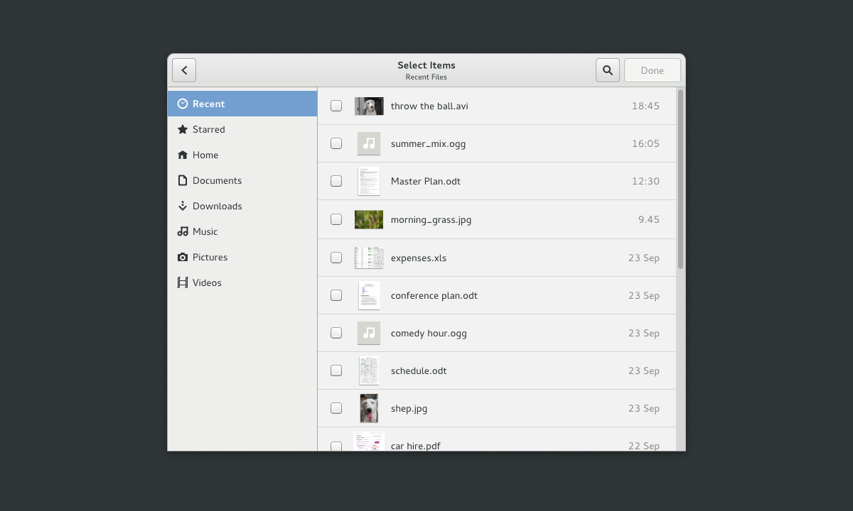
The new content chooser is designed to allow you to select content items from a range of sources. These can be local files or content items that are stored in the cloud. This is where the various new content applications come in – each one is designed to act as a cloud-based content provider. With this approach, you should be able to use the Photos app to select images from Flickr, for example.
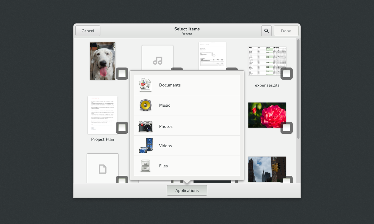
The initial view provides a grid of recently used items. After that, you can choose a particular content provider. Content apps can then present their own content. Notice that, after opting to view files, the familiar places sidebar from Files slides in.
What You Can Do
If you want to help us make these designs a reality, there are many things that we need help with, both large and small. I will be busy turning the designs into bug reports over the coming weeks, and will be keeping the design page up to date as the plans take shape. You can subscribe to the page if you want to follow what’s happening. Otherwise, just get in touch. We would love to hear from you, even if you are just interested.
Comments on this post are now closed. Thanks for all the fantastic feedback.
For the preview library, it might be useful to work together with Xfce’s Tumbler[1], reducing the amount of work needing to be done and allowing Xfce and other services to profit from the work as well.
[1] http://gezeiten.org/post/2009/10/Using-Tumbler-in-Client-Applications
Why should gnome use Tumbler if it already has Thumbnailer since 2008
Obvious really… to reduce the amount of code — reduction of code means reduction of bugs, memory use, disk space, build effort, package updates etc.
Being a project that’s been going on for far longer than 5 years, I would think GNOME developers knew this… ofc, Xfce could just adobe Thumbnailer which would give the same result.
If there’s going to be library to provide expanded thumbnailing capabilities (i.e. displaying larger thumbnails aka previews), one might as well see if the contributions are useful elsewhere.
I don’t think that Applications is a good label for the content provider selection button in the content selection application. It tells me that it will open another application rather than filter contents.
Why not use Content provider, or Filter?
As always, awesome job guys!
I’ve been back and forth on that label myself. I think I originally had “Sources” but changed it to “Applications” after thinking about how third party apps would integrate. This would be an interesting thing to do user testing on.
I think Sources sounds good.
IMO this should be in the top bar like:
Select from: [picker with current source name here]
At the bottom it looks like an action. I thought it was for choosing where to share the selected items on first look. ;)
This was my first thought as well. I was wondering why I would need to choose an application.
thank you for your amazing work! :)
I’m sorry … but… isn’t this kind of UI like to be simple… is more preferable to mobile (Smartphone and Tablet) instead of PC like the old days? …. Is GNOME now getting more in touch with Mobile instead of PC? ..
Hey Sandy, the UI might look simple, but all the existing functionality is retained in the new designs. In fact, extra features have been added, like starred files. I’m not aware of any reasons why it would be less functional on a pointer and keyboard system.
Hmm… the starred files feature and maybe color filtering like on the Mac OS X can be good. But, …. if you say that the existing functionality is retained…. would that be an add-on extensions such as like maybe sync it to Google Drive or UbuntuOne or maybe custom menu on right-click still exist too?
Touc UI are designed for touch devices, is very unconfortable to use touch interfaces on a PC, ask to windows 8.
PC should have all the options in the screen (no, do not take this to a huge level) why shoul I use something designdet to be on a tablet on my PC? It’s ridiculus, even that the fashion is the phones and thablets, but in the future this tablets will become as the normal PC’s of today but with the advantages of tablets.
I don’t like this design’s, the’re too simple.
UI should be useful and easy to use, not only easy to use. And the multiple selection, oh my gosh, WHY did they put a big, no, a huge square on the item? It’s ridiculus, that is for touch where you can’t adtually have a rigth clic, but in here? where I have the MOUSE and my KEYBOARD for select multiple items
GNOME have a really bad design.
Please don’t list to those people bitching about the button arrangement/size, a hybrid desktop/mobile click/touch interface is definitely OK to use in a desktop and looks beautiful and more intuitive.
In the short future will dominate:
The number of smartphones in use on earth will probably pass the number of PCs in the first half of 2014.
https://twitter.com/BenedictEvans/status/410420995464241153/
I think (my opinion) is that Gnome developers note this several years ago, when they started working on Gnome shell. And this is brilliant hard excellent work.
—
Either way, I do not see any problem using Apps on PCs according to this design. (On Guadec Gnome developers did clearly say that the main platform for the Gnome is PCs/NBs.)
Ohh please, dialog boxes with buttons on top (create folder example)?, what is wrong with the current layout with actions buttons below? “Create” button on the corner when normally there is a close button on non dialog windows, “Cancel” on the other side, that doesn’t tell me “consistency”
Controls on top really help with providing a sense of hierarchy, and are consistent with our header bars elsewhere. They also allow some extra tricks like having browsing inside dialogs (imagine going back and forward between different views, or assistants). I see the point about having affirmative buttons in the close button position, but they look sufficiently different for it not to be a problem.
I think that current behavior (create folder immediately and allow to change a name) is far better than opening a new window.
Why break a decade old widespread UI convention like buttons in the bottom of the dialog? For some dodgy reason like “providing a sense of hierarchy”?
In real life people use other applications then Gnome. Now let me just click “Post Comment” located in the bottom right.
The point is not whether putting them at the top has some advantages, the point is whether it does have *enough* advantages to justify the change: it will take years (or more probably it will never happen) before applications (eg. chrome, firefox, gimp, kde apps, apps that need a portable ui across win/osx/linux) and are converted to this new design and in the mean time the users will have to suffer even more inconsistency and fragmentation for very little gain (if any)
I’m also very nervous about controls in the headerbar. I also hope the user can still display lots of stuff in the same folder at once (i.e. I’m hoping the big thumbnails are the default size, not a minimum size).
Overall, looks great, as always. My compliments.
I totally agree with this, IMHO GNOME is pushing this idea (of buttons on the title bar) too far. One thing is to make this behave like a toolbar, but put *every* control there doesn’t work well. I think it’s far more intuitive to interact (confirm, cancel etc.) with information you have just input *after* you provided the information, not before it (think about forms). The way this is going you will fill a text field and then move up (!?) to confirm/cancel it. It just feels unnatural. The new “new folder” dialog looks very weird. Since space is not an issue, why do it this way? Please, please, reconsider this…
Hey Andre, I think you are right for some types of interaction. We’ve been discussing how and when this type of dialog should be used and are hoping to have some guidelines written up soon.
Hi Allan,
glad to hear that =) Please don’t get me wrong, I really like GNOME 3 (I use it daily both at home and at work) and I believe lots of things you guys are (re)thinking are very welcome.
It’s just that IMHO it doesn’t make sense to put action controls such as “confirm”, “cancel” and “done” on the title bar, it’s not intuitive to go up there to do this kind of interaction considering you’ve just gone top-down interacting with other controls and/or providing information. It’s not just the “new folder” dialog, but also “add drive” and “select items”. This last one is even weirder because there is already a bottom bar with a button, there’s no need to move other controls way up.
Anyway, I understand this is work in progress, and I appreciate you guys are exposing it early and are listening to criticism, this is very positive. I’m looking forward to seeing the guidelines.
Keep up the great work.
Is there any integration with google drive planned ? Im dying for this…
Nowadays I manage my files all in the “old” file manager way, but as I have an SSD and also multiple devices all my important documents, pics, etc are all in google drive.
See: https://bugzilla.gnome.org/show_bug.cgi?id=674769
Hey! This looks great, and will probably help a power user like me as well. But I am wondering about the usability for “us” (that is, longtime Nautilus users) — things like not showing the time anymore (see bug 699055) does hamper usability for me and others.
I am not a fan of “expert mode” by any means, but I hope you can manage “expert” functionality (keyboard shortcuts, show time, list large directories usefully, etc) for those who DO use them. Will that be possible?
I wasn’t aware of that bug – thanks for bringing it to my attention. In general I think it’s good to try and keep information focused (I have the old GNOME 2 HIG [1] ringing in my ears here), but agree that there needs to be a solution to this. I’ll follow up.
[1] https://developer.gnome.org/hig-book/stable/principles-simplicity.html.en
Why not implement tags instead of starred files?
Good one, that’s the first thing I thought. That may be handled the way Firefox handles bookmarks.
Please make the outer window borders half-transparent, they’re extremely ugly where they tough the selected sidebar’s item: http://wstaw.org/m/2013/11/14/ugly-vs-nice-nautilus.png
I use bookmarks for local folders and remote servers that I access regularly so that they appear in the left-hand panel, but I can’t see these in your mockups. Will bookmarks still be shown there and if not, then how will they be accessible?
I also see that you no longer have the geary menu in the top-right corner. While this is quite a welcome change from a documentation point of view, the menu does have a number of actions which are difficult or not possible to replicate without a keyboard (for example, on my tablet and on my netbook when using the latter with the screen rotated and closed). What will happen to the contents of that menu?
The gear menu is still there in the top right corner.
Bookmarks are intended to work in the same way that they do now. I’m thinking about rebranding them as “add location to sidebar” / “remove location from sidebar”, since there isn’t a Bookmarks section any more.
Right now the idea is to have actions for the current folder located in an “action bar” at the bottom: https://raw.github.com/gnome-design-team/gnome-mockups/master/nautilus/nautilus-next/folder-menu.png
One of the main motivations for this is to try and group actions in order to make things a bit more predictable, rather than munging everything together in a single menu.
The items that are currently found in the gear menu have all been retained in the new designs. In doing so, I’ve made an effort to display options when they are needed – some are shown as buttons within selection mode, for example. I also thought that undo/redo would be more discoverable as transient, in-app notifications. It should be said that some of this depends on us having an alternative way to learn keyboard shortcuts: https://wiki.gnome.org/Design/OS/HelpOverlay
How is removable disks like USB drives, removable USB hard work in this flow. Every time, we need to add using drive & remove??. Usually these drives plugged for one time use.
The new behavior is for internal volumes only, removable drives will be automatically added to the sidebar automatically, just as they are now.
For the preview mode, please add a next and prev buttons ‘ ‘ . Useful when moving across images/videos. For documents such as pdf, odt etc a preview of the first page + ‘Open with’ should help.
I really should have done that, indeed. :) They are certainly planned.
What will happen when I connect a removable drive? Do I also have to add it manually to the sidebar?
No, as already stated in the article and the comments.
I usually adapt to GNOME changes quite well as one could be as productive with them after a bit of getting used to, but I simply can’t see how this proposal could make working with files as comfortable as it is now.
The time will show.
So far, I liked the Nautilus redesigns (very much indeed) and this one has a few more nice changes (like the new grid and larger thumbnails).
But: if I attach a USB drive or insert a CD, it won’t be shown in the sidebar anymore? And since there are no desktop icons in Gnome, I won’t really have a permanent reminder that the device is mounted? (Yes, there is a notification but that goes away quickly, so not very useful for me; also I can’t open a tab from there.)
Oh, and: tabs — do they still exist (please don’t remove them just as Apple added them)? And how about the extension I am using that add a “Open folder in terminal” menu entry to the (now designed-away) gear menu?
Sorry, I wasn’t clear in the original blog post – removable drives like USB sticks will be automatically added to the sidebar, just as they are now. The manual behaviour is only for internal drives and servers.
As I mentioned in another comment, all the existing Nautilus functionality is retained in these new designs. I actually have a mockup for tabs: https://raw.github.com/gnome-design-team/gnome-mockups/master/nautilus/nautilus-next/tabs.png
Don’t you think that there should be at least a sign that those tabs are separate? It might confuse even experienced users. Sure, there is this text, close button and blue underline, but what if two inactive tabs are are next to each other? Where does one end and the second one begin?
Nautilus has to be able to do a lot with a small footprint. Many times I find I do not require or have the desire to see the thumbnail of a files contents. I just want a listing such that I could put a command before the name of the object, and some text after the object.
Suppose abc is a text file, and scanner is an executable.
I would to see a listing option as follows:
……………….. abc ……………………………………………………………………………………………..
………………. scanner ……………………………………………………………………………………………..
The dots represent whitespace
This would allow me to do
cp……………. abc ……….. /home/repository……………………………………………………………………..
./ ……………. scanner …….. /etc/afolder………………………………………………………………………….
The long dotted lines overflow the presentation space. Sorry.
One component of ‘discoverability’ is ‘overview’ and ‘efficiency’, which can be highly improved by a much smaller vertical clearance (adjustable all the way down to zero) between the _text_ of the list items, i.e. *no* white space. As many items in a list as can the eye can accommodate. And not, as until currently, a white space which is at least as big as the space occupied by the text lines themselves (ugly, ugly, ugly).
This means there should be an option where in list view the icons can be switched off completely, and the visible white space between the items reduced to *zero*.
IMHO this is long, long overdue.
WOW excellent !
Nice!
Looks great! Besides all the other positive changes, single click in nautilus and a more decent file picker in GNOME are way overdue. Unfortunately who knows when will this in fact be coded :-(
You mention that you wanted to make things that aren’t used much not stand in your way. I’m not constantly creating new folders, so why is there a huge button in there all the time for me to create a New Folder?
I would much rather have a small button on the top bar, next to the others to do that. Preferably configurable, so I can remove it, since like I said, I’m not constantly creating new folders, and when I do want to create a new folder I use the right mouse button.
That’s a fair point. I’ll see if the alternative is workable.
This is some truly beautiful work. I look forward to using it in the future.
Great stuff! I second the concern about the “Applications” label. Also, does the “view menu” stay open after you click something? I find with these modern uses of menus I typically want them to stay open, so I can continue to tune the view until it’s perfect. Having the menus close made sense in the past when menus were used to open dialogs and run actions, but these modern menus are more like drawers for toolbars, I think. For example I might want to max the zoom, set it to sort by file size and to sort in reverse. I’d rather do that in four than six clicks, and without context switching between each. Instead I would prefer the menu to close when you click the menu button again or click on something outside the menu, or if you hit Esc etc. Just not every time you click on something inside the menu. Does that make sense?
I’m not sure what is the most common use case (having to perform a single action a time or more then one), but it could be ok to have a “don’t close the menu” behaviour if you click on items having (for example) CTRL button pressed.
Hi Allan,
What are your thoughts around having all of the file / folder actions at the bottom of the window? It seems like I’d have to move my mouse around a lot (particularly on a larger screen) as compared to other file managers in other OS’s which have at least some of those options near the top of the application window.
Also, it looks like I’d be losing the ability to sort quickly from near the top of the application window. Instead, I’d have to open up a menu, and select how I want the files to be sorted. If I want to sort them a different way, I’d have to re-open that same menu and select a different option. I know you’re looking for a graceful design, but please have mercy on us office monkeys. I know the search features are there, but being able to sort quickly is a big help in my day-to-day work.
This is *perfect*. I am really excited about this!
i find the use of overly simplified mimetype in nautilus very annoying – for instance, all compressed files treated the same, be it zip, tarball, etc. it’s very hard to find which file is what particularly when the mimetype’s icons are almost identical or filenames are long.
Shouldn’t there be also an option to remove items from the sidebar (I’m thinking of an add/remove button instead of just add)? During the course of time, the sidebar could get pretty crowded, for example when accessing more network shares.
Hey, this looks like some nice mockups and good ideas.
Has it been discussed to re-introduce the split-pane view (F3)? I find this view very comfortable to copy several files between two folders and it’s one of my main tools I use in everyday filebrowser life and unfortunately also the reason for having to switch to nemo.
I was always wondering: why do people want split-pane, when you can open two windows and snap them to the sides of the screen? I do that all the time. Very useful indeed.
I can give you a few reasons:
– Because they don’t want to open another instance of the application.
– Because it makes the workflow a lot faster, since you don’t have to snap them up to the sides of the screen.
– It’s more organised.
– If you have to change to another application for a few moments, it’s a pain in the ass (too much alt-tabbing ;-)) to get the two instances back to where they were before. That’s probably also my personal problem: I don’t use different workspaces as much as I should :)
In the end, split-pane view is one of the few things I really miss about the new filemanager.
Having the confirm button in the close button position is surely an awful idea? A user should NEVER have to think about where to click to close a dialogue window. Click top right to close or cancel every time. Thought the whole point of this was so user’s didn’t have to learn the application and just used it?
Since nautilus started hiding ways of accessing directories by typing path I am using it less and less. Right now this feature is hidden under “Files > Enter Location”. I see, that this feature is missing from new design completely – is it removed? How can I navigate to / or /etc/ or /usr/share/icons? If new nautilus is intended primarily to navigate user’s home directory, then are there any plans for separate application for navigating files on the rest of filesystem?
Are there any plans for bringing back preview of music files or displaying text file content inside icon (I used to love those features, but now they are gone; content of pdf files is shown in your mockups, so this gives me a glimpse of hope :) ). Right now it’s already more convenient for me to use terminal and switch to nautilus only as last resort (e.g. when I want to open specific graphic file – I don’t think I use nautilus for anything else any more).
“New folder” dialog. Placing buttons on top is inconsistent (compare e.g. with alt-f2, preferences dialogs in gedit, save dialog and every other dialog ever). This may also cause problems with touch interface and it’s plain bizarre to have confirmatory action be placed in top right – where usually close (dismissing action) is placed.
Tabs mockup. I don’t see any tabs in there. (I can infer, where they are from “close” button, but I don’t see them. Can we have something more similar to tabs in Firefox Aurora?
Can you show us mockup with “Open in terminal” feature? Right now it’s provided by nautilus-open-terminal plugin.
You can use Ctrl+L to enter a location, just like in the browser.
You can preview anything by pressing Space when an item is selected. It works differently from how previewing worked in the past, and you might hate it because it opens a new window, but on the other hand it’s much faster than launching the appropriate application and things like text files get a full view with syntax highlighting and all that. Try it and judge for yourself. My understanding from this blog post is that they’re planning on moving this functionality back into Nautilus so it won’t open a new window.
You can click ctrl+l to show path, it’s very useful. If there was no shortcut for it, I would ditch Nautilus immediately – copying and pasting path is critical in desktop Linux unless you only play music and visit Facebook.
To Allan:
I agree with him about “new folder” dialog. But what’s more: “Simple things – like using a dialog for creating new folders – are designed to eliminate basic usability bugs.” Modal dialogs ARE usability bugs. For example I want to name a folder after some file in current folder, but modal dialog obscures it. You see, sometimes making things more discoverable breaks people’s workflows and clutters the screen. Targeting both simple touch tasks and complex desktop workflows in one UI is like making a cake that is also a pizza. You can do it, but you can’t do it really well.
I will paste my comment from G+:
“Looks really pretty, but I’m not sure who are they targeting.
If they target tablets/touch and stuff like this, it’s too complicated. Why there is “reload” or “show hidden files”? If you are a typical tablet user, you don’t hide your own files and you don’t need to access system files. So these options clutter the interface and confuse users.
If they target current Linux desktops, it’s too simple and too “touch-friendly” (note the quotes!). (And I’m not including pro users as a part of this target! They will likely use mc or KDE’s stuff.) Their selection system is annoying to use with mouse (I tried it in several gnome apps). Current directory path doesn’t look like it’s editable or at least selectable.
Also, some things are already broken for that second use-case even with Nautilus 3.8. For example unification of search is terrible, because there are two use-cases that need two different kinds of search:
– non-recursive search in folder by typing beginning of file’s name
– recursive search (most likely through whole home folder or filesystem) to find some file which name I don’t remember fully or even at all (but I may remember type, date, tags, etc.). Should also allow regexp – a nice feature that doesn’t clutter the UI.
So new Nautilus doesn’t exactly fit any of those two cases (and obviously the “pro user” case). Perhaps there was some internal battle and this is the compromise between those two use-cases?”
Lots of questions! Thanks for the scrutiny, it’s helpful.
Everything that is currently in Nautilus will be retained. I don’t have mockups for location entry yet, but I was imagining that it would work in the same way that it does now. Tabs will certainly stay (and hopefully be better than they are now, and I do have a mockup for them:
https://raw.github.com/gnome-design-team/gnome-mockups/master/nautilus/nautilus-next/tabs.png
I think I’ve discussed the dialog header bars elsewhere in the comments… and yes, we’ll need to figure out how to intergate open terminal (I was thinking that it would go into the preview and selection modes, but I haven’t checked with the developers).
You need a tree view in order to navigate the file system. Otherwise finding anything is bound to become a cumbersome and exasperating task. Come on, people. Even Windows has this.
So does Nautilus. Open Preferences and go to the Display tab; you’ll find a Navigate folders in a tree option. Enable it and then use the list view.
What about sorting files in groups? Will that feature be considered. It is a very handy feature to have when you have thousands of different files to sort eg in Downloads folder. Dolphin file manager has that features and so does Windows Explorer.
How does it work? Do you mean sort by filetype or what?
Speaking of Dolphin and Windows Explorer: They both offer the option to add columns in the details view, like “song #”, “album title”, “modified (date)”, “size” etc. The last version of the Nautilus file browser which I used (it was either in “Ubuntu 12.10”, “Linux Mint 15” or the new “Zorin” version) did offer only very few standard columns: “file name”, “file extension” and maybe one or two more.
For example, I have a music folder where I store more than 2500 legally free video game remixes from the OCRemix community. Every song has a song number which depends on when it was released. If I want to sort them by chronological/release order, the only linux distribution where I can do that easily, by clicking on the column “song #”, is KDE’s Dolphin. To illustrate this, I put a link to a screenshot of Dolphin here:
https://lh3.ggpht.com/-szdLlDpZS5k/T8s9ZhFCscI/AAAAAAAACBU/9qDcWEfJZ-c/s1600/dolphin-audio-files.png
Maybe this works in Nautilus or Thunar in some way, too, and I just did not find it, but in that case, it is well hidden, because I looked for it.
Could you implement that? I think this is a essential feature of a file browser!
very well thought out, simple but sophisticated design is what keeps me in Gnome, I follow git mockups and always look forward at work of Gnome design team.
Can this “selection mode” business be disabled, in favour of traditional behaviour? Because if that mode is the same as the one in Documents, it absolutely annoys the hell out of me… one of the most cumbersome UIs I’ve ever had the misfortune to use. And I *really* don’t want that behaviour creeping into something as important as the file manager…
I hate it too, just like I would hate double-click stuff on tablet. And that black popup menu in Bijiben is a bad idea too. Right-click menu is much more usable with mouse and keyboard. (What’s funny is that menu button on keyboard shows a normal menu ON TOP of that black thing.)
I recently taught an old man how to use a PC. With mouse and keyboard. It was hard for him. But if I suddenly showed him an easy to learn and discoverable UI, he would hate it, because he didn’t put all those effort into learning one thing, just to ditch it and learn another.
On the contrary, someone who never used a PC before would probably prefer the new nautilus’ UI, because it’s easier to learn from scratch. But that person would probably also prefer iPad over tablet or desktop with current GNOME. IPad’s UI was designed with iPad in mind. GNOME was designed with desktop in mind and is now being transformed to be usable with touch too. But it’s not perfect on any of those. (How are you going to do window management on touch?)
Meanwhile elementary team is also designing simple apps and is being accused of dumbing down UIs. But they are making a desktop OS, not a hybrid. (They had mockups of phone UI. It was completely different than desktop version.)
I agree with emmanuel, There is no mention of any advancement in file picker dialog. I think it needs to be refreshed as well.
actually i think there is talk about the file picker in this post. he’s talking about differenciating on which type of file to pick in the file picker (image, …) and using the nautilus selection mode for plain files, if I understood correctly.
Also I like to work on screen recorder tool for gnome. But i dont know how can i start with it.
What I don’t like about this windows popping up in the middle of the window is that you can’t move them. I see it with the Save dialog all the time, that I want to save something and the filename I wanted to give it now hidden behind the save dialog. Moving the Save Dialog isn’t possible anymore and so I have to cancel Saving, look for the Name and save again. Is this something that could also happen with the new Naming Folder Dialog or is this Dialog movable?
After the gnome team removed compact view from the browser, arguing that there was no effective difference between it and list view, it sent me scrambling through the other file managers looking for a replacement. For those of us that prefer to single click to manage our files, there’s a massive difference between the two. In list view there is no dead space to click into to select, drag and drop, and whatnot. So however you go forward with your ways of smart selecting in icon view or whatever, try to take into account the workflows of single-click/compact view users. I still think gnome-shell is the best interface, but the hatchet job they’ve done on nautilus is pushing me to Cinnamon so I can use Nemo. Right now I’m using Thunar with my gnome-shell because there seem to be certain conflicts between Nemo and Nautilus running on the same desktop. I also second the motion of Ciprian Lica in that it would be useful to have some configurability in the side pane to hide drives, et. al. the way the newest Thunar allows.
Excellent!
I like it, especially the cleaned-up sidebar. Please consider removing some of the folders from there as well. For example having Music there is completely useless to me, I never do anything with those files as Rhythmbox already presents all the music. The same goes for Videos. Some people just may not store any Videos on their computers so that folder just wastes valuable screen real estate.
I have mixed feelings. (I had them with other designs too and they turned out pretty well in reality)
What happens when I use the right mouse button and click on a file? Do we still get a context menu or do we switch to the selection mode? Always felt like switching to selection mode when using the right button is breaking something in me. I usually just want to do something on a single file and would hate to get a extra-step. I’m somehow afraid that Nautilus starts to feel like gnome documents.
Great imitative Allen!
That being said I don’t understand why “shared files” (I don’t
completely understand how thy are supposed to work) and
not tags are implemented.
I also hope that Nautilus will implement proper tab support.
Otherwise I think the changes makes sense.
(I look forward very much to the day when GNOME
support sharing on social media ).
Looks nice. Can we go back to the ‘spatial’ thing of nautilus remembering which folders you use different views in? It drives me absolutely nuts that I have to change folders back to list view *every single time I open them*.
I miss the minimize button. Often I just want to klick the nautilus-window out of sight, but stay in the selected folder . Don’t want to close the window (x) and then open it again and click through folders to get back to where I have been.. I know I can use the hot corner to get the window out of sight … but.. i don’t know. Just miss the minimize button in nautilus :(
I understand that this new responsive grid is intended to eventually replace the old grid in other applications besides Nautilus, isn’t it? Music and Clocks could benefit from it, for example. I’d be really nice to have responsive grids everywhere.
I quite like these new changes. One thing that wasn’t clear from the the post is whether it’s possible to edit the sidebar to add you own folder to it. I see no reason not to have that option. Furthermore I hope now that the new designs are being created you will reconsider adding back the vital per folder view, even if as a hidden option somewhere and the split pane feature which despite looking extensively for I never found a really convincing reason for its removal.
Please, consider to desing a ‘slidable’ side bar. It should show bottom or upper slide buttons to allow current users discover where they can access its drives.
One of the most criticed issue in GNOME has been makes things more simple, but forget current power users. They must be able to discover the new way very easy as if they are new users.
This slidable side bar allows to show were our users can found somes of the things you pretend to hide. For most users, use of a default customizable view is Ok, but if a power user needs access to drives just for one session they just push one ‘next slide’ button (use icons and context text please) to show up them.
This side bar could have more options/features, some of them loaded by plugins. They could be showed up by dragging a UI item a la movile version of Google Maps, like less common commands/actions or any of any user (including power ones) could use.
Please, make Files a easy tool for new commers but power tool to get things done for power users in less time; make both more productive.
Hi!
I can’t rate the new designs now. They look very much like designed for touch-input, which is not used on productive machines like desktops and laptops. Two points I care about and want to know more:
Is keyboard navigation and usage improved, or at least, possible on the same level? Usability and speed in usage has suffered a lot since the removal of Type-Ahead-Find. Navigation through the files with keyboard is now slower and sometimes weird (multiple files found from different locations). Take look at the current File-Chooser for how fast and convenient it be, also in comparsion to Windows (Explorer) and MacOS (Finder).
Whats about the regular grid view and detailed list view? I can’t see images showing them. The samples shows screens with less information or a lot of space between the files.
I see the places sidebar gets an overhaul. Just wondering, will it be possible to add different folders to the sidebar? I see an ‘Add drive…’ option, but will it be able to select folders also?
In terms of starring files, I liked one feature from OSX about bookmarking as favorites files from a particular search term. It would be great, if one can select files from a search and give labels to them. Files in that levels would still be located in their previous locations (might be disparate directories), but appear as if they were in a single directory. This helps organize files even more.
A few comments:
I like most of the changes, especially the ones who finally allow to use single-click policy easily. I can’t count the times I had to say “here you must sigle click, here you must double-click”. This adds some welcome consistency. I like the grid which gives a cleaner feel, and the new uncluttered “places” behavior a lot.
On the less convincing: while I agree that the popup for new directories is required because of previously poorly-discoverable behavior, the position of the buttons feel really uncomfortable. Ok, you gain same space, but it feels awkward. To see real actions on top instead of bottom. Maybe I just need to get used to it. The nice thing is having the possible answers to the question on the same row as the question, but I’m definitely more used to have configuration above and actions below…
As said above, the “Applications” button is quite strange too, “Source” is better. It gives an application-centric feeling instead of document-centric.
It is nice that the thumbnails are the same size, and for many files (pdf’s, png’s, …) the thumbnail is really all you need to identify the file you are looking for.
However, thumbnails arent’ equally useful for all filetypes. E.g. a zip file doesn’t really have a particular useful thumbnail when trying to locate a particular file. Here you really only have the filename to work with. So, perhaps it makes sense to make the filenames somehow more prominent when the thumbnail isn’t helpful?
Love the work, can’t wait to use this.
Good job guys.
Excellent job, Allan! This new Files iteration is looking very, very clean. I have a quick question for you: does the file preview also work with sound files? I personally loved the audio preview on hover functionality of older Nautilus releases and was somewhat disappointed when the feature was removed. Sushi didn’t quite mesh with me and I am eagerly awaiting a reintroduction of a lighter in-browser alternative. How does this new implementation behave?
Overall, I see some nice progress on Files. Keep up the good work!
oh.. please!.. add transparent backgrouds!…
The Select-Items-Option is something I don’t like in Gnome 3. I want to select by mouse and use CTRL-V and CTRL-C … Is that still possible within your designs?
From where I can download this version to install on ubuntu? Please. Thank you.
Hi Allan,
What about split window mode , is it still there?
I like the IDE interface showing different files in two different tabs for comparison, may be a split window mode like that would work.
Allan, please add the ability to type Ctrl+L (to manually input a url) while viewing the “recently used” tab
I would like to have “Filesysem” and my drives listed on the left pane.
Btw will rubberbanding selection still work?
Really happy to see good ideas taking shape!
> Nowadays, digital content is all about the cloud.
Its not and will never be. Japan is the only country where this could be possible at all (in terms of internet connection speed) and still then it would be very painfull managin 2TB of data over network.
Not to mention what happens if the network is down.
Will there be compact grid mode when I need to browse a directory with _lots_ of files?
I just want to be able to zoom thumbnails in grid view crazy big with not too much whitespace. I don’t care how long it takes to render (say) 384×384 or 512×512 thumbnails. Right now zooming in a lot is still possible but the grid layout zooms the whitespace too, which makes it look bad and is not so useful.
I’m not a power user by any means but I think this looks fantastic! Hats off to the GNOME team for being adventurous. I’m sorry that you’ve alienated lots, but these designs look just delightful to me, and it’s nothing ten minutes of poking around won’t accustom me to.
Interesting. Nautilus in GNOME 3.10 certainly looks much better than it did a few cycles ago!
I have two remarks about the designs:
– Using a modal dialog to create a new folder is not very nice, as it prevents you from looking/scrolling to see other files, which may be needed to find the right name to use. Cf. the problems with access to the contents of a Web page or PDF you are to saving using the file chooser, or WiFi credentials with the Shell system-modal dialogs. Maybe you can create the folder with a placeholder name selected as currently, but add Create/Cancel buttons to the line in the list view.
– For the file chooser, I don’t think you should hide the Applications/Source choice under a menu (which is moreover hard to reach since it’s at the bottom). Since you typically use different types of files, you’re going to need to choose a different source most of the time, so this menu is going to be the most commonly used widget. I’d rather use a sidebar for such a usage pattern — else it is going to be very frustrating.
“Right now, the sidebar automatically includes every available volume and drive. This can lead to a cluttered sidebar which contains lots of items that you never use.”
You realize that by removing them you’ll make it a pain for newbies to find their hard drives?
If the intention is to remove items we don’t use, why don’t you let us tell you what we don’t use? Why don’t you *add the option to remove the drives from the panel* instead of displaying none by default?
I’m not saying this for me, I’m really talking about how new users won’t be able to find their HDDs/SDDs, specially coming from Windows.
For the rest it looks great for everybody!
It would be nice a Nautilus integration with cloud services, like Dropbox and GDrive. :)
For this Sidebar/Bookmark thing:
WHY do you stumble about this for 100 versions now, if its so incredibly easy?
Just make it drag and drop.
This goes along with paradigms used in the “Dock” under Activities and various other places!
Aswell as that let us decide if we want this or that. With drag and drop you can remove/add things without another unwilling button (the new add device thing), because if you drag it in – its just there.
Plus: please try to avoid hitting allready expierienced users (nearly everybody nowadays) with the “showing the non-obvious” campain. This needs very much subtlty and could lead to many people being distracted or just slowed down by such things. (just take care please). A possible way would be “beginner” mode or and “expert” mode. – Generally Users either like the easy way (with tons of buttons and labels) or they have their workflow allready (please consider this aswell)!
Sorry to double post here, but I wanted to add, that there is REALLY no need to fix some items, which can not be removed. Why would anyone want that? Please make all things flex and omit the users willing.. You have bookmarks and home etc are of this type too. But you cant remove videos if you aint a videos guy! Really an odd tactic to slave all the people to see these bookmarks (even before their own!).
The single most functional feature needed, for me anyway, is integrated file comparison. Selection should be based on files being identical or different, and by binary comparison (thorough) or date/size (quick). Personally I prefer to pick the items for comparison in each of the dual panes, but there’s no reason they couldn’t be chosen in the single. Meld and others seem like hacks. This usability should be native, along with profiles.
Where is the path bar? Is the path text in the mockup header bar clickable, or is this feature being removed? Generally I’m in the ‘in favour’ camp (while agreeing with some others above that there are some changes that would be beneficial), but if the path bar goes, I’d have to defect!
Please, just please, add an option to display thumbnails in the ‘file upload’ window. Windows, OS X, and even KDE already have this feature implemented and a lot of people would like to see it in GTK for once.
Maybe this is not the place to ask about a feature, but it really needs to be implemented.
Keep the awesome work, I like how it looks like.