The GNOME 3 Human Interface Guidelines were released just under a year ago. They incorporated material from the GNOME 2 HIG, but they were also a thorough rework: the GNOME 3 HIG has a radically different structure from the GNOME 2 one, and is largely based on a collection of design patterns. The hope was that this collection could grow and evolve over time, ensuring that the HIG is always up to date with the latest design practice.
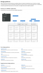
I’ve recently been working on the first major update to the GNOME 3 HIG. This has enabled us to put the new structure to good use, and the number of patterns has increased. These new guidelines are the direct result of design work that has happened in the past year. They attempt to distill everything we’ve learned through our own process of trial and error.
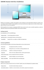
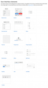
There have been some other notable changes to the HIG. Navigation has been improved throughout: the introduction has been thinned down, so you can get straight to the interesting stuff. The front page gives a much better overview now, and the overview pages for design patterns and interface elements have been much improved.
Another nice addition is that the HIG now links to the relevant GTK+ API reference documentation for each design component. This is nice for knowing which widget does what; and makes the design guidelines a more effective accompaniment to the toolkit.
I’m hoping to continue fixing bugs in the HIG and expanding the collection of patterns for a little while, so let me know if there’s anything you’d like to see added.
[Edit: these improvements to the HIG are work in progress, and will be released with GNOME 3.18.]


I don’t want anything except full version to follow :) That… and saying Gnome did some really outstanding work in HIG department. 3.16 is beautiful.
Also, if what Gnome To Do is what follows as standard result of this HIG https://youtu.be/3xY8NKu5NWE … drop dead gorgeous beside being drop dead simple for users
I’d love to see some documentation on in-app notifications! :)
Good call! I’ll get on it.
The new navigation is definitely better than the old one.
I see just one small issue: it feels a bit strange to read about “cross-platform” or “GNOME 2” stuff in the “Getting started” section, even before the “Common guidelines”… Sounds like some advanced topic. Shouldn’t this come later? Maybe at the end, in a dedicated section?
Anyway, thank you very much for your work, I’m a very satisfied GNOME 3 user, and I’m glad to see the quality of the iterative work of the design team. I even find my GNOME desktop more simple and clear than my MacOS one.
One thing that may still be missing is the ability to have more isolated/dedicated workspaces.
Right now, I always disable alt-tabbing between workspaces, so I don’t see windows I don’t care about.
But I can’t find a way to only show related communications (email? IM?) for each workspace. I still have to use some “communication” workspace to put all the distracting stuff.
And it would be nice to restore the whole workspace to get back to work (there are some “developer” tools for this, but I’m not sure they are accessible to non-technical users).
WDYT? Does this make sense, or is it just far to hard to identify clear usecases for these?
Hmm, good point about the cross platform page. I’ll try shuffling things around.
I’m just writing this comment to say Thank You to your entire team. I’ve been a logn 10+ years user of KDE. But recently switched to GNOME because of an ultrabook/tablet hybrid.
I’m really very impressed with the work GNOME has done. More than that I’m happy with the thought that has been put, and what lies for the future.
Hopefully, soon enough, I’ll read these docs to write my first tool with GTK libraries.
Thanks Ritesh! Very kind.