Every Detail Matters is back for a second round, and let me tell you: it is bigger and better than ever. I have been totally blown away by the response we’ve received.
We managed to fix 20 Every Detail Matters bugs for GNOME 3.4. That target has already been blown out of the water for the 3.8 cycle. At the time of writing, I count 27 bugs fixed by 9 different contributors. We’ve got some really great fixes in there, like improving animations in the lock screen and making the login experience smoother. There’s also been some nice usability enhancements to the Message Tray and Activities Overview.
We’re not done yet though: there are 14 bugs that are currently being worked on, and many more that we want to tackle. I’m adding items to the list all the time, including new features as well as smaller tasks for newcomers. If you want to help make GNOME 3.8 awesome, check out the Every Detail Matters wiki page. If there isn’t something that appeals straight away, come back and check again: we’re updating the page all the time. There’s plenty of time to get involved.
Everyone who has contributed to Every Detail Matters has done a fantastic job so far. A special mention has to go out to Stéphane Démurget, who only recently started contributing, but who has been doing a brilliant job. Stéphane hasn’t just been fixing lots of bugs, but he has been fixing them with style, and has been a real pleasure to work with.
I’d also like to give big thanks to Giovanni Campanga, Florian Muellner and Jasper St. Pierre, who are regular contributors who have been busy fixing bugs and reviewing patches. And now for some screenshots of the work done so far. :)
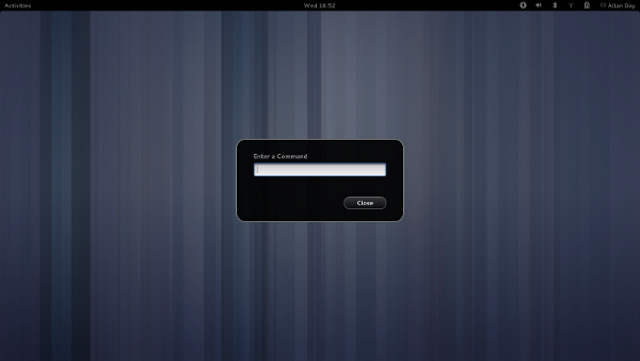
Yes, it’s a detail. But then, details matter: we have a nicer looking run dialog now. The most important feature of this is that it now has a close button, which means that people have an escape route if they accidentally open it. Another thing that this screenshot shows is our new background shade, which is used for modal dialogs and the overview. It used to be a flat transparency, but it has now been updated to use a radial gradient. This gives added depth and atmosphere.
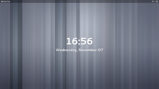
I’m cheating with this one, because it hasn’t actually landed yet. It is cool though: Florian has updated the lock screen to use a translucent top bar, which fits better with the overlaid screen shield metaphor that we’re using here. It also looks awesome. :)
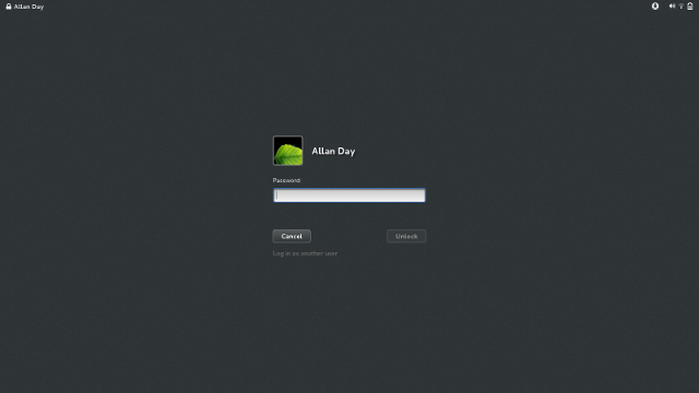
Finally, another detail (which, like all details, matters): the login screen now has properly styled insensitive buttons, and we make sure that the Unlock button is insensitive until the password entry field contains some text.
Expect more updates in the future.


