
I’ve written about designing GNOME apps at a high level before, but not about the actual process of drawing UI mockups the way we do on the GNOME design team. In this tutorial we’ll pick up the Read It Later example from previous tutorials again, and draw some mockups in Inkscape from scratch.
Before we start, let’s look at the sketches we’re going to base this on. I’ve re-drawn some of the sketches from my last app design blog post with just the parts we’ll need for this tutorial.
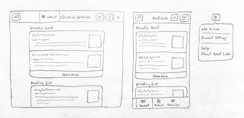
I recommend having a look at that other blog post before jumping into this one, as it will give you some background on the basic design patterns and show step by step how we got to this layout.
What’s in a Mockup?
After you’ve designed the basic structure of your app (e.g. as a sketch on paper) but before starting implementation, it’s good to check what your layout will look like with real UI elements.
This doesn’t mean mockups need to recreate every gradient and highlight from the GTK stylesheet. Doing that would make mockups very hard to edit and keep in sync as the stylesheet evolves. However, things like spacing, border radii, button styling, etc. can be made to look very close to how they’ll look in the implemented version with relatively little effort. This is why on the GNOME design team we use a simplified style somewhere between a wireframe and a mockup, where sizes and metrics are mostly pixel-perfect, but UI visuals are not.
This level of fidelity is great for trying variations on layouts, placement of individual controls, different icon metaphors, etc. which are the most important things to validate before starting development. Once the implementation is in progress there’s usually additional rounds of iteration on different aspects of the design, but those don’t always require mockups as you can just iterate directly in code at that point.
Pre-Requisites
In order to be able to follow along with this tutorial, you’ll need to install a few apps:
- Inkscape: The vector drawing app we’ll be using to draw our mockup
- Icon Library: A handy app for finding symbolic icons to use in mockups
Next, you need the GNOME mockup template. This is an SVG file with many of our most common UI patterns, which enables you to make mockups by copying and adapting these existing components, rather than having to draw every element yourself. You can download the template from GNOME Gitlab.
Finally, you need a recent version of Cantarell, GNOME’s interface font. It’s possible that while you may have a font with that name installed, it’s not the right version, because some distributions and Google Fonts are still on an old version (which has only 2 weights, rather than 5). You can download the new version here.
Inkscape Basics
If you’ve never used Inkscape before it might be good to do some more general beginner tutorials as a first step. I’ll assume familiarity with navigation and object manipulation primitives such as selection, moving/scaling/rotating, duplicating, manipulating z-index, grouping/ungrouping, and navigating through group hierarchies.
Nevertheless, here’s a quick overview of the features we’ll be using primarily.
Controls
Inkscape has a lot of features, but we only need a small subset for what we’re doing. Most interfaces are just nested rectangles, after all ;)
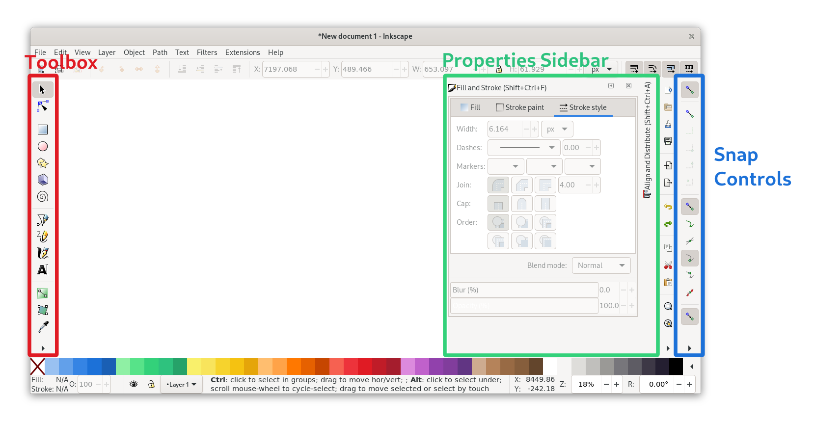
Toolbox (the toolbar on the left edge):
- Selection/movement/scaling tool (S)
- Rectangle tool (R)
- Ellipse tool (E)
- Text tool (T)
- Color picker (D)
Properties Sidebar (configuration dialogs docked to the right side):
- Fill & Stroke (Ctrl + Shift + F)
- Align & Distribute (Ctrl + Shift + A)
- Export (Ctrl + Shift + E)
- Document Properties (Ctrl + Shift + D)
Snap Controls (the toolbar on the right edge): Inkscape has very fine-grained snapping controls to configure what should be snapped to when you move items on the canvas (e.g. path nodes, object center, path intersections). It’s a bit fiddly, but very useful for making sure things are aligned to the grid. The icon tooltips are your friends :)
When aligning things or working with the pixel grid it’s very helpful to have the page grid visible. It can be toggled with the # shortcut or in the View menu.
Advanced: Partial Rounded Corners
One sort of advanced thing I started doing recently is using path effects to get rounded corners only on specific corners of a rectangle. This is handy compared to having the rounding baked into the geometry, because it keeps the rounding flexible, so the object can be scaled without affecting the rounded corners.
The feature is quite hidden and looks very complex, but once you know where it is it’s not that scary. You can find it in Path > Path Effects... > + > Corners (Fillet/Chamfer).
You’ll find that the mockup templates use this path effect technique for e.g. rounded bottom corners on windows.
Color Palette
It’s not as important for mockups as it is for app icons, but still nice to have: The GNOME color palette. Inkscape 1.0+ includes it by default, so you can just choose it from the arrow menu on the right.
Otherwise you can also get it via the dedicated color palette app, or download the .gpl from Gitlab and put it in ~/.var/app/org.inkscape.Inkscape/config/inkscape/palettes for Flatpak Inkscape or ~/.config/inkscape/palettes if it’s on the host.
Page Setup
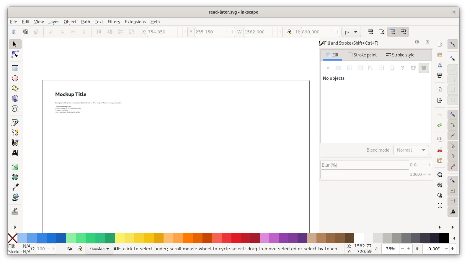
With that out of the way, let’s get started making our mockup! First, we need a basic page to start from. We can start from the empty-page.svg file, by opening that file and saving it under the name we’ll ultimately want for our mockup, e.g. read-later.svg.
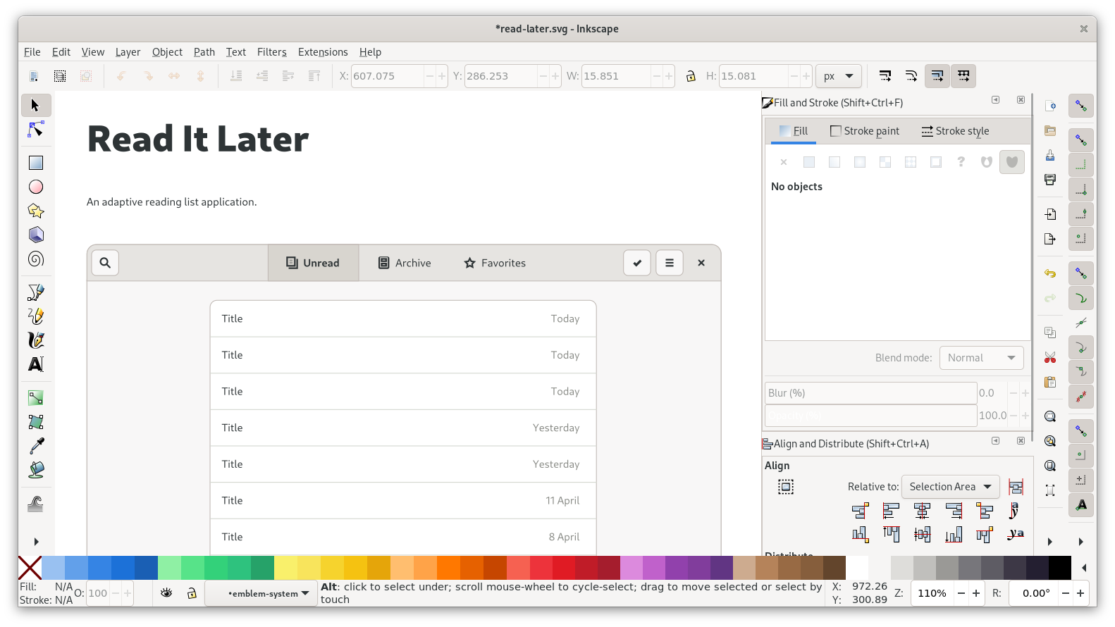
GNOME mockups usually consist of one or more views laid out on a “page” of whatever size is needed to make the content fit. There’s usually a title and description at the top, plus additional captions to explain things about the individual screens where it’s needed (example).
The page dimensions can be adjusted in Document Properties (Ctrl + Shift + D). One useful shortcut here is Ctrl+Shift+R, which resizes to the bounding box of the current selection (Note: Only use this shortcut if the thing you’re resizing to is e.g. a rectangle you set up for that purpose. Resizing the page to things off the pixel grid will break it, because it moves the document origin).
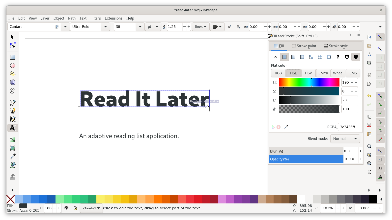
Let’s do that, and tweak the title and description for our case:
Desktop View
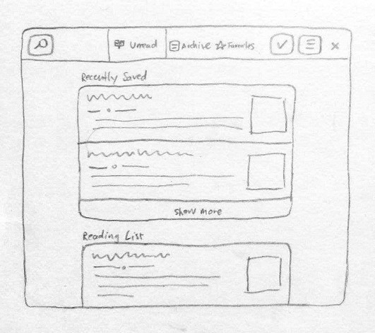
Now that the page is set up we can add our first screen. This is the sketch we’re going to be drawing first:
As a first step, let’s bring in the window template with view switcher from pattern-templates.svg. Open that file in Inkscape, select the top leftmost screen, copy it, and paste it into your mockup file.
After roughly positioning the window, check the exact position using the numeric position entries in the bar at the top, and make sure both X and Y positions are full integers (if they’re not integers it means your mockup is off the pixel grid and will look blurry).
It’s worth pointing out that while in this case we’re just starting from the plain default templates, it’s often faster to start from an existing mockup for another app. The app-mockups repository on GNOME Gitlab is full of existing mockups to borrow elements from or use as a starting point for a new mockup. That said, depending on their age those mockups might be using outdated patterns, so it’s good to check when a particular mockup was last updated :)
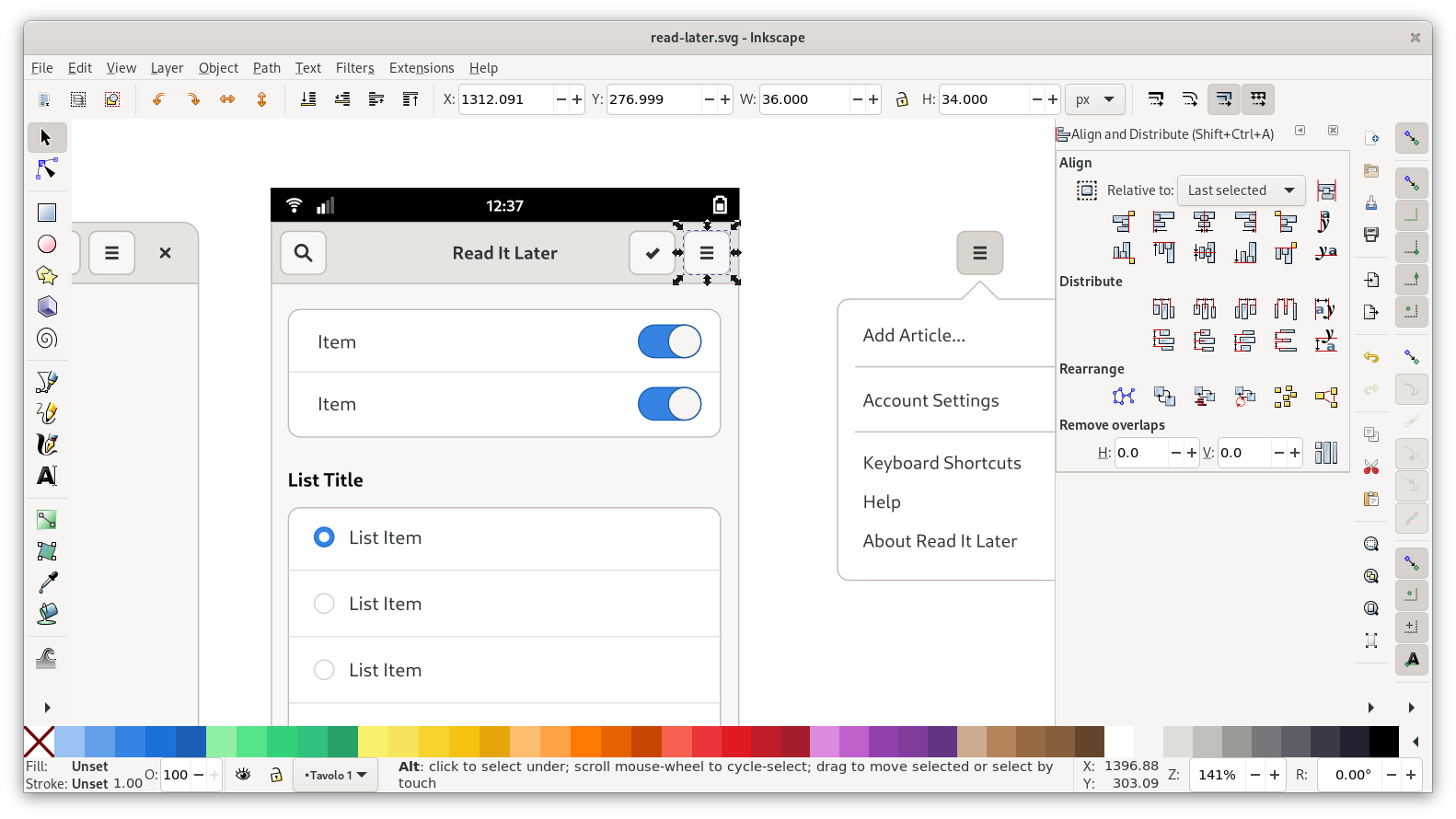
Headerbar
Let’s start by adjusting the headerbar to what we have in our sketch. Conveniently, several of the buttons don’t need to change at all from the template. All we need to do here is move the search button to the left, delete the add button, and adjust the switcher.
As a general rule, spacing between elements is a multiple of 6 pixels (so 6, 12, 18, 24…). For example, there are 6px of padding around buttons inside a headerbar, and 6px between the individual buttons.
When moving/placing elements, always make sure that snapping to bounding box is active (topmost group of snapping controls). As with the placement of the window earlier, it’s good to verify that sizes and positions are even integers in the toolbar up top.
Next up: The view switcher. You can start by changing the three labels, and then re-centering the icon + label groups on their respective containers. The inactive items have invisible containers, so they’re a bit fiddly to select.
For the icons, you can fire up Icon Library and search for the following icons:
- Unread: view-paged
- Archive: drawer *
- Favorites: star-outline-thick
* This icon isn’t included yet, but will be in a future version
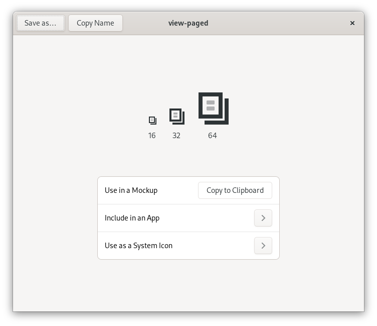
You can paste icons directly into Inkscape using the “Copy to Clipboard” feature. Before pasting, navigate into the relevant icon group (each of the icons is grouped with an invisible 16px rectangle, because that’s the icon canvas size). When placing an icon, make sure to center it on the invisible canvas rectangle, and place them on the pixel grid. You may want to turn on outline mode (Ctrl+5 cycles through display modes) to deal with the invisible rectangles more easily.
Once the icons are replaced, change the label strings with the text tool, and move the icon+label blocks horizontally so they look centered within their containers. I personally just do this manually by eye rather than using the alignment tool, so I don’t lose the icon’s alignment to the pixel grid, but you can also align and then manually move it to the closest position on the pixel grid.
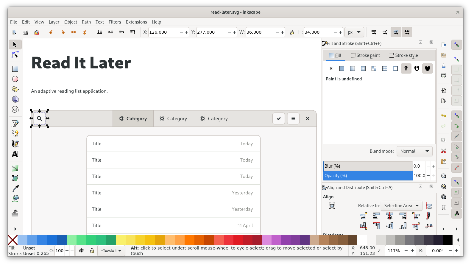
With this, the headerbar is complete now:
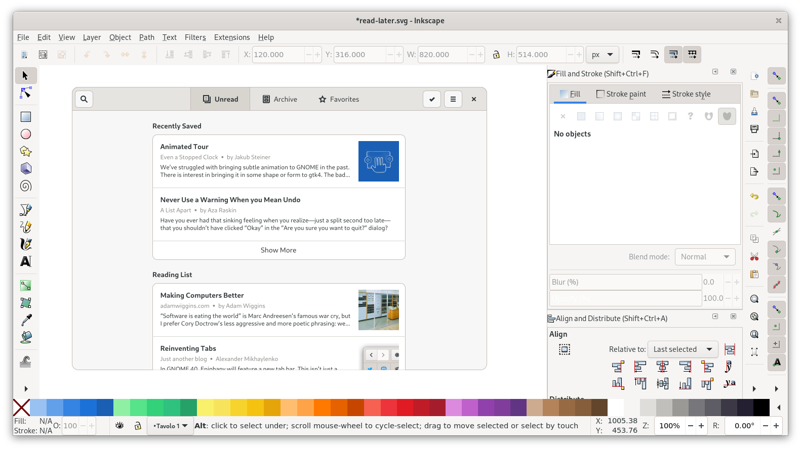
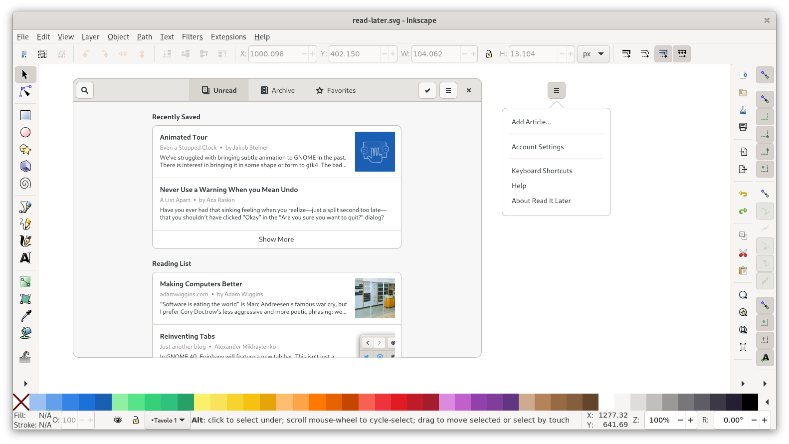
Content
Let’s look at the content inside the window next. We can keep the basic structure of the listbox from the template, but obviously we want to change what’s in the list.
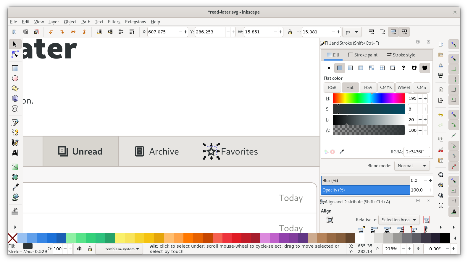
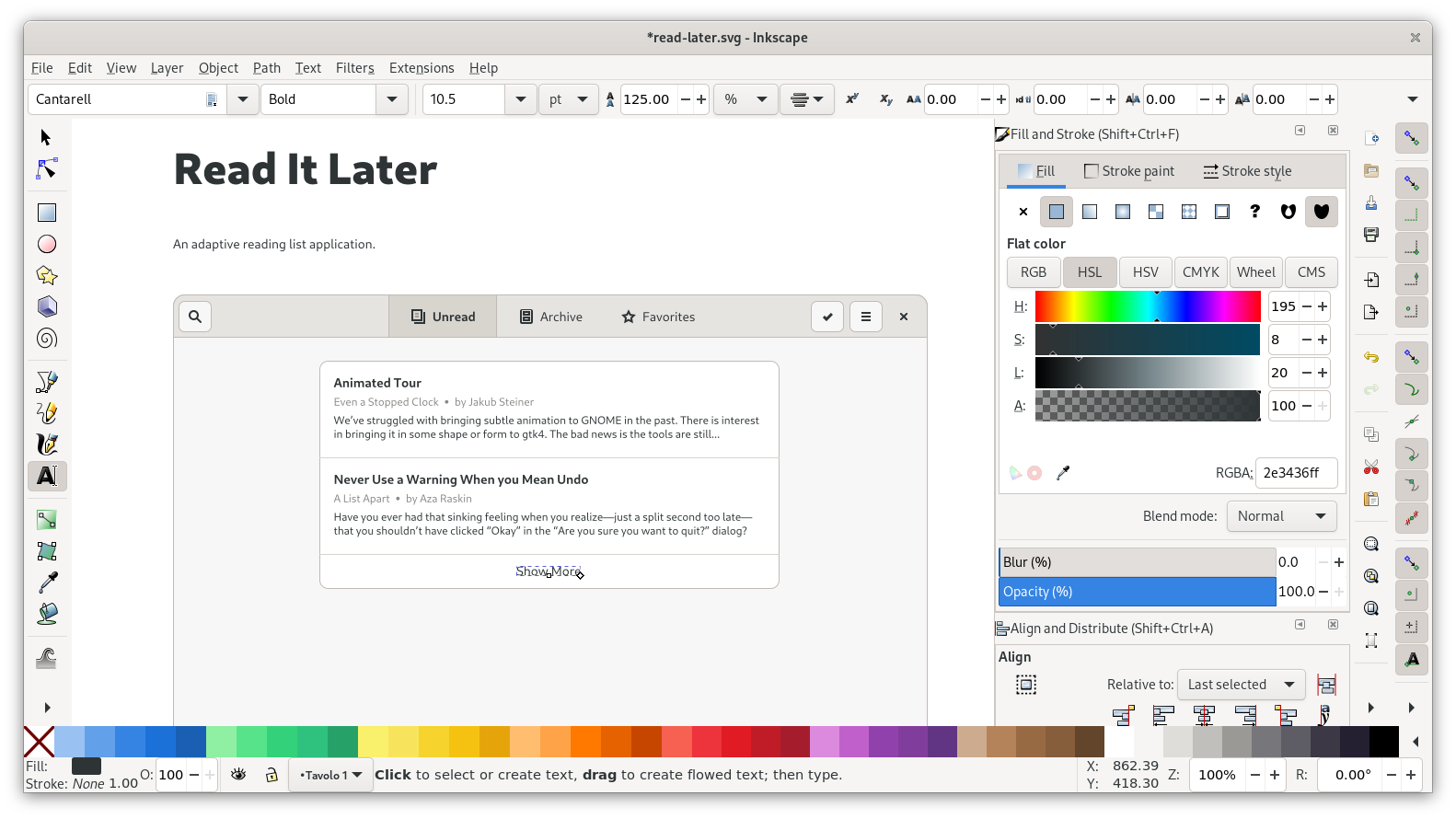
I’ve prepared some example content we can just copy and paste that into our mockup. Each article consists of three labels, one using the regular font size (10.5pt), and two using the small one (9pt). The metadata label also uses a lighter gray, to distinguish it from the body copy (you can get the color from the labels on the right side of the list in the template using the color picker tool).
The list from the template is grouped and has a clipping mask to cut off scrolling content at the bottom. Since our layout is different anyway we can remove the clipping by simply ungrouping (Ctrl + Shift + G). Next, we can delete all content except the first row, and change that to our first article.
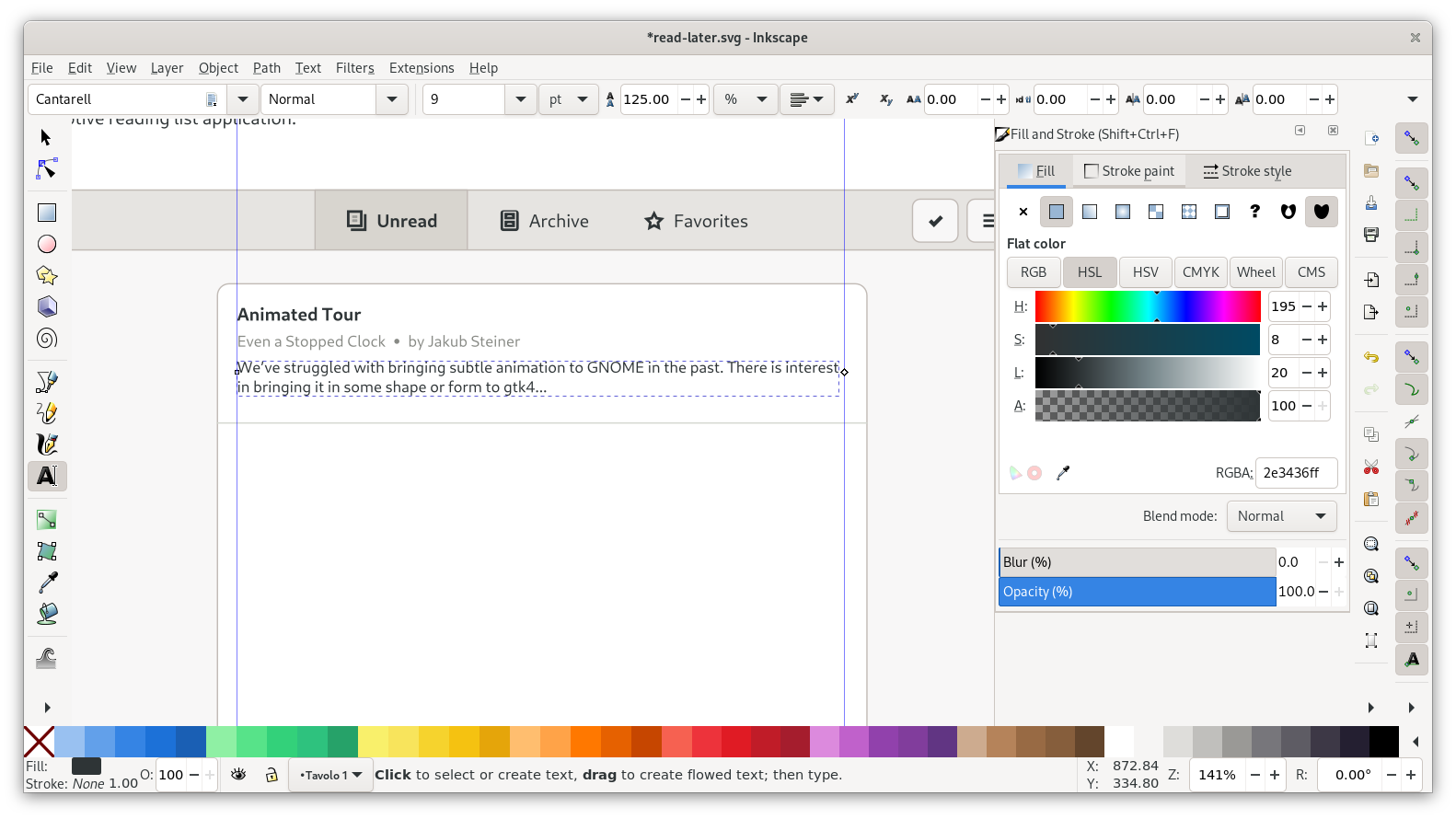
In order to accommodate multiple pieces of content inline as part of the same label, a common pattern is to use middle dots (“·”) as dividers. Pro tip: The Typography app makes it easy to copy and paste typographic symbols like this one into your mockups.
After adding the articles in the first listbox, we need the “Show more” button at the bottom. For that we can just resize the list so it extends past the last article, and add a centered label on that area.
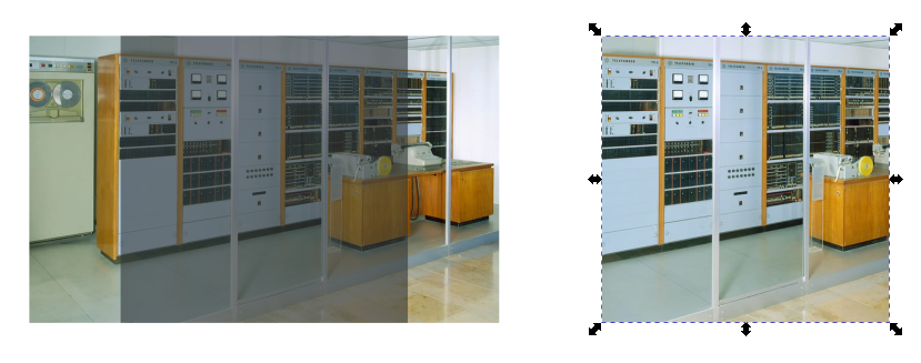
Some of the articles also have images associated with them (there are download URLs for the images in the example content file). Images that aren’t already square need to be clipped to a square shape for our layout. To do that in Inkscape
- Pull in the image via drag and drop from the file manager (or paste it directly from a website via “Copy Image”)
- Place a rectangle with the right size/proportions where we want the image to go in the layout. In this case, images should be 80px squares, with 12px spacing all around.
- Move and scale the image to cover the rectangle on all sides
- Select both the image and the rectangle, and do
Object > Clip > Set. Note that the clipping object (the rectangle) needs to be above the target (the image).
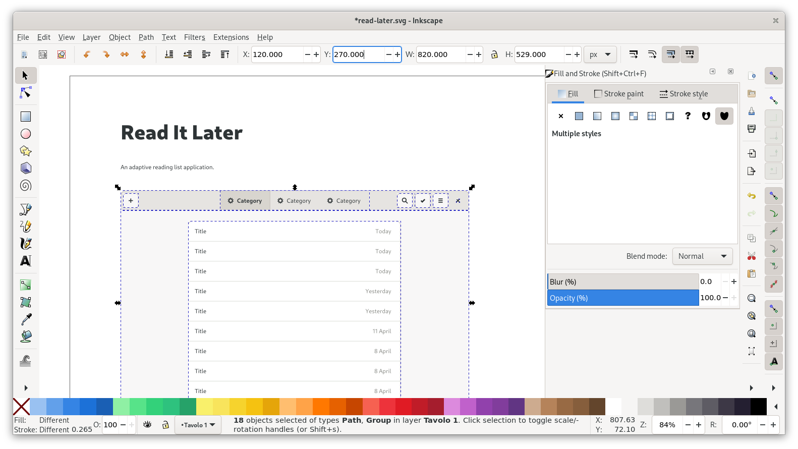
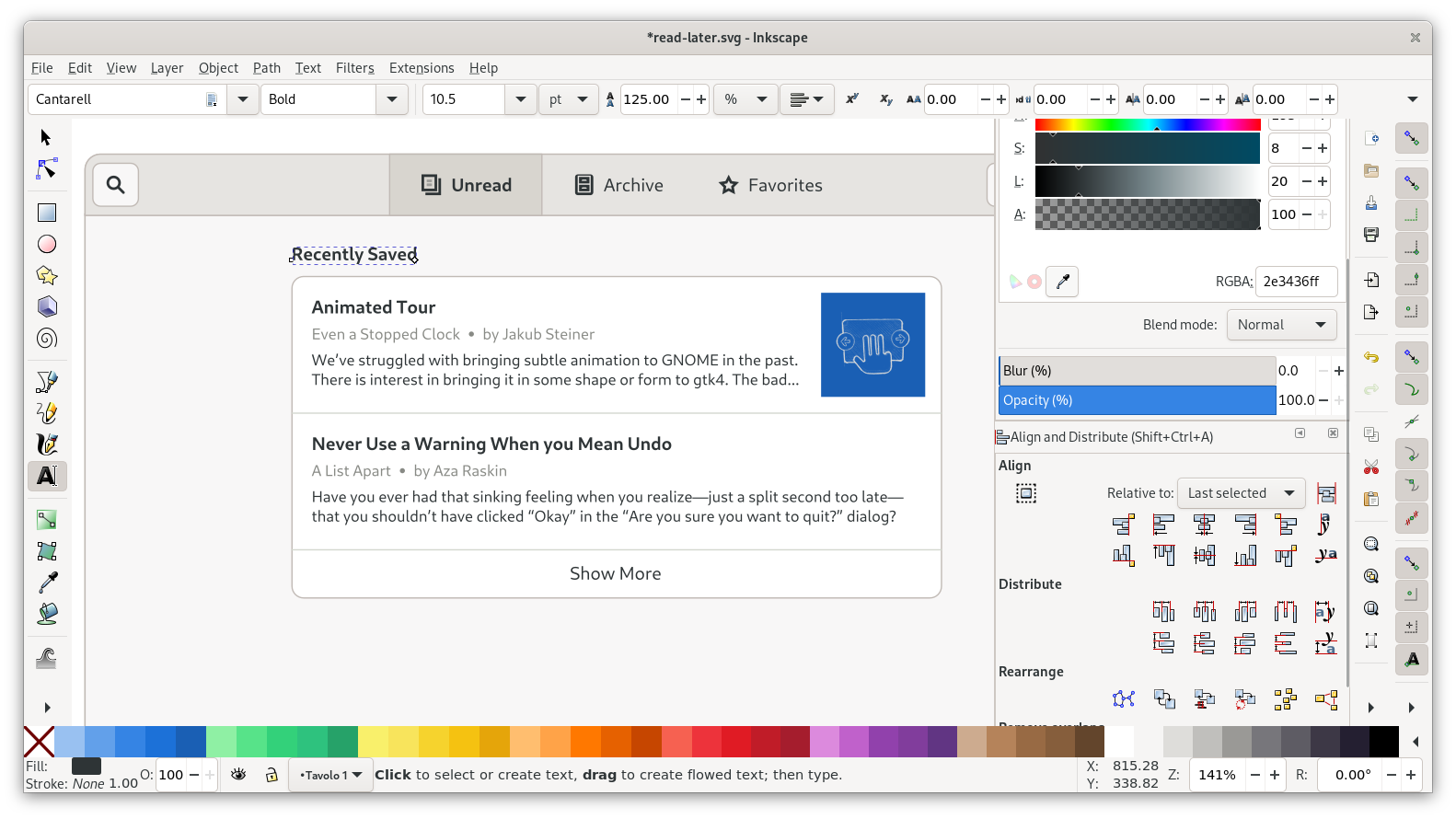
With the first list done, we can move it down a bit and add a title above it. You can re-use one of the titles from the list for that, and just horizontally align it with the list container. Spacing between title baseline and list should also be 12px, and above the title 18px to the edge of the view.
After that, our first list is complete:
For the second list we can duplicate our first list, move it down below, and just change the content:
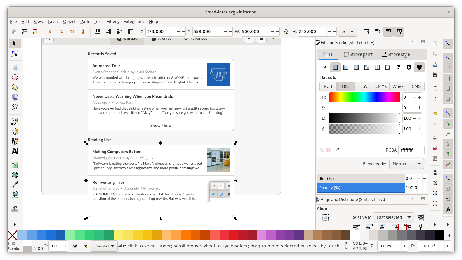
In order to have it cut off nicely at the bottom we can bring back a clipping mask. Group the list, duplicate the window background rectangle, and use that as a clipping mask for the list. To make the last article a little more visible I’m also resizing the window background to be a little bit taller first.
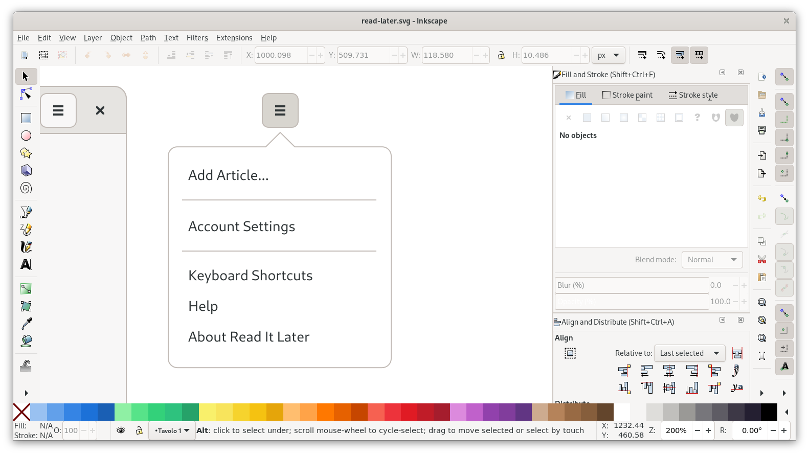
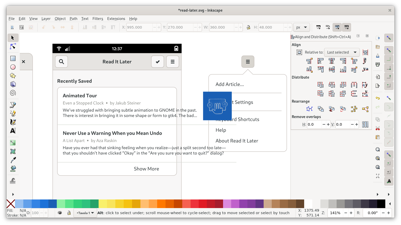
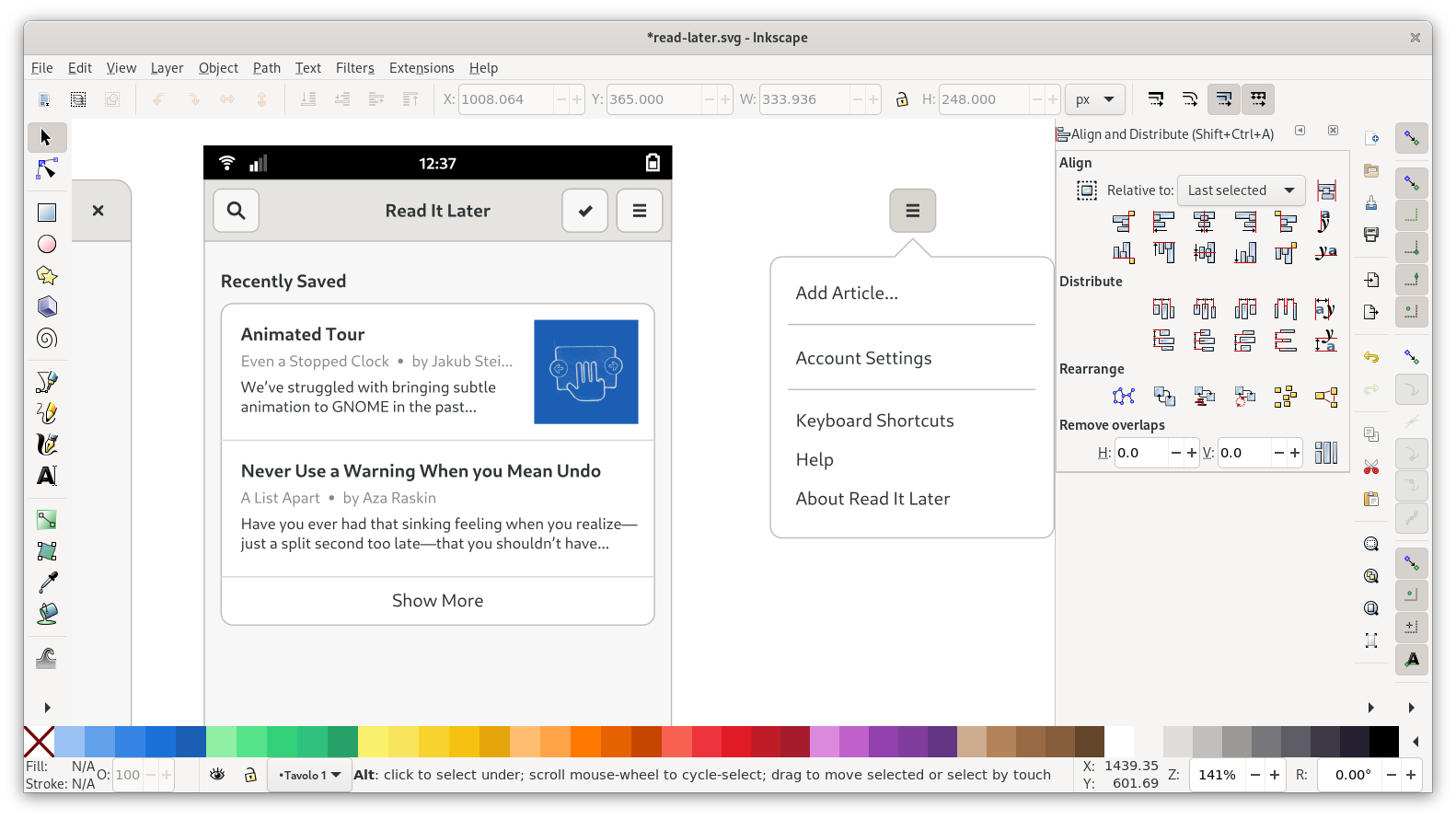
Menu
For the primary menu we can pretty much just re-use the menu from the template (top left, outside the canvas). Copy over the template popover and button, and vertically align it so the button is at the same height as the one in the window.
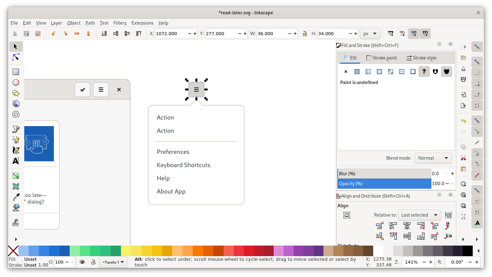
Since we don’t need many actions other than the default ones, all we need to do here is change a few labels, add another divider, and put in the name of the app.
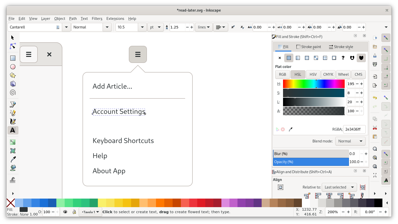
That leaves us with a bunch of whitespace in the popover though, so let’s move up the actions and then resize the popover by selecting the bottom nodes and moving them up using the arrow keys:
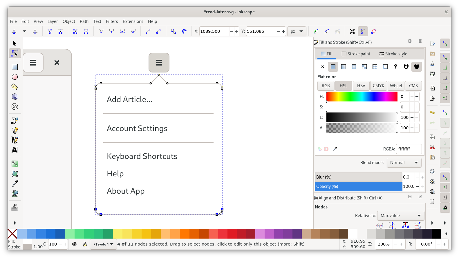
And with that, our menu looks pretty good:
That completes our desktop view, and we can move on to mobile.
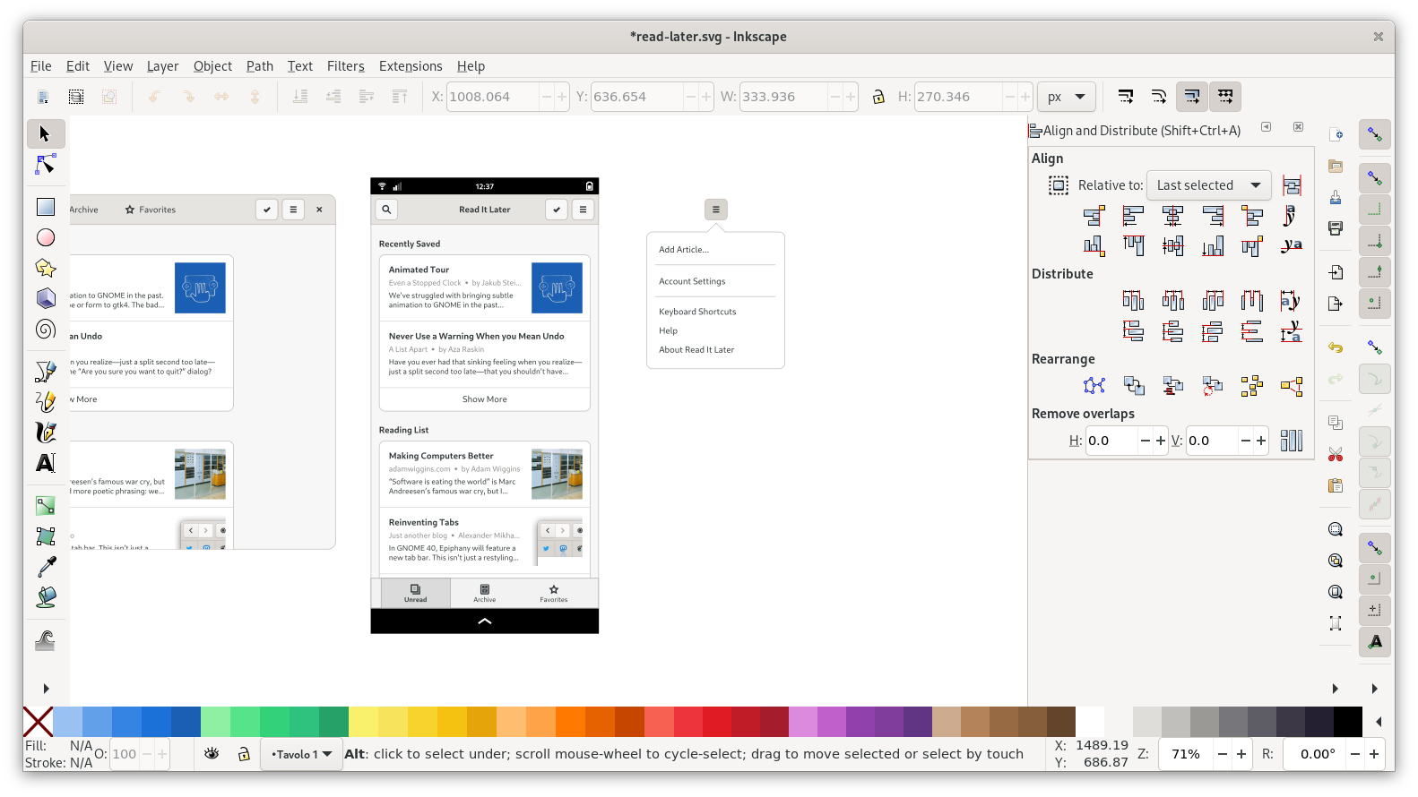
Mobile View
Now that we have a desktop view, let’s do a mobile version of it. Let’s have another look at our sketch:
We can re-use all the elements from the desktop view here, but we need to resize and move around a few things.
As a starting point for the layout, let’s bring in the mobile template. I like to align the mobile headerbar with the desktop one vertically, so all the headerbar buttons have the same vertical position.
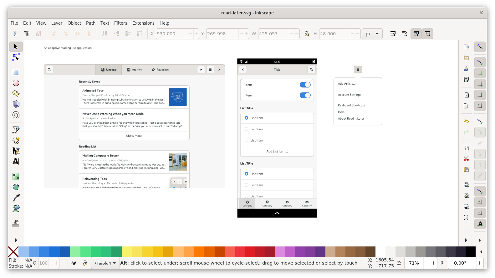
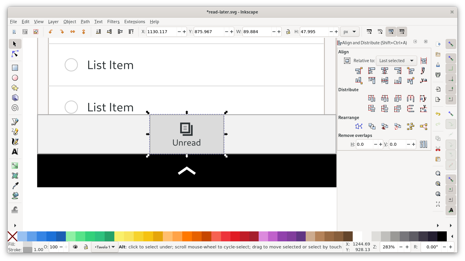
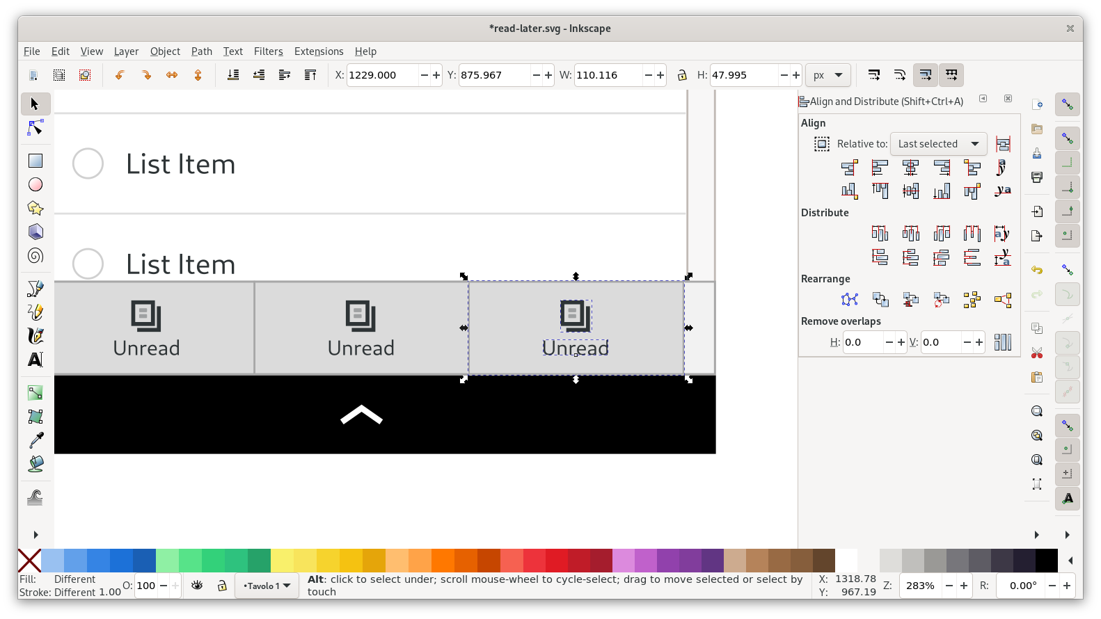
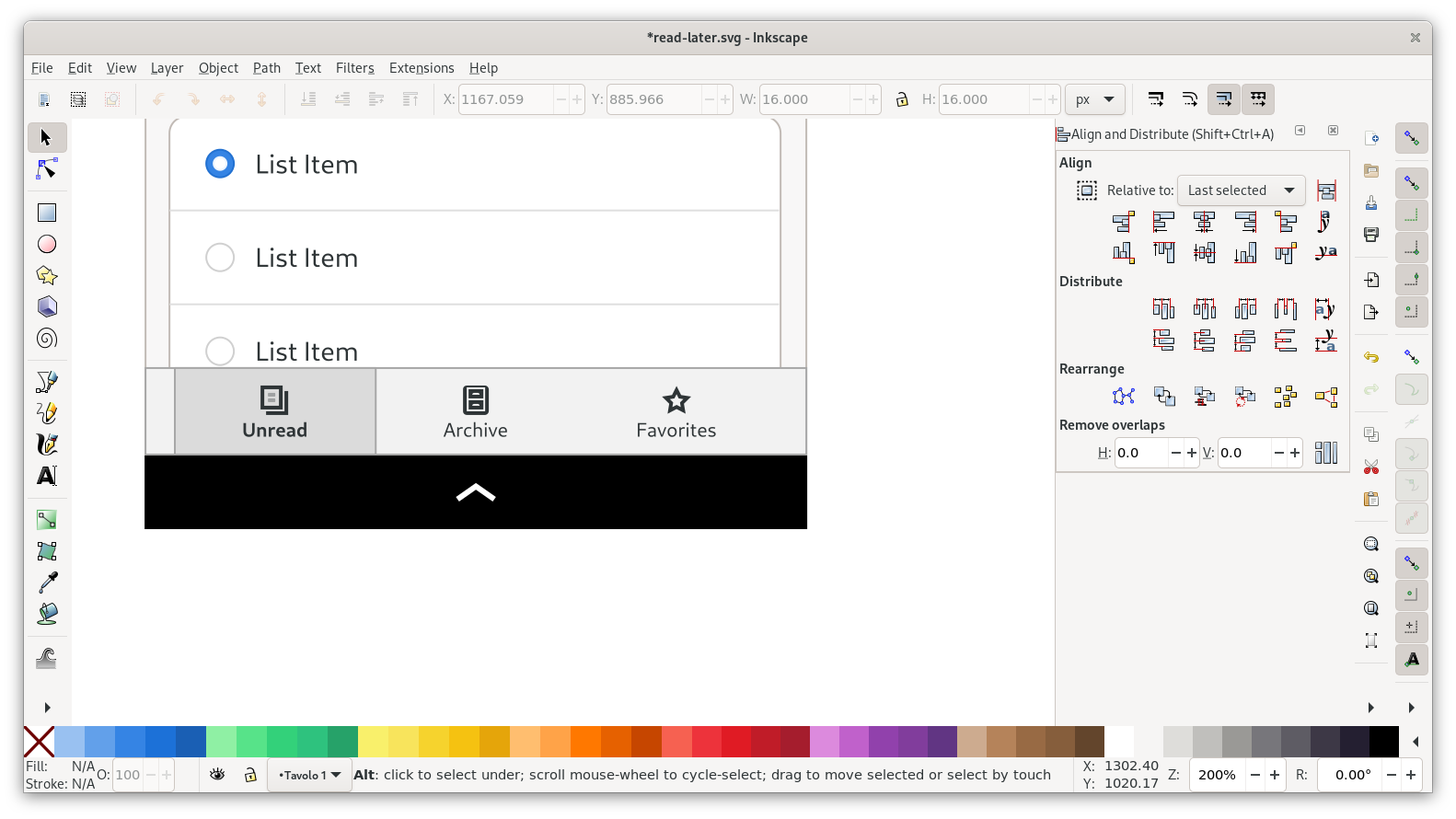
Headerbar & Navigation
On mobile sizes there’s not enough horizontal space to keep the view switcher in the headerbar, so instead there’s just a title. The view switcher is in a separate bar at the bottom.
For the headerbar we can duplicate the buttons from the desktop mockup and use them to replace the placeholder buttons on the mobile template.
For the switcher, start by deleting all items except one. Then center the remaining one, and resize the background rectangle to a bit less than a third of the width of the view.
After that you can duplicate the item twice, and move the two additional switcher items to the sides:
Now you can change the icons and strings, and delete the backgrounds on two of the items, and we have a complete mobile switcher:
Content
Adapting the content is easy in this case. Duplicate the lists from the desktop mockup, left-align it with the lists from the template and delete the original lists.
Then we just need to resize the text boxes by moving the handle on the right of the baseline, truncate the text to two lines, move the images to 12px from the right edge, and center the “Show More” label.
Repeat the same thing for the second list, and we have a complete mobile layout!
Page Size & Export
If we zoom out and look at the whole thing together, we can see that this looks pretty much done now: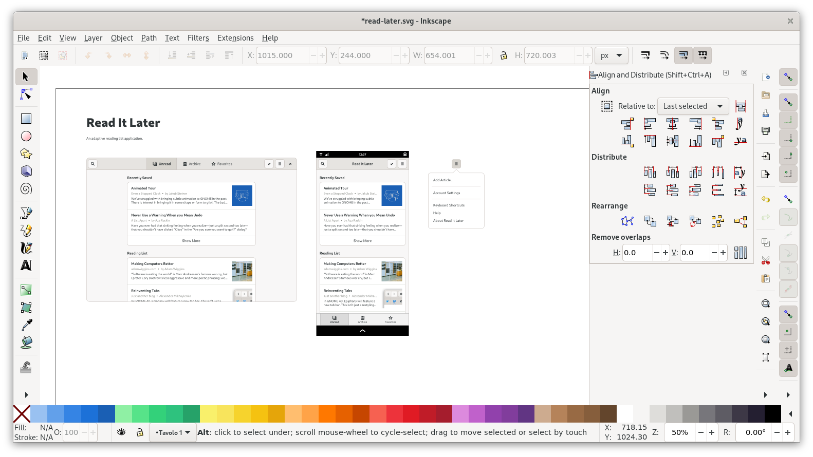
However, the canvas size is too big for the content we have. Open Document Properties (Ctrl + Shift + D) and change the size to about 1780×1100px. 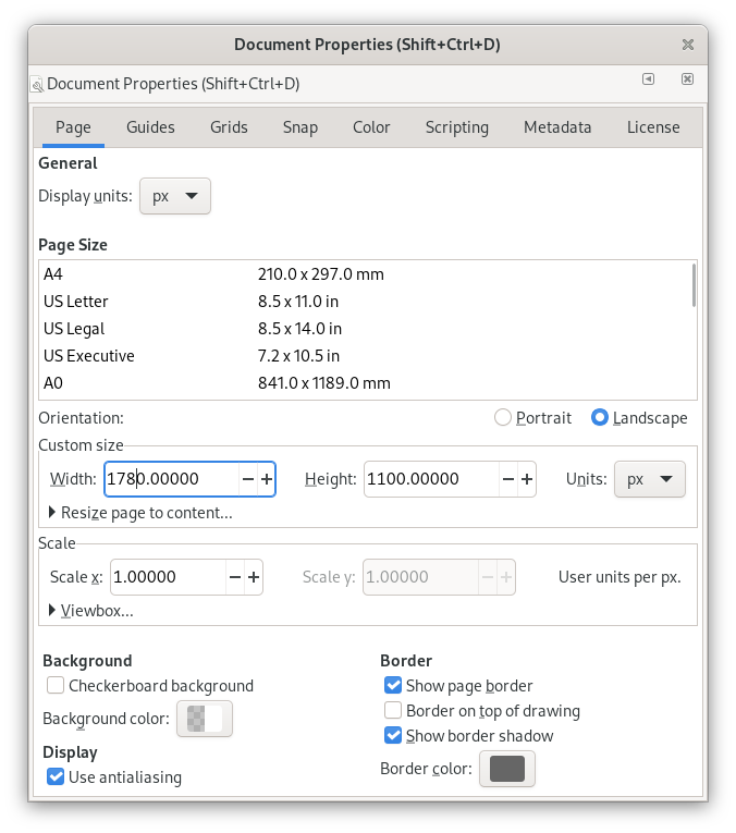
This is what it looks like with the new page size:
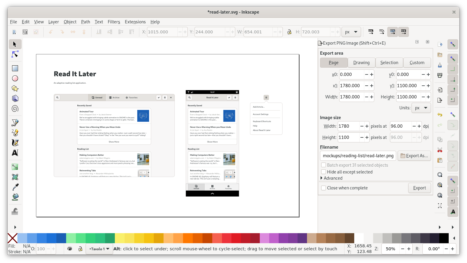
Now that the mockup is ready, let’s export a PNG for easy sharing. Open the Export dialog (Ctrl+Shift+E), choose “Page” at the very top, make sure the DPI is 96, and set the file path. Then press Export, and try opening the PNG in an image viewer to check if there are any issues you missed.
On the design team we usually then push the finished mockup to a git repository, but that’s out of scope for this tutorial.
Conclusion
Congratulation, you made it all the way to the end! I hope this was useful, and you’ll go on to make many great mockups using what you learned :)
You can download the SVG for the mockup I created for this tutorial from GNOME Gitlab. It might come in handy if you have problems with a specific part of the tutorial and want to see how I did it. By the way: The inkscape-tutorial-resources repository contains snapshots of all templates and resources used in this tutorial, in case the original ones change in the future.
Obviously for a real mockup we’d do additional screens (e.g. the article page, various other menus, settings screens, and the like), but I think we’ve covered most of the basics with just this one screen. If you have questions feel free to comment or get in touch!
Thanks for sharing Tobias, that was an excellent post. Cool to see the comparison between the mockup and the actual app and the many steps it takes to create a mockup.
An awesome guide, thanks!
This is an absolutely great read. Thanks for showing us how you do it.
Really insightful article! I wanted to ask a quick question why did you choose inkscape instead of dedicated ui designing tools like figma or sketch?
On the GNOME design team we use free/open software as much as possible, so Figma isn’t an option, and Sketch is macOS-only anyway, so we couldn’t use it if we wanted to :)
Inkscape’s UI is definitely not great but it works for what we need, and so far we haven’t found a realistic alternative. I’ve been meaning to try Penpot, which is supposed to be similar to Figma, but haven’t gotten around to it yet.
Thank you! Best blog post of 2021 so far!
Thanks for the great article!
One year ago I was looking for dedicated open source UX software and couldn’t find anything.
That situation has completely changed because now we have two applications to choose from:
Penpot (in active development)
Quant-UX (stable)
I haven’t used them yet but I’m eager to try them out!
I’ve tried using Inkscape but I just can’t for the life of me find it a good mock up oriented enough program. Figma isn’t open source and uses specialized svg but it’s a much better fit for basic mock up construction. Penpot is a new open source alternative but still lacks a couple major features.
That was a fascinating read and brings back many memories as well as reflection of self and how it seems just yesterday ~2000? I had installed RedHat from multi-cd set that MacMillan publishing had put out and while many were KDE fans I always preferred GDM. I am delighted to see not only does it still exist but that it’s being maintained and standardized specifications!
Thanks!
Feature Request: Create a package that install Inkscape and set-up mockup images in Inkscape as symbol-set, so we could use them easy.
Additionally I would propose, auto-creating an SVG set every time the Design of gnome gets an Update.