3.14 On Its Way

I recently put the finishing touches to the GNOME 3.14 release notes, which means that the next GNOME release is getting pretty close now. I never cease to be excited by new GNOME releases, nor to be amazed by our community’s ability to discernibly improve the GNOME 3 user experience release on release. I’m definitely at the point where I want to be running 3.14 all the time – it’s obviously a lot better than the previous version.

You’ll have to wait for the release notes to get all the details about what’s in the new release. Nevertheless, I thought I’d give a sneak peek at some of my personal favourite features.

Often with new releases we focus on the big new features – obvious bits of new UI that do cool stuff. One of the interesting things about this release, though, is that many of the most significant changes are also the most subtle. There’s a lot of polish in 3.14, and it makes a big different to the overall user experience.

New Animations

https://youtube.com/watch?v=ZOiLFx_LQBM

It’s quite a while since Jakub first posted his motion mockups for the applications view. Since then we’ve been steadily and progressively iterating towards those mockups. With 3.14 we’ve finally got there, and it was worth the wait. The most noticeable effect is the new “swarm” animation, but also a lot of other subtle touches, such as when you browse application folders, or when you launch applications. We’ve also reworked the animations for when windows are opened and closed.

Animations might seem like unimportant window dressing, but it’s surprising how significant they can be for the user experience. They are the glue which binds the different parts of the UX together. By smoothing the transition between views, windows and applications, they make the entire experience feel responsive, fluid and more pleasurable to use. (And they actually make everything feel a lot faster, too. But don’t tell anyone.)

Google Images in Photos

Photos 3.14

GNOME’s Photos app has been steadily maturing over the past couple of releases, and it is turning into the dependable core app that we want it to be. The big news for 3.14 is that Photos will now pick up your Google photos, so any images you’ve uploaded with Picasa, Android, or posted on Google+ will be immediately available there. This is obviously incredibly convenient for users of Google services, and I know I’m looking forward to being able to quickly browse my online photos from within GNOME 3.

Rewritten Adwaita

GTK+ 3 Widget Factory 3.14

Jakub and Lapo have been tireless during the 3.14 cycle, and have completely rewritten Adwaita (the GNOME 3 GTK+ theme). This was a huge undertaking – around 8,000 lines of CSS have been reduced to about 3,300 lines of SASS. This was primarily intended to improve the maintainability of the theme. As such, there hasn’t been a dramatic change in the theme. What has happened, though, is that every aspect of the theme has been gone over with a fine-toothed comb.

There are some more noticeable changes. Progress bars have got thinner. Spinners look different (so much better). Switches are a bit different. However, the more exciting thing for me is that pretty much every part of the theme has changed in a subtle way. Everything feels crisper, sharper, and a bit lighter. There’s also a lot of subtle animations now (thanks to CSS animation support in GTK+), adding to the feeling of polish.

Search More Things

System search has been one of the most successful parts of GNOME 3, in my opinion. The number of applications that are feeding results to system search has continued to increase with 3.14, with two really useful new additions. The first is Clocks, which will return search results for world cities. Search is all you need to do to find the time in a place throughout the world.

search-clocks

The second new search provider in 3.14 comes from the Calculator. As you might expect, this allows you to perform simple calculations straight from the search box. It’s pretty exciting to see system search in GNOME 3 become so versatile, and the great thing about it is that it’s always a single keystroke away.

search-calculator

Go Go GTK+ Inspector

GTK+ Inspector 3.14

I don’t usually write about developer-focused features when I preview GNOME releases, but I can’t talk about 3.14 without mentioning GTK+ Inspector. If you work with GNOME technologies – as I do – this tool is something of a revelation. It’s amazing how quickly it becomes a core part of how you work. I’m already wondering how I ever lived without it.

The inspector isn’t just useful. It is also a lot of fun, and makes it easy to experiment. if you’re not a developer, or you don’t regularly work on GTK+ apps, I’d still recommend trying it out. Just hit Ctrl+Shift+I and have a play around.

Waiting Time

This is just a small selection of the features that are coming in the new release. To learn about everything else that’s coming, you’ll have to wait for the release notes. 3.14 should be out next week.

GNOME design: saving space since 2009 (or so)

One of the pieces of feedback I often get about GNOME 3 concerns the use of space. People repeatedly say to me that GNOME 3 apps use too much space, particularly in terms of header bars and their buttons.

I find these comments about wasted spacing to be perplexing, because they seem contrary to one of the major themes of GNOME design over the past five years or so. It’s incisive to look at GNOME’s history in this area, and to count some pixels along the way.

Back during the tail-end of the GNOME 2.x days, those of us who were involved in GNOME design were strongly advocating for applications that had less chrome, and gave more space to content. We were particularly concerned about apps like Nautilus, and this kind of screenshot was the kind of thing we wanted to eradicate:

Nautilus 2.22

David Siegal wrote a great blog post about it at the time. The proportion of the window that was devoted to content rather than chrome was laugably small, as Andreas Nilsson artfully demonstrated:

Starting with this as a baseline, we can measure how space usage has changed in GNOME in the past four or five years. Back then, a Nautilus window used 171 vertical pixels for chrome (24 pixels each for the title bar, menu bar, and status bar, 55 for the tool bar, and 44 for the path bar).

By the time 3.0 came around, we had managed to reduce the amount of wasted space considerably. The stacked toolbar and path bar were gone, and the permanent status bar was replaced by a floating element. I count 63 pixels for the title bar and menu bar, and 53 pixels for the toolbar – that’s a space saving of 55 pixels.

Nautilus 3.0

Three releases later, and more space saving improvements had landed. The menu bar was gone, which had been replaced by a single toolbar. Chrome stood at a height of 70 pixels – a saving of 46 pixels since 3.0, and a whopping 101 pixels since GNOME 2.

Nautilus 3.6

Finally, to bring the story up to date, in GNOME 3.12 we introduced header bars, which again resulted in a space saving. Nautilus today has 48 pixels of vertical chrome, less than a third of what it had in 2.22.

Nautilus 3.10

This history makes quite a nifty table…

Nautilus Version Vertical Chrome
2.22 171
3.0 116
3.6 70
3.12 48

You get a similar result for other GNOME applications. At the end of GNOME 2, gedit had 127 vertical pixels of chrome. Nowadays it is down to 72 pixels.

What’s more, today’s Nautilus compares favourably with file managers from other operating systems/desktop environments. KDE’s Dolphin uses 109 vertical pixels of chrome compared with Nautilus’s 48. Finder in the upcoming OS X version seems to have around 75 pixels.

So I am puzzled. In GNOME we have greatly reduced our use of chrome, to the point where we seem to use less than obvious alternatives. And yet, we still get repeated comments that we use too much chrome.

You could argue that there is still extraneous chrome that can be shaved off, of course. I’ve looked into the possibility myself, and what I found is that the potential savings really are negligible – in the region of four or six pixels or so. Compared with the dramatic savings we’ve seen in the past years, this is trivial stuff.

Besides, I don’t think that shaving four or six pixels is really the answer to why we get comments about space usage. It’s hard to know exactly what is going on, but I suspect that it is more down to the visual presentation of header bars [1], and something about how some people expect buttons to look. For some reason, buttons like this seem to hit a nerve:

square-button

It might well be something to do with shape, rather than size.

GNOME is actually using space better than it ever has done before, and is more efficient in this respect than at least some major rivals. This isn’t to say that there aren’t real issues behind the feedback we’ve got about space usage – obviously something is going on. It’s more of a subtle issue than many give credit for, though, and it’s certainly not because we are worse at using space than in the past.

[1] Perhaps in combination with their position. On a small laptop screen that is below eye level, something at the top is more noticeable, closer, and appears bigger.

New Human Interface Guidelines for GNOME and GTK+

hig-graphic-940

I’ve recently been hard at work on a new and updated version of the GNOME Human Interface Guidelines, and am pleased to announce that this will be ready for the upcoming 3.14 release.

Over recent years, application design has evolved a huge amount. The web and native applications have become increasingly similar, and new design patterns have become the norm. During that period, those of us in the GNOME Design Team have worked with developers to expand the range of GTK+’s capabilities, and the result is a much more modern toolkit.

It has been a long road, in which we have done a lot of testing and prototyping before incorporating new features into GTK+. As a result of that work, GTK+ provides a contemporary lexicon to draw on when designing and implementing applications, including header bars, popovers, switches, view switchers, linked and specially styled buttons, and much more.

There is a downside to all the experimentation that has been happening in software design in recent years, of course – it can often be a bewildering space to navigate. This is where the HIG comes in. Its goal is to help developers and designers take advantage of the new abilities at their disposal, without losing their way in the process. This is reflected in the structure of the new HIG: the guidelines don’t enforce a single template on which applications have to be based, but presents a series of patterns and elements which can be drawn upon. Each of these is accompanied by advice on when each pattern is appropriate, as well as alternatives that can be considered.

The HIG is also designed so that it can grow and evolve over time. The initial version that I have been working on covers the essentials, and there is a lot more ground to be covered. We want to assist people in finding the design that best fits their needs, and we want to make a whole range of creative solutions available.

In writing the HIG, I’ve made an effort to produce a document that is as useful to as many people as possible. While there is an emphasis on integration with GNOME 3, there should be useful material for anyone using GTK+ to create applications. It includes guidelines on creating more traditional desktop applications as well as newfangled ones, and includes advice for those who are responsible for GNOME 2 style apps. Likewise, the new HIG includes guidance on how to design effective cross-platform applications.

The new HIG wouldn’t have been possible without the help and hard work of many individuals. It incorporates updated material from the previous version, which was written by Seth Nickell, Calum Benson, Bryan Clark, Adam Elman, and Colin Robertson, many of whom recently helped us to relicense the original HIG.

Credit also has to go to those people who designed and developed all the new capabilities that are documented in the new HIG, including Jon McCann and Jakub Steiner on the design side, as well as the developer/designers who helped to test new patterns and add new capabilities to GTK+ – Cosimo Cecchi, Matthias Clasen, Carlos Garnacho, Alexander Larsson, Benjamin Otte, and many others.

I’d also like to thank the GNOME Documentation Team for their advice and assistance with proofreading.

This being the initial release, I’d love to hear feedback, and I’m sure that there’s plenty to be improved. If you’re interested, you can clone gnome-devel-docs and read the development version using Yelp.

GUADEC Highlights

I learnt that Lapo is a real-life human being, and not a robot.

Meeting awesome new contributors.

Hanging out with old friends.

Matthias’s slides – who needs presentation software, when you can write a GTK+ app to do the job?

All the keynotes, especially Matthew Garrett’s.

Getting to meet Timm Bäder, who’s behind the awesome Corebird. I even got around to sending him some patches.

GNOME’s new privacy team.

Jan’s talk on design in ownCloud was great, as usual.

The lightning talks were a lot of fun this year.

Jim Hall.

Working on the design of Clocks with Lasse.

The picnic.

Font hilarity.

Christian’s plans for Builder.

Lots of enthusiasm around application sandboxing.

Great stuff from Benjamin on GTK+ CSS. There was a small group of us designers applauding from the back.

Le Snooker.

Working on the new Weather design with Giovanni.

Arnel gave me lovely dried mangos.

Finally, someone blew the whistle on The Swedish Conspiracy.

Sandboxed applications for GNOME, part 2

This is the second of two posts on application sandboxing for GNOME. In my previous post, I wrote about why application sandboxing is important, and the many positive impacts it could have. In this post, I’m going to concentrate on the user experience design of application sandboxing.

The problem

As I previously argued, application sandboxing has the potential to greatly improve user experience. Privacy features can make users feel more secure and in control, and performance can be improved, for example. At the same time, there is a risk involved with adding security layers: if a security framework is bothersome, or makes software more difficult to use, then it can degrade the user experience.

Sandboxing could be truly revolutionary, but it will fall flat on its face if no one wants to use it. If application sandboxing is going to be a success, it therefore needs to be designed in such a way that it doesn’t get in the way, and doesn’t add too many hurdles for users. This is one reason why effective design is an essential part of the application sandboxing initiative.

Some principles

Discussion about sandboxed applications has been happening in the GNOME project for some time. As these discussions have progressed, we’ve identified some principles that we want to follow in ensuring that sandboxed application provide a positive user experience. Before I get into the designs themselves, it’s useful to quickly go over these principles.

Avoid contracts

Sandboxed applications have limited access to system API and user data and, if they want more access, they have to ask the user for it. One way to allow apps to ask for these permissions is to present a set of application requirements that the user must agree to at install time. Anyone who uses Android will be familiar with this model.

Asking for blanket user permissions at install time is not something we are in favour of, for a number of reasons:

  • People have a tendency to agree to contracts without reading them, or without understanding their implications.
  • It often isn’t clear why the application wants access to the things it wants access to, nor is it clear when it will use them. There is little feedback about application behaviour.
  • There’s no opportunity to try the app before you decide what it gets access to. This is an issue because, prior to using the application, the user is not in a good position to evaluate what it should get access to.
  • Asking for permissions up front makes software updates difficult, since applications might change what they want access to.

It doesn’t have to look like security

All too often, security requests can be scary and intimating things, and they can feel far removed from what a user is actually trying to do. It doesn’t have to be this way, though: security questions don’t have to be expressed using scary security language. They don’t even have to look like security – the primary purpose of posing a security question is to ascertain that a piece of software is doing what the user wants it to do, and often, you can verify this without the user even realising that they are being asked a question for security purposes.

We can take this principle even further. The moment when you ask a security question can be an opportunity to present useful informations or controls – these moments can become a valuable, useful, and even enjoyable part of the experience.

Privacy is the interesting part

People tend to be interested in privacy far more than security. Generally speaking, they are concerned with who can see them and how they appear, rather than with abstract security threats. Thinking in terms of privacy rather than security therefore helps us to shift the user experience in a more human-orientated direction. It prompts us to think about social and presentational issues. It makes us think about people rather than technology.

Real-time feedback

A key part of any security framework is getting real-time feedback about what kinds of access are occurring at any one time. Providing real-time feedback makes the system much more transparent and, as a result, builds trust and understanding, as well as the opportunity to quickly respond when undesirable access occurs. We want to build this into the design, so that you get immediate feedback about which devices and services are being used by applications.

Audit and revocation

This is another key part of security, and follows on from real-time feedback. A vital area that needs to be addressed is the ability to see which services and data have been accessed in the past and which application accessed them. It should be possible to revoke access to individual services or devices based on your changing needs as a user, so that you have genuine control over what your applications get to see and do.
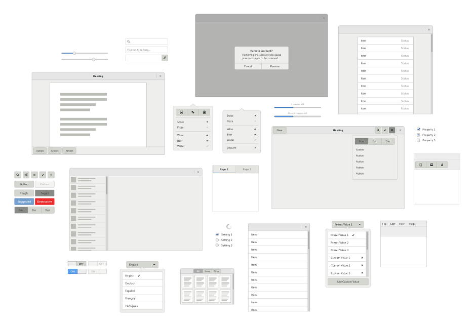
Key design elements

User-facing mechanisms for applications to request access to services and data are one obvious thing that needs to be designed for sandboxed applications. We also need to design how feedback will be given when services are being accessed, and so on.

At the same time, application sandboxing also requires that we design new, enabling features. By definition, sandboxed applications are isolated and can have limited permissions. This represents a challenge, since an isolated application must still be able to function and, as a part of this, it needs (mediated, secure) mechanisms for basic functions, like importing content, or passing content items to other apps. This is the positive aspect of the sandboxing user experience.
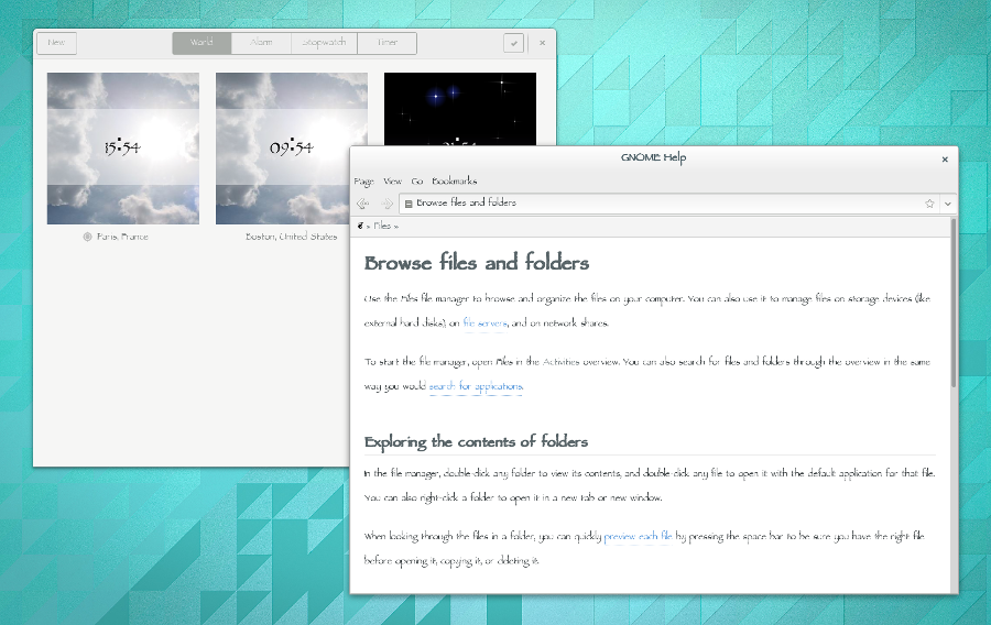
Sharing

Here, sharing is the kind of functionality that is commonly found on mobile platforms. It is a framework which allows a user to pass content items (images, documents, contacts, etc) from one app to another (or to a system service). This is one of the positive, enabling pieces of functionality that we want to implement around application sandboxing.

Sharing is important for sandboxing because it provides a secure way to pass content between applications. It means that persistent access to the user’s files will be less important for many applications.

photos-share-dialog

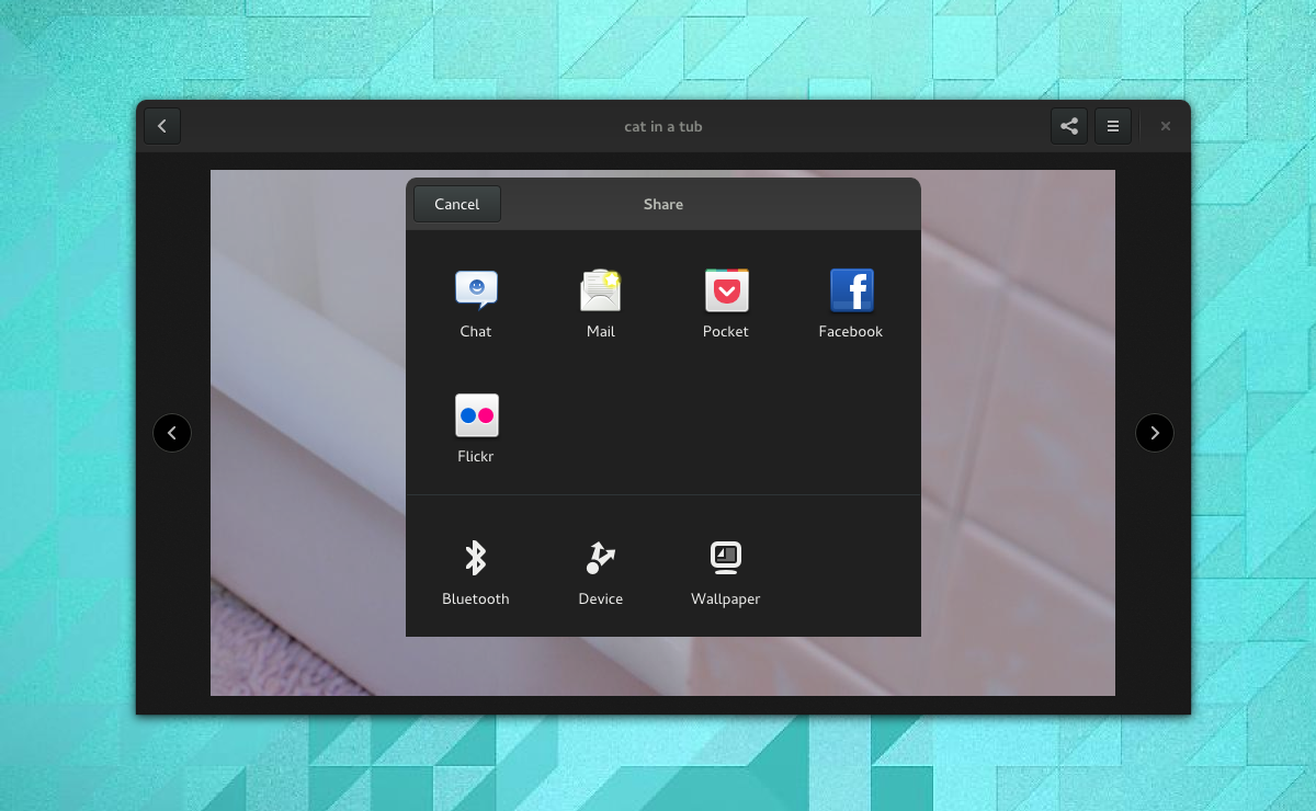
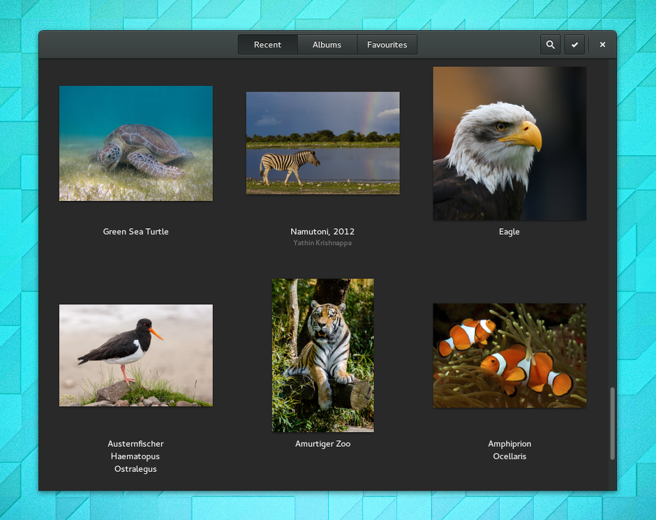
The sharing system is envisaged to work like many others – each application can provide a share action, which passes a content item to the sharing service. The system determines which applications and services are capable of receiving the content item, and presents these as a set of choices to the user.

In the example shown above, an image that is being viewed in Photos is being shared. Other applications that can use this image are then listed in a system-provided dialog window. Notice that online accounts are also able to act as share points in this system, as are system services, like Bluetooth, Device Send (using DLNA), or setting the wallpaper.

Content selection

Content selection plays a similar role to sharing, but in reverse: where sharing allows a user to pass content items from a sandboxed application, content selection is a mechanism that allows them to pull them in.

Content selection has traditionally occurred through the file chooser dialog. There are a number of obvious disadvantages with this approach, of course. First, content items have to be files: you can’t select a contact or a note or an appointment through the file chooser. Second, content items have to be local: content from the cloud cannot be selected.

The traditional file chooser isn’t well-suited to sandboxed applications. Sandboxing implies that applications might not be able to save content to a common location on disk: this means that we need a much more flexible content selection framework.

single-item-selection

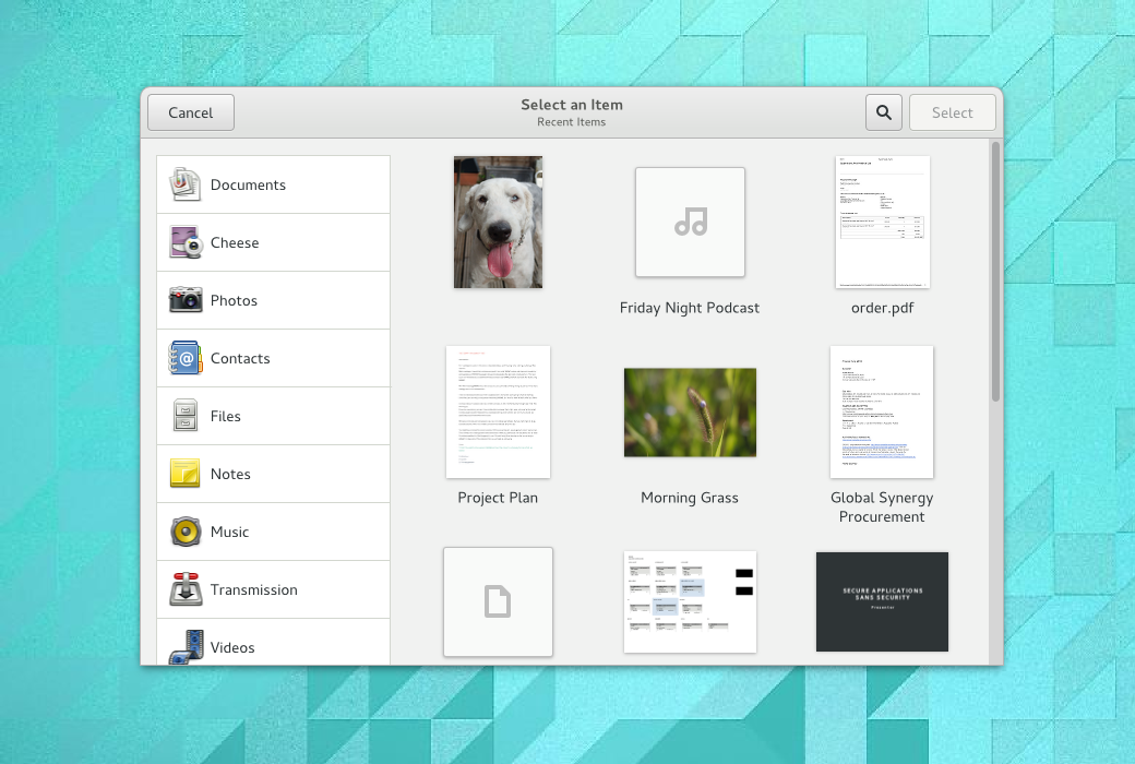
Content selection should enable content from a range of applications to be selected. Content can be filtered by source application, and it can include items that aren’t files and aren’t even stored locally.

System authorisation

Sharing and content selection are intended to provide (system mediated) mechanisms for opening or sending individual content items from sandboxed applications. When access is required to hardware devices (like cameras or microphones), or permanent access is required to the user’s files or data (such as contacts or the calendar), the system needs to check that access is authorised.

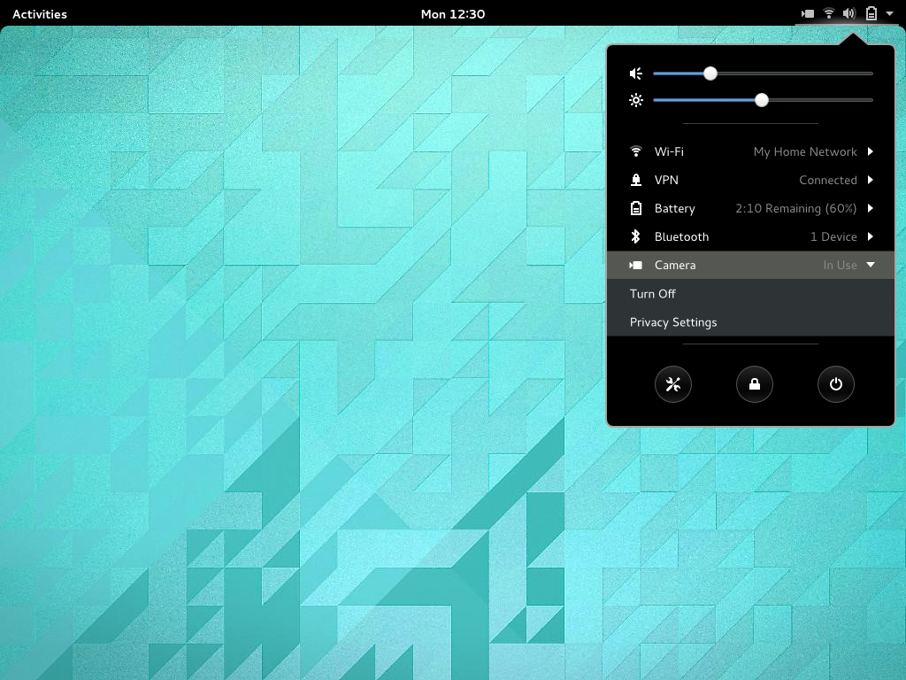
For cases like this, there is little option but to present the user with a direct check – the system needs to present a dialog which asks the user whether the application should have access to the things it wants to have access to. The advantage of posing a direct question at the time of access is that it provides real-time feedback about what an application is attempting to do.

content-access-dialog

camera-access-dialog

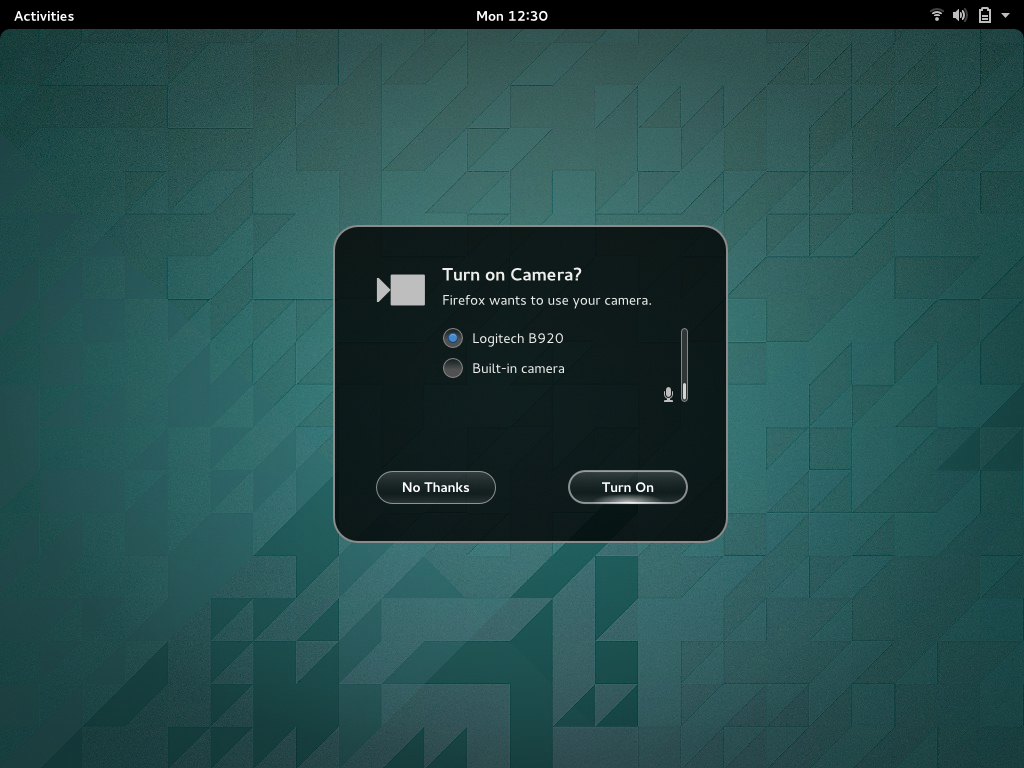
In line with the principles I outlined above, we’re pushing to take the sting out of these dialogs, by phrasing them as relatively friendly/useful questions, rather than as scary security warnings. We’re also exploring ways to make them into useful parts of the user experience, as you can see with the camera example: in this case, the security dialog is also an opportunity to check which microphone the user wants to use, as well as to indicate the input level.

A key requirement for the design is that these access request dialogs feel like they are part of your natural workflow – they shouldn’t be too much of an interruption, and they should feel helpful. One technique we’ll need to use here is to restrict when system authorisation dialogs can be shown, since we don’t want them popping up uninvited. It certainly shouldn’t be possible for an application to pop up an access request while you are using a different application.

Real-time feedback, audit and revocation

system-menu-camera

As I said above, providing real-time feedback about when certain services are being used is one of the goals of the design. Here, we plan to extend the system status area to indicate when cameras, microphones, location and other services and devices are in use by applications.

We also have designs to extend GNOME’s privacy settings, so that you can see which services and content have been accessed by applications. You will be able to restrict access to these different services, and block individual applications from accessing them.

Pulling it all together

One of the things that I’ve tried to demonstrate in this post is that implementing application sandboxing isn’t just about adding security layers to desktop infrastructure. It also requires that we carefully think about what it will be like for people to use these applications, and that security frameworks be designed with user experience in mind.

We need to think beyond security to actually making sandboxing into a positive thing that users and developers want to use. For me, one of the most exciting things about sandxboxing is that it provides the opportunity to add new, powerful features to the GNOME application platform. It can be enabling rather than being a purely restrictive technology.

These designs also show that application sandboxing isn’t just about low-level infrastructure. Work needs to be done across the whole stack in order to make sandboxing a reality. This will require a combined effort that we can all participate in and contribute to. It’s the next step for the Free Software desktop, after all.

The designs that I’ve presented here are in the early stages of development. They will evolve as these initiatives progress, and everyone working in this area will have the opportunity to help develop them with us.