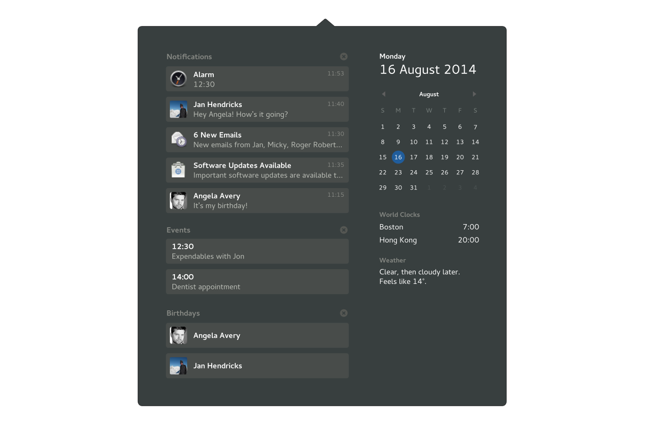
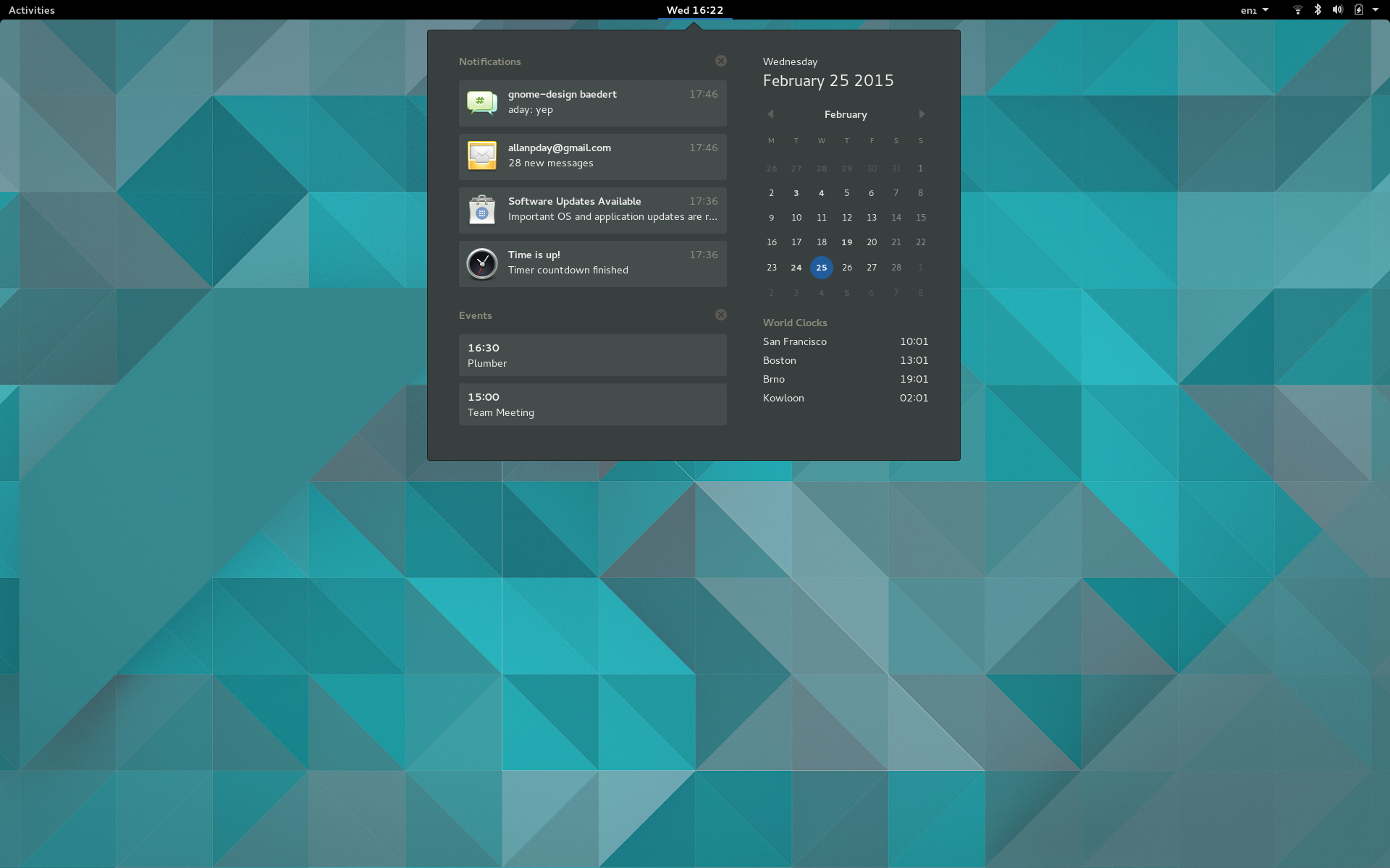
This happened.
It was a big job, and Florian deserves major congratulations for getting it ready (just!) in time.
Credit also needs to go to Jon McCann. If you’ve read my previous posts on the notifications redesign, you’ll know that we’ve gone through a number of different design concepts. In the end, it was Jon who was instrumental in helping us to identify the best approach. He has an amazing clarity of vision, which proved crucial in helping us to give the design a solid conceptual foundation.
The various concepts we have explored as a part of the notifications redesign makes me confident that the approach we have settled on is the right one. It was only with the final design that everything clicked into place, and we were left with a design which effectively avoided the problems found in each of the others.
In the rest of this post, I’ll outline the design’s key features.
“What’s happening?”
One of the key goals for the notifications redesign was to provide an effective way to review previous notifications. In this way, notifications can be used to find out about what has happened in the past, as well as what is happening right now.
With this ability, notifications can be used in an exploratory manner, to get an overview of recent events. This is particularly useful as a way to inform decisions about what to do next. As such, notifications can be a tool for directing our own personal activity.
This recognition informs the new calendar and notifications design. It indicates that notifications have an affinity with other activity-related information – at the moment we ask “what’s happening?”, we are also often implicitly asking, “what should I be doing?”
The new calendar design aims to answer that question in the most effective way possible. It provides a single place where you can find out what has happened, what is happening, and what is about to happen. In concrete terms, this means showing notifications, event and birthday reminders, world clocks and weather information. Notifications take centre stage, while the other information is available for you to fortuitously stumble upon.
All this information is contained in a single view, which means that it is immediately accessible and gives an effective overview.
It’s a time machine
Since they tell us about what has happened in the past, and help us decide what to do in the future, notifications are closely related to time. In accordance with this framing, the new design makes notifications accessible through the time and day indicator in the top bar [1]. All the other information found in the new date and time menu also relates to time – event reminders, birthdays, world times, and the calendar.
The world times section of the date and time menu works through integration with the GNOME Clocks application.
Taking action
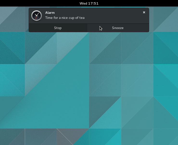
Just like the current GNOME 3 notifications design, the new design incorporates pop up banners that include notification actions. These enable you to quickly respond to a notification in a convenient manner. Built in chat replies have been retained.
The position and appearance of banners has changed though – they now appear towards the top of the screen. This gives them a close relationship with the date and time menu. It also helps to ensure that pop up banners don’t get in the way, which was an issue when banners where at the bottom of the screen.
Keeping it simple
A major goal for the notifications redesign has been to simplify as much as possible. There’s quite a bit of complexity to notifications right now, including different notification types (such as resident and transient notifications), special cases (like music and hot plug notifications), notification properties (including images, action buttons), as well as stacking of notifications within different sources.
This complexity comes at a cost, increasing both the number of bugs and the maintenance burden. With the new design, we are clearing the decks and trying to stick to a single, simple API for virtually all notifications. This will lead to a much lower bug count, as well as easier maintenance.
Plans for the future
The main thing that has still to land for 3.16 is status icon support. We’re still finalising our plans for this, but it will definitely happen, and I’m sure that it will be better than what was in 3.14.
Looking forward to 3.18, there are a number of elements to the design that didn’t make it for 3.16, including music controls (probably based on MPRIS), Weather integration and birthday reminders. These additional elements will make the new design increasingly useful and cohesive, so there is a lot to look forward to. If you want to work on any of these features, just get in touch.

How you can help
The new notifications and calender design landed late in the development cycle, which makes testing vital. If you want to help, the best thing you can do is use GNOME Shell master, and report any bugs that you find.
This is also a good moment to pay attention to the actual notifications themselves. There’s a lot of poor notification usage out there right now [2], as well as obvious examples of things that should have notifications and don’t (completed downloads, anyone?).
If you are responsible for a module or application, take a moment to read over the notifications guidelines, and take a second to check if there are any untapped opportunities for effective notification usage in your software.
The new notifications design will be released next month, as a part of GNOME 3.16. If you want more details about the design or future plans, check out the design page.
[1] This also has some practical advantages, such as communicating that notifications are provided by the system, clearly delineating each section of the top bar, and providing an effective click-target.
[2] Things to look out for: notifications not being dismissed when they are replaced by a new one, application notifications that don’t use the application’s icon, default actions that don’t raise the sender application, notification actions that duplicate the default action (“View” or “Open” buttons are a warning sign of this), notifications being shown by applications while you are using them.


It looks like a nice redesing.
One question regarding the new desing. What about if the events list is, let’s say, too large ?
In the actual desing, I mean the one about date/calendar, it shows the events of today, tomorrow and the entire week. In my case I have it synchronized with a calendar of events in my city and it happens to be too large, exceeding the calendar window.
Anyway, thank you for the effort in improving it :)
With the new design, the initial view only shows events for today. To view events for tomorrow, you have to use the calendar on the right. And if the list is too long to fit on screen, it scrolls. (Radical, I know…)
you are packing it fuller and fuller. Why not having a dashboard with all this information that covers the whole screen?
I have two questions:
(1) Will there be any graphical indicator next to the time in the top bar that shows when I have unprocessed notifications? This always bothered me about the old design, and the redesign would make it so easy to add one.
(2) What is going to happen to old-style tray icons, like e.g. cryptkeeper, which until now where shown in the notification tray? Will they be shown inside the new notification view, or go into the top bar, or be completely unsupported, or…?
Thansk a lot for the good work; Gnome 3 is getting better and better with each release.
Regarding 1, yes it would be easy to add that, although we do have some other competing requirements in that space (like indicating if there are important notifications waiting, or notifications waiting that haven’t been displayed as popups) and, since we haven’t had much time to test, we didn’t want to commit to a design for this at this stage. It’s certainly something that we’ll keep an eye on for 3.18.
As for 2, as I said in the blog post, we’re still working out the details for that. It won’t be long though.
Awesome design. Are there any plans for grouping events? I can easily see chat notifications scrolling away past information where you were away and that could be more important.
Example of the mentioned event:
Security or system notification shows up while you
– are away for some reason
– have IRC client open
When you return all last information that is visible on screen is chat related, since more chat events than can be displayed were following the important system event. Typical user reaction in that case is simply closing all events at once.
It is great to see advancements being made in this area. Many thanks for putting in so much effort by all of you.
Because having no clear indication of received notifications without having perform a manual action first is, in my opinion, the biggest shortcoming of the current (3.14) design I think it’s a shame this issue is not addressed for 3.16 right away.
The new design leaves plenty of possibilities to at least give some form of visual indication. I personally don’t care about numbers nor types of notifications, as long as I know that there is something at all. Even a simple highlight, underline or icon around the clock might do for the time being. All the other fancy extras can be dealt with in the next release.
Having just this as an addition will make the adoption of the new design a lot easier and less criticized (if at all) by the majority of the users I think.
I hope it can still be squeezed in the 3.16 release somehow. Otherwise it’s fingers crossed for a possible Shell extension.
I’d like to see Gnome support the same “indicator” API as Ubuntu and (I believe) KDE Plasma. It doesn’t depend on X and will be widely supported by 3rd-party apps, thanks to Ubuntu and Plasma’s joint popularity. We could make it a Linux-wide standard, like the notifications API.
I’d like to see indicator menus applied to the app’s icon in Gnome’s dash (the launcher in the Activities overview). I should be able to get to Transmission’s menu by right-clicking (or long-pressing) Transmission’s launcher icon.
If an indicator provides a status icon (which Ubuntu would use in its top bar), we could apply that to the app icon as an emblem.
If there is an indicator for an app that doesn’t have an open window and isn’t a favourite, show it in the dash anyway.
If we can’t identify which app the indicator comes from, append the indicator as an extra icon in the dash.
I’ve seen news on this new notification system in a couple sites… one thing that bugged me is that apparently there is no indication of how many notifications without actions are queued inside the calendar… how does it work ?
In a scenario that Im busy focusing on a document and I simply skip all the notifications for lets say… 10 mins. After this 10 mins Im back, is there an indicator somewhere that reminds me of taking action on 5 or 10 pending notifications ? or will I just get a surprise when I open the calendar ?
Nice job!, the notifications look much better not, but…
“””The position and appearance of banners has changed though – they now appear towards the top of the screen. This gives them a close relationship with the date and time menu. It also helps to ensure that pop up banners don’t get in the way, which was an issue when banners where at the bottom of the screen.”””
I am not sold on this. I think is quite the opposite. Having the banners appear at the top of the screen will be more disruptive as is where the application controls are.
As a part of the design process, I spent quite a bit of time testing different positions for notification banners, so I can say that the new placement doesn’t seem disruptive in my experience. It is certainly less disruptive than having notifications in the top right of the screen.
Hi,
cool that this got ready!
However I do have two issues with the kind the notification pops up now:
* It seems to be more disruptive than before, distracting me from the work I want to do.
* It could be more clearly tied to the the date and time menu, thus be even more intuitive.
These things didn’t appear in the design goals back then in http://blogs.gnome.org/aday/2014/06/05/notify-me/ and I think they deserve a bit more attention. (Sorry about bringing this up so late.)
There was a very interesting concept which realized these goals better than this design:
https://wiki.gnome.org/Design/OS/Notifications/CalendarExperiment
However it lacked what was done very well here – the calendar/notification menu. It also would need refinement for notifications with actions – however I can imagine a combination of the current design and the CalendarExperiment to be quite useful when e.g. using the noninterruptive notification for non-urgent notifications. (For urgent ones this design is very good!)
Anyway, it’s great that you all managed to land this for 3.16! It’s a major improvement and I can’t wait to get it.
Cheers,
Lasse
The calendar experiment was cool, and we tried to make it work, but we discovered issues with it…
* As you’ve indicated, it is quite awkward to transition from the initial banner state to show additional information and actions.
* Difficult to show urgent notifications when an application is running in full screen (since you don’t have a visible top bar to show them in).
* Hard to show icons in notification banners.
* Impossible to access the calendar drop down while a banner is being displayed.
* Limited screen width would make it hard to show banners on some devices, particularly with portrait displays.
Love it!
The association of notification with the date, time & calendar makes a lot of sense — one of those designs that seems obvious in hindsight.
I’m looking forward to seeing the design for a notification reminder/counter/bell or whatever it will be will look in 3.18.
Thank you for helping make this happen!
How about the shortcuts to open Clocks and Calendar (launching the new gnome-calendar, perhaps)?
You can click through to Clocks and your calendar application – it should be clear when you try it.
“Built in chat replies have been retained.”
can you say more on this please?
I’ve had chance to try this out now. 2 things I noticed:
1.
If a notification appears while I’m away, it doesn’t disappear until I start using the computer again. This was one of the most useful parts of the old notification system and I’m glad it hasn’t changed.
2.
If my mouse is already at the top of the screen, new notifications can appear under the pointer. Try setting an alarm using Clocks, then switching between views in System Monitor while it’s maximised.
I’ve seen designs where new notifications “peek out” rather than appearing under the pointer. I think this would make the notifications much less obtrusive, especially now they’re in a more prominent position. If we can’t achieve the “peek” effect, I think as a stop-gap we should make it so that notifications simply don’t appear while the mouse is in their territory.
I’m eager to use the new notification system, looks great!
One question though, is it still possible to disable the notifications? I don’t see an on/off switch in the screenshots.
Yes and no. The switch is gone, mostly because there was no immediately obvious place to expose the functionality. But we have left the door open to bring it back in the future, it will just require some thinking. The notification system itself still respects the BUSY session presence:
$ gdbus call –session –dest org.gnome.SessionManager
–object-path /org/gnome/SessionManager/Presence
–method org.gnome.SessionManager.Presence.SetStatus 2 # mark as busy
$ gdbus call –session –dest org.gnome.SessionManager
–object-path /org/gnome/SessionManager/Presence
–method org.gnome.SessionManager.Presence.SetStatus 0 # mark as available
will do what the switch used to do. Not ideal, but there’s the somewhat-similar notification switch in Settings, and extensions can of course trivially bring back some UI for this …
How can I test gnome 3.15.xx? Is there a live image available, unlike fedora 22 alpha which are mostly broken?
Hello allan, just out of curiosity, why did the notification concept of message drawer was discarded? Are there any disavantages for that over the current design? After all it seemed to be closer to the original gnome 3 design goals. Personally I feel that it looks nicer than the current design.