This is the third in my series of blog posts about the latest generation of GNOME application designs. In this post, I’m going to talk about Photos. Out of the applications I’ve covered, this is the one that has the most new design work.
One of the unique things about Photos is that it has been built from the ground up with cloud integration in mind. This means that you can use it to view photos from Facebook, Google or Flickr, as well as the images on your local machine. This is incredibly important for the future of the app, and is something we’d like to build on.
Until recently, we’ve focused on getting Photos into shape as a storage-agnostic Photo viewer and organiser. Now that it has matured in these areas, we’ve begun the process of filling out its feature set.
Editing
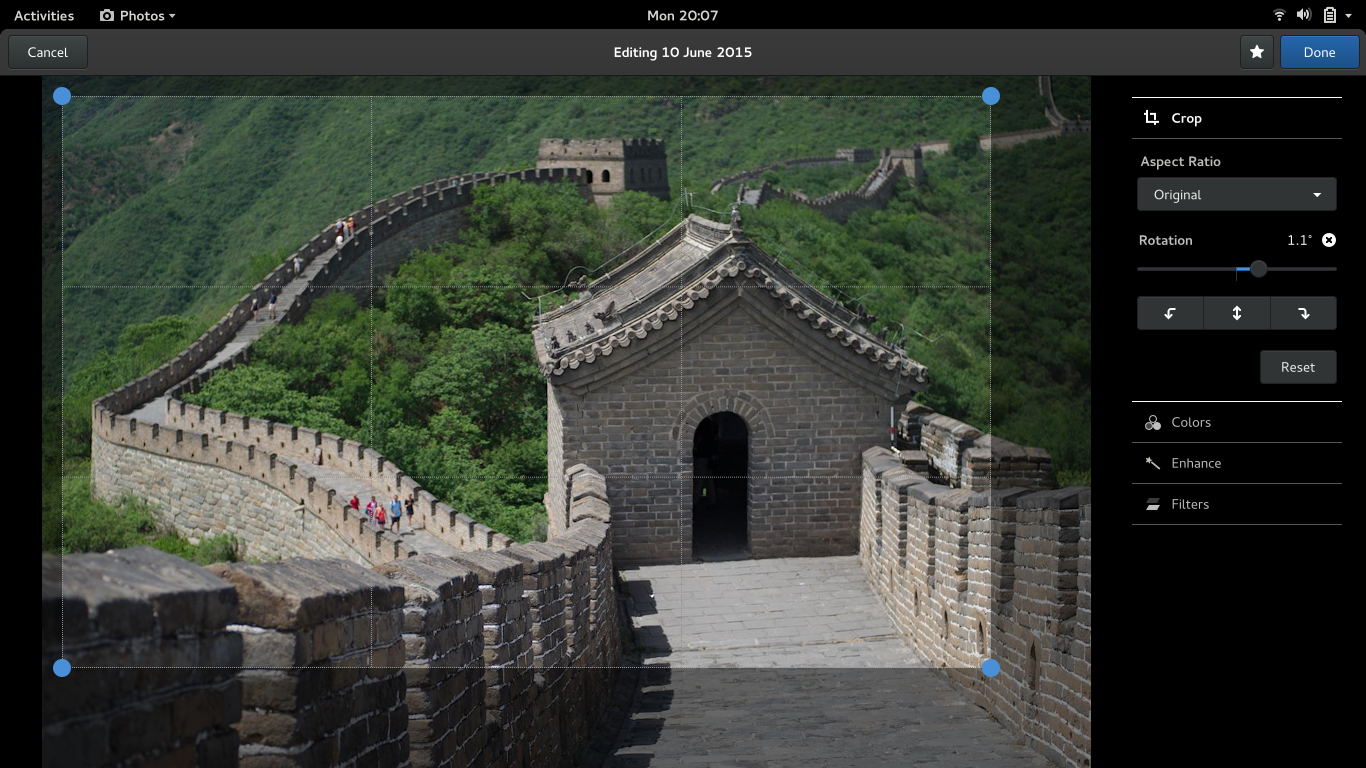
I’m starting with editing because work in this area is already happening. Photos uses GEGL, the GIMP’s next generation image processing framework, which means that there’s a lot of power under the hood. Debarshi has been (understandably) keen to make use of this for image editing.
For the design of Photos, we’re following one of the design principles drawn up by Jon for GNOME Shell: “design a self-teaching interface for beginners, and an efficient interface for advanced users, but optimize for intermediates”. This can be seen in the designs for photo editing: they are simple and straightforward if you are new to photo editing, but there’s also enough in there to satisfy those who know a few tricks.
We’re also following the other principles of GNOME 3 design: reducing the amount of work the user has to do, preventing mistakes where possible (and allowing them to be easily reversed when they do happen), prioritising the display of content, and using transitions effectively.
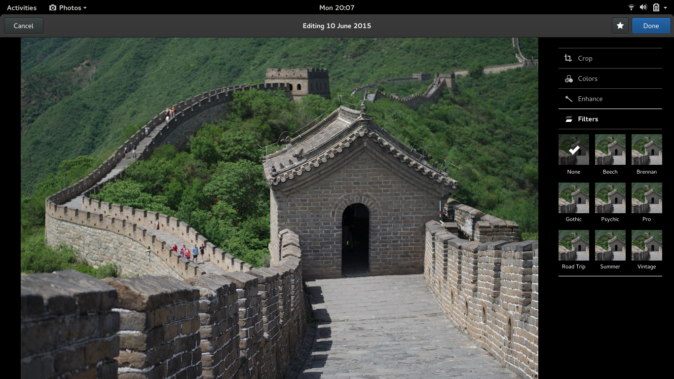
The designs organise the different editing tools according to a logical workflow: crop, fix colours (brightness, contrast, saturation, etc), check sharpeness, and finally apply effects.
We also want editing to feel smooth and seamless, and are focusing on getting the transitions right. To that end, Jakub has been working on motion mockups.
https://youtube.com/watch?v=F3_e24QHzfI
There’s already a branch with Debarshi’s editing work on it, for those who want to give it a try. The usual caveat applies: this is work in progress.
Import
As I mentioned, Photos already has cloud support. This solves the problem of getting photos into the Photos app for many people – if you are shooting with an Android phone, images can be synced to the cloud and will magically appear in GNOME.
However, if you are one of those old-fashioned types who shoots with an actual camera, you have to manually copy images over from the device, and this is labour intensive and error prone. We want a much more convenient and seamless experience for getting images from these devices onto your computer.
The initial designs for importing photos from a device are deliberately simple: generally speaking, all it should take is a single click to import new shots.
One important aspect of this design is that we want it to be error-proof. There’s nothing worse than realising that you forgot to copy over images and then blanked the SD card they were stored on – we want to prevent this from happening by shifting responsibility for maintaining the photo collection to the app.
Sharing
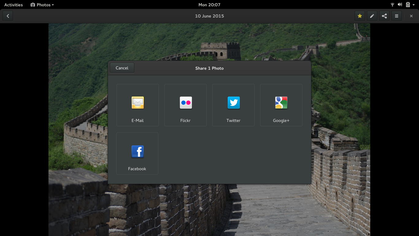
Sharing is critical for a photos app, since sharing is often the primary reason we take a picture in the first place. It can take place through various means, including showing slideshows, but social media is obviously critical.
There are plans to equip GNOME with a system-wide sharing framework, which will allow posting to social media, and we’d like Photos to take advantage of that. However, sharing is so important for Photos that we don’t want to wait around for system-wide sharing to become available.
There are also wireframes and a bug report.
General improvements
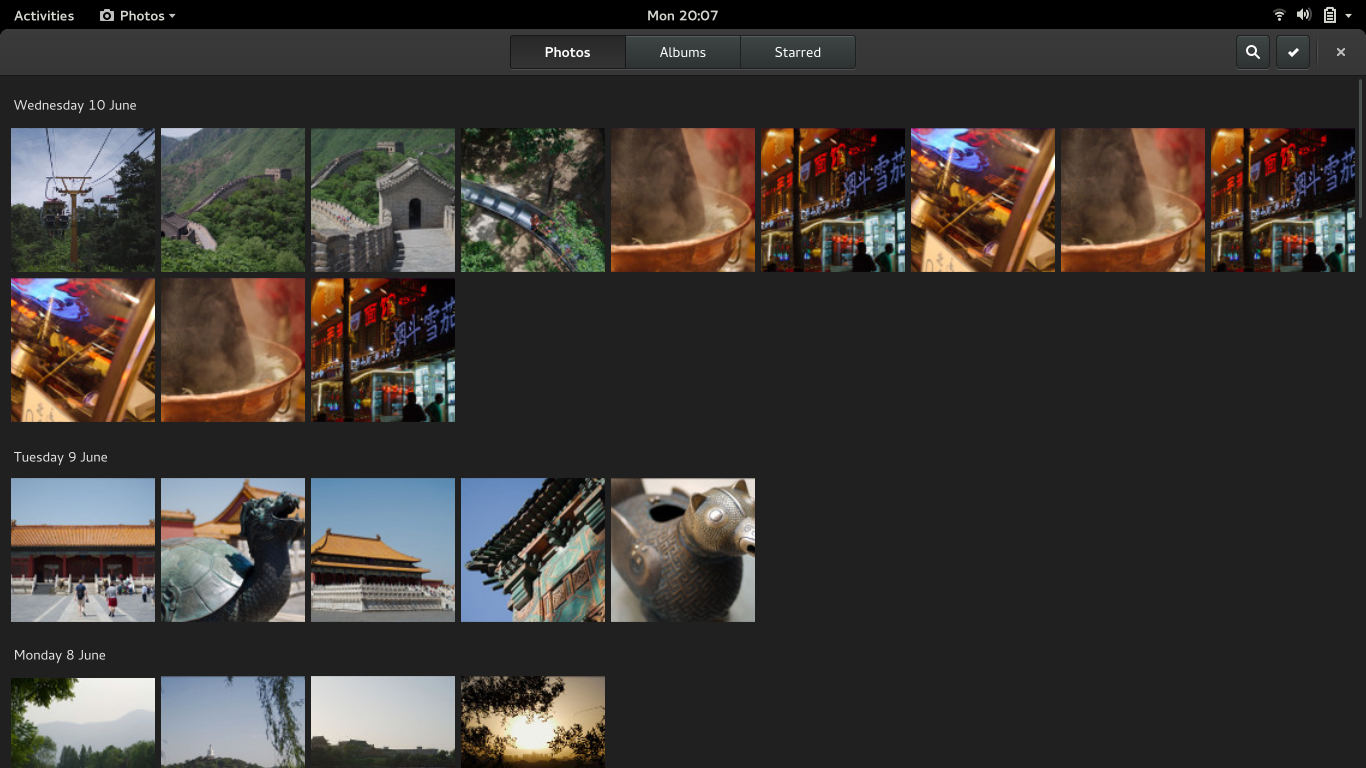
Aside from big new features like editing, import and sharing, we have other changes planned. The first is an improved photos timeline view:
The main changes here are the addition of date headings, switching to square thumbnails, and hiding image titles. This is all intended to give you a less cluttered view of your photos, as well as clearer markers for navigation.
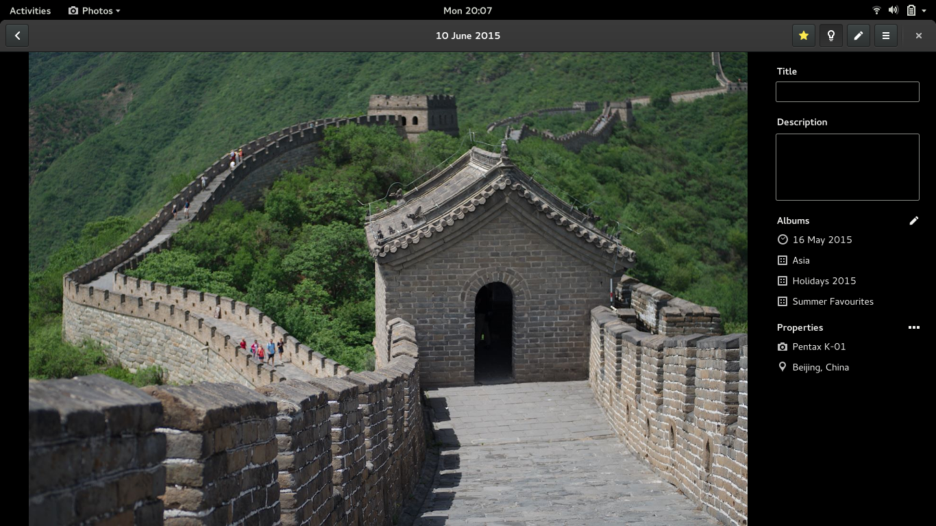
Another change that we have planned is a details sidebar. This is intended to provide a kind of organising mode, in which you can go through a series of photos and give them titles and descriptions, or assign them to different albums.
How to help
There’s already some cool work happening in Photos, and I’m pretty excited about the plans we have. If you want to help or get involved, there’s plenty to be done, but everything is clearly organised.
Bugs have been filed for all the new features and changes that I’ve mentioned in this post, and each one links to the relevant designs and mockups – you can find them listed on the Photos roadmap page.
Also, Debarshi (the photos maintainer), is happy to review patches, and Jakub and I are available for design discussion and review.
What I’m missing is the use of the GPS information, every modern Smartphone saves into images. Wouldn’t that make it e.g. easy to sort the images by location.
Hey Tobias. Yes, that’s definitely something we want to do! We were also thinking about ways to manually mark the location for images that don’t have GPS data.
Will it be also possible to import pictures using Years/Months/Days folder fashion similar to Shotwell either optional or by default?
In addition, when it comes to editing pictures, will be non-destructive and only export the change as desired by the user?
Editing will be completely non-destructive. We won’t touch the original unless explicitly told to. That is one of the big reasons for using GEGL.
Glad to hear that. As a maintainer of Design Suite spin, I am aiming to switch to Photos by default instead of Shotwell.
I’d be interested in how easy in might be to hack together some sort of metadata editor. Kind of like what geeqie has…
A few months ago I did a modification to that application, organizing the various metadata fields into Who, What, Where, When.
https://pbs.twimg.com/media/CA3b6WuVAAAElYK.png:large
That work is based on Metadata Working Group guidelines.
http://www.metadataworkinggroup.org/pdf/mwg_guidance.pdf#page=11
How easy would it be to do this in Photos?
Hi Alan, good to see the progresses made in Photos. I am looking forward to try this new version.
I like the square thumbnails, but it would be good if, when one moves the mouse over one square thumbnail, the remaining parts of the image are also shown.
Great new features for Photos. Will editing include an easy tool for red eye removal? And what about editing EXIF data?
That’s definitely something we’re considering. The mockups are for a basic set of features; we’ll build up from there.
What about shotwell?
Isn’t shotwell doing the same things in GNOME environment?
Shotwell and Photos are fairly different, I’d say. First and foremost, Photos is designed to integrate with cloud storage. It’s also fairly different in terms of its design language (which is deliberately consistent with the rest of the GNOME 3 apps) though.
Hi, I want to know what exactly will the import from the camera do. All the photo management apps fail to communicate what they mean by import from the camera, so I was always afraid to use this feature. And I consider myself an advanced user.
Let me explain. Both me and my family have never used things like the automatic photo importing from the camera (both in Linux and Windows apps) because we never knew what it’s gonna do exactly. We were afraid photos would be moved from the camera to some unknown location on our PC. Or they would be copied somewhere. Or perhaps the app will only take note of them and leave them on the camera. That’s why we always manually copy them to two external drives and put them into folders named like “2015-07-05 Dad’s birthday”. And only use the “import from folder” feature if we are sure it will leave the photos where they are.
TL;DR: please make the import feature explain what it’s gonna do _exactly_.
Hi Allan,
Thanks for this post. I’m “old fashion”, I use a real camera and manage my photos with some Gnome tools.
Currently, to me, the best photos manager is gThumb for various reasons, but here are a some:
– gThumb doesn’t use a database, only XML files which is really easy to backup,
– There is clear split between the physical organisation (the way photos are stored on the disk) and the logical organisation (albums, etc). And this is really great.
– The gThumb interface is pretty and efficient, a bit as you describe in this post.
– The gThumb search capabilities are just incredible!
I don’t know if there are some room to work with gThumb team, or to get some gThumb code into Gnome Photos, but that would be cool to retrieve some of those lovely features.
As it has already been mentioned in a previous comment, import should propose a way to provide the structure we want before the import actually occurs (YYYY-MM-DD, YYYY/MM-DD, etc).
Thanks.
Will we be able to import images from our ownCloud service?
Hi,
Is this the old Eye Of Gnome? The designs look nice. One wish though. I’m working with a lot with screenshots. For them a “zoom to original size” function is very important. Some time ago this has been removed with one of the recent UI overhauls. Please bring it back, either as a shortcut or as a dedicated button next to the zoom slider. Either would be fine for me, though I guess a button would be more in line of the “easy to find out” philosophy of gnome.
Thanks, Dennis
No, this isn’t Eye of GNOME. (Zoom to original size is still available there – just press 1. We are adding this to the new view slider for 3.18 – see https://bugzilla.gnome.org/show_bug.cgi?id=746132)