3.10 Reflections

GNOME 3.10 was released last week. A lot of hard work went into it (I know I felt pretty exhausted by the end), but I think that it was worth it. We ended up with an excellent release.

window-selection-3.10

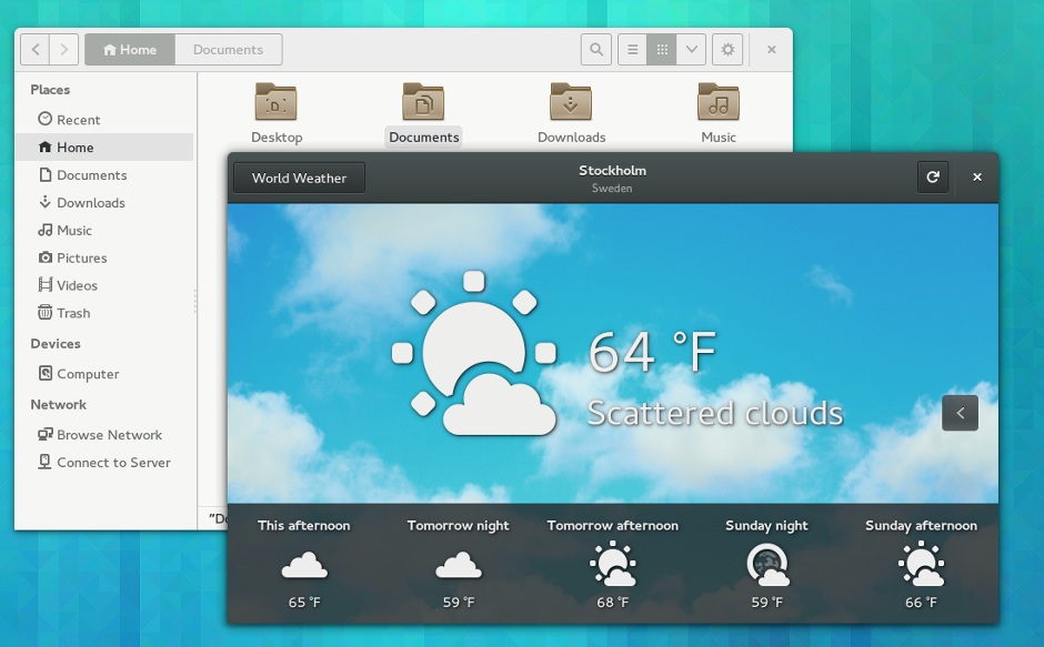
I’ve been using bits and pieces of 3.10 for some time, and completely adopted it (through Fedora 20) about a week ago. It feels like some important aspects of the GNOME 3 experience have started to fall into place with the latest release. Most obviously, we have quite a few new applications, which fill gaps in the core application set. We are also seeing the application design patterns starting to mature. The addition of header bars makes a fantastic difference.

gnome-music

Header Bars

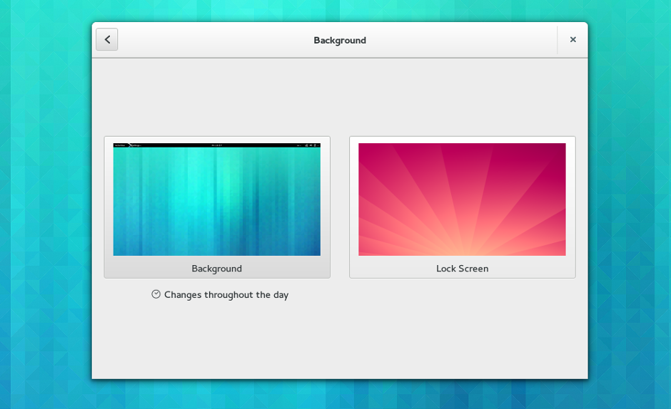
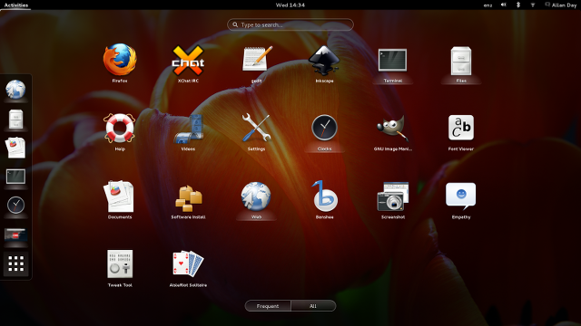
This release also includes some new things which have been planned for a long time, and which round out features that we released in previous versions. Lock screen customisation is one of these, as is the updated application launching view, both of which feel great.

lock-screen

Another exciting thing that happened for 3.10 is that our efforts to modernise the toolkit have started to bear fruit. GTK+ 3.10 has a whole collection of new widgets which will enable developers to make better applications, and should also reduce the amount of work that they have to do. I really hope that this trend continues with even more new widgets and improvements to the developer experience.

GNOME 3 is already in good shape, but as each release comes by, so the vision as a whole takes another step towards realisation. When that finally happens, I think we’ll achieve a qualitative shift in the kind of experience that we’re able to offer. 3.10 is a strong indication that GNOME is making good progress towards that goal, and is a taste of what is to come. Exciting times.

Feature Focus: GNOME 3’s New System Status Area

GNOME 3.10 isn’t far off, and there’s a lot of cool new stuff coming. One of the most visible changes in this release is the new System Status Area. For 3.10 we have reworked this part of the shell, and in this post I’m going to give a bit of background on the process involved in designing and implementing it.

The System Status Area is our term for the section on the right hand side of the GNOME 3 top bar. This is the place where icons indicate how much battery you have left and the strength of your wi-fi network, and so on. It is here that you can also perform basic system-level actions, like powering off. One of the long-standing design goals for this part of the top bar is to consistently use it for system-level status and actions. This makes the area predictable and ensures a clean separation between applications and system.

During the 3.x GNOME series, the System Status Area received quite a lot of work as we sought to refine and mature the original design that was introduced in 3.0. These iterative changes definitely improved this part of GNOME 3. At the same time, the basic design didn’t change a huge amount and was quite similar to what we had in the GNOME 2 days: a series of small icons, each with a menu attached to them. Each icon represented a different aspect of system status (battery, wi-fi-, bluetooth, etc), and the corresponding menu provided actions that you could take in that area.
Continue reading Feature Focus: GNOME 3’s New System Status Area

Things I’ve been doing

I’ve been a bit quiet on the blogging front recently. That’s basically because this cycle has been incredibly busy. There’s been a huge demand for design work from our developers, and keeping up has taken a lot of my time. This is all great of course, and I’m really happy to be busy making sure that everyone has all the design guidance that they need.

Since things are kind of crazy right now, and since there is so much new design work, I’m not going to cover the new designs in a huge amount of detail. Instead, I offer you a list of the things I have been working on recently, along with links to additional resources.

Things I’ve been doing:

Continue reading Things I’ve been doing

Design Goings On

The GNOME 3.8 release kept me pretty busy. In the run up to UI freeze I was focusing on tracking bugs, providing guidance and testing. Then it was marketing time, and I was spending all my time writing the release notes as well as some of the website. (Kudos to the marketing team for a great 3.8 release, btw.)

With 3.8 behind me, I’ve been able to turn back to some good honest design work. I’ve been looking at quite a few aspects of GNOME 3, including Settings and GNOME Shell. However, in this post I am going to focus on some of the application design activities that I have been involved in recently. One of the nice things here is that I have found the opportunity to fill in some gaps and pay some attention to some of the long-lost applications that are in need of design love.

Contacts

I haven’t blogged about Contacts for a while. 3.8 was a great release for the application though, mostly thanks to some fantastic work by Erick PĂ©rez Castellanos. We got a new editing UI and a new selection mode, as well as a new linked accounts dialog. Along the way many of the most prominent usability bugs were fixed. Thanks to Erick for making this happen.
Continue reading Design Goings On

Taking GNOME 3 to the next level (again)

GNOME 3 is making major progress with each and every release. Six months ago, when 3.6 was close to release, I wrote about how excited I was about the improvements that were on their way. That release was a big step up from the previous version in terms of user experience. Now we’re on the cusp of GNOME 3.8, and I find myself in exactly the same position. Testing GNOME 3.8, it is a huge improvement on 3.6. It’s more effective, satisfying and polished. Basic operations like selecting a window or launching an application have seen major improvements and the overall experience feels like yet another upgrade.

The pace of change that we are managing to achieve within the 3.x series is impressive, and is a credit to the hard work and dedication of the GNOME community. In this post I’m going to describe some of the new GNOME 3.8 features that I’m particularly excited about, with a bias towards things that I’ve been involved in. I’ll also try to give a bit of background on the designs of each of these features. As always, you’ll have to wait for the release notes to find out everything that has been improved.

New applications view

Frequently Used Applications

This is one of the most noticeably changes included in GNOME 3.8. With previous versions, if you wanted to launch an application from the Activities Overview, you were confronted with a big grid containing all your application launchers. This could often be a bit overwhelming, and finding the application that you wanted was difficult.
Continue reading Taking GNOME 3 to the next level (again)