I’ve been a bit quiet on the blogging front recently. That’s basically because this cycle has been incredibly busy. There’s been a huge demand for design work from our developers, and keeping up has taken a lot of my time. This is all great of course, and I’m really happy to be busy making sure that everyone has all the design guidance that they need.
Since things are kind of crazy right now, and since there is so much new design work, I’m not going to cover the new designs in a huge amount of detail. Instead, I offer you a list of the things I have been working on recently, along with links to additional resources.
Things I’ve been doing:
- Documenting the GNOME Shell notifications design
- Developing the combined system status menu that Jasper is working on (now up to version four!)
- Specifications for a new GTK+ progress spinner
- New Software designs, including updated hi-resolution mockups and a set of wireframes
- Updated Add User designs for Settings
- Updated Search Settings designs
- A new design for a time zone selection widget (to be used in the new Time & Date settings, Initial Setup and Clocks)
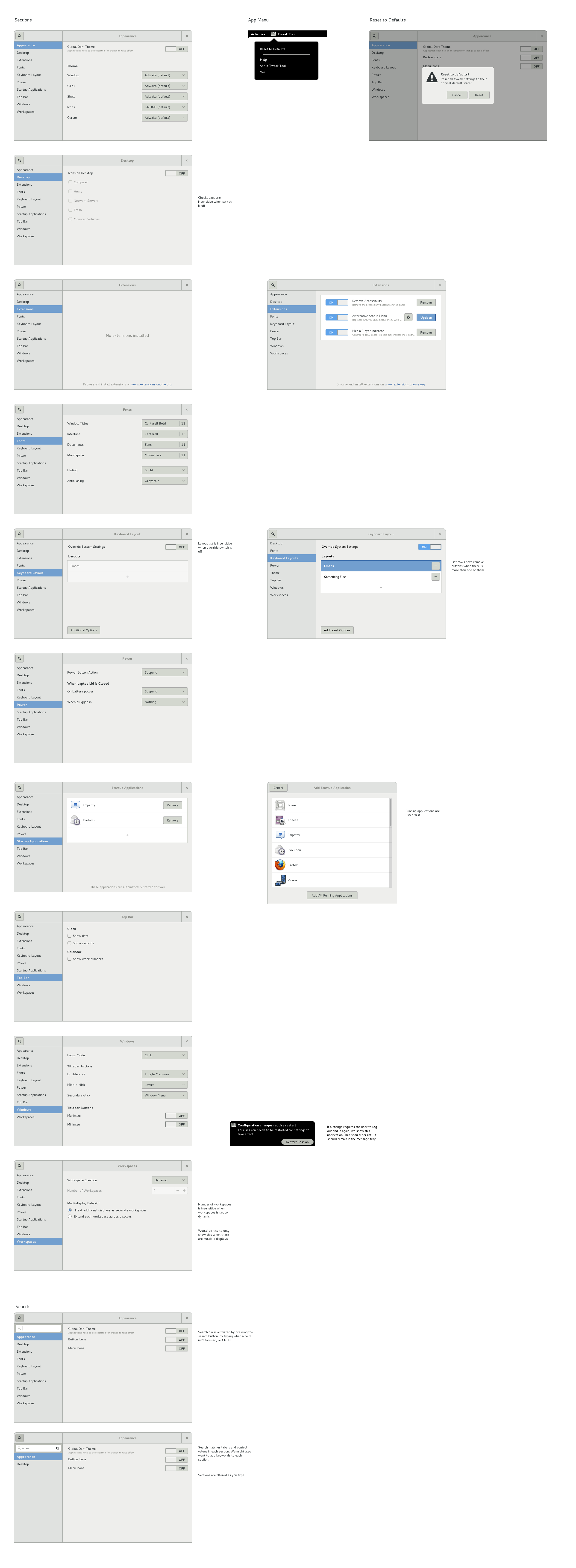
- A fresh Tweak Tool design
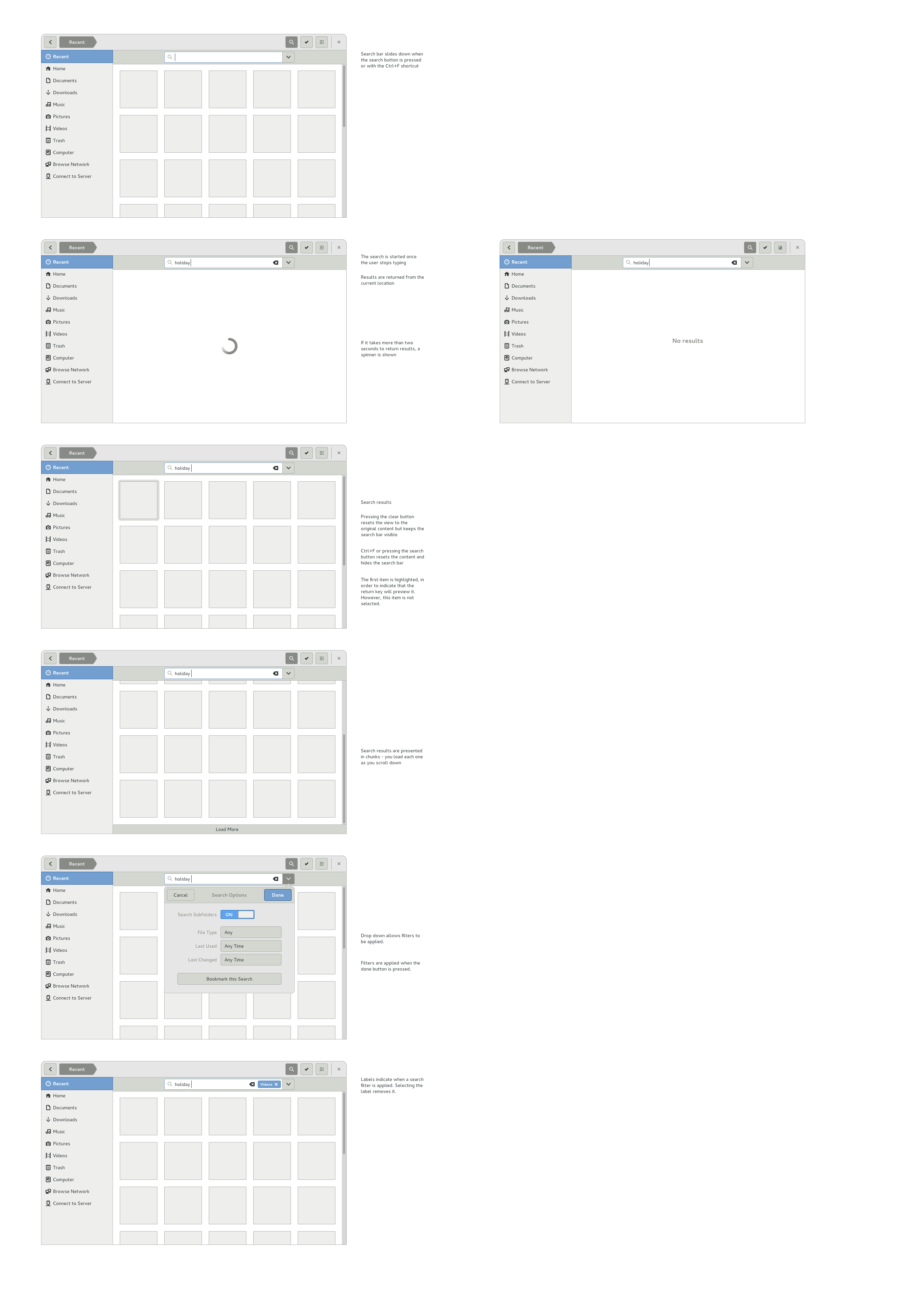
- Wireframes for search in Files
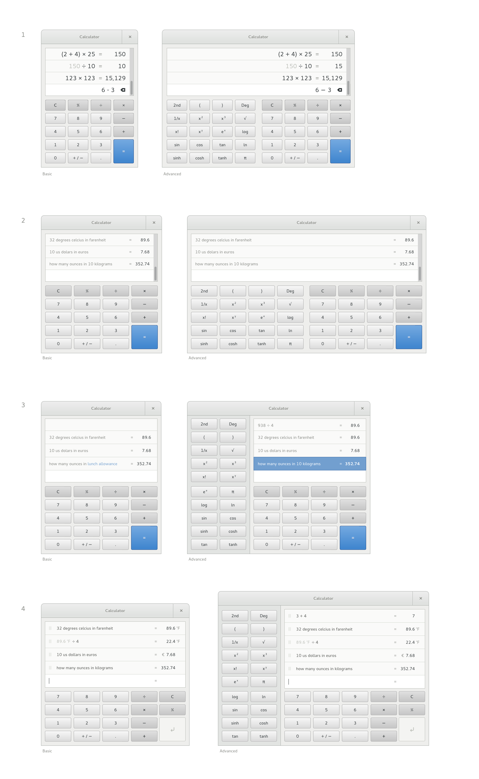
- New Calculator mockups
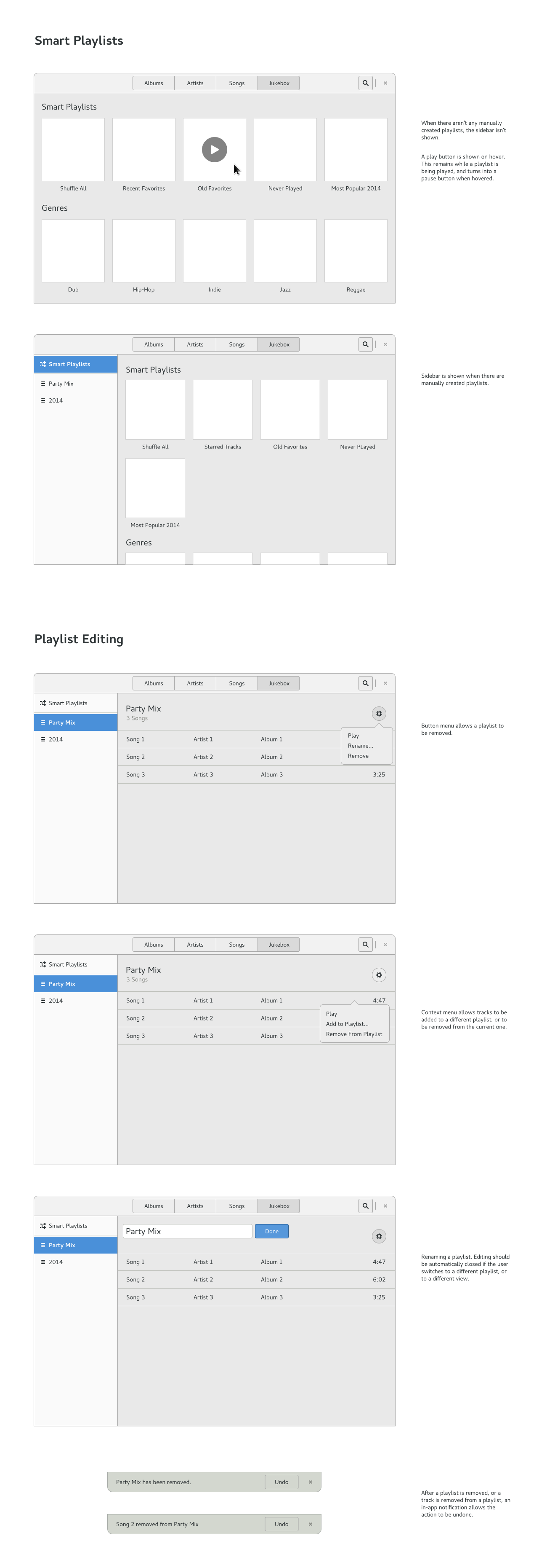
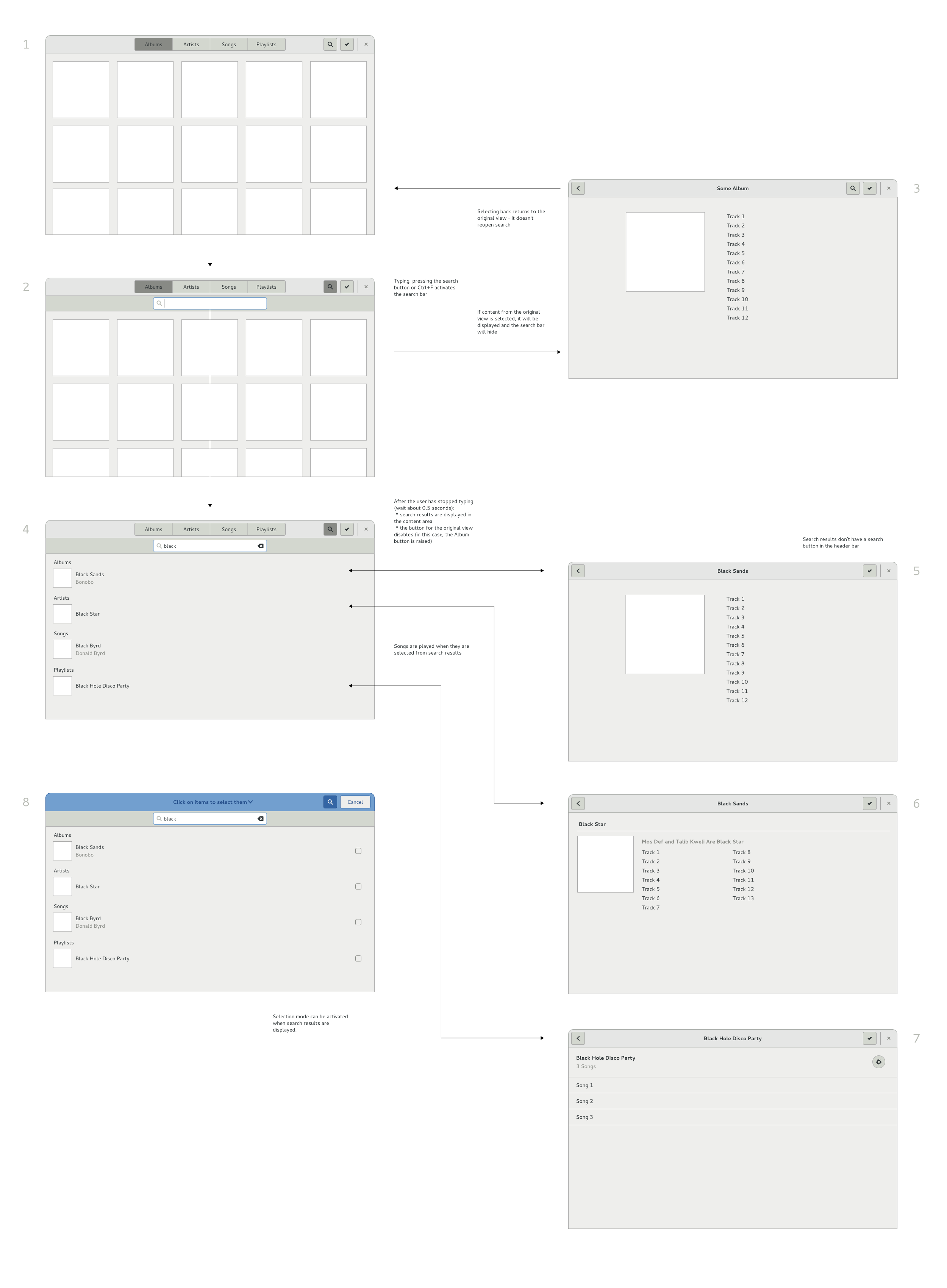
- Wireframes for Music, in particular Playlists and Search
- Wireframes for geolocation support in Clocks
- New designs for Displays Settings
- Experiments for a new GTK+ tab widget
- Layout guidance for the GNOME Shell login screen
- A new iteration of the new avatar selection widget (to be used in Settings, Initial Setup and Contacts)
Most of this work consists of wireframes, but there are some hi-resolution mockups. Here’s what the current Software design looks like:

The Calculator design is still work in progress, but this is how I’m currently imagining it:

And these are some of the many experiments that have been done in the attempt to design a new tab widget:

As with all of our design work, all these mockups and designs are freely available, including all the source files – so you can easily play around with them yourself.
I’m really looking forward to GUADEC this year, and will be around to talk about any of this design work. If you are working on implementing these designs, please come over and say hi, and ask any questions you might have (although I hope you will have done that already!)
About the tabs, I think that it is better when the selected tab is connected to the tab’s content.
(Like here: http://upload.wikimedia.org/wikipedia/commons/8/86/Gedit_tab_example.png )
The other way around (upper right and lower left here) looks wrong to me. It’s like having a pressed button that would de-press when clicked.
The tabs are part of the chrome of the application, which is to be kept minimal. They either blend well with the chrome of the application or just stand out too much on their own, which is the case in the screenshot you linked imo. In that screen you have three clear layers in addition to the document, the menubar/titlebar, the toolbar and the tabs bar. The goal should be to make it look like a single thing.
From the mock-ups listed I like the one in the first row, right column & third row, left column from a purely aesthetic point of view.
I also think tabbed applications shouldn’t need their own titlebar like the Terminal mock-ups indicate – no need to have “angela@monster-box:~” twice on every window. Getting rid of that duplication is one of the best things about CSD, and my favorite thing about Google Chrome’s UI when it first came out.
I quite like the look of the designs you picked out, with their title bars. However, you mentioned getting rid of the duplicate information in the title bar by following Chrome’s example, and I just wanted to point out that not everyone feels the same way about it.
You call it duplicate information, however that assumes that the title of the terminal (or website) is of a fixed length and that all of the information you need to see will be visible even if the text does not fit.
So yes, get rid of the duplicate information, but please have a think about how best to make that information available with as little hassle as possible.
Agreed; tabs make so much more sense, visually and metaphorically, when connected to the content.
Awesome stuff but I’m a fan of going tabless http://blogs.igalia.com/femorandeira/2013/01/29/a-few-more-ideas-for-web-navigation-and-a-talk-at-fosdem/
I wonder if this could be applied to all scenarios.
I still find those tabless ideas really interesting, and tabs do have quite a few drawbacks. That said, I think I’ve accepted that it is hard to find a superior solution for web browsing. :)
When I look at https://wiki.gnome.org/GnomeOS/Design/Whiteboards/Notifications , is it really intended that people can read my xchat messages on a locked screen? I wouldn’t be a fan of that.
That is somewhat dependent on how XChat does its notifications. Right now it includes the message in the notification title (which is what you see in the mockup), which is what we want to display on the lock screen (otherwise you end up with repetitive and generic messages). So one solution would be to change the XChat behaviour so it only includes the message in the notification body.
We do of course provide notification settings so you can configure these things, including whether an app displays notifications on the lock screen. Inconsistent application behaviour is one reason why those configuration options are necessary.
Hi there,
nice work there.
But I am not a big fan of tabs, because they feel inconsistent and redundant somehow. It just doesn’t feel right so I disable them (to gain space) or don’t use them most of the time.
For me tabs are just a way to go around the window managment of the shell. I find it so anoying when there are tabs open in the browser and I switch through multiple windows but then can’t see which one has the tab I need. Some for other application. This brought me to not using tabs but windows and let the shell manage my windows. I can find things more quickly, although the list if windows is often much longer.
It would be great to see a design that relies on window groups instead of tabs. I could put windows in groups so they move together and are grouped like cards behind each other (similar to tabs) but could also quickly realign to have them side by side for example. Same for moving to other desktops for example.
In my mind It’s somehow like a folder with loose sheets in it. I can flip through quickly and if needed open the folder and have two or more pages side by side.
There surely must be more flexibilty when not using tabs and leaving it to the shell to manage the windows. And if it is only implemented as tabs on top of the window for a first step but letting gnome-shell manage it instead of the application itself to gain consistency.
I know I don’t follow the mainstream – and thats okay for me :)
Cheers,
Michael
Does the nautilus search mockup mean that we will get back proper typeahead in nautilus instead of the currently infuriating behavior?
Thanks for sharing!
I wanted to add some comments about some of the mockups that are on github from a documentation point of view, but I can’t find the whiteboard pages or similar for some of them. Any chance you could point me in the right direction? Thanks!
Hey Kat, which mockups in particular?
In almost all of those tab mockups, it’s actually hard to be certain which tab is the current one – whether the one with the depressed look (like a pushed button) is active, or inactive. Having at least three tabs in the screenshots would help that, but it *does* suggest that your styling is unclear (possibly because, as Zen said, they’re disconnected from the content).
A question, though – why the need to change the tab look? The current one works pretty well…
I think the current one looks pretty bad. The angled lines around their extremes look pretty bad even with antialising, it doesn’t fit with the overall softness of Adwaita and Cantarell, and that blue line on top is a straight callback to Windows XP. It looks specially worse in Epiphany where it almost never fits with the current page, and it never blends well with the progress bar.
I’m not the type to be against change per se, but I’ll have to agree with “Zen” and Simon here, I much prefer the usability of the tabs as they are in 3.8. I don’t see the point in flipping them upside down and losing the contextuality.
Same for me. It looks and feels better right now.
It’s clear and useful. What is missing is tab change on mouse scroll and tab close on middle click. This is what is missing in my opinion to make them better.
I guess the style could be better, maybe with the second screenshot look, but with a smaller height and upside down.
I don’t get some of the reasons for System Status Menu:
– icons with padding are as big as any button used in GTK+
– some menus like volume and battery are now quite empty – dont’n need to be, user can have external soundcards (i have) or in power menu power status of the devices attached.
– brightness could be inside power menu – it’s already in power settings
– on smaller screens I could live without some icons (like accesibility, language) and just go to settings
I followed the talk on the mailing list, so that’s what I had to add ;)
It seems to me that both aproaches should be considered, and the current one is very sane, clean, flexible and functional on laptops/desktops compared to any other desktop envirionment out there :)
Cheers
Nice work on the tabs Allan! :)
Can we most of these things implemented in GNOME 3.10?