Looking Forward to 3.12

applications

I usually do a review of what is coming in the run up to a release. However, there have been so many blog posts about 3.12 already that I don’t feel I need to go over individual features. If you haven’t read Planet GNOME in a while, now is a good time to check it out: there’s lots of great content on there right now.

It is worth looking at what the individual features in 3.12 add up to though. A release is more than the sum of its parts, and this is especially true of 3.12.

One important thing you will see in 3.12 is that, more and more, GNOME’s core applications are coming together. Videos will look and behave like a GNOME 3 app: it will let you browse your content, and it offers a modern, streamlined viewing experience. gedit has also had the GNOME 3 treatment. It has retained all its existing functionality, but in a more compact interface [1]. Many of the other apps have also matured of course, Software and Web in particular.

The other big news for 3.12 is that a number of significant gaps have been filled in. For a long time people have wanted to be able to manually organise their apps: now they can with the new apps folder feature. We’ve also added functionality to make installing sofware updates easier and more convenient, as well as the addition of wired networking controls to the system status area.

There are also major developments in the developer space, with the new notifications API, new GTK+ widgets, new capabilities for launching processes, and improved documentation. I think that 3.12 is probably our strongest for developers in a long time.

Finally, and for me perhaps most significantly, 3.12 looks set to be the best quality release so far. Signs of ongoing improvements are everywhere. There are performance gains for startup and (hopefully) memory usage, the theme and animations in the shell has been refined in quite a few subtle ways, high-resolution display support has been extended, and a great many bugs have been fixed. As each release comes and goes, GNOME 3 gets better and better, and 3.12 is no exception.

There’s plenty more that I could mention about this release, of course, and the release notes will provide full details, but what is important is the progress that GNOME is making. 3.12 feels like another significant upgrade, and is another release where it feels like things are coming together more and more.

[1] The other day I did a quick comparison, and found that the chrome in the new version is around 60 pixels shorter than before. That’s an impressive space saving, and makes the app much more focused on what you are editing.

Popovers & You

GTK+ has been getting some really nice new features in recent times. Over the past few releases the list new of widgets has come to include things like ListBoxes and FlowBoxes, stacks and stack switchers, revealers and header bars. Now, in the upcoming 3.12 release, there will be another new widget: popovers. This is something that those of us who work on GNOME design have wanted for a while, and it’s exciting to finally have them.

Of course, once you have a new interface widget, you need to know what to do with it, so I thought I’d write a bit about how to design with popovers. If you’re an application developer or designer and you’re not sure what popovers are for or how to use them, then this post is for you.

What is a popover, anyway?

popovers

Popovers are containers that appear over a parent window. They have some significant characteristics:

  • They are generic containers, meaning that they can contain a variety of widget types (just like a dialog).
  • They have arrow points which are always directed at a specific interface element. Often, this is a button, icon or thumbnail, and the popover appears when this is pressed. (This isn’t always the case though, as one of the later examples indicates.)
  • They cannot be moved and have a fixed position.

Popovers are used to show additional controls or information. As such, they are an example of a widget that allows you to practice “progressive disclosure” in your application. This essentially means hiding non-essential or infrequently used interface elements slightly out of the way. Progress disclosure helps to keep your UI focused by giving more attention to the most important elements. As my favourite part of the HIG states:

“Every extra piece of information or interface control competes with the truly relevant bits of information and distracts the user from important information. Hence, don’t clutter your interface, and don’t overload the user with buttons, menu options, icons, or irrelevant information. Instead, use progressive disclosure and other techniques to limit what the user sees at any given moment.”

The next time you are adding extra controls or information to a UI, you might want to think: “maybe I should put this in a popover”.

When to use popovers

Popovers are one of a number of ways to achieve progressive disclosure, and there are a number of other widgets that can be used in a similar way. In particular, they are similar to dialog windows, so you might find yourself being uncertain about whether to use a dialog or a popover. There are a few things to consider here.

  1. What is the size and complexity of the content you want to display? A popover should generally be small and simple, so if you have a lot of information or controls to disclose, a dialog window is often better: they are nicer than popovers at larger sizes, and you can use tabs to break them up into sections.
  2. Is there a specific element that can act as the source of the popover? If the answer is no, you should use a dialog, since they don’t have to point to something.
  3. Do any of the established conventions for dialogs apply in this case? There are certain interaction patterns where dialogs are the established convention, such as presenting confirmation checks or application preferences. It is best not to abandon the conventions that people are familiar with for dialogs, as this will help your users understand what is happening.

If you can answer these questions and a popover still seems like a good idea, you may well want to use one. In fact, popovers have a number of advantages over dialogs when used correctly. They aren’t as disruptive, since dialogs require a bigger focus shift and give the users more new UI to interpret. In contrast, popovers don’t change the frame in which the user is working, and are generally a more subtle visual presence. This involves less severe context switches and a smoother user experience.

Examples

We’ve been utilising popovers in our application designs for some time, so I thought that it might be instructive to end this post with some examples from our mockups. Hopefully this will give you a better idea about some of the possibilities they present.

A filter menu

This is taken from our mockups for a new character map application. Here a popover is used to allow a filter to be selected for the view (in this case, selecting a font). In the past we would have had to have used a combobox or a dialog for this. A popover is better than either option: it is easier to scroll and search than a combobox, and less disruptive than a dialog.

filter-menu

Note that the popover header shown in this mockup currently isn’t possible, although you could implement something quite similar without it.

Gear menus

Gear menus are a common pattern in GNOME applications. Previously we have used a menu that is activated by a button for this. Popovers are a much nicer way to present a button menu though. Not only can popovers be used as a simple replacement for button menus, but you can also supplement the menu with other controls. In this example, taken from our latest Nautilus mockups, the menu has been prefaced with a pair of buttons and a slider. This makes the menu more compact and interesting, and the slider is a more appropriate control for setting the zoom level than menu items.

gear-menu

A word of caution when using popovers in this way: be careful not to make the popover too complex by loading them with lots of different types of widget. As a rule of thumb, use no more than three different widget types.

Editing Selections

One really nice way to use popovers is for editing controls. Here, the popover can appear in relation to the selection. The great thing about this is that it avoids showing controls until they are needed, so you don’t have toolbars full of insensitive buttons. It also emphasises the context specific nature of the controls that are being presented.

You can already see how this can work in the Notes app, which has had its own popovers implementation for a while. Here’s one of our early mockups for that:

notes-single

And here is a similar pattern for Sudoku controls:

sudoku

Have Fun!

Popovers are an extremely flexible widget, which means that they lend themselves to creative design. They are a really nice way to inject interest and originality into applications, I’m really looking forward to seeing how people end up using them. If anyone has any questions about how to design with popovers, I’d be happy to offer advice.

Help Me! (Yet another docs hackfest blog post.)

Over the past couple of years, I’ve tried to sit down and do some work with the awesome GNOME docs team on a number of occasions, but something always seemed to get in the way. So I was really happy to be able to spend three days with them at this week’s documentation hackfest.

One of the things I looked at during the hackfest was the design of Yelp, our help application. Shaun McCance and I talked about how we can make it more consistent with our other GNOME 3 style applications, and we’ve also been working on designs for an improved “start screen” – so that the content of the help browser looks more engaging.

Help Start Screen

Documentation isn’t always about “help”. To me, our documentation is an opportunity to let people learn about the functionality we provide, to master tips and tricks that will help them be more productive, and find out about the cool new features that have recently been added. As work progresses on the help, I hope that these other aspects of the documentation start to come through more strongly.

The hackfest also gave me an opportunity to participate in some interesting discussions about developer documentation. Documentation is obviously an important part of the GNOME application developer experience, and is something that we really need to improve if we want to stimulate the creation of great applications for GNOME. These conversations generated some pretty cool ideas about how to quickly create helpful developer documentation, and how to tie our existing documentation together in a more cohesive way. I’m hopeful that we’ll be able to take those ideas forward in the coming weeks and months.

Many thanks to the University of East Anglia for providing a great venue. The Ziggurats are awesome.

Nautilus Next

Nowadays, digital content is all about the cloud. Indeed, in GNOME we’ve been pushing to integrate with cloud-based content through our new content apps, like Documents, Photos, Music and Videos. This is important work and needs to continue.

However, local files are still central to the way that many people work, and are an essential part of lots of workflows. This means that, while cloudy things are important, it is also important that we pay attention to the experience of working with local files in GNOME. It is for this reason that a group of us has been working on a plan to improve the state of Nautilus, our venerable file browser.

The new designs are fairly extensive and cover a lot of ground. In the rest of this post I’ll try to describe as much as I can. As always, they are not set in stone and will evolve. Questions, comments and feedback are most welcome, and will help us to develop them further.

Lists & Grids

list

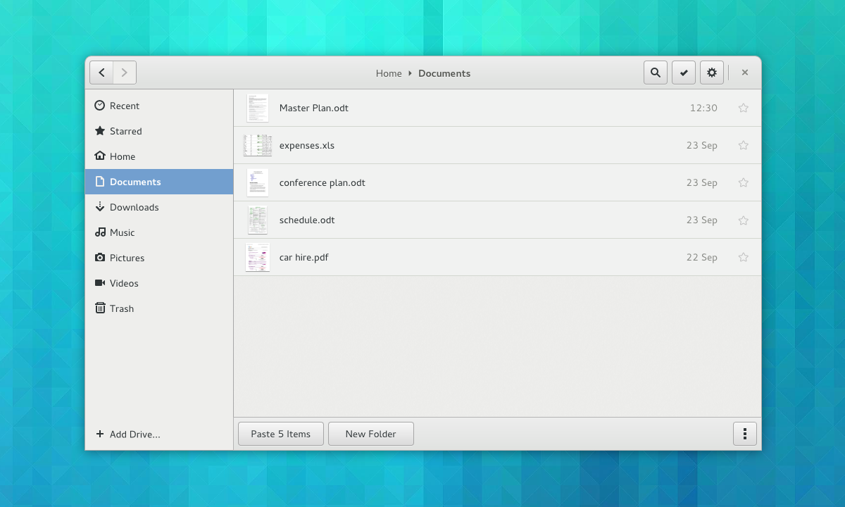
The most important thing in the Files app is, well, your files. If Nautilus is going to provide the kind of experience that we want it to, it needs to do a better job at making your files easy to recognise, look good, and take centre stage. This requires lists and grids that have even spacing, helpful zoom levels, and big, clear thumbnails.

grid

The designs feature new lists and grids, which should hopefully be possible with GTK’s new grid and list widgets. The grids we have in mind will be responsive, so that the content will scale to fit the size and shape of the window (without large spaces between cells or gutters on one side). Lists will feature thumbnails and have separators between rows to aid readability.

gear-menu

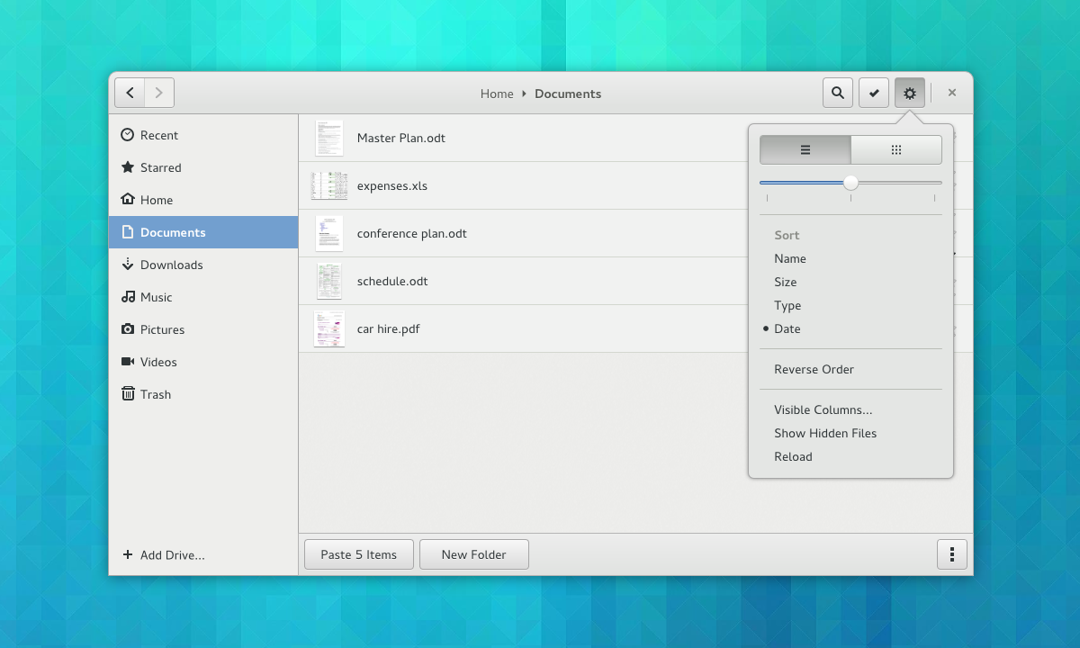
The designs also include mockups for an updated view “menu”. This contains all the existing options, except with nicer controls.
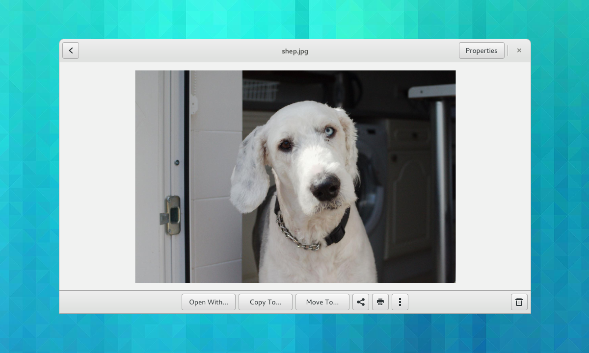
Previews

preview

Being able to inspect the content of a file is often essential to identifying it, such as when you have lots of similar photos, or PDFs with unhelpful file names. Nautilus already has a previewing feature, but it functions as an optional extra and can easily be missed. The new designs make previewing much more central to the browsing experience. They also include actions alongside previews, so that you can quickly act on the file that’s in front of you.

One thing that you can’t see in this mockup – we also want to make it possible to browse between files from the preview – so you can flip back and forth between images or documents in order to compare them.

Generating previews like this may well require new infrastructure. Specifically, it is likely that we will need a new library for generating previews.

Places

Many of the ideas for the new sidebar design came from the awesome António Fernandes.

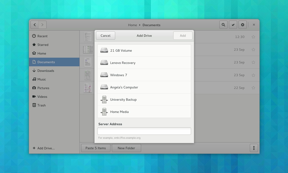
The main objective for the places sidebar is to make it more focused on the things you care about. Right now, the sidebar automatically includes every available volume and drive. This can lead to a cluttered sidebar which contains lots of items that you never use. These often get in the way and distract from the items that you use all the time.

add-drive

We want to rebalance the sidebar: more things you care about, less things you don’t. To achieve this, we want to make adding drives to the sidebar a manual action. In this way you will be able to customise the sidebar to your needs.

Clarification: manual addition won’t be necessary for removable drives – they will be automatically added to the sidebar as they are now. Also, once an internal volume or remote drive is added, it will persistent even when it’s not mounted.

A new add drive dialog is a key part of the new sidebar design. This will allow you to quickly add both local and remote locations to the sidebar all from the same dialog. It is also an attempt to clean up the various network browsing features that are currently available in Nautilus, and consolidate these features into one place.

The reimagined sidebar also contains a new feature which will be really handy: starred files. Being able to mark items that you want to keep track of is such as obvious feature, and I’m sure it will be useful to many people. In UI terms it’s a fairly simple thing to do.

Selections

selection-mode

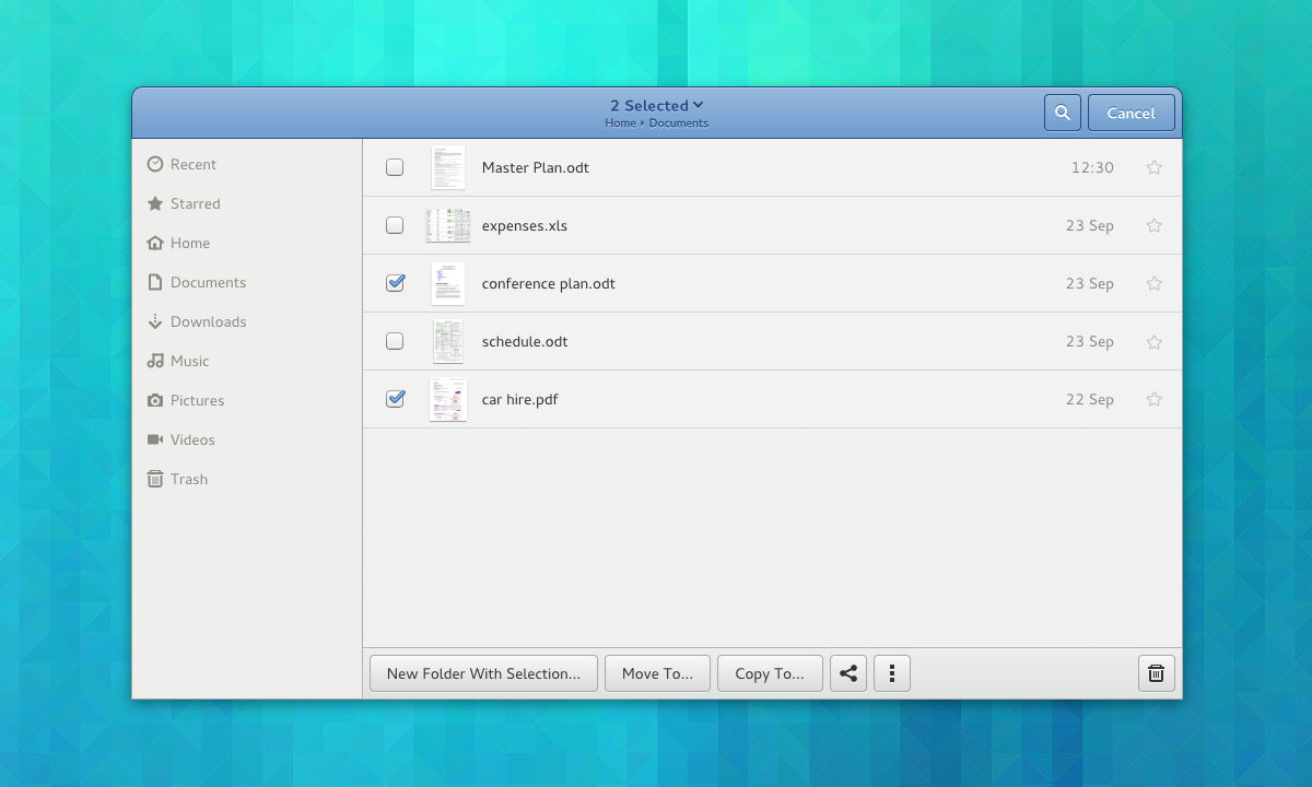
Selection mode is a design pattern that we’re using extensively in the other GNOME 3 applications. It’s nice because it makes contextual actions much more discoverable. It also allows us to use single click (rather than the undiscoverable and inconsistent double-click) throughout.

The best way to think of the use of selection mode here is as a discoverable context menu. Existing methods of selecting multiple items, like holding ctrl and shift in combination with the mouse button, will continue to work.

Added Discoverability

new-folder

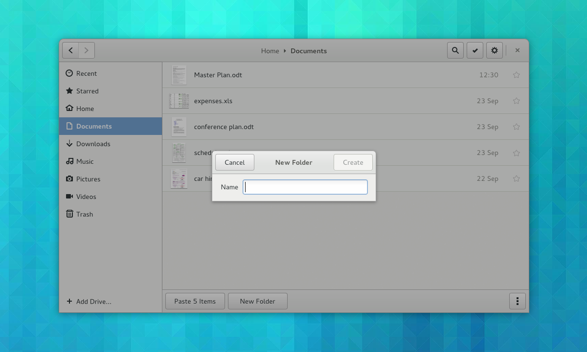
It’s amazing how many undiscoverable conventions that we acclimatise ourselves to, and an old app like Nautilus has a lot of them. At some point in the past, we all learned to double-click to open, to press return to finish naming a new folder, or that Ctrl+V pastes content into the current location. All of this is totally unobvious to new users, of course, and there can be embarrassing moments when you watch someone use an app like Nautilus for the first time.

The new Nautilus designs bring a lot of hidden functionality to the surface, and they make an effort not to assume prior knowledge. Much of the functionality that is currently hidden in the background has been brought to the surface: there are visible buttons for common tasks like pasting items or creating folders, for example. Simple things – like using a dialog for creating new folders – are designed to eliminate basic usability bugs.

Content Selection

Finally, this brings us back to content selection. A next generation replacement for the existing file selection dialog is something that has been mooted for a long while. To make it happen, a number of other long-term initiatives need to come together: the new set of content selection applications needs to come together, and we need the previewing library that I mentioned about above.

This latest round of Nautilus design work was in part motivated to keep these content selection plans moving forward, and the Nautilus designs were developed at the same time as a new set of content selection mockups. This is to ensure that the file browser keeps in step with our longer term plans.

content-selection1

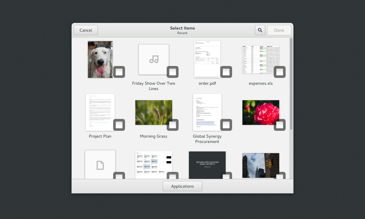
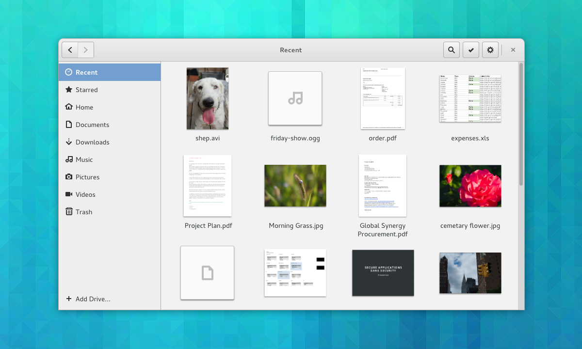
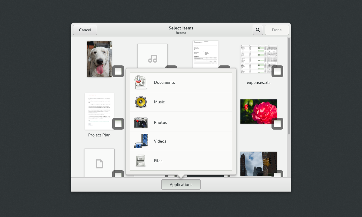
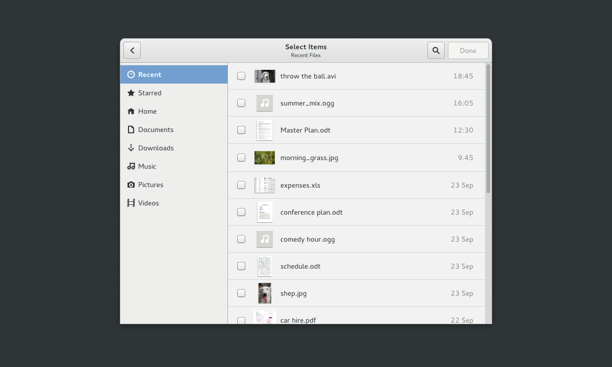
The new content chooser is designed to allow you to select content items from a range of sources. These can be local files or content items that are stored in the cloud. This is where the various new content applications come in – each one is designed to act as a cloud-based content provider. With this approach, you should be able to use the Photos app to select images from Flickr, for example.

content-selection2

The initial view provides a grid of recently used items. After that, you can choose a particular content provider. Content apps can then present their own content. Notice that, after opting to view files, the familiar places sidebar from Files slides in.

content-selection3

What You Can Do

If you want to help us make these designs a reality, there are many things that we need help with, both large and small. I will be busy turning the designs into bug reports over the coming weeks, and will be keeping the design page up to date as the plans take shape. You can subscribe to the page if you want to follow what’s happening. Otherwise, just get in touch. We would love to hear from you, even if you are just interested.

Comments on this post are now closed. Thanks for all the fantastic feedback.

Fun & Games

Games often don’t seem like the most important thing for GNOME. Yet, many people expect to have some common games available, and for some individuals being able to play Solitaire or Sudoku is a major reason for having a computer in the first place.

Historically, the GNOME project has developed a fairly extensive collection of games. These used to share some of the same code, but have recently been split up into independent modules and repositories. This was a great move, and I definitely think that each of the games should be allowed to develop into independent projects in their own right. I’m sure there are plenty of opportunities here for new contributors.

I recently spent a bit of time looking at some of our games to try to help raise the quality level. Since there are quite a few games in GNOME, and this was a fairly quick design pass, I decided to focus on the most commonly recognised games that users might expect to be able to use on GNOME. As a result, I’ve so far restricted my work to Sudoku, Tetris (or Quadrapassel in GNOME language), Reversi (aka Iagno) and Minesweeper (aka Mines). I also took a look at Tetravex, since it seems like it could be an accessible puzzle game.

It should be said that I am no graphic designer. These mockups are just the first step, and if you have a flair for graphics and would like to help, your assistance would be most welcome.

The GNOME games developers have been a pleasure to work with, and some parts of the designs have already been implemented. Many of the proposed changes have also been filed as bug reports, so it’s easy to get started if you want to help to make the games into a really fun and pretty.