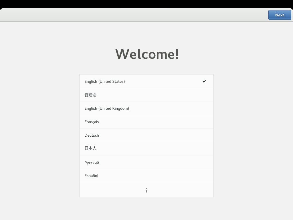
GNOME’s initial setup assistant was originally introduced in 3.8. It helps people set up GNOME 3 when they first log into a new session, and guides them through the essential steps to make their account usable. It enables you to set a language and the date and time, and it helps you to connect to a network and to online accounts.
Without something like initial setup, there’s a risk that a new user might be faced with a system that isn’t using their language or has the wrong time. Hunting through settings on a misconfigured system is not what we want people’s’ first experience of GNOME 3 to be.
From a design and development standpoint, one of the tricky things about initial setup is that it doesn’t get a huge amount of attention. Those of us who work on GNOME don’t see it on regular basis and our users only encounter it once (or very infrequently). People usually aren’t in a position to file bugs when they’re using it. This makes it difficult to know how initial setup is performing.
I have recently been working with Intel’s OTC London office to investigate this situation further. The OTC recently commissioned a series of user tests in this area, which have provided some excellent data on the kind of experience that initial setup is providing. I’ve been given access to the data generated by these tests, which I have been able to use to improve the design. I’d like to say a big thank you to Intel for funding this work and for being so supportive.
The Study
The user tests were run in a fairly conventional manner: participants were given a laptop and were instructed to treat it as if it were their own. They were then invited to run through initial setup. Along the way, a researcher asked them questions about what they were doing, as well as about their understanding of what was happening.
A total of 12 participants ran through the test. One really nice thing about the study was the variety of the participants involved. Of the 12, four had Mac OS X as their primary experience, four had Windows 8, and four used another version of Windows (either XP, Vista or 7). The participants also displayed a range of approaches to the computer – there were careful users who read everything and were very considered, and there were more impatient people who clicked through without much thought. Some were confident, others less so.
The tests were recorded, using a combination of screen recording and a web cam. Unfortunately, technical issues mean that it isn’t possible for the videos to be made available. However, I’ve been given access to the data and have made fairly detailed notes.
Results
As is usually the case with this type of test, the results were mixed. All but one of the participants were able to complete initial setup without assistance from the researcher. Some parts of initial setup worked well, like language and network selection. Reactions to the experience were generally positive.
At the same time, some parts of the initial setup assistant could definitely have performed better. Some of the participants had problems at certain steps, and the purpose of some aspects of the initial setup assistant were frequently unclear.
The main issues encountered by the test participants included:
- Input sources was often an unfamiliar term. The test conditions mean that it is difficult to make definite claims about the interface for adding input sources, but the signs are that it wasn’t clear enough.
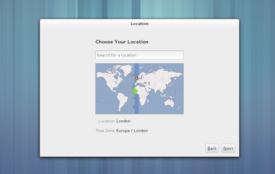
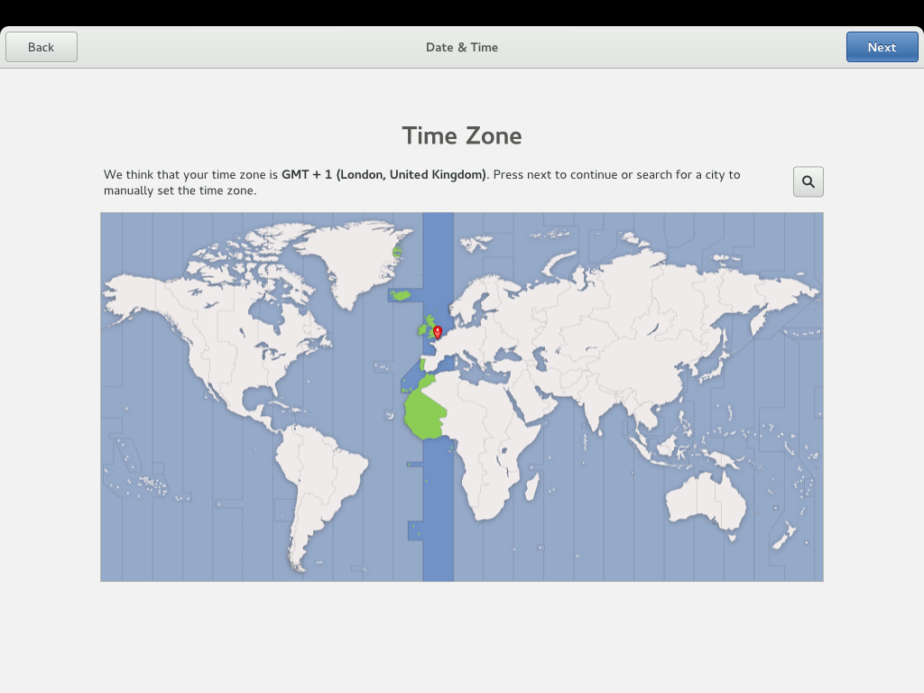
- The purpose of the location step wasn’t clear. Initial setup asks the user to set their location, so that the time zone can be configured; the majority of the participants didn’t realise that this step was specifically about time and date.
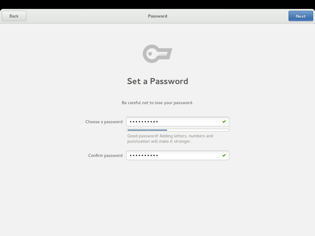
- There were numerous issues with creating a password. Some of the participants obviously disliked the negative feedback given for password strength (this is something we were already in the process of fixing). The one participant who needed help to complete the test was unable to proceed because there wasn’t clear feedback that the password and confirm password fields did not match.
- The online accounts panel suffered from not being clear. Some participants were unsure what it was for.
In addition to these more specific results, there were some other interesting lessons that can be drawn from the study. I think the most significant lesson for me is that the participants really, really disliked passwords.
“[Passwords are] the bit that I always hate, because they always make it complex and I never remember.”
The participants reported having trouble remembering their passwords, and they resented having to create strong ones because it makes them harder to recall. This aspect of the test was by far the most problematic and the one that provoked the most negative responses.
New Designs!
On the basis of the user tests I have been working on an updated set of initial setup designs. These are an evolution of the existing designs.
Two of the panels that the participants didn’t fully understand have been rebranded to clarify their role: “Location” has become “Time Zone”, and “Input Sources” has become “Typing”. The Online Accounts step has also been elaborated to make it much clearer.
Much of the work that was done in the 3.10 cycle to improve adding user accounts in the control center has been carried over; this should hopefully improve what turned out to be the most difficult part of the whole initial experience.
These designs address the worst issues that arose during the user tests, and I’m hoping that we can get initial setup into much better shape for GNOME 3.12. The Intel user tests are an invaluable contribution here, and have provided many other insights that we can follow through on.


