HOWTO:
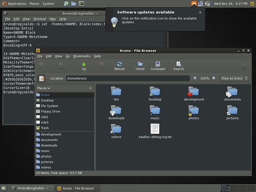
It’s Clearlooks based and I’m using Tango icon theme.
Feel free to mail me (subject: “DARK GNOME”). I’ll send you the theme file (tar.gz) and the user-stylesheet.css (to make browsing easier).
Also, if you´re using Ubuntu, change the notification theme to GNOME default:
~$ gconftool -s --type=string /apps/notification-daemon/theme standard
or just change the key value using gconf-editor.
That’s all!
Dear GNOMErs:
Can I have a “http://www.gnome.org/~brunobol” space to keep some files?

You can always attach files to your posts in blogo. 🙂
@jdub:
I can’t attach tar.gz files. 🙁
Can you please send me the user-stylesheet.css, I will also be able to upload it for you if you wish 🙂
Rename it to tar.gz_
Ah, good point… I figure we trust anyone who can get a blogo account to use it responsibly (or do the appropriate thing if they make a mistake), so I’ll add it to the extension whitelist. 🙂
Try it now and let me know how it goes.
I’d like the css file. I’ve put your theme into use, but the most annoying thing about dark themes is all of the internet assumed you’re using light themes, and so they’ll set the font-color, but not the background, making it harder to read. Maybe the css file you have will make it easier…
Firefox doesn’t quite handle it well with the location/search bar either, but I can deal with it.
i absolutely love dark desktops, the only drawback is a really high contrast, whenever browsing web =(
@jdub:
I could attach the file, but WP changes its name: “dark-gnome.tar.gz” into “dark-gnometar.gz”. 🙁
I think that Gnome foot (in nautilus window) is too dark and is not clearly seen
But it’s a great job 🙂
Thanks
This theme totally rocks.
As mentioned above, there is the problem of ver high contrast while webbrowsing.
So your stylesheet is very welcome as it solves the issue at least for webforms, buttons etc.
And, as i just noticed, for GMail.
Thanks Bruno!
bruno,
You should post this theme in gnome-look.
Abraço.
And what is the problem? 😀 We want the files, we can rename one of them! 🙂 Cheers!
http://developer.gnome.org/doc/policies/accounts/shell.html
There are things I like about this theme, but my biggest problem is that (blue) urls in email are unreadable. It was fun giving it a test drive. 🙂
just funny though, how math formulas in OpenOffice also end up being white
I would change body.background-color to #888, white is burning my eyes.
I’ll comment here and leave off the text in my email request message; I’m assuming you’re getting a handful of them. 🙂
Looks really nice… my problem with Darklooks has been with the libnotify popups. I’m guessing you know this, given the prominent update notification in the screenshot. Good stuff. 😀
I get a “The file format is invalid” message when I drag&drop the theme into the appareance preferences
@michele:
Wordprees changed its name to “dark-gnometar.gz”. Rename to “dark-gnome.tar.gz”.
Cheers!