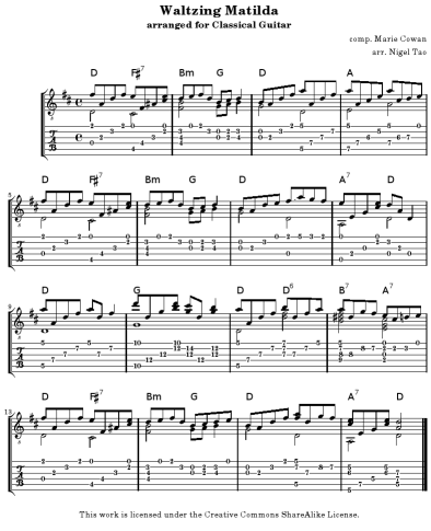
- Take an unofficial anthem.
- Chuck out the boring chords and revise history with some 7ths, since they have more Star Power. Shorten it for fashionable attention spans.
- Plug a guitar into a cheap ‘n’ nasty laptop sound card, and play like your mother (country) just died. If you are an ordinary guitarist and need 30 takes, then play like your entire extended family just died.
Listen (mp3 or ogg, about 1MB large and exactly 1 minute long), or read the score (PDF for printing, or PNG image for imagining, or Lilypond source for the hard-core). Everything’s CC-SA licensed.

On another note (haha), it’s been a year-ish since my first post (I’d link to it, but it’s crap). All up, 37 posts and 6,600 words, with a three month hiatus in the middle. In comparison, my buddy Wes has just squeezed out his 100th blog post since starting 10 months ago. I think the man has found his calling. There are some choice quotes there, bro.
Update (2006-10-23): For search engines’ sake, I really should mention the words Waltzing Matilda, tablature (not just chords) and arranged for classical guitar.
My grandma doesn’t particularly like computers (she’s always afraid that she’ll accidentally break something, having previously been caught in the crossfire of Media Player, iTunes, RealPlayer and WinAmp all squabbling about who “owns” .mp3 files) but she loves the internet and e-mail. Again and again, people have mused that all they needed from their computer was a web browser (and web-mail like GMail, Hotmail, Yahoo, or whatever) and an internet connection. Now, what if you designed a user interface for those people, rather than copying the traditional “desktop” metaphor?
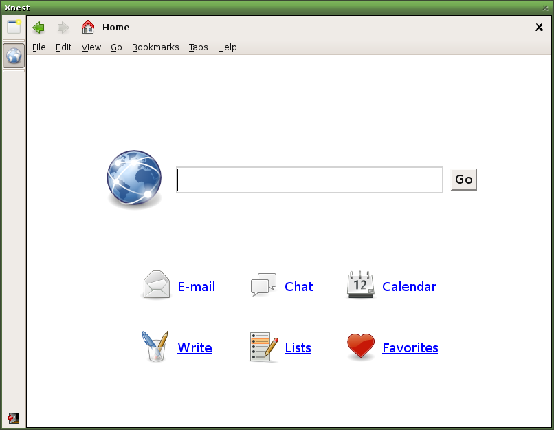
This is what I’d do: there wouldn’t be a Start Menu, but only two buttons – one for the web browser, and one to log out. And the browser itself would be simpler. A common Firefox setup has www.google.com as the home page. This gives me three text boxes – Firefox has the Location bar and the Search bar, and Google gives me a third one. If I installed the Yahoo toolbar, I’d have yet another. This is crazy! There should just be one place to type stuff in. If it looks like you entered a URL, it would take you there. If it looked like you were entering search terms, it would search. Enter an e-mail address – it will compose an e-mail. Users of GNOME’s Deskbar would know what I’m talking about.
This magic text box would take pride of place – it would be big and central. It’s the most important part of the UI, and it’s also all you need. Under that, for convenience, I’d sprinkle half a dozen links, with nice big icons. E-mail, obviously, and one or two nifty web apps – writely, tadalist, whatever webbly calendar and blog-reader are flavors-of-the-month. And that’s it. All very simple, clean, and (hopefully) unbreakable. My Grandma might never have to see “the file system” ever again.
How would I implement this? Well, we already have a light-weight “desktop” in XFCE, and a light-weight Gecko-backed browser in GNOME’s Epiphany. I don’t need big apps like OpenOffice.org, Evolution, or even a file manager like Nautilus. What’s missing? Photos and music, I guess. Maybe I’d concede some specialist apps like F-Spot and Rhythmbox (or Songbird??), if I was going to do this properly. But as far as making a mere prototype, it was no effort at all. Oh, I need a sexy project name, so let’s take two of the biggest brands in the Linux community and mash them together. Voila: Foxybuntu. Enjoy the 3.5MB screencast (mirror). Yeah, the image quality is lousy, since it’s a 256-color GIF and hence dithery, but you should be able to get the idea.


