When I last posted about Every Detail Matters, 27 detail bugs had been fixed by 9 contributors. About two and a half months later, 43 bugs have been fixed by a total of 12 contributors. We’ve made impressive progress, and the results are already making themselves felt. Testing the latest and greatest GNOME Shell, things definitely feel more polished and better executed.
This Christmas, Every Detail Matters brings you…
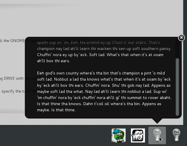
Crisp menu separators. The old ones were fuzzy; now you have a clear line.
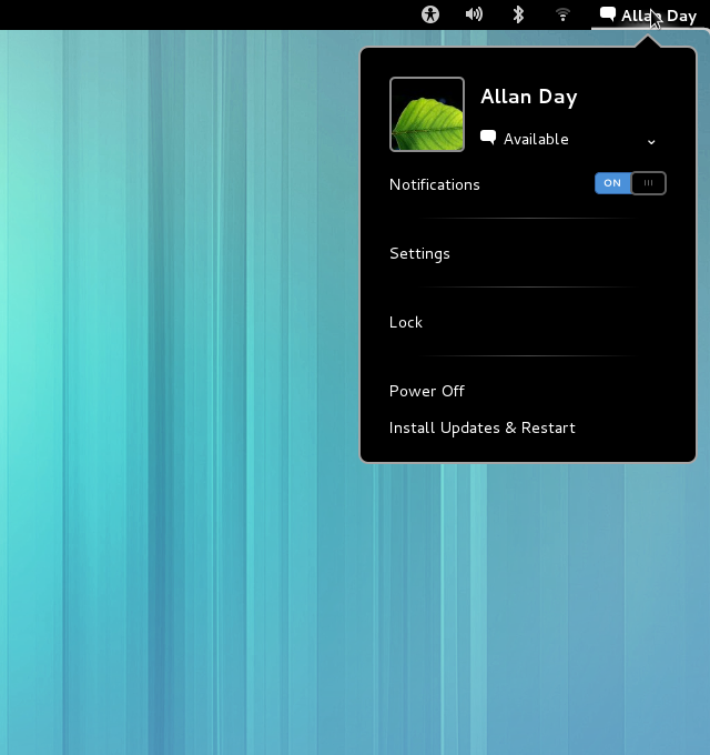
Corner synergy. The rounded corners of popup bubbles and scrollbars have been aligned.
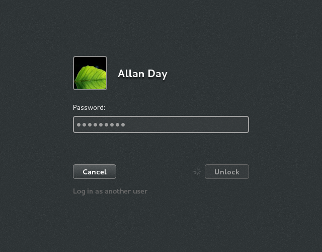
Login process indication. This has been the subject of a few different fixes. We now have proper insensitive states in the login screen, and a spinner is displayed if login is taking a while.
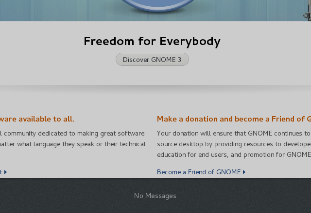
A “No messages” label when the tray is empty.
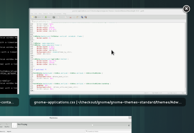
A hover effect for window thumbnails. A border is displayed around window thumbnails when you hover over them; it’s a small thing, but it’s really satisfying.
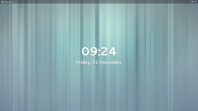
A transparent top bar in the lock screen. I featured this in my last Every Detail Matters blog post; it has now properly landed, and has had some nice polish work done on it.
An icon to remind you when you have headphones plugged in. This bug wasn’t actually part of Every Detail Matters, it goes to show that there is plenty more happening in GNOME to get the details right.
![]()
We hope you like what we’ve been working on. If you’re looking for a hacking project for the holiday, check out the Every Detail Matters wiki page. GNOME Shell is a lot of fun to work on, and we’ve got some nice bugs just waiting for someone to fix them.
Thanks for this post! Always love seeing the progress you guys are making. Keep up the fantastic work!
Great stuff, Alan – details do matter. When skimming through the screenshots, I spotted a place where some detailing is needed. Alignment in the menu bar, see: http://cl.ly/image/1b0J3b1Q3s0r – merry Christmas from Norway!
The headphones and volume icons are closer together to show that they’re one item. When you hover over the item, they highlight together, and when you click on it, the highlight goes under the entire thing.
It’s much like the VPN lock icon.
One item, but two icons?
I was wondering if one could come up with a headphone icons that indicates volume level. Then the speaker icon could be swapped out with a headphone icon.
My thoughts exactly. In my optinion, this is the most logical and perfect solution
I actually noticed the “blurry separators” thing. Glad to see it’s fixed!
Where’s the logout button?
You only have it if there are multiple users on the system. A new configuration key is also available to force the log out option if you really really need it always-show-log-out. It is also shown if there is entreprise login.
Where can I find this always-show-log-out?
My “would-be-nice-to-have” – in overview mode we only see the overviews of the workspaces on the primary monitor. If I have a second monitor plugged in and “workspaces_only_on_primary” set to false I have a whole series of workspaces on the secondary monitor but I can’t see them (or their windows) from the overview area (on the right side of the screen). Are there plans to address this?
The issue is one of presentation.
If you have three monitors in an “L” arrangement, it could be a bit crowded and awkward to have all three monitors in the box they fit in now.
The obvious response being – can we not think “outside the box”? :)
Makes sense to fix little things before major things.
May I suggest making a new icon with the “speaker” inside the headphones when headphones are connected. That way there’s only one icon, but the information is all there.