Those of us who work on GNOME design have been busy with all kinds of things recently. One major area of activity has been settings (aka System Settings, aka GNOME Control Center). In total, we have produced designs for four new panels (search, notifications, privacy, and sharing) and we have redesigned four of the existing panels (power, network, display, and date & time). Some of these have already been implemented, some are being developed on, and a few more are waiting for coders to get involved.
The new panels are things we’ve wanted to do for a while. They represent an effort to allow applications to integrate better with GNOME 3: hence panels for configuring search and notifications. The new panels also reflect a long held goal to give users control over privacy, whether that is through controls over how much personal information is displayed on screen, how your identity is exposed over the network, or what content you are sharing.
We’ve also been working to improve the overall experience provided by GNOME Settings. Some of our existing settings panels weren’t (and still aren’t) as good as they could be, and we want them all to be easy to use and to look great.
Since so much work has been done for these settings panels, I thought it would be useful to show some mockups and give bit of background on the design for each panel. One thing you might notice here is a new set of design patterns around settings in GNOME, which has been made possible by the new list widget developed by Alex Larsson.
Network
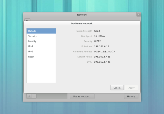
The new network designs have been in progress for some time. They currently exist in a development branch, which will hopefully be merged in time for GNOME 3.8. The main aims here are refinement and expansion. We’re making the existing UI easier to interact with and better looking, and we’re replacing the old settings dialogs with new ones. We’re also adding new features, such as the ability to have multiple configurations for wired interfaces (not a common thing, but some people need to be able to manually switch between static IP and DHCP, for example).
Power
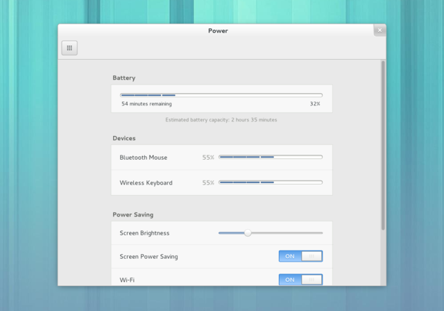
Although this is a mockup and not a screenshot, the redesigned power panel has actually landed. It has a new layout using the new list widget, and looks much better. One goal behind the new design was to try and make the power settings useful, so we’re including controls which will allow you to control how much power you’re using.
Date & Time
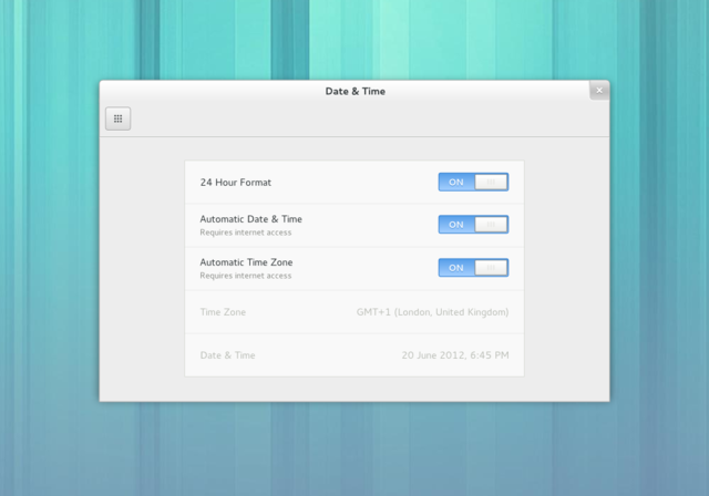
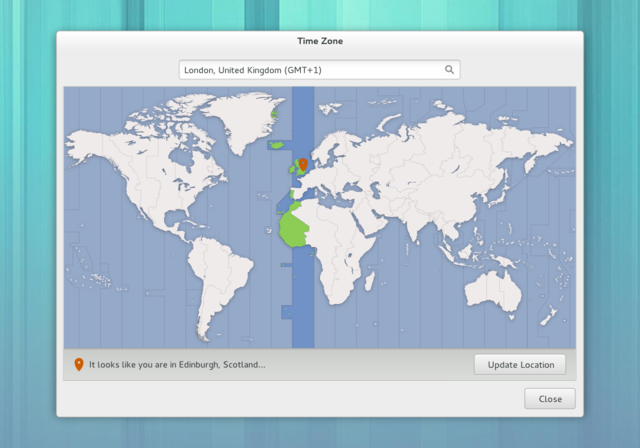
I did this redesign a little while ago, and got plenty of contributions from others along the way. There’s not much in the way of new functionality here: it’s mostly about making the panel nicer. One thing that the new design does is make the relationship between the automatic and the manual modes much clearer. It also has a big dialog for selecting a time zone, which means that the world map is displayed at an effective size.
This design still needs implementing, if anyone fancies taking it on.
Privacy
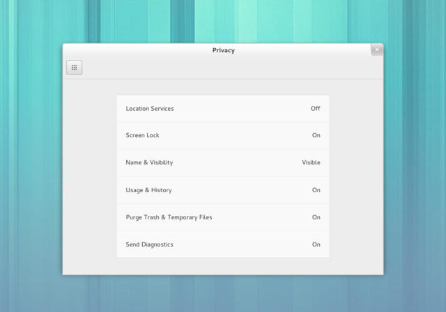
This is a new panel that was mainly designed by Jon. It is part of the effort to allow people to control how much information about them could be revealed, through things like location services, the lock screen, recent files, or even how your device is advertised over the network.
Privacy controls are especially important for GNOME nowadays, since recently used content is become a more prominent part of our applications, like Files. Privacy settings are also a good place to host options relating to the new lock screen that was introduced last cycle.
Search
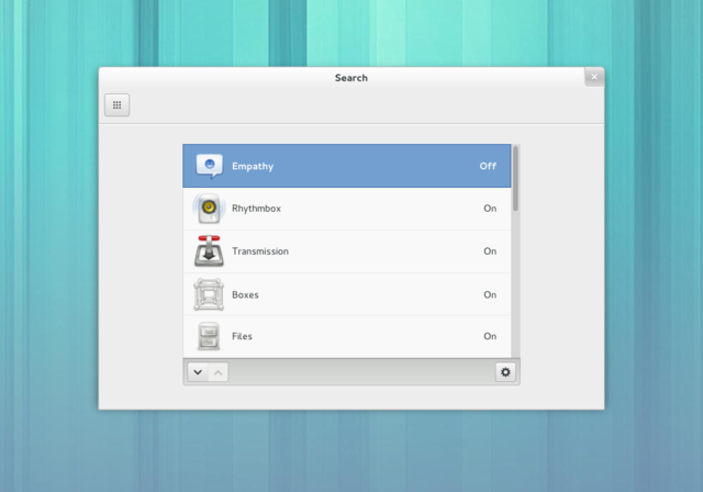
We now have settings for configuring how search works in the Activities Overview. These complement the new search results view which has also landed this cycle. The search settings give control over which applications are able to display results, as well as the order in which results are displayed. This is useful if there is an application you’re not interested in or, on the other hand, if you are mostly interested in the results from one or two applications.
Notifications
This new settings panel controls which applications are able to display notifications and what kind of information is displayed in the notifications. Allowing people to hide private information is a key motivation behind this panel. It can sometimes be uncomfortable if you are at work or in public, and notifications are popping up on screen that contain personal information, for example. These settings will let users deal with these situations, by either letting them turn off certain types of notification, or by restricting the amount of information that they contain.
Displays
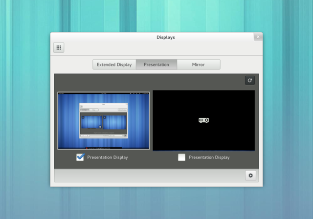
These mockups are still very new, and will probably go through a few more iterations before development work starts. The aim is to produce something more refined than the current panel, and that is more focused on the specific use cases in which multiple displays are used. We want to provide a nicer experience when doing presentations in particular.
Sharing
This new panel (which is currently being implemented) is largely a house keeping exercise. We currently have a range of standalone sharing tools, including preference dialogs for Vino, Rygel and file sharing via bluetooth and samba. Integrating these dialogs into system settings will clean up the application launcher space and provide a single place where you can control the various sharing settings on your machine.
I ♥ settings
So there you have it: lots of settings work! I’m personally really happy to see the control centre becoming much more refined and, hopefully, more interesting to users. It’s a lot of work to get all of these different settings panels in good shape, but I’m sure that the result will be a better overall experience.
As with all our designs, more information and mockups can be found on the wiki as well as in the GNOME Design Team Git repositories. Everything, including all our mockups, is freely available.



Regarding the first screenshot (and for example existing keyboard layouts). There are small plus and minus sings in the left bottom corner. They are meant to add and remove entries. However, the minus sign is the only way to remove entries. Whenever I try to interact with this type of a dialog and remove something, I first press delete and get no response (is that intentional? why?). Then I try to rightclick to reveal a menu. Nothing happens. Only then I discover the minus sign and click that (and I need to aim precisly, I am fortunate I have a mouse and do not need to use a finger, if this is supposedly aimed to be touch-friendly). I know these dialogs are not used often (so I can live with that even if it is suboptimal), but in this regard, they much remind me of dconf-editor in terms of unusability.
I can second part of this comment.
I don’t try right-click, but the first thing I try is definitely to hammer the “del” key.
So I opened a bug https://bugzilla.gnome.org/show_bug.cgi?id=691598 – let’s see what happens. (I also opened one about backspace not going back to the main menu: https://bugzilla.gnome.org/show_bug.cgi?id=691601 even though it seems the developers already knew about it: https://bugzilla.gnome.org/show_bug.cgi?id=409230 ).Let’s see what happens.
Thanks for the bug reports, drew070 – I’ll follow up there. Having keybindings for removing entries from add/remove lists definitely isn’t a bad idea. My only issue there is that we need to make sure there is a mechanism in place to undo accidental removals, since this could happen a little more easily with a keybinding (although it is something that we should have for all destructive actions).
Context menus are fine also, provided that they have a few entries in them – in general menus should have more than one item in them.
Those look great. I hope you’ll do the same for desktop background settimgs: the dialog in 3.6 is a failed attempt to improve the one from 3.4.
I think that the background panel will make more sense once it includes the option to set the lock screen background also…
I think the background panel had more sense when we had a button to browse through files.
Come on, Allan, it really has nothing to do with lock screen bg setup :)
Uhm? In the case of the panel itself, I think it does. :) Maybe you were referring to a different part of the settings though…?
These settings look wonderful. But on the otherhand, the settings for enabling scrolling is removed from the mouse/touchpad settings. Why?
Perhaps what Alexandre means is this: https://bugzilla.gnome.org/show_bug.cgi?id=691366
A little but important technical question about sharing panel: Personal File sharing, Remote Login and Media Sharing will automatically open port on the firewall with Firewalld ?
Thank you for doing these updates, watching the Gnome designs evolve is very entertaining. The team is doing a great job polishing everything.
Please oh please allow for editing network settings even if NetworkManager is currently trying to associate or get an IP. The inability to edit a network until it has connected has been extremely frustrating with the 3.4 UI. The modal dialogs are also occasionally frustrating as they prevent viewing information that might be useful in the current context (such as security settings from a similar wifi network).
Wow, they look great.
And YAY for the multi-monitor!!!
Looks like finally I can setup ‘Extended’ display without editing gconf??
Also, it would be wonderful if you could drag the entries in the network list to supply a priority: for example when I have have multiple known access points in the neighbourhood then I do want to specify a priority for connecting with one out of all the known ones.
These designs provide some nice examples of the pitfalls of trying to design a single interface for both PCs and mobile devices.
On a mobile device, the screen is small, and scrolling is a flick with a finger or thumb that’s usually already hovering. So it makes sense for interfaces themselves to scroll (as opposed to lists inside them). But on a PC there’s plenty of space and clicking is easier than scrolling. So something like the Power panel design just looks like a bug.
And on a mobile device, because the screen is narrow, toggles are presented as On/Off switches opposite terse labels. If more explanation is needed, a caption goes underneath. On a PC there’s room to be simpler: labels that explain themselves, on a checkbox or especially a pair of radio buttons. What does “Screen Power Saving” do, and why would anyone want to turn it off? What happens to notifications when “Show Pop Up Banners” is turned off? What does the toggle at the top right of “Sharing” do? A well-designed PC interface would use labels to answer those questions. These designs, despite hundreds of pixels of empty space, do not.
Hi mpt,
I don’t see your point about mobile vs. PC. There is only one panel that scrolls. In this case, the difference between using something like tabs as opposed to scolling is minimal, and the layout has advantages that make it worthwhile: it looks good, and has a natural progression from status to settings.
There is plenty of space for longer labels, should they be required. The specific examples you bring up there can easily be addressed, and indeed at least one of them already has been (Screen Power Saving has been replaced with an option that is easier to understand).
All of these panels are still evolving. Bug reports are welcome.
Exactly my thoughts. I find the UI choices rather baffling. The on/off switches instead of check boxes, scroll bars without arrows, no menus, general lack of controls and text… these interfaces seem less functional and much more difficult to use than any ‘traditional’ GUI. I can see that this sort of thing would make sense on a touch-screen device, but it’s a terrible choice for software that is intended to run on full-fledged computers.
Okay, I’ll make the point simpler. Designing as if this was a mobile interface — or as if there was no difference between that and a PC interface — will naturally lead you, again and again, to make the kinds of mistake you’ve made here.
If you’re designing in that mindset, of course you’re going to think that a scrolling panel “looks good” — even though one of the switches is scraping the bottom of the window.
If you’re designing in that mindset, it will make perfect sense that switches go on the opposite end from their labels — even though on a PC screen, there’s a river of empty space that makes it hard to see which switch is which.
And trying to lessen that problem, in some (but not all) cases you’ll add horizontal dividers, increasing non-data ink. This problem was solved more elegantly 30 years ago with the checkbox. Ironically, as Lubomir pointed out, the only use of checkboxes in these mockups is actually incorrect.
To be clear, that is not the only cause of problems here. The lack of explanation of what any of the items in the “Search” and “Privacy” panels actually do can’t be blamed on thinking this is a mobile UI. That’s just misplacing your newbie-goggles.
It’s true and good that we can report bugs to fix mistakes like these after the fact. But as I’m sure you know from dealing with engineers, it’s more efficient if design errors are avoided in the first place.
While this type of layout certainly does introduce additional visual noise, it also allows greater spacing between items and regular layouts between different types of controls. In my view this arrangement is easier to read. In many cases it also makes better use of the space: instead of tightly grouped controls pushed to the top of the window, you end up with something that is aligned front and centre, which has room to breathe, and whose regular layout allows easy scanning. It also has other advantages, such as flexibility (this approach allows us to add additional privacy controls in the future, for example, it also means that the power saving section can grow and shrink depending on the hardware present on each device).
As for eliminating design errors, that is obviously desirable. At the same time, an iterative approach to design creates opportunities for an array of voices to become involved in the design process – something which is important for an open project such as GNOME. Some of these mockups are very new (such as the displays panel that you pick up on). Implementation has improved on some of the others. In each case, the goal is to let developers and the wider community have a say in determining the final form of what is produced. And high bandwidth between designers and developers means that this process isn’t a burden.
Yes, those are my thoughts whenever I use the new interfaces (I almost cry as a baby). They might look slicker and cleaner (even though I liked the old ones better, but that isa personal preference) but they are painful to use. It is slower and often not clear what they internd to do. Luckily one does not need to change settings often.
I think one of the problems with the new design is that it is not designed with keyboard (sometimes even without a mice) in mind. With touch based interfaces, the fingers are usually close to screen and penalty for interacting with the device (provided the hardware is up to it and a device is responsive) is very low compared to computer where moving from mouse to keyboard is expensive (we do not like to do it) and even travelling a long distance with a mouse is tiresome (and slower). The new interface invites to experiment with it as it is not clear (to me) from looking at it what the actual values of the settings are. I wanted to write that I do not have this problem with my N900, but it actually uses checkboxes for binary choices:-). I have never understood what was wrong with checkboxes.
I think it is very visible in Ubuntu’s Unity where an interface is tailored to a given device (look how the phone is different from the desktop and they say there will be a different interface for tables as Unity is not well usable in its current form on tablets). The use of the keyboard is extensive if the user so chooses (features such as shortcuts overlay, HUD and others). I actually realized a release back that my gripes with it are (beside some odd design choices like https://bugs.launchpad.net/bugs/733349) actual bugs that are slowly being fixed rather then design. I cannot say that with the remnants of the GNOME 3 software that I use nowadays (that I used to love in the GNOME 2 days as I still do love the GNOME 2 applications).
Thanks a lot for keeping the community as much in the loop as possible! It really great to see all this coming together and shared early so that everyone can bring good (and bad) points in the prior states before coding.
“Display” looks good, but I hope I can still get at the previously available settings like rotation and relative positioning.
Also, the “Screen power saving” option under “power” seems unclear; something like “Reduce display brightness when idle” would make much more sense. (And the presence of that option seems inconsistent with the position that kicked out “suspend when lid closed”; both seem like they have the same rationale for existing, namely that the default doesn’t work for everyone.)
Anonymous: yes, that is actually what has already been done for the Screen Power Saving option. :)
Which “that” do you mean? The option name, or the consistency issue?
1. reintroduce mouse acceleration
2. add NFS sharing tool
3.[BUG] setting aren’t saved (es mouse speed in ArchLinux gnome3.6)
Woah, I’m totally blown away, all the panels are great! Thanks Allan and the whole team!
Is the new list widget the eggslist box (I think that is the name I heard mentioned on irc)? And is there documentation yet, or is it still too early?
Hey Meg! Yes, it is the EggListBox, and it’s still a bit early. The widget is a fairly flexible container. One thing that we’re working on is defining two or three styles in which it can be used – that shuold happen within the 3.8 cycle. Once it has I’ll write some documentation.
Nice! I’ll keep an eye on it then, thanks Allan.
In the Displays panel, are those Presentation Display checkboxes really checkboxes? It seems to me it makes no sense to check it under both displays and therefore it might act as sort of a radio button. The appearance of those might be confusing to some users. Is this pattern used somewhere else?
Lubomir, yes they’re checkboxes. Those mockups are only days old; I’m sure they’ll evolve. I’m not sure that radios would work. One other option would be a toggle button in the attached toolbar. What do you think?
Why wouldn’t radios work? They are supposed to be used for exclusive choice rather than a multiple choice. Seems like a perfect fit to me.
To me, the items are a bit too far away from each other for the meaning of the radios to be clear. Maybe I’m wrong though. :)
Hey Allan,
thanks for keeping us updated — the new designs look neat.
I’d like to ask, however, why the scrollbar is placed differently in the power settings and the search settings. There seems to be no functional difference, in both cases you have a scrollable collection of settings: why shuld the search settings be contained in a smaller list view, while the power settings are not? That seems confusing to me.
I also don’t understand what the up/down buttons in the search settings panel are for? They look to be either for moving entries in the list (but why?) or for scrolling them (in which case the user will probably just scroll the list with touch-scroll or the mouse wheel or the scrollbar, and the buttons look like a less efficient alternative, so — again — why?) Am I missing the point?
Finally — and this applies to most designs so far — could you please consider differentiating more between the panel backgrounds, the window title, and the contents? Like by tinting the background with a slightly darker shade of gray? That may give your applications a bit more depth, perhaps.
As always, just my opinion. ;-) Cheers!
Hey Stefano,
Search is a bit different from power – in the former, it is a collection of items that is scrolled (in this case, applications); in the latter, it is the settings pane as a whole..
I totally agree with your other comments. For search I think we want to have a label to explain what reordering the list is for (I just reported https://bugzilla.gnome.org/show_bug.cgi?id=691703 for this issue). And yes, we definitely need to differentiate the panels from the toolbar and window title above (that’s bug https://bugzilla.gnome.org/show_bug.cgi?id=643322).
Hey Allan,
search is different than power only because you want to be able to enable the user to re-order the search items (as you pointed out in bgo 691703). I’d say this is one choice the user should never be required to make. Ideally, the search result reordering/ranking should work automagically, like in all common search engines (Google, Yahoo, etc.) But I guess this may be too much to ask in a first iteration, so okay.
To elaborate a bit, let’s assume for a second that the reordering ability is removed: without that in the way, the two panels work exactly the same. By making them identical (i.e., not enclosing the search items in a list view) you get a more streamlined interface; this can be done by either folding the gear button within each search list item, or just by opening the per-item configuration panel on single click. (Which sounds definitely more efficient than having to select an item and then having to click the gear button.)
Note, I’m assuming the gear button is there to configure the individual items; the mockup (and the panel) don’t otherwise communicate its meaning at all.
The second bug you linked to alas doesn’t reflect what I was saying, but I believe you there’s a bug about that in bgo, no worries. ;-)
Thanks for working on this!
Hello! Thanks for sharing this. Here goes some constructive comments…
Mockups contain different widgets that do basically the same thing. For example, in the first network mockup we have (1) sidebar for different kinds of network, (2) EggListBox for wireless networks, (3) and the second network mockup have gray labels and black values for selected network details. Every three things look different.
So the good idea could be use of one, single, universal widget that contain two things: (1) primary label on the left (title/key/metadata), (2) and value on the right (data/summary of data). For example, “Wi-Fi: On/Off”, “Screen Sharing: 2 Connected”.
On the information architecture side, I would think about all settings as the hierarchical structure of key-value elements, every one represented by single widget. It’s similar to Mac OS X Finder column view: http://osxdaily.com/wp-content/uploads/2010/02/mac-os-x-finder-column-view.JPG Just like in many mobile OSes, next-back navigation works very well then. That’s why modal windows looks disrupting for me.
The second issue I see is the interaction with those elements. For example, most mockups contain the gear icon on the bottom contextual toolbar, but on the first network mockup the gear is also inside the list (EggListBox). It would be great if there was one interaction model with elements, but that is even more complicated, I suppose.
Thanks for work on this.
Thanks sllih, constructive comments indeed! I’ll definitely think about this; the point about the gear button is a good one in particular.
When are we going to be able to install/change Gnome Ghell, GTK and Icon themes natively through Gnome Settings, without the need for other tools like Gnome Tweak Tool?
There should be a way to specify a Network configuration based on locations. Let me add locations for which I can chose the connection method priority and configuration (wired or wireless) and actions to perform when connecting to that location (like changing the proxy, changing home pages, executing some script, etc)
Hi Allan,
Nice work! I still have a question… laptops with hybrid graphics are very common nowadays. Will there be a way to specify on the power settings when to use a specific graphics card ? If not where would that fit ?
I think this should ideally use automatic switching based on performance requirements or running apps; whether plugged in or not, you want to choose a graphics card based on how much performance you need.
This is the ideal, but this mechanism to ‘guess’ the performance need is very far away from being reality… and still there are some apps that the guess may be wrong. What AMD Catalyst do in windows is very interesting. It shows the running/recent apps and you can check “high performance” and “low performance”. Here in g-c-m there is no dialog for the graphics adapter settings. Display doesn’t seem the right place. I think the sanest is something like in power settings. Screenshot: http://h20435.www2.hp.com/t5/image/serverpage/image-id/2247i4A9147923464168A/image-size/medium?v=mpbl-1&px=-1
Hi Allan!
Is the control centre not going to maximised by default like all of the other applications, or is that just an inconsistency in the mockups?
I think it’s quite neat to have vertically scrolled windows of settings. One problem that desktop GUIs have had for years is that users with small or low-resolution screens (or just really large fonts) end up with big dialog boxes that extend way beyond the edge of their screen and can’t be resized or even closed in many cases. Although part of me wonders if vertical scrolling is the correct answer on laptops and netbooks, where screens are generally ridiculously wide and not very high these days. Either way I hope to see a lot more massive dialog boxes replaced with neatly scrollable lists of elements in the future (not that GNOME itself has many, but lots of more specialised applications do).
I don’t like that most of the dialogs have a button in the top left hand corner with a grid of 9 squares on it. I presume this is to return to the main settings window, but surely a button labelled “Back” or “All Settings” would be clearer than a heiroglyphic? The button has an entire horizontal bar to itself, so space isn’t an issue.
As always, thanks for taking time to provide a summary for those of us that don’t follow #gnome-design !
> Is the control centre not going to maximised by default like all of the other applications, or is that just an inconsistency in the mockups?
Yeah, gnome-control-center seems to fit all the guidelines to make it a maximized-by-default no-title-bar app.
> I don’t like that most of the dialogs have a button in the top left hand corner with a grid of 9 squares on it. I presume this is to return to the main settings window, but surely a button labelled “Back” or “All Settings” would be clearer than a heiroglyphic? The button has an entire horizontal bar to itself, so space isn’t an issue.
Seconded; a text label would make much more sense.
Is there any progress toward having per-network proxy settings? This is kind of a huge oversight in the network manager right now. Having a single proxy setting is only really sufficient when you have a stationary machine. Laptops and such that travel and connect to many wireless networks need to be able to change settings based on the current network.
There’s a bug open, but I haven’t heard anything from it for quite some time.
The new mockups look good. One great thing I noticed was that the GTK+ theme looks much neat and more polished than the default Adwaita in 3.6. Is this just a mockup, or would we get this in reality? Maybe it’s just me or an effect of seeing artwork rather than actual output, but if we get this look in 3.8 I’d be very happy.
Hey congrats, these mockups look very good!
One thing I have always found missing in GNOME settings is a simple way to set the power saving settings. We should be able to tweak the most important power saving options from GNOME control center – for me this would be Wifi/Bluetooth power settings (your implementation looks promising), CPU power saving (aka cpufreq governor ondemand/performance) and laptop-mode status (enable or disable the service).
Are there plans to have these options too? I was thinking about filing a bug on bugzilla for these.
What are the toggle buttons used in the new displays mockup?