Over recent months, a fair amount of work has been done on the design of GNOME’s settings. Quite a lot of this work is experimental, but I wanted to share the work in progress and explain some of the reasoning behind it.
A major feature of the latest settings designs is a rethink of the GNOME Settings “shell” (that is, the overall framework of the settings application). We want to move from the current model, that uses an icon grid and fixed window size, to one that uses a list sidebar for navigation, and has a resizeable window.
While icon grids are an established approach for system settings, they aren’t the only solution, and we have encountered limitations with them. The main drawback of the icon grid is that it is hard to promote some settings over others. We have quite a lot of settings, and some are more frequently used and more interesting than others. To make this easy for users to deal with, we want to make some settings more prominent than others, so that users are guided into the interface in a logical way, rather than being presented with a wall of stuff that equally competes for attention.
There are other issues with the icon grid approach. It is difficult to accommodate new settings panels, and some settings don’t fit well into the constrained space of the fixed size window. This also doesn’t work very well on convertible devices (primary windows really need to be maximized when in “tablet mode”).
Moving to a list sidebar and resizeable window will address these issues, and create a much more guided experience where the order of the settings becomes familiar through use. It will also make the Settings application feel much more integrated and like a single unit, rather than being a collection of separate parts. It should make it quicker to navigate and more inviting to browse.
Moving to a list-based approach for settings involves both design and implementation challenges, and it is definitely not going to happen tomorrow. However, this is the general direction that we are aiming towards in the long term. On the design side, it requires that a number of settings panels be redesigned in order to fit into the new shell. This isn’t actually a bad thing though: most of these panels are in need of some design love anyway.
In what remains of this post, I’ll review our plans for the groups of settings where we have planned changes.
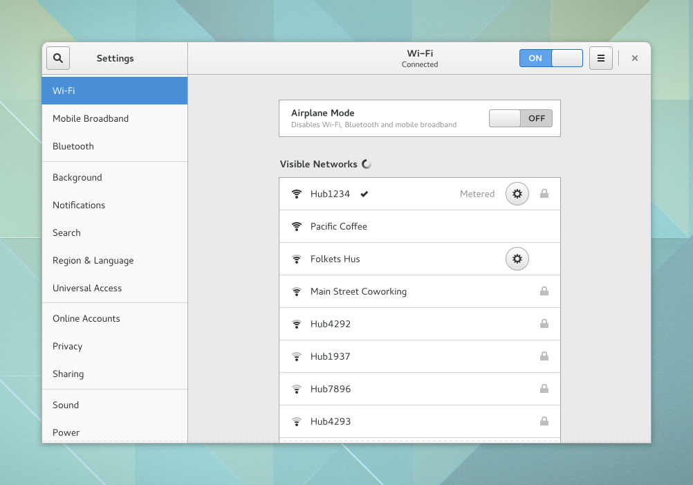
Network
Network settings are notoriously difficult to get right. I think it’s fair to say that the current ones in GNOME could be better, and they’re something that I’ve wanted to take another run at for some time. One particular issue we want to eliminate is the overcomplexity of the settings for simple, common, cases. Many of the more advanced settings could be easier to use, also.
Networking is one area that is heavily impacted by the settings shell redesign plans. We want to split Wi-Fi and Mobile Broadband out into their own panels, leaving a general Networks panel for wired connections, VPN and network proxy settings. This allows the most commonly used network settings to be made more prominent and easier to access, which will make the settings more convenient to use.
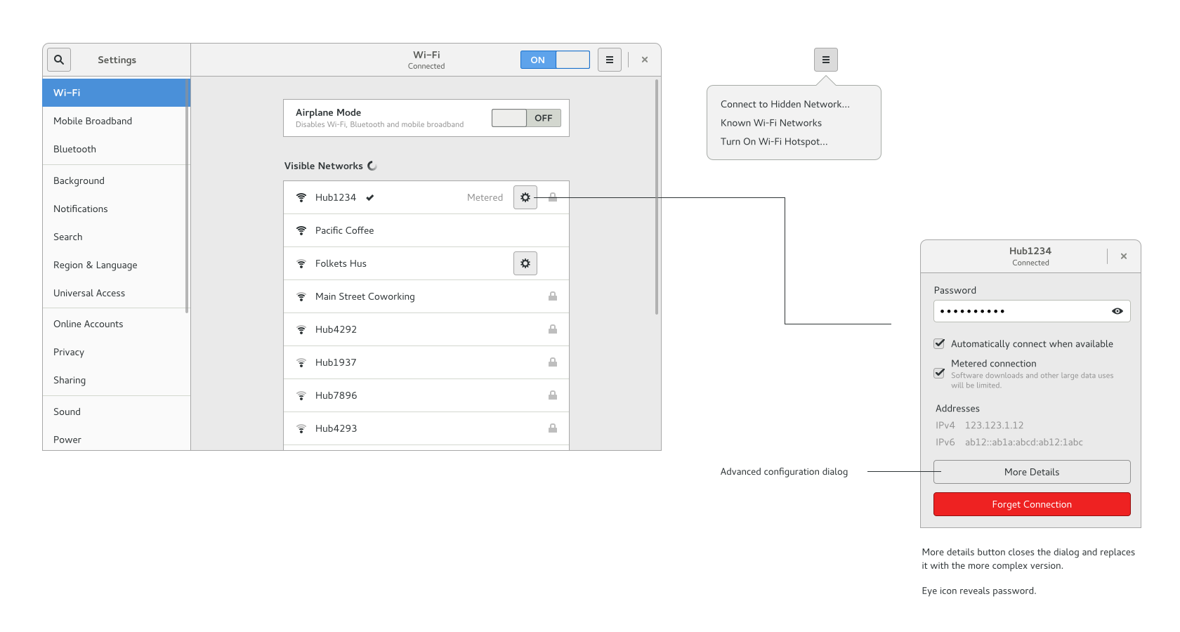
Another goal for this panel is to make greater use of progressive disclosure. Again we’re focusing on the common cases, and making them easy – like changing a Wi-Fi password without being exposed to IP routing settings.
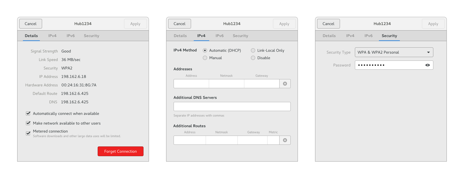
We do also want to improve the advanced network settings too, of course: by making them more compact, reducing the amount of navigation that is required, and making them more straightforward to use.
Sound
We’ve wanted to redesign the sound settings for some time, along with a redesign of how volumes work generally. Per-application volumes don’t work well for transient system sounds or when there are lots of multimedia apps open at once (this is especially an issue when browser tabs contain music or video), and the relationship between application and system volume often results in unpredictability. We plan to replace these with three more generic volume levels (media, alerts and alarms), which will merge system and application volumes.
Another issue that we plan to address is the overcomplexity of the sound settings UI itself. This isn’t necessary for what is actually a fairly simple set of features. It also prevents being able to easily get an overview of the current configuration. These issues are addressed by the new designs.
Displays
The display settings were last updated for GNOME 3.10. These changes succeeded in redefining display settings as not just being about joining displays together. In particular, it put an emphasis on using displays for presentations, where there previously hadn’t been much concern at all. However, this design tends to work best when there are a lot of displays, which is obviously not the most common case, and can be a bit too much work to use.
I’ve therefore recently been experimenting with how to modify the current design to optimise it for the two display case – which is when these settings are most commonly used. These designs are still fairly experimental, and aren’t particularly connected to the settings shell redesign that I’ve discussed above.
The new designs attempt to bring the most important settings to the front, without requiring the user to delve into dialog windows every time. They are also structured around global modes, rather than purely consisting of per-display settings: this should make it clearer what’s going on at any one time.
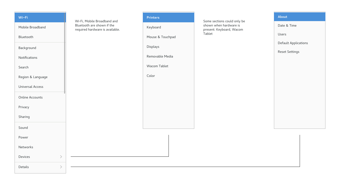
Users, keyboard, printers


The changes to the Users, Keyboard and Printers settings are fairly similar, and aren’t as sweeping as some of the other design proposals. Each of these settings panels currently includes a selection list of its own, which wouldn’t work so well with the new settings shell that we’re planning. We are therefore looking to remove these selection lists. In some cases this has some real advantages, like in the Users panel, where it enables us to provide a better experience when there is only one user on the system (which is the case a lot of the time). In others it is more of a simple reorganisation.
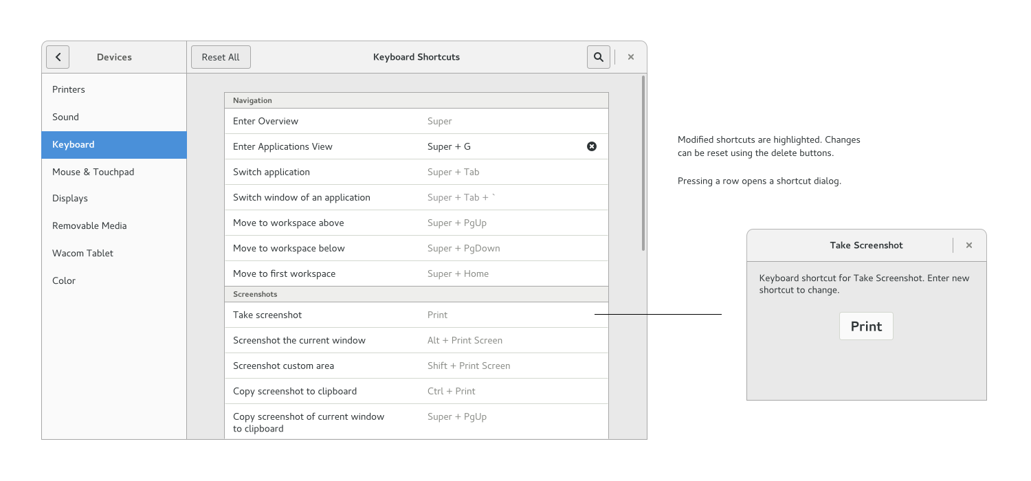
All of the designs include various refinements and improvements on the existing designs. There are a lot of visual improvements to the printer settings, for example, and there’s improved feedback for changing shortcuts in the keyboard settings.
Conclusion
In this post, I’ve outlined the general direction that we are hoping to take with GNOME’s settings. There isn’t a fixed roadmap for any of these changes, and it might be some time until they are all implemented. However, we are making progress. One part of the plans has been implemented during the current GNOME development cycle, with the new Mouse and Touchpad settings panel, and I’m hopeful that we will continue to make push forward with this in the future.
One reason for publicising these plans when they are still at an experimental stage is to get feedback, so we can improve the designs before they are implemented. So, if you do have any thoughts on this, please get in touch, either through the comments on this post, IRC, or via one of the relevant design pages.
I use balance for headphones all the time because they are not very well balanced themselves. Therefore I think it should be shown for that type of devices as well. But maybe I should get new headphones.
I also swap audio channels on another computer, that doesn’t actually run GNOME at the moment but it’d be nice to have a simple option to swap channels. Currently I have some custom pulseaudio config file that adds a pseudo device for that purpose (because you can’t do that easily on KDE either). I don’t actually know how even that (what I’ve done) would work on GNOME and could I assign programs to pseudo outputs.
I have to agree with respect to the headphone balance options, but mainly for different reasons. How do people connect their external stereo systems to their computer? I have desk speakers that are small enough to be driven directly from my computer’s headphone jack, so that’s what I do. And even though the speakers are equidistant from the center of my desk, I do not sit by the center of my desk. Therefore it’s beneficial to compensate for the audio balance.
I agree that balance controls should be shown for speakers. If we can’t distinguish between speakers and headphones, then sure, we can show balance controls for headphones too.
And maybe there are other reasons to show balance for headphones – someone mentioned hearing impairment as a possible reason, for example.
For the sound wireframe, one line is missing —
Headphones.
We need headphones and lineout as two distinct and even concurrently active outputs.
I currently accomplish this concurrency with calling amixer softwarel.
Fantastic work there!
Two things I’d like kept in mind/noted somewhere:
If you’re going to make the window resizable, please ensure the actual implementation remembers the size set by the user (and ideally the position, too). Over the past decade I had to keep filing this bug report over and over and over again ;)
The sound panel with the GtkListBox doesn’t seem as clear to me as a série of radiobuttons when it comes to making a single choice, however I think it reveals the opportunity to tackle something I’ve wanted for a long time: a priority system. My usecase is that I have a bunch of input and output devices that get hotplugged all the time, and I want them to be used in a certain priority order. So the USB microphone is to be used first, then the USB webcam’s, then the built-in analog mic,…. And when it comes to output, it could be that a USB/bluetooth speaker has priority over the analog speakers, or the networked pulseaudio sound server from another computer has priority, etc.
On my desktop workstation, I never want to worry about my USB microphone not being used when it’s plugged in (which happens *all the time* in the current state of things… I have to manually go and set it back to be the default).
A settings UI is obviously not intended as a substitute for having good hotplug behaviour. What you’ve described here sounds like what the default behaviour should be, so any deviations from that might simply be bugs. I know I’ve certainly noticed a few issues in this area myself, particularly with bluetooth outputs not being automatically selected.
Great work! I’ve been hoping for an overhaul of the UI to add a few extra options for a while. Would it be possible to change the mouse UI a bit? We have a good number of gamers coming to Linux these days, however the mouse settings on GNOME don’t really give much information as to what you’re getting. I frequently have to recommend people use xinput and xorg.conf to get what they want.
Ideally we would have a sensitivity slider with either a numerical read out or a notched system like Windows has. Having the same scale as the Windows slider wouldn’t be that necessary as long as it was clear what slider position gives what multipliers.
Additionally it would be great to be able to disable mouse acceleration, either as a tickbox like Windows (enhance pointer precision) or adjust the threshold (when the acceleration kicks in) and the multiplier (how much the cursor is accelerated by) as you can under KDE. This particularly is a feature gamers would massively appreciate as basically every gamer plays without mouse acceleration – it’s simply bad for real accuracy and with more modern mice the reason for it’s existence at all is pretty debatable.
We did rework the mouse settings this cycle, and there was some discussion about acceleration and gaming. I can’t quite remember what the outcome was, but I’ll do some digging.
Also, unrelated point: Will the new mouse settings support high refresh rate monitors? GNOME always overrides my X settings and forces the monitor to 60hz, nor is there any option in the display settings to change this. I can either open nvidia’s control panel and apply to restore it or as I have done set an xrandr script to run at startup. This is ofc a pretty hacky workaround, not to mention going to a tty and back resets it. Gnome is the only desktop that has this issue, the others either don’t mess with the settings or have an option to select refresh rate.
You should really file a bug about this.
This is really a pain also for usage with projectors that wants a specific refresh rate.
BTW:
https://bugzilla.gnome.org/show_bug.cgi?id=655041
Another request is the ability to adjust scroll speed, I.e. how many lines to scroll per tick on the mouse wheel. Right now you cannot, but it is possible in KDE
That’s really a toolkit setting: the input layer has no idea what “a line” means — it depends on the specific font, at the specific size, used by the specific widget underneath the pointer that is scrolling.
Even if we added an option like this (likely in the tweak tool) then we’d have to implement this functionality inside GTK, and then agree on some shared setting so that applications not using GTK to draw their UI would be able to follow the setting.
Well how is it worked out now between gtk apps and non-gtk apps? Is it a specific amount of pixels per notch on the scroll-wheel? If that is the case, why not be able to adjust it either up or down the amount of pixels per notch? The line amount was just a suggestion based on Windows and OSX environments, any sensitivity adjustment would be appreciated.
> The main drawback of the icon grid is that it is hard to promote some settings over others. We have quite a lot of settings, and some are more frequently used and more interesting than others.
The order also changed depending on the language, since they are ordered alphabetically.
Every time I move from a GNOME in English (on my laptop) to a GNOME in French (on someone else’s computer) and back, it takes me way too much time to find the settings I’m looking for, simply because they are not where I’m expecting them.
Moving to a list, with an ordering curated by the GNOME designers based on what is more useful, will fix this problem as well.
Thank you!
One use case for the sound settings dialog that the current implementation doesn’t address is choosing which applications go to which device. I would like to be able to have game volume come through my speakers and voip through my headset. Given the simplification that is happening I’m guessing there isn’t a lot of interest in addressing it in the system settings.
A sound setting which seems missing to me in the new mockups is choosing the type of output (stereo speakers, 5.1 surround sound, etc). Is this intentional?
Hi David! We don’t simplify for the sake of it: there’s usually a specific reason why it’s desirable. And it’s not that we aren’t interested in adding new features: we’ve added quite a few over the years.
About routing sound from particular apps to specific outputs, I totally see the motivation there, and it’s something that was brought up recently. I haven’t given it much thought with regards to the designs, but they are very early concepts and I’ll add this to the list of possible requirements.
The omission of the output type wasn’t deliberate in the sense of excluding it from the design. It’s rather a reflection of the fact that many of the relevant developers haven’t been consulted yet, and that those mockups are still immature.
Thanks for the reply Allan. Currently I feel like none of the major OS’s have a great example of how sound settings (or actually a control panel) should be done. I think this a great opportunity for gnome to shine.
It seems to me that it could work through some sort of progressive disclosure. Perhaps that could work for tweaking application volumes too.
I hope the new display settings panel will be better than the previous, which was a huge regression imho when it was done. As it is currently (in 3.16 in that machine case, but I don’t see any changes in 3.18 on my laptop in this panel), I actually had to apply settings three times, reconfiguring things at X level, hitting “Keep changes” to the popping dialog and so on. First to enable secondary screen. Second to move the enabled screen to the left of the primary screen (it seems to often come up as being to the right of it). Third to rotate the screen, as it is in pivot portrait mode physically. For each step have to apply all the settings, to be able to change the next (well, the second step is kind of independent), as it didn’t allow to rotate the screen before enabling it and applying that configuration, nor would it allow to do so in the positioning dialog. It’s all a minute long ordeal with all the waiting for display hardware to reconfigure things, hitting keep changes dialogs, while with xrandr on the command line it’s a 3 second process. Granted, in my use case many of this could be a bit better with better handling of remembering monitor configurations, which may have improved in 3.18, but should be able to imagine a bit modified use cases where it would still be an issue. Display configuration really should be possible with one applying of them, it doesn’t work like the usual instant apply configuration that GNOME does, so putting it all into different subdialogs just doesn’t work out right.
Various distributions seem to be completely patching this panel to be more like it was before, or at least DEs like Cinnamon seem to do so.
So hopefully the redesign will improve on this and reduce it to always a max needed amount of 1 in the Keep settings dialog click count. Maybe atomic modesetting helps here too somehow.
Otherwise outside display settings, I hope application volumes don’t get hidden away completely, as not all applications allow to change their own volume properly by changing that via its pulseaudio stream properties/volume, but some generalization might not hurt indeed for the common case and for newly appearing sound streams. Shortcomings in the current sound panel design for me are
1) Inability to differentiate different volume streams of the same application . Here I mostly mean chromium – I can’t set a different volume for pepperflash and HTML5 audio on different sites; I can, but only when they are both running and I can individually change the stream volumes, they seem to only have it remember as one, so when going back to that site later on, it’ll be the volume of one of those, not certainly the same volume. Not sure much can be done here without adding extra information to the streams by the application (chromium) itself as well, but maybe it already does and nothing is done with that information, or it’s possible, but not worthwhile right now as no DE settings really do anything with it. I bet the PA guys would have some pointers here.
2) Inability to choose to be able to quickly change per-application volumes without opening the fullblown sound settings panel, like some versions of Windows allow. This is complicated when the sound handling is part of the overall status component in gnome-shell, not separate like the keyboard layout indicator. At least in 3.18 now mousewheel works for changing the global volume…
The icon grid with separate screens (with the overview going away) was nice for the cases where a concrete panel was opened right away (i.e “gnome-control-center display” from terminal, but I believe it is done from GUI in some places as well), but otherwise the listbox might be good, especially if a global search for settings is added like gnome-builder preferences has.
Have the same kind of problem with two screens that aren’t perfectly aligned. The dialog allows one to tweak the positions which is cool – then I can move the mouse from one screen to the other. But unfortunately, getting this right requires a bit of fiddling, and there’s no preview, you have to apply the settings, watch the monitors blank and reset and hit “keep these settings”. As long as you don’t change the resolution, this shouldn’t be necessary?
While I absolutely get the reason why you’d want to do away with per-app muting and leveling I feel like this is something we should keep, albeit tucked away in an advanced panel or some such thing. There are many times when there is a program i have in use which is generating sound but doesn’t by itself have a mute button, web browsers being the obvious big one. In such cases the choice is often to either close the offending program/tab (which itself is often not an option due to needing to work in said program/tab) or use the per-app mute.
For what it’s worth, recent Firefox versions seem to have added a mute button to the tabs of any tab which is using HTML5 media elements – e.g a YouTube video or something.
Great work!
I would like to make one suggestion regarding the display configuration design.
One of my biggest issue is I am not able to save configuration as “profiles” and simply turn on/off profile on demand.
E.g. “Movie theater” – turn off primary and make hdmi connection primary.
What about creating popup window with list of the profiles once the machine detects display configuration change (plugging in the new display, projector, ..). I am not sure if current technologies allows for such discovery.
I think such profiles are good option how to satisfy more users.
Please consider exposing the refresh rate settings for the displays.
I and a few of my colleagues have ran into problems when trying to connect our laptops to some older projectors more than once and the reason has always been the refresh rate. Trying to change it using the command line when you should be giving the presentation is not fun. Moreover, not all people know how to do it.
I just would like to see a better config for network printers. I would like to be able to insert the ldp address as before (like in the old gui that Ubuntu Unity still uses). Aside from that, I think you are in the right direction.
A lot of times people get confused with icons and need some time to find what they are looking for.
Regards.
I thought about the display settings dialog for a while and, after doing a bit of combinatorics and counting the many possible configurations existing already for three displays, I came up with the following simplified work-flow that uses ‘unions’ that organize displays in a groups. What follows is certainly overkill for 2 displays, but could potentially accommodate the configuration of a large number of display devices.
# First Step: Assign Unions
In the proposed scheme, there are three kinds of unions to choose from:
– desktop union: mandatory, singleton, forms virtual desktop out of arranged displays
– presentation union: optional, singleton, forms presentation surface out of arranged displays (for slide shows, photo shows, movies, games, etc.)
– mirror union: optional, make one or more of these to display mirror images of other displays or display unions
Select for each display which union it should be part of. Allow for drag and drop if possible. Start from intelligent guess based on display type and history. If no historical data is available, internal and external (non-presentation) displays are assigned to the desktop union by default. If one presentation device (digital projector and big TV) is present, assign it to the presentation union. If two presentation devices are present, choose one of them arbitrarily and assign it to the presentation union. Leave the other one unassigned. If three or more presentation devices are present, leave all of them unassigned.
# Second Step: Configure Unions
## Desktop union
Choose spatial arrangement and select primary display. Allow for drag and drop if possible. Allow for rotation in increments of 90 degrees. Snap to edges. Make it possible to edit pixel offsets in pop-over for precision.
## Presentation union
Choose spatial arrangement via drag and drop. Snap to edges and allow for rotation and precise offset specification. If there are two or more displays in the union (think display wall or two 4K projectors for an 8K screening), the biggest rectangle (by area) that can be fitted *inside* the screen arrangement defines the presentation space. While doing that, display test patterns on the displays indicating boundaries. After the assignment, relax to black screen showing gray camera icon in the middle of the rectangle.
## Mirror union
Choose spatial arrangement via drag and drop. Snap to edges and allow for rotation and precise offset specification. If there are two or more displays in the union, the biggest rectangle (by area) that can be fitted *around* the screen arrangement defines the space used for mirroring. The mirror union can mirror:
– the desktop union (as is, showing black where there is nothing to mirror)
– the presentation union (the active rectangle)
– a single display from any existing desktop or presentation union
That should cover all common use cases and also many rather unlikely scenarios.
I really like the idea about these new UI
In the sound “panel”,
it’s will be great if the “Balance” can be dynamics (depending on the “output” & also manage 5.1 (like balance front/rear & subwoofer)
Can I make a very specific request, since you guys are revamping network settings anyway. Can you (or who should i poke?) expose a check box under VPNs to “Always connect”, similar to wifi networks? I have a VPN that I always have to connect to, and having to reconnect anyway I suspend my computer, or anytime the network drops for even a second, is a little frustrating.
It available via nm-network-manager or something like that.
It’s in the first tab when you click details or edit.
Nonetheless it should be part of the Gnome network setting.
Sounds more like a question for the upstream NetworkManager developers than for the guys doing the control panel… such a checkbox isn’t much use if nothing uses it.
I understand that text is better for new users since you exactly know what it is and you don’t have to guess, but icons are faster to identify than text labels (once you know them). Could it be possible to have both?
I certainly wouldn’t be against investigating the use of icons in the sidebar. One of the challenges there, though (and I think you’ve hinted at this in your comment), is whether icons can successfully contribute meaning to the UI. Icons should help users identify each settings group, rather than being additional cognitive burden. We know through experience that many of the setting sections are hard to communicate visually through icons (think online accounts, region & language, colour, networks). Sure, it is possible to come up with icons for these, but is it possible to come up with icons that are obvious and unambiguous?
I second the use of icons to add visual markers. I think the problem with the previous settings is that the icons are too distracting and naturally draw your eye. Thus I agree in the old approach the icons had to be unambiguous to identify the section.
I don’t think it’s strictly necessary in a list view that the icons are obvious and unambiguous since the text will still be the main focus for clarification. I think the Android Lollipop settings is a good source of inspiration in that they use a list view with text and icons, but the icons are simplified and a single color. This allows the icons to provide a visual marker but without distracting from the main text label.
I fully agree with this comment. I find I never read unless I’m unsure what the icon is for, but if I know what the icon is for, I look for that as a visual cue first.
Hi, Allan. Please keep in mind the use case where one needs to turn off a display (such as an integrated laptop screen) while the computer is connected to an external display. Many reasons detailing why users need the ability to turn off a display are included in this bug report:
https://bugzilla.gnome.org/show_bug.cgi?id=707570
Thanks!
Looks really nice!
To me, the proposed “Devices” category feels like a place where you configure stuff that didn’t really fit in anywhere else. E.g. is “Color” really a “Device”?
Thanks for the designs, nice work!
Overall it would be very positive if you would either add an option to every setting to toggle it with a custom shortcut, or add a ‘profiles’ setting page with a possibility to bind a shortcut for switching to a profile. Each profile would switch a set of settings – it might solve quite some issues with gnome.
Purely as an example: my workstation usage which contains two monitors, a projector, two soundcards, wacom tablet, jog wheel, keyboard+mouse.
Profiles would do:
profile 1(writing):
1 main monitor active, sound to desktop speakers, set Wacom to one monitor aspec ratio
profile 2(image/video/audio editing):
two monitors active with extended desktop, sound to headphones, set Wacom to two monitor aspect ratio, run command to turn on jog wheel
profile 3(cinema):
main monitor active mirrored on the projector, sound to second soundcard connected to amp, main monitor dims after a minute keeping the movie on the projector
profile 4(vinyl ripping):
1 main monitor active, input from second soundcard, output on second soundcard to amp, set Wacom aspect ratio to 1 monitor
Having setting profiles would allow to switch between these common setups easily. You can imagine how it is now to open the settings, open displays, disable a monitor, enable projector, make it mirror, exit displays, go to sound, switch output… several times a day.
More questions/suggestions I would have about your nice designs:
Sound: 1. you use “microphones” instead of “input”, what happens if a user connects instruments to a soundcard? like a guitar? some soundcards have RCA inputs for connecting equipment like a turntable.. 2.
Displays: any shortcuts?
Wacom: 1. you didn’t mention the Wacom panel. would be great to finally see a possibility to select the active table t portion to map to screen; 2. would be nice if the aspect ratio of the tablet would correctly match the current screen setup (for my Wacom if I switch between single and dual monitors, i have to ‘re-map’ the tablet area, otherwise horizontal/vertical speed isn’t the same :( )
Mouse: any chance of adding a ‘scrolling speed’ option?
*I’m dying to finally see GNOME growing more towards multimedia oriented users and more advanced usage – this only can attract new users who are now on other operatingsystems; would be ok if all the power features are hidden or only accessible via shortcuts but please, please don’t strip features off – keep adding them!
Multi-Screen:
– It would be great to have a box on the screen that is repositioned that overlaps onto the screen next to it, to simplify alignment
– I see no way to fiddle with optimus-like setups
Please think about using more icons.
English speaking people tend to forget that the world has more languages than English and that the rest of the world is very much visually oriented and not text oriented. Just look at the traffic sign differences between the US and (for example) Europe: text only basically vs. icons
You should also consider making the display settings system wide, because if I configure screen number 2 to be the primary display, rotated 90° (portrait) and to the left of screen number 1, there’s a huge chance that’s how the two screens are actually physically laid out and all users would benefit from the settings. Even on a single user system, the login manager looks wrong in such a case because it doesn’t use the settings of the session.
Look, I’m not sure if this is the right place but I have to say it!
I want to thank you Gnome guys/girls EXTREMELY much! Just not able to express more emotion with words. But Gnome – once the philosophy lands in you brain – is just BRILLIANT!
It’s beautiful, it’s logical, it’s fast, it (above all) simple!!!
I use the Gnome Desktop to install everywhere, from advanced Windows users to elder people who don’t even know what operating system is on their computer.
AND THEY ALL LOVE IT!!!
My only fear is you people of Gnome might one day change your philosophy. Please, never do!
Thanks again for your brilliant work!!!
Loosing per application volume would be quite a regression for me. I can see the rationale of aggregating multiple instances of the same application but my workflow has common cases like VoIP + occasional music or video check, or game. I’m not sure how this could work with the 3 planes you describe without bending the model too much.
The current “scrolling” behaviour of settings is very annoying. 1) I do not see what’s available, sometimes missing it and thinking a setting is not there because I forget to scroll down. 2) It seems like a badly designed webpage (like those: “10 engineering failures” pages with all the ads taking up space so that you have to scroll just to find the “next” button). Here the extra space is taken up by empty space, or is outside the window, while it could be used to show content. Why is the window not simply large enough to show all the content if it can? Why are there these huge margins (and still relatively small text). In the (good?) old days of early GNOME we used to have a rule that seems to have gotten lost: “If a dialog box needs a scrollbar, your design is wrong”, it was even in the original HIG if I remember correctly. Scrolling is a terrible thing to impose if you don’t need to do it. It’s like this comment box, the box where I am typing this (not as bad as say a facebook comment box). There’s all this extra space on this webpage yet the one place where I need to look, I feel like I’m in a submarine only looking at a small piece of my text. Why did I get a 22 inch monitor if the main content is only using a 3×7 box which only fits slightly less than 9 lines of text (I’m mostly complaining about the 3, not the 7). Even this comment, which is one paragraph, one thought, has to be scrolled to be viewed on this very large screen.
Jiri, scrolling isn’t as evil as you make it to be here. People do have an issue seeking back to the beginning of the next line, that’s why a max-width text blocks that scroll are a better idea than super wide blocks.
While limiting the number of controls is definitely a desirable effort, scrolling is not the devil you make it out to be.
Will the tweak-tool, which already has a similar design approach to what is being proposed, be updated along with these changes? Or, better yet, merged (or parts merged) somehow?
Any considerations on settings panel that relies less on modal dialogs and more on parent/child activity navigation? That is to say more like Android Lollipop settings where clicking on an option never opens a dialog but replaces the current panel’s contents while allowing navigation back to the previous panel. I find this flow much less jarring than a popup that has multiple content windows, one on top of the other competing for attention. I think it would also improve the experience of Gnome on touch based devices.
In Android phones there is an option to enable developer options by taping the build name 7 times.
It would be great if such options, used only by developers, and several other advanced options enabled by such means.
That’s what gnome-tweak-tool and dconf-editor are here for, I suppose.
Awesome design concept!
Here ate some notes on the grouping of settings:
“Background”, “Notifications” and “Search” could be merged into a sub-category called “[GNOME] Shell”. This would also be a wonderful place to put an extensions manager, like the one in gnome-tweak-tools.
“Networks” would fit into the first section with all actual connection settings. Maybe “Sharing” could be merged into the remaining settings there (as it does not really do much)
“Details” is a good category, but the name doesn’t really give away much about what it contains. Maybe sticking with the old “System” is a better option. And the “Reset Settings” could also go into the AppMenu (of course with a confirmation pop-up).
That’s it, maybe you can work with some of this :)
Think about adding a searchdetail box On top of the side bar. The search should then search inside the modules (sound, Video, keyboard…) and highlight items in the sidebar that have matches inside. Some IDEs like AndroidStudio do that and it’s tremendously helpful.
For the display arrangement, dragging a monitor between two others should insert it there. Having to do that with 3 monitors when you can only follow the edges is quite tedious at the moment.
Have you considered to join the input method settings into keyboard settings (at least for language with the need).
My language (Chinese) requires input method to properly type anything. My intuition is always to look for language settings in Keyboard Settings. And I am always surprised that it is not there.
It would be helpful enough to even have a shortcut there.
[WORDPRESS HASHCASH] The poster sent us ‘0 which is not a hashcash value.
This new design looks really nice. And I have nothing to say more about it. It is just nice. :)
And I have a question about Settings app overall. It is possible to integrate own setting panels without patching Settings? Using some kind of plugins, maybe?
And also, why MAC address configuration, and firewall zone configuration is going to be removed from Advanced Wi-Fi configuration dialog? I know, what you are optimizing the common uses of Settings, and this is great. But what do you propose to do if someone will be in need to change the firewalld zone, or change the MAC address?
There should be some alternative way, which will not lead to manual editing of NetworkManager configuration, or using Terminal.
Please give some love to wallpaper settings dialog as well and give the option to select how the wallpaper is shown on desktop (stretched, zoomed, tiled etc). Its so annoying to go to gnome tweak tool for such a small thing, that is provided by all other DEs.
It could be nice to an easy way to share connection via ethernet to avoid the use of nm-connection-editor.
(see https://major.io/2015/03/29/share-a-wireless-connection-via-ethernet-in-gnome-3-14/)
excellent work, best design across OS
Good point that you said some items are more frequently used.
Thank you very much for sharing the info with us “bystanders” ahead of time. In the past I saw some changes I really disliked (especially in nautilus) which were badly communicated ahead of time (as far as I can tell – maybe I just missed the relevant postings). I wish there would have been an opportunity to comment on these changes – maybe I could have convinced the developers to do things differently. So kudos for taking time and explaining the changes ahead of time.
Would “presentation” mode be what I use when I connect laptop to my TV or projector and want to play the film on that screen (+ not mirror) ?
Hi Allan,
Please apologize if this has already been sayed in a previous comment, I didn’t take time to read them.
I run Gnome on a daily basis, both at work and on my personal computer. For times, I’ve been facing 2 issues with the Gnome Settings as they currently are:
– Display: when using 2 monitors, there is nothing on the settings GUI to specify the main one, this has to be done by hacking the monitors.xml file and I’m pretty sure it’s not the good way to process ;-) I also create a bug report months ago because the settings of the main monitor must be taken into account as soon as the graphic server starts (so before login), not once the user is logged in.
– Printers: the current printers applet is fantastic. But, if one doesn’t want to use a generic driver but, for example, use a Windows PPD, one must install system-config-printer to do so, and that’s pretty boring.
Just 2 cents, thanks and best regards.
Everything is great, I think it takes a notification that the laptop battery is 100% ready and loaded
It’s exciting to see that GNOME have so many talented people onboard, and you should know that your kindly transparency is *very* appreciated! Hopefully this will bring even more talented people onboard!
The mockups looks good and as long as no fuctionality is removed in the process im all in. Also, it would be great if all the functionality of gnome-tweak-tool was melded into the new GNOME Settings, giving the user a one-stop place for adjustments. We all use it and its so confusing to have several different tools when its all settings.
[WORDPRESS HASHCASH] The poster sent us ‘0 which is not a hashcash value.
I think than the ‘switch toggle’ may be change. I’s nice and great, and work very well. But i’m brazillian and i speak portuguese and the ‘on’ and ‘off’ isn’t good. For a better design and more universal, is better remove that ‘on/off’ on switch toggle.
This looks great. While I know next to nothing about Gnome or Debian or OSes in general under the hood, I do look at the GUI for hours. The shades of grey with white and clearly defined window boarders are very welcome. Seems that some thought was given to how the windows are shaped and organized.
Three things that I would love to see:
1) resizable windows everywhere, as much as possible
2) able to copy text from any window, such as from error messages
3) items in alphabetical order, or the option to do so, or movable by user to their liking
I would like to give this a try on of my own machines some time. Appreciate the amount of work that goes into this. Just some ideas of what I miss in… some other OS.
Thank you
Nice job.
Now, just need to merge tweak-tool