Taking GNOME 3 to the next level (again)

GNOME 3 is making major progress with each and every release. Six months ago, when 3.6 was close to release, I wrote about how excited I was about the improvements that were on their way. That release was a big step up from the previous version in terms of user experience. Now we’re on the cusp of GNOME 3.8, and I find myself in exactly the same position. Testing GNOME 3.8, it is a huge improvement on 3.6. It’s more effective, satisfying and polished. Basic operations like selecting a window or launching an application have seen major improvements and the overall experience feels like yet another upgrade.

The pace of change that we are managing to achieve within the 3.x series is impressive, and is a credit to the hard work and dedication of the GNOME community. In this post I’m going to describe some of the new GNOME 3.8 features that I’m particularly excited about, with a bias towards things that I’ve been involved in. I’ll also try to give a bit of background on the designs of each of these features. As always, you’ll have to wait for the release notes to find out everything that has been improved.

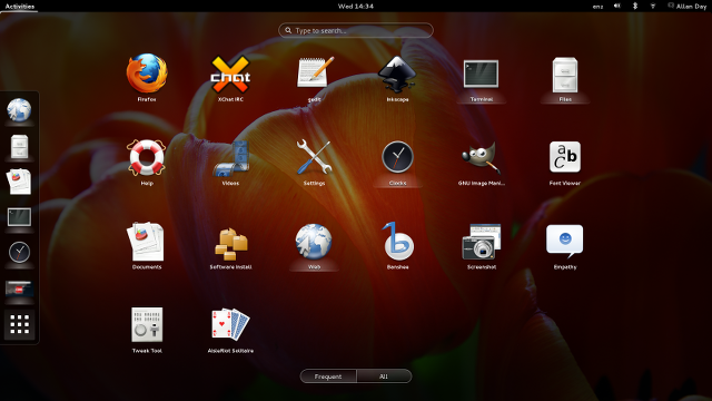
New applications view

Frequently Used Applications

This is one of the most noticeably changes included in GNOME 3.8. With previous versions, if you wanted to launch an application from the Activities Overview, you were confronted with a big grid containing all your application launchers. This could often be a bit overwhelming, and finding the application that you wanted was difficult.
Continue reading Taking GNOME 3 to the next level (again)
Settings!

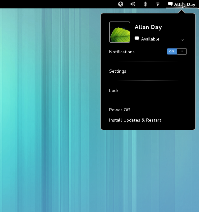
Those of us who work on GNOME design have been busy with all kinds of things recently. One major area of activity has been settings (aka System Settings, aka GNOME Control Center). In total, we have produced designs for four new panels (search, notifications, privacy, and sharing) and we have redesigned four of the existing panels (power, network, display, and date & time). Some of these have already been implemented, some are being developed on, and a few more are waiting for coders to get involved.

The new panels are things we’ve wanted to do for a while. They represent an effort to allow applications to integrate better with GNOME 3: hence panels for configuring search and notifications. The new panels also reflect a long held goal to give users control over privacy, whether that is through controls over how much personal information is displayed on screen, how your identity is exposed over the network, or what content you are sharing.

We’ve also been working to improve the overall experience provided by GNOME Settings. Some of our existing settings panels weren’t (and still aren’t) as good as they could be, and we want them all to be easy to use and to look great.

Since so much work has been done for these settings panels, I thought it would be useful to show some mockups and give bit of background on the design for each panel. One thing you might notice here is a new set of design patterns around settings in GNOME, which has been made possible by the new list widget developed by Alex Larsson.
Continue reading Settings!

Give a detail this Christmas

When I last posted about Every Detail Matters, 27 detail bugs had been fixed by 9 contributors. About two and a half months later, 43 bugs have been fixed by a total of 12 contributors. We’ve made impressive progress, and the results are already making themselves felt. Testing the latest and greatest GNOME Shell, things definitely feel more polished and better executed.

This Christmas, Every Detail Matters brings you…

Crisp menu separators. The old ones were fuzzy; now you have a clear line.

menu-separators

Corner synergy. The rounded corners of popup bubbles and scrollbars have been aligned.

bubble-corners-cropped

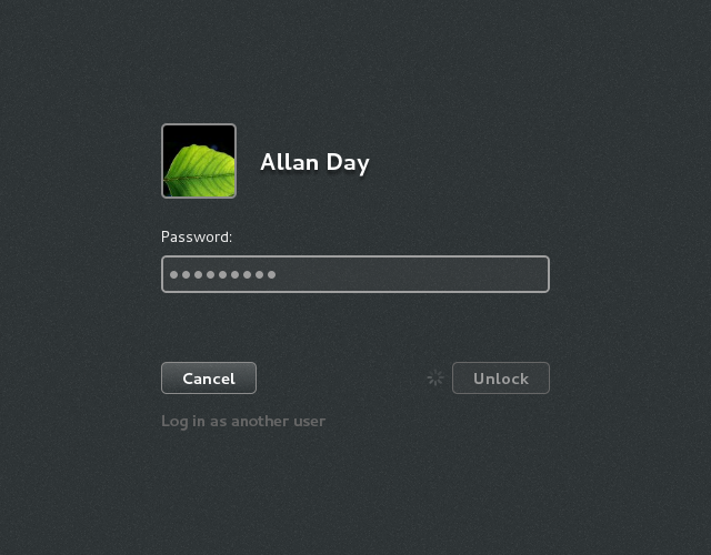
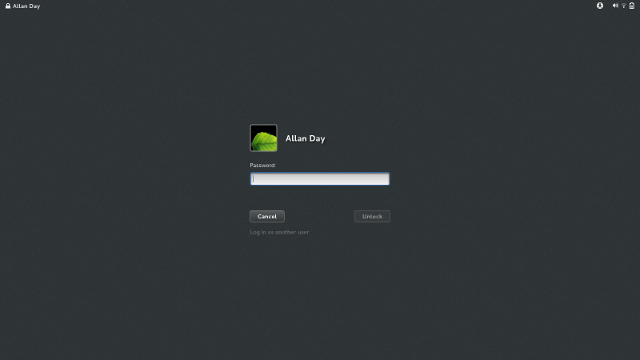
Login process indication. This has been the subject of a few different fixes. We now have proper insensitive states in the login screen, and a spinner is displayed if login is taking a while.

login-process

A “No messages” label when the tray is empty.

no-messages

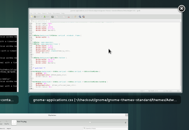
A hover effect for window thumbnails. A border is displayed around window thumbnails when you hover over them; it’s a small thing, but it’s really satisfying.

thumbnail-highlight

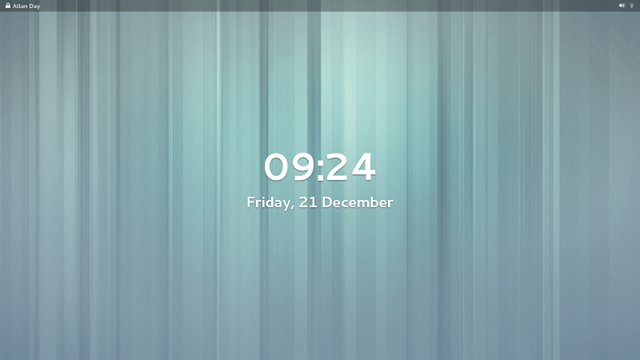
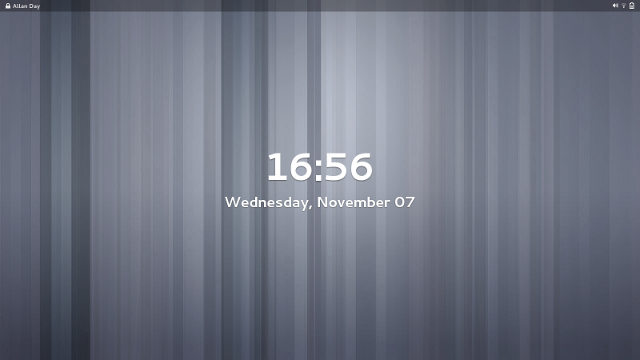
A transparent top bar in the lock screen. I featured this in my last Every Detail Matters blog post; it has now properly landed, and has had some nice polish work done on it.

transparent-top-bar-scaled

An icon to remind you when you have headphones plugged in. This bug wasn’t actually part of Every Detail Matters, it goes to show that there is plenty more happening in GNOME to get the details right.

headphone-icon

We hope you like what we’ve been working on. If you’re looking for a hacking project for the holiday, check out the Every Detail Matters wiki page. GNOME Shell is a lot of fun to work on, and we’ve got some nice bugs just waiting for someone to fix them.

The Next Step

The GNOME Project has been working hard to evolve and improve GNOME 3 since it was initially released in April 2011. We’ve made substantial progress, introducing new features, like GNOME Online Accounts, the lock screen and integrated input sources. We’ve also adjusted and refined many parts of the core UX, including improvements to the Activities Overview, the new-look Message Tray and ongoing work on System Settings. This is important work, and there is more that still needs to be done.

However, the core UX isn’t just about the Activities Overview or System Settings. There is another, crucial aspect of the new experience that we are in the process of building: core applications. And there’s one type of application that is especially important for the GNOME 3 user experience: the content application.

Content is one of the most important parts of a user experience. People care about content. Software is often just a means to get at and do something with it, whether it is the means to share holiday photos with your family, create documents for work, or play that new album you just bought. If we are going to provide a competitive, first-class user experience, we have to do content well.
Continue reading The Next Step

Fantastic Progress in Every Detail Matters

Every Detail Matters is back for a second round, and let me tell you: it is bigger and better than ever. I have been totally blown away by the response we’ve received.

We managed to fix 20 Every Detail Matters bugs for GNOME 3.4. That target has already been blown out of the water for the 3.8 cycle. At the time of writing, I count 27 bugs fixed by 9 different contributors. We’ve got some really great fixes in there, like improving animations in the lock screen and making the login experience smoother. There’s also been some nice usability enhancements to the Message Tray and Activities Overview.

We’re not done yet though: there are 14 bugs that are currently being worked on, and many more that we want to tackle. I’m adding items to the list all the time, including new features as well as smaller tasks for newcomers. If you want to help make GNOME 3.8 awesome, check out the Every Detail Matters wiki page. If there isn’t something that appeals straight away, come back and check again: we’re updating the page all the time. There’s plenty of time to get involved.

Everyone who has contributed to Every Detail Matters has done a fantastic job so far. A special mention has to go out to Stéphane Démurget, who only recently started contributing, but who has been doing a brilliant job. Stéphane hasn’t just been fixing lots of bugs, but he has been fixing them with style, and has been a real pleasure to work with.

I’d also like to give big thanks to Giovanni Campanga, Florian Muellner and Jasper St. Pierre, who are regular contributors who have been busy fixing bugs and reviewing patches. And now for some screenshots of the work done so far. :)

Run Dialog

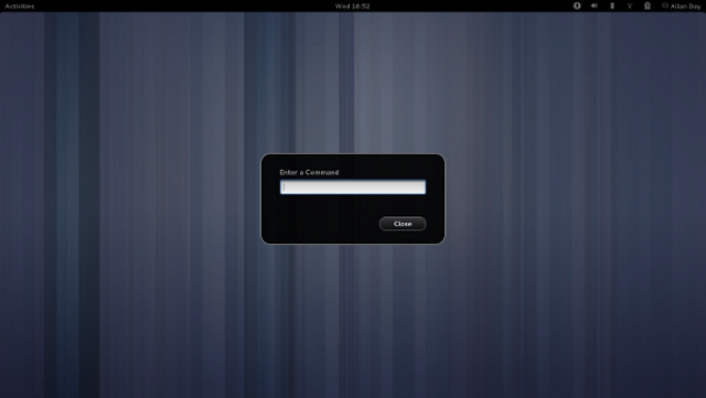
Yes, it’s a detail. But then, details matter: we have a nicer looking run dialog now. The most important feature of this is that it now has a close button, which means that people have an escape route if they accidentally open it. Another thing that this screenshot shows is our new background shade, which is used for modal dialogs and the overview. It used to be a flat transparency, but it has now been updated to use a radial gradient. This gives added depth and atmosphere.

Lock Screen

I’m cheating with this one, because it hasn’t actually landed yet. It is cool though: Florian has updated the lock screen to use a translucent top bar, which fits better with the overlaid screen shield metaphor that we’re using here. It also looks awesome. :)

Login Screen

Finally, another detail (which, like all details, matters): the login screen now has properly styled insensitive buttons, and we make sure that the Unlock button is insensitive until the password entry field contains some text.

Expect more updates in the future.