GNOME Shell has made significant improvements over the years since GNOME 3.0 was first released. This has included overhauling notifications, introducing a unified system status area, and refining how window selection and application launching works. Additionally, a huge amount of work has gone into polishing the experience through many many small improvements.
At the same time, some of the core elements of the GNOME Shell experience haven’t significantly changed for some time, and I have started to feel that a round of improvements is due, both to address long-standing issues and to ensure that the shell continues to develop in ways that our users value.
GNOME is also in the fantastic position of having new partners who we are developing working relationships with, particularly around the shell. Nowadays there are a variety of derivatives who are using the shell, including Endless, Ubuntu and Pop!_OS, and there’s a real desire to collaborate over the future of the shell and share in any benefits that might result.
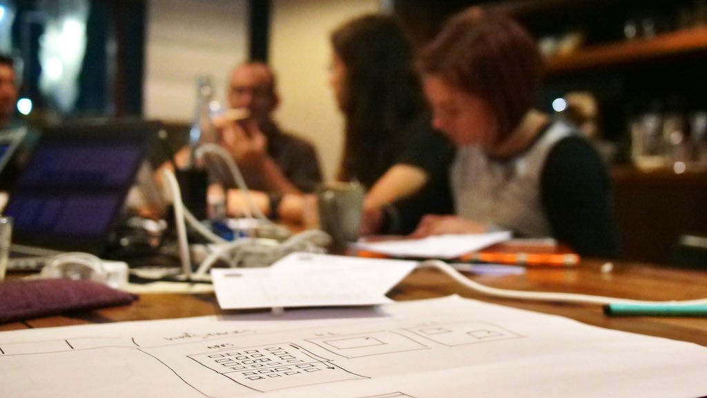
Last week, these twin desires coalesced as a user experience hackfest which aimed to improve the design of the shell.
The hackfest was deliberately small, in order to provide a conducive environment for design work. Participants included Robin Tafel, Cosimo Cecchi, Jakub Steiner, Tobias Bernard, Florian Müllner, Cassidy James Blaede, Mario Sanchez Prada and myself (Nick Richards also called in). These individuals had affiliations with Endless, Red Hat, System76 and elementary OS, and they included both experienced GNOME designers and fresh perspectives.
While there wasn’t anyone from Ubuntu at the hackfest, we are in contact and I’ll be working to ensure that they are included in the process that the hackfest has initiated.
Overall, I was extremely happy with the event, and we came away with some exciting plans, which we think will result in major improvements to the GNOME Shell user experience.
Turning the ideas we’ve generated into viable designs will be a lot of work, and I’ll provide more details once some of the details have been filled in. In the mean time, Cassidy has written up a detailed account of the hackfest, which includes some more specifics for those who are especially interested.
I’d like to thank the GNOME Foundation for sponsoring my attendance at the hackfest, as well as Endless and Red Hat for providing the space for the event. I’d also like to offer my heartfelt gratitude to all the attendees, every one of whom made valuable and talented contributions over the four days.
Last week I attended the first ever GNOME Foundation hackfest in Berlin, Germany. The hackfest was part of an effort to redefine how the GNOME Foundation operates and is perceived. There are a number of aspects to this process:
Giving the Board of Directors a higher-level strategic oversight role.
Empowering our staff to take more executive action.
Decentralising the Foundation, so that authority and power is pushed out to the community.
Engaging in strategic initiatives that benefit the GNOME project.
Until now, the board has largely operated in an executive mode: each meeting we decide on funding requests, trademark questions and whatever other miscellaneous issues come our way. While some of this decision-making responsibility is to be expected, it is also fair to say that the board spends too much time on small questions and not enough on bigger ones.
One of the reasons for last week’s hackfest was to try and shift the board from its executive role to a more legislative one. To do this, we wrote and approved spending policies, so that expenditure decisions don’t have to be made on a case-by-case basis. We also approved a budget for the financial year and specified budget holders for some lines of expenditure.
With these in place the board is now in a position to relinquish control over trivial spending decisions and to take up a high-level budget oversight role. Going forward the board will have have its eye on the big budget picture and not on the detail. Smaller spending decisions will be pushed out to our staff, to individual budget holders from the community and to committees.
It is hoped that these changes will allow us to play a more strategic role in the future. This transition will probably take some time yet, and there are some other areas that still need to be addressed. However, with the Berlin hackfest we have made a major step forward.
Huge thanks to the good people at Kinvolk for providing the venue for the event, and to the GNOME Foundation for sponsoring me to attend.
“Status icons” go by a few different names. A lot of people know them by the area where they appear, which gets described as the “system tray” or “notification area”. Whatever you call it, it’s the place where a string of little icons often gets shown, typically by applications that are running in the background.
GNOME 3 currently shows status icons in the bottom-left corner of the screen, in a tray that slides in and out. We know that this isn’t a good solution. The tray gets in the way and it generally feels quite awkward. There’s a general consensus that we don’t want to continue with this UI for the upcoming version of GNOME 3.
At the same time, the GNOME project has done a lot of work in recent years that reduces the importance of status icons. This includes integrating media controls and weather information into the shell’s calendar drop down, creating the Night Light, and working with third party application developers to reduce their reliance on status icons. In the next release, we will be introducing a new integration API for file synchronisation apps, which will be another positive step.
From GNOME 3.26, we are therefore planning not to show status icons in GNOME Shell by default. We feel that, long-term, this change will enable us to provide a better experience for our users (I’ll go into some detail about this in the rest of the post). We also feel that the consequences of the change won’t be as dramatic as they would have been in the past.
We do recognise that people are using status icons today and that some will continue to want to use them. That’s absolutely fine, and our decision to stop showing status icons by default is in no way a negative judgement on this. If you want or need to continue using status icons, you should feel free to use the TopIcons GNOME Shell extension. This will continue to work and the extension offers a better status icon experience than the current default anyway.
Having reviewed how applications are using status icons, we are confident that the majority of applications that use status icons will not be impacted by the decision not to display them by default. In many cases applications won’t have to make any changes, and if changes are required we have hopefully contacted you already.
It is also worth noting that many of the recommendations for how to provide a good experience without status icons are established guidelines anyway, and can be adopted whether an application is using a status icon or not (such as using existing APIs effectively and having a consistent behaviour when your application is launched). This is a great opportunity to improve applications more generally!
If you are an application developer and are uncertain about whether this change affects you, or how to adjust to it, check out the guidelines on the GNOME wiki and feel free to get in touch if you are still uncertain. We want to help you any way we can.
The rest of this post includes background information on our approach to status icons. It will hopefully help those who are interested to understand the decision a little better.
The why.
Still with me? OK, let’s continue!
As a starting point, it’s worth pointing out that status icons are pretty old. The first version of the spec is dated April 2002, which means that it predated GNOME 2.0. They had “balloon messages”. It perhaps goes without saying, but status icons are something that we inherited, rather than something that was designed as part of the overall experience.
But why don’t we want them anymore? There are some specific issues with status icons, which I’ll get on to, but the main reasons relate to a) the existence of better APIs and b) how they align with GNOME’s wider design philosophy and goals. The following are some of these.
1. Purposeful API
In GNOME we have two closely related goals: to provide application developers with a clear vision of how apps should be built and to provide users with a simple, easy to understand and logical experience. One key ingredient to achieving this is to have a straightforward set of APIs for application integration.
We want to have clearly differentiated APIs, with each one having its own role. Primary examples include:
Status icons originated prior to all of these, and overlap with three of the four. This creates ambiguity for developers and makes it harder to know which APIs to use. Should you use notifications to notify users, or status icons? Is it best to use a status icon or MPRIS for media controls? While some of these questions can be answered by documentation and guidelines, there’s no avoiding the fact that they generate ambiguity and, inevitably, inconsistent application behaviour. Many applications today use status icons as a notifications system, despite the existence of the official notifications API, for example.
2. Application versus system
One of GNOME 3’s central design tenets is to clearly differentiate system and applications. This is intended to make the structure of the experience clear to users. It is one reason why we call the area in the top right the system status area.
Status icons and system status are both concerned with status and there is therefore a natural pull to merge the two (indeed, back in the GNOME 2 days, status icons were used for both application and system status). This is how status icons are typically presented on other platforms. However, we feel that this would dilute the experience as a whole, since it would introduce a lack of clarity over what belongs to what. The influence of this kind of distinction is a subtle but pervasive one.
3. User control
Another key design principle for GNOME is to put the user in control. We aim to ensure that how the system looks and behaves is determined by the user. The only person who should be able to change your wallpaper, your preferred wi-fi networks, your favourite applications or your default email client, is you. This is one reason why we are so keen on the concept of application sandboxing.
The design of status icons goes against this principle. We know from observation that people often only care about a small fraction of the status icons that they are exposed to, and the rest don’t reflect their interests or activities. This stems from the status icon API and the ethos behind it.
Users don’t opt into status icons. They don’t neatly stay out of the way when they’re not wanted (as with notifications). They don’t reflect a particular type of user activity (like MPRIS integration). In essence, they take control from the user.
4. Accessible click targets
Finally, throughout GNOME 3, we have attempted to ensure that click targets are always easy to target. Teeny tiny click targets pose a challenge in a whole host of situations, from those with poor quality pointing devices, to those who don’t have the same level of motor control as others. Look around and you won’t see many small click targets in GNOME 3, and this is why.
Status icons are, in essence, a string of tiny little click targets. They are hard to click.
Scalability
Clearly differentiated API, a distinction between applications and system, ensuring user control and keeping our UI accessible are four design principles which inform our view on status icons.
Another reason for wanting to move away from status icons is more a criticism of the concept itself. Part of the difficulty with status icons is just how appealing they are to application authors. They are visually prominent, giving great advertising and brand presence. They also provide users with quick access to application controls. What’s not to like!?
Unfortunately the very attractiveness of status icons leads to problems. Most obviously, users often end up with too many of them.
Every platform that has embraced status icons has ended up having to wrestle with this problem, from the Windows notification area overflow, merging of application indicators on Ubuntu, and a raft of modifications on Mac. In my mind, all of these management solutions are indicative of an underlying issue.
There’s a contradiction at the heart of a system which on the one hand offers to present application UI in a persistent manner, but which can be used by any number of applications. In the end, you end up presenting more information than users can process. When this happens, some of the icons have to be hidden, which means going back on the central promise of persistent presence. The whole concept eventually collapses.
Conclusion
We recognise that this is a potentially contentious issue. At the same time, we hope that this post has helped to provide some better insight into why the decision has been made and shows how it is part of a more general effort to improve the platform.
My feeling is that we have actually been using status icons as a crutch for far too long – that they have been used to fill gaps in our APIs, gaps which are now thankfully getting filled – and that moving away from them will help us to extend application integration in some exciting directions.
Finally, when we say that we want to hear feedback we truly mean it: there are bound to be issues that need addressing and that we need to hear about. The more information we have, the better.
This is a bloggified version of the talk that I gave at GUADEC 2017. In converting it into print, it has been elaborated and refined.
When I first got involved in GNOME, one of the things that struck me was how principled it was. The members of the project had a strong set of values, both about what they were doing and why they were doing it. It was inspiring to see this and it’s one of the things that really made me want to get more involved.
Over the years that I’ve participated in the project, I’ve been able to get a better sense of GNOME’s principles and the role that they play in the project. They are the subject of this post.
The principles that the members of the GNOME project hold in common play an important practical role. They make problem-solving more efficient, by providing a basis on which decisions can be made. They also help to coordinate activities across the project.
However, GNOME’s principles also have a far more important role: they define the project. They are what makes GNOME GNOME. The project’s code can get rewritten and its contributors can come and go, but as long as its principles are preserved, it will still be GNOME. It is GNOME’s principles that make it different from other projects. They make it unique. They are the basis of its identity and its purpose.
Another reason that I want to talk about GNOME’s principles is that the project is going to be 20 years old this year. That’s a long time in the software world! GNOME’s longevity is a great success and something to be hugely proud of. It also comes with an inherent risk: as the contributor base renews itself over time, the project’s collective memory could get eroded. As a result, GNOME could forget its principles and the lessons of the past. It is therefore important to find ways of communicating the project’s principles and values, so that they continue to inform successive generations of contributors.
In what follows, I’m going to summarise what I think are GNOME’s most important principles. It’s a personal list, but it’s also one that I’ve developed after years of working within the GNOME project, as well as talking to other members of the community. If you know the GNOME project, it should be familiar. If you don’t know it so well, it will hopefully help you understand why GNOME is important.
Principle 1: GNOME is principled
This principle is quite meta, but I think that it is worth emphasising. GNOME is a principled project. It was born out of principles – that is, out of a belief in Free Software – but it also lives by its principles in the day-to-day activities of its contributors.
Members of the GNOME project don’t just make things up as they go along and they don’t always take the easiest path. They don’t do things just because someone somewhere thought that they might be a good idea. Instead, they seek to make decisions based on insight and on informed view points. In doing so, they draw on the collective history of the project: the lessons that have been learned through the years that the GNOME project has been active. This is one way in which GNOME’s principles are significant – as a way of communicating experience and understanding.
Being principled often means making tough decisions. It can require that, sometimes, we have to stand up to pressure. In some cases this has resulted in bad press, and in GNOME gaining a certain notoriety.
However, being principled also defines who we are, and it gives us direction. A project that gave in to every demand, or that flip-flopped on decisions without trying to stay on course, would quickly find itself lost.
Members of the GNOME project don’t always get things right, and there are decisions that we’ve made over the years that haven’t been the best. But while individual decisions might be questionable, the overall direction of travel has been positive, and that is exactly because we have been true to our principles. It is why, after almost 20 years, the project continues to have a strong sense of purpose.
Principle 2: software freedom
GNOME was born out of a concern with software freedom: the desire to create a Free Software desktop. That commitment exists to this day. While individual members of the project vary in their interpretation of what software freedom means, or the best way to achieve it, they all share a concern with its ideals.
One reason for GNOME’s continued commitment to Free Software is that its members’ views are informed by their day-to-day experiences working on the project. Freedom isn’t simple or easy. It doesn’t just appear. It grows out of a million small decisions and interactions. Members of the GNOME project live and breath software freedom, in all its messy and sometimes uncomfortable reality. They work at it, day in, day out, so that it becomes habit and instinct.
My view is that GNOME has a particularly deep and sophisticated understanding of software freedom. We recognise that it isn’t just a matter of licensing. Instead, we work to ensure that every aspect of the project is accessible to those who want to participate. This applies to all the activities that make up a software project, including marketing, translation, design and documentation.
Make no mistake: GNOME’s vision of software freedom is a radical one. It goes beyond the principle that code should be modifiable. It says that everyone should have the ability to participate in its development. This is an inclusive vision of freedom which has a principle of equality at its heart. It is a rejection of technological elitism. It is an egalitarian version of openness.
One of GNOME’s foundational documents is the GNOME Foundation Charter, written in 2000. In it, you can clearly see the commitment to freedom and openness that is still alive in the project today:
“In almost every sense of the word, GNOME is an open project. This is one of our greatest strengths, has always been, and should be the balefire by which we plot our course into the future.
The foundation should not be exclusionary or elitist. Every GNOME contributor, however small his or her contribution, must have the opportunity to participate in determining the direction and actions of the project.”
The Foundation Charter is a principled, aspirational document. It is part of GNOME’s heritage. It shows how, while the members of the project have changed, the culture of openness has remained. Those who want to understand the GNOME project would do well to read it.
To see GNOME’s culture of openness at work, you have to look no further than the Newcomer’s Initiative. Originally started as “GNOME Love” back in 2001, the Newcomers Initiative helps new contributors get started, and is emblematic of the effort to be welcoming and accessible that happens across GNOME.
While efforts to help new contributors have a self-interested aspect – more contributors are obviously a good thing for the project – I believe that they are also a logical extension of the software freedom principle. If software freedom means enabling people to participate in software development, then helping people to participate is a direct extension of software freedom. GNOME has been doing this in an explicit way for 16 years.
Principle 3: inclusive software
GNOME is committed to making its software usable by as many people as possible. This principle emerged during the project’s early years.
This commitment to inclusive software has a number of dimensions:
Usability. This is the commitment to make software that can be used by the vast majority of people, particularly (but not only) non-technical users. Here the GNOME project owes a great debt to the Usability Team at Sun Microsystems, who conducted the first usability test of GNOME back in 2001, a move which led to the creation of the GNOME Usability Project. Special mention has to go to Calum Benson who led this effort for many years. GNOME was one of the first open source projects to take up usability in a serious way, something which it can be very proud of.
Accessibility. This is the commitment to ensure that GNOME’s software can be used by those with a range of physical and mental capabilities. Like usability, the concern with accessibility has been with the GNOME project for a long time (around 2000) and was initially driven by Sun Microsystems.
Language. The commitment that GNOME’s software should be usable irrespective of the language is represented by the project’s ongoing Translation Project. We continue to value our translators and plan the project’s development activities around their work.
Geography. This is GNOME’s newest commitment and is one that is being pioneered by Endless. It fits perfectly with GNOME’s wider principles and represents the commitment to ensure that GNOME can be used by those who live in parts of the world where access to high-end hardware and reliable internet connections is limited.
GNOME’s belief in inclusive software is one of the reasons for its success. In making software that reaches beyond the community who makes it, the project makes itself valuable and relevant.
The principle of inclusive software also clearly ties in with the commitment to software freedom – if you want to promote software freedom, it makes sense to try and make that software usable by as many people as possible.
It should be noted that, like all the principles being described here, the commitment to inclusive software can be a source of conflict, particularly around usability. Members of the GNOME project have had to repeatedly fight in the name of inclusive software, something which they continue to do to this day. It is a constant cultural tension, between those who would make software only for technically-inclined people like themselves, and those who would make software that takes others into account. For some, the fact that GNOME stands up for this principle is a reason to see it in an unfavourable light. However, for me, it is one of the reasons why GNOME matters.
Principle 4: high-quality engineering
This principle was particularly evident to me when I first joined the GNOME project. It was obvious in the project’s development practices, through things like code review. It was also expressed in the conversations that I observed between the project’s engineers.
GNOME has high standards when it comes to engineering. We expect our software to be well-designed, reliable and performant. We expect our code to be well-written and easy to maintain. We don’t do hacks (or at least, we do them as infrequently as possible, and when we do, we feel bad about it!) We champion competence and excellence, and we draw on experts from a wide range of fields.
Sometimes this principle can result in development taking longer than it might otherwise. Sometimes it requires that we say no to features that cannot be implemented to our standards, or that we say no to contributions that do not meet our expectations. Like the other principles, this can cause conflict. But again, it is something that we ought to be proud of.
Principle 5: we care about the stack
Traditionally, “desktop environments” were seen as an interchangeable layer that could be added or removed to a system. They were the icing on the cake. This is a position that has long been rejected by members of the GNOME project, and it is one of the reasons why many have felt uncomfortable describing GNOME simply as a “desktop”.
Early in its history, the GNOME project figured out that it was not just a layer, and that it needed to intervene in lower-level components and subsystems in order to achieve its goals. We became OS designers and engineers. The result: over the years, members of the GNOME project have generated important pieces of infrastructure which have gone on to become vital parts of Linux-based operating systems.
GNOME cares about the entire system: how it performs, its architecture, its security. We don’t stop at our own code. We make changes down the stack. We fix problems at their source. We drain swamps. We’re not afraid to expose issues that originate from further down the stack. Indeed, we view it as our duty.
Members of the GNOME community go wherever they need in order to get the job done. In doing so, they respect the principle of upstream first, working with the members of other communities and projects.
To see this principle in action, you only have to look at all the significant components that have been created by GNOME contributors: GStreamer, D-Bus, NetworkManager, Polkit, systemd, OSTree… it’s long! This work continues today, with vital initiatives like Flatpak and PipeWire, and services like the Linux Firmware Update Service.
Principle 6: take responsibility for the user’s experience
I learnt this, final, principle from Jon McCann, who taught me a lot when he brought me into the GNOME design team. It features in the original GNOME Shell design document (PDF), and was at the heart of GNOME 3. In many senses, it is an extension and intensification of some of the other principles that I’ve outlined above.
In bringing attention to user experience, this principle expands the definition of what it is that the GNOME project creates: not just a functional piece of software, but something that has distinct aesthetic and emotional qualities. This requires that GNOME 3 be treated as a single entity and not as a collection of parts. It also requires that we think about the full range of non-software elements that make up the experience, whether it is documentation or support services.
Taking responsibility is hard, particularly for open source projects. Culturally, we come from a place where users fix or workaround bugs, essentially supporting themselves.
Taking responsibility means taking quality seriously, and rejecting the “works for me” culture that is so common in open source. It requires testing and QA. It requires that we take testing matrices seriously (not just for the “desktop layer”, but the entire stack). It requires the collection of data on the problems people experience, and that that data is analysed and acted upon.
The options question
The six principles that I believe define GNOME can be seen in the tensions and conflicts that happen in and around the project. One prominent example from over the years is in debates around the inclusion of user options in GNOME’s software, whether they are settings to change the behaviour of the software, or capabilities to customise it in various ways. I’d like to linger on this question briefly, because it serves as a powerful example of how GNOME’s principles can come into play.
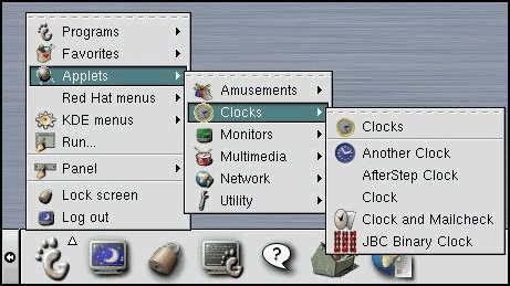
For many, the GNOME project is associated with a conservative approach to options. We are said to not be configurable enough and that we “dumb software down”. However, it wasn’t always this way. In the early days of GNOME, there were all kinds of ways you could customise. Want to add the time to your panel? Here’s five different ways you can do it!
Adding a clock applet in GNOME 1.4
Then Sun Microsystems came along, with their usability study. The results were not good. It was “a bucket of cold water for the project” (to paraphrase Jonathan Blandford’s 2017 GUADEC talk). Thus GNOME learned some of the problems associated with a proliferation of options, and one of its principles was born.
That principle – of usable software – was further championed by Havoc Pennington, another name to which the project owes a debt. His essay on Free Software UI is another of GNOME’s foundational documents. In my opinion, every contributor should be familiar with it. The key lesson: preferences have a cost. A usability cost, an engineering cost, a QA cost. They result in software that isn’t inclusive. They decrease the engineering quality of the software. They put responsibility for the experience in the user’s hands, whether they want it or not.
This is not an argument for never including options, but it is an argument for being careful about which options are supported.
Free Software UI was written in 2002. Its lessons were taken on by GNOME and inspired a number of incredibly successful software projects (hello Metacity, NetworkManager). Yet I still encounter people to whom its arguments are surprising, even controversial. This is another reason for us to restate GNOME’s principles with ever more clarity.
Conclusion
Writing this post, and giving the talk on which it was based, reminds me what an inspiring project GNOME can be. It takes me back to when I first got involved. I hope that, in writing this, others are experience that same sense of excitement and inspiration.
I also hope that this post helps to reignite a connection with GNOME’s principles and its past. The project’s ethos shouldn’t be frozen in amber: it should be a living, breathing thing that we continually recreate and reimagine. Just as we attend to the software that we develop and the community that creates it, so we should also care about the principles and values that lie at their heart.
Here’s to the next 20 years!
Thanks to several members of the GNOME community who helped me with the original talk. You know who you are!
Simple Scan is a great app and there’s a lot of love for it. It’s one of those reliable, indispensable tools that it would be hard to live without. Just because it’s great doesn’t mean that it can’t be improved, of course, and it was recently suggested that I take a look at its design.
Most of the improvements can be described as refinements. Right now there are a bunch of operations which can be a bit tricky to find, or which aren’t as obvious as they could be. There are also a few actions that are well and truly buried!
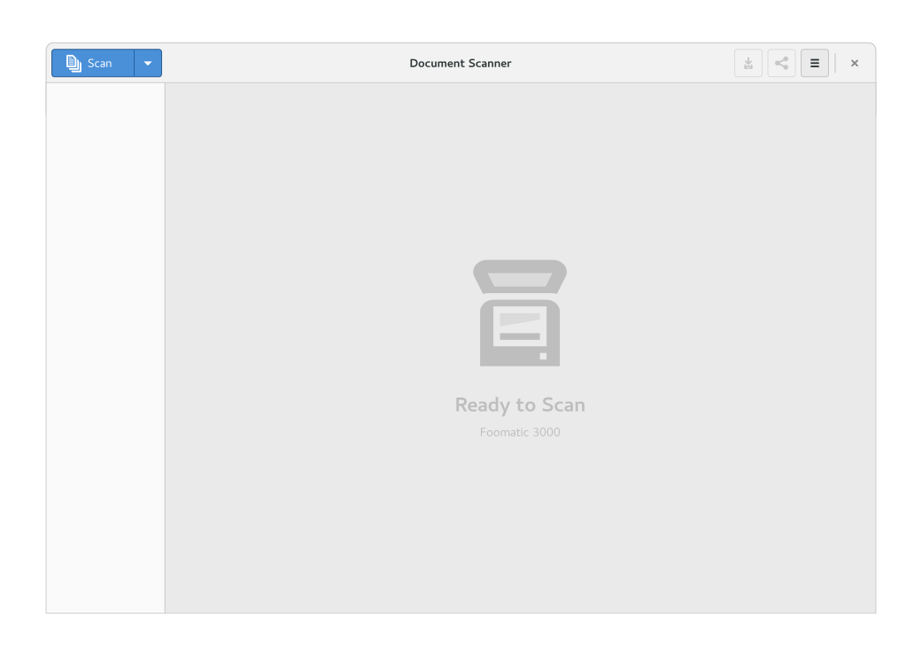
Let’s look at the mockups. First, the initial “ready to scan” state:
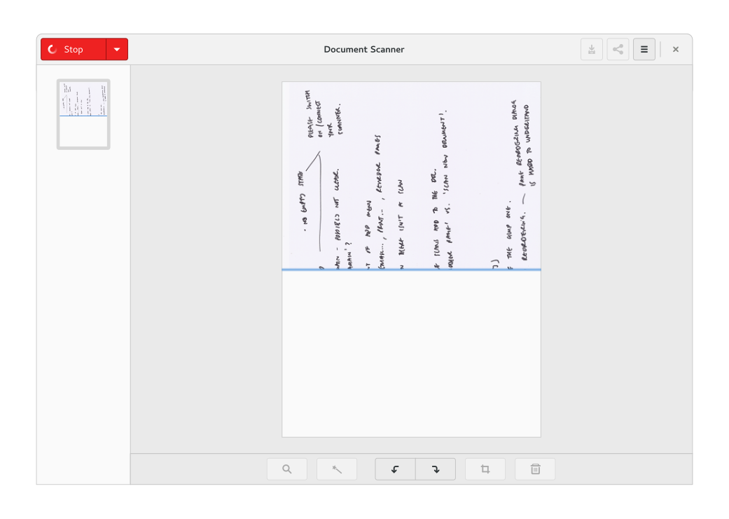
How it could look when scanning:
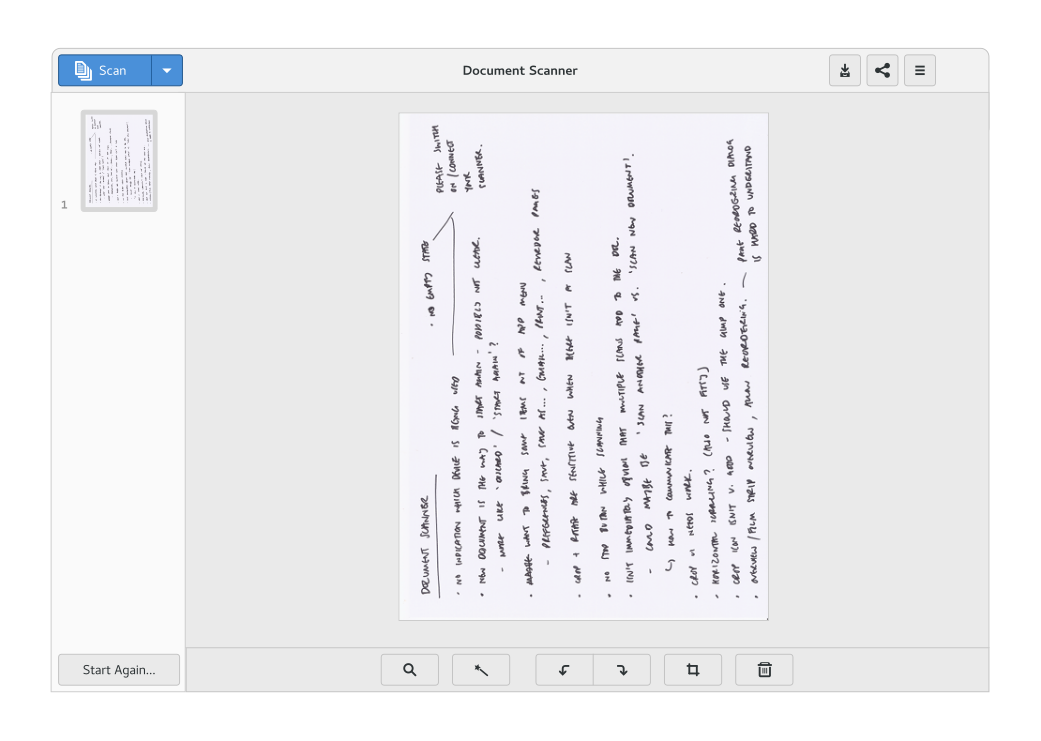
Finally, what a scanned document could look like:
The primary changes are the introduction of a sidebar for selecting a page and the use of an action bar at the bottom for performing page actions. This makes it much clearer which page is selected, which is important when you want to perform edits. It also helps to communicate the purpose of the edit buttons – right now crop and rotate are a little ambiguous, largely due to their placement.
There are some other smaller improvements. The scan button now communicates the image/text and single page/document feeder modes, which means that you don’t have to dig into the UI to find out what will happen when you click the button. Some options, like reorder pages, have been rescued from the relative obscurity of the app menu. The current “new document” action has been rebranded as “start again”, in order to communicate that it’s how you clear the current scan as well as start a new one.
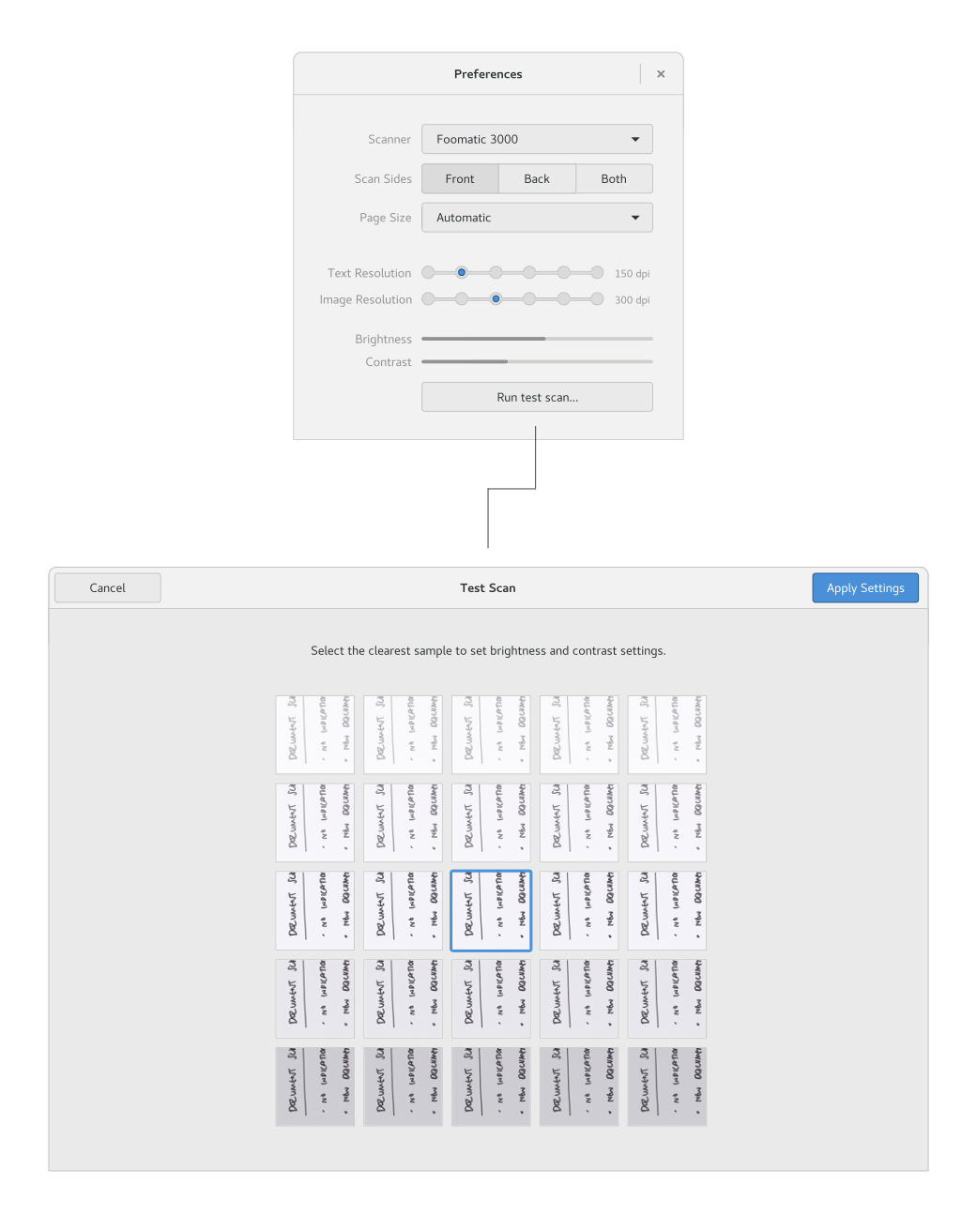
I’ve also reworked the settings:
This uses an experimental approach to the brightness and contrast settings here. To be able to use these, someone really needs feedback on what the different settings look like in practice. To enable this, I’ve sketched out a test scan mode which produces samples using a range of settings. This allows the user to specify the settings by selecting the best sample.
Observant readers will notice a crop of new controls for features that don’t currently exist. This includes OCR text reading and editing, a zoom control, and a magic enhancement feature. These are mostly placeholders for features that Robert Ancell, the Simple Scan maintainer, would like to add at some point in the future.
As far as I’m aware, no one is lined up to implement these changes, so if anyone fancies taking a shot at them, that would be great. The initial changes are described in a couple ofbug reports. For more details, you can also see the full mockups in all their warty glory.


