Last August, we ran a research exercise using a small tool called gnome-info-collect. The tool allowed GNOME users to anonymously send us non-sensitive data about how their systems were configured. The plan was to use that data to inform our design and development decisions. We got a fantastic response to our call for participation, with over 2,500 people uploading their data to the GNOME servers.
We’ve just finished the final parts of the analysis, so it’s time to share what we’ve learned. This post is on the long side, so you might want to get a brew on before you start reading!
Research limitations
The people who provided their data with gnome-info-collect were primarily recruited via GNOME’s media channels, including Discourse and Twitter. This means that the data we collected was on a fairly particular subset of GNOME’s users: namely, people who follow our social media channels, are interested enough to respond to our call for help, and are confident installing and running a command line tool.
The analysis in this post should therefore not be treated as being representative of the entire GNOME user base. This doesn’t mean that it’s invalid – just that it has limited validity to the group we collected data from.
It should also be noted that the data from gnome-info-collect is by no means perfect. We collected information on GNOME systems rather than individual users. While there were some basic measures to avoid double counting, they weren’t foolproof, and there was nothing to stop the same person from submitting multiple reports using different accounts or systems. We also have no way to know if the systems which we got data on were the main desktops used by the reporters.
Who responded?
In total, we received 2,560 responses to gnome-info-collect. Of the 2,560 responses, 43 were removed from the dataset, due to not being GNOME installations, or being a virtual machine.
Distro used
A little over half of the responses came from a Fedora installation. The other main distros were Arch and Ubuntu.
| Distro |
Number of responses |
% of responses |
| Fedora |
1376 |
54.69% |
| Arch |
469 |
18.64% |
| Ubuntu |
267 |
10.61% |
| Manjaro |
140 |
5.56% |
| Other |
78 |
3.10% |
| EndeavourOS |
66 |
2.62% |
| Debian |
44 |
1.75% |
| openSUSE |
38 |
1.51% |
| Pop! |
38 |
1.51% |
| Total |
2516 |
100.00% |
Hardware manufacturer
The data we got on the hardware manufacturer of each system was poor quality. Many systems didn’t accurately report their manufacturer, and the names were often inconsistently written. Of the manufacturers that we could identify, Lenovo was the most common, with Dell, ASUS, HP, MSI and Gigabyte making up the bulk of the other systems.
| Manufacturer |
Responses |
% Valid Responses |
| Lenovo |
516 |
23.54% |
| Dell |
329 |
15.01% |
| ASUS |
261 |
11.91% |
| HP |
223 |
10.17% |
| MSI |
213 |
9.72% |
| Gigabyte |
211 |
9.63% |
| Acer |
86 |
3.92% |
| Other |
353 |
16.10% |
| Total valid responses |
2192 |
100.00% |
Desktop configuration
We collected data on a number of different aspects of desktop configuration. Each of these areas are relevant to ongoing areas of design and development work.
Workspaces
We collected data on both the “workspaces on primary” and “dynamic workspaces” settings. The former controls whether each workspace is only on the primary display, or whether it spans all displays, and the latter controls whether workspaces are automatically added and removed, or whether there is a fixed number of workspaces.
In both cases, the default setting was used by the vast majority of systems, though the number of systems where the default was changed was not insignificant either. It was more common for people to change workspaces on primary, as opposed to the dynamic workspaces option.
|
Enabled |
Disabled |
% Enabled |
% Disabled |
Total |
| Workspaces on primary |
2078 |
439 |
82.56% |
17.44% |
2517 |
| Dynamic workspaces |
2262 |
255 |
89.87% |
10.13% |
2517 |
Sharing features
GNOME’s sharing settings include a variety of features, and we collected information on which ones were enabled. When looking at this, it is important to remember that an enabled feature is not necessarily actively used.
Remote login (SSH login) was enabled more than any other sharing feature, which suggests that the gnome-info-collect respondents were relatively technical users.
Activation of the other features was relatively low, with multimedia sharing being the lowest.
| Sharing Feature |
Systems Enabled |
% Enabled |
| Remote login |
527 |
20.95% |
| Remote desktop |
248 |
9.85% |
| File sharing |
160 |
6.36% |
| Multimedia sharing |
108 |
4.29% |
Online accounts
Around 55% of the responses had one or more online accounts set up. (Again, an enabled feature is not necessarily used.)
| Number of Online Accounts |
Responses |
% Responses |
| 0 |
1115 |
44.30% |
| ≥1 |
1402 |
55.70% |
| Total responses |
2517 |
100.00% |
Google was the most common account type, followed by Nextcloud and Microsoft. Some of the account types had very little usage at all, with Foursquare, Facebook, Media Server, Flickr and Last.fm all being active on less than 1% of systems.
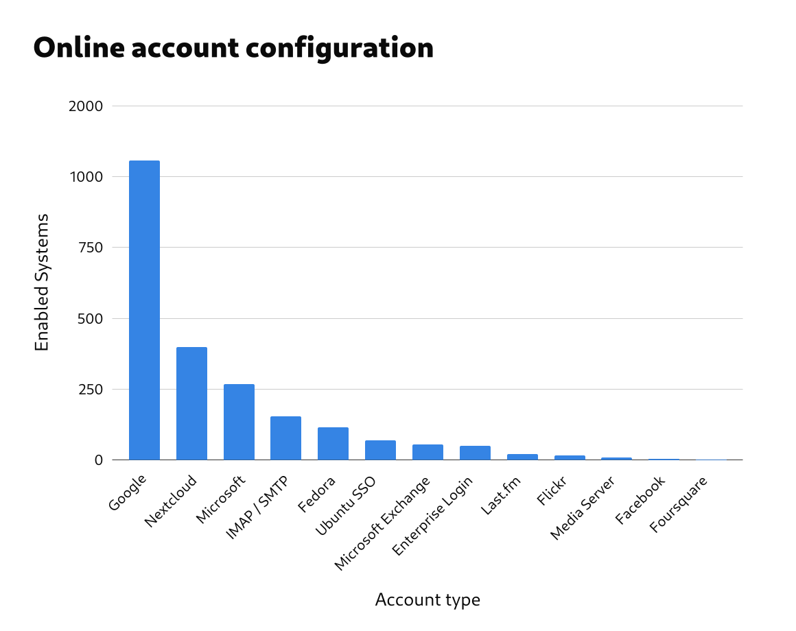
| Account type |
Responses |
% Responses |
% Responses With ≥1 Accounts |
| Google |
1056 |
41.95% |
75.32% |
| Nextcloud |
398 |
15.81% |
28.39% |
| Microsoft |
268 |
10.65% |
19.12% |
| IMAP and SMTP |
153 |
6.08% |
10.91% |
| Fedora |
114 |
4.53% |
8.13% |
| Ubuntu Single Sign-On |
70 |
2.78% |
4.99% |
| Microsoft Exchange |
55 |
2.19% |
3.92% |
| Enterprise Login (Kerberos) |
50 |
1.99% |
3.57% |
| Last.fm |
20 |
0.79% |
1.43% |
| Flickr |
15 |
0.60% |
1.07% |
| Media Server |
9 |
0.36% |
0.64% |
| Facebook |
4 |
0.16% |
0.29% |
| Foursquare |
2 |
0.08% |
0.14% |
Flatpak and Flathub
Flatpak and Flathub are both important to GNOME’s strategic direction, so it is useful to know the extent of their adoption. This adoption level is also relevant to the design of GNOME’s Software app.
Over 90% of systems had Flatpak installed.
| Flatpak status |
Responses |
% Responses |
| Installed |
2344 |
93.13% |
| Not installed |
173 |
6.87% |
| Total |
2517 |
100.00% |
In total, 2102 systems had Flathub fully enabled, which is 84% of all reporting systems, and 97% of systems which had flatpak installed. (The Flathub filtered status refers to Fedora’s filtered version of Flathub. This contains very few apps, so it is more like having Flathub disabled than having it enabled.)
It would be interesting to analyse Flatpak and Flathub adoption across distros.
Default browser
The default browser data referred to which browser was currently set as the default. It therefore doesn’t give us direct information about how much each browser is used.
The following table gives the results for the nine most popular default browsers. This combined the different versions of each browser, such as nightlies and development versions.
Most distros use Firefox as the default browser, so it’s unsurprising that it came out top of the list. These numbers give an interesting insight into the extent to which users are switching to one of Firefox’s competitors.
| Default Browser |
Responses |
% Responses |
| Firefox |
1797 |
73.14% |
| Google Chrome |
286 |
11.64% |
| Brave |
117 |
4.76% |
| Web |
49 |
1.99% |
| Vivaldi |
47 |
1.91% |
| LibreWolf |
44 |
1.79% |
| Chromium |
42 |
1.71% |
| Junction |
38 |
1.55% |
| Microsoft Edge |
37 |
1.51% |
| Total |
2457 |
100.00% |
Shell Extensions
gnome-info-collect gathered data on which extensions were enabled on each reporting system. This potentially points to functionality that people feel is missing from GNOME Shell.
Extension usage levels
When analyzing extension usage, we removed any pre-installed extensions from the data, so that data only included extensions that had been manually installed.
The vast majority of systems – some 83% – had at least one enabled extension. Additionally, 40% had between 1 and 5 enabled extensions, meaning that the majority (around 60%) had 5 or less enabled extensions.
At the same time, a substantial minority of systems had a relatively high number of enabled extensions, with around 25% of systems having between 6 and 10.
| Number of Manually Enabled Extensions |
Number of Responses |
% Responses |
% Responses With Enabled Extensions |
| 0 |
421 |
16.84% |
|
| 1-5 |
1058 |
42.32% |
50.89% |
| 6-10 |
635 |
25.40% |
30.54% |
| 11-18 |
341 |
13.64% |
16.40% |
| 19+ |
45 |
1.80% |
2.16% |
| Total |
2500 |
100.00% |
100.00% |

Extension popularity
The data included 588 individual extensions that were enabled. When analysing the popularity of each extension, we grouped the extensions which had similar or identical features. So, for example, “appindicator support” includes all the various status icon extensions as well. The table below shows the 25 most common enabled extension types, after grouping them in this way. Some of the extensions are included as part of GNOME’s classic mode, and we didn’t have a way to filter out those extensions which were enabled due to the classic session.
| Extension |
Enabled Systems |
% Systems |
| Appindicator support |
1099 |
43.66% |
| Gsconnect |
672 |
26.70% |
| User theme |
666 |
26.46% |
| Dash to dock / panel |
579 |
23.00% |
| Sound output chooser |
576 |
22.88% |
| Blur my shell |
530 |
21.06% |
| Clipboard manager |
510 |
20.26% |
| Caffeine |
445 |
17.68% |
| System monitor |
346 |
13.75% |
| Just perfection desktop |
318 |
12.63% |
| Drive menu |
310 |
12.32% |
| Apps menu |
308 |
12.24% |
| Place menus |
276 |
10.97% |
| Openweather |
242 |
9.61% |
| Bluetooth quick connect |
239 |
9.50% |
| Night theme switcher |
208 |
8.26% |
| Tiling assistant |
184 |
7.31% |
| Launch new instance |
180 |
7.15% |
| Rounded window corners |
158 |
6.28% |
| Game mode |
146 |
5.80% |
| Alphabetical app grid |
146 |
5.80% |
| Burn my windows |
140 |
5.56% |
| GNOME UI tune |
116 |
4.61% |
| Auto move windows |
99 |
3.93% |
| Desktop icons |
98 |
3.89% |
| Background logo |
2 |
0.08% |
As can be seen, appindicator support was by far the most common extension type, with 44% of all reporting systems having it enabled. Gsconnect, user theme, dash to dock/panel, sound output chooser, blur my shell and clipboard managers were all enabled in over 20% of the responses.
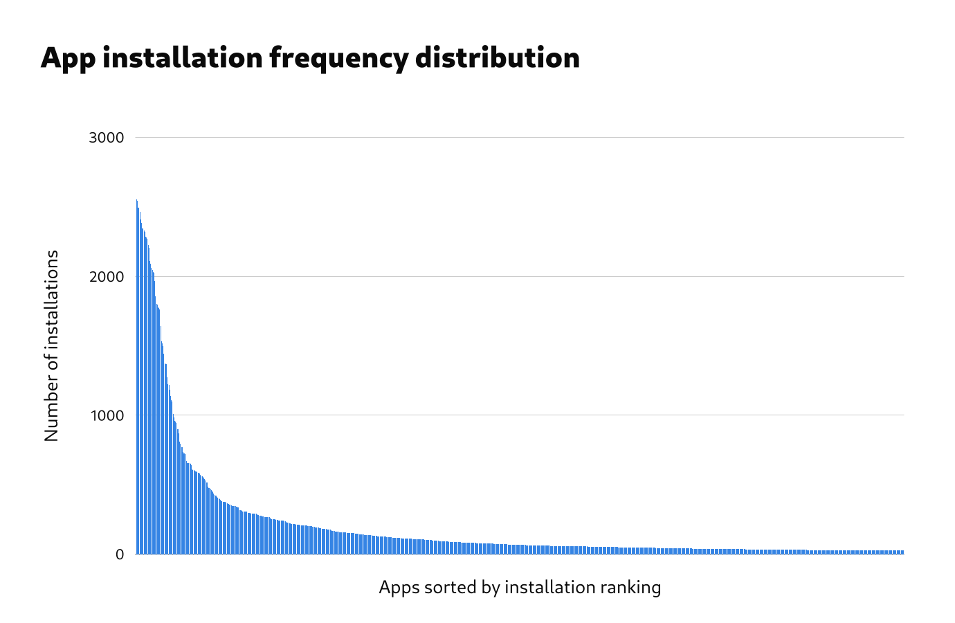
Installed apps
Knowing which apps are installed was one of the most interesting and valuable aspects of the data. It was also one of the most challenging aspects to analyse, and required processing to remove duplicate and spurious entries from the data set. The data set is still by no means perfect, but it is good enough to draw some initial conclusions.
In general, we are interested in which apps get used, which apps people have a strong need for, plus which apps people really like. App installation does not directly indicate any of these things directly, and is a relatively poor indicator for measuring them. We therefore need to be careful when drawing conclusions from this part of the analysis.
Frequency distribution
The frequency distribution of installed apps is really interesting. The total number of installed apps was very high. Even after processing, the data contained over 11,000 unique app names. Within this very large number of installed apps, the 400 most common apps represented 87% of all that were installed. This bulk of popular apps was followed by a very long tail.
The number of apps and the length of the frequency distribution tail has undoubtedly been inflated by issues in the data, and more processing to improve the data quality would be helpful.
Popular apps
After removing the most obvious preinstalled apps from the data, the 20 most common installed apps were as follows:
| App |
Installations |
% Systems |
| GIMP |
1497 |
58.48% |
| VLC |
1375 |
53.71% |
| Steam |
1367 |
53.40% |
| htop |
1184 |
46.25% |
| Dconf Editor |
1108 |
43.28% |
| Extension Manager |
984 |
38.44% |
| Inkscape |
952 |
37.19% |
| Flatseal |
942 |
36.80% |
| Discord |
938 |
36.64% |
| Google Chrome |
899 |
35.12% |
| Web |
898 |
35.08% |
| Chromium |
871 |
34.02% |
| Thunderbird |
824 |
32.19% |
| GParted |
795 |
31.05% |
| Wine |
772 |
30.16% |
| OBS Studio |
770 |
30.08% |
| Visual Studio Code |
726 |
28.36% |
| Transmission |
719 |
28.09% |
| Telegram |
713 |
27.85% |
| Geary |
672 |
26.25% |
A longer list of the most common 110 installed apps is available separately.
Note that the removal of preinstalled apps from this lists was extremely rudimentary and the numbers in the list may represent some apps which are preinstalled by some distros.
The most common manually installed apps are a mixed bag of traditional Linux desktop apps, third-party proprietary apps, and newer GNOME apps. Examples of common apps in each of these categories include:
- Traditional Linux desktop apps: GIMP, VLC, Inkscape, GParted, Transmission
- Third party apps: Google Chrome, Steam, OBS Studio, NVIDIA Settings
- Newer GNOME apps: Flatseal, To Do, Bottles, Sound Recorder, Builder
Conclusions
Overall, the data gives some strong hints about which features should be concentrated on by the GNOME project. It also provides evidence about which features shouldn’t be prioritised.
It needs to be remembered that, while we have evidence here about some of the decisions that some GNOME users are making, the data doesn’t give us much insight into why they are making the decisions that they are. For example, it would seem that people are installing the GIMP, but for what purpose? Likewise, while we know that people are enabling some features over others, the data doesn’t tell us how those features are working for them. Do people find online accounts to be useful? The data doesn’t tell us.
We therefore need to be very careful when making decisions based on the data that we have here. However, what we do have is a great basis for followup research which, when combined with these results, could be very powerful indeed.
The app installation picture is complex. On the one hand, it doesn’t look like things have changed very much in the past 10 years, with people continuing to install the GIMP, Wine, and GParted. On the other hand, we have 3rd party apps being widely used in a way that wasn’t possible in the past, and it’s exciting to see the popularity of new GNOME apps like Flatseal, To Do, Bottles, and Fragments.
The data on apps is also some of the most limited. We need data on which apps are being used, not just just which ones are installed. It would also be really helpful to have data on which apps people feel are essential for them, and it would be great to have demographic information as part of the dataset, so we can see whether there are different groups of users who are using different apps.
Methodological lessons
gnome-info-collect was the first data collection exercise of its kind that has been run by the GNOME project, and we learned a lot through the process. I’m hopeful that those lessons will be useful for subsequent research. I have notes on all that, which I’ll share at some point. For now, I just want to touch on some general points.
First, doing small standalone research exercises seems to be a great approach. It allowed us to ask research questions around our current interests, and then generate research questions for followup exercises. This allows an iterative learning process which is strongly connected to our day to day work, and which can combine different research methods to understand the data from different perspectives.
Second, the whole premise of gnome-info-collect was to do a quick and lean initiative. In reality, it turned out to be a lot more work than anticipated! This was largely due to it being the first exercise of its kind, and there not being a preexisting platform for gathering the data. However, I think that we also need to acknowledge that even lean research exercises can be a lot of work, particularly if you want to gather large amounts of data.
Finally, we discovered some major issues with the data that we can get from Linux systems. Perhaps unsurprisingly, there was a lot of inconsistency and a lack of standardisation. This required additional processing at the analysis stage, and makes automated analysis difficult. If we want to routinely collect information from GNOME systems, cleaning up the raw data would be a big help.
Outro
I’d like to take this opportunity to thank Vojtěch Staněk for all his work on gnome-info-collect. Vojtěch handled all the technical aspects of gnome-info-collect, from writing the code to processing the data, as well as helping with public outreach. He did a great job!
The gnome-info-collect data doesn’t include directly identifying information, or anything very sensitive. However, there are still privacy concerns around it. We are therefore going to be archiving the data in a restricted location, rather than publishing it in full.
However, if members of the GNOME project have a use for the data, access can be arranged, so just get in touch. We are also currently investigating options for making some of the data available in a way that mitigates any privacy risks.
