
You’ve designed your app’s interface, and found the perfect name for it. But of course a great app also needs a great icon before you can release it to the world.
After the name, the app icon is the most important part of an app’s brand. The icon can help explain at a glance what the app does, and serves as an entry point to the rest of the experience. A high quality icon can make people want to use an app more, because it’s a stand-in for the quality of the entire app.
Think of the app icon like an album cover for your app. Yes, technically the music is the same even if you have a terrible cover, but a great cover can capture the spirit of the album and elevate the quality of the thing as a whole.
Metaphors
The first thing you need is a metaphor, i.e. some kind of physical object, symbol, or other visual artifact that symbolizes your application.
Finding a good metaphor is a fuzzy and sometimes difficult process, as it’s often hard to find a physical object many people will recognize as related to the domain of your app. There are no hard and fast rules for this, but ideally your icon metaphor should fall into one of these categories:
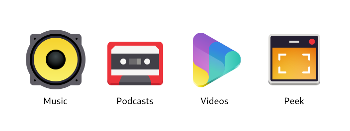
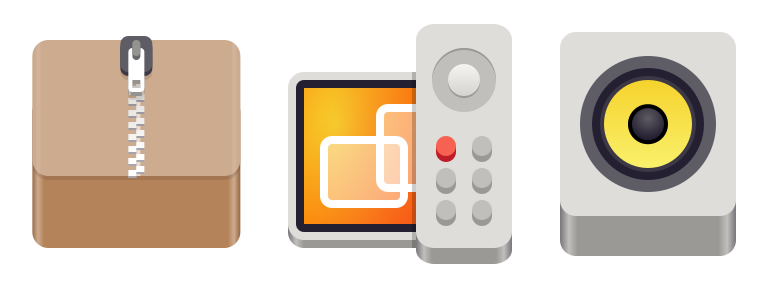
- Physical objects directly related to what the app does (e.g. a speaker for Music)
- Physical objects vaguely related to the app’s domain or an older analog version of it (e.g. a cassette tape for Podcasts)
- Symbols related to the domain (e.g. the “play” triangle for Videos)
- A simplified/stylized version of the app’s user interface (e.g. Peek)
There are also anti-patterns for metaphors which should be avoided, if possible:
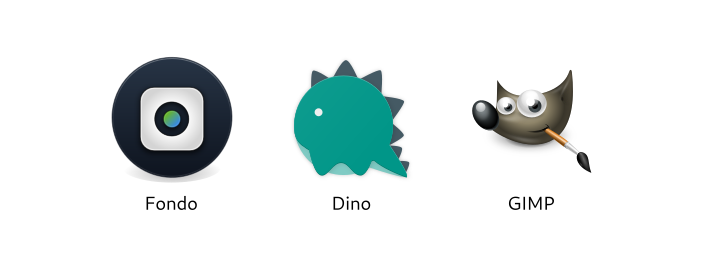
- Heavily stylized symbols or logos (e.g. Fondo)
- Completely random objects or symbols (e.g. Dino)
- Mascots (e.g. GIMP)
These kinds of metaphors can work, but they make it harder to see at a glance what the app does, and don’t fit in as well with the rest of the system.
Let’s try an example: Remember the Reading List app we designed in a previous tutorial? Let’s make an icon for that!
My process for brainstorming metaphors is quite similar to the one I use to brainstorm names: I come up with a few ideas for physical objects, put them in a thesaurus to find more related ones, and repeat that until I have a list with at least a few viable candidates.
Let’s start with related physical objects:
- Reading List
- List
- Book
- Bookshelf
- Article
- Newspaper
- Bookmark
How about related non-objects? Maybe we can find some more interesting objects that way:
- Reading, the activity: Couch, reading light, tea/coffee, glasses
- Later (as in, “read later”): Clock, timer
- Collecting things: Folder, clipboard
Now that we have a few options, let’s see which ones are viable. Ideally, the metaphor you choose should have these attributes:
- Somewhat specific to the app’s domain (e.g. a book is probably too generic in our case)
- Recognizable at small sizes
- Can be drawn in a simple, geometric style (this can save you a lot of work later on)
In this case, the most viable options are probably
- Stack of books
- Bookshelf
- Bookmark
- One of the above + a clock
Sketches
Now that we have some metaphors, let’s try to sketch them to see if they make for good icons. I usually use pencil and paper for this, but you can also use a whiteboard, digital drawing tablet, or whatever else works for you to quickly visualize some concepts.
There are also official sketching templates with the base icon shapes available for download.
While sketching it’s good to think about the overall shape your icon will have. If it makes sense for your metaphor, try to make the icon not just a simple square or circle, but something more unique and interesting. If it doesn’t make sense in your case don’t force it though, there are other ways to make the icon visually unique and interesting, such as color and structure.
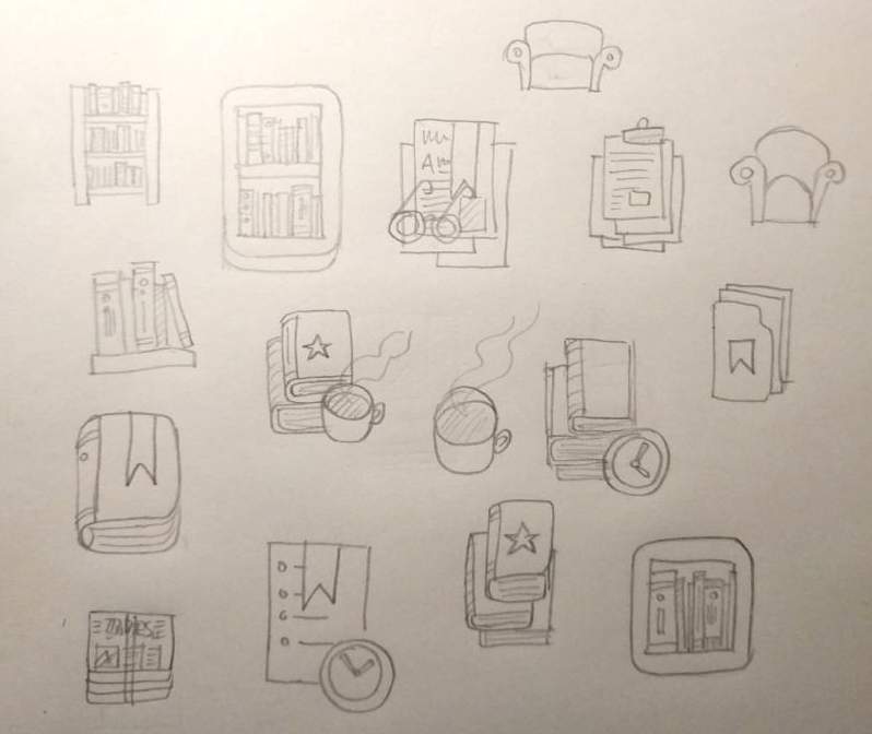
In this case, it looks like there are a number of viable concepts among our sketches, though nothing jumps out as the obvious best option. I kind of like the bookshelf, so let’s try going forward with that one.
Start from a Template
We now have a concept we like, so we can move to vector. This is where we can start using the shiny new icon design tools!
The first step is to install App Icon Preview from Flathub. We’ll also need a vector editor that works well with SVG, such as Inkscape.
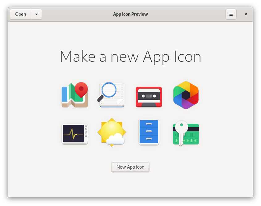
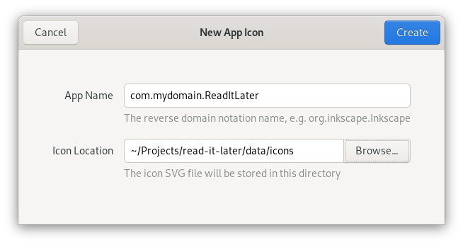
Open App Icon Preview, and hit the “New App Icon” button on the welcome screen. We’re asked for the Reverse Domain Name Notation name of the app (e.g. org.mozilla.Firefox), and where to store the icon project file.
In most cases you’ll want to keep this file in your app’s git repository. Think of it as your icon’s source file, which the final icon assets are later exported from.
After that, the icon will open in preview mode in App Icon Preview. Now we open the same file in a vector drawing app, and edit it from there. Every time we save the source file, the preview will automatically update.
Now we have our icon source file open in both App Icon Preview and Inkscape. Icon Preview shows just the icon grid:
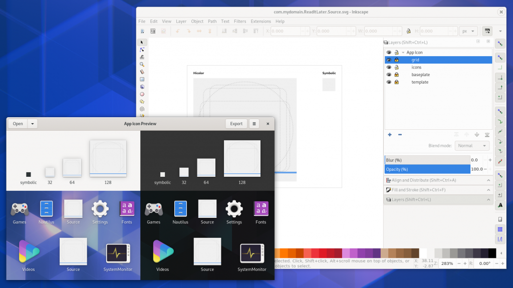
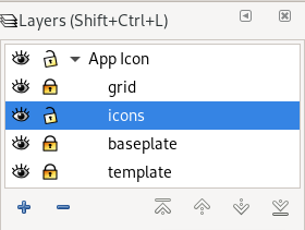
In Inkscape, open the Layers panel (Ctrl + Shift + L) and check out the layer structure. The icons layer is where the actual icon goes. The grid and baseplate layers contain the icon grid and the canvas respectively.
Behind everything else is the template layer, which doesn’t contain anything visible and is only needed so App Icon Preview can get the canvas size for preview and export. Don’t change, hide, rename, or delete this layer, because the icon might not show up in App Icon Preview anymore.
When previewing the icon in App Icon Preview you’ll want to hide the grid and baseplate layers (using the little eye icon next to the layers).
Make sure you have the GNOME HIG Colors palette in Inkscape. Inkscape 1.0 Beta has it by default, otherwise you can download it from the HIG App Icons repository and put it in ~/.var/app/org.inkscape.Inkscape/config/inkscape/palettes for Flatpak Inkscape or ~/.config/inkscape/palettes if it’s on the host. There’s also a color palette app, which you can get on Flathub.
Inkscape Tips
Once you’re familiar with the template, you can start drawing your icon idea as vector. If you’re using Inkscape and aren’t very familiar with the app yet, here’s a quick overview of the things you’ll likely need.
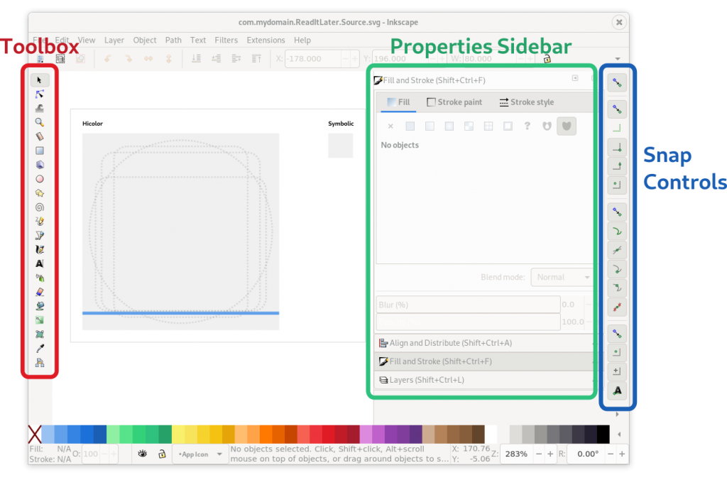
Toolbox (the toolbar on the left edge)
- Selection/movement/scaling tool (S)
- Rectangle tool (R)
- Ellipse tool (E)
And if you’re doing something a little more advanced:
- Bezier path drawing tool (B)
- Path & node editor (N)
- Gradient editor
Dialogs Sidebar (configuration dialogs docked to the right side)
- Fill & Stroke (Ctrl + Shift + F)
- Align & Distribute (Ctrl + Shift + A)
- Layers (Ctrl + Shift + L)
Snap Controls (the toolbar on the right edge) Inkscape has very fine-grained snapping controls, where you can configure what should be snapped to when you move items on the canvas (e.g. path nodes, object center, path intersections). It’s a bit fiddly, but very useful for making sure things are aligned to the grid. The icon tooltips are your friends :)
Of course, teaching Inkscape is a bit out of scope for this guide. If you’re just getting started with it, I recommend doing a few beginner tutorials first to familiarize yourself with the basic workflows (especially around the tools listed here).
The GNOME Icon Style
Traditionally, GNOME app icons were very complex, with lots of photorealistic detail and many different sizes which had to be drawn separately. This changed when we revamped the style in 2018, with the explicit goal of making it easier to produce, and more approachable for third party icon designers.
The new style is very geometric, so in many cases you can draw an entire icon with just basic shapes.
Perspective
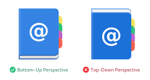
One important attribute of the style is the abstract perspective. Even though the style is simple and geometric, it’s not “flat”: It makes use of material, depth, and perspective, but in a way that is optimized for easy production as vector.
The perspective works by “folding” horizontal and vertical layers into one dimension, so you can see the object orthogonally from both the top and the front.
This results in a kind of “chin” an the bottom of the object, which is shaded darker than the top surface, since light comes evenly from the top/back.
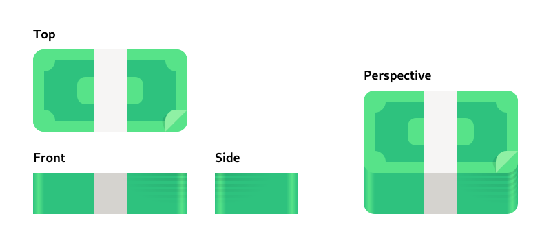
In practice, this usually doesn’t have a huge impact, since it’s also suggested to make objects not too tall, when possible. A lot of icons are just a simple 2D shape with a small chin at the bottom.
That said, it can look very weird when you get the perspective wrong, e.g. by folding the layers from the top/back instead of the front, so it’s important to keep this in mind.
Material & Lighting
Icons can make use of skeuomorphic materials (e.g. wood, metal, or glass) if it’s needed for the physical metaphor, but outside of those special cases it’s recommended to keep things simple.
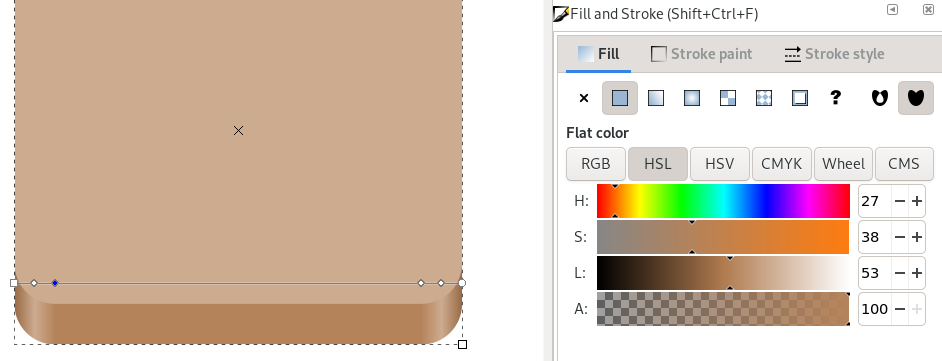
Straight surfaces have flat colors (instead of e.g. slight vertical gradients), but curved surfaces can/should have gradients. The corners on the chin on rounded base shapes should have a highlight gradient.
Shadows inside the icon should be avoided if possible, but can be used if necessary (e.g. for contrast reasons). Do not use drop shadows that affect the app outline though, because GTK renders such a shadow automatically.
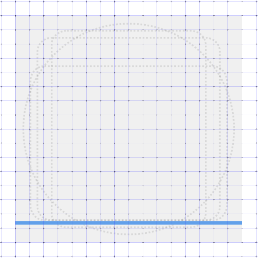
Icon Grid & Standard Shapes
In order to make sure icons are somewhat similar in size, alignment, etc. we have a grid system.
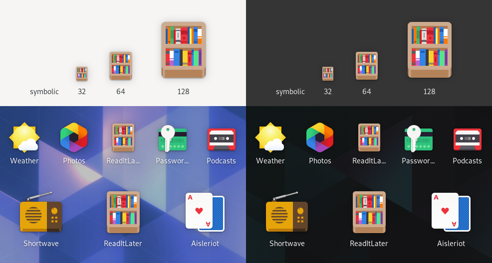
The canvas is 128x128px (for legacy reasons), but you’re designing for 64×64, while also taking 32×32 into account where possible. In general, it’s good to make sure you’re putting as many lines as possible on grid lines, so they’re sharp even at 32. Testing in App Icon Preview helps a lot with this.
The icon grid also has some standard shapes for wide, tall, square, and circular icons, which can be used as a basis for the structure of the icon if it makes sense for the metaphor (e.g. if the object is more or less square, use the square standard shape).
Protip: Great Artists Steal Reuse
There are lots of apps with icons in the GNOME style out there, and they’re all free software. If there’s something you like about another app’s icon you can get the source from GNOME Gitlab or Github, look at how a certain object is drawn, or just take (parts of) other icons and adapt them to your needs.
This is especially useful for common objects needed in many icons, e.g. pencils, books, or screens. The icon template in App Icon Preview comes with a few of these common objects on the canvas, which can be a good starting point for new icons.
Draw, Preview, Repeat!
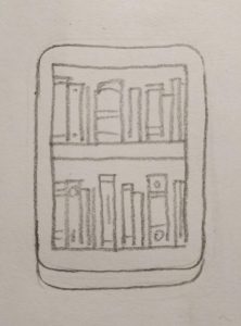
Armed with this knowledge about the style and tooling, we can finally jump in and start drawing! In this case I re-did the sketch at a slightly larger size to get a better feel for it:
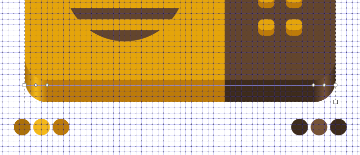
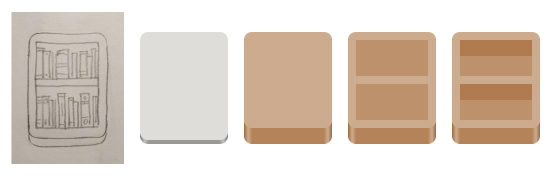
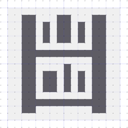
Now let’s try vectorizing it. Since the overall shape is a tall rectangle, we can start with the tall rectangle standard shape. If we change the color to brown, and make the chin at the bottom thicker (by resizing the top layer vertically), we have the basic frame for the shelf.
After that we can add the actual shelves, by simply adding two slightly darker brown rectangles (the back of the shelf), and two wide rectangles at the top of these (the bottom of the horizontal shelf).
Changing the color of the chin is a bit tricky, because it has a horizontal gradient. It requires selecting the bottom rectangle with the gradient tool, clicking each gradient stop manually and changing it to brown by clicking one of the colors in the color palette at the bottom edge of the window.
Let’s see what this looks like in Icon Preview now:

Getting there, right? Now let’s add some books. Lucky for us, book spines can also be drawn as rectangles, so this shouldn’t be too hard. We don’t want too much detail, because we’re designing for 64px first and foremost. Something like 10 books per row should work.
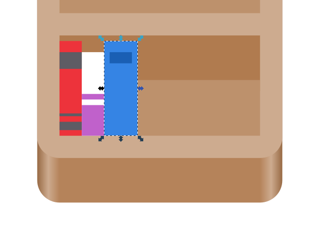
If we want to get fancy we can also round the top of the spine on some of the books by adding an ellipse of the same color, but it’s not really needed at this size.
Looking good! I think we’re done with the full-color icon.
If at this point in the process you feel like the concept or metaphor isn’t working out (for example because it doesn’t look interesting enough, or because it’s too complicated to work at small sizes) you can always go back a few steps and try vectorizing a different one of your sketches. The nice thing about the simplicity of this style is that you can do this without losing weeks of work, making iteration on concepts much more feasible.
Symbolic
Now that the full-color icon is done, we can start thinking about the symbolic icon for our app. Ideally this is a simplified, one-color version of the app icon, designed for a 16×16 px canvas. It’s used in notifications and some other places in the Shell where a colorful icon would not be appropriate.
I won’t go into too much detail on this here since drawing good symbolics is a big topic, and this post is too long already. I might expand on this in a future post, but for now here are a few quick tips:
- Alignment to the pixel grid is very important here if you don’t want the icon to end up a blurry mess
- Stick to the original metaphor if at all possible, go for something else if not
- Test in App Icon Preview to make sure the icon is actually recognizable at 16px
- If possible leave the outermost 1px empty on all sides
- Most strokes should be 2px, but they can be 1px in some cases
- Don’t overthink it for the first version. This icon is a secondary thing, and it’s relatively little effort to fix/redo it later :)
Our bookshelf example looks tricky at first glance, because we have all these tiny books, and only 16 pixels to work with. However, if we simplify it enough it’s not too hard to get something decent. We can just use a two tall and two wide rectangles to draw the shelf, and three smaller rectangles as books on each shelf:
And that’s it! We have a real app icon now, with everything that entails. If you want to have a look at the source for the icon we made in this tutorial, you can download the SVG here. It includes the final icon and some of the intermediate steps.

Export
Now that we’re happy with the icon, we can press the “Export” button in App Icon Preview and save the final icon assets. The app will automatically optimize the SVGs for size, and if you have nightly builds of your app, you also get an automatically generated nightly icon without any extra work!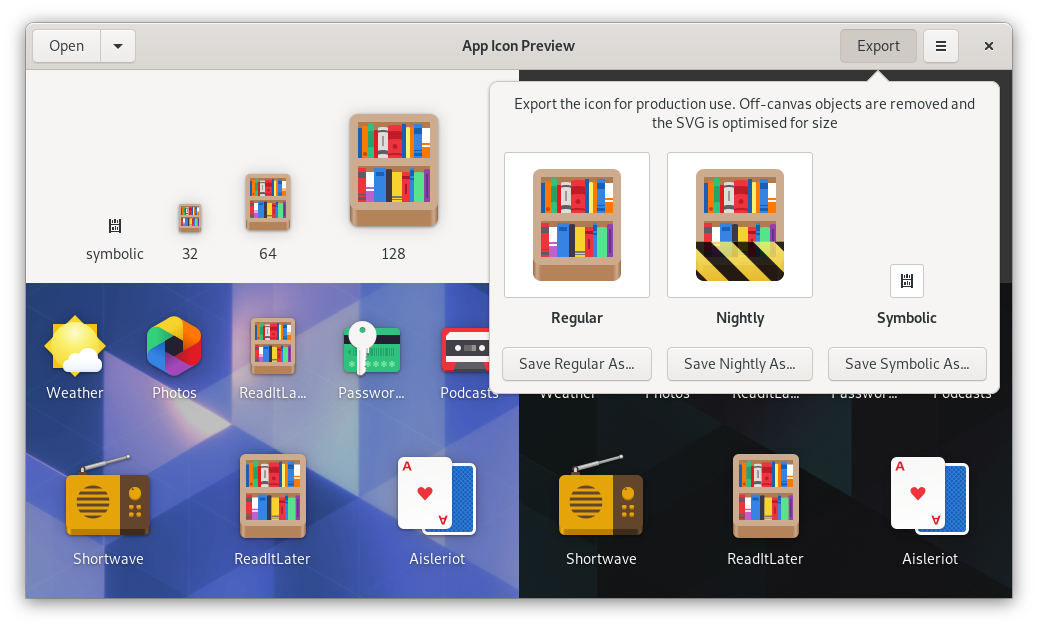
Congratulations for making it all the way to the end! I hope you found this tutorial useful, and will go on to make great icons for your apps. If there’s anything you found unclear while following along, please let me know in the comments.
If you’re looking for more resources on the topic, check out the Icons and Artwork HIG page, the official guide on making GNOME App Icons, and the Icon Design Workflow wiki page.
Happy hacking :)
Beautiful!
Thanks, this was great.
Looking at that last screenshot of Icon Preview, I finally understood what was making me feel weird about the “nightly” style: the yellow/black striped overlay completely covers the chin of the icon, in a way that erases the perspective.
It looks bizarre next to icons with that perspective visible, but I couldn’t put my finger on it until now. Your example app icon perfectly illustrates the problem.
Do you think this is something which would need to be fixed?
Our first goal with this was making it easy to have a separate nightly icon without extra effort (especially given that not many people see these icons).
There are definitely a few issues with the current implementation, such as the broken perspective, the vertical position of the ribbon on some icons, and some rendering glitches on the edges, which we want to fix but haven’t found a good solution for yet.
Sehr interessante und ausführliche Anleitung! Man kriegt direkt Lust Icons zu zeichnen.
this is a wonderful guide. thank you! it’s incredible to see that even a community ran ecosystem can look so uniform and harmonious.
looking forward to reading more things you’ve written