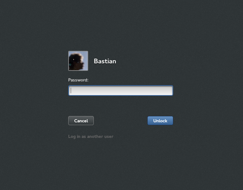
One day while hanging around at the #gnome-design IRC channel, Allan Day made me aware of the fact that default avatars in GNOME could use a revamp. Sounded like a nice adventure, so I began following an exciting yet challenging path, aiming to find the treasure that is good avatar conceptual design.

A typical example of a context which these default avatars would appear in.
First step for the conceptual design was to define an avatar’s purpose based on the context which the avatar(s) would appear in (see figure above). My main thoughts were that:
- An avatar should be unique to each user, to make the user distinguishable from other users on the system.
- The avatar is the only colorful asset on the grey background.
- The default avatar should be formal and personal at the same time, to fit on everything from your laptop at home to your workstation at work.
After some experimentation and a bit of discussion on #gnome-design, I came up with the idea of utilizing the great symbolic footer-art seen in GNOME on the web, to create a default set of avatars that could meet these criteria. The avatars’ personal yet simple and clean look makes for a nice balance to fit in both personal and formal contexts in my opinion. The picture below displays the majority of the avatar motives (colors not final). More information can be found on the design page for avatars.
![]()
More avatars can be found at the design page for GNOME avatars.
Based on this, Allan Day came up with a design of an avatar chooser (it rocks!). The picture below is one out of six interfaces which the avatar chooser consists of.
![]()
Source: /gnome-design-team/gnome-mockups/avatar-chooser/ by Allan Day
Next up I’ll be focusing on the default avatars for Empathy, which for now will follow a more ‘generated’ approach. However, most of my time still goes towards the documentation video. More on that in a future blog post of mine.