Boiling The Ocean Hackfest

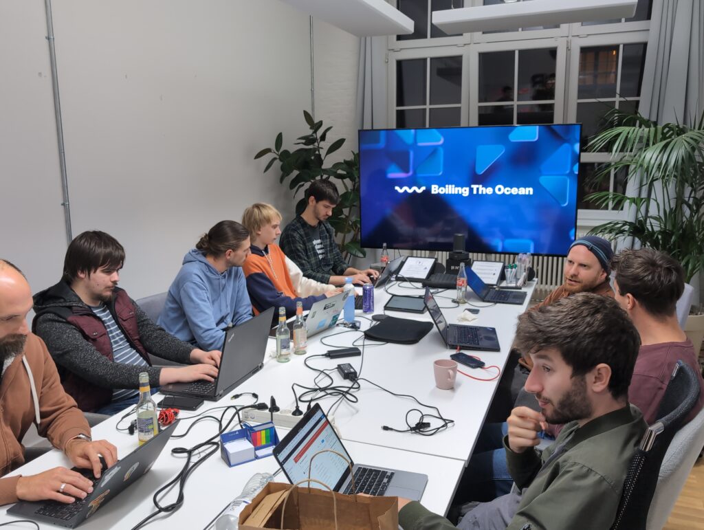
Last weekend we had another edition of last year’s post-All Systems Go hackfest in Berlin. This year it was even more of a collaborative event with friends from other communities, particularly postmarketOS. Topics included GNOME OS, postmarketOS, systemd, Android app support, hardware enablement, app design, local-first sync, and many other exciting things.

This left us with an awkward branding question, since we didn’t want to name the event after one specific community or project. Initially we had a very long and unpronounceable acronym (LMGOSRP), but I couldn’t bring myself to use that on the announcement post so I went with something a bit more digestible :)
“Boiling The Ocean” refers to the fact that this is what all the hackfest topics share in common: They’re all very difficult long-term efforts that we expect to still be working on for years before they fully bear fruit. A second, mostly incidental, connotation is that the the ocean (and wider biosphere) are currently being boiled thanks to the climate crisis, and that much of our work has a degrowth or resilience angle (e.g. running on older devices or local-first).

I’m not going to try to summarize all the work done at the event since there were many different parallel tracks, many of which I didn’t participate in. Here’s a quick summary of a few of the things I was tangentially involved in, hopefully others will do their own write-ups about what they were up to.
Mobile

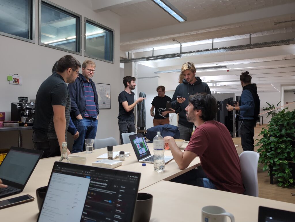
Mainline Linux on ex-Android phones was a big topic, since there were many relevant actors from this space present. This includes the postmarketOS crew, Robert with his camera work, and Jonas and Caleb who are still working on Android app support via Alien Dalvik.
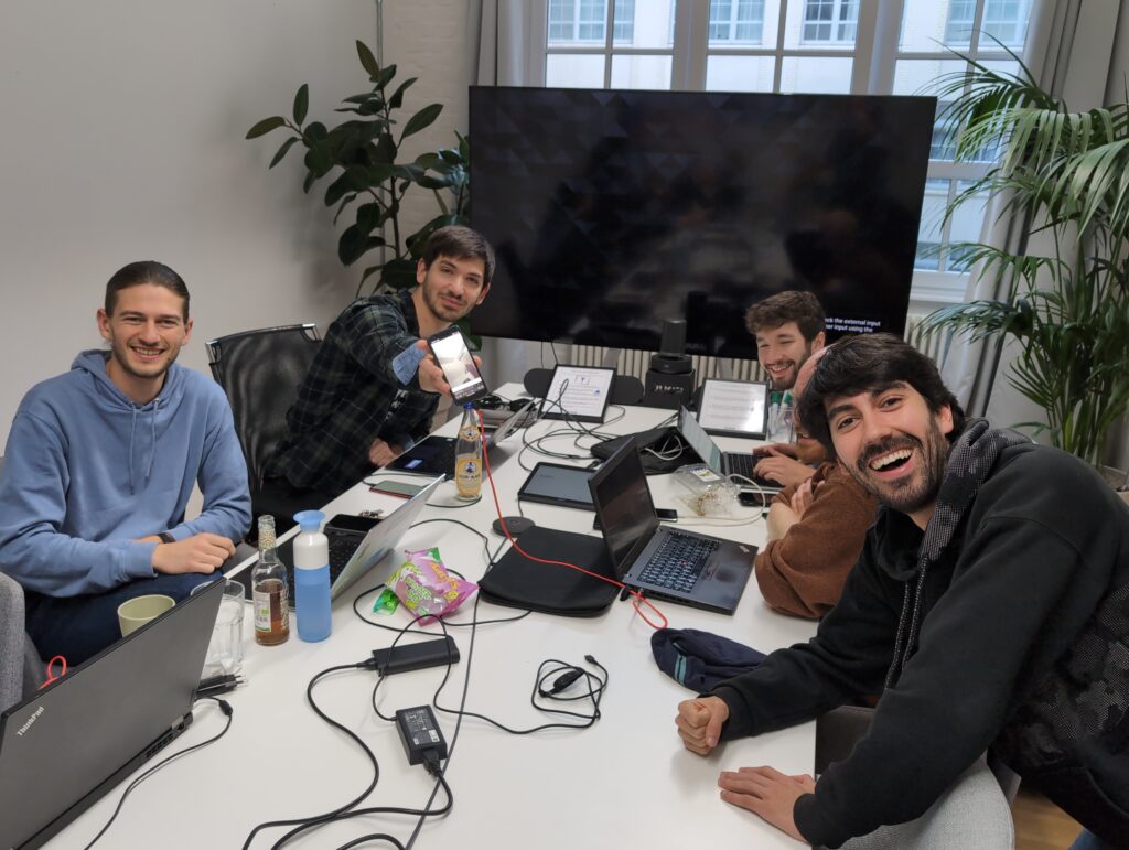
To me, one of the most exciting things here is that we’re seeing more well-supported Qualcomm devices (in addition to everyone’s favorite, the Oneplus 6) these days thanks to all the work being done by Caleb and others on that stack. Between this, the progress on cameras, and the Android app support maybe we can finally do the week-long daily driving challenge we’ve wanted to do for a while at GUADEC 2025 :)

Design

On Thursday night we already did a bit of pre-event hacking at a cafe, and I had an impromptu design session with Luca about eSIM support. He has an app for this at the moment, though of course ideally this should just be in Settings longer-term. For now we discussed how to clean up the UI a bit and bring it more in line with the HIG, and I’ll push some updates to the cellular settings mockups based on this soon.

On Friday I looked into a few Papers things with Pablo, in particular highlights/annotations. I pushed the new mockups, including a new way to edit annotations. It’s very exciting to see how energetic the Papers team is, huge kudos to Pablo, Qiu, Markus, et al for revitalizing this app <3

On Saturday I sat down with fellow GNOME design contributor Philipp, and looked at a few design questions in Decibels and Calendar. One of my main takeaways is that we should take a fresh look at the adaptive Calendar layout now that we have Adwaita breakpoints and multi-layout.

47 Release Party

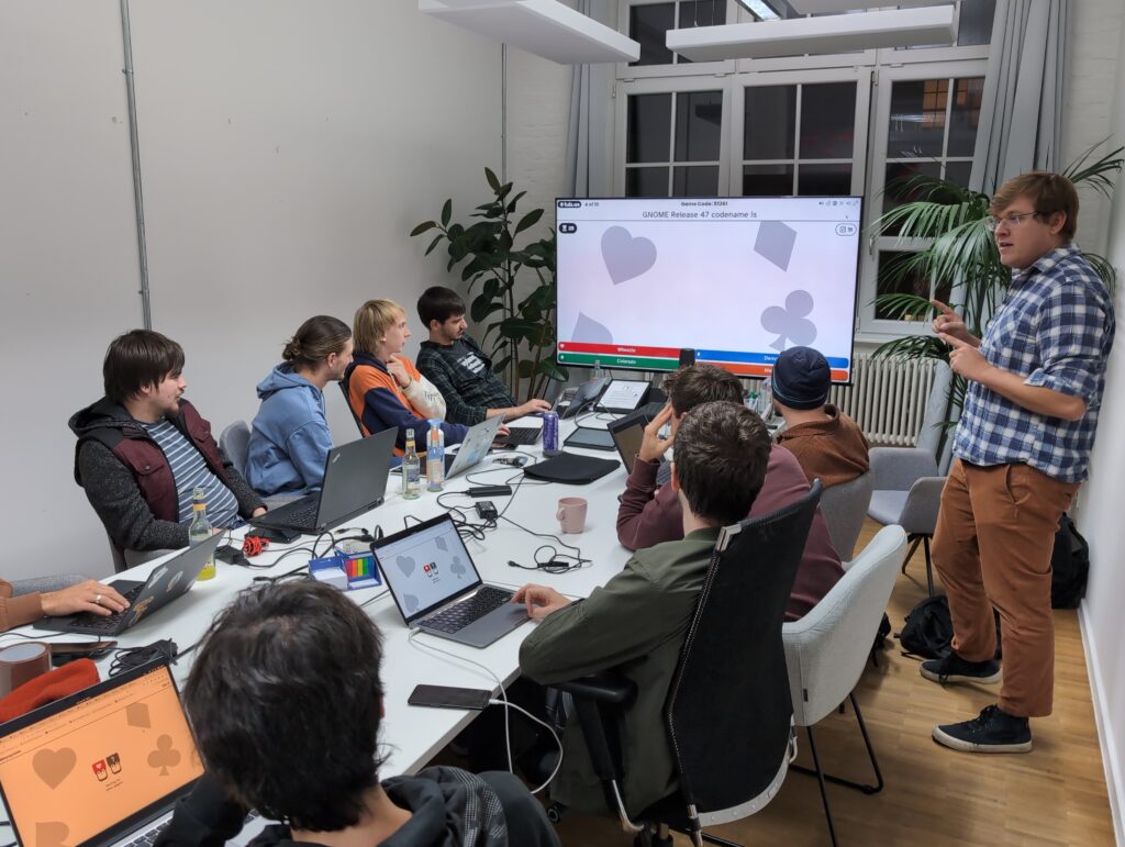
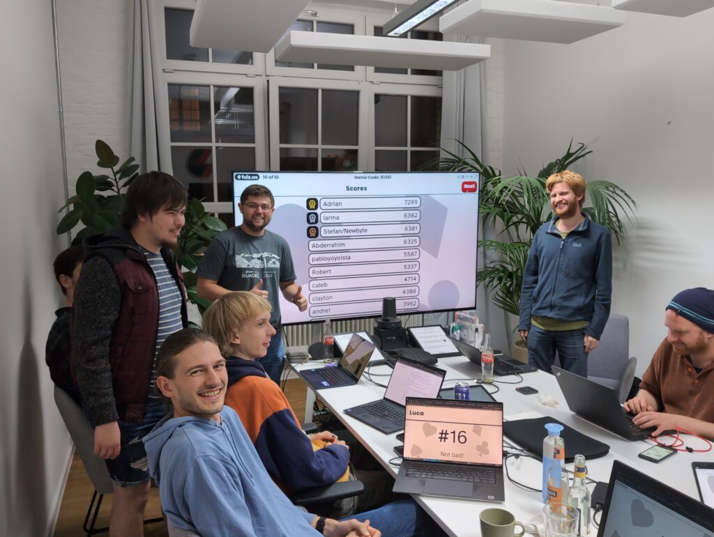
On Saturday night we had the GNOME 47 release party, featuring a GNOME trivia quiz. Thanks to Ondrej for preparing it, and congrats to the winners: Adrian, Marvin, and Stefan :)
Local-First

Adrian and Andreas from p2panda had some productive discussions about a longer-term plan for a local-first sync system, and immediate next steps in that direction.

We have a first collaboration planned in the form of a Hedgedoc-style local-first syncing pad, codenamed “Aardvark” (initial mockups). This will be based on a new, more modular version of p2panda (still WIP, but to be released later this year). Longer-term the idea is to have some kind of shared system level daemon so multiple apps can use the same syncing infrastructure, but for now we want to test this architecture in a self-contained app since it’s much easier to iterate on. There’s no clear timeline for this yet, but we’re aiming to start this work around the end of the year.

GNOME OS

On Sunday we had a GNOME OS planning meeting with Adrian, Abderrahim, and the rest of the GNOME OS team (remote). The notes are here if you’re interested in the details, but the upshot is that the transition to the next-generation stack using systemd sysupdate and homed is progressing nicely (thanks to the work Adrian and Codethink have been doing for our Sovereign Tech Fund project).
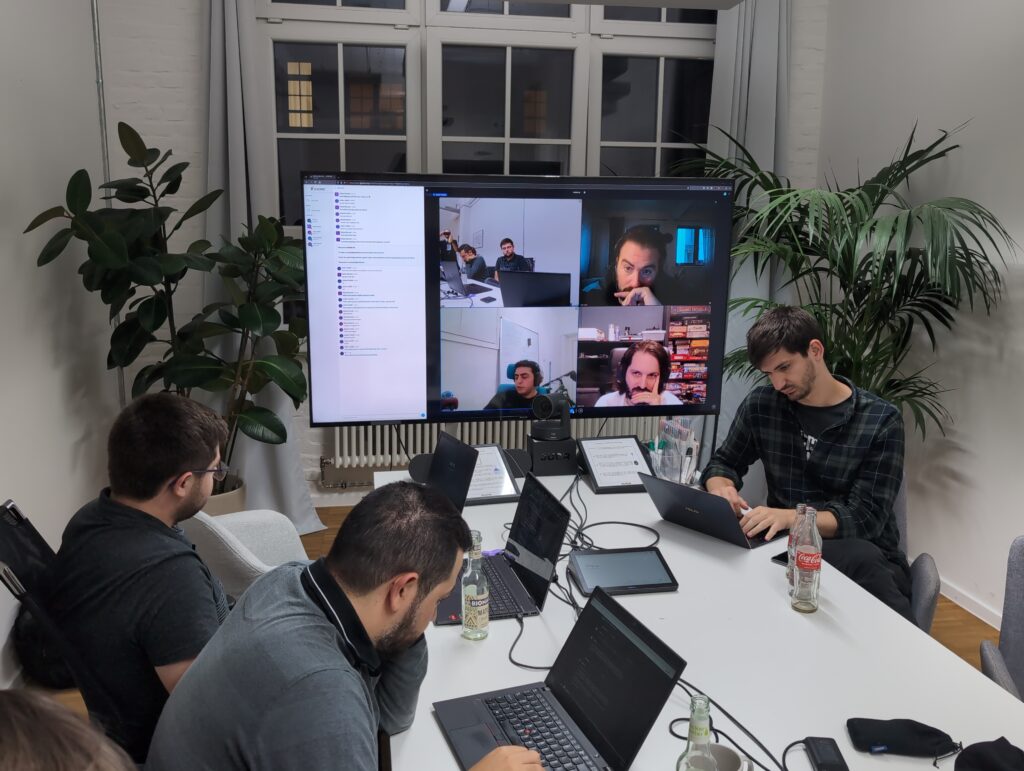
If all goes to plan we’ll complete both of these this cycle, making GNOME OS 48 next spring a real game changer in terms of security and reliability.

Community

Despite the very last minute announcement and some logistical back and forth the event worked out beautifully, and we had over 20 people joining across the various days. In addition to the usual suspects I was happy to meet some newcomers, including from outside Berlin and outside the typical desktop crowd. Thanks for joining everyone!
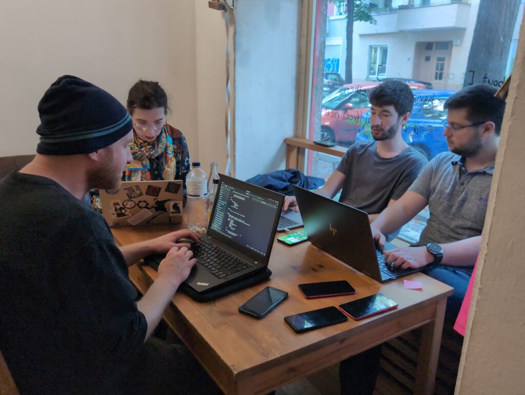
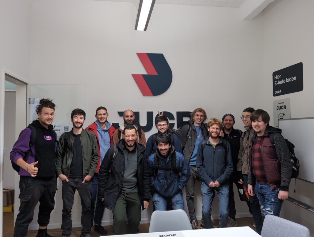
Thanks also to Caleb and Zeeshan for helping with organization, and the venues we had hosting us across the various days:

  • offline, a community space in Neukölln
  • JUCR, for hosting us in their very cool Kreuzberg office and even paying for drinks and food
  • The x-hain hackerspace in Friedrichshain

See you next time!
Get your apps ready for Software 41

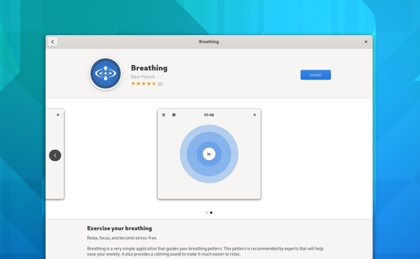
Software 41 will be released with the rest of GNOME 41 in a few weeks, and it brings a number of changes to how app metadata is presented, including the newly added hardware support information, larger screenshots, more visible age ratings, and more.

If you haven’t updated your app’s metadata in a while this is the perfect moment to review what you have, update what’s missing, and release a new version ahead of the GNOME 41 release!

In this blog post I’ll walk you through the different kinds of metadata your app needs to really shine in Software 41, and best practices for adding it.

App Summary

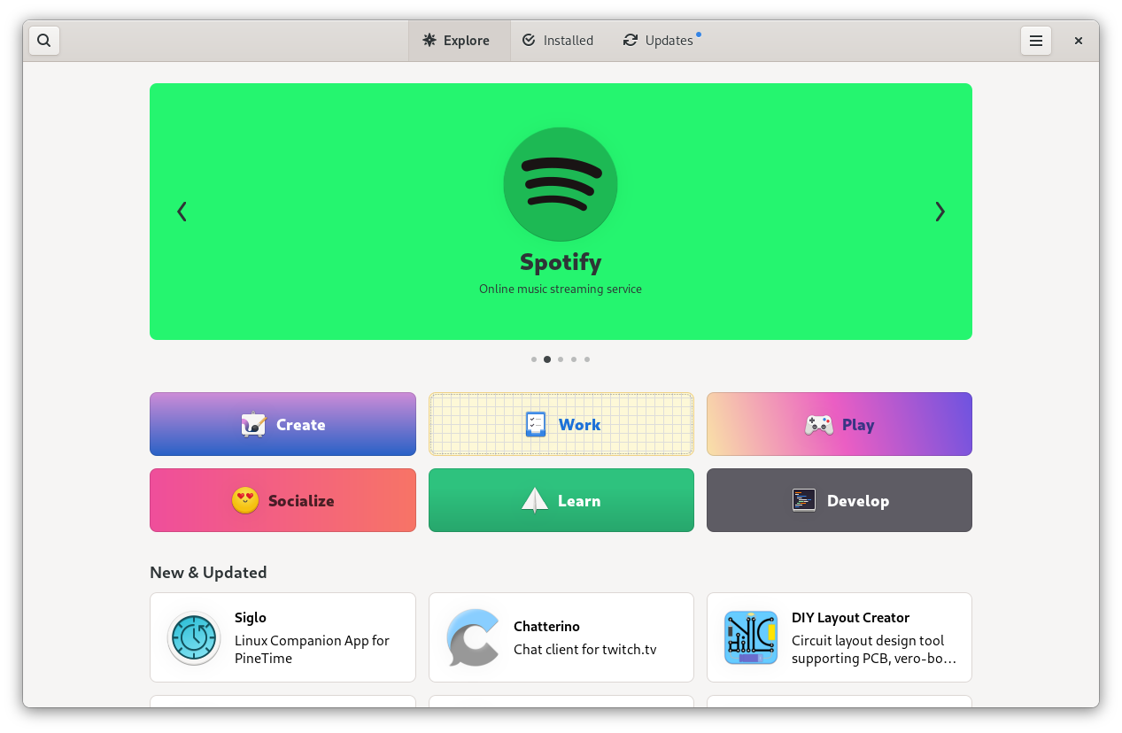
The app summary is a very short description that gives people an idea of what the app does. It’s often used in combination with the app name, e.g. on banners and app tiles.

If your summary is ellipsized on the app tile, you know what to do :)

In Software 41 we’re using the summary much more prominently than before, so it’s quite important for making your app look good. In particular, make sure to keep it short (we recommend below 35 characters, but the shorter the better), or it will look weird or be ellipsized.

Writing a good summary

The summary should answer the question “What superpower does this app give me?”. It doesn’t need to comprehensively describe everything the app does, as long as it highlights one important aspect and makes it clear why it’s valuable.

Some general guidance:

  • Keep it short (less than 35 characters)
  • Be engaging and make people curious
  • Use imperative if possible (e.g. “Browse the web” instead of “A web browser”)
  • Use sentence case

Things to avoid:

  • Technical details (e.g. the toolkit or programming language)
  • Structures like “GUI for X” or “Client for Y”
  • Mentioning the target environment (e.g. “X for GNOME”)
  • Repeating the app’s name
  • Overly generic adjectives like “simple”, “easy”, “powerful”, etc.
  • Articles (e.g. “A …” or “An …”)
  • Punctuation (e.g. a period at the end)
  • Title case (e.g. “Chat With Your Team”)

Good examples:

  • Maps: “Find places around the world”
  • Shortwave: “Listen to internet radio”
  • Byte: “Rediscover your music”

Code Example

The app summary is set in your appdata XML file, and looks like this:

<summary>Listen to internet radio</summary>

Appstream documentation

Device Support

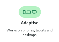
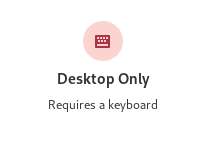
Hardware support metadata describes what kinds of input and output devices an app supports, or requires to be useful. This is a relatively recent addition to appstream, and will be displayed in Software 41 for the first time.

The primary use case for this at the moment is devices with small displays needing to query whether an app will fit on the screen, but there are all sorts of other uses for this, e.g. to indicate that an app is not fully keyboard-accessible or that a game needs a gamepad.

Code Examples

Appstream has a way for apps to declare what hardware they absolutely need (<require>), and things that are known to work (<recommends>). You can use these two tags in your appdata XML to specify what hardware is supported.

For screen size, test the minimum size your app can scale to and put that in as a requirement. The “ge” stands for “greater or equal”, so this is what you’d do if your app can scale to phone sizes (360px or larger):

<requires>
  <display_length compare="ge">360</display_length>
</requires>

Note: The appstream spec also specifies some named sizes (xsmall, small, large, etc.), which are broken and should not be used. It’s likely that they’ll be removed in the future, but for now just don’t use them.

Input devices can be specified like so:

<recommends>
  <control>keyboard</control>
  <control>pointing</control>
  <control>touch</control>
</recommends>

Appstream documentation

Screenshots

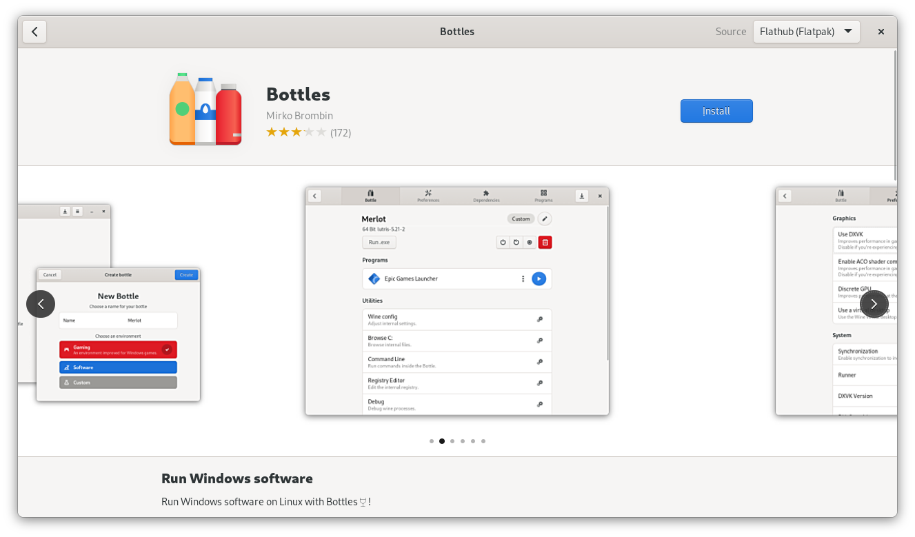
If you want your app to make a good impression good screenshots are a must-have. This is especially true in 41, because screenshots are much larger and more prominent now.

The new, larger screenshot carousel

Some general guidance for taking good app screenshots:

  • Provide multiple screenshots showing off the main areas of the app
  • Use window screenshots with a baked-in shadow (you can easily take them with Alt+PrintScr).
  • For apps that show content (e.g. media apps, chat apps, creative tools, file viewers, etc.) the quality of the example content makes the screenshot. Setting up a great screenshot with content takes a ton of time, but it’s absolutely worth it.
  • If you’re only doing screenshots in a single language/locale, use en-US.
  • Don’t force a large size if your app is generally used at small sizes. If the app is e.g. a small utility app a tiny window size is fine.

Before taking your screenshots make sure your system is using GNOME default settings. If your distribution changes these, an easy way to make sure they are all correct is to take them in a VM with Fedora, Arch, or something else that keeps to defaults. In particular, make sure you have the following settings:

  • System font: Cantarell
  • GTK stylesheet: Adwaita
  • System icons: Adwaita Icon Theme
  • Window controls: Close button only, on the right side

Things to avoid:

  • Fullscreen screenshots with no borders or shadow.
  • Awkward aspect ratios. Use what feels natural for the app, ignore the 16:9 recommendation in the appstream spec.
  • Huge window sizes. They make it very hard to see things in the carousel. Something like 800×600 is a good starting point for most apps.

Code Example

Screenshots are defined in the appdata XML file and consist of an image and a caption which describes the image.

  <screenshots>
    <screenshot type="default">
      <image>https://domain.tld/screenshot.png</image>
      <caption>Screenshot caption</caption>
    </screenshot>
  </screenshots>

Appstream documentation

Other Metadata

The things I’ve covered in detail here are the most prominent pieces of metadata, but there are also a number of others which are less visible and less work to add, but nevertheless important.

These include links to various websites for the project, all of which are also defined in the appstream XML.

  • App website (or code repository if it has no dedicated website)
  • Issue tracker
  • Donations
  • Translations
  • Online help or user documentation

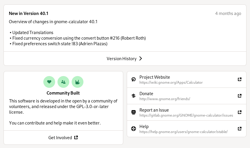
When making releases it’s also important to add release notes for the new version to your appdata file, otherwise the version history box on your details page looks pretty sad:

Conclusion

I hope this has been useful, and inspired you to update your metadata today!

Most of these things can be updated in a few minutes, and it’s really worth it. It doesn’t just make your app look good, but the ecosystem as a whole.

Thanks in advance :)

Joining Purism

I’m very happy to announce that I’ve joined Purism. It’s awesome to be working for a company that not only cares about software freedom, but also has Ethical Design as a core principle. My role there is UI/UX designer on the Librem 5, a phone built from the ground up to run free software and GNU/Linux.

As a past user of first Firefox OS and then Ubuntu Touch, I couldn’t be more excited about this. Unlike these previous failed efforts, the Librem 5 is focused on freedom and privacy, because it’s made by people who share that philosophy. It’s using PureOS (a full GNU/Linux distro based on Debian), instead of a completely different technology stack with Android drivers (like Firefox OS and Ubuntu Touch did). To make things even sweeter, the UI will be GTK-based, and we’re using upstream GNOME apps (which we’re adapting with a responsive layout). We’ll also be working on new applications for the phone, such as Calls and Messages, which will work on the desktop as well. We want as much of this work as possible to go upstream, so it can benefit all GNOME users.

It’s still early days, but some of the work around apps should become more concrete in the coming weeks, so expect phone-related discussions in #gnome-design. Let’s make a killer GNOME phone!