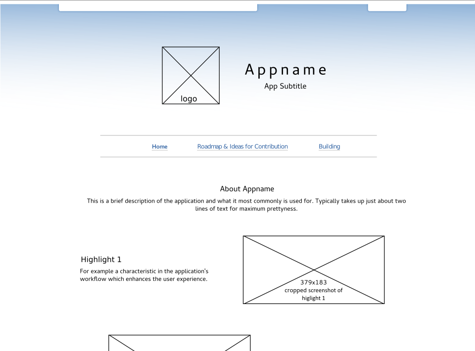
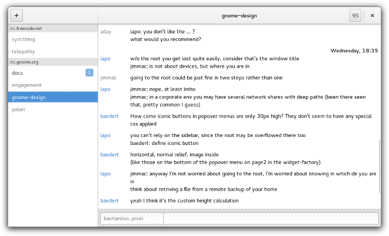
I recently adapted Builder’s wikipage layout for Polari. I think it adds some fresh air to the app and gives it a home to build upon. Nautilus and Calendar has adopted the layout as well. So I thought I might post how to adopt it.
Before we continue however, I have a warning: at the moment this template contains ugly markup based on tables. Use at your own risk only if presentation means anything for you beyond the ordinary. And feel free to help improve on it!
A GNOME Apps landing page wiki template
There’s two links you need be concerned about:
* Template as wiki markup.
* Template as Inkscape SVG file
To give your wiki page a makeover, copy the wiki markup from link 1. The wiki markup consists of four pictures and some text. To change the text, I would suggest you use find and replace, so you avoid messing up the markup. For images, I suggest you take screenshots and use something like GIMP to crop and export the images as PNG. The four images in the markup code are named “appname-splash.png”, “highlight1-figure.png”, “highlight2-figure.png”, “highlight3-figure.png”. I suggest you rename them (remember to do that in the markup too) to something appropriate for your App.
The Inkscape SVG file which I have provided above can be used to produce the splash image in the top of the template. While you are on the blank layer, copy and paste a high resolution icon of your app into the template. Then select the outer black rectangle, hide the layer called “place-holder-content” and e
To export a splash screen, turn off the visibility for the “place-holder-content” layer and the “bg” layer. Then while, you still have this selection, press Ctrl+Shift+E and export a PNG of your selection at around 750x275px. For this to work properly, “Hide all except selected” should NOT be checked.
If you are not too familiar with Inkscape, I would suggest you download the splash image from Polari (right-click -> Save image as..) and use this png as reference to create your own in fx GIMP.
Let me say this a second time: At the moment the layout is made up of ugly tables (in 2015!). It’s not mobile-friendly, possibly not screen-reader friendly and I think it might require someone to look at theme and workings of our GNOME Wiki itself. With these things fixed though, I think the layout would be cool for all app wiki pages to adopt in some far-away future. The efforts I did on this is only to try to push this a bit forward. I will gladly assist anyone making that future happen.

