Today I spent some time building various branches and modules to see if I could find some early signs of the features that have been proposed for GNOME 3.10. It is still early in the cycle, we are just about to release 3.9.2 this week.
Here is my harvest of screenshots. Not all features are easy to capture in a screenshot, but see for yourself.
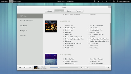 GNOME Music is a new app for, well, playing music. Of course, it can’t yet compete feature-wise with e.g. rhythmbox, but it looks fresh and promising. And it plays my music already.
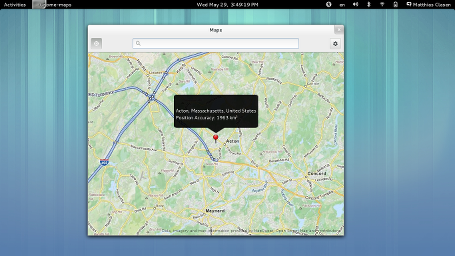 GNOME Maps is a map viewer. It is still in its infancy – it does not do much yet beyond loading maps and showing me my location. But that will soon change.
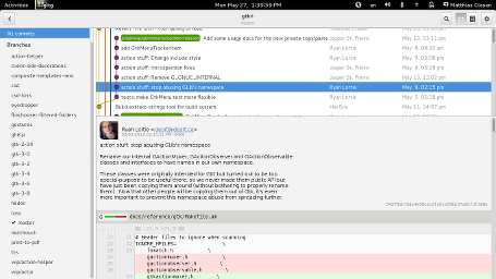
Gitg is a git repository viewer. It has been around for a while. Recently, it has been rewritten in vala and it is getting a visual refresh this cycle.
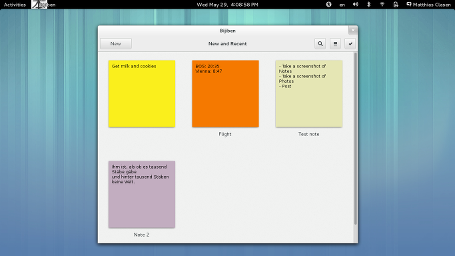
Bijiben is a note-taking application, it was available as a ‘preview’ in 3.8 (and you can install it in Fedora 19 by running yum install bijiben). For 3.10, it will be much more feature-complete, data exchange with tomboy and online accounts is planned.
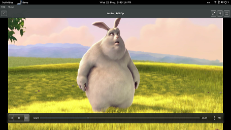 Totem is getting a face-lift, picking up user-interface elements from other GNOME 3 applications (while not losing any features).
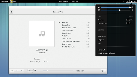 The GNOME shell status area may be getting a design update, combining most of the hardware controls into a single menu.
That’s all the screenshots I could gather in an afternoon. If you want to learn more about the things that GNOME contributors and summer-of-code students are working on, you can look at the proposed features, or you can try out the latest code with OSTree or jhbuild.
Hi.
That features link at the beginning is broken (missing “:”)…
Anyway, this stuff is looking nice so far.
In general, love how everything is shaping up. A few comments.
GNOME Music:
Why does the list widget on the left hand side look different than say the one in the gitg screenshot? The list widget in Music looks out of place amongst other GNOME apps.
GNOME Shell status area:
The icon spacing in the unified menu looks pretty cramped. The slightly larger spacing in the mockups you linked are easier on the eyes.
Yeah I agree about the icon spacing. I’ll be reviewing the work in progress with Jasper soon. 🙂
so would you be able to individually select the icons. cause from the photo it look like everything is selected.?
I think the idea is precisely that you can click whereever you like and still get the same menu so it’s easier (and faster) to hit.
Good news. Thanks for your works.
PS: I prefer the actually (3.8) status area in Gnome-shell.
+1
Great things ahead!
One thing that comes regularly when people present features/mockups/previews, is that the software contains basically no data. Here the music player has 4 artists.
Having “real life” datasets help to see how the software scales in real envirnoment. In the case of an Artist list, as an example, you may have 50 artists in your own music library. *Plus*, if you have 10 compilations (movie soundtrack? dance compilation?) with each 30 individual artists , and tadam… +300, your artist list is flooded with artists (whom you never heard) with a single track. Your artist list becomes useless, although it looked so nice and clean and easy on the mockups.
I suggest that GNOME set up a user data database to be used to test and present applications in more real situations. Ideally there would be several user profiles. The case of a fresh install (with basically no user data) is definitely a case to take care of, but it is from far not the most frequent.
Music does not have to actually contain copyrighted content. It can use files with white noise, or just empty files when it is just to demonstrate the organization features.
Same thing for movies, photos, contacts, documents, bookmarks, notes, folder tree, etc.
You are more than welcome to work on that.
I can help, but it makes no sense to do it myself. This really should be part of the design process, to see how an application scales, is it robust to real data sets, to i18n, etc.
By “part of the design process”, you mean “other people should do it” right?
It’s fair enough to complain about open source when they’re heading in the wrong direction, but to complain about things that aren’t done because no one has had time yet isn’t so easy to take. Why don’t you *be* the change instead of merely complaining about the lack of it?
Crag,
your comment is pointless and completely off topic. This is the king of comment that discourages people to contribute. Thanks!
Look at Matthias comment, and compare it to yours. Which one is inviting and encouraging?
Now if you actually had read my own comments, you would see NO complain, and that I DO offer my help.
> By “part of the design process”,
> you mean “other people should do it” right?
You are absolutely wrong.
Read again.
The single status menu is a bit confusing. Sound and display brightness together, and right next to network settings…(what does “Red Hat” mean in the list?) and there’s the lone keyboard layout menu.
On the other hand, Gitg looks sweet.
On the other hand, the notes at https://live.gnome.org/GnomeShell/Design/Guidelines/SystemStatus/#Update_Proposal make sense, so I guess this will just take some time getting used to…
Red Hat is a vpn connection.
Would be nice to label it as such: “VPN: Red Hat”
Icons would help identify the vpn and wifi toggles.
Just one small question: with the old status area icons I could scroll over the volume one to change the volume level. Will this be possible in the new design iteration? I found it to be extremely practical 🙂
Thanks a lot, and keep you the good work!
Alessandro
A few people have brought up that feature, and we’re happy to keep it around.
I use it too.
That’s what immediately came to my mind. Glad to know you’re aware of the importance of the feature.
Thanks for the update! looks like gnome 3.10 is going to push the envelope once again.
The new status area is not visually very pleasing. Icons are too packed. Not only doesn’t it look very nice (huge black area between the clock and status area and then status icons packed as much as possible), but it actually takes some time to recognize a status icon you’re looking for. I’d definitely make paddings bigger. If it doesn’t work well on small screens, well then make the paddings dependent on screen size, but as it is now, it looks just ridiculous on a larger screen.
Hey Jiri, remember that this is still rough work in progress. We have plenty of time left in the cycle, and there will be lots of testing, iteration and polishing before it lands.
I believe you’ll make a lot of polishing there. I was just a bit worried because status icons in GDM suffers from the same problem. But I don’t mind it there too much.
The whole status area change worries me a bit because it will be a challenge to make it the way it doesn’t lose any options and it’s not confusing and cluttered at the same time. The mockups look promising, the current state on the screenshot not so much. Anyway, good luck with it!
There are other problems the new status area would have.
You have to be more precise to hit the volume or screen brightness bars. Otherwise you may change the wrong setting by accident. I think this is especially an issue for beginners, who are not trained to move their pointer hyper-accurately.
Another thing is, that as far as i can tell from the screenshot, you can not open the settings for volume, energy and network directly from the top bar anymore. Having the chance to do so is very handy: when you are e.g. watching a video on the web which is to silent to understand at 100% volume, you can open volume settings and change the volume to even more than 100%.
Also, I can see no real benefit from unifying the status area into one single menu.
A user wants to do one thing at time. I.e. he wants to change the volume, energy settings, or his online status (the latter is not possible at all with the new version as it seems ?!).
Having status area items with separated purposes does fit better in here, as you do not have to look at a giant amount of menu entries popping up and select the right one out of it.
Putting all entries into one menu makes it cluttered and confusing. It makes you loose options and quick access at the same time.
Nonetheless, thanks for your hard work! 😉
I think your argument is invalid.
Why?
Because…
1.It’s the same just more efficient. And easier because you can go your cursor very fast in the top-right corner oposite to go to top-right but a little to left to find the sound button.Now that I think of I just can’t explain to you something like this that is so obvious.
The point is:
Sound: TOP-RIGHT CLICK
Brightness: TOP-RIGHT CLICK
Wi-Fi: TOP-RIGHT CLICK
1 CLICK.
Putting all entries into one menu makes it cleaner, faster and more efficient. It makes you cool.
How Wayland and Weston port goes?
That’s not really relevant to this post.
I really like the “Gnome maturation”, most of all I like the simple, coherent and integrated design of all programs.
I really like the direction and visual improvements in GNOME. But the new status area looks a bit confusing to me.
First, at the top bar you still have different icons for sound, power, wifi and shutdown. As a user I would expect that all of them provide a special functionality to me and would be confused if every time the same status area would open.
Second, putting everything in one status area can become quite crowded and confusing. Shorter menus and menus more focused on what the user actually is looking for (sound settings, wifi settings, etc) makes it much easier to find the right setting. As already mentioned you could increase padding to make it easier to distinguish the different elements but this would also make the menu yet larger.
Just some thoughts from a random user… 🙂
I hate the bottom notification area. I preffer the notifications at top in a single icon … as PEAROS do…
Me too. I’d really like a single notification menu in the top bar that simply changes color when I have a new notification. The bottom notification bar is very bizarre UI design and still has serious usability and missed notification problems.
Awesome! Looking real good.
Except for the unified status menu. Personally not appealing at all.
I like have separate popups for each item. Especially when there are extensions for advanced volume management and additional user menu items.
Thanks for the update, Allan!
I used to be a big fan of GNOME.
I just realized that I now no longer have GNOME installed on any of my systems – I’ve moved to XFCE everywhere. Because I felt more and more alienated with Gnome, which seems to move to a smartphone/tablet user base. And even worse, some of the applications I used most – evince, for viewing PDF – have become much less stable, and useful functionality was moved to a stupid menu button, instead of keeping it ready to use right away. Similarly Totem: I’ve been hating it ever since it was changed to black, and I’m now using VLC for all my video viewing needs. Similarly when I upgraded my dad to Gnome3, he A) wanted the panels back and B) was unable to shut down the computer. I switched him to legacy, and now that this is discontinued, I will also switch him to XFCE next. Because that is what he needs, not the hipster-mobile thing that Gnome3 has become.
I wish you much luck, but it looks as if our ways have parted, I’m with XFCE now.
I think this is very telling:
https://news.ycombinator.com/item?id=5730142
GNOME 3.8 introduced a classic desktop mode.
So what? I’m not so much complaining about the panel being gone. The “classic” mode appears to be like an alternative theme for shell.
But about bad UI decisions (I’m not stupid, and not using a mobile phone, but a PC) throughout. The Big Fat On-Off switches are a good example of pointless UI design that fails with respect to actual usability, because most of the time I’m wondering whether they are on or off.
Gnome3 is all about visual looks, but I’m a lot slower when working with it. Heck, and some systems won’t even run it, because OpenGL is not reliable enough.
Plus, we all know that the Gnome3 community doesn’t like “Classic” mode. They didn’t like “fallback” either. Probably the latest in 3.12 it will be gone again.
As I don’t have the impression there are any developers in the Gnome3 community left that feel about UI the way that I do, I guess I’m really better of with others.
I really like the idea of combining all the menu controls in one but u just don’t need those icons anymore, just delete them and put them in the window with the controls.
Just a sugestion for a cleaner, nicer interface.
Yeah, except that I and many other *DO* requires those icons to see at a glance what my wifi signal is like (is my connection flaking out?), what my volume is set at (will clicking play blast someone’s ears out?), what my battery charge is like (do I need to plug into AC?).
Obviously anyone who thinks the icons are unnecessary hasn’t given it even a moments consideration.
All of this looks great… except the status area! IMHO, there are a couple of issues with the proposal:
– Except for the most simple scenarios, there will be too many items in the menu.
– The Shell is a desktop-centric UI. I don’t understand why changing anything to appeal to touchscreens is necessary. One size fits all never works well. If GNOME devs want GNOME to work well on touchscreens, a touch-centric UI should be developed.
– Multiple icons for a single menu is very confusing. This is not consistent with the rest of the UI (or the rest of the status area!) and counter intuitive. An icon should stand for one distinct thing.
– It’s not clear what the UIs for changing a network and the like should look like, and how they are going to be incorporated into the menu. The obvious (?) idea, expanding the menu vertically, is bad unless you’re friend of overcrowded, screen-filling menus. And this won’t work well at all on smaller screens in landscape.
The status area works very well as-is. Please don’t change anything for the worse.
“I don’t understand why changing anything to appeal to touchscreens is necessary.”
It’s not necessary, it’s just the policy that the project adopted since version 3.
> Except for the most simple scenarios, there will be too many items in the menu.
I agree. My network menu is already full of wifi options and VPNs. Add everything else to that, and it’d going to be a step backwards for useability.
The rest of the changes look great though.
Whatever happened to the idea of eliminating the title bar on fullscreen apps? I don’t see that in screenshots anymore, even for apps where it makes perfect sense.
Sorry, I should clarify: I see that some of the apps have done so, but some don’t. Why the difference?
It can easily be added into any given metacity theme. The shell team has made it easier to work with undecorated windows by allowing the user to drag top-panel to unmaximize.
Should GNOME Music opt in to the dark theme too?
What’s 8LQ39 mean in the network menu?
BLQ39 is my wireless access point
The last snapshot showing all status icons jammed together is a big joke. Stop changing things just for the sake of changing things.
What I really like in the Shell is that you have an icon for sound, a slider for sound and a link to sound settings. All organized in a minimal and structured way. The same goes for Wi-fi and other categories. Jamming everything together is just stupid and will break this categorization you have had since 3.0.
Yes, please don’t implement that status area!
Reasons:
If you combine everything into one it will be confusing and jammed. Chances are that because of that you will start removing options from the menu leading to less features. Same old story.
Users will be confused having several icons and just one menu. It’s one icon, click, one menu. Not five icons, click, one menu.
The current system is simple, efficient and logical.
…
These are just the ones on the top of my head.
And, anyways, what benefit does this provide? Don’t change things for the sake of changing things…
Totem is getting a face-lift, picking up user-interface elements from other GNOME 3 applications (while not losing any features).
*WHILE NOT LOSING ANY FEATURES*
WHILE NOT LOSING ANY FEATURES!?
Hell freezes over!
Looks like the GNOME-Developers start to hear on what the community is telling them from “3.0” till “3.8”. Thank you for *not removing any features* from totem. This is the first step back to regaining the user-base. I hope you keep this development-policy.
If you keep the policy of “not removing features” GNOME3 could return back to be a sersious environment for companies, public authorities, developers and the average users.
PS:
Status menu looks a little bit overloaded (wow, I’m saying this about GNOME…). Maybe it it better not the put everything in one single menu. Also the picture of the current user should be shown.
“Regaining the user base”
Even distros don’t have much idea what people are using, so how could you possibly know?
I’m using Gnome 3.4 on Debian Wheezy. It seems every release since 3.0 has pushed new features, designs, applications. We will ever see Gnome move to a different development model, perhaps closer to libre-office, with a N.x being new features, with N.x1, N.x2 and N.x3 being more every more modest development, with the final x3 being bug fixes?
If it ain’t broke, don’t fix it.
IMHO the single menu is a BIG step backward.
Every status menu should do one thing and do it well, this multiple icon menu item looks awful closed and horrible once opened.
I’d like to quote Alex: “Stop changing things just for the sake of changing things.”
New GNOME looks nice. But there are few questions about new status menu:
1. how it can be extended (like advanced sound controls and etc)?
2. how it will be displayed on small screens (especially with a large number of available wifi networks, multiple configured vpn connections and, say, connected 3g modem)?
3. it would be great if there was an option to enable display of the currently logged user’s name (somewhere in the privacy settings and turned off by default).
Anyway, I’m looking forward GNOME 3.10.
Thanks for your hard work.
I wish they would concentrate on a better gui interface than what we have now with Frequent and ALL
With Gnome and KDE, and a few audio and video programs, my all view has over 220 icons and I have to scroll through them to find what I want, because, my Frequent folder is full, and my program of interest is not in my 30 Frequent entries.
What we had with Fedora 18 (gnome 3.6) as a user interface is superior to the the 3.8 interface. I am not saying that the functionality in Gnome 3.8 is worse than 3.6, given the hidden new features, but the actual user presentation needs to reduce the effort to find a program that I am after.
We also very much need user tagging. I would put my development applications under one tag, my music applications and files under a second tag, my finance stuff under a third and my database stuff under a forth.
As it is now, searching for the appropriate program is not well thought out. It needs a design enhancement.
But you have an awesome search feature !
GNOME Maps? is emerillon still a thing? is it related?
Not sure what we gain from merging the shell menus together, but the rest looks great.