Attention to details

In this post, I want to highlight some of the small things GTK+ does for your application that you may have never noticed, or haven’t thought about. GTK+ has many of these, and toolkit developers loose sleep over them, so you don’t have to.

Keyboard navigation

It is important that the entire UI of your application can be reached with the keyboard − a mouse may not be around, or the user may not be able to use it. To this end, GTK+ lets you move the focus between widgets using the Tab key. The order in which widgets are reached is referred to as focus chain. In most situations, GTK+ comes up with a reasonable order by itself. But you can always force a different order with gtk_container_set_focus_chain().

Focus

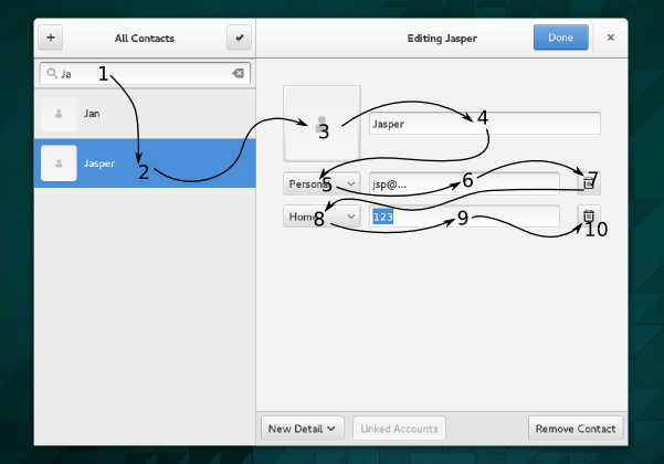
Apart from tabbing, GTK+ also provides directional navigation using the arrow keys, mnemonics to directly move the focus to specific widgets, and accelerators for actions in menus. Mnemonics are keyboard shortcuts that use Alt in combination with an underlined character; accelerators often involve the Ctrl key.

Internationalization

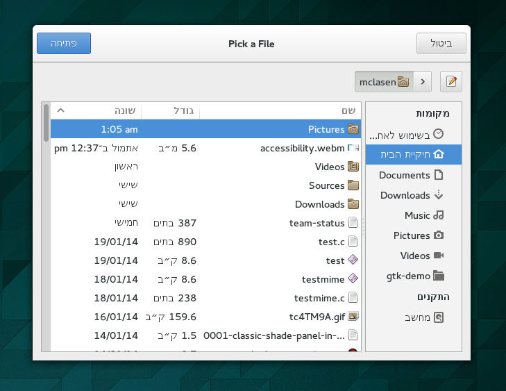
Most applications are translated in many languages. But you may have never seen how your application looks in one of its translations. You should check it out. In languages with a right-to-left writing direction, it is not enough to replace all strings by their translations; it is also expected that the interface adapts to the change in direction.

We casually call this flipping, and most GTK+ container widgets do it automatically when appropriate.

FilechooserResoohcelifIn the rare case where flipping is not appropriate (say, if you are dealing with maps, and you want to show an arrow that indicates West), you can override the locale-derived direction by calling gtk_widget_set_text_direction().
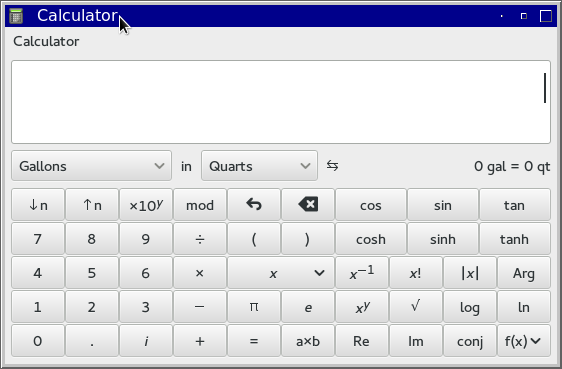
Baseline alignment

The human eye is very sensitive to jumps of the baseline as it moved over a line of text. If that happens, it leaves a ransom note feeling. The most common case where this can be a noticeable problem in UIs is when controls are layed out in a grid with labels.

Baselines 
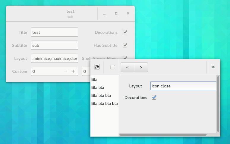
GTK+ has the ability to align widgets with respect to their baseline. To take advantage of this, you must set the valign property of the widgets to GTK_ALIGN_BASELINE.

Accessibility

Accessibility
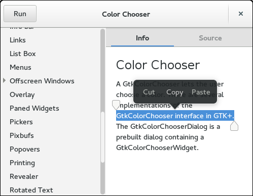
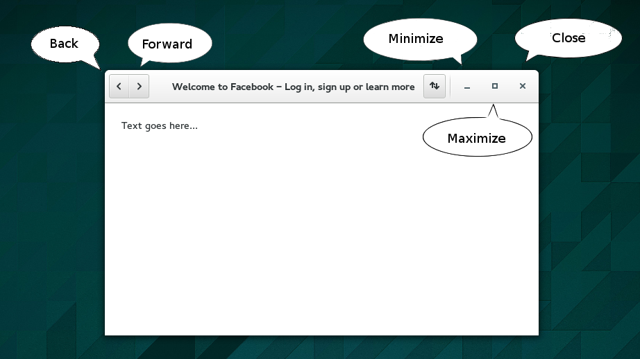
In modern UIs, many controls use just an icon. This looks nice and saves space, but it might be a problem if you can’t actually see the contents of the screen very well. A screen reader can only help if it knows how to translate those icons into meaningful text. For many standard icon names (such as the icons shown in this example), GTK+ does this automatically. If you are using other icons, you should use atk_object_set_name() to set a name on the accessible of the button.

And now, popovers

GTK+ has seen a fair bit of new development over the last year. We’ve gained new containers such as list box and flow box and stack and new widgets like the search bar, places sidebar, header bar and action bar. The Wayland backend has come a long way, and we’ve gotten hi-dpi support and client-side decorations.

One feature that we haven’t gotten until today, and that has been on the wishlist for a while is popovers. 

Popovers are transient views that are somewhat in the middle between menus and dialogs. The are transient like menus – you don’t expect to keep them open for more than a single action. On the other hand, they can display arbitrary information and allow input and interaction like a dialog. One big advantage of popovers over menus is that they are much easier to interact with using touch.

These are of course very popular in mobile UIs, but it makes a lot of sense to have them available on the desktop as well.

Inside GTK+, we’ve had some nascent support for this style of UI with the touch selection work that Carlos Garnacho merged almost exactly a year ago.

Touch selection

Carlos has now generalized this work and turned it into a full-blown GtkPopover implementation. Since the work has only been merged today, I can’t really link to API documentation yet. But the API is very easy: you create a popover with gtk_popover_new(). It is a container like any other, so can just pack your content as usual. And you control its visibility with gtk_widget_show(). The direction of the ‘tail’ that points to the parent widget can be set with gtk_popover_set_position().

popover = gtk_popover_new (parent_widget);
gtk_container_add (GTK_CONTAINER (popover), my_content);
gtk_widget_show (popover);

We don’t yet have any users of popovers inside GTK+ apart from touch selections, but I expect that to change soon.

Many thanks to Carlos for getting this done!

Even more client-side decorations

The design for the new GTK+ color chooser had its buttons at the top from the beginning. When I implemented it, we just didn’t have client-side decorations and headerbars to realize this aspect of the design. Now we do, so we can complete the redesign of the color chooser:

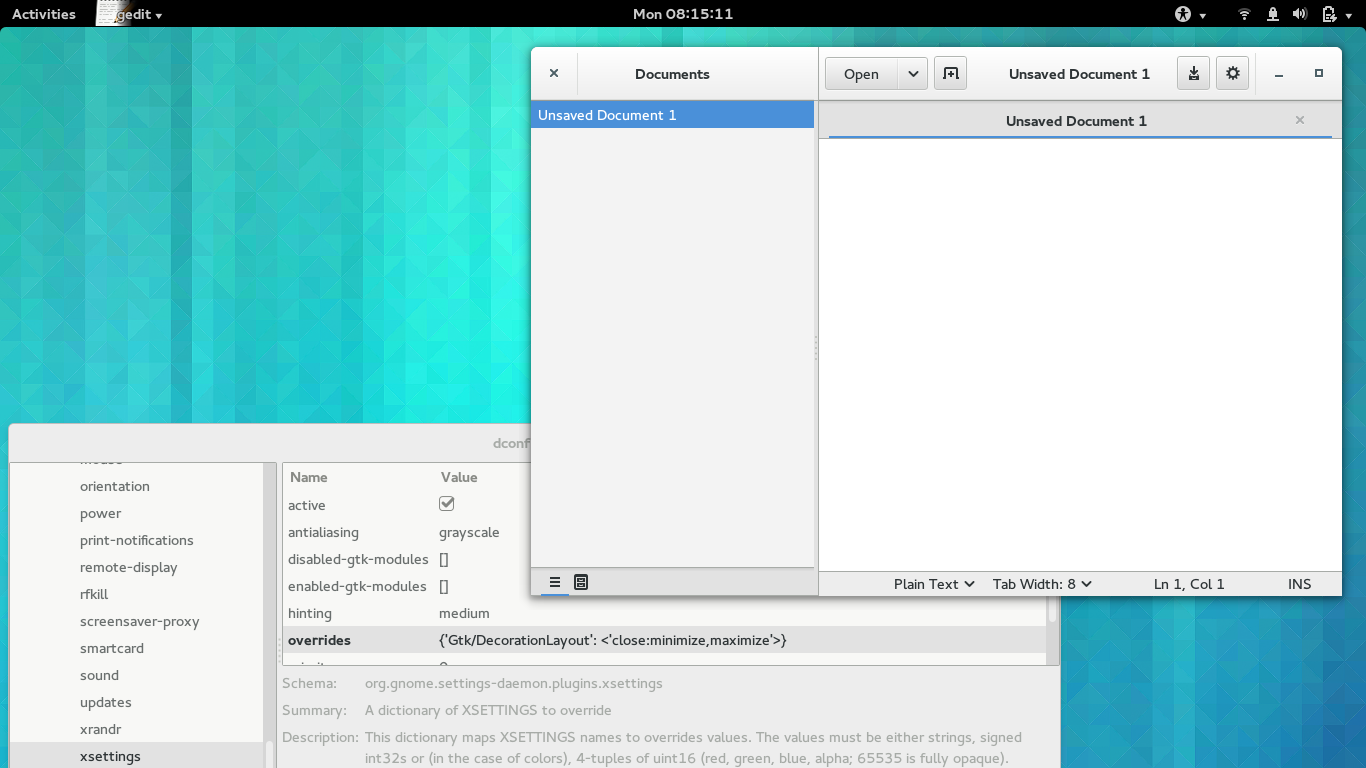
Of course, it doesn’t make sense to do this only for one dialog, so the other dialogs that are included in GTK+ have received a similar facelift.

Apart from recovering vertical space (do you really need the typical dialog title “Open a file” to remind you that the window you are looking at is a file chooser ?), the main advantage of this change is consistency: There is always a control at the top right corner of a window to close it.

These new-style dialogs are also more consistent with applications using client-side decorations, like all the modern GNOME applications. But of course, GTK+ is not just a toolkit for GNOME, therefore we’ve done our best to introduce this change in a way that does not upset our other audiences.

The use of header bars in GTKs built-in dialogs is controlled by a setting, GtkSettings::gtk-dialogs-use-header, whose default value is FALSE.  As usual, the setting is backed by an Xsetting, Gtk/DialogsUseHeader. For 3rd party dialogs which are derived from GtkDialog, header bars can be enabled with the construct-only property GtkDialog::use-header-bar. Buttons that are added with gtk_dialog_add_button() or its variants are automatically relocated to the header bar. And if you are manually adding content to the action area, we will keep it visible.

You can try these dialogs with the development branch GTK+. If you are using running gnome-settings-daemon, it is as simple as overriding the Xsetting with:

gsettings set org.gnome.settings-daemon.plugins.xsettings \
    overrides "{'Gtk/DialogsUseHeader':<1>}"

The changes in GTK+ master are not 100% complete yet, I expect that we will make some adjustments to the dialogs.

Client-side decorations, continued

Time to talk again about client-side decorations (csd).

buttonsA while ago, I’ve talked about themes and what adjustments they need to make csd windows look respectable. Back then, I avoided the most thorny issue with csd: window controls. Window controls are the close, minimize, and maximize buttons that window managers have traditionally put into their titlebars.

Early in the GNOME3 era, we tried to save some vertical space by simply hiding titlebars when the they containing important information. This is particularly relevant for maximized windows on small screens, where vertical space is scarce. This was the hide-titlebar-when-maximized property. As we soon found out, the lack of a reliable close button in the upper right corner with this approach is a big problem for many users.

More recently, we’ve switched to a different approach: Reclaim the area that has traditionally been taken up by the titlebar for applications. To this end, we’ve introduced the GtkHeaderBar widget, which lets applications use this space for its own purposes. This was pretty successful. Many GNOME applications are making good use of this now, e.g. nautilus:

headerbar2These custom titlebars require window managers to have support for mwm hints, so we can convince them to not show their own titlebar. These hints have traditionally been well-supported in window managers — so far, the only problematic case we’ve found is xfwm4.

As you can see in that nautilus screenshot, there is a window control — a close button in the upper right corner, which will stay in there as the window is maximized, addressing the problem with hidden titlebars. Since the header bar is application area, the close button is only shown if the application author explicitly allows this by setting the show-close-button property.

This is a nice and clean story, but of course, things never stay that simple.

Window decorations, and in particular window controls are a traditional area for distro differentiation and theming (you may still remember the discussion about Unity buttons), and unsurprisingly, we soon got requests to allow some themability.

In 3.10, GTK+ added a style property, gtk-decoration-button-layout, to let themes control the button layout. At first, we only respected this property for  client-side titlebars that were not explicitly added by the application. This turned out to be insufficient and opened us up to some (justified) criticism about the (lack of) consistency with client-side decorations.

So, shortly before christmas, I’ve gone back and redone the configuration mechanism one more time, changing it to a combination of a setting, GtkSettings::gtk-decoration-layout, and a regular property, GtkHeaderBar::decoration-layout, whose default value is taken from the setting. The settting is backed by an xsetting, Gtk/DecorationLayout.

This adds more flexibility: Themes can influence the default value of the setting (via their settings.ini file), distributors can set a default value and users can override it via the xsetting (hopefully soon from gnome-tweak-tool).

But application developers / designers have the last word: they can hardcode the property to just show a close button on the left, if the application design does not accommodate wild variations in the header bar layout. Or they can read the setting and make adjustments, e.g. for the case of split header bars, as can be seen in the new gedit design:

geditIf you want to experiment with this, GTK+ ships a two interactive testcases, testtitlebar and testsplitheaders:

TestcasesThis is a difficult area for a toolkit. We find ourselves between multiple competing interests:

  • Users expect consistency across applications
  • Distributors expect applications to adapt to whatever environment they are running in
  • Application designers want applications to appear as designed, and not wildly different depending on the environment

I hope that the mechanism that is in place now is flexible enough to allow balancing these interests, and to make GTK+ applications work well in different environments.

One last thing I should mention in this context is the GNOME application menu. GtkApplicationWindow has had a built-in fallback for other environments since day one, but it is not that great.

Application menu fallbackIt uses a mostly-empty menubar, which adds to the vertical space problems, and it duplicates the application name. In GTK+ 3.12, the fallback menu will be integrated in the header bar, and look much more natural:

Better fallbackEnjoy.