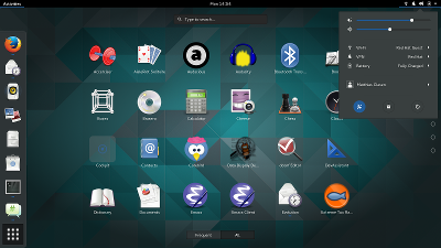
As is my habit, I’ve taken some screenshots of new things that showed up in my smoketesting of the GNOME 3.15.90 release.Since we are entering feature freeze with the .90 release, these pictures give some impression of whats in store for GNOME 3.16.
The GNOME shell theme has seen the first major refresh in a while. As part of this refresh, the theme has been rewritten in sass, and is now sharing much more code with the Adwaita GTK+ theme. Window decorations are now also sharing code between client-side and server-side.
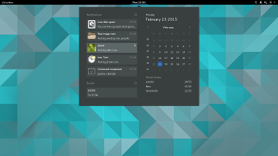
 A long-anticipated redesign of notifications has landed just-in-time for 3.15.90. This is a major change in the user interaction. Notifications are now appearing at the top of the screen. The message tray is gone, old notifications can now be found in the calendar popup.
 System integration has been improved, e.g in the area of privacy. We now have a privacy page in gnome-initial-setup, which offers you to opt out of geolocation and automatic bug reporting:
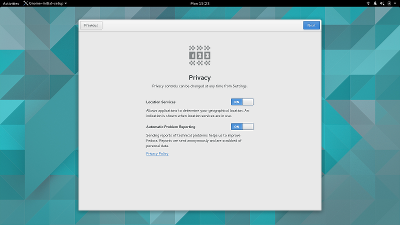 Outside of the initial setup, the same settings are also available in the control-center privacy panel.
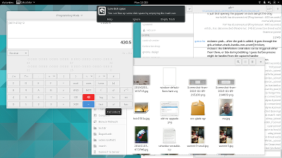
The nautilus UI has received a lot of love. The ‘gear’ menu has been replaced by a popover, the list appearance is improved,
and file deletion can now be undone from a notification.
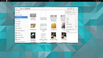
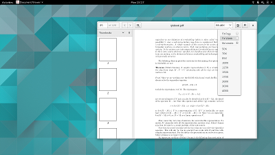
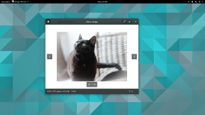
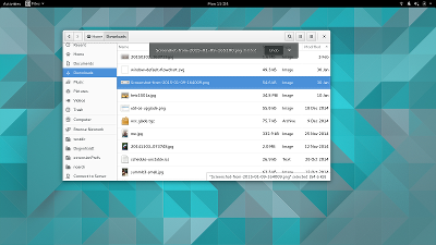 Other applications have received a fresh look as well, for example evince and eog:
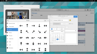
 There will also be a number of new applications, here are a few:
 You can try GNOME 3.15.90, for example in Fedora 22 today. Or you can wait for GNOME 3.16, which will arrive on March 25.
What’s up with the “stippled” lines in the Evince and Nautilus screenshots? (the thing at the top of the places sidebar in Nautilus for example).
Those lines indicate that there’s content scrolled off at this edge. The treatment is maybe not the greatest, but with scrollbars hidden by default, I feel that we need some hint for this.
Sure, because nothing says, more content off-screen like a dash line reminiscient of cut along this line.
Maybe, just maybe, adding a scrollbar if there’s more content to scroll through?
How does one scroll without a mouse wheel when not having a scroll bar? Oo
The scroll bar appears when you move close to the edge of the scrolling area, and then you can scroll using it.
Please keep the scrollbars.
The scrollbars are still there to be used, just hidden when not used.
https://www.youtube.com/watch?v=TBrIpNh4joM
Which is really painful to use when you’re trying to resize the window, and the scrollbar jumps into and out of active state…
So why are we hiding scrollbars by default? I appreciate that big wide traditional scrollbars (the kind with arrows and handles) are out of fashion, because they eat a lot of screen space, and don’t see much interaction in practice.
But that doesn’t mean that the concept of a visible indicator equivalent to the scrollbar is a bad idea… something thin and non-interactive, but permanently visible.
Why are the bars hidden by default?
Having a bit more width for pdfs isn’t tremendously useful, but fast scrolling to a certain percentage of the document might be.
At a minimum, why not set scrollbars based on the presence of LIBINPUT_DEVICE_CAP_POINTER or LIBINPUT_DEVICE_CAP_TOUCH?
If you are using libinput then we do the right thing already. We’ll be able to rely on libinput only on Wayland, sadly, until everyone switches X11 to it as well.
Fantastic!
Thanks for the clarification.
What about fading it out, like a gradient, as it gets towards the limit of the pane?
We tried that, but it didn’t work really well with theming. We’re still trying to find the right approach, though.
Then why not just use a shadow instead? I think that makes much more sense…
We did use a gradient, but it did not really work out in a way that was compatible with the theme.
At first I didn’t knew what everyone was talking about. Upon looking at the screenshots again, I can see it now and I’ve to say: You should definetly change it.
For one, it’s kind of confusing (someone already pointed out the ‘cut here’-look). At least change the simple dots in to downward facing arrows. (or sideway facing arrows. Basically the arrows should point to the offscreen content)
Maybe a subtle gradient/fade-out would make more sense. It could cover part of the top icon to indicate there’s more you’re not seeing.
Maybe a kind of “zig-zag ” dashed line could be used?
I think I’ve seen this in some case used for “more contents outside the visible are” case.
No new file choser with preview? 🙁
Anyways, looks great so far!
The file picker looks terrible to me. I often the type-to-complete too look up files in directory and now it fires up a global search which shows completely different files from what I’d expect. When I realize the mistake I’m not able to figure out how to get back to the directory view and end up either panicking or typing the whole path 🙁
Not sure if I’m XKCD #1172, but it is confuses me enough to render the dialog unusable for my use.
I’m looking towards the day the file picker looks more nautilus-y so that it would show previews for pictures 🙂
Rest of the changes look neat to me though.
Wow! While I have read a lot of dislike from people on Gnome 3, I’ve always believed in the work the project has done from 3.0!
3.15.90 I think is beginning to prove that there is something truly special happening with Gnome that one really has to appreciate to see. The apps are actually beginning to take on their own identity, and I must say: the Notifications *really* needed this work done! The new top-panel oriented design is a LOT more natural and makes sense, especially on my HP tablet where I always had trouble getting the Message Tray to open for me with the pen! And the Files (nautilus) improvements are definitely a plus! I just wish that on one glorious day file-roller and other tidbits would be integrated (i.e. merged) into Files to make it more coherent.
If I may give just one critique, though, I’m really not digging the background grays in the first screenshot. The foreground grays, such as the menus and Dash, are sharp, elegant, and beautiful. To elaborate, the grays appearing around the app icons (i.e. Cockpit) are what I am referring to. To me, it just looks clouded, but that’s my taste. Others may love the new background. I just *really* miss the gorgeous blue backgrounds very much from the 3.8 and earlier releases; could they at least be made an option in the Background pane?
But I think all these new improvements, as always, really cleans up and modernizes the Shell. Also, the new behavior Calendar widget is a wonderful fix to the old Notification/Message Tray, but it seems to me there should be a pulse animation, change of color, small icon, number badge… or really anything, obvious that lets end users definitively understand where their notifications have disappeared to (are hiding). Then again, I haven’t run this just yet, so I’m recommending this blindly.
Aside from that, this release so far looks like it’s going to be truly awesomeness! I will definitely download Fedora 22 and check out the new s/changes/improvements!!!
Is there a reason those blue highlights for opened applications in the Overview are so small?
The table shadow thing from before was quite obvious, but this one looks rather difficult to distinguish.
On the panel with the active application, I see that the new shell theme uses the symbolic icon or a small hicolor icon. It appears the larger ‘faded’ icon with the overlapping app title text is a thing of the past now?
Any plans to add controls for Recent Files tracking to that privacy panel?
Also, having a giant geolocation hammer seems odd, since applications should only be using geolocation on user request. Would it make sense to have it off-by-default, but allow applications to *request* access to the user’s location, and let users say “yes, always for this app” (e.g. for maps or calendaring apps)?
I’d second that. Having “Recent File” tracking is sometimes useful, sometimes not – in particular, it’s quite useful for working documents (things opened in Gedit, Evince, etc), but not much use for media (movies, audio files).
It would be nice if tracking could be easily enabled/disabled at a per-application level, or perhaps a per-folder level. Basically, I’d like to say that random stuff in the ~/Downloads folder should never be remembered, but stuff in ~/Documents or ~/Development always should.
> Also, having a giant geolocation hammer seems odd, since applications should only be using geolocation on user request. Would it make sense to have it off-by-default, but allow applications to *request* access to the user’s location, and let users say “yes, always for this app” (e.g. for maps or calendaring apps)?
How do you do that, without app sandboxing, though?
AFAIK, the current on/off switch is a compromise between what is desired (per-app settings) and what is possible now: turn on or off the geoclue daemon.
No code, AFAIK, but recently used files would be a good thing to integrate in the Privacy panel indeed. Do you feel up to filing a bug in Bugzilla, so that we don’t forget? Thanks!
> Any plans to add controls for Recent Files tracking to that privacy panel?
Like this?
Control Center -> Privacy -> Usage & History -> Recently used -> OFF.
> Also, having a giant geolocation hammer seems odd, since applications should only be using geolocation on user request. Would it make sense to have it off-by-default, but allow applications to *request* access to the user’s location, and let users say “yes, always for this app” (e.g. for maps or calendaring apps)?
Right now, it’s almost like this. The only difference is that instead of a “Yes|No”, GNOME Shell shows that a app is *actually using* the feature.
If the old message tray at the bottom is gone, where do system tray icons now live?
There was no such thing as “tray icon” in GNOME 3 ever.
Old-style tray icons used to appear in the messaging tray alongside notification icons (well, they still do, as of GNOME 3.14).
I was wondering the same thing. It is a major problem with GNOME that you can’t see ownCloud or Dropbox’s status because there is no visible system tray.
Wondering the same
Looks good. I’m tempted to switch from my current XFCE desktop. Sadly, it appears Gnome now has a big dependency on SystemD. Any idea how to run Gnome without recompiling or changing my init system?
[WORDPRESS HASHCASH] The poster sent us ‘0 which is not a hashcash value.
The answer is a bit involved. We use various things from systemd. The most discussed one is the usage of logind. For that see: https://wiki.gnome.org/Projects/ConsoleKit.
While it looks good still is painful to have to make 10 click to connect to the bluetooth headset… but probably is half fault of gnome and half fault of bluez/pulseaudio
Does the new notification design facilitate chatting from a conversation bubble at the bottom the screen like before, that was a really neat feature.
I appreciate all the hard work and follow GNOME 3 development but don’t use GNOME 3 any more. I stopped using it after GNOME 2 because GNOME project refused to listen to the users actually using and caring about GNOME.
This interface is suitable for touch devices but as GNOME has no interest to pursue adoption on touch devices this clearly show how much GNOME 3 is mismanaged.
Seeing on how much struggle Canonical has been facing to get first phone out i doubt GNOME would get there in 5 year time if it starts today. And GNOME doesn’t have real ambitions to go on that path.
I often ask myself why are you showing us this phablet user interface again and again if you know users of GNOME use standard PC and GNOME on small touch devices is not going to happen as GNOME has no real ambition for it to happen?
Get your act together and for GNOME 4 introduce more standard desktop PC user interface back. You lost users on desktop with GNOME 3 and you didn’t gain any new phablet users with GNOME 3.
How long will this “stick your had in the sand and ignore reality” game go on in GNOME camp?
You are forcing phablet interface but have 0 phablet users. Talk more about that fact please as GNOME is important project in my opinion and we should care.
By.
Gnome 3 is not meant for phablets, and I doubt that category of devices even existed back when Gnome Shell was initially designed. It is designed for Desktops and Laptops. Since many of those nowadays also feature touchscreens, being touch-friendly isn’t such a bad idea.
I can’t speak for anyone but myself (you don’t seem to have that limitation), but one reason I like Gnome 3 is, that it isn’t yet another copy of the same desktop interface everyone implemented over the last decades. I don’t believe that the traditional desktop is the one optimal way to interact with a PC and I think that Gnome is innovating in the right direction here.
Why do you want to take that away from those of us who use Gnome and thus probably care more about it than you?
” that it isn’t yet another copy of the same desktop interface everyone implemented over the last decades.”
Mac OSX Clone 😉
As a mac owner who is using linux with gnome, they are not similar at all. Osx is way more traditional and in many ways more similar to kde and cinnamon.
The other way around, given the release schedule of GNOME and MacOS. 😉
Actually is more like a WebOS clone.
http://www.businessinsider.com/hp-touchpad-webos-screenshots-2011-4?op=1&IR=T
It’s far away from OSX, if you were serious about this 😉
Anyway, there will always be elements that are close to other desktop interfaces, or inspired by them. It’s always about “stealing” and improving.
GNOME 3 has phablet interface but i agree it’s not meant for phablets as GNOME 3 has no real ambitions to be used on phablets. User base on phablet is probably down to 0 and i doubt that will change soon. Actually trying to use GNOME 3 on phablet would still have a lot of usability issues! The same as using it on the desktop! It doesn’t do desktop and it doesn’t do phablet good.
About being original or a copy. From usability point of view good copy is better compared to bad original if good copy works and bad original does not!
There is not all that much original in GNOME 3. There is icon overly as seen on all phablet today, dock and title bar. What is original is tweaking and implementing this already seen desktop/phablet elements in a way they introduce usability issues that did not existed before but they do now.
Sure i could be GNOME 3 hater or maybe i am not and its just the opposite and GNOME 3 doesn’t like its users ATM al that much. Maybe we did something in the past and deserve this or maybe GNOME 3 just needed to go down the dead end path to redefine itself and to come back stronger.
Hey Rethink,
This blog is not meant to make you feel better by venting your frustrations.
I’ve approved various comments on behalf of mclasen. However, the latest reply (won’t be approved) is too much. That you don’t like GNOME is fine though I find it completely offtopic to have such a discussion here (e.g. write your own blogpost). In your latest post (which is never going to approved) you’re complaining about the direction GNOME is taken and in the same sentence giving instructions on people what to think and what they should do. That’s way too entitled. I’d prefer to approve posts. This is not possible if you’re not behaving like a guest.
In my opinion it wont help to silence the opposing views, as they wont go away, but i will conclude my involvement if it makes other uncomfortable.
Hopefully this last opinion of mine gets trough:
GNOME 2 was in general loved and GNOME 3 is in general hated and that is too bad.
By.
Why so much hate? Go listen to some reggae.
You are confusing hate with the ability of talking about something that is obvious but nobody (core GNOME) wants to talk about. I doubt listening to reggae will make any difference but go ahead and suggest it and maybe they will take you serious.
They don’t listen to plain reasoning any maybe you are correct and they would listen to you suggesting reggae!
As I am not part of the core team and I like the Gnome 3 interface you may rephrase your statement.
[WORDPRESS HASHCASH] The poster sent us ‘0 which is not a hashcash value.
Speak for yourself, I use Gnome 3 on the desktop and love it. It has improved my workflow considerably. Just because you don’t like something, does not mean everyone shares your opinion.
If you call phablets to all those devices with a keyboard and a big screen that other people call laptops/desktops or even PCs, I’d agree with you. GNOME is heavily optimized to be used with a keyboard.
Call it a “refresh” if you like but things have changed in a way that forces relearning, leaving little room for old habits. So it’s Xfce or MATE for me too, but frankly I use android more than either of those.
When I started using Gnome I never thought I’d have to deal with even more inconsistency and user interface changes than the proprietary alternatives (until Windows 8 Microsoft was actually quite good about letting users revert to old habits if they really wanted to).
Not sure why I even check Planet Gnome anymore, I don’t feel like I’m a Gnome user anymore, but I can’t help agreeing with the previous comment. Gnome will probably continue on regardless, time will tell.
If the message tray is gone, where to tray applications like Pidgin reside now?
It looks like things are getting closer to what I need to be able to return to Gnome, but I think it’s not there yet. Instant messaging is a big part of my work flow, but I need to be able to work on my current task without the IM notifications distracting me until I’m ready to switch tasks. The notification system of Gnome fails miserably on this, and really is miserable in general. I don’t need anything popping up on the screen unless it is completely critical in nature. Anything short of that should simply light up some sort of an non-obtrusive but, and this is the critical part, always visible indicator. Something like Gnome 2.x tray icons. Any chance that a return to a usable notification system is getting closer?
>Instant messaging is a big part of my work flow, but I need to be >able to work on my current task without the IM notifications >distracting me until I’m ready to switch tasks.
You can disable *per app* notifications in the Control Center.
>I don’t need anything popping up on the screen unless it is >completely critical in nature
You can disable *all* (non-critical) notifications in the Control Center.
> […] non-obtrusive but, […], always visible indicator.
There is one in 3.15.90, if I’m not wrong.
>Any chance that a return to a usable notification system is >getting closer?
3.15.90?
Ok, with the notifications change, I happen to have two questions. .. One of the bigger things with the old notifications system was the integrated chat (via Empathy ), so what happens to that now?
Two, the old notifications bar was where the system tray lived… is that gone now?
Same wondering here.
Thanks for all the improvements, but please bring important features back to Nautilus that had been removed: Something that instantly shows how much free space is on the disk. And the indicator after cutting/copying how many files (and file size) are to be copied or moved. These feautures add important usability to Nautilus. Please bring them back! Thanks.
> Something that instantly shows how much free space is on the disk.
In Nautilus, *anywhere*: right click -> properties.
Or, also: look at the “File System” tab, in GNOME System Monitor.
Or, even better: use “Baobab” (GNOME Disk Analizer, I think). It is fucking awesome.
If you make 100 copy-paste operations per day over 500 folders (located throughout different partitions), it would be super annoying to open/switch to properties or baobab 100 times just to check free disk space. Wouldn’t it?
What is your preferred solution for this kind of problem?
Why is it org.gnome.characters in the top panel? Should it be just ‘Characters’ ?I hope it would be fixed.
Would be a nice bug to get someone started, don’t you think? Wink.
Looks like there are some really nice visual improvements coming, I especially like the integration of the messages into the calendar drop down. Also, thanks for taking the time to post the screen shots, interesting stuff!
Hi, old GS3 theme was nicer in my opinion. It has better contrast and with little opacity was also stylish. This gray background is not the nicest and likely distracting me a bit.
Milan
Very glad about the ditching of the message tray. I have tried the new notifications area and it is so much better the way it is! Kudos!
unsure about the changes in EOG that make the picture smaller while the whole point of the app is to display the picture. I hope there’s an option to have the arrows displayed on top of the image rather than scaling the image down.
Don’t worry. The buttons don’t take up precious space from the image. They are overlaid over the image area. So, together with the replacement of the toolbar and menubar there should actually be more room available to the image now.
Glad to hear this, great news!
Does shotwell plugin “edit image” still work? In traditional toolbar I always add that plugin. How to the same for headerbar?
Why dont you work with the numix team for the icons ??
They are very good at it.
Because the icons are really not all well designed.
Which icons? The applications icons?
If yes, it should be clear that each developer is responsible for its own icons.
Anyway, at least about the icons of the apps that fall under GNOME umbrella, I can say they seem very well made, with a lot of effort and knowledge. And also very pretty and easily recognizable, like GNOME Music or GNOME Builder icons, for example. Jakub Steiner is behind most of them, I think. Go check his website: http://jimmac.musichall.cz/, he seems rad 🙂
And, by the way, please forgive me for the sincerity, but I don’t think a bunch of squares can be so “much better”.
GNOME is not responsible of (all) application icons; Numix can replace them all because they are a theme — but applications really like their icons. It’s how users recognise their work.
I strongly feel evince need more feature then a new look. In evince site, the to-do is not updated after 3.2!! And really, we have not seen any new feature in evince lately.
What new features would you like to see in Evince, buddy?
Didn’t the new Evince look arrive in 3.14?
You’re right, though It has received some small improvements/fixes, mainly in the sidebar.
Shiny!
Although I do not like the search thing in the file picker. I also wonder where the notification icons (or whatever they are called) go now. And chat integration, and unmounting.
The app menu is terrible. First use hot corner or keyboard short-cut to get to the app menu, then click on the dotted icon to get recently used apps and then “all apps” to find all. Where are the menu filter for office, internet, system, games, etc.? Fedora 15 had a good menu
To go directly to the list of Apps, press “Super+A” (Super is the “Windows” key – and, if needed, you just need to click in “all apps” once in a life, by the way.
Or better: press “Super”, then type something about the App. It doesn’t need to be the name, something like “internet” should be fine.
Or even better: if you need to open an App all the time, just add him to the “sidebar”.
For last, if, for whatever holy reason, you don’t know anything about the App you need to open, categories *won’t* help you.
BUT if you *really* need to categorize your Apps, guess what, ou can do it: open GNOME Software, click in “installed”, click in the “checkmark” button, select the Apps, then click in “Add to folder…” and be happy. FOREVER.
Is it enough for you?
Oh, isn’t? Try “classic mode”, then 😉
The new flat design looks awesome!!
How can I install Gnome 3.15.9 in Debian 8?
You can see the status here:
https://www.0d.be/debian/debian-gnome-3.16-status.html
The best change I can see is the redesign of the notifications. But I wonder, without the message tray, where do resident apps, like Skype or Dropbox, appear?
I also agree with the people above about the need for permanent scroll bars by default. Scrollbars have info in them; they are more than just a way to scroll the page. Removing the scroll bars drops this somehow important info in return for very little screen space at an age where HD resolutions are a norm.
Why not use the Ubuntu scroller? Is it a prestige thing?
Overlapping notifications are bad UI design and disturbs your work. It would be much better to use a billboard scroller in the top bar from the top down, and shrinks from left and right inward the time/date and gives a weak flash before it goes away.
Something like this
https://www.youtube.com/watch?v=m-_RHSV80mY&hd=1
Because not even Ubuntu wants to use their overlay scroll bars module/hack any more as it’s evidenced here.
Wow. It is kind of sad that difficult maintenance rules over features.
What do you think about a billboard scroller in the top bar?
Hey, looks pretty neat.
One thing that bothers me is that notifications are being hidden in the calendar popup. Nothing says “Find notifications in here” like today’s date! Or not.
I’ve always thought that the Activities layer was the right place for notifications. A simple indicator that “something needs attention” in the activities pane would suffice – say, a subtle color change on the hot corner label or maybe a badge.
Maybe add a “Notifications” icon next to the “Show Applications” button on the favorites bar, leading to a rich notification history.
Anyways, good work overall – I am sure I can cope with notifications being hidden in the calendar, but it just seems a bit odd.
If there are notifications, a glowing dot will appear next to the clock.
I am not sure exactly what it is the reason but i am not convinced. Looking at the pictures makes me try it every once in a while that much is true.
As soon as i start using it i do feel something is off and i switch back to other Linux DEs i use occasionally. I like to use different DEs and every few months i switch to something else for fun. Gnome 3 does not work for me but i like to use Gnome applications if i use for example Unity. I am guessing GnomeShell is the culprit and that is what i don’t like to use it as a whole. I like to use Mate or Cinnamon for example and looking from that perspective the only reason obvious to me is GnomeShell is the culprit and needs more work for me to use stock Gnome and to enjoy the experience it provides.
I really love the new look of notifications. It’s easier to use.
Epiphany needs lots and lots of love , is somebody ready and does anybody have time to give the love it requires , until then it will be abandoned child.
When does gnome theme and windows looks so bad compared to windows 8 , any idea when it will be improved.
While I appreciate the improvements re the messages now being at the top, of the screen, I still have some disappointments.
One of my disappointments has to do with the radio buttons.
I have 9 radio buttons for the “ALL” display. I had sent a suggestion to the design group to suggest that the radio buttons be replaced or augmented by having a tab field containing the first two letters of the upper left icon corresponding to that button. There is too much scrolling to find a program from the 9 pages. It gets worse if I add some extra applications and the number of radio buttons increases by one (or two). Not everyone wants to search by typing.
Justification.
I used to have a dictionary where the edge was chisoled out and a tab was glued in place to show the start of the next alphabet letter. This request that I made was for a similar concept. Replace the radio button by a two character radio button.
Gnome 3 has reduced my productivity big time! I hate the Activities screen! I spend hours idling away clicking around the Activities and admiring the subsequent animations! You have made it too slick for my tastes. Only kidding, the animations in the Activities screen are too cool!!!
I used to use KDE on my PC, and then when i installed Linux on my aging laptop i switched to the lighter Xfce. Then around last September i started reading good things about Gnome 3 so replaced Xfce with Gnome. At first i was really frustrated with the interface because it wasn’t like what i was used to so tried everything i could to get rid of Activities and re-enable a start menu and active window icons. Then after a while i decided to bit the bullet and revert the desktop back to Gnome default with the Activities in the top left corner.
I’ve now grown to love the Activities screen. I really like the way the UI hangs together. The Favourites and the Frequent list are really useful and IMHO it’s more efficient than a start menu because with a start menu you have to remember which category an App resides in.
I think a nice enhancement in the Activities screen would be to have the App icon on the top left corner of each App thumbnail. I no longer use Alt-Tab, instead using the Activities to switch betwen Applications. When there are say 6 apps or so, my eyes have to scan over the thumbnails. If many thumbs look similar it can take a second or so to find the right one to click. Having a visual cue like the application icon would make the process quicker for the eye to find the right one.
I’m using Vivid and installed Gnome 3.15 from PPA, and find it to be solid which is not bad for a development branch.
I have noticed a lot of subtle changes in the interface and really do like the changes, i particularly like the fact you got rid of the oversized app icon that appeared on the top bar for the active app. Never did understand why it was oversized and looks better now that it’s the same size as the font.
So thank you for your work on Gnome. I think 3.16 is really going to be a great release.
What’s wrong with traditional scroll bars? If you need more space, why not to make buttons, controllers, handlers and the space between them smaller? I never understood why they are so big. And now, instead of trying to make narrow bars, you simply get rid of them. =/