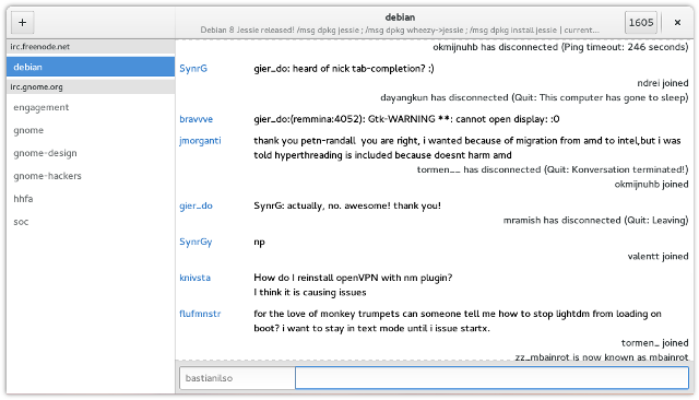
In heavily populated IRC channels such as #debian on Freenode, a lot of idle IRC users are joining and leaving every couple of seconds. At the moment, we display a status message for every user in the room which in some cases results in a lot of visual noise.
 another busy day on #debian. 9 out of 17 messages in the chat view are status messages..
This problem is filed as bug 711542 in GNOME’s bug tracker. I have decided to try addressing this issue with some logic.
The main purpose of status messages is to indicate activity concerning a user, such as the user joining a channel, disconnecting or being renamed. The two primary use cases I see for displaying status messages in the chat view are:
- ..when a user on a channel is actively participating in a conversation, but then the user’s status suddenly changes. For anyone reading the conversation, it is interesting to know what has happened with the participating users as a change in their status can affect the conversation itself.
- ..when a channel is idle and no conversation is happening. In this case it is a convenience to display status messages. You might be waiting for someone particular to join the channel for example and thus is checking the channel occasionally to see if the person has joined the room. On the other hand, we also want to avoid flooding the chatView with status messages as it creates more unnecessary extra text to scroll through between conversations in log history.
To adress point one, I have implemented the concept of “active” users and “inactive” users. An active user is any user on the channel who has sent a message to the room within the last X* minutes. If the user is considered active, we allow any status messages related to this user to be displayed in the room.
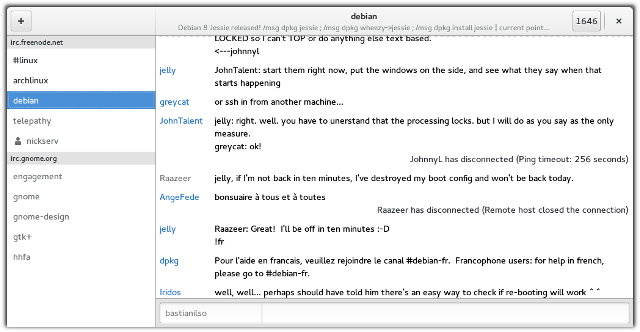
 Only recently active users emit status messages.
So because user Raazeer wrote “jelly, if I’m not back in ten minutes, I’ve destroyed my boot config and won’t be back today”, Polari will allow Raazeer’s status messages to be displayed the next X minutes. As can be seen in the screenshot above, a status message indicated that Raazeer disconnected shortly afterwards.
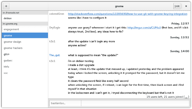
To address point 2, Polari will display status messages for any users provided there hasn’t been any conversation in the channel within the last X minutes. However, if more than 4 status messages are emitted while the channel is idling, Polari collapses the status messages and displays a single line summary instead. The summary can be expanded to reveal the details at any time.
 Screenshot of a status summary in action. Clicking the “…” can be clicked to reveal the status messages.
With these changes I hope we’ll have less visual noise from status messages in Polari. Feel free to have try my current branch. With problems like these, I think the best way to find out if it’s solved, is by trying it over a longer period of time.
*duration to be discussed. It’s currently set to 5 minutes, which is unfortunate for Raazeer since he said he would return in 10 minutes. Maybe a good indication that I should use a higher number? d:
This is amazing. Keep up the good work!
I completely agree that showing “disconnect” message during a conversation is unuseful if the user is “inactive,” great idea that I’ll be really happy to test (next unstable release!)
But for the “join” message, I disagree on your analyse (IIUIC). If you want to talk to someone, you’ll be really happy to know she just connected, even if people are already talking on the channel; notably, if you’re talking there, so that you can directly talk to her.
But she probably doesn’t know that you want to talk to her on that particular channel, so she probably won’t talk there (she just opened her computer, has other things to do than to say “hello I’m here” on all her IRC chans).
So, at the exact time you’re both on keyboard… one won’t be notified the other just connected, and the second won’t talk. Bad.
Maybe I misunderstood that second point, so I’ll wait to test; but from now, it doesn’t look like for me a so good idea.
Oh, and the collapsing looks good. In any way, thanks for working so hard on Polari, making it the perfect IRC client. =)
[WORDPRESS HASHCASH] The poster sent us ‘0 which is not a hashcash value.
I agree on the second point about the join message – it was a use case I hadn’t considered so thanks for bringing it up. :)
It’s hard to know for sure which user user A is waiting for. At best we could try to make a good guess through a combination of:
– who did the user talk to recently in that chatroom.
– who has the user recently tried to look up in the userList.
I think it is very often the case that if you intend to ping or write to someone in a chatroom, you either look them up in the chatroom’s user list first or try to use the tab completion in the bottom entry.
Polari has a bug filed with some work towards obtaining a list of “important users” by Carlos. This could be yet another place where it could be useful. :)
It is probably a hard use case to satisfy 100%, but it might be worth a try. I’ll have a look into it later. Thanks for your input!
Really nice!
And I think considering something like “in last X messages’ (if the user had activities in channel’s last X messages) in addition to “last X minutes” for the first first issue (active/inactive users) might be also useful and show some smarter behavior, especially in not very active channels.
This is indeed a very smart way to (not) show status messages. Nice work!
Dimming chat lines of users that left the channel, would be cool. That way you can reduce noise even more if you discard leaving messages from the chat pane. No need to decide on an x minutes window as well. I’m sure you won’t find that magic value everyone agrees on anyways.
actually we have patches in unstable dimming the nickname already, so that when you look through the logs you can see who is currently online (blue nicknames) and who are offline (grey nicknames)! :)
Dim chatlines once a user leaves a channel. Revert when she enters again. That would be cool.
Reduces noise even more when you drop leaving messages completely. Also no need to decide what time window to use. No matter what you choose, everyone will complain.
I think it would look nicer if join/quit messages would be dimmed out (ie. a brighter color than the rest of the text)