There was some discussion on fedora-devel-list about how to make it more obvious that the Fedora desktop spin. Various proposals were worked out to the point of working implementations.
Kamil Paral made the start with an extension that puts an ‘Install’ button in the top bar. I’ve followed up with a notification that pops up at login, explains that you are using live media, and offers you to install (The backstory here is that we’ve actually had a shell extension for showing the installer on the desktop spin for a while before F16, but the gnome-shell team asked that we ship GNOME 3 without extensions installed, so we’ve taken it out.). The notification was never my favourite approach to this issue; I preferred to just auto-start the installer.
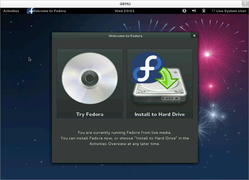
We are very lucky that Cosimo Cecchi and Kalev Lember teamed up for an outstanding job, and got a much nicer solution implemented, polished and integrated in a matter of days, so the initial experience when booting the F17 desktop spin will be this:
I’m looking forward to it !

Are there plans to make a higher-detail version of the right icon? It looks odd that the CD icon is very detailed while the right one is a much simpler style with fewer details.
Nice job.
One small thing (probably a typo to fix):
There are two big items “Try Fedora” and “Install to Hard Drive”. The explaining text below though mentions twice that you can install Fedora. I suppose the text should read:
“You can try Fedora now, or choose “Install to Hard Drive” in the…”
Geert, I agree that it is a little confusing at first, when comparing it with the images. But it is actually not a typo.
The images offer you the ‘try or install now’ alternative. The text is actually talking about a different alternative: ‘install now or install later’.
The tip can be both. ‘try, install now or later’. This why, there will be no confusion and the user will be aware of all the possibilities he have.
This looks fabulous! Great work!
You, me and most people here will understand that try means “Run, but do not install” but many won’t. How about:
Try Fedora (Without Installing)
But I really think that “Try” is a bad word. When you really mean “Run, but do not install” or “Continue but don’t install”.
Ugh, that scaled up install to hd icon sucks eh. Very nice work on the rest tho 🙂
That looks very nice, I like it! And it’s certainly an improvement to what we have right now.
@Lapo:
The icon is an SVG, so I don’t see how that’s badly scaled up.
If you really think you need a branded icon in there instead of the current anaconda icon, use this one. Includes a highres —
http://jimmac.fedorapeople.org/fedora/anaconda.zip
Take a look at http://kalev.fedorapeople.org/fedora-welcome.png , the icons look better in there. The image here is heavily compressed and doesn’t do justice to the icons, even though they actually scale up fine.
The branded “Install to Hard Drive” icon is anaconda.svg from the fedora-logos package. If you look at my screenshot, do you still think it needs replacing?
Will this window be visible on the DVD and live-cd?