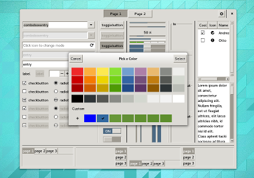
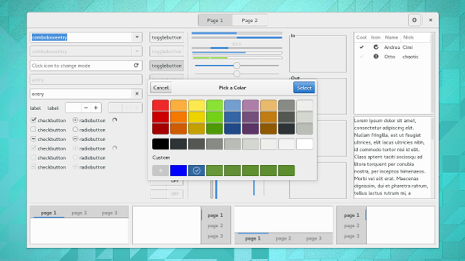
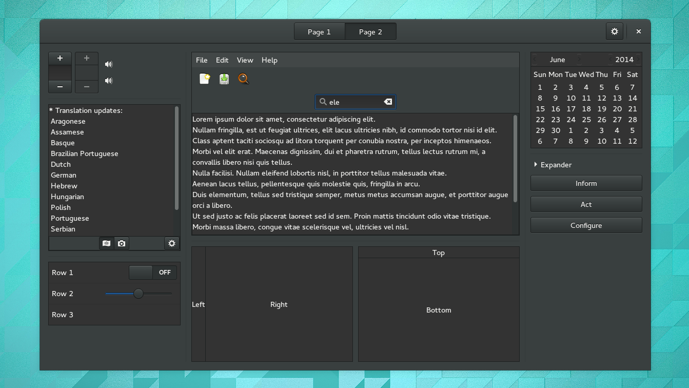
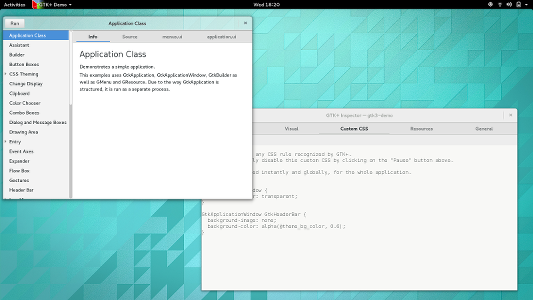
This has been a long time coming. We’ve wanted to replace the default GTK+ theme for a very long time.
-#define DEFAULT_THEME_NAME "Raleigh"
+#define DEFAULT_THEME_NAME "Adwaita"
The Raleigh theme that we’ve used as the default until now has some advantages:
- It is very simple
- No dependency on a theme engine (external or internal)
- It does not use a lot of resources
But there is no nice way of putting it: it is very ugly.

This may not be such a big deal on Linux, where distributions generally have ‘their’ theme, not to mention the many packaged and readily available themes. So, basically no Linux user ever sees the default GTK+ theme. The situation is very different on other platforms, where GTK+ is often bundled with applications, and it may not be easy to install themes, or get the bundled GTK+ to use them.
For a very long time, we’ve held onto the belief that the theming system is a way to make applications blend smoothly into the platform, and that there should be a native theme for each major platform that GTK+ can run on.
This is a great idea in theory. In practice, it has not worked out so well. The one platform where we have a native theme is Windows, and even though the ms-windows theme has received much appreciated attention and updates by Руслан Ижбулатов this cycle, it is still incomplete and has problems with some recent GTK+ features.
(No need to panic though. Even if it is no longer the default, the ms-windows theme will still be available.)
Adwaita on the other hand, is a very complete theme that has received a lot of attention over the last three years. Not only does it support all recent GTK+ features, many of the CSS improvements that the GTK+ theming machinery has received in the last years were direct responses to the needs of the Adwaita designers.

With Adwaita, GTK+ applications can rely on having a 100% complete theme that will look and feel the same on all supported platforms. A theme that is constantly receiving a lot of love and attention and keeps up with new GTK+ features.
Another big plus: Adwaita has a high-quality dark variant, which will now also be available everywhere.

So, why not do this switch earlier ? After all, Adwaita has been around for a while.
The main reason is that we did not want to lose the ‘no theme engine’ characteristic of the default theme. Theme engines, and loadable modules in general, are something we’ve been moving away from for a while now. They are
- questionable from a security perspective (executable code thats shipped separately, inserted into all your applications)
- associated with search path problems
- require stable APIs for many things that are more or less internal
(No reason to panic, though. Theme engines will not stop working overnight in GTK+ 3.)
The alternative to engines that we want themes to use is CSS. Our CSS implementation has only recently become powerful enough to replace the last features from the Adwaita theme engine (focus rectangles and menu shadows). That is why we are doing the switch now.
One of consequences of moving Adwaita into GTK+ is that we will no longer ship application-specific theming as part of the theme (many core GNOME applications currently have small amounts of CSS glue inside gnome-themes-standard). Where this is still relevant, applications should just install it themselves. Here is an example for how to do this.
Thanks for the huge amount of recent work on Adwaita go to Jakub Steiner, Lapo Calamandrei, Jon McCann and Cosimo Cecchi.
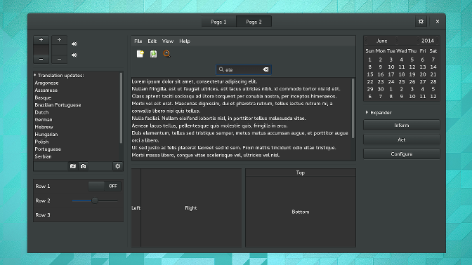 Next, I’ve noticed that our sharing infrastructure has become network aware, and lets you change what is shared depending on what network you’re on:
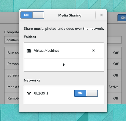 This works not just for media sharing, but for file sharing and screen sharing as well.
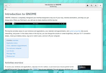
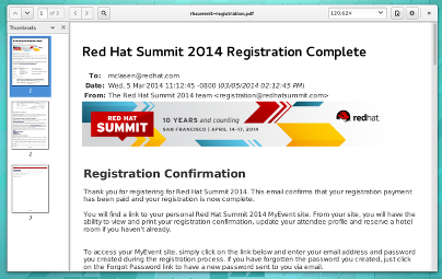
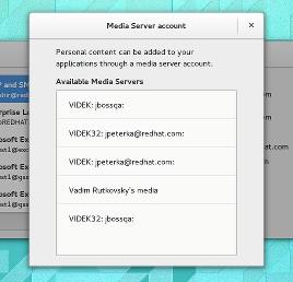 Among the applications, yelp and evince stand out with new, modern looks that fit in very well with the rest of GNOME:
 There are more things to discover that I could not capture in a screenshot. For example, I noticed that GNOME shell now remembers which workspace windows where on when you disconnect and reconnect external monitors.