In my last update, I talked about CSS nodes in GTK+, which are used to match theme style information to widgets, and to hold state that is needed to handle e.g. animations.
Today, I’ll focus on CSS boxes in GTK+. This is where we take size information from the theme, such as margins, padding, and minimum sizes, and apply them to the widget layout. The internal name we’ve chosen for the objects that encapsulate this information is gadgets . I’m well aware that we’re not exactly breaking new ground with this name, but the name isn’t really important (as none of this is currently exposed as public API). For the purpose of this post, you can think of gadgets simply as CSS boxes that make up widgets.
Lets start with a simple example widget, to see what this is about: a radio button (all of the screenshots here are showing GtkInspector, which is available in any GTK+ application, so you can easily do these experiments yourself).
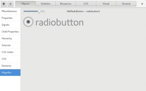
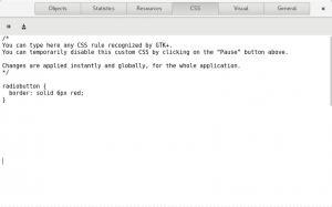
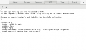
We start by making the border of the widget’s box visible. The CSS snipplet shown below is using the element name radiobutton, which GtkRadioButton sets on its main CSS node, so this selector will match.
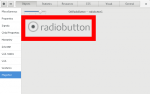
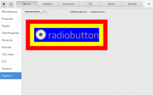
This is how it looks. If you compare carefully with the earlier screenshot, you can see that GTK+ has made the widget bigger to make room for the 6 pixel border, while giving the same size as before to the content of the widget.
The CSS box model has more than just a border, it also allows for padding (inside the border) and margins (outside the border). In fact, the box model is much more complicated than this, and we’re only scraping the surface here. The GTK+ implementation of the box model handles most of the important parts, but doesn’t cover some things that don’t fit well in our situation.
So, lets add a margin and padding. To make this visible, we use some features of CSS background rendering: We specify two backgrounds (a solid blue one and a solid yellow one), and we let one of it be clipped to the size of the ‘content box’ (the area given to the widget content) and one to the size of the ‘padding box’ (which is the content area plus the padding around it).
This is how it looks. The margin is not very visible here, but you can clearly see the padding (yellow) and the content (blue). Note again how the widget has gotten larger to accommodate the padding and margin.
When I talked about CSS nodes, I mentioned how widgets can have extra nodes for their ‘components’. This extends to gadgets: each of the widgets components gets their own CSS box, with its own margin, padding, background and whatnot.
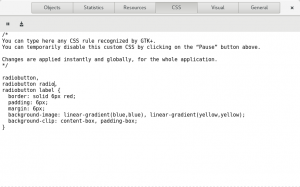
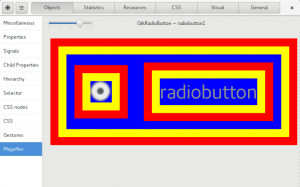
So, lets continue the coloring exercise by making our CSS snipplet match not just the radiobutton itself, but also the label and the indicator. Their CSS names are label and radio.
This is how it looks. Here, we can actually see the margin of the label have an effect: it causes the content area (in blue) to be bigger than it would otherwise be.
I hope by now it is obvious that this is giving a lot of expressive power to theme authors, who can use all of this to affect the layout and rendering of all the widgets and their components. And there are a lot of them:
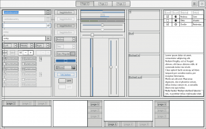
The GtkInspector is a really useful tool for exploring what is possible with all of this. It gives easy access to both the CSS nodes of each widget:
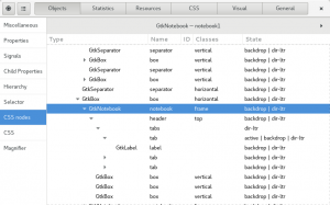
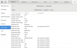
…and to the CSS properties of each node, which is basically the outcome of matching the theme CSS information to the node tree, also taking into account inherited properties and other complications:
Whats next ? All of what I’ve shown here is already available in GTK+ 3.19.5. We’ve made good progress on converting most widgets to use gadgets internally (‘progress’ is a bit of an understatement, it was a herculean effort, mainly by Benjamin Otte, Cosimo Cecchi and myself). But we are not done yet, so we will continue working on completing the conversion, and on documenting GTKs CSS capabilities better.
When that is done, we can look at adding other interesting bits of the CSS spec, like calc() or border collapsing. CSS is a huge standard, and theme designers always ask for more.
