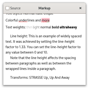
I’ve spent some time on Pango, recently. Here is a little update on the feature work that I’ve done there. All of these changes will appear in Pango 1.50 and GTK 4.6.
The general directions of this work are:
- Take advantage of the fact that we are now using harfbuzz on all platforms. Among other things, this gives us much easier access to font information.
- Match CSS where it makes sense. If nothing else, this makes it much easier to connect new Pango features to the CSS machinery in GTK.
CSS features
Lets start with the second point: matching CSS.
 Line spacing has historically been a bit painful in GtkTextView. You can set distances before and after paragraphs, and between wrapped lines inside a paragraph. But this does not take font sizes into account—it is a fixed number of pixels.
A while ago, I added a line-spacing factor to Pango, which was meant to help with the font size dependency. You basically tell Pango: I want the baselines of this paragraph spaced apart 1.33 times as wide as they would normally be. The remaining problem is that Pango handles text one paragraph at a time. So as far as it is concerned, there is not previous baseline above the first line in a paragraph, and it does not increase the spacing between paragraphs.
The CSS solution to this problem is to just make the lines themselves taller, and place them flush next to each other. With this approach, you need to be a little careful to make sure that you still get consistent baseline-to-baseline distances. But at least it solves the paragraph spacing issue.
Pango recently gained a line-height attribute that does just that, and GTK now supports the corresponding CSS property.
Another feature that has come to Pango from the CSS side is support for text transformation (also in the screenshot). This lets you change the capitalization of text. Note that this is just for presentation purposes—if you select STRASSE in the example and copy it to the clipboard, you get the original straße.
And again, GTK supports the corresponding CSS property.
Font features
As I said, harfbuzz makes it much easier for us to access features of the fonts we use. One of these that I have recently looked into is caret metrics. High-quality italic fonts can contain information about the slope at which the text caret is best drawn to match the text:
 I’ve added a new api to get this information, and made GTK use it, with this result:
Another useful bit of font information concerns placement or carets inside ligatures.
Historically, Pango has just divided the width of the glyph evenly among the characters that are forming the ligature (w and i, in this example), but high-quality fonts can provide this information. This is most relevant for scripts using many ligatures, such as Arabic. I’ve made Pango use the ligature caret data if it is available from the font, and got this result:
The wi ligature in this test is what I could come up with after a struggling for a few hours with fontforge (clearly, font design is not in my future). The only other fonts I’ve found with ligature caret information are Arabic, and I sadly can’t read or write that script.
The last feature closed a 15 year old bug – not something you get to do every day!