I had a chance to demonstrate some GTK+ file chooser changes that have accumulated in the last year, so I thought I should share some of this material here.
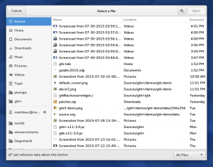
All the screenshots here are of the testfilechooser application in GTK+ master as of today (some bugs were found and fixed in the process).
Search
Search in the filechooser area that I have spent a bit of time on myself this cycle. We’ve improved the internals of the search implementation to match the sophistication of nautilus:
- The current folder is already loaded, so we search through that data without any extra IO.
- We ask tracker (or the platforms native indexer) for search results.
- Locations that are not covered by that, we crawl ourselves, skipping remote locations to avoid excessive network traffic.
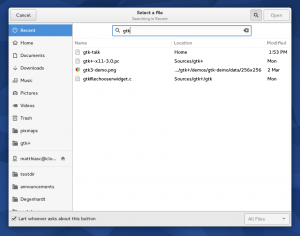
The easiest way to start a search is to just type a few characters – the search entry will appear and the search begin (you can of course also use the Search button in the header, or hit Ctrl-F to reveal the search bar.
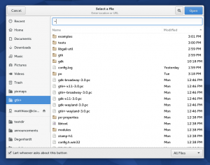
If you type a character that looks like the beginning of a path (~, / or .), we bring up the location entry instead to let you enter a location.
Note that we show helpful hints in the subtitle in the header: if you are searching, we tell you where. If you are expected to enter a URL, we tell you that.
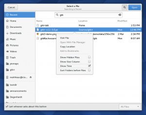 For search results, we show a location column that helps to determine quickly where a result comes from – results are sorted so that results from the current folder come first. Recent files also have a location column. The formatting of the modification time column has been improved, and it can optionally show times in addition to dates.
As you can also see here, the context menu in the file list (as well as the one in the sidebar) has been changed to a popover. The main motivation for this is that we can now trigger it with a long press on touch screens, which does not work well with a menu.
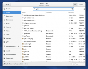 If the search takes longer than a few moments, we show a spinner. Hitting Escape will stop the search. Hitting it again will hide the search entry. Hitting it one more time will close the dialog.
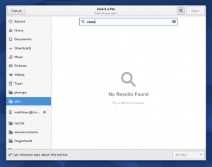 If the search comes up empty, we tell you about it.
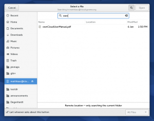 As I already mentioned, we don’t crawl remote locations (and tracker doesn’t index them either). But we still get results for the current folder. The footer below the list informs you about this fact.
Sidebar
The GtkPlacesSidebar is shared between nautilus and the file chooser since a few years ago. This cycle, it has been rewritten to use a GtkListBox instead of a GtkTreeView. This has a number of advantages: we can use real widgets for the rows, and things like the eject button are properly themeable and accessible.
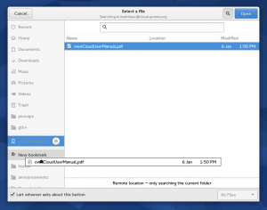 Another aspect that was improved in the sidebar is the drag-and-drop of files to create bookmarks. We now show a clear drop location and gray out all the rest. Some of these changes are a direct result of user testing on nautilus that happened last year.
Places
The sidebar used to list all your removable devices, remote mounts, as well as special items for ‘Enter Location’, etc. To prevent the list from getting too long, we have moved most of these to a new view, and just have a single “Other Locations” item in the sidebar to go there.
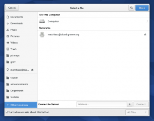 As you can see, the places view also has enough room to offer ‘Connect to Server’ functionality.
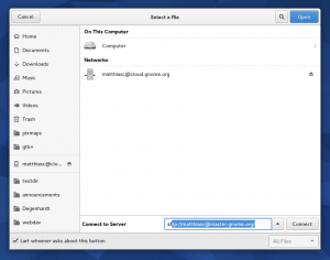 It has completion for known server locations.
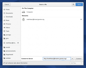 We show progress while connecting to a server.
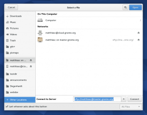 And after the connection succeeded, the location shows up under ‘Networks’ in the list, from where it can be unmounted again.
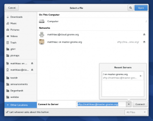 The recent server locations are also available in a popover.
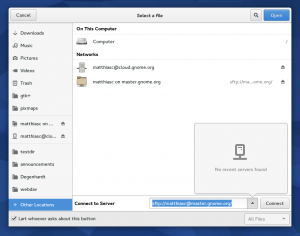 If you don’t have any, we tell you so.
Save mode
All of the improvements so far apply to both Open mode and Save mode.
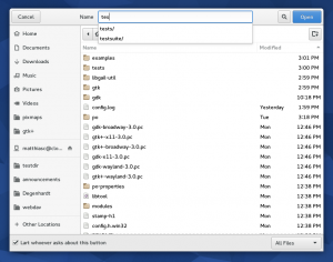 The name entry in Save mode has been moved to the header (if we have one).
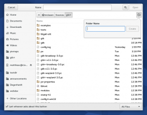 For creating directories, we now use a popover instead of an embedded entry in the list.
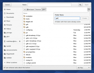 This lets us handle invalid names in a nicer way.
Credits
All of these changes will appear in GTK+ 3.18 in September. And we are not quite done yet – we may still get a modernized path bar this cycle, if everything works out.
The improvements that I have presented here are not all my work. A lot of credit goes to Allan Day, Carlos Soriano, Georges Basile Stavracas Neto, and Arc Riley. Buy them a drink if you meet them!
This looks a way better as the current state, thank you for your work and sharing. Going to search mode when typing is something I miss every time I start the file chooser in the current version. As the buttons are kinda hidden in the corner, I never recognized the search mode. In fact, I stopped to use GEdit as I often have to open files in full directories and don’t want to bother myself with an extra step. So this improvements are appreciated!
There is something else I wonder about: Is there a way to ask the file chooser not to show recently used as default? E.g. gedit already shows recently opened files. I already have to click on the open button, ignore recently used files, click on open again just to end up seeing recently used files again. As far as I remember, there is no way to show HOME programmatically.
You can make the file chooser open with the cwd showing instead of recent files with this:
gsettings set org.gtk.Settings.FileChooser startup-mode ‘cwd’
I’m using this setting already on every computer for Gtk3 and Gtk2. I want a clean list of files and directories from my current work location. Should be default 😉
Gtk3 & 2:
https://wiki.archlinux.org/index.php/GTK%2B#File-Chooser_Startup-Location
Thank you, I am already using this setting on my desktop and my convertible. What I tried to describe is that the default does not make sense for some applications as they are already showing recently used files on their own, such as GEdit while there is no API to override the default.
Another question: Before I switched the default, recently used where also shown as default when using the dialog to save a file. This is another case where showing recently used files on default is simply wrong. When I use “safe” I usually do not want to override a file. I remember that I was confused the first time recently used files where shown instead of my file tree. I had to re-review the whole dialog for a few seconds to proceed.
After all, “recently used” and the lack of “search on typing” are the two reasons why the file chooser experience is so bad during the current release in comparison to what we had before and why I am so relieved to read that you guys improved it for the next one. So thank you and the team again for working on it.
Well. That’s true.
How is progress indicated when attempting to connect to a remote location?
Did you, perhaps, upload the wrong image?
You can’t see it very well in the screenshot. There’s a progress indicator in the entry.
You said, “we don’t crawl remote locations (and tracker doesn’t index them either”. Is there some way to index and recursively search remote locations? If not, could this be made so remote locations work with all the same features as local locations (perhaps with a preference or configuration bit)?
I don’t want remote locations to be treated differently than local locations. The more I depend on remote storage the more I want a consistent experience no matter where I store my data. I understand this means using bandwidth and I’m fine with that. It seems a shame to have nifty ad hoc search and index functionality but be stymied with a design that intentionally never uses it for increasingly important remote storage.
[WORDPRESS HASHCASH] The poster sent us ‘0 which is not a hashcash value.
Word. (I’m thinking Gigabit-Ethernet attached NAS here.)
I think for consistency’s sake, the search bar component should fill the entire area it occupies, just like the location bar.
Thoughts?
In Save mode, the blue button in the top right corner says “Open”?
Thats just testfilechooser not doing the right thing.
As a tablet user that’s my favourite improvement! I really hope this will come to nautilus as well (it’s not fun to use without a stylus right now)
I’m all for it! But we fear it comes with some inconsistency due to not all the context menus in all apps using the popovers.
But probably the only way is to switch to them progressively…
This looks a lot of better than the current state of Gtk 3.16! Especially the search seems awkward and broken in Gtk 3.16 and only the Gtk2 dialogs seem to still work reliable with Type-Ahead-Navigation.
What I like from the upcoming Gtk 3.18:
1. List entries from currenct directory first
2. Don’t search remote locations, only current directory if you’re actually on a remote directory.
3. Show path to found files
This allows to use the dialog like Type-Ahead-Navigation, which is great 🙂
It seldom that I like something upcoming in GNOME, but this looks really good.
Looks promising, thank you for your work. I have one suggestions to make: Would you consider to add an entry in the right click context menu for folders that enables you to open a folder in file manager? In my work flow it often happens that I want to save or open a file and then notice, that I have to do some file operations first, that I can’t do with the file chooser.
That would be very handy and probably easy to implement.
At the moment we have the option »copy location«, which is very useful too, but the new function could have the title »Show location in file browser« .
I love the “Other Locations” upgrade. I had a growing list of bookmarks and turning that into a more browseable view will make it easier for me to find the bookmark I want.
What about broken type-ahead navigation? It’s a standard behavior on all systems and platforms. The decision to abandon it was simply and objectively wrong and I hope GTK developers will understand it and at least give their users option to choose the default behavior. Two ways of triggering recursive search and NO WAY to do type-ahead search is a serious flaw in usability.
Wow, fantastic! I like all those changes 😉
[WORDPRESS HASHCASH] The poster sent us ‘0 which is not a hashcash value.
Hey there!
I love all the improvements that are coming in but here’s something i feel that missing out from the File Choose are:
1. Columns ->> User choice – There should be options to right click the columns and add another column based on Size, Creation Date etc. Its a basic feature and helps the user in finding/sorting a file instantly.
2. Select Folder for uploads; i noticed on Firefox i can only upload file and never folder because theres only an “Open” option provided and no “Select and Okay” kind of option.
3. Thumbnail Support – I hope this comes fast enough and the user should be able to switch on/off whenever he/she pleases!
Kudos to you & the GNOME Team!
Keep the improvements coming in!
Great Job 😀