Here is the next installment of ‘Seen in this weeks GNOME release’. Todays screenshot gallery is a little more extensive than last weeks. We’re rapidly completing our feature list. Most of the items on that list are now marked as ‘Complete’ or ‘Almost complete’. Good timing, since we are entering the freeze with the 3.5.90 release, and can now focus on polishing these features and fixing the remaining bugs.
 The first feature to show this week is one that I’ve wanted to see for a long time: the harfbuzz 1.0 release is right around the corner, and harfbuzz support has been merged in pango. Behdad has been working on this OpenType implementation since 2006, and pango has been using an embedded copy of an early harfbuzz snapshot for a while.
After a long period of stasis, we will finally see new life in our text rendering stack. The screenshot I’m showing for this looks just the same as it always has, since all the harfbuzz goodness is still under the hood.
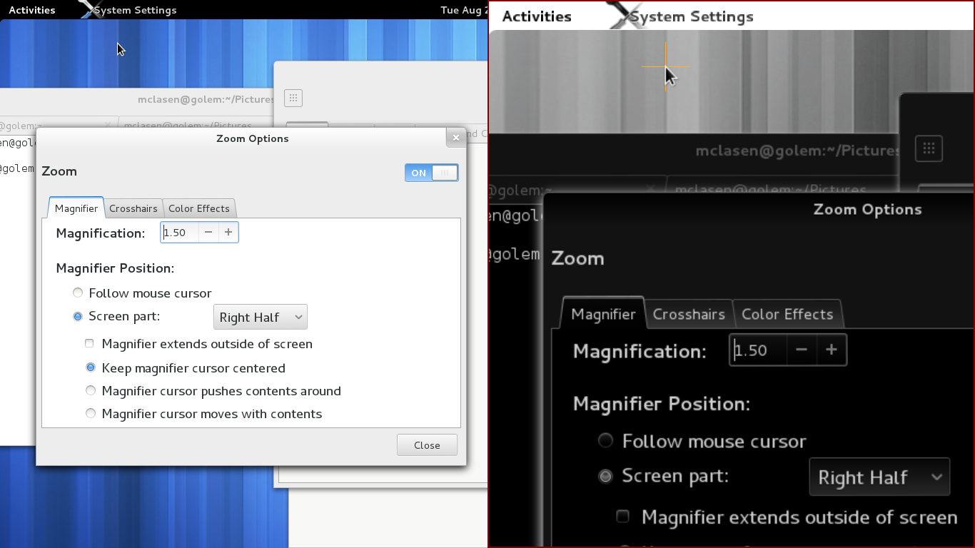
We’ve had a magnifier integrated in gnome-shell for a few releases now. Since 3.4, it was configurable from the universal access panel. In this release, it will be possible to configure various color effects on top of the zoom, such as inverted colors, desaturation and contrast changes. As you can see in the screenshot, we’ve reorganized the zoom options into tabs, and added a tab for the color effects.
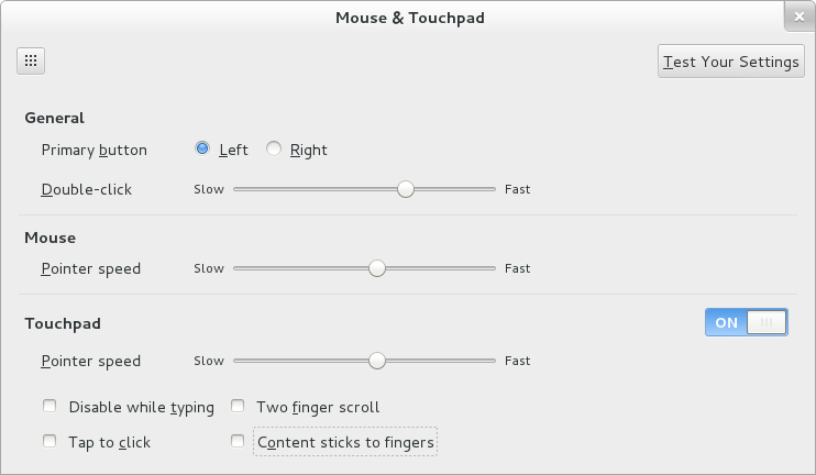 Still in the control-center, we have a redesigned Mouse & Touchpad panel, which was implemented by our Red Hat desktop team intern in Brno, Ondrej Holy. Amongst other things, you might spot the option for ‘natural scrolling’ in here.

Over in the shell, there’s a new ‘mode-less’ overview. As you’ll notice, the search entry is bigger and centered, and the tabs are gone. To switch from the window view to the application grid, you can use the ‘nine dots’ button that can be seen at the end of the dash.
The new overview is the work of Florians summer of code student, Joost Verdorn, who has written more extensively about it already.
At the bottom of the overview, the new message tray is visible. It received a major redesign to address the problems that people have had with the original 3.0-era tray design.
Beyond the new visuals (bigger icons, no labels, close buttons), there are many subtle behaviour changes here that are hard to explain unless you try it yourself. One notable change is that the message tray is not raised ‘by itself’ anymore, you always have to bring it up explicitly. One way to do that is to use the new Super-M keybinding. Keyboard navigation is generally improved: you can focus individual icons and actions.
Many people have contributed to the message tray redesign, around the core work done as a summer of code project by Ana Risteska.
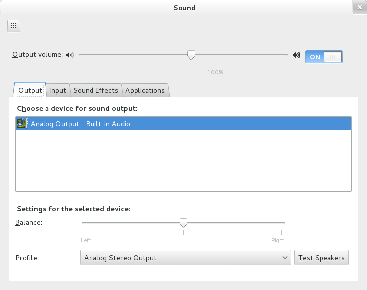
 Back in the control-center, the sound panel has gotten its Hardware tab removed. Instead, the device lists now offer more fine-grained choices.
This simplification has been implemented by Canonical. It was made possible by earlier pulseaudio work by David Henningsen that has landed upstream in pulseaudio 2.0.
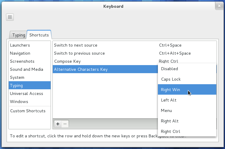
In the keyboard shortcuts section, some useful pieces of XKB layout configuration have reemerged. The frequently used compose key and ‘third level chooser’ variants can be set like other keyboard shortcuts now.
When it comes to appearance, GTK+ 2 applications will look less out of place in GNOME 3.6, thanks to a much improved gtk2 version of Adwaita. This theme was originally developed under the name ‘Bridge’ by Jack Gandy.
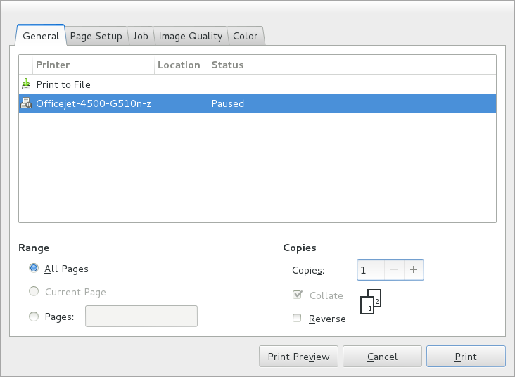
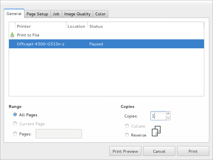
You have to look closely to see the differences between the GTK+ 2 and GTK+ 3 print dialog in these screenshots.
The last thing I have managed to capture in screenshots is the support for secondary Kerberos logins that has been integrated in gnome-online-accounts. The functionality is seamlessly integrated with the traditional krb5 commandline tools: if you run kinit in a terminal, the ticket will immediately show up the online-accounts panel, and you will get notifications before it expires.
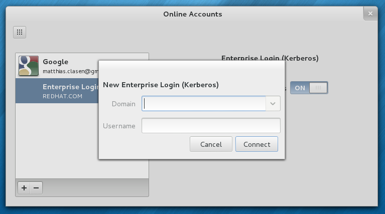
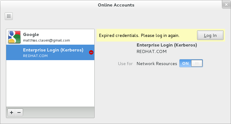
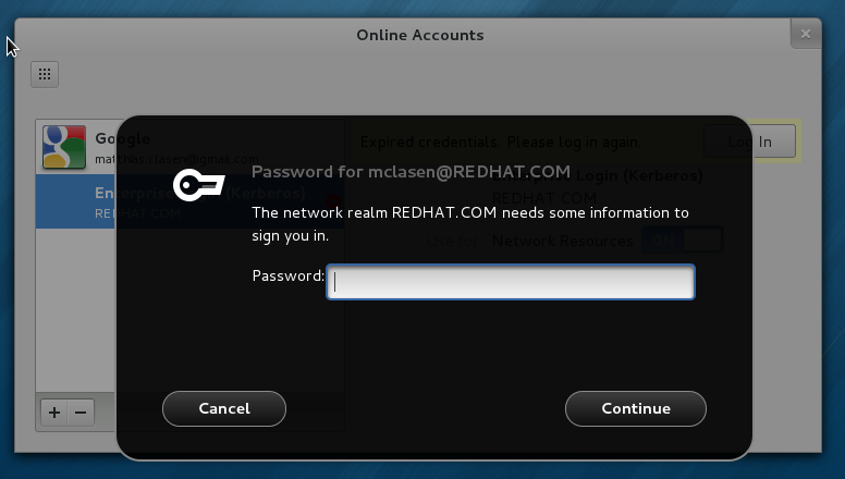 This functionality was originally planned to land in the user panel, but the online-accounts panel seems a much better fit.
Fantastic work as usual, thank you all who have been a part of it!
I have to say I’m a bit puzzled by the “message tray won’t show up on hotcorner”. I understand why it was decided to move away from that behavior (I’ve seen it being problematic with users), but I’m curious to know if it will feel like an impairment for me not to have it at the flick of a mouse anymore.
It’ll pop up after some ‘pressure’ from what I’ve heard. You really have to try it.
Pressure couldn’t make it for 3.6 (requires X server patches that I still need to finish), so right now you just have to sit your mouse on the bottom of the screen for a bit for it to pop up.
Probably he meant the message tray won’t show up by itself, for example when a new notification is received, the message tray shows up. He didn’t mention about hot corner!
With the new behaviour, you can now *push* the mouse pointer at the bottom of the screen to make it appear. That means that merely having the pointer positionned there won’t trigger the tray (so that it doesn’t get in the way) but you can still easily access it with your mouse.
“One notable change is that the message tray is not raised ‘by itself’ anymore, you always have to bring it up explicitly. One way to do that is to use the new Super-M keybinding.”
I hope there is also one way to bring it up by mouse or by touch?
There are a number ways to access the message tray in the new design:
* Go into the overview – it is always displayed there
* The Super+M keyboard shortcut
* Placing the mouse/touchpad pointer against the bottom screen edge for a short time
In the future we hope to use a more sophisticated pressure sensitivity trigger on the bottom screen edge. However, we’ve got to wait for the next X11 release for that to happen.
Hey, why don’t show message tray when hold Super key for a short time?
In my thought, the Super key is always acessible, and is easiest to hold it than use two hands to press Super and M…
I also think the same key used to display, must be used to hide (press Super key – or Super+M).
Do you know any way to change how long we have to keep the pointer down until the tray pops up? I feel like the time is too large for me. (Not QQing, just wondering if I can modify mine)
Great! GNOME 3.6 is coming! However I prefer the old message tray.
I may have to start using Gnome more again. It looks like you guys have gone in and done the work to address the usability issues that I had with 3.0. This article made me hungry to try them out.
I love Linux, I can run as many Desktop Managers as I have disc space….
I love Linux, I can run Gnome! 😉
If the intend of the Kerberos/AD integration is to provide login-functionality, it would be better placed in the user settings, imho.
We have support for login through Kerberos/AD as well. If you want to enroll in AD and use it for login, then that is indeed done in the user panel. What I’ve been highlighting here is just the support for secondary Kerberos tickets. Basically, we’re integrating the functionality that was provided by the external krb5-auth-dialog in GNOME 2.x.
Could you explain a bit more about the new tray raising behaviour; does the hot corner still exixst?
Thanks in advice.
While I agree that the current messge tray is all kinds of problematic, I’m not sure that I like the redesigned one. It’s way too large, and visually dominates everything else in the overview. It simply doesn’t deserve such prominence, particularly since it will ususally contain no more than three or four icons. All that space is just wasted.
I have a suspicion that the large size was chosen primarily to have more display space for chat avatars – since the names of your chat partners are no longer shown. That doesn’t feel like a sensible trade-off to me. Just keep the old size, keep the icons and the text, and kill this, ehm, accordion-like text-hide-and-icon-switcheroo-effect, whatever you call it.
As for the hot corner, maybe it would be more usable if you had to keep the cursor in the lower-right corner for a second before the message tray is raised. That should keep it from getting in the way too easily. There could still be a Super-M shortcut, of course.
As I haven’t tried it yet, I can’t say if the new one is better or not, but my first impressions are the same.
I totally agree about the hot corner behaviour, it’s very useful, but the timing is just annoying.
Yeah, I’ve got a very similar impression, too. I just hope there will be an extension that will make the panel and icons smaller. It’s way too big. And removing labels? I use IRC in Empathy and I easily have 10 persons on chat at work. All contacts in IRC have the same icon. How am I supposed to know who is who?
I say get rid of the message tray. Add the notification system to the top right part of the screen, keeping it clean and styling. Plus we will have the bottom part of the screen for fullsized docky 😛
What happened to the discussions about including an AppStore in Gnome? The old Add/Remove Programs doesn’t really fit in any more…
DDD
Gnome is a graphical window system that sits on top of many different types of Linux systems. An app store would have to accommodate all of the different types of binary packages like .deb, .rpm, source, etc. Almost all distributions have their own form of an “app store”. Ubuntu and Linux Mint have their software centers, Debian still has Synaptic Package Manager (actually, tons of different distros do), openSUSE has YaST…and then there are all of the GUI frontends that you can install if your distro of choice doesn’t already have one. It would be nice for Linux to have a standard binary installation format, but that’s what makes Linux so good: freedom of choice!
Freedom of choice, my ***.
There is an application I want to install, but I can’t because I am running Fedora and the application is only available in .deb format.
This package format hell is restricting my choice. It is hurting users’ freedom.
So much about open standards… How can we request other people to send us files in ODF format instead of proprietary formats if we don’t use standards for our own binary distribution?
Fortunately, the GNOME OS initiative is trying to define a file format for cross distribution application installation. I hope they succeed and distributions embrace it.
You can use the alien command, apt-get install alien and use it to convert the package.
example:
alien -r debianpackage.deb
alien -d rpmpackage.rpm
Did not know, great tip!
Any chance to kick the live-media a little harder? Would be really great to try 3.6 out easily 🙂
Thank you for overview, thanks to all gnome developers for your work!
I always wonder where all those “gnome 3 is a disaster” are coming from as I loved GNOME very much since it hit 3.0. Actually this was the version which made me switch to it from another DE. Always wanted to say: do not listen to those rants guys, GNOME 3.x is awesome, keep it up! 🙂
I’ve been using debian since 27 of Martch, before gnome everything was quite crappy, but I started using gnome 11 June 2000, and linux turned easy. Then (2004/2005) I had a terrible car accident, I got rammed, then I szpent 6 months in coma, which messed up my hands, so I can’t use mouse, that’s why I prefer keyboard. Maake a place under gconf-editor where you can choose the style of menu, so people can use either classic or modern style.
GNOME 3 should be fully usable with just the keyboard. If it isn’t, it needs to be fixed. We have an accessibility list at https://mail.gnome.org/mailman/listinfo/gnome-accessibility-list. Could you please raise your issues there?
Finde Gnome 3 sieht richtig gut aus! Bei 3.6 finde ich die Option zum einstellen von ‘natural scrolling’ sehr gut.
27 March of 1996.
Nice work but I wish the ‘nine dots’ button was on top, Windows and Applications categories were near the activities button, now you have to travel all the screen to see the applications list, not nice for users of big monitors like myself
> Nice work but I wish the ‘nine dots’ button was on top
This. The current implementation increases mouse travel distance.
Let’s see what rationale they will pull out of the hat with this.
The new icon is at the edge of the screen and has a higher height than the old button. I find it much easier to hit.
I also find that the icons for most commonly used applications are used more often so it’s better to have them first. It also makes scanning the dash for apps easier if the non-application icon is at the bottom.
my only question for what is that icon that shows the name of the focused aplication? only consume top bar space…
If you click on it, it shows options specific to the application. A few use it in 3.4, many more in 3.6.
Any chance of getting ownCloud added to the list of online accounts? Kerberos is great and all, but it’s really only for those who are part of the enterprise.
ownCloud is a FOSS alternative to DropBox and in the spirit of GNOME.
We have been discussing both dropbox and owncloud as possible additions for the next cycle.
https://bugzilla.gnome.org/show_bug.cgi?id=660573 if you are interested
Sad that the concept of tabs in overview was replaced by unintuitive 9 dots somewhere where you expect to see your (favorite) applications. I just hope they’ll be possible to remove. Moreover, how cool would be if there would be tab “docs” instead of gnome-documents and tab “VMs” instead of gnome-boxes. This is step backward 🙁
And also sad that it seems that “mouse & touchpad” control panel still ignores track points :/ Hope that it is just due to hardware used to take a screenshot
I’m not the right person to suggest things, could you help me out there ovitters.
Thank you!
That’s why I can’t use mouse.
http://www.hot.ee/surma/Surma_24.12.05.jpg
I built this car myself … and had an accident with it.
I dont really like the new way of switching between applications and windows,the mouse would fly all over the screen.
VLC volume control shouldn’t control gnome volume.
This is what was left of my car.
http://www.hot.ee/surma/katki.jpg
Thanks ovitters, but I already did it.
Nice, nice… Willing to use it on my Arch 🙂
Anyways, what about Skype screen share? Is that bug going to be fixed some time?
Just curious, and then stuck! How to make a shortcut on GNome desktop? I use Gnome 3.6 on Ubuntu (Gnome-shell) 12.04.1 64 bit and using a theme called “Mac-OS-X Lion” (you should try it, looks cool!). I wanted to create a Google chrome shortcut with some extra parameters (like ” –useragent=ubuntu;….”) but shamefully couldn’t create it! No “New launcher..” option comes in the context menu either.
Open the control-center, keyboard panel. The shortcuts tab has a ‘+’ button that lets you add custom shortcuts.
I think he meant desktop shortcuts, for which one should install gnome-tweak-tool and re-allow the file manager (Nautilus) managing the desktop.
I’m currently using Xfce and I’ve noticed that since the introduction of the app menus in GNOME 3.4 some apps now have a single item in the menubar with the name of the application, which is actually the app menu from GNOME.
The problem with this is that it’s extremely confusing to have the application name as the name of the app menu outside GNOME (and it makes my blood boild), and it’s redundant since the name of the application is already on the title bar.
WHEN WILL SOMETHING BE DONE ABOUT THIS?
The application name in the menubar is just the default fallback that we do automatically in GTK+. Applications can implement something different themselves. The GTK+ documentation has a fully-worked-out example for how to do this:
http://developer.gnome.org/gtk3/3.5/GtkApplicationWindow.html#id1559539
Then will something be done about the GNOME apps that show the default fallback? Because having the name of the application appear on the menubar is INSANE.
Hopefully, we will be able to switch between display monitors using Shift + Super + Left and Shift + Super + Right, maximize verticalliy with Super + Shift + Up, and resize windows using Alt + Right-click. The lack of which made me switch to KDE.
Thank you very much for all the hard work.
I would donate money, if my country’s currency wasn’t so weak.
Gnome is all the time going the way I want it to be. Excellent work!
One think I do not like long-term: wasting of screen space. More information can on the screen if dialogs are more compact and space between widgets are lessen. Even some widgets waste space in their canvas.
I’m really disappointed with the relegation of the windows view to a dash implementation. I don’t use the applications view in the Overview as I have both Cairo Dock and the excellent Axe Menu extension installed. If I cannot install an extension that would reverse this, then I’m afraid I’ll have to switch to Unity to take advantage of the Scale Compiz plugin. This is very unfortunate….
Thank you very much people.Gnome Shell rocks and it is presently the only reason which keeps me sticking onto Linux…:)
I am using Gnome since 2006, at work and at home. Gnome 3 is not made for the way I work with it. The lack of information slows down my work flow. I am a programmer and engineer.
Just one example is the grouping of applications in the tab view. And I replaced Nautilus with Nemo to get split screen and location bar back. I do need it, it´s not just because I was used to it.
Another one, it feels weird to unlock the lock screen with the mouse.
It´s not that I do not like Gnome 3 at all. There are many things I like, but it is getting worse.