Before Thanksgiving I’ve caused some uproar and made people doubt our incurable stubbornness by first announcing the release team decision to drop fallback mode (*), and then that we’re going to be looking at supported extensions as a replacement (*). Some have been calling this ‘classic’ mode – I’m using the term ‘legacy’ here, since ‘classic’ may raise some false expectations.
Two weeks have passed since that initial announcement, so I thought it would be a good idea to give an update on what we [1] have achieved so far.
GNOME Legacy
We’ve decided to use the gnome-shell-extensions repository as the place where we collect the extensions that will be part of this effort. If you configure with –enable-extensions=classic-mode, we will install a small set of extensions.
Since 3.6, GNOME shell has some infrastructure to operate in different ‘modes’. To see the list of supported modes, run:
gnome-shell –list-modes
and to run GNOME shell in a particular mode, you start it like this:
gnome-shell –mode=gdm
Different modes are what defines the GNOME shell appearance on the login screen and on the lock screen. Ever since we first introduced this functionality, the plan was to extend it to allow e.g. a ‘kiosk’ mode, which would reconfigure the shell in a way that is suitable for e.g. a point-of-sale kiosk. The one thing that is still missing is a way to load externally defined modes, since it is somewhat unrealistic to expect people to patch the installed GNOME shell JavaScript files.
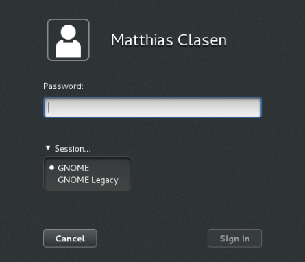
Not anymore! In bug 689304, Florian has added support for external modes. And in bug 689285, Debarshi has added the necessary glue to install a desktop file that runs GNOME shell in classic mode and a session definition that includes this modified shell. The upshot is that we now have a ‘GNOME Legacy’ session appear in the session chooser in the login screen:
With all the infrastructure in place, we are now starting to fill out the legacy session. There is not too so much to see yet, but we do have a small extension to add the minimize and maximize buttons back. And in bug 688913, Florian has added a new key binding for a more traditional Alt-Tab switcher:
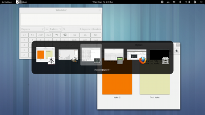 In another unexpected synergy, this could be built on top of independent work that Rui has done to reuse the switcher popup for an input source switcher.
Next up, we are looking at taskbar and main menu extensions.
Modern GNOME
Does all this attention on legacy mean that we no longer believe in GNOME 3 ? Of course not ! There’s plenty of great new stuff coming to GNOME 3.8. Here are some examples that have either landed already, or are in the process of landing:
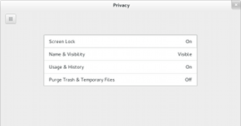
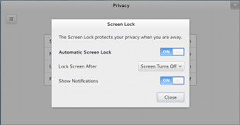
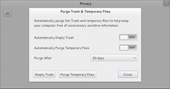
A new settings panel to control privacy settings:
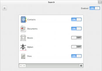
Configurable shell search:
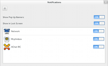
Notification filtering:
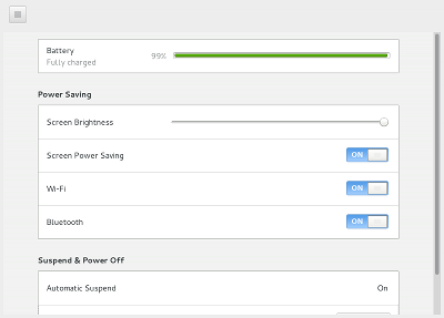
A new power panel:
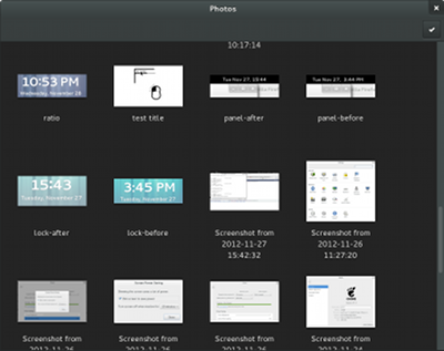
A new Photos app:
Among the many things that don’t screenshot so well, a noteworthy improvement that will land very soon: working key bindings in the overview (and elsewhere). Super+M now toggles the message tray off as well as on.
[1] Florian, Debarshi and Giovanni have been doing all the work, I’m just egging them on…
Looks great!
Could the privacy control panel also address gvfs metadata?
Too little too late. I’m setting my sights on Cinnamon and MATE. Gnome will end up in the history books of open source for what happens when you blatantly ignore your user base.
Great for MATE and Cinnamon right? Use whatever, the important thing is that you’re using what suits you best.
Nope! Many of us are quite happy with where GNOME is going.
Cheers.
The choice is always your, especially with open source world. So if you don’t agree with the GNOME Roadmap, you can switch to Cinnamon or MATE. I myself dislike GNOME 3 when it first was released but after few releases, I am getting to used to the new way as the components become more mature. Now I am switched to GNOME 3 on my main workbox.
Smashing up the looms again, eh? Look I agree that GS has many shortcomings (currently I run KDE, very happily), but you’re mistaken if you think you can live in the past forever. Mate and Cinnamon are just that, holding on to the past for as long as possible. Cinnamon is also Gnome 3 underneath, anyway.
I hope you understand the relationship between GNOME and Cinnamon and MATE. You cant have the latter without the former idiot!!
I use computers ever since 80286 times, have used a lot of gui’s, including Amiga 500, KDE, Aston Shell, etc.
Gnome Shell seems to me like a perfect evolution of GUIs. You can have your favourite alternatives, but who are you to say that Gnome is dead and stuff like that? Are you the world’s most expert guy in interface design? Otherwise, sorry, it’s just an opinion. Good that you have one, but don’t try to play god, please.
Gnome Shell is a solid environment and, once the user loses his/her fear of experimenting something a little different, it turns out like something you can’t live without anymore. Well, that’s imho, but many people out there just love it 🙂
Cinnamon is great too! Built on top of Gnome, but, still, a great alternative for more conservative users.
Casio,
I’ve designed interfaces and was programming long before the 80286. The first PC I owned didn’t even have Lower-case letters largely because there wasn’t enough memory space. For decades, I’ve quite successfully taught MS Windows, Linux, and all sorts of apps and workflows to all sorts of users at all sorts of experience levels. Over the years, I’ve successfully taught people how to use hundreds of different interfaces, dozens of OS desktops.
You and many others like to say that those complaining about Gnome 3 are just not giving it a chance. The truth is that the public reaction to Gnome 3 is so split because it sucks. Yes, if you are persistent you can learn it and get used to it. But it’s also true that for more expert users, far too much functionality was simply removed or buried. It’s OK for a Kiosk or PDA or _MAYBE_ a tablet, but it’s inadequate for people who work all day on computers, my target audience as a teacher.
This is one of the more awkward interfaces I’ve ever tried to teach, not because it doesn’t work, but because it is inadequate. Far too many features (“distractions”) were tossed out. Many workflows are just more convoluted. It isn’t possible to convert MS Windows or Gnome 2 users to Linux with Gnome 3 by showing them an interfact that can’t do half of what users expect. Many of my Linux students have migrated back to MS Windows.
It would have helped if I hadn’t lost days of productivity scouring the Web trying to find instructions on how to do this or that on Gnome 3 before giving up, or eventually finding some obscure blog post admitting it doesn’t exist. Two years ago, I really would have appreciated the Gnome 3 team producing list of things it just couldn’t do.
I gave up on Gnome 3, and I only teach from the various Classic Gnome interfaces. I teach users how to get around Gnome 3 if they must use the latest versions instead of an LTS release. I don’t have any more time to waste on it.
Having said all that, the blog post above is good news. It’s nice to see some of the Gnome 2 features, after years, re-appearing in Gnome 3.
–Steve
Nice improvements on the modern GNOME front. Especially the configurable shell search function.
Whats Photos? An equivalent of Documents?
PS. I don’t care about Legacy at all TBH.
My biggest gripes with GNOME, after returning to it after 6 years of Xfce, Various window managers (mostly ratpoison) usage and last 3 years in KDE are:
a) Evolution is way behind Kontact in usability terms. It is mostly just for Email and it doesn’t really integrate with Gmail that well. For example no way to set Trash folder. No proper NNTP support, no RSS (the plugin kinda sucks) etc etc.
b) The most important one is there is no central place to edit GNOME settings.
There is of course GNOME system settings, then dconf-editor, plus gconf-editor is still around which i guess in time will be deprecated, and then there is the Tweak Tool many people are evangelizing while it does nothing more than exposing only some dconf settings in a more user friendly way than dconf-editor. Then of course you can also edit preferences with gsettings using the command line.
Why can’t GNOME have one place to edit ALL settings? For example adding Advanced buttons in System Settings, along with keeping the command line way?
Thanks for all your work in GNOME.
“Why can’t GNOME have one place to edit ALL settings? For example adding Advanced buttons in System Settings, along with keeping the command line way?”
Adding to the above: And use the same pattern in applications? Exposing more preferences using advanced buttons, disappearing the need of having dconf-editor.
See https://mail.gnome.org/archives/foundation-list/2012-November/msg00174.html.
But GNOME 3 is not GNOME 2, is it?
Plus that was what 10 years ago?
Dconf-editor is complete but not user friendly at all, while on the other hand tweak tool is neither complete nor official.
GNOME 3 is not GNOME 2, but the argument still holds see the “The Question of Preferences” section in http://www106.pair.com/rhp/free-software-ui.html for a more detailed argument.
In addition to what bob said, tweak tool is official.
You’ve suggested advanced buttons, while it already exists: (System) Settings for the most common ones, then we have tweak tool, the extensions website and dconf-editor as well.
Settings are not free, they come at a cost (as explained in the email).
Ovitters wrote:
“In addition to what bob said, tweak tool is official.”
Of course, because it is part of the GNOME core:
http://ftp.gnome.org/pub/GNOME/core/3.7/3.7.2/NEWS
Oh wait, maybe it is part of apps:
http://ftp.gnome.org/pub/GNOME/apps/3.7/3.7.2/NEWS
Hmm, no its not there either.
I can understand not wanting to implement advanced buttons, but ONLY for wanting to avoid code complexity, but having 4 GUIs to edit system settings is irrational.
Even if the tweak tool is official as you claim, i still think it is not, it is only duplicating dconf-editor settings so avoiding code complexity comes at the cost of introducing code duplication.
The calendar and weather apps are starting to look pretty spiffy too.
Of course you could simply have taken the Frippery extensions, taken care of a stable extensions API that wouldn’t have required a total rewrite with every minor Release and he whole problem wouldn’t have turned up in the first place.
But hat probably wouldn’t have been in line with “The Gnome Way (TM)”
To correct a few of your assumptions:
– Existing extensions have been used
– Extensions do not need a total rewrite with every minor release
– A more stable API would be appreciated, but in reality, there is no API and extensions can do anything they want
Existing extensions have been used
Great. So what’s the fuss about ?
Extensions do not need a total rewrite with every minor release
Yeah, right. Like changing the main entry point from “main” to “init” (GNOME 3.0 -> 3.2) or changing the behaviour of nearly all GUI objects with every release doesn’t require a rewrite. Yeah, right.
in reality, there is no API and extensions can do anything they want
Exactly. A little piece of misbehaving, un-debuggable JavaScript Code can play havoc with the very innards of your Desktop Environment Shell. Sounds like a terrific design decision to me.
I don’t really see how changing a function name would require a total rewrite. There was no extensions website in 3.0, it was developed later and only after a while it got an alpha label. Currently it has a beta label.
Regarding javascript: this is exactly like Firefox. Further, the extensions are reviewed by people familiar with the gnome-shell code.
If you have suggestions on how to improve things for extensions, write to gnome-shell-list.
[WORDPRESS HASHCASH] The poster sent us ‘0 which is not a hashcash value.
Overitters: Don’t be so argumentative without providing more background information. As was made clear by Franz, changing main to init was just one of many examples. So are you saying that he was wrong, there are no other changes that would require a re-write? No, you are just being argumentative.
In fact, in the professional sofwate industry, just changing main to init is significant. Even if it were the only change, the overhead for moving the changes through the various stages of the release process is expensive, and every modified object must be re-tested, very expensive and time consuming.
i love how everything looks like an iphone now!
As i can’t afford an iphone myself, i at least get the next best thing on me free OSS desktop!
Cool,
Activities overview is constantly improving. With increasing providers (documents, photos, boxes, contacts, notes, …) , perhaps being able to “show results into ‘Search’ window” would be nice? Unless it already exists? (Didn’t found in https://live.gnome.org/GnomeShell/Design/Whiteboards/Search#Tentative_Guidelines)
Gnome 3.8 looks great. Congratulations.
Aside from everything looking more iphoney, I don’t think the power preferences screen does a good job at explaining what it does.
1. “Screen Power Saving” sounds like if “screen” was used as a verb. I think what it really means is “dim the screen to save power”.
2. “Wi-Fi” and “Bluetooth” don’t come with any explanation. The section title is “Power Saving” so I’d expect them to mean “enable power saving for Wi-Fi/Bluetooth”. Why would I ever want to disable that? Or are these regular kill-switches that just disable radio chips altogether?
How can people say Gnome 3 is shit? It runs way more smoother than Gnome to Mate is buggy as hell it has a start menu glitch and devs cant fix it also that glitch triggers my seizures.Cinnamon is a fork that cant preform as well as Gnome the original can face it quit running wanna be shit and use Gnome 3.
kidx86, GNOME 3 forces you to use compositing, which is bad (for gaming especially).
inb4 censorship
Gnome does unredirect fullscreen windows.
“Real” fullscreen breaks alt-tab in 90% of games.
This has nothing to do with “forced compositing” but the games take a grab and thus the WM no longer gets an event to handle alt-tab.
This needs to be solved in X.
Its too late, I made a permanent switch to MATE because is Blazing fast, reliable and awesome.
I am glad that you are settled with MATE, but again MATE will continue targeting the old desktop metaphor in which GNOME3 is trying to cater for the new tablet (which will be the future).
I agree with the assessment that tablets will be a large part of the future. The only problem is that that market is cornered by iOS and Android. Even mighty Microsoft is failing to garner excitement there with “Metro” based OSes. Unless the Gnome team have a trick up their sleeves, there will be zero credible Gnome tablets out there.
The slight hope might be touch enabled laptops, but before these become ubiquitous, a lot of people have switched or will be switching to interfaces who use mouse input efficiently. Gnome Shell (in its current form) is heavily dependent on keyboard interaction for efficient use and leaves “mousers” out in the cold.
I kinda disagree.
Ok, Gnome shell is not like the Tablet interface of choice, even though it can be with little or almost no tweak. But to say it’s heavily dependent on keyboard is just not true, if I may say so. I even think it could use some more keyboard interaction, since I don’t like switching my right hand between keyboard and mouse 🙂
Trung, you’re wrong. Tablets will only be part of the future. You can’t flick and swipe a new Functional Spec into existence.
People who work all day on computers and have tablets in the meetings, go back to their desk and set it aside to work with a keyboard and mouse and big screens, because it’s more efficient.
It’s also important to be able to do things with the mouse OR the keyboard, severly lacking in Gnome3. When I’m drawing UML documents and reshaping text layouts, I’m mostly using the mouse, but I still have a hand on the keyboard for the text bits. When I’m typing, I want a keyboard, with keys that my fingers can find and feel on their own. Typing speed and accuracy is pathetic with an on-screen simulated keyboard, and the screen gets messy. I also want to be able to do most of my work without leaving the keyboard to select and change a word or a line.
It will never be possible for a tablet to replace a desktop, and Gnome 3 appears to be made to look and feel like a smartphone or a touch-screen kiosk at the mall, not a work platform. After years of trying to prepare users for the complete death of Gnome 2 and making it harder to reach, Gnome 3 is still not as useful. I’ve lost Linux students back to MS Windows because of Gnome 3.
Thanks for all your hard work on Gnome!
With those panels, one has to focus on a lable and then look to the right … further to the right … across the void … to finally find the accompanying switch widget.
A layout with checkboxes on the left of the labels would be much compacter and could be read faster.
Gnome 3 really frustrates me. In some ways, it’s very polished. But the whole “you’ll ONLY do it THIS way” just doesn’t work. eg … no fixed desktops means you can’t lay out your apps where you want them, because desktops fly away when Gnome deems them ‘dead’. Dialogs MUST be modal, and even worse, MUST drag their parent window with them when moved. What happens if I NEED information from the parent window when deciding what to do with a dialog? Too f’n bad. I’ve been switching back and forth between E17 and Gnome 3 … and I’m glad to say that E17 doesn’t try to enforce ‘the one way’ on you … and hence I’m far more productive and less frustrated when using it. Seriously people … drop the shackles …
If E17 is your thing, that’s cool too.
> no fixed desktops
Yes there is.
> Dialogs MUST be modal, and even worse, MUST drag their parent window with them when moved.
Not true either.
GNOME 3 is very configurable and at least to me it feels much more flexible than what GNOME 2 did.
I know you are frustrated but bad attitude doesn’t help you to get help or answers.
Not everything is configurable, but the static workspaces is available in tweak tool. If you like E17 more, cool!
[WORDPRESS HASHCASH] The poster sent us ‘0 which is not a hashcash value.
What is the “photos app” ? It looks like empty space + a check mark + a close button.
Guys when there are 8-9 windows open; to switch between the windows from activities panel makes me slow down.
You guys should attach the icon for the program to each window’s left corner, so it will be recognized faster and easier among the other windows. Each time I go to Activities panel, I’m trying to select the correct window by looking at 8-9 almost same looking rectangles.
Please solution.
Here is the remedy:
https://extensions.gnome.org/extension/105/panel-docklet/
What about making GNOME Shell usable without keyboard shortcuts or requiring people somehow figure out that you unmaximize windows by clicking on the top bar and drag down (you call THIS intuitive?)…
lost me as well, I have very time as it is and the last thing I need is to have to relearn how to do quite honestly the simplest little thing on a computer desktop.
earlier I was also not happy with what GNOME was transforming…I liked MATE more than GNOME…But now I am used to it.
Will I be able to change all gnome fonts without any external software? Or are gnome devs still afraid of users having their own changes in their own desktops? I’m really tired of all that: “Oh, are you unsatisfied? We’ll make something for you, but you must not complain!” I really think that cinnamon effort worths more, simply because they listen what people wanting to use it are saying. If user can’t change anything, then there’s no change at all. Bringing the legacy back is giving back the choice that was stolen from the user. That’s my opinion.
I still don’t understand what was wrong with the old desktop paradigm and why force users to do more clicks to perform the same actions as before, and why hide the state of the desktop and options from them. Windows 8 is a usability disaster and so is Gnome Shell in its current state.
Just to drop my two cents on this whole project. You guys are the BEST, BRIGHTEST, and most DARING developers to ever walk the Earth! I am not about to bash any of the other DE’s becasue I have just about enough desktops / laptops / and external drives with at least ONE of them on there! But my “Main” machine? Is a Gateway that has Fedora 17 on it….running the GNome DE….and NOT a re-mix” or a “throwback” but the most current one! I love the fact that this DE is NOTHING like Windows!….that there are “secret” key/button combinations that can tweak my system, make options on a menu appear / disappear, and that can make my laptop more seucre. I don’t have a “wish” list of things I’d like to see in this or the next iteration of this DE…..I love everything about it!..and as much as there are those who “need” the past in order to function….I love looking toward the future, and want this DE to remain cutting edge and “new” I have used MATE, KDE, XFCE, LXDE, and Cinnamon, and while they all are “easy-to-use” and have a “familiar” desktop (familiar to WHOM and WHAT is it you’re trying to get familiar with…WINDOWS?…LoL!) I alway thought the whole premise for Open Source Software, was to be the OPPOSITE ot the “mainstream”….to be the OS…..DE……software…..application that does what the “same ole'” DOESN’T. Like give you the option to make the applications what YOU want it to be…..or make your DE be what YOU want! I don’t insult the other DE’s because they are used in my machines as well and I can find no fault with any of them, but for MYSELF…..and in MY OWN PERSONAL OPINION….I……Love Gnome! And I know I said before I have no “wish list” concerning Gnome…..but I actually DO….my one wish?…please don’t stop developing this DE! Some of us aren’t stuck in the past, nor do we need familiar and plain-vanilla-sameness! Some of us want cutting edge, different, exciting, new, fresh, and “impossible” to clone!….LoL! Cheers to you all and have a great day!!
Hi all really good to see people attacking Gnome 3 and others holding up to it. To be honest i use Mate because it suits me its true. Tablets are good to read your email, news, social media (facebook, twitter etc.) fine with that but there is no inputs on a tablet how do you build software? If your are lucky you can write a “hello world” program before it overheats like mine while debugging the Linux Kernel it really smelled bad oh and the warranty does not cover excessive usage of the device (more than 4 hours) lol. What about gaming can you play on a tablet the same way you play on a computer? No you cant i mean the floating controls are S***, the graphics are C*** and its slow. Now going back to explain all who think GNOME 3 will reach the tablets not impossible but Apple and Android rule it sorry 🙁 Gnome 3 was a risk that killed a desktop some will love it some hate it it live get over it. To end it tablets will take a long time before they kill the Desktops or Laptops. Linux is on tablets as android kernel is base on Linux. Gnome the apps are amazing but the shell is a nightmare you guys can talk about it as long as you want, updates this, patches that and it still looks ugly and buggy as when it came out. 🙁 One last thing Mate is not buggy as you guys say as a prove Fedora is including it on the latest Fedora 18.
PS: i am not here to offend anyone this is just my opinion.
Last time I heard developers calling user-critics ‘idiots’ was Nokia n900 + Maemo. Look how well that worked out as a strategy…
I still don’t understand why there was a need to fix something that wasn’t broken. It may be old, but Gnome 2.x worked for a lot of us. What should have happened was Gnome 3 forked off Gnome, leaving the original intact and able to continue, with people choosing Gnome 3 if they want, rather than the gun-to-head approach, that has clearly put many people’s noses out of joint.
But, if you see users as idiots, none of this will matter, and some will use XFCE
instead.
Wow, amazing! Thanks to developers, your users appreciate that 🙂
That sounds great! However I’ve never understood why some Gnome Apps have a black look and feel, such as “Videos” and now “Photos”. It is inconsistent I think.
Let me start by saying that I love reading your updates about gnome Matthias and I hope you’ll continue giving us updates in the future. Thanks a lot!
About gnome: I’m using gnome 3.4 and I love it! What I saw about 3.6 and hear now about 3.8 makes me looking forward! Keep up the good work!
What does Gnome Shell lack that I love from Unity? The overview of all the windows of a single app (and not all windows of every app)
Why not add by default the “Dash to Dock” extension and when the user clicks the a running app on it, the overview shows only the windows for that app? And also make more noticeable which apps are running, like the solid triangles Unity uses.
Other idea would be to show all windows like it is done now, but grouped the by app.